Monday, May 21, 2007

An Ugly Chart

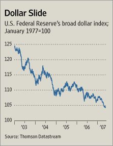
Here is a long-term dollar chart from the Wall Street Journal. The article dealt with a different topic. I simply wanted to put up this chart to show what the dollar chart looks like right now. It's not a pretty picture.

Photo Sharing and Video Hosting at Photobucket

5 comments:

BruceMcF said...

In what sense is that not a pretty picture? That's our best hope for avoiding a recession this summer ...

... and if we have a recession when bank balance sheets are vulnerable in the middle of the bursting of the mortgage bubble, that could be very painful indeed.

If we are going to have a recession, I would very much prefer it hold off as long as possible ... a recession in the middle of 2008 will not do as much damage as a recession this summer.

Anonymous said...

If you are a manufacturer, selling product overseas and competing in the US market with foreign competitors, that graph looks like a god-send.

Dave Johnson said...

Question - why no inflation?

(I mean on the things they call inflation -- not the health care, housing and gas prices that are eating people alive.)

CA Pol Junkie said...

Actually, that chart has been very nice to those of us who are heavily invested in Europe!

BruceMcF said...

Why no little inflation? Actually, core inflation above 2% is one of the main things keeping the Fed from cutting interest rates to cushion the blow of the burst of the housing bubble.

And that inflation is not driven by wage-cost inflation ... with unemployed labor hours certainly in excess of 7%, there are almost stagnant real wages, so with any productivity gains at all, average wage costs will be falling. Imported cost inflation is one source of that core inflation.

Flipping that chart over into a direct exchange rate, that is an effective foreign cost inflation of about 4.2% annually ... with imports representing about 1/5 of the economy, that could easily account for about 0.9% inflation annually.