Saturday, June 4, 2022

Weekly Indicators for May 30 - June 3 at Seeking Alpha


 - by New Deal democrat

My Weekly Indicators post is up at Seeking Alpha.

The slow drip, drip, drip of decelerating or declining data is continuing, as among other things, the YoY increase in withholding tax payments from workers has declined significantly in the past month.

As usual, clicking over and reading will bring you up to the virtual moment in what is happening in the economy, and reward me a little bit for my efforts.

Friday, June 3, 2022

May jobs report: a little softening, but very positive; non-managerial workers are now working *more* total hours than before the pandemic


 - by New Deal democrat

Like the past few months, I was most interested in three main issues:

1. Is the pace of job growth decelerating?  (Yes, but it is still very strong by historical standards)
2. Is wage growth holding up? Is it accelerating? (It is still strong, but decelerated again slightly)
3. Are the leading indicators in the report beginning to flag? (Not yet)

We still have 822,000 jobs, or 0.5% of the total to go to equal the number of employees in February 2020 just before the pandemic hit. At the current average rate for the past 6 months of 505,000 jobs added per month, that’s 2 months from now. Perhaps even more importantly, non-managerial workers are now working in total *more* hours than they did before the pandemic hit.

Here’s my in depth synopsis of the report:

HEADLINES:
  • 390,000 jobs added. Private sector jobs increased 333,000. Government jobs increased by 57,000 jobs. 
  • The alternate, and more volatile measure in the household report indicated a gain of 321,000 jobs. The above household number factors into the unemployment and underemployment rates below.
  • U3 unemployment rate was unchanged 3.6%, 0.1% above the January 2020 low of 3.5%.
  • U6 underemployment rate *rose* 0.1% to 7.1%, 0.2% above the January 2020 low of 6.9%.
  • Those not in the labor force at all, but who want a job now, declined -178,000 to 5.681 million, compared with 4.996 million in February 2020.
  • Those on temporary layoff declined -43,000 to 810,000.
  • Permanent job losers were unchanged at 1,386,000.
  • March was revised downward by -30,000, but April was revised upward by 8,000, for a net decline of -22,000 jobs compared with previous reports.
Leading employment indicators of a slowdown or recession

These are leading sectors for the economy overall, and will help us gauge whether the strong rebound from the pandemic will continue.  These were positive:
  • the average manufacturing workweek, one of the 10 components of the Index of Leading Indicators, was unchanged at 41.3 hours (but last month was revised down -0.1%).
  • Manufacturing jobs increased 18,000. Since the beginning of the pandemic, manufacturing is now down only -17,000 jobs, or -0.1% of the total.
  • Construction jobs increased 36,000. All of the jobs lost during the pandemic, plus another 774,000, have been made up. 
  • Residential construction jobs, which are even more leading, increased 5,000. Since the beginning of the pandemic about 60,000 jobs have been gained in this sector.
  • Temporary jobs rose by 19,300. Since the beginning of the pandemic, about  250,000 jobs have been gained.
  • the number of people unemployed for 5 weeks or less declined by -161,000 to 2,066,000, which is 57,000 *lower* than just before the pandemic hit.
  • Professional and business employment increased by 75,000, which is about 800,000 above its pre-pandemic peak.

Wages of non-managerial workers
  • Average Hourly Earnings for Production and Nonsupervisory Personnel: rose $0.15 to $27.33, which is a 6.5% YoY gain, down from its 6.7% peak at the beginning of this year.

Aggregate hours and wages:
  • the index of aggregate hours worked for non-managerial workers rose by 0.3%, which is now 0.2% *above* its level just before the pandemic.
  •  the index of aggregate payrolls for non-managerial workers rose by 0.8%, which is a gain of 14.0% (before inflation) since just before the pandemic.

Other significant data:
  • Leisure and hospitality jobs, which were the most hard-hit during the pandemic, rose 84,000, but are still -1,345,000, or -7.9% below their pre-pandemic peak.
  • Within the leisure and hospitality sector, food and drink establishments added 46,100 jobs, and is still -750,700, or -6.1% below their pre-pandemic peak.
  • Full time jobs rose 733,000 in the household report.
  • Part time jobs declined -325,000 in the household report.
  • The number of job holders who were part time for economic reasons rose 295,000 to 4,328,000, which is still below their level before the pandemic began, although it is 611,000 above their low this past January.
  • The Labor Force Participation Rate rose 0.1% to 62.3%, vs. 63.4% in February 2020.

SUMMARY

One month ago, while the Establishment report was very good, the Household report was not good at all. This month both sides of the jobs report were very positive.

While the pace of jobs growth isn’t as blistering as previously, it is still excellent by ordinary standards. The unemployment rate is still near historic lows. The leading sectors are almost all positive, indicating growth should continue. Wage growth is still very strong. With the exception of labor and hospitality, plus education, almost all sectors of the jobs market have made up, or almost entirely made up, their pandemic losses. In another two to three months we are likely to have more jobs than we did before the pandemic hit. What’s more, non-supervisory workers in total are now working a total of *more* hours than they did before the pandemic hit.

About the only soft spots were the upward tick in the underemployment rate, part of which was the continued increase in involuntary part-time workers, the 0.2% decline from best levels in the manufacturing workweek, and the second month in a row of downward revisions to previous reports. 

In short, a little softening, but still very positive.

Thursday, June 2, 2022

April JOLTS report: record low layoffs, still near record high quits and job openings


 - by New Deal democrat


Late last year I introduced the idea that the jobs market was similar to a game of musical chairs, where employers added or took away chairs, and employees tried to best allocate themselves among the chairs. Because of the pandemic, there have been  several million fewer players trying to sit in those chairs, leaving many empty. Additionally, there is 10% greater demand for goods and services in total in the past year than there was before the 2021 stimulus payments. As a result, wages have continued to increase sharply, as employers attempt to attract potential employees to sit in the continuing big number of empty chairs.

I’ve further posited that the game of musical chairs will only slow down once some employers throw in the towel, and the number of job openings signficantly declines.

In April, as yesterday’s Census Bureau JOLTS report shows, the game of musical job chairs in the jobs market has actually intensified to all-time levels. Specifically, both job openings and quits made all-time highs, and total separations during their entire 20 year history were only higher in March and April 2020.

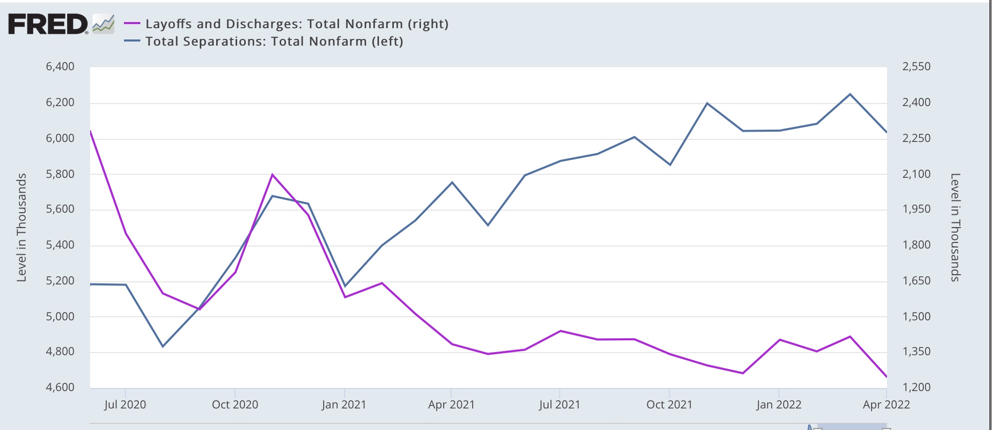
Layoffs and discharges (violet, right scale in the graph below) declined -170,000 to 1.246million, a new all-time low. Total separations (blue) declined -215,000 to 6.033 million (graph starts in June 2020 for reasons of scale):


For all intents and purposes, nobody is getting laid off.

Meanwhile, job openings (blue in the graph below) declined -455,000 to 11.4 million vs. their all-time high of 11.855 million one month ago. Voluntary quits (the “great resignation,” gold, right scale) declined -25,000 to 4.424 million. Actual hires (red) declined -59,000 to 6.586 million, vs. February’s all-time high of 6.832 million:


Importantly, there has been a sharp *deceleration* in the rate of YoY growth of both quits (to 10.2%) and job openings (to 23.0%). But those rates still constitute red hot growth vs. virtually any other time in the past 20 years:


In particular, in the past 6 months, vs. 23.0%, openings have grown at a 5.6% annualized rate, and in the past 3 months, at a 4.2% annualized rate. Openings could have peaked in March, or may continue to slowly rise for another 3 or 6 months.

In summary, the competition by employers to attract employees is still near a record. Employers aren’t laying anybody off, and the trend of workers quitting for better-paying jobs also continues at a near record pace. As a result, I expect wages to continue to increase sharply. Only when the trend in job openings rolls over, based on a 3 month average, do I expect to see a change in the underlying job market.

Initial claims stabilize, yet another 50+ year low in continuing claims


 - by New Deal democrat


Initial jobless claims declined 11,000 to 200,000 last week, continuing above the recent 50+ year low of 166,000 set in March. Meanwhile the 4 week average declined 500 to 206,500, compared with the all-time low of 170,500 set eight weeks ago.  Meanwhile continuing claims declined 34,000 to yet another 50 year low of 1,309,000:


Initial claims have trended slightly higher over the past 2.5 months, indicating a little cooling in the white hot employment market, but no real trend change. The almost complete lack of layoffs, and the attendant “Great Resignation” in favor of jobs with higher pay remains  the brightest spot in the entire economy.

Wednesday, June 1, 2022

Manufacturing and construction continue to be positive for the months ahead


 - by New Deal democrat

Let’s take a look at the new month’s first data, on manufacturing and construction.

The ISM manufacturing index, and especially its new orders subindex, is an important short leading indicator for the production sector. In May both increased, by 0.7 to 56.1, and by 1.6 to 55.1, respectively. The breakeven point between expansion and contraction is 50, so these both remain solidly positive, if not white hot like they were during last year’s Boom (new orders shown in graph below):


This forecasts continued economic expansion on the production side through summer into early autumn.

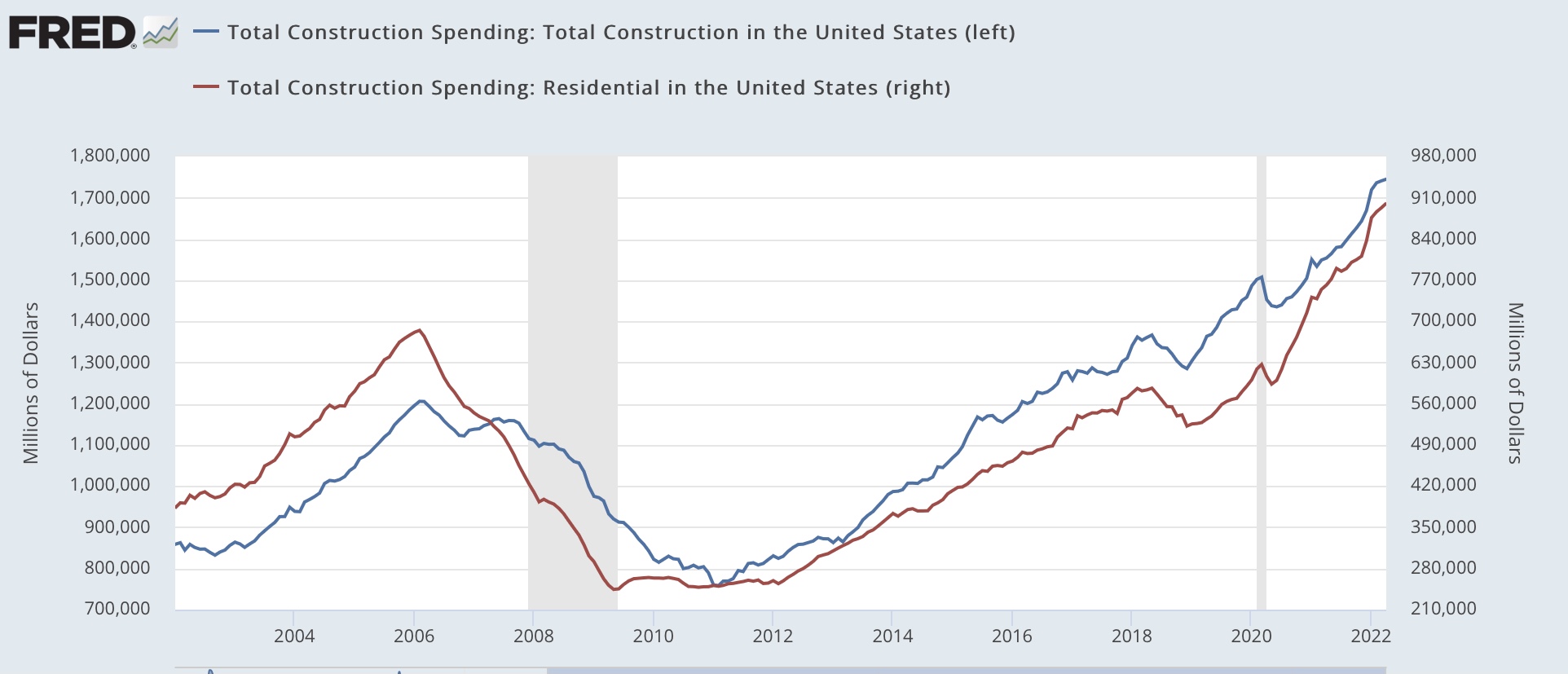
Meanwhile, construction spending rose 0.2% in nominal terms in April, and March’s number was revised up 0.2% to 0.3%. The more leading residential sector rose 0.9%, both thus making new highs:


On a YoY basis, nominal residential construction spending is up 18.4%.

Adjusting for price changes in construction materials, which declined -0.2% for the month, and have been almost exactly unchanged since January, “real” construction spending rose 0.4% m/m, and residential spending rose 1.1% m/m. In absolute terms, “real” construction spending has declined sharply - by -16.7% - since its peak in November 2020,  while “real” residential construction spending has declined -9.4% since its post-recession peak in January of last year, and has risen by about 6% in the past six months:


While total construction spending has declined by more than the -10.4% it did before the Great Recession, the decline in residential construction spending, while substantial, at its worst was only as bad as its 2018-19 decline, and was nowhere near the -40.1% decline it suffered before the end of 2007. In general these two series have been helped considerably by the fact that the cost of construction materials has stopped rising this year.

Mindful of the fact that it takes awhile for the downturn in mortgage applications, sales, and permits to filter through into actual construction, especially with record numbers of housing units permitted but not yet started, these two reports point to continued growth, albeit at a slower pace than last year, in manufacturing and construction in the next few months.


Tuesday, May 31, 2022

House prices: signs and portents of an approaching peak?


 - by New Deal democrat

House prices increases were still going strong through March, as reported this morning in both the Case Shiller and FHFA house price indexes. The Case Shiller national index rose 2.1% for the month and 20.5% YoY, the biggest YoY% gain ever, while the FHFA purchase only index rose 1.5% for the month, and 19.0% YoY.

In the first graph below I also include the quarterly YoY% gain in the median price of all houses sold from the Census Bureau’s home sales report (gold), which increased 15.9% YoY:


While both the FHFA and Case Shiller indexes are at or near record YoY gains, quarterly median house prices from the Census Bureau are down significantly from 21.8% YoY in Q3, which was the highest YoY% gain since 1973. The FHFA gain also decreased slightly. These are of interest because the Census Bureau’s measure, while very noisy, tends to be the first to turn, and the FHFA has in the past slightly led the Case Shiller number.

In this second graph below of the past 5 years, I also include the monthly median new home sales price from the Census Bureau (black):


The monthly number from the Census Bureau is *very* noisy, so I don’t put much much stock in any particular month, but the decelerating trend from last summer is clear.

Finally, while I can’t show you graphically the YoY% change in prices in existing homes from the NAR, since they only allow FRED to show one year, below are the YoY% changes for every month in median existing home sales prices for the past 12 months:

Apr 2021 +19.1%
May +23.6% [peak]
Jun +23%
Jul +20%
Aug +15%
Sep +13%
Oct +13.1%
Nov +13.9%
Dec 2021 +15.8%
Jan 2022+15.4%
Feb 2022 +15%
Mar 2022 +15%
Apr 2022 +10.4% [lowest]

Since the NAR data is not seasonally adjusted, the YoY% change is the only valid way to measure. My rule of thumb for non-seasonally adjusted data is that, when the YoY% change declines to less than half of its largest change, the peak (if we were able to seasonally adjust) has probably occurred. In April, that threshold was crossed - although so far only for one month.

In summary, the best seasonally adjusted data indicates that, through March, the surge in house prices was still ongoing. But the most leading data series, which unfortunately aren’t seasonally adjusted, show signs of a slowing in house price appreciation, and one data series - from the NAR - may indicate that prices, could we seasonally adjust, peaked in April, although I would definitely want to see if that is an anomaly, or if the trend continues in May and June.

Prices follow sales. And sales are down significantly. It would not surprise me if the peak in house prices happened this summer. But while we have some ambiguous signs and portents, we’re not there yet.


Monday, May 30, 2022

Memorial Day 2022


 - by New Deal democrat

Memorial Day is that most somber of national observances, in which we remember all those, of whatever race, creed, color, or nationality, who gave their lives so that government of the People, by the People, and for the People shall not perish from the Earth.


In past years I have included photographs of famous Civil War and World War 1 and 2 graveyards, as well as Arlington National Cemetery.

This year let me focus on several others who gave all in defense of the Republic.

This is a photo of the 54th Massachusetts Infantry Regiment, the unit whose story was made into the 1999 Oscar winning movie “Glory:”


The 54th suffered roughly 42% casualties, including the death of their commander, leading the failed Union assault on Battery Wagner on Morris Island, South Carolina. Of 600 men, over 280 men were killed, wounded, captured, and/or missing and presumed dead.

This is Officer Brian Sicknick, the US Capital Police Officer who was killed by the insurrectionists who attempted to stage a coup on January 6, 2021:


May all those who gave their lives in the defense of the Republic Rest In Peace, and be remembered forever.

Saturday, May 28, 2022

Weekly Indicators for May 23 - 27 at Seeking Alpha


 - by New Deal democrat

My Weekly Indicators post is up at Seeking Alpha.

Few changes to the headlines, but lots of churning underneath.

People seem to have jumped the gun on recession, thinking one is either here or imminent. It’s not here, and it isn’t imminent. I wonder if people will get complacent later in the year, thinking we have dodged a bullet. That probably won’t be true either.

In any event, clicking over and reading will bring you right up to the moment on the long leading, short leading, and coincident readings on the economy, and bring me a little pocket change.

Friday, May 27, 2022

Real income and - especially - spending increase in April, but households are getting much more overextended


 - by New Deal democrat

In April nominal personal income rose 0.4%, and spending rose 0.9%. March’s spending was revised up from 1.1% to 1.4%. In more good news, the personal consumption deflator, i.e., the relevant measure of inflation, rose only 0.2%, so real income rose 0.2%, and real personal spending rose 0.7%. So far, so good.

While both real income and spending are well above their pre-pandemic levels, I have stopped comparing them with that, but instead with their level after last winter’s round of stimulus. Accordingly, the below graph is normed to 100 as of May 2021: 


Since then spending is up 3.3%, while income has declined -1.0%.

Comparing real personal consumption expenditures with real retail sales for March (essentially, both sides of the consumption coin) shows big increases in both:


The one fly in the ointment is that, as a result, the personal saving rate declined another -0.6% from a revised 5.0% in March to 4.4% in April.  The below graph of the last 60+ years subtracts 4.4% from all months, so that the current reading is shown as 0:


Usually the savings rate has tended to decrease as expansions grow longer, leaving consumers more vulnerable to shocks (e.g., gas prices). The current value is the lowest of any period except the two months after 9/11, and the 2004-2008 period when home equity refinancing from the last housing bubble was all the rage. In other words, so far consumes are making up shortfalls by digging into savings or tapping another source of credit, probably home equity. 

This is very concerning late cycle consumer behavior, and leaves households very vulnerable to further prices increases in, e.g., gasoline. But it may continue until house prices inevitably break.

Thursday, May 26, 2022

Initial and continuing jobless claims continue moderating trend


 - by New Deal democrat

Initial jobless claims declined 8,000 to 210,000 last week, continuing above the recent 50+ year low of 166,000 set in March. Meanwhile the 4 week average rose by another 7,250 to 206,750, compared with the all-time low of 170,500 set seven weeks ago.  Continuing claims also rose from their 50 year low of 1,317,000 set last week to 1,346,000:


Initial claims have trended slightly higher over the past 2 months. This continues to indicate a little cooling in the white hot employment market, which nevertheless remains  the brightest spot in the entire economy.

Wednesday, May 25, 2022

Real money supply declines sharply; another leading indicator for recession next year


 - by New Deal democrat

Real M1 declined -0.8% in April, and real M2 declined by -0.7%, following March declines of -1.0% for each:


These have been the sharpest monthly declines since 2005:


Real money supply is a long leading indicator, as shown in the below graph of both real M1 and real M2 going back over 60 years (shown in log scale to prevent inflation from showing earlier periods as mere squiggles):


Here is a close-up of the past 10 months showing both:


Real M1 is at a 9 month low. Real M2 is at a 12 month low.

Real M2 fell out of favor after failing to actually decline YoY prior to the 2001 and 2008 recessions, but a YoY% decline in real M1 and a real YoY% gain of M2 of less than 2.5% is nevertheless an excellent leading indicator for recession:


Again, the short term view shows that real M1 is only up 0.7% YoY (and if the trend continues, will be negative YoY in one month). Real M2 is already negative YoY:


Real money supply is now another negative leading indicator for recession next year.

Tuesday, May 24, 2022

New home sales get walloped


 - by New Deal democrat

New single family home sales got walloped in April, declining -16.6% for the month compared with March, and down -26.9% from one year ago. Measured from their most recent peak last December, they are off -29.6%, and measured from their pandemic peak of August 2020, they are down a whopping -43.0%! :


In the long term perspective, a decline like this is usually recessionary:


But not always: from November 1965 to September 1966, sales declined -41.9%; from March 1986 to January 1988, they declined -33.5%; and from December 1993 through February 1995, they declined -31.2% - in each case without a recession following, although in each case real GDP decelerated sharply to nearly zero, even if it remained positive.

Further, new home sales are heavily revised after the first report. It is not unusual at all for big monthly moves like this to suddenly look much less severe when the number gets revised one month later. I would not be surprised in the slightest if that happened to this month’s cliff dive, when next month’s report comes out.

As to prices, in the first graph above note that the median price of a new home continued to rise (red). As shown in the below graph of YoY changes, prices are still up 19.6% from one year ago, even as sales are down:


This confirms for the umpteenth time that sales lead prices, as shown in the longer term YoY perspective (note: graph averaged quarterly to cut down on noise):


In the past prices have continued to rise sometimes for over a year after sales went into steep declines.

Finally, here is a comparison of housing starts (blue), single family permits (red), and new home sales (gold), all normed to 100 as of February 2020:


Although it is a very noisy number, new home sales frequently do peak and trough before either of the other two numbers - and it appears they did so again during this expansion. Keeping very firmly in mind my above note about revisions, today’s new home sales number suggests that more substantial declines in permits, and ultimately starts, will soon take place. This does not portend recession now, but is a significant piece of evidence adding to the heightened possibility of recession next year.


Monday, May 23, 2022

Inflation reversals as unique markers of Boom and Bust cycles vs. Fed interventions


 - by New Deal democrat

As I’ve already mentioned a couple of times, I am seeing posts from the usual DOOOMERS warning that a recession is imminent, if we’re not already in one. Typically - again, as per usual - they cite data that they never bothered with before, and won’t bother with again when it turns up, in support of their claims.


These cherry-pickers have strong narratives, so they get a lot of dedicated (and probably a lot of new, naive) followers. But they’ve been wrong many times before, and they’re probably wrong again now.

Another issue I’m seeing is people projecting the negative or decelerating trends of the last few months ahead. That’s also very typical, and also makes for lots of mistakes. While it is OK to use, e.g., a short leading indicator to project a coincident indicator forward, it is a mistake to project that *same* indicator forward simply because of its recent trend.

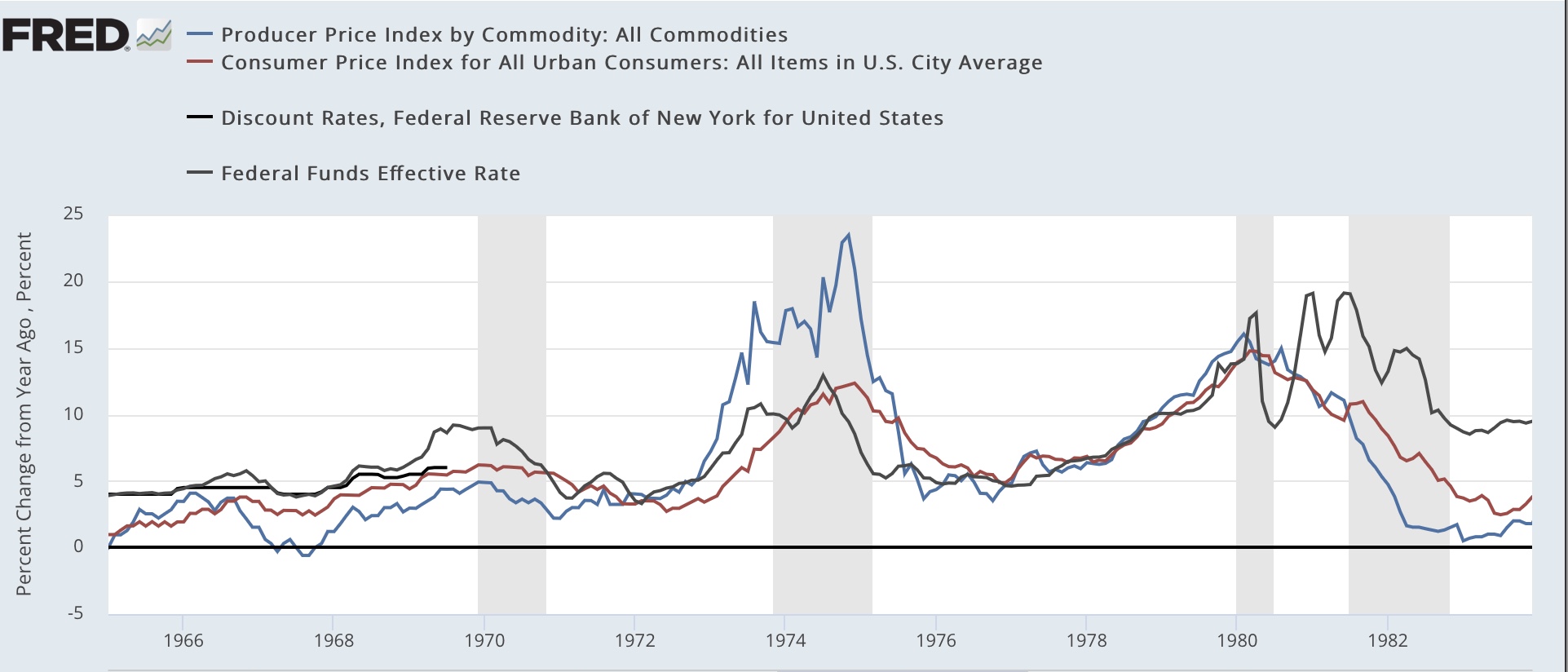
I’ve also mentioned before that we are currently in a “boom and bust” type cycle that we used to have before the Federal Reserve actively managed interest rates starting in the late 1950s. So let me very briefly compare an important difference between the two types of cycles.

Here are the Boom and Bust cycles from the end of WW2 through the 1950s:


Note that the Federal Reserve basically stayed on the sidelines. In fact, the yield curve never inverted at all until late in the 1950s - and yet there were two complete cycles, typified by sharply accelerating commodity and consumer inflation, which abruptly reversed coursed an decelerated to close to if not outright deflation at the onset of recession. This occurred because consumers could not keep up with the price increases. Typically mortgage rates (not shown) also rose enough to cause big changes in monthly house payments.

Now here are the 1970s stagflationary cycles:


There cycles were also typified by high inflation, but the Fed intervened early, raising rates substantially and (again not shown) causing an inversion of the yield curve. The recessions happened before either commodity or consumer inflation decelerated that much - in two cases not at all!

Now, here is our current cycle:


As in the two immediate post WW2 cycles, the Fed has barely intervened - if you squint, you can see the slight rise in the Fed funds rate from zero at the far right. But also, neither commodity nor consumer inflation has cooled at all on a YoY basis.

Until one or both of those markers - an inverted yield curve or a sharp decline in inflation - occur, I do not see any recession in the immediate future.

I plan on examining this in much more detail in a post at Seeking Alpha.

Saturday, May 21, 2022

Weekly Indicators for May 16 - 20 at Seeking Alpha


 - by New Deal democrat

My Weekly Indicators post is up at Seeking Alpha.

The yield curve tightened some more this week (but did not invert).

Meanwhile, I am seeing a fair amount of commentary suggesting that a recession is imminent. This is jumping the gun, and is mainly relying on the downturn in the stock market as well as the increase in gas prices. These are short leading indicators, but only signal correctly once the long leading indicators have been in place for a sustained period of time - which they have not.

As usual, clicking over and reading will bring you up to the virtual moment as to the economy, and will bring me a little beer money.

Friday, May 20, 2022

Coronavirus dashboard for May 20: signs of a peak in BA.2.12.1 in bellwether jurisdictions; is BA.4/BA.5 next?


 - by New Deal democrat

With no significant economic data today, let’s take a look at where the BA.2.12.1 COVID wave is.


Nationwide cases (thin line below) have increased about 3.5x from their bottom of roughly 26,700 five weeks ago, to just over 100,000. Meanwhile deaths (thick line) appear to still be in the process of making a bottom at under 300 per day:


A longer term perspective shows that, compared with the Omicron peak, both deaths and cases are comparatively very low:


The CDC variant update shows that, as of last week, the BA.2.12.1 variant was causing just under 50% of cases nationwide. Its share has been increasing by only about 6%-7% per week nationwide in the past month:


As usual, different regions of the country show very different progress of the BA.2.12.1 variant:


NY, NJ, and PR remain the epicenter, with BA.2.12.1 constituting a majority of cases along the rest of the East Coast and, surprisingly, in the central Plains. Meanwhile it constitutes a distinct minority of cases along the West Coast.

Focusing on the bellwether region, in NY, NJ, and PR, BA.2.12.1 made up almost 75% of cases last week:


And this week showed the first signs that BA.2.12.1 cases are peaking in the Northeast and portions of the upper Midwest that also began to rise early this spring:


Puerto Rico has been particularly hard hit, so I am showing it separately, but it too is apparently peaking:


New Jersey has still been rising, with a possible peak beginning to form in the past few days:


With the exception of PR, where cases increased 30x, and Vermont, where cases only increased roughly 2.5x, the other bellwether States increased roughly 5x from their March bottoms to their present peaks.

If we extrapolate the experience of the bellwether jurisdictions to the rest of the country, we can expect cases to continue to rise for about another month, with a peak of about 140,000 -150,000 cases. A similar increase in deaths would put a peak of roughly 1400-1600/day in about 2 months.

With ever more evidence that reinfections are becoming common, plus plenty of evidence that the Omicron variants can break through vaccinations (although it must be emphasized that cases in vaccinated people are typically much milder, with much less risk of poor outcomes), we meanwhile await the inevitable next variant, which may or may not be the BA.4 and BA.5 lineages from South Africa, which are now being found in almost every State albeit in very small amounts.


Thursday, May 19, 2022

Initial claims: a little cooling in the white hot employment market


 - by New Deal democrat

Initial jobless claims rose 21,000 to 218,000, continuing above the recent 50+ year low of 166,000 set in March. The 4 week average also rose by 8,250 to 199,500, compared with the all-time low of 170,500 set six weeks ago. On the other hand, continuing claims declined another -25,000 to 1,317,000, yet another new 50 year low (but still well above their 1968 all-time low of 988,000):


Initial claims have trended slightly higher over the past 2 months, which, while it shows some cooling in the white hot employment market, is nowhere near a cause for concern at this point. This continues to be the brightest spot in the entire economy.


Wednesday, May 18, 2022

Housing permits and starts decline slightly, but housing still an economic positive over the next 12 months


 - by New Deal democrat

Housing permits and starts declined, but not by much, in April.

Importantly, while typically permits, especially single family permits, lead these series, in the past year there has been a unique divergence between permits and starts due to construction supply shortages.  This has been reflected in the number of housing units authorized but not started increasing to 50+ year records. In April that number declined by a tiny 0.6 million annualized to 293.3: 


As a result, I am paying the most attention to the three month average of housing starts (blue in the graph below) for the time being, as these reflect actual economic activity, vs. permits (gold) which don’t. And that three month average increased slightly to 1.743 annualized, a new 15 year record:


Meanwhile, single family permits (red above, right scale) declined .53 million units annualized to a 5 month low of 1.110. This is -9% off from their peak in January 2021, and does give us the best signal as to where housing is going in the near future.


And what does that future hold? Below are the YoY% change in starts (blue) and single family starts (red), vs. the YoY change in mortgage rates (inverted, *10 for scale), showing that mortgage rates are higher by 2% YoY (shown as -20%). The last time this drastic an increase in mortgage rates YoY happened was in 1994. Note that housing permits and starts declined 20% in the next year, and changes in mortgage rates in 1999 and 2018 resulted in similar declines in permits in starts in 2000 and 2019.  At present the three month average of starts is still 13% higher YoY, while single family permits are now down -4% YoY:


The “demographic tailwind” that buoyed housing activity 5 and 10 years ago has dissipated, as the number of 25-35 year old first time buyers has stopped increasing. Thus I expect a 20% YoY decline in housing permits and starts to manifest in roughly the coming 12 months. But while ordinarily that would be a major negative long leading indicator, actual construction starts mean the downturn will be delayed until the 50+ year record backlog has been cleared - which might take another 6 to 12 months. Since starts are the actual, hard economic activity, this indicates that housing is still going to make a positive to the economy looking out ahead 12 months.