Thursday, May 16, 2013

April consumer deflation boosts real wages and sales


- by New Deal democrat

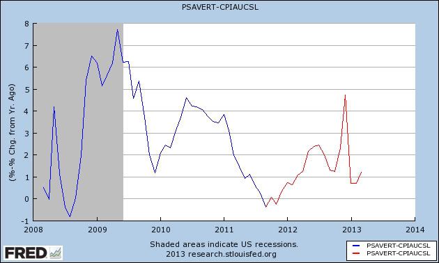
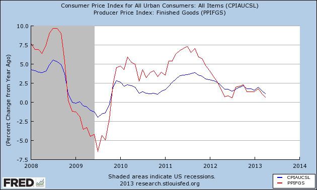
As I expected, the big, surprising decline in gas prices caused April consumer prices to decline -0.4%, one of the biggest declines recorded in the last 50 years outside of the 2008 recession. This brought YoY inflation down to +1.1%, likewise one of the lowest readings outside of the great recession, as shown in blue in the graph below, which also shows YoY producer prices for consumer goods in red [Note: FRED hasn't updated their CPI series yet, so the graphs below don't include April data. I'll update as soon as they do! UPDATE: up to date graphs added.]:


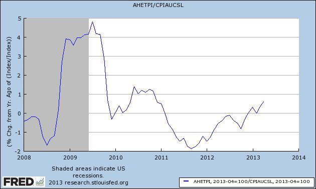
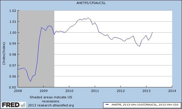
This also raised real, inflation adjusted wages by +0.5% in April, to their highest level in several years:


YoY growth in wages is the highest since early 2011 as well:


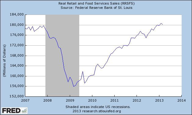
And it also means April real retail sales rose to a new post-recession high:


Because the decline in April prices was due to energy costs, I do not think this correlates with economic weakness, but rather shows how even a temporary loosening of the oil choke collar acts like an economic stimulus.

Market Analysis: Mexico

From the FT:

Mexico’s lower house of Congress late Thursday gave overwhelming general approval to a telecoms bill that seeks to curb the power of some of the country’s most powerful businessmen. 

The approval, by 414 votes to just 50 against, marks the first big step towards introducing more competition into telecoms and television as part of a wider push to make Latin America’s second-largest economy more competitive and grow faster. 

In addition, they are also considering a banking reform bill:


Mexico’s centrist government announced it would send a financial reform bill to Congress that seeks to boost economic growth by making it easier and cheaper for companies to access credit. 

Enrique Peña Nieto, the reform-minded president, has said that, together, the reforms would lift the annual growth rate in Mexico to as much as 6 per cent a year within five years from less than 4 per cent in 2012.
Flanked by opposition leaders, now a customary sight when announcing an important reform, Mr Peña Nieto said the reform proposal was “essential for the economy to grow more and to generate the jobs that our population needs”.

This has led to an upgrade in Mexican debt:

The upgrade of Mexico’s sovereign ratings reflects its strong macroeconomic fundamentals, including the absence of macro-financial imbalances, consistent adherence to its inflation targeting and flexible exchange rate regimes, as well as the greater than anticipated commitment of the new administration and Congress to pass structural reforms. Moreover, the resilience of the economy is supported by the stabilization of oil production and progress in addressing drug-related violence, albeit it remains high.

All of the above news items are very positive for the country going forward.  Let's take a look at some of the macro numbers


The current account is in good shape.


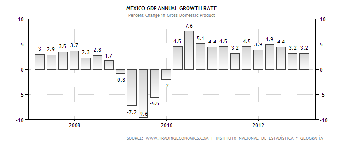
The annual growth rate has been consistent for the duration of the latest recovery


 The government budget deficit is contained.

 Inflation is running a little hot, but not at a fatal level.


 And the unemployment rate is very low.

Let's turn to the Mexican ETF:


Resistance was strong in the 60-65 price area -- the pre-recession highs. However, prices have recently moved through that level.


Essentially, we see a rally from mid-June2012 to the Spring of 2013.  Since the beginning of the year, prices have been meandering sideways, trading between the 70 and 76 level.  Overall momentum has been weak, with the MACD nearing a "0" reading.  The CMF tells us there's a net selling situation, albeit at small levels.  All three of the shorter EMAs are trading in a very tight range, again giving us no sense of upcoming direction.

Overall, the daily chart is one of consolidation since the beginning of the year.  As with any chart, pay particular attention to the price/200 day EMA relationship.  Right now, it tells us we're still in a bull market.

Wednesday, May 15, 2013

What US Inflation?

From Bloomberg:

Wholesale prices in the U.S. dropped in April by the most in three years, reflecting a decrease in fuel costs that is helping underpin profits.

The producer-price index declined 0.7 percent, the biggest decrease since February 2010, after falling 0.6 percent in March, according to a Labor Department report released today in Washington. The median estimate in a Bloomberg survey of 73 economists projected the index would decline 0.6 percent. So-called core wholesale inflation, which excludes often-volatile food and energy prices, climbed 0.1 percent. 

Slow growth in the U.S. and abroad is holding input-price gains in check for American factories. Absent a surge in inflation, policy makers at the Federal Reserve have the option of weighing whether the U.S. economic expansion needs more stimulus to pick up.

“We’ve seen a moderation in inflation across the board, given the weak demand environment everywhere,” Sam Bullard, a senior economist at Wells Fargo Securities LLC in Charlotte, North Carolina, said before the report. “Inflation is just not problematic to central bankers, particularly those at the Fed.”

Guess What? The EU Is Still A Basket Case!

From the latest GDP report:

GDP fell by 0.2% in the euro area1 (EA17) and by 0.1% in the EU271 during the first quarter of 2013, compared with the previous quarter, according to flash estimates2 published by Eurostat, the statistical office of the European Union. In the fourth quarter of 2012, growth rates were -0.6% and -0.5% respectively.
 

Compared with the same quarter of the previous year, seasonally adjusted GDP fell by 1.0% in the euro area and by 0.7% in the EU27 in the first quarter of 2013, after -0.9% and -0.6% respectively in the previous quarter.

Let's look at the data from the report:
The chart above shows the EU has been contracting for over five quarters.  More importantly, let's look at the breadth of the contraction:


As the above chart shows, the breadth of the slowdown is wide: 8 countries have seen four straight quarters of year over year contraction.  France and Germany have printed a negative Y/O/Y number in the latest quarters.  Only three countries (the Baltic state of Latvia, Lithuania and Estonia) are showing any rate of meaningful Y/O/Y/ growth and they are still far below potential GDP rates with high unemployment. 

This is the net end result of austerity.  


Spain's Economy Is Still a Basket Case

Consider the following two charts of Spanish GDP growth:


The economy has been experiencing negative quarter on quarter growth rates for 8 quarters or two years.  Just as importantly, consider the year on year growth rates in the second chart that show a contraction for five quarters.

Let's look a little deeper into the GDP numbers.


With the exception, we see a decrease in the annual percentage changes of all major GDP components.  And these are not small changes: machinery investment is dropping on average at a 6.65% rate, construction is dropping at an 11.45% rate, and overall PCEs are dropping 2.15% rate on average.  The only good news is coming from exports which are increasing.

Let's place this information into a market context by looking at the Spanish ETF, EWP.


Notice three basic price trends.  First we see a decline from April 2011 to July 2012.  Prices consolidated about half way down between the 26 and 32 price level.  Starting at the end of last summer, the ETF rallied as the ECB stated it would do "whatever it takes" to keep the euro together.  However, we see that rally end in the spring of 2013 as negative news about the EU region started to increase.


On the daily chart, we see the trend break right at the end of January.  However, the sell-off was quite disciplined; notice that prices moved lower in a downward sloping trend channel, to right below the 200 day EMA and the 61.8% Fib level from the late summer-early spring rally.  Prices are now meandering with little sense of direction.


Tuesday, May 14, 2013

Ezra Klein Gets the IRS Scandal Right

I've been trying to come up with a way to explain the reason for the "tests" employed by the IRS.  However, Exra Klein has done a good job of summarizing what happened:

It is worth remembering an important fact here: The IRS is supposed to reject groups that are primarily political from registering as 501(c)4s. If they’re going to do that, then they need some kind of test that helps them flag problematic applicants. And that test will have to be a bit impressionistic. It will mean taking the political rhetoric of the moment and watching for it in applications. It will require digging into the finances and activities of groups on the left and the right that seem to be political even as they’re promising their activities are primarily non-political.

If we’re not comfortable with that, then we need to either loosen the definition of 501(c)4s or create a new designation that gives explicitly political groups the benefits of the 501(c)4s (namely, they don’t have to pay taxes and they can keep their donors anonymous). But either way, as I wrote on Friday, the only way to make sure this doesn’t keep happening is for the IRS — or the Congress and White House that control it — to make some tough decisions about 501(c)4s.

He then notes above these observations:

The context for all this is that after Citizens United and some related decisions, the number of groups registering as 501(c)4s doubled. Because the timing of that doubling coincided with a rise in political activism on the right rather than the left, a lot of the politicized groups attempting to register as 501(c)4s were describing their purpose in tea party terms. A popular conceit, for instance, was that they existed to educate on the Constitution — even if the particular pedagogical method meant participating in Republican Party primaries and pressuring incumbent politicians.

The non-profit section of the tax code is one of the few areas of the code where I don't have any experience; it's actually become it's own legal specialty.  However, in general terms, Ezra gets the general terms right. The service was looking for some way to screen applicants who were political rather than charitable.  And, as he notes, that coincided with the rise in political activism on the right, hence the original targeting of the name "tea part" etc....

Unfortunately, the service really screwed up on this one.  They should have been far more sensitive to the political implications of what they were doing and come up with a way to screen applicants that was not based on clearly right leaning groups.  Frankly, I think think the proper action would be for all groups trying to use this section of the code to be given stringent applications that attempted to separate the political from the non-political. 


Abenomics Is Paying Off

From the NY Times:

But in the last few months, the nation’s new prime minister, Shinzo Abe, has pushed policy makers and other officials to take bold steps to revive Japan, one of the world’s largest economies. Their handiwork was evident Friday when the yen hit 100 to the dollar for the first time in four years. 

Normally a weakening exchange rate might be taken as a sign of decline. The yen has fallen nearly 14 percent against the dollar this year, and no currency has fallen more except the Venezuelan bolívar.

In Japan’s case, it is a sign that the policies put in place by Mr. Abe and Haruhiko Kuroda, chairman of the Bank of Japan, are starting to work. A weaker yen makes Japanese exports more competitive around the world.

“Abenomics is about coming out on top in global competition,” Mr. Abe said during a live interview on the Fuji Television Network. “We’re finally seeing a correction of the excessively strong yen.” 

Let's start by looking at a chart of the yen:


Since the beginning of October to now, the yen's ETF has dropped from 126 to ~96, which is a percentage decline of nearly 24%.  The chart itself is incredibly bearish -- prices are making lower lows and lower highs, all the EMA are moving lower, momentum is in negative territory and the money is flowing out of the market.  

However, this is one of the things that Japan wants to happen.  Despite having record low interest rates, the yen become a safe haven currency after the recession, driving its value higher, as shown on the weekly chart:


From late 2008 to late 2011, the yen rallied from 90 to 130 -- an increase of 44%.  

The above rally creates headaches for Japan, as their economic model (like most Asian countries) is centered on exports.  And that area of the Japanese economy has been hurting for some time.  First, consider this chart of real exports and real imports:


Japan has been a net importer for the last decade.  And since the end of the great recession, overall exports are more or less flat:

This overall policy has a long way to go, but it's having the intended initial effects.


Why yesterday's retail sales report was actually a huge positive


- by New Deal democrat

On the surface, yesterday's report on retail sales for April was just barely positive, rising 0.1% after a revised -0.5% decline in March. But the real story is how strong inflation adjusted retail sales are likely to be. In fact, they probably set a new post-recession high. You can thank the loosening of the Oil choke collar for that.

Here's a breakout chart showing total nominal sales, gasoline sales, and nominal sales ex-gasoline for the last three months:

AprilMarchFebruary
total419.0418.6 420.5
gasoline43.946.047.5
ex-gasoline375.1372.6373.0


While nominal rales have declined -0.4% since February, once we subtract gasoline sales, nominal sales have actually increased +0.6%.
But it gets better once we factor in inflation. March featured -0.2% deflation, and if my analysis is right, on Thursday we are going to find that consumer prices declined -0.4% or -0.5% in April. That means that real retail sales for April are likely to have risen +0.5% or +0.6% over March, and further that real retail sales are up +0.3% over February to a new post-recession high.

The resilience of the consumer in the face of the 2% increase in the payroll tax, as evidenced weekly by same store sales and Gallup's consumer spending poll, and now confirmed by the Census Bureau's monthly retail sales report, has to be one of the big surprises of the first half of 2013. The dark cloud within this silver lining is the strong decline in the personal savings rate. At the same time, it certainly bespeaks a real robustness in consumer confidence - at least as reflected in how consumers vote with their wallets.

Monday, May 13, 2013

Austerity Kills -- Literally

The NY Times has an op-ed today, published by two authors who have studied the health effects of austerity.  Remember that in an austerity environment, government agencies have their budgets cut, sometimes drastically.  The public health effects are devastating.  The authors draw the following conclusions:

First, do no harm: if austerity were tested like a medication in a clinical trial, it would have been stopped long ago, given its deadly side effects. Each nation should establish a nonpartisan, independent Office of Health Responsibility, staffed by epidemiologists and economists, to evaluate the health effects of fiscal and monetary policies. 

Second, treat joblessness like the pandemic it is. Unemployment is a leading cause of depression, anxiety, alcoholism and suicidal thinking. Politicians in Finland and Sweden helped prevent depression and suicides during recessions by investing in “active labor-market programs” that targeted the newly unemployed and helped them find jobs quickly, with net economic benefits.

Finally, expand investments in public health when times are bad. The cliché that an ounce of prevention is worth a pound of cure happens to be true. It is far more expensive to control an epidemic than to prevent one. New York City spent $1 billion in the mid-1990s to control an outbreak of drug-resistant tuberculosis. The drug-resistant strain resulted from the city’s failure to ensure that low-income tuberculosis patients completed their regimen of inexpensive generic medications. 

What I have found incredibly ridicules about the current situation is the lack of emphasis on unemployment and its long-term effects.  I have said the following numerous times, but it bears repeating again: 

With interest rates at multi-decade lows, the US could borrow at incredibly low rates, hire the out of work blue collar people (primarily manufacturing and construction workers) and fix our crumbling infrastructure.  Problem solved.  The long-term growth projections from such a move would more then pay for the original cash outlay.

Yet, here we are with a fairly high unemployment rate and the commensurate problems associated with it -- lack of upward wage growth, lack of meaningful savings etc...

I especially like the idea of classifying unemployment as a pandemic.  That makes perfect sense.

Anyway, read the whole piece.  It's well worth your time.


The Non-Threat of Inflation

From Bloomberg:

The odds of disinflation are mounting as the world economy slows anew and commodity prices slide, defying forecasts that easy money would trigger an acceleration of prices. More than half of the world economy, including the U.S. and the euro area, instead confronts inflation below the central banks’ desired levels, according to Ethan Harris, co-head of global economics research at Bank of America Corp. in New York.

“There is a developing inflation problem: undesirably low inflation,” said Harris, a former Federal Reserve Bank of New York economist. “For central banks, this increases the pressure to maintain super-easy monetary policy.” 

Declining prices for everything from gasoline to coffee are good news for consumers. The danger comes when disinflation turns into deflation, which leads households to hold off purchases in anticipation of even lower prices, and companies to postpone investment and hiring as demand for their products dries up and profits drop. 

Let's start by looking at a chart of commodities and ETFs representing some of the largest commodity groups:


Oil has been trading between 85 and 100 for a little under a year.


Both grains (top chart; wheat, corn and soy beans) and softs (bottom chart; coffee, cotton and sugar) are in the middle of a year long decline.


Copper is also trading just above multi-lows.


And finally, gold (which I use as a proxy for inflation sentiment) has broken through support and is trading at the 200 week EMA.

This is translating into weak price pressures across the globe. 


The EU is experiencing declining prices. The rate of year over year percentage change is declining for the last three months.


And above is a chart of the year over year percentage change in CPI for the UK, US, Japan and China.  Notice that prices are very much contained.

Anyone talking about inflationary threats or hyperinflation isn't paying attention right now.  


Market Analysis: US


Pulling back to a year long view of the daily chart, first notice the rally that started in mid-Novemver.  We see a continuing upward move of higher highs and higher lows with prices using the EMAs for technical support.  There are also several periods of price consolidation (late February, late March, mid and late April/early May), allowing the market to "breath."  The CMF indicates we've seen a steady stream of money flowing into the market.  The one negative of the chart is the MACD declining for a fair amount of the period in a modest way.


The NASDAQ has been a surprising laggard to the current rally.  While this index also shows an uptrend starting in mid-November, it was contained by yearly highs established in mid-September.  However, prices have finally broken through the 70 price level, making strong advances, closing the week at 73.10.  Again we see a consistent inflow of money and -- unlike the SPY -- a strong MACD reading.


The Russell 2000 shows three primary trends.  A rally from mid-November to late March, a downward sloping trend channel from late March to late April and then a rally breaking through the top line of the channel and the high established in late March.  The MACD is now printing a strong level of upward momentum and the CMF is showing decent cash inflow into the market.


Saturday, May 11, 2013

Weekly Indicators: the sunny blue skies of May edition


 - by New Deal democrat

Absolutely no monthly data of any significance was reported during the last week, except for the actual surplus the US government ran last month. So let's get directly to the high frequency weekly indicators and start again with transport:

Transport

Railroad transport from the AAR
  • +7700 or +2.8% carloads YoY

  • +5200 or +3.1% carloads ex-coal

  • +6700 or +2.8% intermodal units

  • +14,400 or +2.8% YoY total loads
Shipping transport Rail transport had its best week in over a month, after it had turned negative for three recent weeks.  The Harpex index continues to improve slowly from its January 1 low of 352, and the Baltic Dry Index remains above its recent low.

Consumer spending Gallup's YoY comparisons have been very positive since last December. They got less positive in the early part of April, but have rebounded again, and this week had one of the most positive comparisons all year.  The ICSC varied between +1.5% and +4.5% YoY in 2012. In the past two weeks it has rebounded from prior results near the bottom of this range. The JR report this week also rebounded the upper part of its typical YoY range for the last year.

Employment metrics

Initial jobless claims
  •   323,000 down 1,000

  •   4 week average 336,750 down 5,500
American Staffing Association Index
  • 93 up 1 w/w, up +0.2% YoY
Initial claims established a new lower bound to their recent range of between 330,000 to 375,000. The spring increase of the last two years has not materialized this year.  The ASA is still running slighty below 2007, but now essentially unchanged from last year as well. In other words, the comparison has been generally deteriorating on a YoY basis.

Daily Treasury Statement tax withholding
  • $130.5 B (adjusted for 2013 payroll tax withholding changes) vs. $135.1 B, or -3.4% YoY for the last 20 days.  The unadjusted result was $151.5 B for a 12.4% increase.

  • $56.2 B was collected for the first 7 days of May vs. $50.0 B unadjusted in 2012, a $6.2 B or a +12.4% increase YoY.
These are very good YoY comparisons compared with the last three months. While my best estimate is that collections should be up 15% due to the payroll tax increases that took effect on January 1, that appears not to be accurate, so now that we have enough data from this year I am making comparisons with earlier this year, and this week's comparison is one of the two best.

Housing metrics

Housing prices
  • YoY this week +6.6%
Housing prices bottomed at the end of November 2011 on Housing Tracker, and averaged an increase of +2.0% to +2.5% YoY during 2012. This weeks's YoY increase makes a new 6 year record.

Real estate loans, from the FRB H8 report:
  • up 9 or +0.3% w/w

  • up 16 or +0.5% YoY

  • +2.4% from its bottom
Loans turned up at the end of 2011 and averaged about 1% gains YoY through most of 2012.  In the last several months the comparisons have softened significantly.

Mortgage applications from the Mortgage Bankers Association:
  • +2% w/w purchase applications

  • +12% YoY purchase applications

  • +8% w/w refinance applications
This year purchase applications have finally established a slightly rising trend, and this week's number was the best in 3 years.  Refinancing applications were very high for most of last year with record low mortgage rates, but decreased slightly since then. Nevertheless this was the best week for refinancing in 5 months.

Interest rates and credit spreads
  •  4.52% BAA corporate bonds down -0.01%

  • 1.70% 10 year treasury bonds down -0.03%

  • 2.82% credit spread between corporates and treasuries up +0.02%
Interest rates for corporate bonds have generally been falling since being just above 6% two years ago in January 2011, hitting a low of 4.46% in November 2012.  Treasuries have fallen from about 2% in late 2011 to a low of 1.47% in July 2012. Spreads have varied between a high over 3.4% in June 2011 to a low under 2.75% in October 2012.  The  last several months saw a marked increase in rates and credit spreads widened, followed by a reversal in the last few weeks.

Money supply

M1
  • +1.0% w/w

  • +3.0% m/m

  • +11.8% YoY Real M1

M2
  • +0.3% w/w

  • +0.2% m/m

  • +5.4% YoY Real M2
Real M1 made a YoY high of about 20% in January 2012 and has generally been easing off since.  This week's YoY reading increased sharply.  Real M2 also made a YoY high of about 10.5% in January 2012.  Its subsequent low was 4.5% in August 2012. It has increased slightly in the last month or so.

Oil prices and usage
  •  Oil $96.04 up +$0.43 w/w

  • Gas $3.54 up +$0.02 w/w

  • Usage 4 week average YoY -2.4%
The price of a gallon of gas, after declining sharply in March and April, has risen slightly in May. The 4 week average for gas usage remained negative after previously spending nine weeks in a row being positive YoY.

Bank lending rates The TED spread recently increased again, but is still near the low end of its 3 year range.  LIBOR remained at its new 52 week low and is close to a 3 year low.

JoC ECRI Commodity prices
  • up 0.15 to 125.58 w/w

  • +2.25 YoY
After months of gradual deterioration, there were absolutely NO negatives in the weekly indicators this past week. The closest were several positive but deteriorating indicators: temp services are barely above last year, and Oil and gas prices have started climbing again, with less gas usage. Bond spreads were neutral. Commodities were muted.

Positives included house prices, and both purchase and refinancing mortgage applications. Initial claims continued their terrific recent run. Money supply was positive. Overnight bank rates are somnolent. Consumer spending as mesured by same store sales is decent. Gallup consumer spending continues on a tear. Rail traffic had the best week in over a month. Even tax withholding, when compared with its adjusted YoY results over the last four months, had its best comparative weekly result yet.

This is about as good a weekly batch of statistics as could be hoped for, and I'll take it. Have a nice weekend.
Friday, May 10, 2013

An updated look at the long leading indicators


. - by New Deal democrat

It's been a really slow news week, so now is a good time to step back and update a look at the long leading trends In the economy.  These are the four long leading indicators Prof. Geoffrey Moore identified in the 1990's just before he founded ECRI.  Each of these tends to peak more than one year before the economy as a whole does, and in particular before industrial production, spending, and payrolls turn.

In the graphs below, the last 5 years for each indicator - housing permits, corporate profits, real M2 money supply, and yields on BAA corporate bonds (inverted) are shown in blue, with the last 18 months highlighted in red.

Here are housing permits:


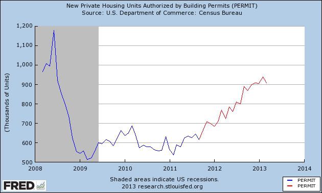
These started rising about two years ago and have remained in a strong uptrend over the last 18 months,

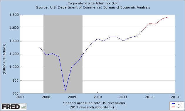
Next, here are corporate profits after taxes.  The first quarter of this year hasn't been added yet, but since we are mainly concerned with 12+ months ago, the relevant trend still shows:


Corporate profits have risen to all time highs.

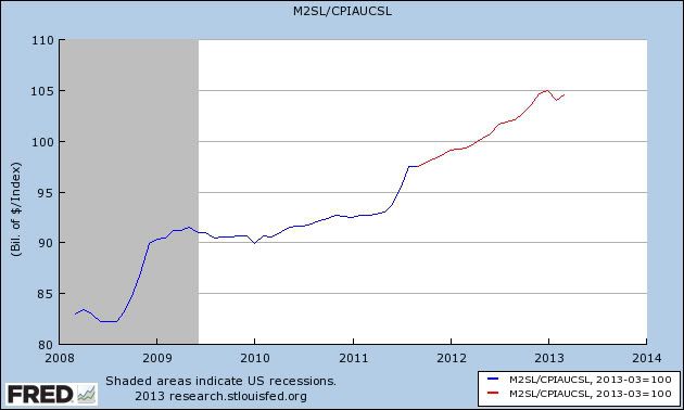
Next, here is real M2 money supply:


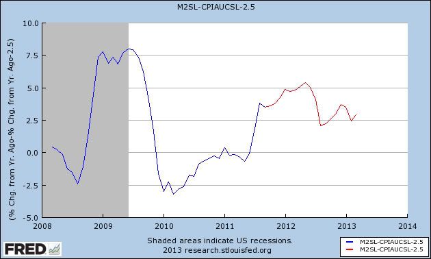
Real money supply has also been rising sharply over most of the last few years with several exceptions.  Because recessions have occured when real M2 has slipped below +2.5%, here is the YoY% growth in real M2 minus 2.5%:


Real M2 did fall into the recession warning area in 2010 and early 2011, but that signal is now waning.

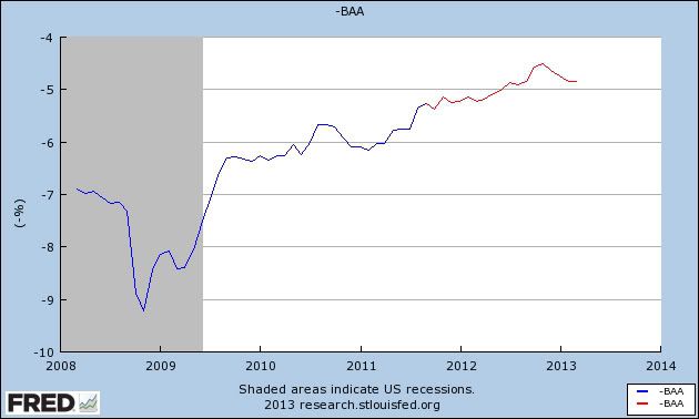
The last of Moore's  four indicators is inverted yield on corporate bonds:


Here again the rising signal is unambiguously positive.

In summary all four long leading indicators signal that, left to its own devices (i.e., without idiotic austerity imposed by Washington), the economy and with it payrolls and consumer spending, should continue to be positive this year.

Despite the above, there are two very big flies in the ointment.  The first, of course, is that Washington hasn't left the economy to its own devices.  Consumers have been forced to stump up an additional 2% of their pay due to the expiration of the payroll tax cut; and austerity via sequestration has been added on top of that.  The two times in the past when many leading indicators gave the least warning is when the Arab oil embargo was imposed in late 1973 and the economy almost immediately went into recession; and when the recovery from the 1980 recession was strangled by the Fed's sharp and abrupt increase in interest rates.

The second concern is the very low real personal savings rate:


The real personal savings rate tends to be a very long leading indicator.  It can remain low for a long period of time, but once consumers worry that the must save more, a recession typically occurs.  Both warnings from this indicator have been triggered - it has fallen more than 5%, and it is close to zero.  The increase that began 18 months ago is probably feeding through the economy now.

While none of the other long leading indicators have rolled over, several - permits, Baa corporates - have hit soft spots, and bear watching more closely.

Regular Blogging Will Resume on Monday

I'm on the last day of a two week travel fest, moving from San Francisco last week to New Jersey this week.  To put it simply, I'm beat.  Regular blogging will start back up on Monday.  NDD will be here this weekend. 


Thursday, May 9, 2013

EU Is Still a Basket Case

Continuing my look at recent central bank action that occurred during my absence, we have the EU dropping its rate from 75BP to 50BP.  The reason is simple: the region is still in a recession with the numbers being reported getting worse.

Let's turn to the recent data to get a better idea for the deteriorating fundamentals, starting with the still worsening employment situation:

The euro area1 (EA17) seasonally-adjusted2 unemployment rate3 was 12.1% in March 2013, up from 12.0% in February4. The EU271 unemployment rate was 10.9%, stable compared with February4. In both zones, rates have risen markedly compared with March 2012, when they were 11.0% and 10.3% respectively. These figures are published by Eurostat, the statistical office of the European Union.

Here's a chart of the data:


Starting in the 1Q12, we see the unemployment rate start to tick up consistently.  Also notice how there has been absolutely no pause in the rise.  This alone would be of concern to any central bank.  But the news continues to get worse.

The EUs manufacturing sector's problems are worsening.  From the latest Markit manufacturing report:

  • Final Eurozone Manufacturing PMI at four month low of 46.7 (flash: 46.5)
  • German output contracts for first time in 2013, joining ongoing downturns elsewhere
  • Job losses recorded across the currency union, as March recoveries in Germany and Austria prove short-lived
Here's a chart of the Markit data:


All the major economies are now below 50.  Some have been at that level for over a year, indicating a prolonged contraction.

Finally, retail sales contracted in the latest report:

In March 2013 compared with February 2013, the volume of retail trade1 fell by 0.1% in the euro area2 (EA17) and by 0.2% in the EU272, according to estimates from Eurostat, the statistical office of the European Union. In February3 retail trade decreased by 0.2% in the euro area, but rose by 0.1% in the EU27.

And a chart of the data shows the deteriorating condition of the sector:


 Simply put, the EU remains mired in recession with little to no indication of getting out anytime soon.


Initial jobless claims in normal expansionary range


- by New Deal democrat

For the second week in a row, initial jobless claims were under 330,000, at 323,000. Furthermore, the 4 week average, at 336,750, is only 750 above what I consider a population-adjusted normal expansionary range. The 4 week average is also the lowest since November 2007, before the onset of the great recession.

Should next week's number be below 350,000, that ought to be enough to move the 4 week average under 336,000.

If Atrios calls this "good news," I think we are officially there.

India Drops Rates 25 BP

I've written previously that I'm bearish on the Indian economy (see here and here).  They're got numerous problems -- an incredibly poor infrastructure, a terribly bloated and inefficient government, lower overall growth and high inflation.  All in all, it's not a very promising picture from a short or medium term perspective, barring a big change in the way the government regularly goes about its business.

Let's turn to the decision by the central bank and it's statement on release of the news of the change in rates:

10. Today’s decision to further cut the repo rate carries forward the measures put in place since January last year towards supporting growth in the face of gradual moderation of headline inflation. Nevertheless, it is important to note that recent monetary policy action, by itself, cannot revive growth. It needs to be supplemented by efforts towards easing the supply bottlenecks, improving governance and stepping up public investment, alongside continuing commitment to fiscal consolidation.

11. Upside risks to inflation in the near term are still significant in view of sectoral demand supply imbalances, the ongoing correction in administered prices and pressures stemming from increases in minimum support prices. In view of this, monetary policy cannot afford to lower its guard against the possibility of resurgence of inflation pressures. Monetary policy will also have to remain alert to the risks on account of the current account deficit (CAD) and its financing, which could warrant a swift reversal of the policy stance.


Translating out of central bank speak we get the following points.
  • We're doing our part to help the economy.  But we can't do it alone.  It would be really nice if the government would change the way it goes about setting policy.
  • Inflation is still a really big problem and it limits our ability to continue lowering rates.  
Here is how the bank described the India economy :

16. Moving on to the domestic economy, with output expansion of only 4.5 per cent inthird quarter of last year, the lowest in 15 quarters, cumulative GDP growth for the period April-December 2012 declined to 5.0 per cent, down from 6.6 per cent a year ago. This was mainly due to the protracted weakness in industrial activity aggravated by domestic supply bottlenecks, and slowdown in the services sector reflecting weak external demand.
17. The Central Statistics Office (CSO) put out the advance estimate of GDP growth for last year, 2012-13, of 5.0 per cent, lower than the Reserve Bank’s January 2013 baseline projection of 5.5 per cent. The CSO’s lower estimate reflects slower than expected growth in both industry and services.

18. Looking ahead, economic activity during the current year is expected to show only a modest improvement over last year, with a pick-up likely only in the second half of the year. Agricultural growth could return to trend levels if the monsoon is normal as recently forecast. The outlook for industrial activity remains subdued because the pipeline of new investment has dried up and existing projects remain stalled by bottlenecks and implementation gaps. Growth in services and exports may remain sluggish too, given that global growth is unlikely to improve significantly from 2012. Accordingly, the Reserve Bank’s baseline projection of GDP growth for 2013-14 is 5.7 per cent.

  • Notice that growth is slowing down.  This is due to both internal and external factors.  Also note the internal factors are difficult to change, implying we'll see these problems continue for the foreseeable future.
  • The slowdown is broad based and has a diverse set of causes, making a change in policy difficult.
  • The age of the massive Indian growth story appear to be over
The bank's discussion about inflation had the following points:

19. Let me now turn to inflation. Headline inflation, as measured by the wholesale price index (WPI), moderated to an average of 7.3 per cent last year from 8.9 per cent in the year before. The easing was particularly significant in the fourth quarter of last year. We ended the year with WPI inflation of 6.0 per cent in March 2013, the lowest in the last three years.

20. Even as headline inflation eased, there were upside pressures on food inflation through the year owing to an unusual spike in vegetable prices early in the year followed by rise in cereal prices.

21. Fuel inflation averaged in double digits during 2012-13, largely reflecting upward revisions in administered prices and the pass through of high international crude prices to freely priced items.

22. Non-food manufactured products inflation ruled above the comfort level in the first half of 2012-13 but declined in the second half, reflecting easing of input price pressures and erosion of pricing power.

23. Even as WPI inflation eased, retail inflation, as measured by the new consumer price index, averaged 10.2 per cent during 2012-13, largely driven by food inflation. Even after excluding food and fuel groups, CPI inflation remained sticky, averaging 8.7 per cent.

24. In the Reserve Bank’s assessment, WPI inflation is expected to be range-bound around 5.5 per cent during 2013-14. This assessment factors in the domestic demand-supply balance, the outlook for global commodity prices and the forecast of a normal monsoon.

25. It is critical to consolidate and build on the recent gains in containing inflation. Accordingly, the Reserve Bank will endeavour to condition the evolution of inflation to a level of 5.0 per cent by March 2014.

Notice how non-core inflation (food and energy) is starting to bleed into core inflation -- notice the description of inflation as "sticky" in point number 23.  This would be a great concern to any central bank and is a primary reason why the bank doesn't have a great deal of room to lower rates further.

Let's turn now to the chart of the India ETF:


The chart really hasn't meaningfully moved in the last 6 months, trading between 55 and 62 -- a roughly 11% range.  Over that time frame, we've seen very little meaningful movement in the MACD which has been flat for a majority of the time.  Volume flow into the ETF is still positive, however.

Obviously a break about 62 or below 55 would be the key developments to this chart moving forward.

Wednesday, May 8, 2013

Are affluent democrats boosting the economy?


- by New Deal democrat

The title of this post isn't a partisan statement. It actually seems to be a fact that there has been disproportionate spending particularly by more affluent democrats for about the last half year, that has given a boost to the economy.
Let me lay out my thought process. Yesterday David Atkins of Digby's blog put up a post entitled, Things are looking up for the rich as usual. He wrote that:
The official unemployment rate is still hovering over 7.5%. The real unemployment and underemployment rate is far, far higher. But no worries: the Dow Jones index just shot above 15,000 for the first time today, reaching a new record high.

And as it turns out, the economic confidence of the wealthy is soaring. 

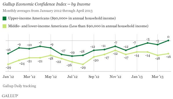
Upper-income Americans' economic confidence in April pushed out of negative territory for the first time [in five years]. Middle- and lower-income Americans' economic confidence remained in negative territory at -16 in April, compared with -18 in March and -14 in February.

Sure, everyone else still thinks the economy is terrible. But what do those middle-class moochers matter? The people whose homes in the Hamptons depend on a soaring stock market are doing fabulously. That's all that counts, right?
Now, about 90% of the time I agree with the political material David posts. But this is a classic example of what I wrote about on Sunday, whereby some in the left blogosphere conflate "the top 20%" (in Gallup's case, at a $90,000 cutoff as we'll see below, about the top 25%) with Wall Street Brahmins like Jamie Dimon. As I noted Sunday, "the top 20%" frequently go by the names of "mom and dad." According to a recent report by the Census Bureau the median stock ownership by households age 55 to 64 is about $25,000. For households age 65 and above, the median is about $50,000.

Still, I was curious as to what he was referring, so I clicked through to find this story and this accompanying poll of economic confidence from Gallup:


So the first thing I noticed is that the dividing line between upper income consumers and the rest is $90,000 annual income. David lives in southern California, so he may not be aware, but the only way somebody with a $90,000 income is getting into a home in the Hamptons is as a caterer or landscape contractor.

But the next thing that got my attention, being a total data nerd, is that big spike upward in the confidence of the lower 75% back in September 2012, that continued upward through November and seems to have had a lasting effect. So I did some searching of archived Gallup reports, and lo and behold, Gallup found a very specific reason for that spike:
Because the Gallup Economic Confidence Index is based on daily tracking of consumer attitudes, we can pinpoint the day that confidence increased. That day was Sept. 4, the first night of the Democratic National Convention. [NDD note: the night of Bill Clinton's keynote address] After averaging -27 in August, and registering -28 on Sept. 3, the Gallup Economic Confidence Index jumped to -18 on Sept. 4, and has mostly remained at or near that improved level.

Because Gallup Daily tracking includes political questions as well as economic ones, we can analyze whose confidence changed in an effort to understand why it changed. The data show that the rise in confidence this month has been almost exclusively due to soaring optimism among Democrats and independents who lean Democratic.
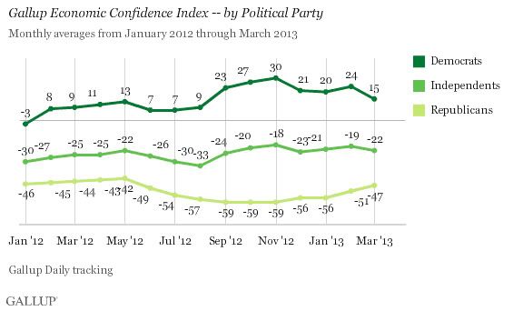
And indeed, while they didn't this month, usually Gallup also includes a breakdown of economic confidence by party affiliation. Here it is from one month ago:


Note that democrats have been positive about the economy since the beginning of 2012, and moreso ever since the democratic convention in September. So in fact David is wrong: "everybody else" besides the top 25% doesn't think the economy is terrible. Democrats in general are positive - a bigger determinant of being positive than having an affluent income.

And although there's no smoking gun, it seems likely that that confidence has translated into spending. Here I believe David is correct: the rising stock market is having an effect (specifically, a "wealth effect"). Anecdotally in the last few months I've heard (older middle class) people discussing how their 401(k)'s are doing - for the first time since before the great recession. And a few graphs of the S&P 500 suggest that's very much the case.

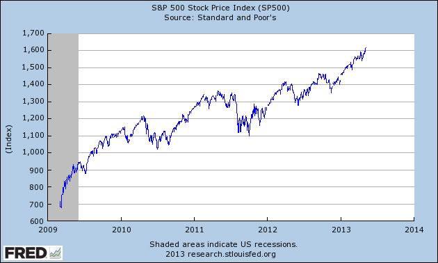
First, here's a graph of the S&P 500 since the bottom in March 2009:


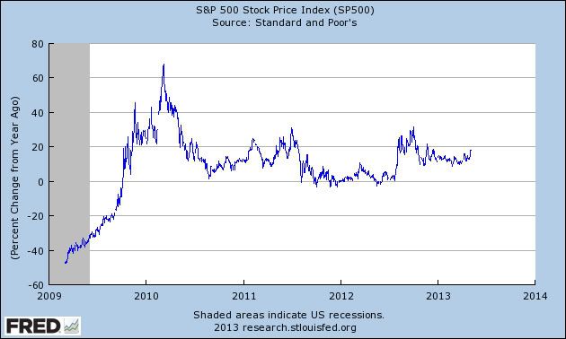
But to see the reason for the wealth effect, looking at the S&P 500's YoY% growth shows it better:


After spending 2 years barely ahead YoY, since last summer the S&P has not just been rising, but it has consistently been up 10% or 20% YoY.

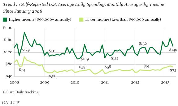
Finally, let's look at Gallup's latest monthly consumer spending graph:


Consumer spending really started to pick up especially for higher but also for lower income consumers in late November, after the stock market had made impressive gains, as it was beginning to close in on its old 2007 records, and just after Obama got re-elected. By Gallup's measure, it has remained strong all through the first 4 months of this year, despite the payroll tax increase, and despite sequestration.

Hence the title of this post, and why it isn't a partisan comment at all. Correlation is not causation and all that, but it does seem likely that democrats, especially affluent democrats, have played a disproportionate role in boosting the economy ever since Bill Clinton's stemwinding speech on the first night of the democratic convention.

Australia Lowers Rates

Hey all -- this is Bonddad.  I'm back after vacation.  First, many thanks to NDD for the fine work he did while I and the Bondspouse vacated in San Francisco for a week.

During my time off, there was plenty of economic news which I'll be catching up on.  Let's start with some of the big news from yesterday -- Australia's dropping its rates 25 basis points.  First, remember that I'm bearish on the Australian economy as I've noted several times (see this link).   The big reason is they're dependent on Chinese growth for most of their growth.  So as China rebalances their economy, Australia should see a decrease in growth.

Here are the important points from the bank's interest rate decision:

Growth in Australia was close to trend in 2012 overall, but was a bit below trend in the second half of the year, and this appears to have continued into 2013. Employment has continued to grow but more slowly than the labour force, so that the rate of unemployment has increased a little, though it remains relatively low. 

With the peak in the level of resources sector investment likely to occur this year, there is scope for other areas of demand to grow more strongly over the next couple of years. There has been a strengthening in consumption and a modest firming in dwelling investment, and prospects are for some increase in business investment outside the resources sector over the next year. Exports of raw materials are increasing as increased capacity comes on stream. These developments, some of which have been assisted by the reductions in interest rates that began 18 months ago, will all be helpful in sustaining growth. 

Australia's central issue -- as with China -- is a need to diversify their overall economy.  Over the last 10 years, Australia's primary economic growth has come from exporting raw materials to China.  But as China has slowly started to move their growth model to one that is more driven by internal demand, raw material exporters like Australia have to change their respective growth models.  But turning an economy in a different direction is a bit more difficult than you'd think, hence my bearishness on Australia.

There are a few more data points from Australia over the last few weeks that should be highlighted.

First, retail sales dropped .4% month to month on a seasonally adjusted basis.  From the report:
  • The trend estimate rose 0.4% in March 2013. This follows a rise of 0.4% in February 2013 and a rise of 0.4% in January 2013.
  • The seasonally adjusted estimate fell 0.4% in March 2013. This follows a rise of 1.3% in February 2013 and a rise of 1.3% in January 2013.
  • In trend terms, Australian turnover rose 3.3% in March 2013 compared with March 2012.
  • The following industries rose in trend terms in March 2013: Food retailing (0.5%), Household goods retailing (0.6%), Cafes, restaurants and takeaway food services (0.4%), Other retailing (0.3%), Department stores (0.4%) and Clothing, footwear and personal accessory retailing (0.1%).
  • The following states and territories rose in trend terms in March 2013: New South Wales (0.5%), Queensland (0.6%), Victoria (0.4%), Western Australia (0.2%), the Australian Capital Territory (0.7%), Tasmania (0.5%) and the Northern Territory (0.2%). South Australia (0.0%) was relatively unchanged in trend terms in March 2013.
 Overall, we see an decent increase over the last few months in this metric.

Total housing permits issued has been decreasing:
  • The trend estimate for total dwellings approved fell 1.2% in March and has fallen for three months.
  • The seasonally adjusted estimate for total dwellings approved fell 5.5% in March following a rise of 3.0% in the previous month.
Here's a chart of the relevant data:


And we also have this from the Conference Board:

The Conference Board LEI for Australia increased again in February for the second consecutive month, with rural goods exports and stock prices making the largest positive contributions to the index. The leading economic index has been flat over the six months between August 2012 and February 2013, an improvement over its decline of 1.1 percent (about a -2.3 percent annual rate) during the previous six months. Additionally, the strengths and weaknesses among the leading indicators have become balanced in the last six months.
The Conference Board CEI for Australia, a measure of current economic activity, also increased in February. In the six-month period ending February 2013, the coincident economic index increased by 0.5 percent (about a 1.0 percent annual rate), down from the 0.9 percent increase (about a 1.8 percent annual rate) for the previous six months. Nevertheless, the strengths and weaknesses among the coincident indicators have been fairly balanced in recent months. Meanwhile, real GDP increased at a 2.4 percent annual rate in the fourth quarter of 2012, slightly down from the 2.6 percent (annual rate) in the third quarter of the year.

The LEI for Australia increased again in February, and its six-month change emerged from negative territory for the first time in more than a year. Meanwhile, the CEI also increased in February, and its six-month grow rate has improved somewhat from the second half of last year. Taken together, the recent improvement in both the LEI and CEI and their components suggests that the economy should continue to grow at a steady pace.

However, consider that news in context:


The overall trend in the LEIs is still down.  The coincident indicators have been level for a bit with only the recent increase to show economic expansion.


And finally notice that while the overall uptrend of the Australian ETF is still intact, the market has not been making new highs with the rest of the world. 

The fact that the bank lowered rates indicates they're concerned about the economy's growth prospects enough to continue goosing growth forward.  That should tell us a great deal about the future.  And while we've seen some positive numbers (retail sales and the LEIs), I still think that the need to rebalance their economy from raw materials to consumer led growth will be more difficult than they anticipate.