Thursday, July 26, 2012

Morning Market Analysis

The IWM P&F chart shows that we had a sell-off in May and June, a rally from June to July and then a sell-off for the last few weeks.


The QQQs P&F chart shows that prices have been in a fairly tight range (62-65) for most of July.  

And the SPYs have been in a range of 132-138 for the last few months as well.

The great thing about P&F charts is they take out the noise and show absolute price moves without the daily "up 5 points, down 1 point" reporting.  And the above charts show that prices have actually been moderately stable for that time period.


After dropping from 51 to 42 (a move of about 18% from May through June), the copper ETF has been trading in a tight range (from 42-45) for the last month and a half.  Prices are still below the 200 day EMA (which is also moving lower) and the MACD has given a sell-signal.  However, money is moving into the market and prices are moderately strong. Also note the low volatility.  This chart is trying to form a bottom.  However, with weak news from a variety of economies continually coming out, it's hard to see how this chart can rally strongly in the near term. 


After spiking for a few weeks, the entire grains complex has taken a breather, largely as traders have taken some money off the table.  The most likely course of action for these futures is a sideways trade for a bit (2-4 weeks) as trader get their bearings on what the final crop looks like.  However, that assumes we won't have any freak weather events -- which is not as unlikely as we would like.


Wednesday, July 25, 2012

The Joke That Is US Economc Debate

From Bloomberg


In reality, there’s remarkable consensus among mainstream economists, including those from the left and right, on most major macroeconomic issues. The debate in Washington about economic policy is phony. It’s manufactured.

And it’s entirely political.

Let’s start with Obama’s stimulus. The standard Republican talking point is that it failed, meaning it didn’t reduce unemployment. Yet in a survey of leading economists conducted by the University of Chicago’s Booth School of Business, 92 percent agreed that the stimulus succeeded in reducing the jobless rate. On the harder question of whether the benefit exceeded the cost, more than half thought
it did, one in three was uncertain, and fewer than one in six disagreed.

Or consider the widely despised bank bailouts. Populist politicians on both sides have taken to pounding the table against them (in many cases, only after voting for them). But while the public may not like them, there’s a striking consensus that they helped: The same survey found no economists willing to dispute the idea that the bailouts lowered unemployment.

How about the oft-cited Republican claim that tax cuts will boost the economy so much that they will pay for themselves? It’s an idea born as a sketch on a restaurant napkin by conservative economist Art Laffer. Perhaps when the top tax rate was 91 percent, the idea was plausible. Today, it’s a fantasy. The Booth poll couldn’t find a single economist who believed that cutting taxes today will lead to higher government revenue -- even if we lower only the top tax rate.

The consensus isn’t the result of a faux poll of left-wing ideologues. Rather, the findings come from the Economic Experts Panel run by Booth’s Initiative on Global Markets. It’s a recurring survey of about 40 economists from around the U.S. It includes Democrats, Republicans and independent academics from the top economics departments in the country. The only things that unite them are their first-rate credentials and their interest in public policy.


As I've grown older, I've really started to hate politicians on both sides of the aisle with equal relish.  I left the Democratic party several years ago, largely because I'm too "pro business."  There is a distinct dislike on the left side of the aisle for people who understand markets or have any degree of financial acuity.  At the same time -- and over the same period -- the Republicans have become stark-raving mad.  Anyone with an IQ above that of a dead person or who thinks in nuance is the enemy. 

That being said, no party in Washington is making any economic sense.  The Republicans are off on an Ayn Rand austerity kick, using the Paul Ryan budget as their blueprint.  This document is, well, laughable at its best.  The results would be catastrophic in terms of overall growth.  The Democrats, on the other hand, have absolutely no idea what policies to propose, suggest or coalesce around.  They timidly make mild suggestions via the press, only to then see what the Republican (or more specifically, the Republican media apparatus) says in response, usually resulting in them backing down, with the end result being nothing happens.    

Ask any sane economist (not some hack on the payroll of any think tack or in the pocket of some ideological master) and you'll get a fairly clear answer on how to handle the current situation.  Macro 101 says: boost demand.  Borrow at low rates, build out infrastructure (which is in terrible shape) lower blue-collar unemployment (which is in terrible shape), boost overall economic demand to increase growth.  It's really not that complicated.  And no, these are not fake jobs, and no, it's not ephemeral growth.  It's very real. 

But neither party is listening to any amount of sane reasoning right now.  They're both .., well, pretty useless.


Where We Are: Services

From the Beige Book:
Demand for nonfinancial services was generally stable to slightly stronger since the previous report. Richmond noted that revenue improvement was strong among professional, scientific, and technical firms. Strength in energy, legal, and audit-related services was noted in the Dallas District. Advertisers in the Philadelphia and San Francisco Districts reported strong revenues, and consulting and advertising contacts in the Boston District noted steady activity. Richmond and San Francisco reported that restaurants were busy, while food service contacts in Atlanta reported that demand had softened a bit.

 Transportation contacts reported that activity was generally positive. In the Atlanta and Dallas Districts, rail contacts reported strong shipments of petroleum and motor vehicles and equipment. The Richmond District reported increases in port activity with container volumes and tonnage at or near record levels. Input from logistics and trucking contacts was mixed. The Cleveland and Atlanta Districts noted softening volumes and less-robust forecasts for the remainder of the year. Kansas City's report cited an uptick in trucking activity, while San Francisco's report cited moderating growth in trucking
Oddly enough, there is actually precious little hard data on the service sector of the economy, save for the ISM services index. 


Overall, we still see readings above 50, indicating expansion.  While the data series has a slightly downward trend to it, it's certainly not fatal.

Let's look at the anecdotal notes from the latest ISM report:
    "General state of business this month is flat, with no changes." (Construction)
    "Business is steady and an increase over last month, as we begin our peak season." (Arts, Entertainment & Recreation)
    "We are starting to experience a slowdown from the modest, grinding improvements our market areas have been experiencing of late." (Finance & Insurance)
    "Patient counts continue to be lower than budget." (Health Care & Social Assistance)
    "Business is still growing, but there has been a definite slowing in growth." (Wholesale Trade)
    "We have noticed a slowing of customer counts and sales over the last 30 to 60 days, compared to the same period last year." (Accommodation & Food Services)
    "Stable business globally, but softening backlog as clients further tighten discretionary spend." (Professional, Scientific & Technical Services)
Notice that most of the comments focus on the slowing overall growth in demand.

While the data is a bit thin to draw strong conclusions, the overall impression is one of a slowing sector.


Where We Are; Housing

I'm going to continue looking at Ben's testimony and the latest Beige Book this week, largely to get a gauge of the overall condition of the US economy.  Let's continue with housing.

From Ben's testimony:
We have seen modest signs of improvement in housing. In part because of historically low mortgage rates, both new and existing home sales have been gradually trending upward since last summer, and some measures of house prices have turned up in recent months. Construction has increased, especially in the multifamily sector. Still, a number of factors continue to impede progress in the housing market. On the demand side, many would-be buyers are deterred by worries about their own finances or about the economy more generally. Other prospective homebuyers cannot obtain mortgages due to tight lending standards, impaired creditworthiness, or because their current mortgages are underwater--that is, they owe more than their homes are worth. On the supply side, the large number of vacant homes, boosted by the ongoing inflow of foreclosed properties, continues to divert demand from new construction
From the Beige Book:
Reports on residential housing markets remained largely positive. Sales were characterized as improving in Philadelphia, New York, Richmond, Chicago, St. Louis, and Minneapolis, while home sales increased in Boston, Cleveland, Atlanta, St. Louis, Minneapolis, Kansas City, Dallas, and San Francisco. However, reports on sales were mixed in the New York District, and gains in the Boston District eased from earlier in the year. New home sales were described as disappointing in the Philadelphia District. Construction increased in the New York, Atlanta, St. Louis, Minneapolis, Dallas, and San Francisco Districts, while reports from the Cleveland District said construction slowed. Most Districts reported declines in home inventories. Homes prices have begun to stabilize in some markets and price increases were noted in select markets. Boston and Atlanta noted that appraisals were coming in below market prices
Both NDD and I have written pretty extensively about the current situation in the housing market.  See here, here, and here.   NDD also wrote a very good series a few months ago which was a rebuttal to Barry's negative housing take.  In summation, both of us feel the housing market has bottomed and there are now signs of an increase in activity.  However, this is still a new development, and the market is still weak. 

To add more to the debate, the NY Fed has just released a report.  Here is their conclusion:
The stabilization of the housing market suggested by various national indicators is corroborated by looking at a number of indicators disaggregated to the county level. Importantly, the median county is now experiencing stable house prices on a year-over-year basis. Transaction volumes in most markets, while still far below normal, have steadied. Finally, the share of distressed sales, although still very high in many markets, appears to have peaked. If these trends continue, then local housing markets are making progress in their convalescence. However, our analysis indicates that most local housing markets still have a way to go to achieve a clean bill of health.


Morning Market Analysis

Let's start by taking a long view of the BRICs.


The Brazilian market is near a two year low.  Prices have been trading in a fairly narrow range for the last few months.  Prices are also below all the EMAs (including the 200 week EMA) and the shorter EMAs are all headed lower.  While the MACD may be about to give a but signal, remember that this indicator is still negative and the underlying economy is still weak.


The Russian market is trying to rally from a near two year low.  The MACD has given a buy signal and its trajectory is rising.  In addition, prices are strengthening. However, prices must still move through all the EMAs and overcome a negative CMF.  The first key will be holding a weekly level that's above its current trend line.


The Indian market is in the exact same position as the Russian market.


The Chinese market is not at or near multi-year lows.  Instead, it's resting right at levels established at the end of last year.  However, the EMA picture is very negative -- all are moving lower and the shorter EMAs are below the longer EMAs.  Money is flowing out of the market and prices are moderately strong.

With all of the above charts, note that the Bollinger Band width is declining, indicating volatility is decreasing.  This is usually a precursor to a bottom; we can but hope at this point.


The chart above shows the difference between the 10 year treasury and the effective Federal Funds rate.  Notice there is still a long way to go before we're near a recessionary reading.


The above chart shows the difference between the 10 and 2 year US treasury.  Again, notice that we're above a recessionary reading, although the difference is declining.

Tuesday, July 24, 2012

Bonddad Linkfest

  1. Republicans face difficult political playing field with tax proposals (NYT)
  2. A closer look at middle class decline (Economix) 
  3. Fed to debate new bond buying program (BB)
  4. Moody's issues negative guidance for Germany (BB)
  5. European heat wave lowers EU crop estimates (BB) 
  6. IPOS getting cancelled in Brazil at increasing pace (BB)
  7. CFNAI shows below trend growth (Chicago Fed)
  8. EU PMI composite still shows contraction (Markit)
  9. German manufacturing contracting (Markit)

Where We Are; Manufacturing

From Ben's latest speech:
After posting strong gains over the second half of 2011 and into the first quarter of 2012, manufacturing production has slowed in recent months. Similarly, the rise in real business spending on equipment and software appears to have decelerated from the double-digit pace seen over the second half of 2011 to a more moderate rate of growth over the first part of this year. Forward-looking indicators of investment demand--such as surveys of business conditions and capital spending plans--suggest further weakness ahead. In part, slowing growth in production and capital investment appears to reflect economic stresses in Europe, which, together with some cooling in the economies of other trading partners, is restraining the demand for U.S. exports.
From the Beige Book:
Manufacturing continued to expand in June and early July in most Districts, but at a more modest pace compared with earlier in the year. Several Districts reported that new orders had moderated since the last report, but the Philadelphia, St. Louis, and Kansas City Districts were more optimistic that new orders would rebound. The Philadelphia and Richmond Districts however, reported declines in shipments and orders. The passing of a transportation bill through Congress led contacts in the Philadelphia District to express interest in increasing their capital spending. Capacity utilization rates at refineries and petrochemical manufacturing facilities held steady in the San Francisco District, with weaker domestic demand being offset by growing exports. Meanwhile, manufacturers in the Dallas District reported operating at above 90 percent utilization rates to catch up with below-normal inventory levels

First, note that in Ben's testimony, he places the blame for the slowdown in US manufacturing on the EU and developing market situation.  This is a very important point, and one that we have stressed on this blog for the last six months, especially as we have seen the BRIC countries experience a big slowdown in growth, albeit for various reasons.

Lets start with a macro view of the manufacturing sector:


The ISM manufacturing index had readings above 50 for a little over a year.  However, it's latest reading showed a contraction with a reading of just below 50. 


More importantly, the new orders index dropped sharply in its last reading.


 The above chart compares the ISM reading (blue) with the ISM new orders number (red).  Notice the tight correlation, along with the fact that new orders typically lead the overall ISM reading.


The durable goods orders numbers show an overall stagnation with a slight downward trend over the last 7 months.


The top chart shows overall industrial production.  While it has moved upward slightly over the last five months, that rate of increase has definitely slowed.  More important, the capacity utilization number below indicates that the rate of industrial expansion has slowed, confirming the slowing trend in the IP numbers.

The above macro numbers indicate that the overall manufacturing sector is stalling, most likely as a result of the slowdown in the EU and developing markets.

The race between deleveraging and deflation: deflation is winning


  - by New Deal democrat

One of the running themes in my long term outlook since the Great Recession has been that the American economy is in a race between debt deleveraging by households, and wage stagnation leading to outright wage deflation.  If households deleverage in time, they will be able to safely spend more, with increasing demand will come increasing jobs, and real wages can stabilize at a rate of growth comfortably above zero.  On the other hand, if wage deflation strikes before households are fully deleveraged, then we are very much in a scenario similar to if not the same magnitude as the 1929-32 vicious cycle.

At this point, the odds are increasingly favoring deflation winning out.

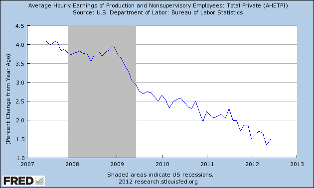
Here is an updated graph, through June, of average hourly earnings measured YoY:


Even during the Great Recession, with wages growing at a nominal annual rate of 3%, there was room for real wages to grow if the inflation rate was 1% or even 2%.  At 1.5%, we are running out of room.  Even a YoY inflation rate of 2% is too much for households.  If this trend holds, we have no more than 24 months before actual wage deflation is upon us -- and remember, mean wage growth has been higher than median wage growth, which unfortunately is only reported quarterly.

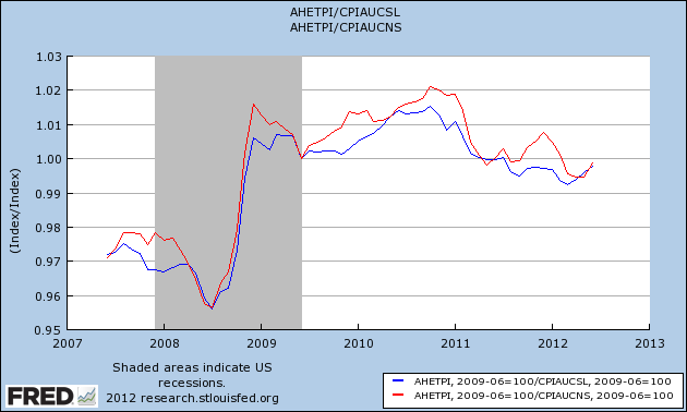
Here is what is happening with real wages, i.e., wages deflated by the CPI, both seasonally adjusted (blue) and non-seasonally adjusted (red):


On a seasonal basis, inflation tends to accelerate in the early months of the year, and become quiescent later in the year.  This probably is a large part of the explanation as to why recently the economy seems to grow more at the end of the year, and then slow down in the first half of the next year.

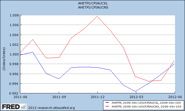
Here's a close-up of the same information for the last year:


Note the 1.3% decrease in real wages between December of last year and April of this year.

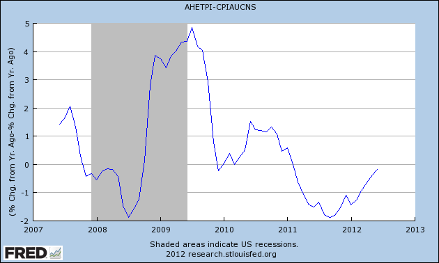
Now here's the YoY% change in real wages:


Notice that on a YoY basis, real wages declined nearly 2% in late 2011, as bad a relationship as during the middle of the Great Recession.  As of June of this year, this has nearly totally abated, as wages are only down about 0.2% YoY.  With any luck, this will turn positive this month or in August.  If the ongoing tension with Iran does not cause another spike in gas prices, this should temporarily ease the strain on consumers.

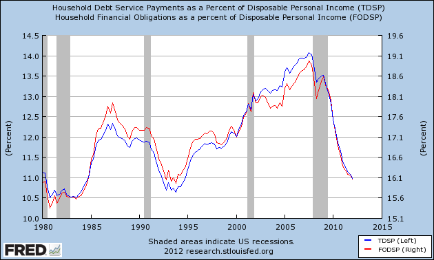
To complete the picture, here is the latest information (through the first quarter) on household deleveraging.  This looks encouraging until you know that in each of the last two quarters, revisions to past data have completely wiped away any continuing progress in deleveraging.  In other words, the levels of debt now are almost exactly what they were initially reported to be in the third quarter of 2011:


The chances that household deleveraging will reach new series lows sufficiently before 24 months from now so as to generate robust and safe new consumer spending by then appear increasingly remote.

If that's the case, then wage deflation is going to win the race.

Morning Market Analysis


The Italian (top chart) and Spanish chart (bottom chart) are both in terrible technical shape.  Both are at 6 months lows and below their respective 200 day EMAs.   Both show decreasing (and negative) momentum and weak prices.  Both charts also have prices below all their respective EMAs.  In short, the most logical move for both is down.

 
Interestingly enough, the emerging Europe ETF is in the middle of a decent rally.  Prices are in an upward sloping channel and are above all the shorter EMAs.  Momentum is increasing -- although its rate of ascent is slowing -- and prices are strengthening. 


The top chart (SPY 5 minute) shows that -- despite the sharp sell-off at the open -- prices rallied for the entire day.  The bottom chart (the 60 minute SPY) places everything in context; for most of the last month prices have been trading in a tight range between 132.5 and 138.


What's fascinating is that -- despite heightened uncertainty in the world as a whole -- gold remains in a very thigh range. 


Monday, July 23, 2012

A Comment on Crops, Crop Prices, Global Warming and Abject Stupidity

One of the odd things about reading economic reports on a daily basis is you wind up reading about sectors your never thought you would read about.  For example -- and as some of you may have noticed -- I've wound up becoming interested in agricultural futures (yes, the movie Trading Places and the infamous phrase "crop report" enters my mind on a regular basis).  As a result, I've noted that over the last 5 years, we've had several major weather related seasons that horribly impacted crop prices.  In 2008, it started with Russia being on fire -- that is, literally the whole country was engulfed in a wildfires, leading to the country banning exports, which in turn drove up crop prices.

This year, the entire US Mid-west -- in what was supposed to be a banner year -- is now in the middle of a horrible drought which is literally killing the latest crop.

All that being said, here's the deal: there is no way to look at these events -- along with the massive amount of record temperatures being reported across the country (not to mention the record polar ice cap melt) -- and not come to the conclusion that global warming is here and we better get ready to understand its impact on the economy.

So, if you don't think global warming is real, let me make this comment: you are
  • an idiot
  • a dolt
  • a moron
  • an embicile
  • dumber than a stump
  • dumber than a post

More importantly, your stupidity has voided your first amendment right to speak.  Put another way, you're too damn stupid to have a place in sane public discourse.  Please go back to the children's table in the kitchen and let the adults discuss this matter as adults.

Here's Bill Nye, doing what he does best: explaining things in a way even an idiot political operative or blogger can understand (OK -- maybe I'm overstating the case)

Will the Grain Complex's Price Spike Lead to Recession?

NDD has written extensively about the oil choke collar.  However, does the same hold true for food prices -- and, more specifically, grain prices?  This is an important question to ask considering the latest run-up in the grain complex.

So -- let's look at the data.  Unfortunately, the FRED system only has a long series of non-seasonally adjusted numbers for the cereals and baked goods component of the CPI.  These numbers go back to the late 1930s.  The seasonally adjusted numbers go back to the 1990s.  So, the numbers we'll use going ahead will be the NSA numbers.


Here's the long series, going back to the mid-1930s.  We can break this chart down into two periods; pre and post 1974.

Before 1974 we see several large YOY percentage spikes in prices that didn't lead to a recession.  These occurred in the early-1940s and the early 1950s.  In addition, there is a somewhat large spike in the late 1960s that was not followed by a recession.  There are three spikes -- the first in the late 1940s, the second in the late-1950s and the final at the beginning of the 1970s that were followed by a recession.  So, in the pre-1974 era, there is a 50/50 chance a large YOY cereal and bakery price spike would proceed a recession.

However, starting in the early 1970s, we see that large price spikes were far more likely to occur before a recession.  On this graph note that in the early/mid 1970s we see a YOY spike of over 30% that presaged a recession.  A smaller spike of nearly 10% occurred before the 1980s double-dip recession.  A spike of nearly 10% occurred before the early 1990s recession (where we also had an oil price spike).  Finally, there was a large YOY run-up before the last recession, that continued into the recession.

Let's look at the more recent data in more detail.


The above chart shows that before the 1974 recession, the YOY grain price spike was nearly 20%, which helped to create the 1974 recession.  In addition, notice the nearly 13% YOY price spike that occurred before the 1980 recession.


The above chart shows the remainder of the data.  Note the large spike before the second dip of the early 1980s double-dip recession, along with the over 6% spike before the early 1990s recession.  Finally, a near 5% spike occurred before the last recession -- a spike which continued to increase into the recession.  Also note the nearly 5% run-up that occurred just recently, which occurred as the US economy was slowing down.

Put another way, since 1974, a year over year percentage change of 5% or more in the cereals and bakery component of the CPI has occurred before every recession.  That's not a comforting thought when you consider these charts:


The long leading indicators are still positive


  -by New Deal democrat

In his 1992 book, Prof. Geoffrey Moore, the founder of ECRI, identified 4 data series that turned more than 1 year before business cycle turning points:
  • housing permits
  • corporate profits after taxes
  • real M2 money supply
  • corporate bond yields (inverted)

That all of those turned down in late 2010 or early 2011 is the primary reason, along with the Oil choke collar, that I foresaw weakness in the first half of this year.  By the second quarter of last year, however, each was improving again.

With the possible exception of corporate profits, each is still in an uptrend.

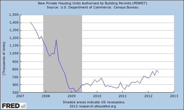
First of all, here's housing permits:


Housing permits last bottomed 18 months ago.  They continue to run about +200,000 compared with a year ago.

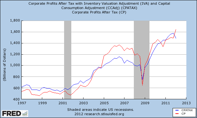
Next, here's corporate profits after taxes (red) and also after inventory adjustments (blue):


While corporate profits after inventory adjustments did decline slightly in the first quarter, corporate profits after taxes continued to improve.  Note that these turned at least 18 months before the onset of either of the two last recessions.

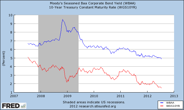
Bond yields continue to decline to new lows, as they have since the beginning of 2011.  Since this series is inverted as a long leading indicator, this is positive:


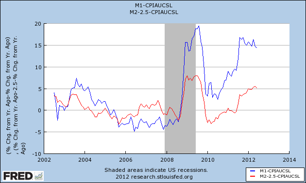
Finally, real money supply, both for M1 and M2, has been positive for over a year:


Although at the moment the economy looks to be teetering on the edge of recession, if we simply follow the series that Prof. Moore studied for half a century as long leading indicators, the situation should improve later in the year.


Morning Market Analysis


The daily charts of the three major ETFs still show a reluctant rally; prices are moving higher, but there is hardly a sense of this being a strong rally.  Instead, this is money seeking out some place to go, but not thrilled about where it lands.  All are above the 200 day EMA, indicating we're in a bull market.  However,  the QQQs have a muddled shorter EMA picture, while the same EMAs are losing their intensity on the IWM chart.  The IWMs MACD has given a sell signal, and the same indicator on the SPY and QQQ chart is weak as well.

There is further good news, however.  The weekly top performing sectors were
  1. Energy
  2. Basic Materials.
  3. Technology
  4. Utilities
  5. Industrials
  6. Consumer Discretionary
  7. Health Care
  8. Consumer Staples
  9. Financials
This is a more bullish orientation than the previous week, when the 2, 3 and 4 top performing sectors were utilities, health care and consumer staples, respectively.  Over the one year time horizon, we still see that utilities, staples and health care are the top sectors, so we're not out of the woods yet.


The weekly chart of the euro shows that prices are in a clear downtrend, and have been in one for nearly a year.  Prices are trading below the 200 week EMA; all the shorter EMAs are below the 200 day EMA, and all are heading lower.  Momentum and the RSI are weak, the CMF is negative and volatility is rising.  In short, the next logical price target is the low established last summer.


The yen is still trading sideways.  This currency is caught between two currents.   Bulls are looking for a safety bid -- a place to park money to ride out the overall economic storm.  However, there is still concern about Japan's overall growth rate, leading to downward pressure.  There is also the possibility that the BOJ will engage in further easing, adding downward pressure to the yen.


The Australian dollar is now in an uptrend.  Prices are above the 200 day EMA and the shorter EMAs are rising.  The MACD shows positive momentum, relative prices are strong and money is flowing into the market.  There are several reasons for this.  First, Australia has a higher interest rate.  Secondly, the economy is, overall, still doing fairly well.

Saturday, July 21, 2012

Weekly Indicators: Consumer spending red flag edition


  - by New Deal democrat

Monthly data reported included very poor June real retail sales, off -0.5%.  Consumer prices were flat, meaning -0.3% deflation for the 2nd quarter.  Housing permits declined, although still at the third highest level in 4+ years.  This contributed to a -0.3 decline in the June LEI, the second decline in 3 months.  Existing home sales also dropped to a 6 month low.  Housing starts, which usually follow permits by about a month, did rise to a 4+ year high, and industrial production also rose 0.4.

A reminder about my weekly look at the high frequency weekly indicators:  they are not meant to be predictive at all.  Rather, while reporting on monthly or quarterly data is "looking in the rear view mirror," by using data that is reported every week we are glancing out the side windows at what is happening virtually in real time.  Although weekly data can be noisy, turns will show up here before they show up in monthly or quarterly data.

And indeed, a significant turn did show in consumer spending.  Last year the smoothed Gallup daily consumer spending data showed that, despite concerns of an imminent recession from some last September, consumer spending was holding up.  Meanwhile same store sales were almost uniformly running at over +2% YoY.  Last winter, I identified this as a metric to watch.  Beginning in May, this level was being frequently breached to the downside by at least one of the reporting services.  By late June, Gallup spending in particular was basically flat YoY.  All of this presaged the poor June retail sales number.

This week, Same Store Sales were decidedly mixed and Gallup was negative.

The ICSC reported that same store sales for the week ending July 14 were flat w/w, and were up +2.6% YoY.  Johnson Redbook reported a 1.7% YoY gain.  Shoppertrak, which has been very erratic, reported a +3.6% YoY gain.  The 14 day average of Gallup daily consumer spending,  at $67 was $4 under last year's $71 for this period.  This is the fifth week in a row in which consumer spending has weakened significantly, and the worst YoY comparison in two months for the Gallup report.  One year ago, sales were building to a good "back to school season" that peaked in early August. Since the beginning of June, however, sales have been in decline.  This is now a red flag showing that consumers have turned cautious and that caution has continued into July.

Employment related indicators were also mixed to poor:

The Department of Labor reported that Initial jobless claims rose 36,000 from the prior week's unrevised 350,000, reversing all of its decline and then some from last week.   The four week average fell 1000 to 375,500.  

The Daily Treasury Statement for the first 13 reporting days of July was $97.5 B vs. $96.9 B a year ago, a very slight +0.6% improvement.  For the last 20 days ending July 19, $135.0B was collected vs. $135.8B for the same period in 2011, an outright decline.  This decline may be an artifact of the July 4 holiday, since an extra Monday is included in last year's number.  Moving the average by one day either way results in a +$4B or +$7B gain.

The American Staffing Association Index fell by 5 to 88. This index has been generally flat for the last three months, mirroring its 2nd quarter flatness last year. The big decline this week is due to the July 4 artifact that happens every year.  It should rebound next week.

The energy choke collar is close to re-engaging:

Gasoline prices rose again last week, up .02 to $3.43.  Oil prices per barrel rose sharply during the week, and settled Friday up another $5, closing Friday at $91.83.  Gasoline usage, at 8628 M gallons vs. 9028 M a year ago, was off -4.4%.  The 4 week average at 8848 M vs. 9154 M one year ago is off -3.3%, still a significant YoY decline; however, June and early July of 2011 were the only months after March 2011 where there was a YoY increase in usage, so the YoY comparison now is especially difficult.  

Bond prices and credit spreads both decreased:

Weekly BAA commercial bond rates fell .13% to 4.90%.  These are the lowest yields in over 45 years. Yields on 10 year treasury bonds  fell .09% to 1.52%.  The credit spread between the two declined to 3.38%, but is still near its 52 week maximum.  The recent collapse in bond yields shows fear of deflation due to economic weakness, as does the recent increase in credit spreads. 

Housing reports remained mixed:

The Mortgage Bankers' Association reported that the seasonally adjusted Purchase Index declined a slight -0.1% from the week prior, but remained down approximately 3% YoY, back into the middle part of its two year range.  The Refinance Index rose 22%, again at its 3 year high. 

The Federal Reserve Bank's weekly H8 report of real estate loans this week rose +0.1%, and the YoY comparison remained at +0.9%.  On a seasonally adjusted basis, these bottomed in September and is up +1.2%.  

YoY weekly median asking house prices from 54 metropolitan areas at Housing Tracker  were up + 2.7% from a year ago.  YoY asking prices have been positive for 7 1/2 months, and remain higher than at any point last year.

Money supply was positive and is now being compared with the inflow tsunami of one year ago:

M1 rose +2.7% last week, and was up +1.8% month over month.  Its YoY growth rate rose to +16.0%, so Real M1 is up 14.4% YoY.  M2 was flat for the week, and was up 0.8% month/month.  Its YoY growth rate remained at 8.5%, so Real M2 grew at +6.%.  Real money supply indicators after slowing earlier this year,  have increased again, but YoY comparisons are starting to wane as expected.

 Rail traffic turned solidly positive:

The American Association of Railroads  reported a +3.9% increase in total traffic YoY, or +20,300 cars.  Non-intermodal rail carloads were up +1.7% YoY or +4600, as coal hauling turned solidly positive for the first time in months, up 3000 carloads YoY.  Intermodal traffic was up 15,600 or 6.8% YoY.  Negative comparisons, however, continued for 10 of the 20 carload types. 

Turning now to high frequency indicators for the global economy:

The TED spread stayed at 0.37. In the last few weeks it has established new 52 week lows. The one month LIBOR declined slightly 0.2468. It has risen significantly above its recent 4 month range, it remains well below its 2010 peak, and has still within its typical background reading of the last 3 years.  Even with the recent scandal surrounding LIBOR, it is probably still useful in terms of whether it is rising or falling.

The Baltic Dry Index fell another 73 to 1037. It is still 367 points above its February 52 week low of 670, although well below its October 2011 peak near 2200.  The Harpex Shipping Index fell for the seventh from 430 to 423, but is still up 47 from its February low of 375. 

Finally, the JoC ECRI industrial commodities index rose from 116.13 to 118.73. This is still near its 52 week low.  Its recent 10%+ downturn during the last few months remains a strong sign of all that the globe taken as a whole is slipping back into recession, and its increase in the last two weeks is probably primarily due to the price of Oil.

While as I have said for the last several weeks, weakness has grown widespread, the most positive signs are in the long leading indicators of bond yields, money supply, and housing.  Labor indicators remain weak, and it is particularly ominous that the Oil choke collar is close to re-engaging just when consumers appear to be rolling over. 

Have a nice weekend!

Friday, July 20, 2012

Weekend Weimar, Beagle and Pitbull

It's that time of the week.  NDD will be here tomorrow or Sunday with the weekly indicators.  I'll be back on Monday.  Until then..


Initial jobless claims and the onset of recessions


  - by New Deal democrat

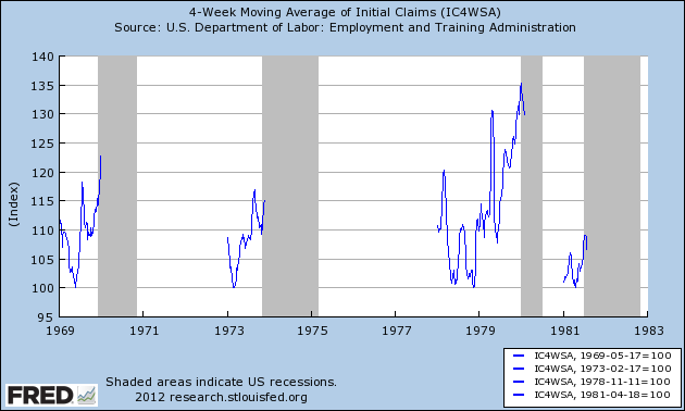
With the recent increase in the number of initial jobless claims filed weekly, and the general weakness we have seen in the data for the last month, I wanted to take a close look at the relationship of initial jobless claims to the onset of recessions -- not in terms of the duration between the upturn of claims and the start of a recession, but rather the amount of the increase.

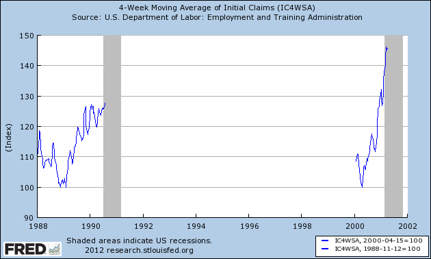
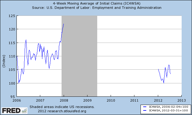
We have data going back 45 years and including 7 recessions.  In each of the graphs below, I took the lowest number of initial claims reported during the economic expansion and normed that to 100.  I started with January 1st of that year, and continued to the end of the first month of the next recession.  The result shows the percentage by which initial claims had increased at the onset of each recession.  After the first month of each recession, claims rose sharply and are not included.

Here's the result for the miserable 1970s and the major recession of 1981-82:


Here are the 1990 and 2001 recessions:


And here is the onset of the Great Recession and the entirety of this year so far:


The only case that is comparable is the onset of the major recession of 1981-82, and even there claims were consistently over 5% higher than the previous low at all times.  The lowest initial claims number during the interim between the "double dip" at that time was still over 400,000, and on a population adjusted basis, 50% higher than the low of March 31 of this year.

As usual, the caveat of a limited data set applies, and this is only one series, but the limited increase in initial claims in the last 3 1/2 months looks much more consistent with very weak growth than actual contraction.