On Friday I posted the below graph that showed the very surprising close and leading correlation between initial jobless claims adjusted for population (the "initial jobless claims rate") and the unemployment rate:
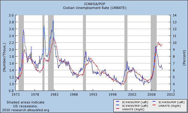
So close is the correlation that the initial jobless claims rate predicts the unemployment rate 3 months later within 2% in all but 31 of 524 months - about 93% of the time, and predicts the unemployment rate within 3% all but 13 times, or 97.5% of the time:
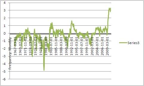
It appears there is a slight secular trend higher in this metric in the long term. I will address this in point 4 below. (Note: my co- blogger Silver Oz has put this relationship together in a spreadsheet. If you would like a copy, let us know in the comments section).
On Monday I showed an alternative, similar measure caclulated from the YoY change in the 6 month averages in the two metrics.
Both ways of looking at the data show that this past year has been an exception to the rule: the unemployment rate has remained stubbornly high and unchanged even though initial claims have dropped by over 20%.
On Friday I suggested that the exceptional circumstances prevailing now meant that layoffs were actually no longer higher than average for the last 50+ years. Rather, the issue was a lack of new job creation.
I believe there are 4 reasons that give rise to this exceptional situation in which job creation has not been as strong as compared with the leading metrics. Numbers 1 and 2 are unique to this recovery, while number 3 and 4 are continuations of a trend - and in the case of number 4, a continuation at a completely new scale:
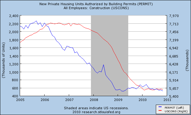
1. The expiration of the $8000 housing credit distorted the normal recovery pattern. Construction growth is not only failing to lead this recovery, but there has been no net construction hiring 19 months after the bottom of the economy.
2. In accord with number 1, and drastic cutback in fiscal aid to the states after one year has pushed job losses that would otherwise have taken place in 2009, into 2010, instead of renewed hiring beginning.
3. Manufacturing job growth is taking place in Asia in response to renewed American consumer demand.
4. Growth in hiring has been replaced with growth in hours.
Let's look at them in turn.
1. Housing
As part of the February 2009 economic stimulus package, Congress passed an $8000 housing credit. In response, housing sales and prices, both of which had been plummeting, stabilized and housing sales actually increased. When the stimulus was originally planned on being terminated in October 2009, and then when it actually did terminate at the end of April 2010, housing starts and permits dropped again, all the way back to their previous lows, and decreased demand showed up in dropping prices as well.
Prof. Edward E. Leamer made a persuasive case several years ago that housing booms and busts always lead the economy into and out of recessions. With the huge housing hangover, there has been no such growth yet, and construction jobs have flatlined as shown in this graph:
Bill McBride, t/a Calculated Risk, has produced this graph over the last few months showing that housing permits and starts lead the unemployment rate:
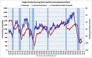
It is obvious they are still affecting it.
2. Of a piece with the housing stimulus is the saga of Congressional fiscal aid to the states, which was forthcoming in 2009, grudgingly and only partially extended for one more year in June 2010. State and local layoffs, which otherwise would have taken place in 2009, have taken place in 2010 instead. If you needed the reminder, here is the graph of local employment. Over 250,000 jobs in this sector have been lost.
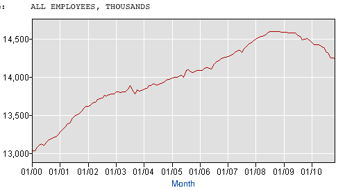
As to both housing and state and local government employment, what happened is a shift in layoffs. There would have been more layoffs and a steeper climb in the unemployment rate in 2009, and most likely a decline to where we are now this year. Instead the unemployment rate has flattened.
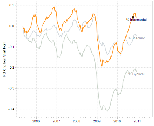
3. Another piece in the puzzle has to do with imports. Intermodal containers are typically the boxes that arrive via ship on the West Coast, and then are transported by rail to other locations.
Consider this graph of intermodal transit on railroads:
Consider also this graph of Los Angeles port traffic:
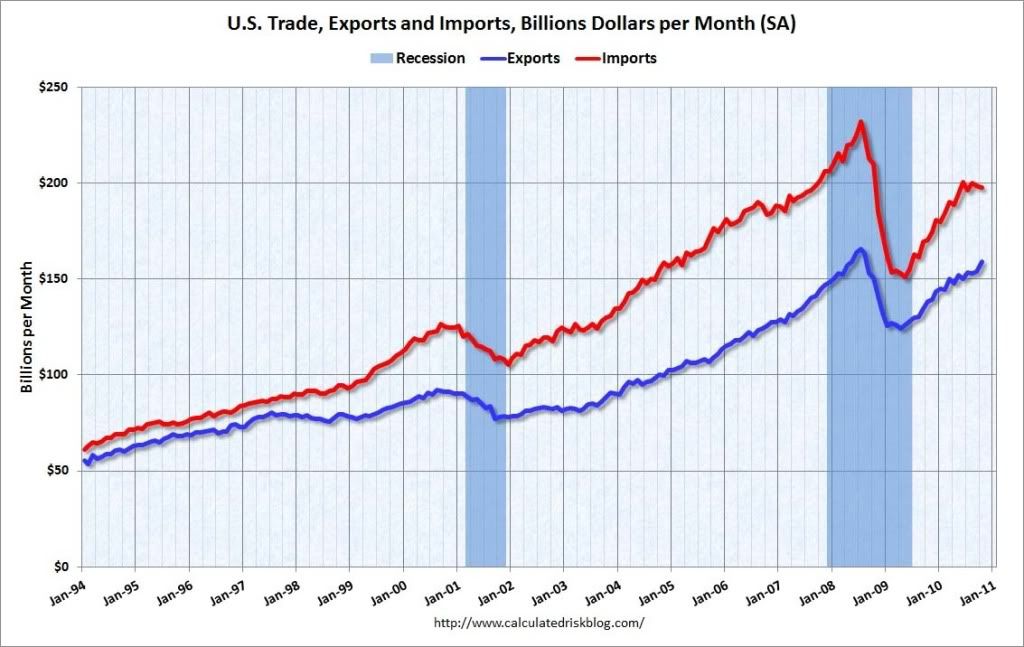
Although real retail sales have rebounded approximately 2/3 from their recession low, intermodal container imports and rail transit have made up essentially all of their lost ground. In other words, American cnsumer demand stimulated production in Asia, not manufacturing jobs in America.
4. Growth in hiring has been replaced with growth in hours.
The Great Recession, unlike prior recessions, including other severe recessions, hit service jobs every bit as hard as manufacturing jobs. Fully half of the 8 million or so jobs lost during the recession came from services. No other prior recession comes even remotely close to that percentage:
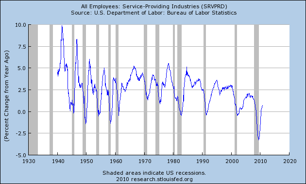
In short, this was a broad based drastic decline in jobs across the entire spectrum of the economy.
I submit that the Recovery in employment is taking place, relatively speaking, in the amount of hours worked, rather than in the number of jobs gained, and until that is resolved, metrics like the initial jobless claims rate (and real retail sales too) compared with employment and unemployment will lag compared to prior recoveries.
This in my opinion is the crucial graph -- average hours worked in private industry:
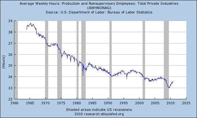
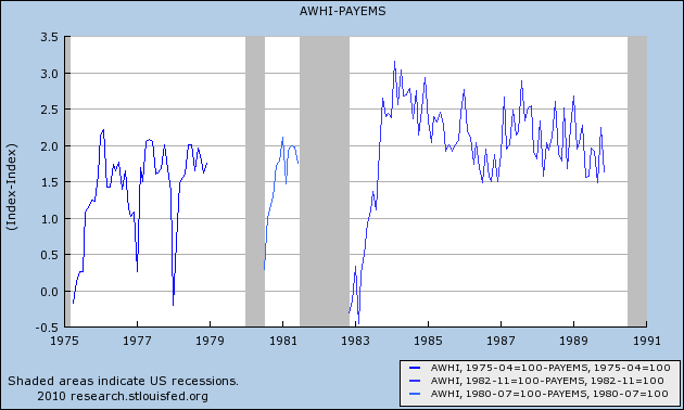
As you can see, it has been in decline for half a century. What this means is, every time there is a recession, there are more and more hours available to be increased in the workforce before new hires need to be brought on board. To see that, first let's look at the following graphs, in which for each recovery, the YoY percentage change in jobs is subtracted from the YoY change in hours. Here are the 1970s and 1982 severe recessions:
And here are the more recent "jobless recoveries:"
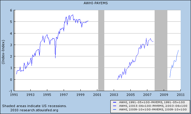
As you can see, in earlier recoveries the number of hours initially grew faster than the number of jobs, but quickly reached a "saturation point" after which jobs grew just as fast. In more recent recoveries, the saturation point was very lately, if ever, reached.
Let's now look at the actual growth in jobs and hours over time. In this next graph, the last half century's data is normed so that the 1981 peak is at 100. You can see that before then, jobs grew faster than hours. After that, the growth looks a little more equivocal.
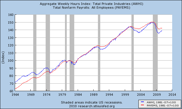
When we look at the same data over the last 10 years normed so that the 2007 peak is normed to 100, the change becomes much more obvious.
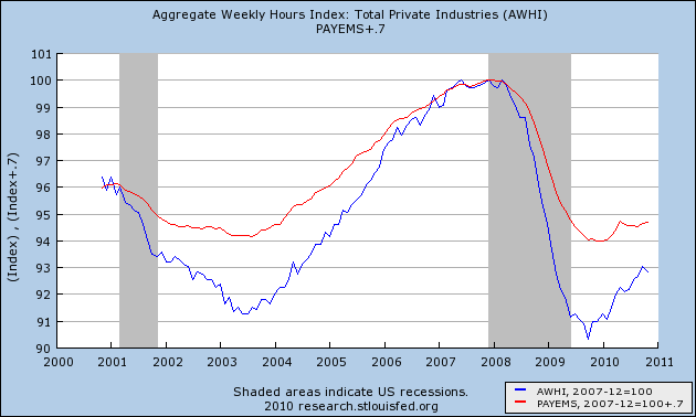
Since 1981, jobs and hours over the long term have grown about equally. Hours decline more in recessions, and grow more in recoveries. In the Bush economy, the number of hours worked only caught up with the number of jobs gained in 2007 - just in time for the Great Recession. Since bottoming a year ago, half of the difference in the declines has been made up.
Let me show you the same data one more way. This is the same information above in YoY terms:
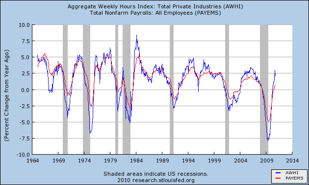
If it looks like gradually hours are being added faster in expansions, and job losses are increasing relatively speaking in recessions, then this next graph, with payroll changes amplified 1.6 times so that the YoY changes in the last 10 year are almost identical, should make it obvious:
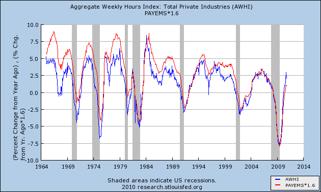
It is now easy to see that over time, fewer and fewer jobs were gained in economic expansions, and more jobs were shed during recessions, relative to hours worked.
So let's put together the above 4 points into a conclusion.
There has been a lag in job growth and unemployment decline compared with historical norms as to any number of metrics, including but not limited to the initial jobless claims rate and real retail sales. This is due in part to distortions due to the economic stimulus package of February 2009 which delayed and blunted losses in residential construction and state and municipal labor, which have continued to take place later than usual. In particular, one normal leading engine of recovery - residential building - is still bouncing along the bottom.
Additionally, the rise of offshoring on a secular basis has meant that increased spending by Americans is, relative to past recoveries, stimulating job growth in Asia rather than in America.
Finally, the secular reduction in average weekly hours worked in America means that there is much more slack to be taken up by growth in hours than by growth in jobs.
This does not mean that the historical metrics aren't relevant. There are signs in things like architectural billings, rail freight related to housing, and prices for housing that in real terms are lower in some markets than at any point in the last 25 years - that suggest both residential and nonresidential construction may start to grow together at some point in the next 4-8 months. Additionally, if hours continue to regain lost ground relative to jobs at the same pace as they have in the last 12 months, then by about the end of next year hours will have caught up with jobs, and if we avoid another crisis we can expect job growth to accelerate.
In short, the correlation may be delayed, but most likely it will assert itself in 2011.