While the recent decline in first time unemployment claims is certainly good news, the fact remains that over 400,000 initial jobless claims have been made each and every week for a long time. Since the beginning of August 2008 to be precise.
That got me wondering how long initial claims were over 400,000 in the other severe recessions of the 1970s and early 1980s. As it turns out, in the 1973-74 recession, they only exceeded 400,000 for 1 year: November 1974 to November 1975. In the "double dip" 1980 and 1981-82 recessions, however, claims remained elevated over 400,000 for a full 4 years -- November 1979 through November 1983!
Comparing that with the time unemployment over 6% gives us the following graph of two periods of "hard times:"
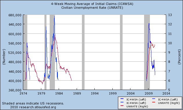
In fact, unemployment stayed over 6% for all but a few months in 1978-79 for a full 17 years, from April 1974 to August 1987. That is certainly a portrait of a very bad decade, that we hopefully are not in the process of repeating.
But it isn't really fair to compare 400,000 weekly new jobless claims over a time period when population grew from 200 million to over 300 million. So I replaced that metric by dividing the number of initial claims by the population, giving me the number of people per 1000 who were laid off each week, and this is the graph that emerged:
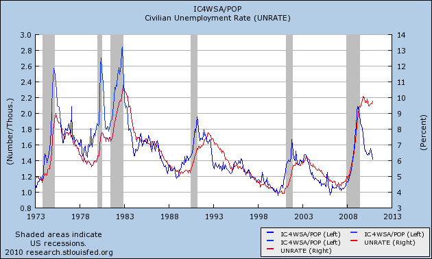
This, second graph is the better one, since we are measuring both first time claims and the unemployment rate as percentages of population. And it paints a more interesting picture. Seen in this light, we have improved to the point where are having fewer layoffs now than we have had in about half of the last 35 years.
Notice too that by this measure, the unemployment rate and initial jobless claims track closely, with 2 exceptions. One is during the very brief 1979 recession, where there wasn't time for unemployment to rise very much.
The second time is right now. Unemployment remains far more elevated than is suggested by the relative lack of layoffs. In other words, the poor employment situation isn't so much that a large number of people are still being laid off, but rather that hiring for new jobs is close to pathetic.
It strikes me that this is of a piece with why we haven't seen new hiring keep up yet with real retail sales (as I described yesterday). I think I can pinpoint why. I'll put up a post on that next week.