Let's look to a definition from Investorpedia:
A technical indicator that plots changes in the value of the advance-decline index over a certain time period. Each point on the chart is calculated by taking the difference between the number of advancing/declining issues and adding the result to the previous period's value, as shown by the following formula:
A/D Line = (# of Advancing Stocks - # of Declining Stocks) + Previous Period's A/D Line Value
Investopedia Says... This indicator is used by many traders to confirm the strength of a current trend and its likelihood of reversing. If the markets are up but the A/D line is sloping downwards, it's usually a sign that the markets are losing their breadth and may be setting up to head in the other direction. If the slope of the A/D line is up and the market is trending upward then the market is said to be healthy.
Let's look at the chart to see what they say.
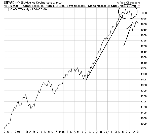
Here's the weekly New York Advance Decline Line:

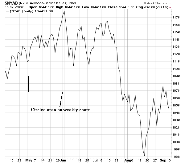
Here's the daily chart:

Notice the index had a heck of a run for the latest bull run that started in March of last year. However, look at the circled area on the weekly chart and then look at the bracketed area on the daily chart. Notice that in June of last year we started to see the AD line break the upward trend and move sideways. This was a very important development; it indicated the number of declining issues was increasing. This indicates there was an increase in profit taking. By this time the SPYs had risen 124 in July 2006 to 154 in early May 2007 -- an increase of 24%. These two facts -- a strong increase plus a decreasing AD line -- was a pretty good indication of a possible change in overall market sentiment.
Looking at August of this year we really don't see a firm trend emerging in one direction or the other. We've seen dips and rallies, but no trend has emerged in any way. In other words, the market is still trying to figure out where it wants to go. Considering the overall trend of the economy this lack of direction is to be expected.