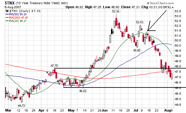
Here's the daily chart. Notice yields have been decreasing since the market started selling off in mid-July. This indicates Treasuries are the clear beneficiary of a "flight to safety" move in the market. Also note the 4.60% - 4.75% area is clear support for the market. Finally, it's important to remember that inflation expectations are not the primary driver of this rally.
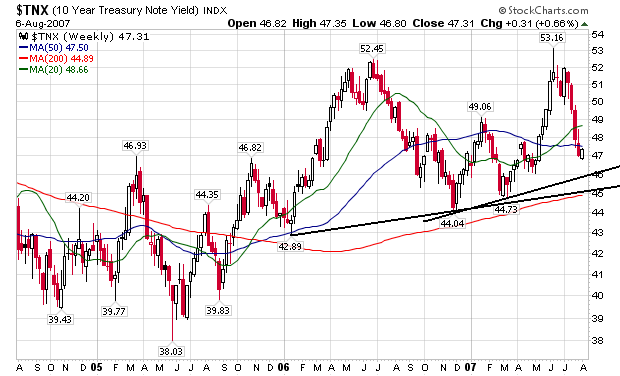
Here's the weekly chart, which shows there is a slight upward bias to rates over the last year or so, but that yields are also pretty range bound as well.
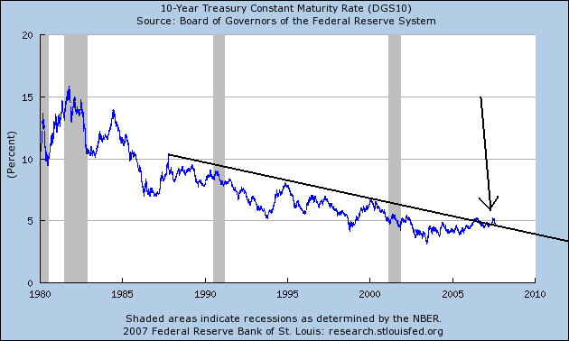
Here's the super-long view chart from the St. Louis Federal Reserve. There was a lot of ink spilled over the 10-year yield breaking the long-term trend. Notice that rates have dropped a bit since then.
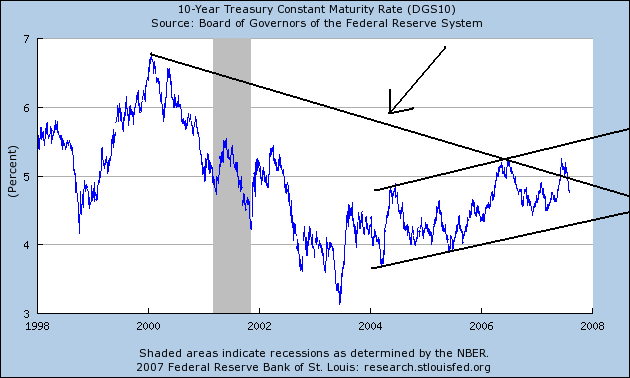
Finally, here's the 10-year chart of the 10-year. The top line with the arrow is the long-term trend line from the previous chart. Notice yields are back below that line. But because of the underlying reason for this rally -- a flight to quality rather than inter rate concerns -- the break of the trend line isn't as important. Also note the underlying 3-5 year trend in rates is clear up.