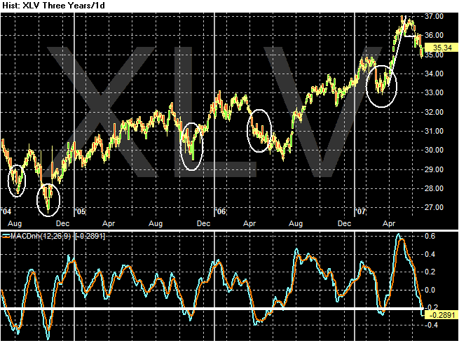
Here is the same type of chart as the XLF below. It's a three year chart of the health care ETF (XLV) with the MACD. Notice the MACD has been at this level or below 6 times in the last three years including this time. The index rebounded strongly 4 of those times and the fifth time it rebounded after about 2 months.
This play makes more sense in the current market. Health care may benefit from a more risk adverse investor.