Saturday, August 28, 2021

Forecast-palooza: Weekly Indicators, Short Term, and Long Leading Forecast all posted at Seeking Alpha


 - by New Deal democrat

My Weekly Indicators post is up at Seeking Alpha.


Despite the Delta wave raging, the consumer data continues to be very positive.

But wait, this week there’s more!!!

My biannual Short Term forecast for the next 6 months has also been posted.

As has my biannual Long Leading outlook through mid year 2022.

(Hint: the situation changes as we get into and past Q1 of next year).

As usual, clicking over and reading will not just bring you up to the virtual moment on the economy, and this week, it will give you a pretty good look at what is in the near and farther distance ahead. And it will pay my bar tab, which is a positive as well.

Friday, August 27, 2021

July personal income and spending: return to normalcy, and normalcy is good


 - by New Deal democrat

How well personal income and spending held up throughout the pandemic is one of the best things about the government response. That has continued to be the case as of this morning’s report for July.


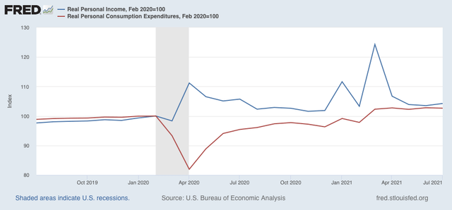
Real personal income (blue) increased 0.7%, and is 4.2% above where it was in February 2020. Real personal spending (red) decreased -0.1%, but is still 2.7% above its immediate pre-pandemic level:


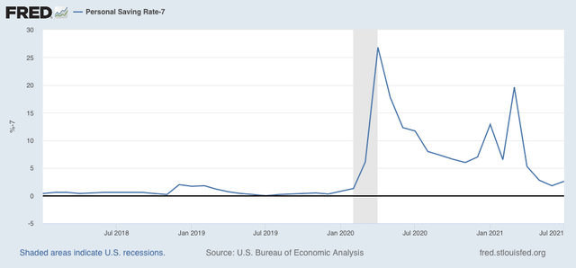
Further, the “cushion” in personal savings due to the emergency pandemic programs continues, as the savings rate remains significantly above where it was before the pandemic (the below graph subtracts 7.0%, which was the lowest level in the immediate few years before 2020, better to show this):


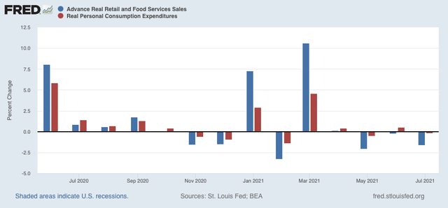
Real personal spending is basically the other side of the coin compared with real retail sales, since they cover the seller and buyer of consumer transactions, which is over 2/3’s of the entire economy:


Both of these have returned to basically normal levels m/m. While the stimulus has abated, spending hasn’t crashed, although sales have declined relatively modestly in the past few months. At this point in the pandemic, normalcy is good.

Thursday, August 26, 2021

Initial and continuing jobless claims: the good news continues


 - by New Deal democrat

The good news for both initial and continued claims continued this week.

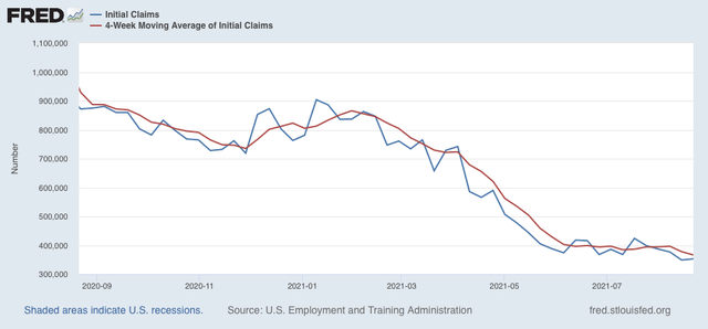
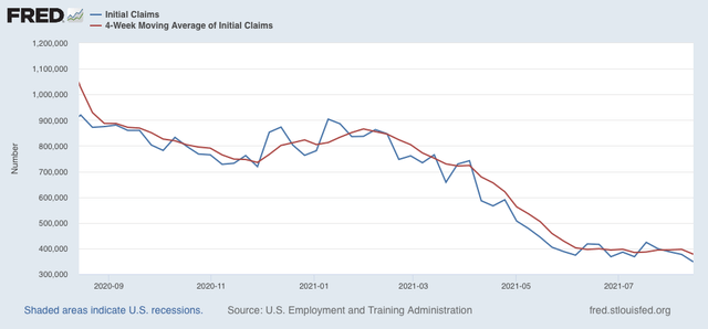
Initial jobless claims rose 4,000 to 353,000 from last week’s pandemic low. The 4 week average of claims declined by 11,500 to 366,500, another new pandemic low:


Significant progress in the decline of initial claims had stalled for the last 2 months, but that has ended.

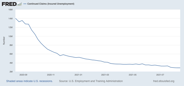
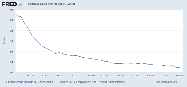
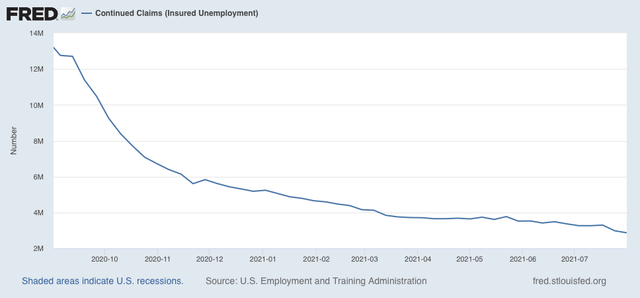
The story is the same for continuing claims, which declined 3,000 to another new pandemic low of 2,862,000 (with last week’s preliminary estimate of 2820,000 being revised substantially higher):


This continues this series’ recent declining trend that began on May 29. As I have noted before, this may reflect the termination of special pandemic benefits in many States, the impact of $15 minimum wages and signing bonuses being offered, or other items.

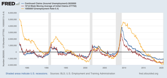
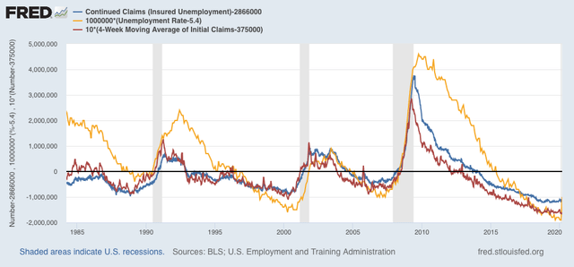
From the long term perspective, below is the current level of continuing claims  (blue), together with the 4 week average of initial claims* (red), and the unemployment rate from last week’s jobs report* (gold)(*adjusted for scale)(all current values = zero). The first two are consistent with early- to mid-expansions over the past 40 years, while the unemployment rate is consistent with mid-expansion or later:


Surprisingly, so far the awful outbreak under the Delta variant has had no apparent effect on either initial or continued claims at all. While they are by no means consistent with full employment, claims are in a good spot, relatively speaking.

Wednesday, August 25, 2021

Coronavirus dashboard for August 25: is the Delta wave close to peaking?


 - by New Deal democrat

I’ve been writing for about a month that, if the US outbreak followed the cycle of India and the UK, in which the Delta wave hit its peak about 6 to 8 weeks after onset, in the US the peak would be about Labor Day. As the graph below (which is in log scale better to show accelerating and decelerating trends) shows, it looks like that is about to happen:
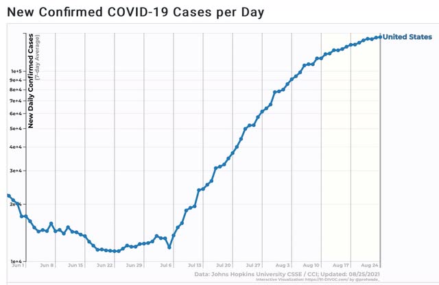

For the US as a whole, cases over the last 7 days increased by about 10%. 
One week prior, on August 17, it was about 20%. 
On August 10 it was 30%. 
On August 3 it was 50%. 
On July 27% it was almost 70%. 
So if the pattern continues, it looks like the Delta wave is about 1 week from peaking - I.e., right about and maybe a little before Labor Day.

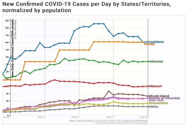
That the Delta wave may be approaching its peak by noting in how many States it has already done so, or is very close to doing so. A couple of weeks ago I noted that was the case with the 4 or 5 earliest States to be hit. Now there are 8 States + DC which are down week over week, or at least clearly down from their prior peak:


Additionally, there are 9 other States that appear very close to doing so:
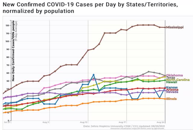

Note that 3 of the 4 biggest States - NY, TX, and FL - are on this list, plus IL. Among the largest States, only CA is still in an unabashed uptrend.

Deaths, which have been following cases by 3 to 4 weeks, are still in a pronounced uptrend:
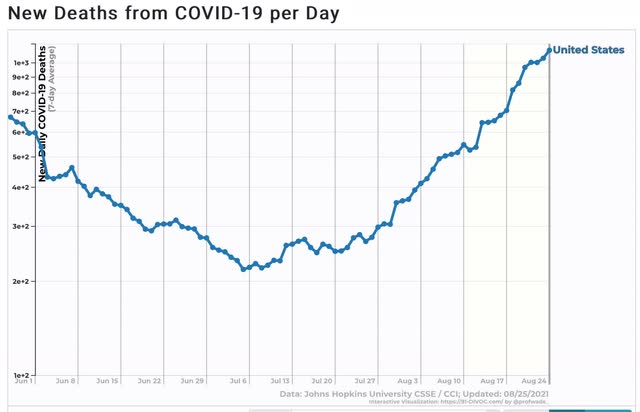

The likelihood is, we will be up to about 1750 to 2000 deaths a day in 3 to 4 weeks.

Finally, I have to comment on one item in the news the past few days in which I am clearly a dissenter; namely, the matter of cases in South Dakota in the wake of the Sturgis rally. You’ve probably seen the charts and graphs showing that over a 14 day period beginning on August 7, SD had the highest rate of increase in cases of any State.

There are two problems with the claim: (1) the starting date happened late in a week during the last week in which SD stopped reporting daily results; and (2) the % increases start from a very low number.

As to the second item, note that an increase from 1 to 4 cases is a 300% increase, while an increase from 1000 to 2500 cases is only a 150% increase. The amount of the % increase is strongly affected by how small the initial number is. For example, the purported huge increase of 225% in 2 SD counties’ hospitalization cases, came in counties with exactly 1 and 4 COVID hospital patients. 

As to the first item, here is a six month comparative graph of cases Per Capita in South Dakota vs. Vermont (which has one of the highest vaccination rates of any State):
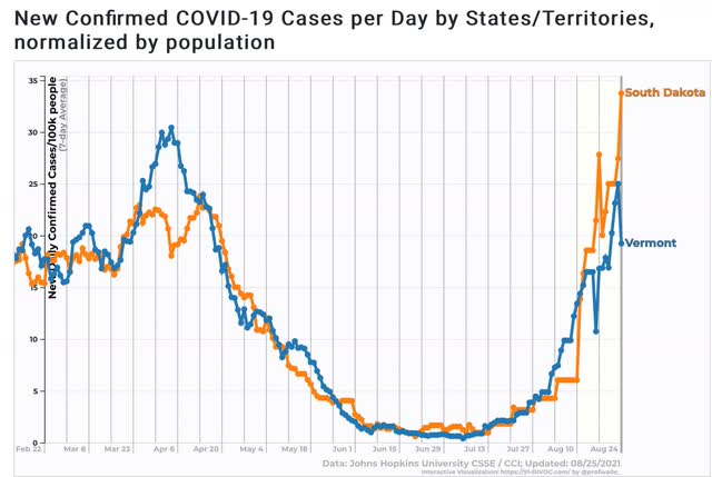

The trajectories of these two graphs over the six month period is nearly identical.

Now here is a look at South Dakota’s reported cases Per Capita on a daily basis (wide solid line), and the weekly average (narrow dotted line):
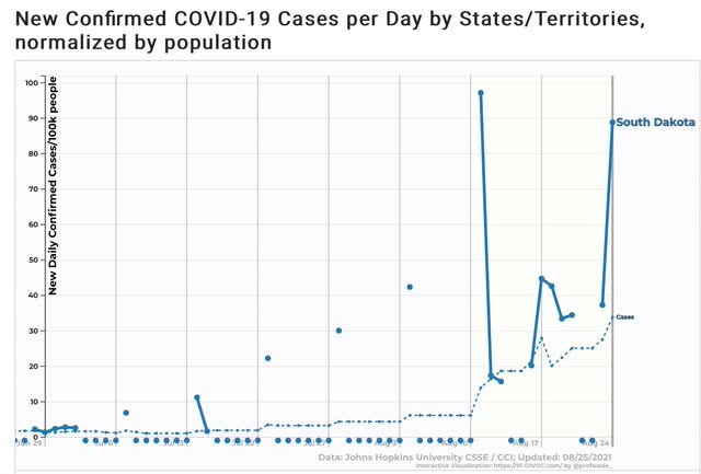

Note that until August 11, SD was only reporting once a week. The rest of the days were entered as zeroes. Which meant that the entire time from August 4 through 10 were entered as an average of 6 cases per 100,000; after which on August 11 it abruptly rose to 14 per 100,000. There is simply no way that the number of cases on August 7, the start date of The NY Times charts and graphs, had zero cases. In fact, had SD been updating daily, it probably would have been about 9 cases per day on the 7th, resulting in a 2 week increase of about 2.7x vs. Vermont’s 2.3x increase - higher, but not by much.

I don’t doubt that the Sturgis motorcycle rally has had some affect increasing SD’s numbers. But we’ll have a much better idea once the artifact goes out of the data starting tomorrow. If SD - with 48% fully vaccinated - and VT - with 67% fully vaccinated - continue to track fairly closely in the next few weeks, that will be significant evidence that there are a large %age of SD’s population with immunity or resistance to COVID due to previous infection.

Tuesday, August 24, 2021

July new home sales down nearly 30% from peak, as prices perhaps start to plateau

 Here

 - by New Deal democrat

Unlike yesterday’s existing home sales, today’s report on new home sales is much more economically significant. The reason I prefer single family housing permits as a measure is that the sales data is extremely volatile, and heavily revised over the next several months. But with those caveats, let’s take a look.


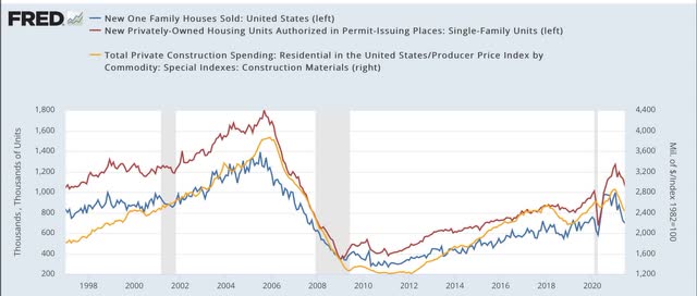
New home sales (blue in the graph below) increased 1% for the month, but are still down 28.7% since their January peak:


In the graph I also show single family permits (red) and deflated residential construction spending (gold). Not unusually, new home sales surged earlier than either of the other two metrics, peaking on a 3 month averaged basis last September. Permits and construction spending were far less noisier, but peaked a few months later.

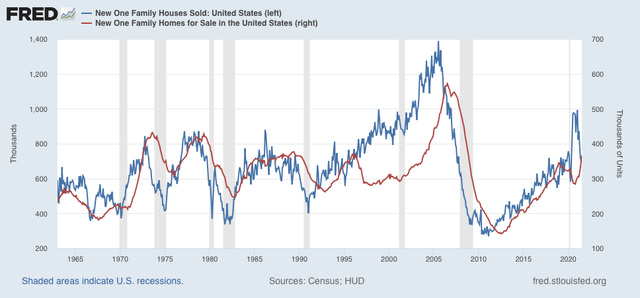
The inventory of new homes for sale (red in the graph below), unsurprisingly, continues to rise, as has been its typical pattern of lagging actual sales by a number of months:


New home inventory will probably peak shortly.

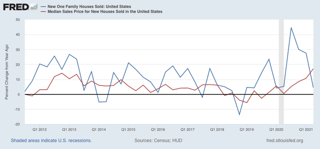
Prices have traditionally lagged sales, as shown quarterly for the past 10 years:


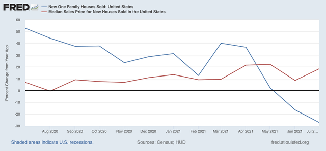
A monthly close-up of the past year shows that sales are negative YoY, while price increases may have plateaued:


Finally, the NAR does provide public access to its existing home inventory data (but unfortunately not sales) for the past 5 years here.

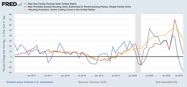
Below I show the YoY% change in that data (gold, inverted) compared with permits and sales:


Note that in general, it tracks pretty closely with permits, just as existing home sales and new home sales have historically tracked similarly. In other words, existing home inventory is largely (not exactly!) a mirror image of existing home sales. In other words, it is more confirmatory evidence of a downturn in housing sales and construction, that has not yet resulted in a decline in prices (but I do expect it soon!), although those price increases may have started to decelerate, as the building of new inventory accelerates. 

Monday, August 23, 2021

A note on existing home sales


 - by New Deal democrat

Existing home sales are the least noteworthy of the housing data, because of the very limited economic activity moving into or out of an existing home provokes compared with the construction, furnishing, and landscaping of a new home. But it’s worth a brief look, so let’s note this month’s report.


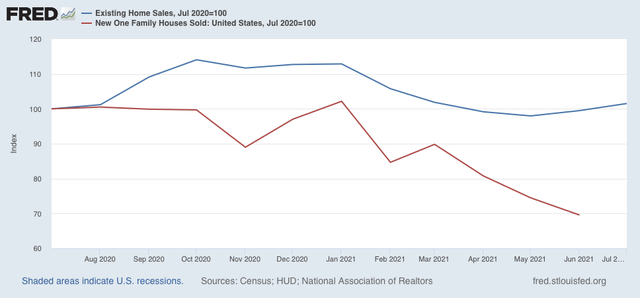
Existing home sales (blue in the graph below) are only up 1.7% compared with one year ago, as opposed to new single family home sales (red), which are off over 30%! :


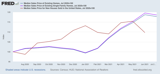
Prices for all existing homes (blue) and single family existing homes (violet) are up almost 20% - which is still less than the 23% YoY increase recorded one month ago. Note that the median price for new single family homes (red) is also higher, but much less so at 10%:


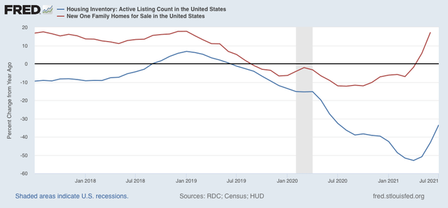
It is likely that the supply constraint of lumber for new homes has crimped some construction, driving some demand to existing homes, the median price of which tends to be less, and which in turn is driving up the prices for same, as well as driving down inventory. Here’s a look at the YoY% change in inventory of existing homes (blue) vs. new homes (red) for the past 4 years:


In general both move in tandem (and in the case of new homes, we know that inventory lags both sales and prices), but the decline in existing home inventory, which had been slow for the past decade, started to accelerate even before the pandemic hit as sales increased.

As more and more potential buyers grow gun-shy about the insane price increases, I expect prices to level off and then actually decline, with a concomitant increase in inventory that likely began in the spring.

Saturday, August 21, 2021

Weekly Indicators for August 16 - 20 at Seeking Alpha


 - by New Deal democrat

My Weekly Indicators post is up at Seeking Alpha.

Surprisingly, Delta still has not made much of an impact on the coincident indicators. People as a whole are still out shopping and dining with nearly full enthusiasm. And there are signs that the Delta wave is beginning to peak.

As usual, clicking over and reading will bring you up to the virtual moment on the economy, and bring me some pocket change for brunch.

Friday, August 20, 2021

Housing update for 2022 at Seeking Alpha


 - by New Deal democrat

Following up on Wednesday’s post here, I took a comprehensive look at housing construction and sales, and their implications for the 2022 economy, over at Seeking Alpha.

As usual, clicking over and reading should be educational for you, and additional for me by a few pennies in my financial condition.
While I am at it, I haven’t updated my Big Picture short term and long term forecast for the economy since February, so I expect to do that at some point in the next week.

Thursday, August 19, 2021

Initial claims: simply, good news


 - by New Deal democrat

The bottom line for both initial and continued claims this week is simple: unadulterated, absolute good news.

Initial jobless claims declined 29,000 to 348,000, 20,000 below their previous pandemic low. The 4 week average of claims declined by 19,000 to 377,750, 6,750 below its previous pandemic low of 384,500:


Significant progress in the decline of initial claims had stalled for the last 2 months, but as of this week, that has ended.

The story is the same for continuing claims, which declined 79,000 to another new pandemic low of 2,820,000:


This continues this series’ recent declining trend that began on May 29. As I have noted before, this may reflect the termination of special pandemic benefits in many States, the impact of $15 minimum wages and signing bonuses being offered, or other items.

From the long term perspective, below is the current level of continuing claims  (blue), together with the 4 week average of initial claims* (red), and the unemployment rate from last week’s jobs report* (gold)(*adjusted for scale)(all current values = zero). The first two are consistent with early- to mid-expansions over the past 40 years, while the unemployment rate is consistent with mid-expansion or later:


Last week I wrote that the trend in claims was “under the control of the Delta variant . . . . , [because of which] I consider it likely that initial claims do not make much more headway.” Barring a huge upward revision next week, I was wrong. And for good news, I am happy to have been wrong, and I hope it continues.


Wednesday, August 18, 2021

July housing permits and starts: yellow flag for economy in 2022


 - by New Deal democrat

Last month I noted that, from here on, the comparisons with 2020 in housing would become much more challenging. And so they have.


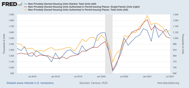
While permits (gold in the graph below) did increase this month, their declining trend remains intact. Starts (blue), and more importantly, single family permits (red, right scale) - the least volatile measure of all - both decreased again, as they have almost relentlessly since the beginning of this year:


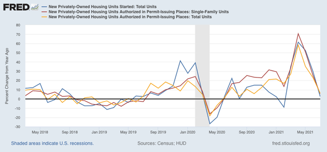
Viewed YoY, all three are only 2.5%-6.0% above last July:


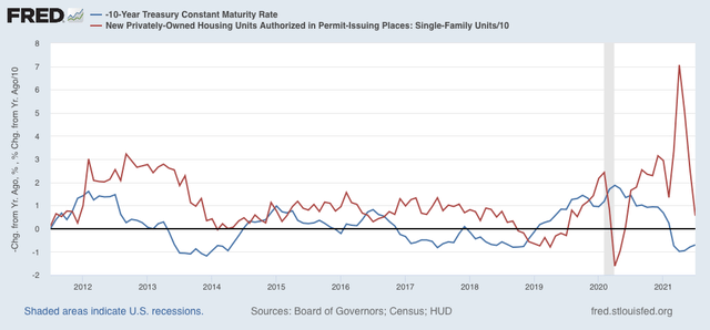
Here is a graph I have run many times, the inverted YoY change in interest rates (blue) vs. the YoY% change in single family permits (red/10 for scale):


Note that in late 2018-early 2019, in the face of a similar increase in interest rates, permits actually declined YoY. Almost certainly, by September permits and starts will be negative YoY again.

All of which is of academic interest, except that housing is a very important long leading indicator for the economy. Starts are currently off about 7.5% from their peak, while both total and single family permits are off between 13% to 17%. In the past, when these have declined 20% from peak, it usually has resulted in a recession at some point 12+ months after the peak. Only one indicator, but still this is a yellow flag at minimum for the economy in 2022.


Tuesday, August 17, 2021

July industrial production (good news) and retail sales (bad news still being pretty good news)


 - by New Deal democrat

This morning brought the July report for the King of Coincident Indicators, industrial production, as well as one of my favorite consumer side indicators, retail sales. Let’s take a look at each.


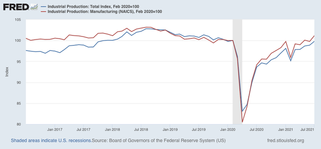
Industrial sales increased strongly in July, up 0.9% overall, and the manufacturing component up 1.4%. Manufacturing production is now higher than it was just before the pandemic recession, and total production is only -0.2% lower, as shown in the below graph in which each are normed to 100 as of February 2020:


The only coincident indicator still below its pre-pandemic level is jobs, which is off -3.7% compared with February 2020.

Which is a good segue to retail sales, which are a good short leading indicator for jobs.

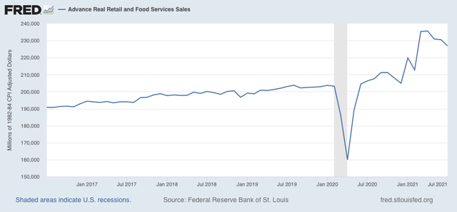
Nominally retail sales declined -1.1% in July, a pretty steep decline. Since consumer prices rose 0.5% that month, real retail sales declined -1.6% ! Ordinarily this would be very concerning, but in the context of the wild swings since the pandemic began, it is well within the range of monthly changes. Indeed, although I won’t bother with a YoY graph, the fact is that real retail sales are still over 10% higher than they were just before the pandemic hit, thanks to government emergency assistance programs, as shown in the graph of the absolute level of real retail sales:


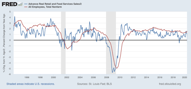
As I have written many times over the past 10+ years, real retail sales YoY/2 has a good record of leading jobs YoY with a lead time of about 3 to 6 months. That’s because demand for goods and services leads for the need to hire employees to fill that demand.  The exceptions have been right after the 2001 and 2008 recessions, when it took jobs longer to catch up, as shown in the graph below, which takes us up to February 2020:


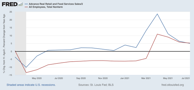
Now here is the same graph since the onset of the pandemic. Note the scale is much larger, given the huge changes wrought by the early lockdowns, and of course the comparative spikes from the data one year later:


As with the recoveries immediately after the two prior recessions, up until the past several months YoY job creation has been well below YoY real retail sales growth. But as of last month, jobs entirely caught up to forecast trend, as real sales/2 = 5.0%, while job growth YoY has been 5.2%.

The fact that real sales continue to be so strong compared with pre-pandemic levels even after the -1.6% decline in July argues in favor of continued strong monthly jobs growth as well.

Monday, August 16, 2021

Coronavirus dashboard for August 16: some (relatively) “good” news, some bad news


- by New Deal democrat

Recently I’ve speculated in a few places that Delta may be acting as a backfire-type firebreak against Lamdba, which has been getting a lot of press as potentially evading vaccines.

Confirmation that this may in fact be the case comes from Dr. Eric Topol who writes:

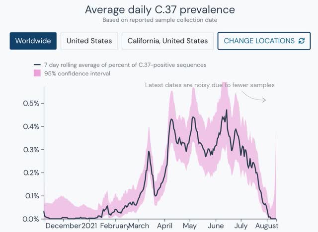
The Lambda variant is going out like a lamb. (from the hard to find pandemic good news list) outbreak.info/situation-repo It can't compete with Delta.

and here is the graph (C.37 is Lambda):


Delta appears to be so infectious that it is preventing Lambda from getting a foothold anywhere beyond the west coast of South America.

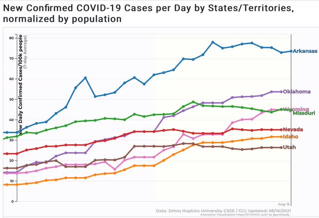
Elsewhere in the (relatively) “good” news front, there is further confirmation that the Delta wave appears to be peaking or maybe even past peak in the earliest States that it hit:


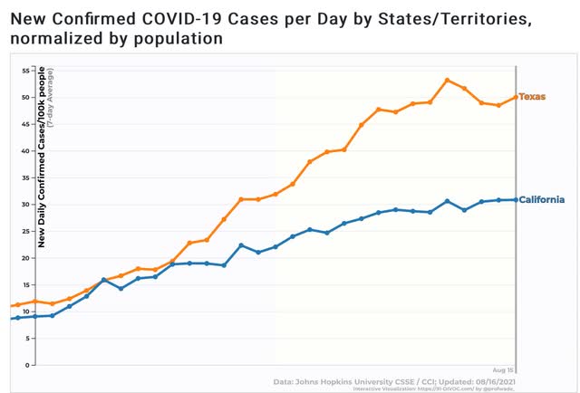
Cases in California also appear to have plateaued, and even Texas has shown at least marked deceleration:


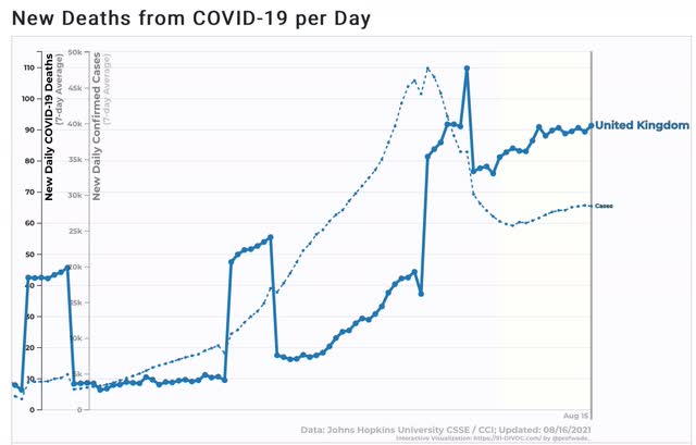
Meanwhile, deaths in the UK’s Delta wave also appear to have plateaued, as have new cases since its “Freedom Day” living all restrictions one month ago:


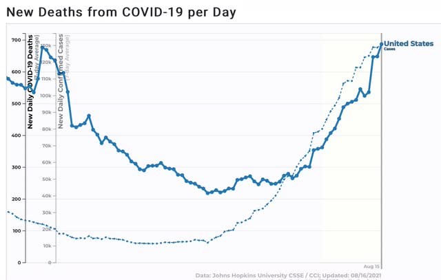
But in the “continued bad news” department, deaths in the US have continued to climb, and can be expected to continue to climb for at least the next 2.5 weeks:


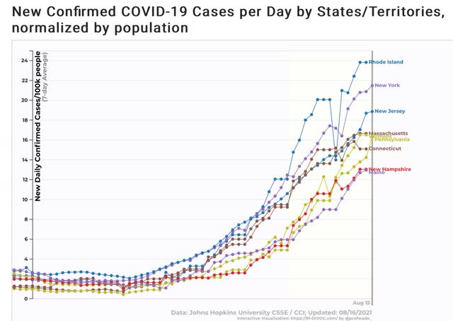
And even in the most vaccinated States of New England and New York, the case count continues to climb:


In only 3 States - CT, MA, and VT - has over 60% of the total population been fully vaccinated. It appears that even this level of vaccination has not prevented a Delta wave. And there is no guarantee, especially as colder weather arrives in the north in the next 75 days, that a really bad situation, such as we have among the Gulf Coast States now, can’t happen.

Saturday, August 14, 2021

Weekly Indicators for August 9 - 13 at Seeking Alpha


 - by New Deal democrat

My Weekly Indicators post is up at Seeking Alpha.

For the first time, there are some significant if still minor impacts on the economy showing up due to the Delta wave.

As usual, clicking over and reading will bring you up to the virtual moment as to the economy, and help me out a little bit with my lunch money.

Friday, August 13, 2021

Here is my inflation worry


 - by New Deal democrat

I want to follow up on a comment I made yesterday in connection with Wednesday’s consumer price report.


It is certainly true that *inflation* is likely to be transitory. The 5.3% YoY inflation we’ve seen in June and July may certainly pass in the next few months, and reduce to a more somnolent number under 3%.

Hoorah! Inflation was transitory!

But what if the price increases “stick?” In other words, what if the absolute price increases in houses, cars and trucks, and gas don't recede? Then I think we have a problem.

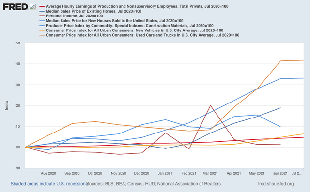
To show you what I mean in one easy (I hope) graph, below are wages and personal income (red shades), house and construction materials prices (blue shades), and new and used vehicle prices (gold shades), all normed to 100 as of one year ago in July 2020:


Wages are up on average 4.7%, and personal income is up 2.3%.
Meanwhile, existing home prices are up 23.4%, new homes up 6%, and construction material prices up 33.1%!
New car prices are up 6.4% and used vehicle prices up 41.7%!

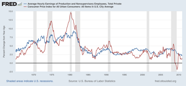
There is simply no way that sales of new homes and new vehicles don’t take a hit if this situation obtains much longer. And here’s the problem: wages not keeping up with prices has historically been a very important “real economy” indicator of an oncoming recession:


Note from the mid-1960s to mid-1990s some of this was ameliorated by the entry of women into the workforce, meaning that household income could increase even if wages didn’t keep up.

So, we don’t simply need for *inflation* to abate. We need the absolute price increases in important consumer assets like houses and vehicles to deflate back to trend.

Thursday, August 12, 2021

Initial claims continue rangebound, while continuing claims continue slow decline


 - by New Deal democrat

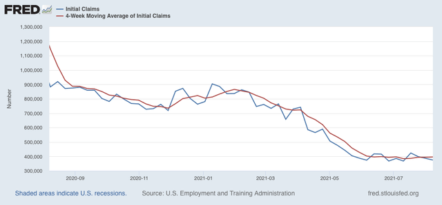
Initial jobless claims declined 12,000 this week to 375,000, still 7,000 above their best pandemic levels of 368,000 set on June 26 and July 10. The 4 week average of claims increased by 1,750 to 396,250, 11,750 above its pandemic low of 384,500 set on July 10:


Significant progress in the decline of initial claims remains stalled, as it has for the last 2 months.

The story once again is quite different for continuing claims, which declined 114,000 to another new pandemic low of 2,866,000:


This series, which had also been near a stall, now looks to have begun a slow declining trend on May 29. This may reflect the termination of special pandemic benefits in many States, the impact of $15 minimum wages and signing bonuses being offered, or other items.

From the long term perspective, below is the current level of continuing claims  (blue), together with the 4 week average of initial claims* (red), and the unemployment rate from last week’s jobs report* (gold)(*adjusted for scale)(all current values = zero). The first two are consistent with earlier in the expansions over the past 40 years, while the unemployment rate is consistent with mid-expansion or later:


The decline in continuing claims is good news, provided those whose claims have ended are able to start new jobs, and not just being arbitrarily tossed to the economic wolves.

I continue to believe that whether claims will continue to stall, reverse, or improve from here is under the control of the Delta variant, and whether new vaccinations continue to stall. My best guess is that as to the pandemic August and September will not be good months, as Delta burns through the dry tinder, so I consider it likely that initial claims do not make much more headway.

July consumer inflation: the spike subsides somewhat, but we are close to the limit of “transitory”


 - by New Deal democrat

For the last two months my theme has been that if the spike in inflation only lasted two or three months, it was not a big deal, but if the trend were to continue longer, it would begin to impact consumer spending, and it will get the Fed’s attention.
In that regard, the “good” news is that in July consumer inflation was “only” 0.5%. The bad news is that for the last 5 months alone, consumer prices have risen 3.5%. Further, while inflation was only confined to a few sectors, those sectors were houses andcars - the two most important purchases made by most consumers - and the gas with which to power those cars, the most visible of all prices.

Let’s break it down.

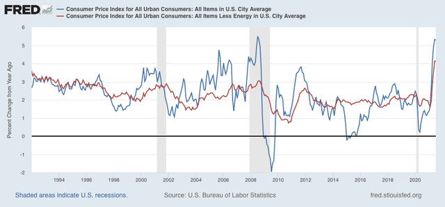
While YoY inflation was 5.3% (blue in the graph below), typically it has not been a concern unless inflation ex-gas (red) has been in excess of 3.0%. Since it is now over 4%, unless it ramps down shortly, as in 2011, this is indeed a concern:

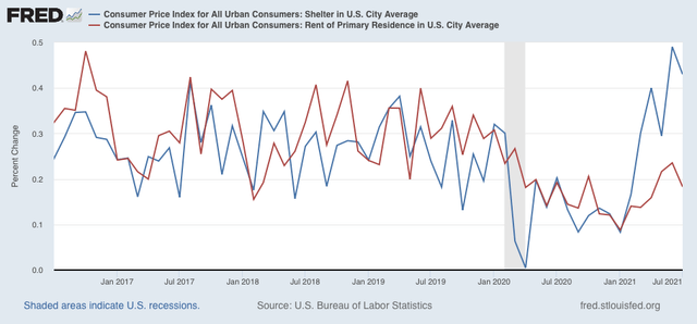
Inflation in shelter (blue in the graph below) has risen sharply m/m for the past 6 months. In the past 4 months, the trend in rent increases (red) have also increased m/m (although they are not up nearly as much as they were before the pandemic):

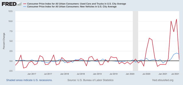
New car prices have increased sharply each month for the past few months, while in July used car prices may finally have hit a wall:

The building of new houses, and the manufacture of new vehicles are the two most forward looking, learning sectors of the “real” economy. That price pressures are now constraining both is not good for the economy going forward into 2022.

Returning to inflation ex-energy, now over 4% YoY, If this number goes back down below 3% quickly, then consumers can live with that. If not, however, and particularly if wages fail to keep up, then consumers may cut back on other purchases. In fact, wages (more broadly, household income) failing to keep pace with inflation has been one of the tradition “real” harbingers of a recession. Here the news is mixed.
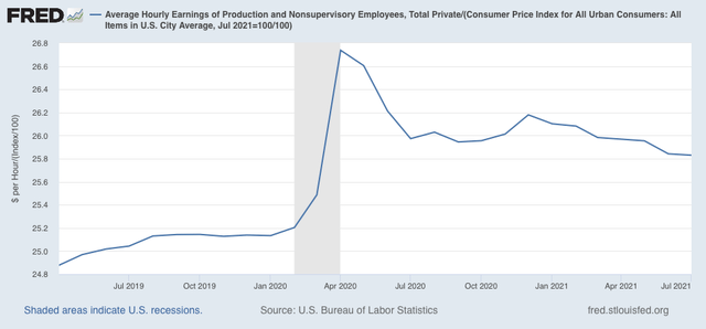
Real hourly wages, I.e., wages deflated by consumer prices, declined slightly in July. Further, while real wages have been more or less flat in the past year, they are down over 1% from their pandemic peak. But on the other hand, they are still up over 1.5% since before the pandemic began:

The big fly in the ointment here is the expiration of many emergency pandemic programs, even as the Delta wave rages.

We really need to see the main drivers of this so-far transitory inflation spike subside: microprocessors for vehicles, and construction materials for houses. The latter will be reported for July as part of the PPI which will be released tomorrow.

The other two important variables are the course of the pandemic, and whether or not emergency measures are renewed if the pandemic does not subside. So far the bond market does not seem concerned, and bank credit as I reported recently has been expanding. If that continues, the economy should continue to do well. But if the pandemic itself, or an inept government response to it cause a crash landing, all bets are off.

Addendum: I note where, inter alia, Paul Krugman lauds this report as demonstrating that inflation has indeed been transitory. I demur. For example, used car prices only increased 0.2% in July. But they are still up 41.7% YoY! Truly transitory inflation in a resource-constrained boom shouldn’t just plateau after a huge price increase, it should ramp right back down, as lumber prices in housing have done, plummeting all the way back down to 2018 prices. It is this ramping back down which was missing in yesterday’s consumer inflation report.


Wednesday, August 11, 2021

Coronavirus dashboard for August 11: evidence that the Delta wave may be peaking in the earliest hit States


 - by New Deal democrat

My framework of analyzing the economy via leading, coincident, and lagging indicators continues to come in handy at looking at the course of the pandemic.


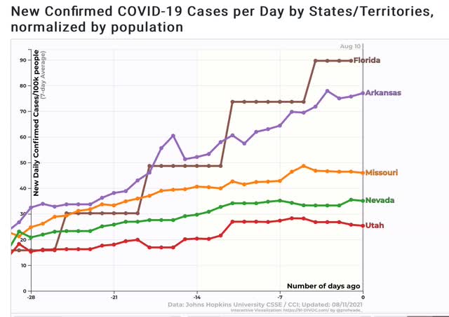
At the beginning of June, I flagged that the number of cases had stopped declining among 5 of the least vaccinated States. By the middle of June, I wrote that Delta was going to be a real challenge for those States. More pointedly, on June 23, I wrote that the Delta wave was beginning in those States, including Missouri, Arkansas, Nevada, Oklahoma, and Utah. Sure enough, as the days went by, more and more States showed increasing cases as Delta took hold. By the end of June, I was warning that the end of July was going to look very different, and by late in July I was warning that the US was on track for 1000 deaths/day by the end of August (as of this morning, deaths are up to 545).

Consistent with the idea that Delta has been burning through the dry tinder, as demonstrated by the sharp peaks and declines in India and the UK, I have been looking for signs of when the peak might come in those early States hit with Delta. And the signs now look like they are showing up.

Here are the 7 day averages in new cases in 4 of the earliest hit States - Missouri, Arkansas, Nevada, and Utah, plus Florida as well. In 3 of the States - Missouri, Nevada, and Utah - new cases look completely flat over the past 7 to 10 days. In the other two, the rate of growth appears to be decelerating:


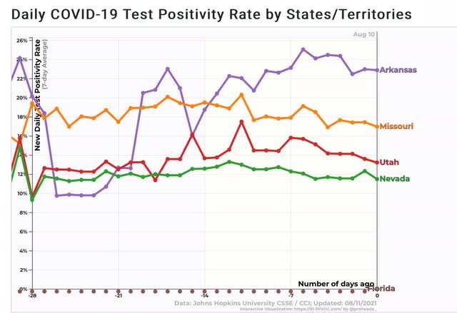
The ratio of positive to total COVID tests in 4 of those also appears to have peaked (Florida no longer bothers to report):


This is pretty strong evidence that the Delta wave is peaking in those States.

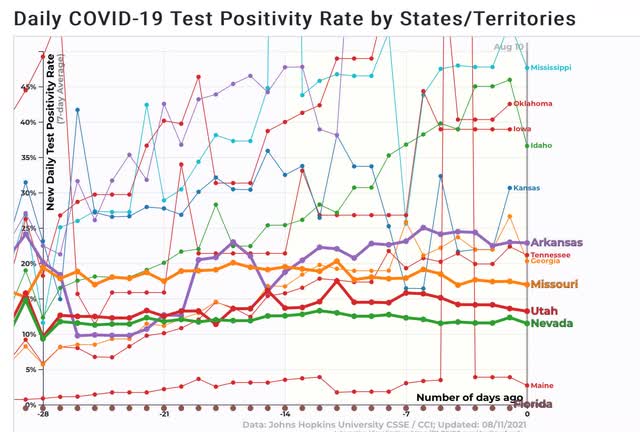
Turning our attention further to the ratio of positive to total tests, here is a graph of the 10 States with the highest ratio, in addition to the 5 already examined:


We have 5 States over 30% - Mississippi, Oklahoma, Iowa, Idaho, and Kansas.

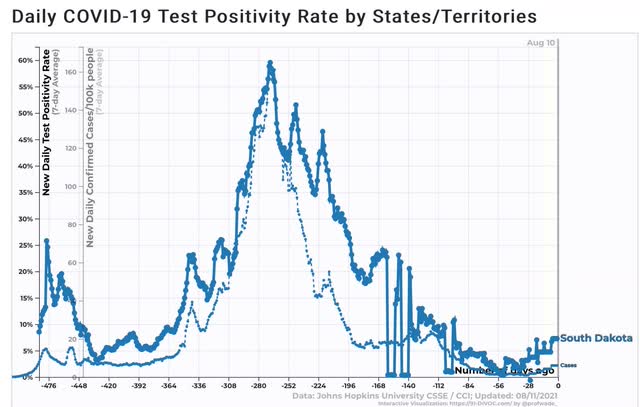
Let’s compare this to the signal case of South Dakota:


South Dakota’s positivity ratio peaked at 60% during its horrific outbreak last autumn. Right now South Dakota is averaging 6 cases per 100,000 per day, the lowest of any State in the nation.
As I have speculated a number of times, South Dakota may have stumbled into herd immunity, or at least close to it, the hard way. The positivity rates in the worst hit States for Delta suggest that some of them at least, may not be far behind. 

Once Delta burns through the dry tinder nationwide, which is looking more and more to happen sometime around Labor Day, just what % of all Americans have actually been infected by COVID becomes determinative in what is likely to happen next.

Tuesday, August 10, 2021

Scenes from the July jobs report


 - by New Deal democrat

[Note: I haven’t put up a Coronavirus dashboard in almost a week. I’ll try to get around to that later today or tomorrow. It isn’t *all* bad news.]


Last Friday’s jobs report for July was probably the most uniformly positive report I have seen since I started writing about them going on 15 years ago. Let’s take a look at a few of the most salient items.

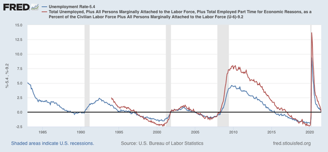
First of all, unemployment (blue in the graph below) at 5.4% and underemployment (red) at 9.2% are about where they were in the middle of each of the last 3 expansions:


Not a boom, but not bad at all either. This is real progress, and a real positive (note graph is normed at the 0 level equal to the current month in both numbers).

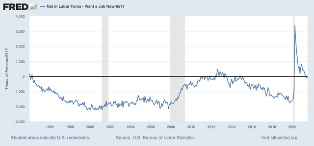
On the other hand, when we look at those who aren’t actively looking, so aren’t counted in either the un- or under-employment rates, but say that they want a job now, we see that the number is close to the worst levels since the series started being reported in 1994:


At 6.517 million, that’s about 1 million higher than the number at the midpoint of 2 of the last 3 expansions, and 1.5 million above the 3rd.

If we keep getting very good jobs reports, I expect this number to drop, but gradually, over the next 6 to 12 months.

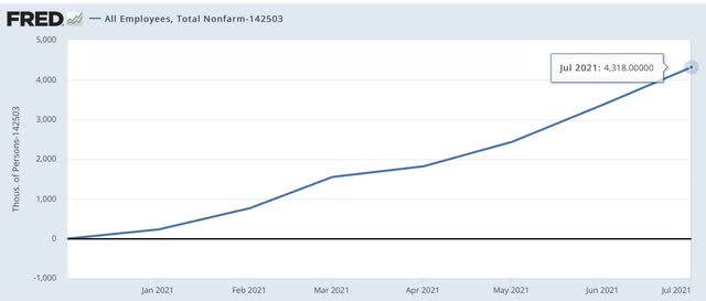
Turning to the number of jobs added themselves, since the end of last year, we have added 4.318 million jobs:


That’s an average of a little over 600,000 per month.

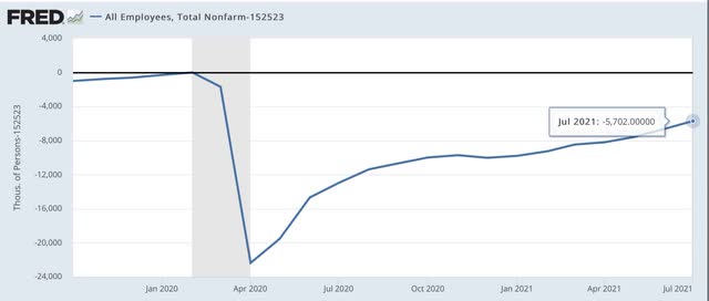
But we are still 5.7 million below where we were in February 2020. In other words, if the current - excellent! - rate of growth continues, it will still take 9 or 10 months to get back to the pre-pandemic levels.


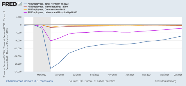
Finally, here’s a look at the jobs deficit is several sectors:


You can see that the total jobs deficit is mainly one in the service sector, especially leisure and hospitality. Manufacturing and construction, relatively speaking, were never hit as hard, and are closer to making up their losses.

The jobs market was actually in quite good shape in the year before the pandemic, with lots of wage pressure due to nearly “full” employment, with lots of marginal and minority workers getting jobs. While it is by no means booming in the absolute sense now, we have made a lot of progress this year, but with a lot more distance still to go, especially in the services sector.