Saturday, March 7, 2015
Friday, March 6, 2015
February 2015 jobs report: headlines great, wages stink, underemployment mixed
- by New Deal democrat
HEADLINES:
- 295,000 jobs added to the economy
- U3 unemployment rate down -0.1% to 5.5%
With the expansion firmly established, the focus has shifted to wages and the chronic heightened unemployment. Here's the headlines on those:
Wages and participation rates
- Not in Labor Force, but Want a Job Now: up 180 ,000 from 6.358 million to 6.538 million
- Part time for economic reasons: down -175,000 from 6.810 to 6.635
- Employment/population ratio ages 25-54: up +0.1% to 77.3%
- Average Weekly Earnings for Production and Nonsupervisory Personnel: unchanged at $20.80, up 1.6%YoY. (Note: you may be reading elsewhere that wages went up. They are citing average wages for all private jobs. I use wages for nonsupervisory personnel, to come closer to the situation for ordinary workers.)
There were no revisions for December. January was revised down by -18,000 from 257,000 to 239,000.
The more leading numbers in the report tell us about where the economy is likely to be a few months from now. These were mixed with a downside bias, basically taking back their gains in January.
- the average manufacturing workweek was unchanged at 41.0 hours. This is one of the 10 components of the LEI.
- construction jobs increased by 29,000. YoY construction jobs are up 321,000 YoY.
- manufacturing jobs were up ,000, and are up 208,000 YoY.
- Professional and business employment (generally higher-paying jobs) increased 51,000 and is up 664,000 YoY.
- temporary jobs - a leading indicator for jobs overall - decreased by -7,800.
- the number of people unemployed for 5 weeks or less - a better leading indicator than initial jobless claims - decreased by -48,000 to 2,431,000, compared with December 2013's low of 2,255,000.
Other important coincident indicators help us paint a more complete picture of the present:
- Overtime decreased by 0.1 hour from 3.5 hours to 3.4 hours
- the index of aggregate hours worked in the economy rose 0.2 from 102.9 to 103.1.
- The broad U-6 unemployment rate, that includes discouraged workers decreased from 11.3% to 11.0%
- the index of aggregate payrolls rose by 0.3%.
- the alternate jobs number contained in the more volatile household survey increased by 96,000 jobs. This represents a 2,996,000 million increase in jobs YoY vs. 3,298,000 in the establishment survey.
- Government jobs increased by 7,000.
- the overall employment to population ratio for all ages 16 and above was unchanged at 59.3%, and has risen by +0.5% YoY. The labor force participation rate declined -0.1% from 62.9% to 62.8% and is down -0.2% YoY (remember, this includes droves of retiring Boomers).
SUMMARY:
The economy is finally adding a truly good amount of jobs. Unemployment continues to fall. Great.
But with wages for nonsupervisory personnel only up 1.6% YoY, there remains a giant black hole at its center.
Meanwhile, some measures of underemployment improved, e.g., part-time for economic reasons, and the e/pop ratio for the prime working ages, but on the other hand, those who aren't even in the labor force but want a job now (the supposed "missing workers") increased again. Not cool.


Thursday, March 5, 2015
Another useful economic indicator: purchases of durable goods
- by New Deal democrat
I have a new post up at XE.com.
Personal consumption expenditures for durable goods fails as a mid-cycle indicator, but turns out to be a very reliable long leading indicator.
Another small sign of a slowdown
- by New Deal democrat
Initial jobless claims rose last week to 320,000. The four week moving average went up over 300,000 to 305,000.
This is another small sign of a Q1 slowdown. Mind you, the four week moving average was 307,000 back on January 17, and we still got a very good employment report. But a miss to the downside in tomorrow's February report looks more possible.
Wednesday, March 4, 2015
Updating two mid-cycle indicators
- by New Deal democrat
Ultimately I would like to have a set of indicators to describe an entire business cycle: long leading, short leading, coincident, short lagging, long lagging, and mid-cycle. A mid-cycle indicator is one that turns roughly in the middle of an economic expansion. It is a way to focus attention. Are we in the first part of an expansion, or are we at a point where we should begin to watch for a turn down in long leading indicators?
In this post I want to update 2 series which appear to make good mid-cycle indicators: retail sales vs. personal consumption expenditures, and the personal savings rate minus the inflation rate.
First, three years ago, I identified a consistent pattern whereby retail sales grew faster than the broader category of personal consumption expenditures early in an expansion, but slower later in an expansion. Retail sales constitute about 50% of PCE's. Note, however, that real retail sales are much more volatile. And, as this graph below (subtracting YoY PCE growth from YoY real retail sales growth through 1997) shows, in a very specific and non-random way:

Retail sales minus PCE's are always negative before the economy ever tips into recession. That's 11 of 11 times. Further, in 10 of those 11 times (1957 being the noteworthy exception), the number was not just negative, but was continuing to decline for a significant period before we tipped into recession.
Essentially these graphs tell us that, in the later part of a business cycle, consumers cut back on discretionary purchases to preserve other spending. Until they do, consumer spending does not support any claim that a recession has begun or is even imminent.
I updated this graph a few times last year, noting that it looked like it was turning.
So, what does it show now? Here is a 25 year history of the relationship, measured YoY:

Here is a close-up since the end of the last recession:

Two trends are apparent. The first is that PCE growth has generally been approaching,equal to, or slightly greater than real retail sales growth for the past five quarters. The second is that both are increasing, just as they did in the second half of the 1990s. This supports the notion that the midpoint has been reached, and probably passed, but that a downturn in nowhere near.
The second mid-cycle indicator I want to update is the real personal savings rate. This is, essentially, a measure of economic confidence. How much of their paychecks do consumers feel they need to save over and above the rate of inflation? Here's the answer, going back over 50 years:

Note that in every single economic expansion except the 1980-81 double-dip, at some point from about the middle to 3/4 mark, there is a steep decline in the real personal savings rate from its peak of about 5%. Further note that in every single recession, the real personal savings rate increases as consumers seek to buttress their balance sheets. Generally speaking, as an economic expansion goes on, consumers expose themselves to too much risk, either due to overconfidence, or the need to stretch their finances to keep up.
I do not think we have seen the relevant 5% decline yet, even though it has happened twice during this expansion. The December 2012 - January 13 decline is an artifact of income shifting due to the fiscal cliff. The early 2010 decline is too early, and is the result of the big run-up in gas prices after the end of the Great Recession (inflation went up, so the real savings rate went down).
Similarly, I am not concerned by the recent rise in this metric, which is also an artifact of the plunge in gas prices. To show you why, let's compare our current situation with the 1986 and 2006 steep declines in the price of oil and gasoline (red in the graphs below). First, here's 1986:

and here's 2006:

In each case, the initial reaction by consumers was to pocket the savings (for 12 months in 1986, for 3 months and declining thereafter in 2006). That appears to be what has happened in the last few months as well.
To summarize, one mid-cycle indicator looks like it has been reached, the other has not.
Tuesday, March 3, 2015
More signs point to a slowdown in Q1 US growth
- by New Deal democrat
I have a new post up at XE.com.
There are accumulating signs of a slowdown in the US economy this quarter. Not anything like last year's horrible -2.9% quarter, and probably not negative at all, but a real slowdown on the order of only +1% or so annualized growth.
Monday, March 2, 2015
Wages in the service sector lead
- by New Deal democrat
Some of the most interesting relationships I've ever uncovered have been the result of total serendipity. So it was last week when I examined the relationship between wages in the goods-producing vs. service sectors of the economy.
I found that tepid GDP growth is correlated with lackluster growth in jobs in the goods-producing sector, and that wage stagnation is primarily found in the goods-producing vs. service sector.
Here is something I found totally by chance: wage growth both peaks and troughs in the service sector almost always before it peaks and troughs in the goods-producting sector.
Here are two graphs going back 50 years of the YoY% change in wage growth. The goods-producing sector is in blue, sercices in red.. First, here's 1954 to 1982:

And here is 1983 to the present:

In every instance but one in the last 50 years (1980) growth in service wages peaks before growth in goods-producing wages. In all but two (the early 1990s and 2012), growth in service sector wages bottom before those in goods-producing industries.
In 2014, service sector growth started down, followed by the goods-producing industires. If we see an increase in the growth of service sector wages, it is a good bet that manufacturing and construction will follow.
Unfortunately, because the goods-producing sector has shrunk to a small share of the overall labor force over time, while service sector wage growth led overall wage growth in the 1960s and 1970s:

since then the service sector has so dominated the labor force that since the 1980s, the two measures have become coincident:

So, an interesting phenomenon, but of limited forecasting value.
Sunday, March 1, 2015
A thought for Sunday: when will Happy Days be Here Again?
- by New Deal democrat
My overarching theme about the economic news for the last 5 years is that it has been "positive, but not good enough." Hardly like striking up "Happy Days are Here Again," as claimed by a few Doomers.
But in the last year monthly job creation has run over 200,000, and the unemployment rate has dropped below 6%. While the economy is by no longer awful, it's really only doing so-so. Involuntary part-time employment, and the number of truly discouraged workers remain high. And wage increases still stink.
So, I thought I would lay out what would really cause me to think the economy was downright good? I came up with two levels.
First:
- U-3 unemployment below 5%
- involuntary part-time employment of persons below where it has been in the past with 6% unemployment (about 4% of the labor force, or about 500,000 fewer persons than now)
- people out of the work for but who want a job now equal to where it has been in the past with 6% unemployment (about 5.75 million people, or about 600,000 fewer persons than now)
- nominal wage growth of 2.5% YoY or more
- real wage growth of 1% YoY or more
- continuing job creation at 200,000 a month or more
Second:
- U-3 unemployment below 4.5%
- Involuntary part-time employment of persons below where it had been in the past with 5% unemployment (about 3% of the labor force, or about 2.1 million fewer people than now)
- the number of people out of the work force but who want a job now equal to the number in the past with 5% unemployment (about 5 million, or about 1.4 million fewer than now)
- nominal wage growth of 3% YoY or more
- real wage growth of 1.5% YoY or more
- continuing job creation of 200,000 a month or more
There's a pretty good chance that we pass the first test this year. It's not clear we will ever pass the second in this economic expansion.
And of course, even if the current economy were going like gangbusters, that still wouldn't solve the long-term problems of income inequality and institutionalized barriers to children being able to overcome the US's increased class stratification.
Saturday, February 28, 2015
A death scene for Spock
- by New Deal democrat
As I have occasionally mentioned, I am a fossil. I am also a nerd, which means I am thoroughly familiar with the Star Trek oeuvre. I sincerely hope that before Leonard Nimoy passed away, J. J. Abrams filmed a death scene for Spock. Here is how I imagine it:
Spock 2.0: [enters hospital room under cloak and hood. Removes hood]: Is it time?
Spock 1.0: [breathing laboriously] Yes. Are you in agreement?
Spock 2.0: It is only logical that someone should have the benefit of your experience.
Spock 1.0 Then proceed.
Spock 2.0 reaches out to touch Spock 1.0 to perform a mind-meld.
Spock 1.0: Live long ... [pause]
We see, in several seconds at incredible speed, all of the episodes we have seen over the last 50 years of Spock 1.0's life.
Spock 1.0 ... and prosper. [Dies].
The mind-meld is still ongoing. Out of grayness, a bright light appears and intensifies. We hear and see Spock's parents beckoning him to the light. Then the mind-meld fades..
Spock 2.0 [with all of the emotion reserved for someone who has just witnessed the squashing of a bug] Fascinating.
With that, Spock 2.0 pivots and strides out of the room.
Weekly Indicators for February 23 - 27 at XE.com
-by New Deal democrat
My Weekly Indicator post is up at XE.com.
It's time to consider that first Quarter GDP is going to be not so good.
Friday, February 27, 2015
GDP: Meh. But two forward-looking nuggets
- by New Deal democrat
I have a new post up at XE.com, discussing this morning's revision to 4th Quarter 2014 GDP.
I of the forward-looking nuggets is good, the other mixed.
Thursday, February 26, 2015
Welcome to good deflation: real retail sales flat, real average wages highest in 35 years
What a difference falling gas prices make! By falling as low as $2.02 in January, gas prices helped deliver a -0.7% CPI reading for January. The big decline since the end of last summer means that YoY consumer prices have declined by -0.2%:

This is the first deflation since collapsing gas prices did the same thing at the end of 2008 during the Great Recession.
And this kind of deflation is good. Remember the awful retail sales number we had a couple of weeks ago? (red in the graph below) Only -0.1% in real terms(blue), considerably less of a decline than we saw in either 2013 or early 2014:

Even more important, here is what it means to real wage growth. This is the YoY% change in real average wages for the last 2 years:

Back above 2%, to +2.2%.
And here is the entire 50 year history of real average wages:

Real average wages are more than 1% higher than at any time in the last 35 years, including during this recovery.
Two very big caveats, of course:
- we are still below almost the entirety of the 1970s, and more importantly
- nominal wage increases are still miserly (unless Wal-Mart has just kicked off a wage war). I would really prefer to see substantial wage growth driven by actual increases in pay.
Pardon me while I pat myself on the back
- by New Deal democrat
I have a new post up at XE.com. On January 8 I called both the timing and the price of the bottom and the subsequent rebound in gas prices. Since no news organization has come knocking at my door offering to pay me boatloads of $$$$$ for spot-on analysis rather than shoddy analysis out here in the Oort Cloud of economic blogs, please pardon a little chest-thumping.
Of course, I sarcastically concluded my January 8 piece by saying:
At that point we will presumably stop being DOOMED because of deflation, and will start being DOOMED because of high prices. With both forecasts probably having the same accuracy.So I would like to congratulate Wolf Richter, as republished by Naked Capitalism, for being first past the post, claiming two days ago that after a brief bit of low-gas-price-induced positivity, consumers confidence once again shows that, well, . . . we're Doomed!
Dear Washington Post: may I please have Matt O'Brien's job?
- by New Deal democrat
Writing in the Washington Post's 'Upshot' blog, Matt O'Brien claims "Why rising wages might be bad news:"
The economy's biggest problem is that workers' wages have fallen, in inflation-adjusted terms, for 15 years now, but we kind of don't want that to change right now. If it did, that would mean the Great Recession had pushed millions of people into early retirement. It'd be better if more of those people came back, and then wages started rising again.
The above phrase "for 15 years now" links to this article by Ben Casselman, which discusses median income:
In 1988, the typical American adult was 40 years old . . . .
Twenty-five years later, . . . [o]ne thing that hasn’t changed? The income of the median U.S. household is still just under $52,000.
Sigh.
As I've said over and over and over, median household income is the most misused statistic in the econoblogosphere. Claiming that median household income has fallen means that wages have fallen is a fundamental error. The households included in the measure of median income include the burgeoning number headed by retirees, as well as households with unemployed adults.
Needless to say, retirement typically causes a big hit to income. Further, those households also include the unemployed. Fifteen years ago, we had a 4% unemployment rate. You may have heard, that number got a wee bit larger since then. Last time I heard, the unemployed usually had lower incomes than job holders.
Normalize for demographics and the unemployment rate, and - as, for example, I posted yesterday - wages since 1988 have risen significantly. In other words, it is precisely because of the increased unemployment rate that working age household income has stagnated.
So, O'Brien's argument boils down to, it would be better if more working age people got jobs (so raising household income) without raising wages, than more working age people getting jobs at higher wages!
The Washington Post is presumably paying O'Brien decent money to post this essentially circular argument. I'm getting nothing for making the correction. May I please have his job?
Wednesday, February 25, 2015
The housing recovery is not faltering
- by New Deal democrat
I have a new post up at XE.com, discussing the state of the housing market. I agree wholeheartedly with Bill McBride a/k/a Calculated Risk that the housing market is not "faltering." Far from it.
Wage stagnation: primarily a story of manufacturing jobs
- by New Deal democrat
This is a continuation of my examination of the impact of wages in goods-producing vs. services jobs. On Monday I wrote that real GDP growth in the last 30 years correlates well with the amount of growth (or shrinkage) in goods-producing jobs.
Before I turn to a longer historical examination, I wanted to point out something even more fundamental: wage stagnation since the turn of the Millennium has been a story of manufacturing jobs. The service economy has seen considerably more growth in real wages.
Let's start with an overview. Here's a graph of (nominal, not inflation-adjusted) wages in goods-producing (red) vs. services jobs (blue) for the last 50 years:

Note that goods-producing jobs have paid slightly more, on average, throughout that period. Further note that goods-producing jobs increased faster than wages in service jobs in the 1970s, but the gap has narrowed since 2000.
Now let's take a look at real wages for those same categories. Again, goods-producing jobs are red, services blue. Real wages are normed to 100 as of December 2014:

Now we see a HUGE difference, and an important story.
In the 1970s, unions were still strong, and were primarily in goods-producing industries. Workers in goods-producing industries were able to maintain their high real wages. Meanwhile, real wages in services jobs declined dramatically, probably also impacted by a disproportionate entry of women into those fields. With the assault on unions beginning in the 1980s, and flight of manufacturing to Latin America during that decade, wages in goods-producing jobs fell precipitously, while the decline in pay in services jobs was slight. By the end of 2014, real wages in services jobs were near record highs only eclipsed by 1972 and 1973. By contrast, real wages in goods-producing jobs are languishing below their level of the entire 1970s and half of the 1980s, are no higher than they were over a decade ago, and have even declined during this recovery!
Further, measured since their 1995 lows, real wages in services jobs have risen at more than double the rate of their rise in goods-producing jobs:

Manufacturing jobs have taken the brunt of offshoring and automation. While no job category is at all time high real wages, services jobs are getting close. The story of wage stagnation over the last 15 years has been primarily one of goods-producing jobs.
UPDATE: Just to be clear, I don't want to oversell the improvement in real wages in service jobs in the last 20 years. Here's the improvement in real wages in service jobs since the inception of the series in 1964 through their all-time high at the beginning of 1973:

Real wages for service jobs grew by nearly 14% in that 9 year period (between 1.4% to 1.5% annually) vs. over 18% in the last 20 years (between 0.8% and 0.9% annually). In other words, real wage growth in services jobs has been growing at only about 2/3 its rate during the halcyon 1960s and early 1970s.
Tuesday, February 24, 2015
Did real wages continue to decline in 2014? It (very much) depends on how you measure
- by New Deal democrat
There's a new graph that has been created by the Economic Policy Institute showing that real wages continued to decline in 2014. Is that true? It depends on how and what you measure.
Here is EPI's graph:

The graph purportedly shows real average hourly wages, and further shows that wages for those with advance and college degrees fell the furthest in 2014. In fact, only those with less than a high school degree saw their wages improve. According to this measure, everybody except those with advanced degree has seen their wages actually decline since 2007.
Since I have been focusing on real wages for the last several years, and since I've been pretty emphatic that by almost all measures they bottomed several years ago - and in the last two months average real hourly wages made a new 35 year record - I was skeptical. This wasn't helped by the fact that the EPI's site is not helpful. It only tells us that the data comes from the monthly household survey (part of the jobs report). They don't supply anything beyond the data in their graph, and they don't supply their methodology. This shouldn't make anybody happy, since a conclusion is persuasive only to the extent the work can be replicated.
I believe what the EPI did was make use of quarterly "usual weekly earnings" data, use a deflator such as the CPI, Both real average hourly wages, as measured in the monthly surveu (blue in the graph below), and median wages as measured in the Employment Cost Index (green in the graph below) have improved substantially since 2007. On the quarterly usual weekly earnings measure (red) shows a slight increase in 2014 vs. 2013:

Note that this measure too improved measured YoY from the end of 2013 to the end of 2014. Also, see that sudden 2% drop in the red line in the second quarter of 2014. That's significant, so keep it in mind.
But look what happens when we measure the *average* for the four quarters of 2013 v. 2014:

Now we get the decline we see on the EPI graph.
Without belaboring the point too much, when we apply the annual *averages* to all employees (blue) vs. those with college degrees (red) and those with advanced degrees (green), we see the same decline in earnings as appeears in the EPI graph:
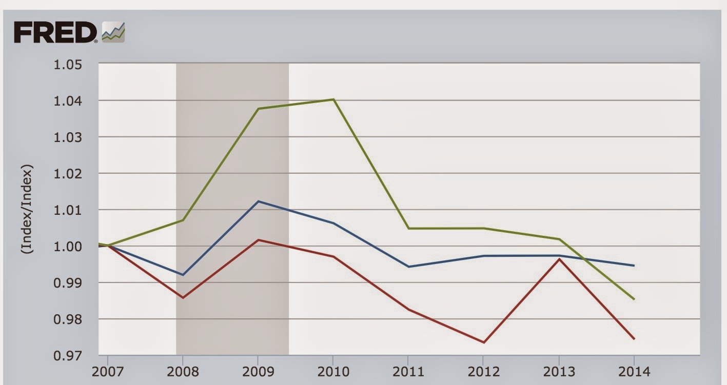
The data for lesser education levels similarly matches the EPI graph.
So what is the "secret" to the EPI finding? The above graph is the annual average. Here is the *quarterly* change, normed to 100 as of 2007, for the same workers:

Remember how I told you to keep in mind that big 2% dip in Q2 2014 of usual weekly wages? Notice that in Q2 and Q3 of 2014, there was an anomalous big decline for those with college degrees and above (a 5% drop in weekly wages in just one quarter!!!), that did not show up for other workers. This is what produced the nearly 2% decline in overall weekly earnings in the 2nd quarter. At the time, I surmised it was simply the case of a "bad panel," i.e., a sample that wasn't really representative. I still think that was the case, and the rebound in Q3 and Q4 appears to bear that out, as does the fact that no other measure of real wages moved in the same direction. But since the Q2 number is part of EPI's 2014 average, it single-handedly is responsible for their reported decline.
So, is the EPI graph true? Yes. Further, there is no doubt that workers with college degrees and no advanced education, relatively speaking have seen the value of their services decline.
That being said, is the EPI graph giving us a current, or likely correct, view of wages? In the face of the other evidence, probably not.
Monday, February 23, 2015
How wages in services vs. goods-producing jobs explain relative GDP growth during Recoveries (Hint: producing goods is better)
- by New Deal democrat
This week I will put up several posts discussing the relative impact of goods-producing vs. service jobs in the economy, prompted by an article by Kevin L. Kliesen and Lowell R. Ricketts of the St. Louis Federal Reserve entitled "Faster GDP Growth during Recoveries Tends To Be Associated with Growth of Jobs in 'Low-Paying' Industries" (pdf), which was subsequently picked up by Prof. Mark Thomas at Economist's View.
The title gives the essential conclusion of the authors, and is primarily supported by the information in the chart below:

The authors explain that they compared 14 industries:
The industries are ranked by their average real wage per worker in that industry . . ..{i}n 2007. . . . [I]ndustries with average real wages above the industry median as “high-paying industries” and industries with average real wages below the industry median as “low-paying industries.The breakdown by high vs. low paying industry is similar to that of the National Employment Law Project (except they include a mid-range bracket as well). The NELP found 33% of all jobs created as of August 2014 to be high-paying vs. 41% low-paying, or roughly a ratio of 4:5. The article in question, counting through December, has the same ratio at 9:8.
As I wrote two weeks ago, the NELP data strongly suggests that recovery started among low-paying jobs, and has spread to higher paying jobs over time. The St. Louis Fed article is consistent with that trend towards higher-paying jobs having continued.
Part of what piqued my interest is the following statement:
What might surprise some people is that both durable and nondurable manufacturing jobs were in the lower-paying end of the distribution (below the median) in 2007.
My immediate thought was that while, in 2007, manufacturing was not a high paying industry, that was not the case before. Perhaps sensing that criticism, the authors wrote in footnote 4:
As we will see several times this week, that starting point of 1981 is important.We chose 2007 under the assumption that the distribution of real wages within an industry was that which prevailed when the economy slowed and subsequently fell into a recession. In analysis not reported here, we looked at the distribution of average real wages for these 14 industries in 1981, 1990 and 2000. The distribution of high- to low real-wage industries changes very little across time.
The first important point to be made is that the title can hardly be supported by such a limited set of 4 recessions and recoveries, which does not even include earlier post-World War 2 economic cycles. And of course, as better indicated by the authors in the actual conclusion in the body of the article, correlation does not mean causation.
Second, note from the chart that the 4 recoveries do not break down so cleanly as suggested by the authors. In the "higher GDP growth" 1980s and 1990s, low-paying jobs outpaced high-paying jobs by roughly 2:1. In the "lower GDP growth" 2000s, the ratio was the reverse, i.e., 1:2. In the present recovery, the ratio is closer to 1:1 -- i.e., only slightly tilted towards "high-paying" industries. Such a limited data set, and such a diversity of results, only barely supports the conclusion.
Third, the study only compares at the 66-month mark (that is, 5 1/2 years into a recovery). The NELP found that this recovery started by adding almost exclusively low-paying jobs, and has increasingly added higher-paying jobs as the expansion has progressed. It has been my thesis that this is probably not unique, that is, recoveries commonly start by adding lower paying jobs, and add higher paying ones later. I would have liked to see if an examination of the same data by the St. Louis Fed showed the same for the last 3 recoveries as the NELP data supports for this one.
But the biggest issue is whether the authors overcomplicated the issue. If we simply divide jobs into goods-producing vs. services, we get a very similar result for all 4 recoveries and 3 of 4 of the recessions (the 2001 recession being the exception).
The singular difference between losses in the Great Recession and the 3 previous ones is that, in prior recessions, service jobs were relatively untouched, while in the Great Recession, nearly as many service jobs were lost (4.5 million) as were goods-producing jobs (5.0 million). I wrote about this over 5 years ago. Here is the graph from that article for the 3 previous recessions:

Here is the updated graph for the 2008-09 Great Recession:


Turning to the subsequent recoveries, in the 1980s and 1990s, goods-producing jobs increased at about double the rate of service jobs:


In the 2000s, service jobs increased at double the rate of goods-producing jobs:

In this recovery, goods-producing jobs have increased at a slightly higher rate than service jobs:

In other words, the data found by the Kliesen and Ricketts can be simply explained by the huge loss of goods-producing jobs (to Latin America and subsequently to China and robots) beginning in 1982, and in particular the halving of such jobs between 2000 and 2010.
I decided to see if I could extend the analysis back in time to prior recessions and recoveries, and to further examine the impact of wages in goods-producing and services jobs over time. The results were very telling, and will form the basis of my next few posts.
Sunday, February 22, 2015
A thought for Sunday: the October forecast that near-record Siberian snow cover would lead to a brutal eastern US winter has been vindicated
- by New Deal democrat
You know the drill. It's Sunday so I can write about whatever interests me. In this case, a long range weather forecast that turned out to be spot-on.
This past week saw record-shattering cold in much of the eastern half of the US:
While Thursday might seem plenty cold enough for mid-February, Friday will be even more frigid as the plume of Arctic air digs in across the eastern United States. All-time February record lows are possible from Ohio to Virginia on Friday morning as temperatures plummet to as much as 40 degrees below average for this time of year.The severe arctic outbreak, which has even caused the American half of Niagara Falls to freeze over, may be miserable for millions, but it is good news for Dr. Judah Cohen. Why?
You may remember a spate of stories that started in October, indicating that Siberian snow cover forecast a brutally cold and snowy winter for the eastern US. Here's Bloomberg on October 10:
There’s a theory that the amount of snow covering Eurasia in October is an indication of how much icy air will sweep down from the Arctic in December and January, pouring over parts of North America, Europe and East Asia.
Here's another from October 15:
Cohen has found a link between a snowy October in Siberia and a cold and stormy winter in the Eastern United States. And this year, he said the snowpack is expanding in Siberia at breakneck pace.
Here's the basic theory:
Cohen’s method proposes that when snow increases rapidly and over a large area over Eurasia during October, it is a strong indication that a weather pattern known as the Arctic Oscillation (AO) will average in its negative phase during winter. When the AO is negative, it favors cold air outbreaks into the eastern U.S. and western Europe, that can also set the stage for snowstorms. (Conversely, when the Siberian snow is cover is minimal and slow to advance, the AO is favored to be positive, with cold air locked up in the Arctic and mild conditions farther south.)In fact, the correlation coefficient between the snow cover south of 60 degrees latitude in Siberia in October, and the subsequent winter's Arctic Oscillation (AO), is .86:

(h/t: Firsthandweather.com)
By mid-October, Siberian snow cover was at its second-highest in several decades:
Siberian snow cover is already rapidly expanding, and based on forecast model guidance, that trend is going to continue throughout the rest of the month. Because the SAI considers daily snow extent values, Cohen and his team will not make any predictions until after this month is over. Remember how cold the 2013-14 winter was?? Well, October 2013 had the 4th highest snow cover extent over Eurasia (Siberia) since 46 years of records began. As of October 13, 2014, 12.2 million square kilometers of Eurasia were covered by snow compared to 10.8 million square kilometers around this same time last year. We’re already way ahead of what even occurred last year!
By early November, the result was clear:
About 14.1 million square kilometers of snow blanketed Siberia at the end of October, the second most in records going back to 1967, according to Rutgers University’s Global Snow Lab. The record was in 1976, which broke a streak of mild winters in the eastern U.S. In addition, the speed at which snow has covered the region is the fastest since at least 1998.
. . . .
“The big early snowbuild will definitely set things up for a cold back half of the winter,” said Todd Crawford, a meteorologist at commercial forecaster WSI in Andover, Massachusetts.
Here is the forecast of relative temperature anomalies for winter 2015 from Cohen's team:

So here we are at the end of February, with snowstorm after snowstorm having raked the Northeast, and some of the most brutal and long-lasting cold in decades. Meanwhile, just as predicted by the forecast, temperatures in Alaska have been has high as 40 degrees above normal!
Dr. Judah Cohen's theory, and forecast, have been vindicated this winter.
Saturday, February 21, 2015
Weekly Indicators for February 16 - 20 at XE.com
- by New Deal democrat
My Weekly Indicators post is up at XE.com.
A Siberian chill has overtaken many of the coincident indicators.
Subscribe to:
Posts (Atom)