- by New Deal democrat
There's a new graph that has been created by the Economic Policy Institute showing that real wages continued to decline in 2014. Is that true? It depends on how and what you measure.
Here is EPI's graph:
The graph purportedly shows real average hourly wages, and further shows that wages for those with advance and college degrees fell the furthest in 2014. In fact, only those with less than a high school degree saw their wages improve. According to this measure, everybody except those with advanced degree has seen their wages actually decline since 2007.
Since I have been focusing on real wages for the last several years, and since I've been pretty emphatic that by almost all measures they bottomed several years ago - and in the last two months average real hourly wages made a new 35 year record - I was skeptical. This wasn't helped by the fact that the EPI's site is not helpful. It only tells us that the data comes from the monthly household survey (part of the jobs report). They don't supply anything beyond the data in their graph, and they don't supply their methodology. This shouldn't make anybody happy, since a conclusion is persuasive only to the extent the work can be replicated.
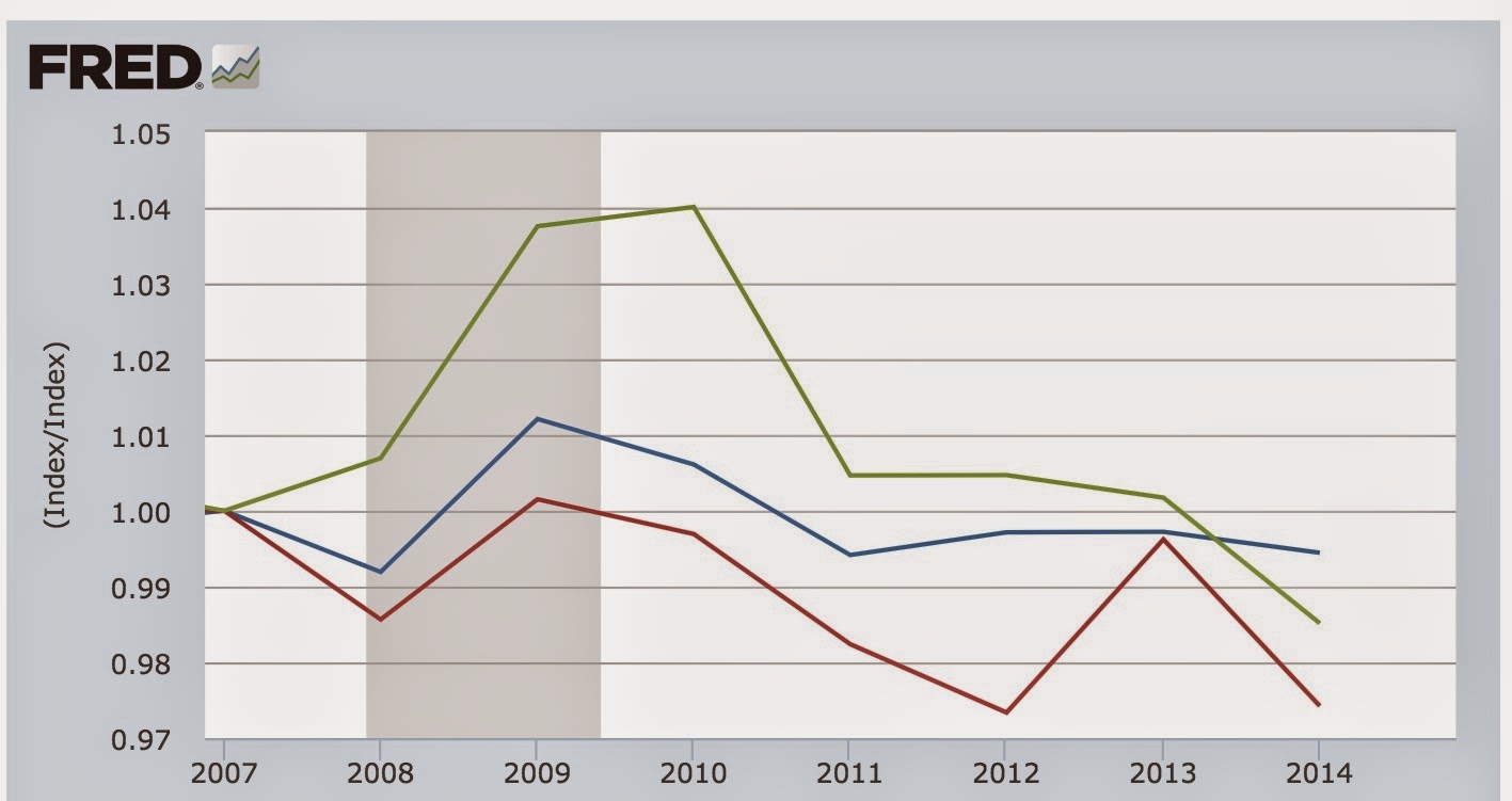
I believe what the EPI did was make use of quarterly "usual weekly earnings" data, use a deflator such as the CPI, Both real average hourly wages, as measured in the monthly surveu (blue in the graph below), and median wages as measured in the Employment Cost Index (green in the graph below) have improved substantially since 2007. On the quarterly usual weekly earnings measure (red) shows a slight increase in 2014 vs. 2013:
Note that this measure too improved measured YoY from the end of 2013 to the end of 2014. Also, see that sudden 2% drop in the red line in the second quarter of 2014. That's significant, so keep it in mind.
But look what happens when we measure the *average* for the four quarters of 2013 v. 2014:
Now we get the decline we see on the EPI graph.
Without belaboring the point too much, when we apply the annual *averages* to all employees (blue) vs. those with college degrees (red) and those with advanced degrees (green), we see the same decline in earnings as appeears in the EPI graph:
The data for lesser education levels similarly matches the EPI graph.
So what is the "secret" to the EPI finding? The above graph is the annual average. Here is the *quarterly* change, normed to 100 as of 2007, for the same workers:
Remember how I told you to keep in mind that big 2% dip in Q2 2014 of usual weekly wages? Notice that in Q2 and Q3 of 2014, there was an anomalous big decline for those with college degrees and above (a 5% drop in weekly wages in just one quarter!!!), that did not show up for other workers. This is what produced the nearly 2% decline in overall weekly earnings in the 2nd quarter. At the time, I surmised it was simply the case of a "bad panel," i.e., a sample that wasn't really representative. I still think that was the case, and the rebound in Q3 and Q4 appears to bear that out, as does the fact that no other measure of real wages moved in the same direction. But since the Q2 number is part of EPI's 2014 average, it single-handedly is responsible for their reported decline.
So, is the EPI graph true? Yes. Further, there is no doubt that workers with college degrees and no advanced education, relatively speaking have seen the value of their services decline.
That being said, is the EPI graph giving us a current, or likely correct, view of wages? In the face of the other evidence, probably not.


