Saturday, February 1, 2014
Weekly Indicators for January 27 - 31 at XE.com
- by New Deal democrat
My column describing Weekly Indictors is up at XE.com
What was relatively strong vs. what was relatively week has been reversed in the last several weeks compared with the last 9 months.


Friday, January 31, 2014
Emerging Market ETF Has Stabilized For Now

Above is a chart of the emerging market ETF. While it has broken the 200 day EMA and pulled the lower EMAs through the 200 day EMA, prices appear to have stabilized around the 38 level. Finally, the sell-off has occurred on higher volume.
However, notice the declining momentum and negative CMF reading. This ETF won't be making a strong relief rally anytime soon.
Comparing personal consumption expenditures with real retail sales: an update
- by New Deal democrat
A couple of years ago I wrote a few posts describing how, if you compare PCE's with real retail sales, you get a good idea where you are in the economic cycle. I've published an update over at XE.com, and also updated my look at real per capita retail sales, which are a short leading indicator.
Thursday, January 30, 2014
NEWS FLASH: Real residential investment *declined* in the 4th quarter
- by New Deal democrat
From the BEA:
Real residential fixed investment decreased 9.8% [in the 4th quarter of 2013].
Are all you Doubting Thomases out there starting to pay attention?
More later ....
Update:
Here's the updated graph of private fixed residential investment (green), as measured as a YoY% (blue), and as measured as a percentage of GDP (red):
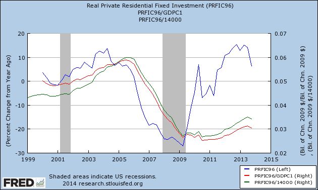
I expected that real residential investment would decline measured as a YoY%, but the absolute decline is a bit of a surprise.
What I want you to pull from the graph above is that the order is (1) decline of fixed private residential investment as a percentage YoY comes first, followed by (2) decline as a share of GDP (the measure favored by Professor Leamer as the first portion of the economy to decline prior to a recession) , and finally by (3) absolute decline.
I want to emphasize that this does NOT mean we are inexorably sliding into a recession from here. Housing could certainly bounce back. But it does add another brick in the wall of evidence supporting my forecast of a decline in housing starts and permits in the first half of this year at least. It also does raise a yellow caution flag to watch for further signs of deterioration in the economy as we head towards 2015.
Flight to Safety Since January 1


Above are four charts, all of which are from US treasury market ETFs. The IEIs are for the 3-7 years, IEFs for 7-10 year, TLHs for 10-20 year and TLTs for 20+ years. All have rallied since the beginning of the year.
What this shows is since January 1, we've seen a fundamental shift in trader's perception of the market as they prefer the relative safety of treasuries over stocks.
Wednesday, January 29, 2014
Q.: What's the politically correct word for "mentally retarded?" A.: Apparently, "Peter Schiff"
- by New Deal democrat
According to Business Insider, last night Euro Pacific Capital president Peter Schiff actually took the position that "people don't go hungry in a capitalist economy..... It's socialism that creates scarcity, that creates famine," Schiff said. "In a free market, there's plenty of food for everybody, especially the poor."
Asked who should earn a wage of $2 an hour, Schiff replied, "What the politically correct word for 'metnally retarded'?"
Never mind that in the Great Depression, with 25% unemployment in 1932, people died of starvation in nearly every single town, and at one point it was estimated that 25% of all schoolchildren were malnourished.
All of those perfectly competitive free market equations that people like Schiff love don't guarantee that people won't starve, they just (supposedly) assure that the most economically efficient number will starve.
So the answer to Schiff's question appears to be, "Peter Schiff."
He walked into that one.
A reminder about housing sales and prices
- by New Deal democrat
House prices show a lot of seasonality, so the only good way to keep track of them is YoY, and YoY price increases are still running very strong.
So how can I be forecasting a decline in house sales if prices have continued to rise so strongly? Because sales will peak and turn down before prices.
In case you needed a refresher, here's a graph of sales of single family homes (red, right scale) compared with median prices for new single family homes (blue, left scale) for the last 10 years:
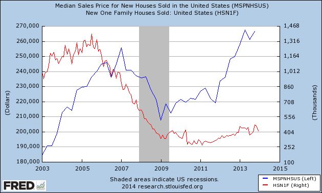
Recall that sales peaked a full two years before nominal prices turned down.
While I don't believe we are in a new bubble (adjusted for income, prices haven't risen nearly so much off their bottom), there has been quite an outcry that traditional first time homebuyers are priced out of some markets.
In any event, I believe the transmission of higher interest rates through the housing market will unfold the same way. Sales will turn down before prices do.
But isn't inventory still tight? Yes, but remember that the months-of-supply metric can resolve either through more inventory coming on the market, or monthly sales declining, or both, which is what happened when the housing bubble burst. If in the next few months sales decline to 900,000 annualized, that will go a long way to a "normal" number of months of supply.
Indian ETF Hitting Resistance


The top chart is the daily Indian ETF chart, while the bottom is the weekly chart. Both charts show the market hitting resistance in the mid 57 area. Anytime a market hits resistance this regularly, we need to ask why, which is almost always answered by the fundamentals.
The Indian economy is experiencing fairly serious structural problems. On one hand, inflation is high bringing with it all the associated problems. At the same time, growth is slowing, leaving the central bank in a rather unenviable position.
Tuesday, January 28, 2014
The housing slowdown has already begun
- by New deal democrat
With yesterday morning's surprise -50,000 month/month decline in new home sales, the 2013 housing data is in the books, and it confirms that in 2013 there was a marked slowdown in the housing recovery.
Below is the graph of building permits (blue), starts (green), new home sales (beige) and existing home sales (orange) for the last three years, normed to 100 at the start of each year:
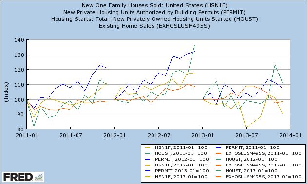
After being up over 10% in each of 2011 and 2012 (over 20% as to permits), permits, starts, and new home sales finished 2013 up 10% or less for the year, and existing home sales are actually negative for the year.
Now here is the same data presented as YoY percentage change, and compared with the YoY change in interest rates (red, inverted, right scale):
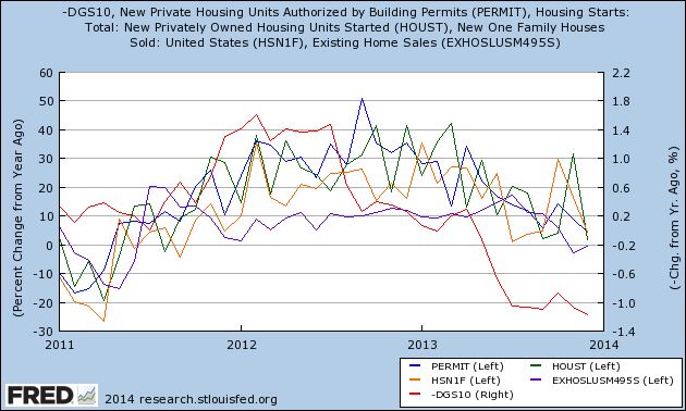
The simple fact is that the housing market follows interest rates usually with a six to nine month lag.
Finally, here are housing permits (blue) and starts (green) in 100,000's YoY vs. interest rates, inverted:
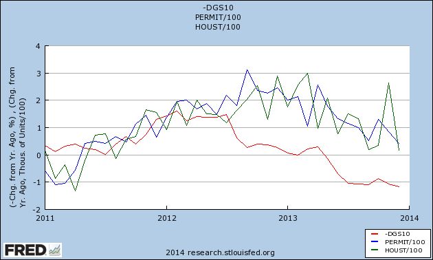
The past history is that a 1% increase in interest rates typically is consistent with a 100,000 decline in permits and starts. The data that we have seen in December confirms that in 2013 we already have seen a slowdown, and is in accord with my forecast that at some point this year, we will see a YoY change of -100,000 in permits and/or starts. Could it be different this time? Of course, but history is on my side.
Australian ETF Breaks Support on Weekly Chart

Above is a weekly chart for the Australian ETF. It had been consolidating in a triangle formation which lasted about 9 months. But price action over the last several days has sent prices through the support of the lower trend line.
There are several reasons for this. First, Australia's fortunes are directly tied to Chinas, as Australia exports a large amount of goods to China. Second, Australia recently had a very negative employment print, showing a contraction of jobs rather than an expansion. As a result, traders have sent the ETF lower.
Monday, January 27, 2014
The International Sell-Off In Perspective
As we start this week, we should look at the price action from the end of last week, as this will have a strong impact for the next few tradings days.

The all Asia except Japan ETF had been trading between 57/57.5 and the lower 61s. Last week we saw a sharp sell-off as prices broke through the 57.5 level by printing two strong down-day bars. Also note that prices moved through the 200 day EMA. The only thing lacking from this sell-off was a huge volume spike. But this could mean the big volume spike is yet to come.

The emerging market ETF was already below the 200 day EMA, making last week's sell-off more pronounced. Unlike the AAXJ chart above, this one does have a huge volume spike. Also note the shorter EMAs are now below the 200 day EMA.
The all Asia except Japan ETF had been trading between 57/57.5 and the lower 61s. Last week we saw a sharp sell-off as prices broke through the 57.5 level by printing two strong down-day bars. Also note that prices moved through the 200 day EMA. The only thing lacking from this sell-off was a huge volume spike. But this could mean the big volume spike is yet to come.
The emerging market ETF was already below the 200 day EMA, making last week's sell-off more pronounced. Unlike the AAXJ chart above, this one does have a huge volume spike. Also note the shorter EMAs are now below the 200 day EMA.
Sunday, January 26, 2014
Saturday, January 25, 2014
Weekly Indicators for January 20 - 24 at XE.com
- by New Deal democrat
Weekly Indicators for this week are up at XE.com.
One week ago rail traffic and consumer spending took a big hit, which I blamed on the extreme cold from the "polar vortex." This week I look to see if they rebounded. The long leading indictors also had something of a rare week of late.
Friday, January 24, 2014
The exception to the rule about interest rates and housing: "Buy now or be forever priced out"
- by New Deal democrat
As I have written extensively in the last several months, a rise in interest rates has almost always - 17 of 21 cases since World War 2, to be precise - been consistent with an outright decline several quarters later in housing. Typically a 1% increase in interest rates has been consistent with a 100,000 decline in the volume of housing permits and starts.
But what about the 4 exceptions? Are they just random outliers, or is there a common thread linking them?
It turns out that, in at least 3 of the 4 cases, there is a common thread: in the immortal words of housing bubbleheads circa 2005, "Buy now or be forever priced out."
The housing bubble of 2004-06 remains the biggest exception in the nearly 70 year history of housing and interest rates that I've examined. Here's the graph of interest rates YoY change (inverted, red) and housing permits YoY change (blue) during that period and the immediate aftermath:
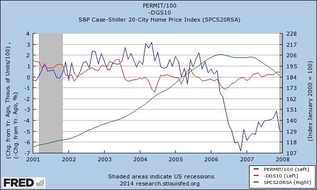
As you can see, despite the fact that interest rates not only had not fallen, but in fact had risen somewhat and remained elevated for several years, housing permits continued to increase stoutly. As we all recall that housing prices (Case Shiller Index, green, index values at right) were rising at the brisk clip of 10% or more a year for about half a decade at that point. It was a common trope that "real estate only goes up!" If so, you had better buy today, because tomorrow the house you wanted would only get even more expensive. And for a long while it did. Until it didn't, and housing crashed in equally spectacular fashion, as you can see from the latter part of the graph above.
A similar, although not identical, explanation can be found to the exceptional performance of housing in 1968, and to some extent, also in 1979.
Inflation and interest rates had remained tame throughout the 1950s, and slightly increased in the early 1960's.
But in 1965, Lyndon Johnson began his "guns and butter" fiscal policy. Previously, it had been understood that you could only either finance wars (guns) or domestic programs (butter). Johnson believed the US was so strong that he could do both. The result wasn't just inflation, but increasing levels of inflation every year beginning in 1965. By 1968, inflation had increased to 4% and showed every sign of accelerating further (and indeed it did). In its report for 1968, the Federal Reserve Bank of St. Louis pointed out this increasing rate of inflation with alarm. It appeared to be the number one economic issue facing the country.
This meant an aspiring homeowner had to deal with not only an increased mortgage rate (which would ordinarily drive housing construction down), but the belief that, if s/he didn't buy a house now, then in 3 or 6 or 12 months those mortgage rates would be even higher. Needless to say, the prudent buyer bought now rather than later, despite the higher interest rates.
And that's what the graph shows (green line is YoY inflation rate):
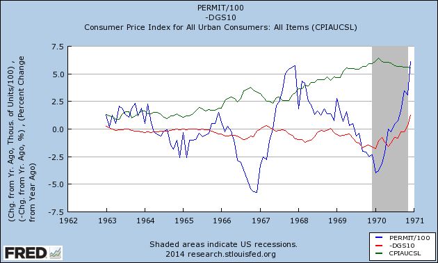
Notice that these sales only borrowed from future demand, as at the end of 1969 the US entered its first recession in almost 10 years.
The same dynamic was in play in 1978, with the same result. Here's the graph:
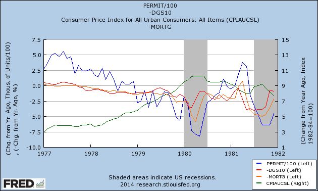
Additionally, in 1978, there were several months that mortgage interest rates (orange) declined significantly, and were in fact negative YoY. This coincided with spikes in housing. Contrarily, there were several months in 1978 that were negative YoY, although not negative enough to result in a negative YoY quarter. Nevertheless, the reckoning was only delayed until 1979.
That leaves only 1962. I have been unable to find any reliable source of what may have happened with mortgage interest rates that year. We can say that the increase in interest rates was relatively short-lived, and that while housing never turned negative, it did turn lower for about a year, falling under +50,000 for 3 of those months. You can also see that inflation (green) began to tick up at this point:
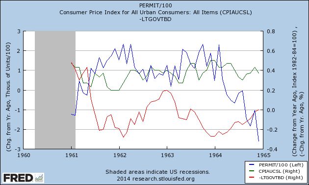
In short, the exception to the rule that rising interest rates are associated with a decline in housing about 6 to 12 months later is when the costs of buying a house not only have risen, but it is expected that they will rise even further in the immediate future. In those circumstances, it makes sense not to delay the purchase of a new house even though interest rates have already moved against you.
So, is there a component of "buy now or be forever priced out" in the present environment? Actually, I believe there has been, evident in the spikes of demand in July and August in existing home sales, and in October and November in housing starts and permits, as shown in this graph of housing permits (blue), new home sales (red), and existing home sales (green) since January 2013:
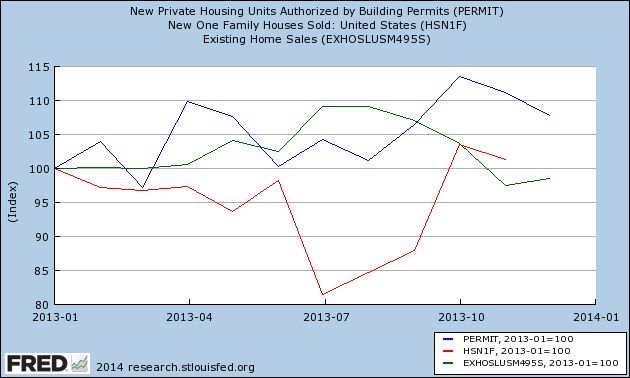
A number of buyers may have tried to lock in rates before they rose any further, as evidenced by the surge in existing home sales in July and August, and permits and new home sales in October and November. That dynamic appears to be fading, and there does not appear to be any mentality that mortgage rates will continue to rise significantly from here. If anything, interest rates seem likely to meander around their current level, and buyers will take advantage of the dips. But that is not the same as "buy now or be forever priced out."
The bottom line is that the exception to the rule that rising interest rates cause a decline in the housing market does not appear to be in play at present. So, having considered the exceptions to the rule, I continue to believe that housing will actually experience a decline (that has already begun) in approximately the first 6 months of 2014.
As I have written extensively in the last several months, a rise in interest rates has almost always - 17 of 21 cases since World War 2, to be precise - been consistent with an outright decline several quarters later in housing. Typically a 1% increase in interest rates has been consistent with a 100,000 decline in the volume of housing permits and starts.
But what about the 4 exceptions? Are they just random outliers, or is there a common thread linking them?
It turns out that, in at least 3 of the 4 cases, there is a common thread: in the immortal words of housing bubbleheads circa 2005, "Buy now or be forever priced out."
The housing bubble of 2004-06 remains the biggest exception in the nearly 70 year history of housing and interest rates that I've examined. Here's the graph of interest rates YoY change (inverted, red) and housing permits YoY change (blue) during that period and the immediate aftermath:
As you can see, despite the fact that interest rates not only had not fallen, but in fact had risen somewhat and remained elevated for several years, housing permits continued to increase stoutly. As we all recall that housing prices (Case Shiller Index, green, index values at right) were rising at the brisk clip of 10% or more a year for about half a decade at that point. It was a common trope that "real estate only goes up!" If so, you had better buy today, because tomorrow the house you wanted would only get even more expensive. And for a long while it did. Until it didn't, and housing crashed in equally spectacular fashion, as you can see from the latter part of the graph above.
A similar, although not identical, explanation can be found to the exceptional performance of housing in 1968, and to some extent, also in 1979.
Inflation and interest rates had remained tame throughout the 1950s, and slightly increased in the early 1960's.
But in 1965, Lyndon Johnson began his "guns and butter" fiscal policy. Previously, it had been understood that you could only either finance wars (guns) or domestic programs (butter). Johnson believed the US was so strong that he could do both. The result wasn't just inflation, but increasing levels of inflation every year beginning in 1965. By 1968, inflation had increased to 4% and showed every sign of accelerating further (and indeed it did). In its report for 1968, the Federal Reserve Bank of St. Louis pointed out this increasing rate of inflation with alarm. It appeared to be the number one economic issue facing the country.
This meant an aspiring homeowner had to deal with not only an increased mortgage rate (which would ordinarily drive housing construction down), but the belief that, if s/he didn't buy a house now, then in 3 or 6 or 12 months those mortgage rates would be even higher. Needless to say, the prudent buyer bought now rather than later, despite the higher interest rates.
And that's what the graph shows (green line is YoY inflation rate):
Notice that these sales only borrowed from future demand, as at the end of 1969 the US entered its first recession in almost 10 years.
The same dynamic was in play in 1978, with the same result. Here's the graph:
Additionally, in 1978, there were several months that mortgage interest rates (orange) declined significantly, and were in fact negative YoY. This coincided with spikes in housing. Contrarily, there were several months in 1978 that were negative YoY, although not negative enough to result in a negative YoY quarter. Nevertheless, the reckoning was only delayed until 1979.
That leaves only 1962. I have been unable to find any reliable source of what may have happened with mortgage interest rates that year. We can say that the increase in interest rates was relatively short-lived, and that while housing never turned negative, it did turn lower for about a year, falling under +50,000 for 3 of those months. You can also see that inflation (green) began to tick up at this point:
In short, the exception to the rule that rising interest rates are associated with a decline in housing about 6 to 12 months later is when the costs of buying a house not only have risen, but it is expected that they will rise even further in the immediate future. In those circumstances, it makes sense not to delay the purchase of a new house even though interest rates have already moved against you.
So, is there a component of "buy now or be forever priced out" in the present environment? Actually, I believe there has been, evident in the spikes of demand in July and August in existing home sales, and in October and November in housing starts and permits, as shown in this graph of housing permits (blue), new home sales (red), and existing home sales (green) since January 2013:
A number of buyers may have tried to lock in rates before they rose any further, as evidenced by the surge in existing home sales in July and August, and permits and new home sales in October and November. That dynamic appears to be fading, and there does not appear to be any mentality that mortgage rates will continue to rise significantly from here. If anything, interest rates seem likely to meander around their current level, and buyers will take advantage of the dips. But that is not the same as "buy now or be forever priced out."
The bottom line is that the exception to the rule that rising interest rates cause a decline in the housing market does not appear to be in play at present. So, having considered the exceptions to the rule, I continue to believe that housing will actually experience a decline (that has already begun) in approximately the first 6 months of 2014.
Thursday, January 23, 2014
Existing home sales down YoY and down 10% from high for second month in a row
- by New Deal democrat
Let me be the first to say that, of the measures of the housing market, existing home sales are the least important, because they don't have the impact that new home construction has on the economy.
But, that being said, they typically move in the same direction as new home construction.
So, for the Doubting Thomases who think my forecast of a weakening housing market due to the rise in interest rates last year is off the mark, the title of this post states the simple facts.
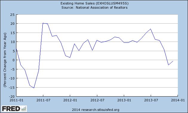
For the second month in a row, existing home sales are less than they were a year ago.
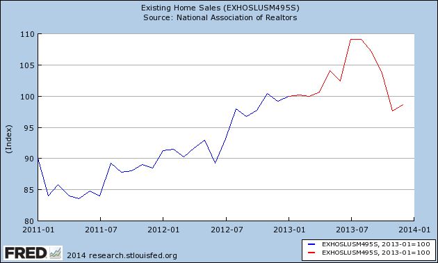
For the second month in a row, existing home sales are down over -500,000 sales annualized from their July and August 2013 peaks. November was off slightly more than 10%, and this month was -9.6% off that peak.
Here's the graph of existing home sales since their bottom at the end of 2010, with 2013 highlighted in red (set to 100 for January 2013):
And here is the same data presented YoY:
In addition to existing sales, both housing permits and starts have cooled down from growing at a 20% rate in 2012 to +4.6% and +1.6% respectively at the end of 2013.
So far, only new home sales have not meaningfully decelerated. Those will be reported next week.
Additionally, Bill McBride reiterated this week why he remains bullish on housing and accelerating economic growth in 2014. He and I do disagree on what some of the facts mean, but I want to wait for next Thursday's GDP report before I explain why.
Subscribe to:
Posts (Atom)