Tuesday, May 22, 2012

Morning Market Analysis

Now that we're probably in "bounce" territory, let's take a look at key levels.


I fully expect to see the market to technically rebound this week -- or at least for the next few days -- as buy-programs start to view current levels as under-valued.  For the SPYs, pay attention to the 134.35 and 136 level.  However, don't expect this to be anything more than a technical bounce; negative momentum is very strong right now, and volatility is up.


For the QQQs the important levels  are 63.38 and 64.20 for now.


For the IWMs, it's 77.75 and 78.75

For all of the above averages, until prices move about the highest Fib level, we're still in a technical bounce area, nothing more.


The dollar -- which has broken out of a trading range -- is now retesting previous resistance levels at the 22.3-22.4 level.  Expect to see prices find support in one of these areas over the week.


Over the last week, we've seen wheat spike sharply for two reasons.  First, we're hearing rumblings from Russia that some type of drought is hitting the crop and, two, that diminished rain is going to hurt the US harvest.  There's also been a fair amount of short covering going on.  Right now prices are still contained in their six month trading range.  But a move about the 7.00 level will be what to watch for.


Monday, May 21, 2012

Actually, GDP *does* (usually) contract at or before the onset of recessions


- by New Deal democrat

While the formal definition of a recession is a pronounced downturn in sales, income, production, and jobs, informally it is usually evidenced by at least two quarters of negative GDP. In the case of the 2001 just-barely-a-recession, the two quarters of negative GDP were separated by one quarter of growth, at the end of the recession GDP was actually higher GDP than when it began.

Two weeks ago a prominent forecaster scoffed at the idea that a recession could not have begun because of first quarter GDP of +2.2%, pointing out that GDP was typically positive in the quarters that past recessions have begun.

A closer examination reveals that while he was correct, in context his conclusion was misleading. Since economic statistics don't typically move in a straight line, when we add in the quarter before the start of recessions, it turns out there usually is a negative quarter.

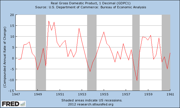
Unfortunately I can't show you a bar graph with recession indicators, so you'll have to squint a bit to see my point in the below graphs. Quarterly GDP started to be reported after the Second World War. Here's the immediate postwar era to the 1960's:


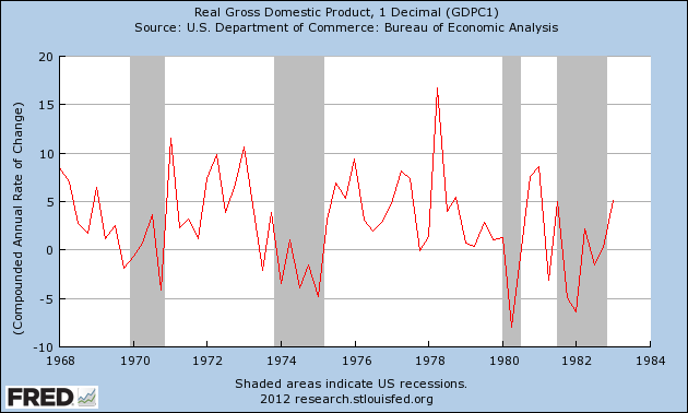
Now here is the stagflationary 1970's and the double-dip Fed induced recession:


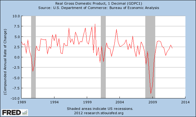
Here are the last 3 recessions up to the present:


There have been 11 recessions since quarterly GDP has been reported. In 6 of the 11 cases (1948, 1957, 1973, 1980, 1981, and 2007), the quarter when the recession began recorded positive GDP.

However, when we consider both that quarter and the quarter immediately before the recession began, in 8 of the 11 cases, at least one of the two quarters had negative GDP. The only exceptions were 1948, 1980, and 2007.

In the three cases where both quarters were positive, growth was rapidly decelerating, and in the quarter that the recession began annualized growth was +0.8% once and +1.7% twice.

Acknowledging that we have a limited data-set, applying that to our current economy means that growth absolutely continued in the first quarter. Obviously there is no report for the current quarter, but if GDP for this quarter remains positive, it is very likely that the expansion is continuing, and if growth should exceed 2% again this quarter, recession is off the table. Of course, GDP statistics are infamous for being revised. The second estimate of first quarter growth will be reported next week.

Housing and car sales indicate economy will improve


- by New Deal democrat

This is going to be a light week for data. We'll get new and existing home sales, and later in the week durable goods orders. So let's take a look at what houses and the biggest durables purchase made by consumers - namely, cars - are telling us about the economy.

UCLA Anderson School Prof. Edward Leamer made an excellent presentation[pdf] about the progression of business cycles at Jackson Hole in 2007. It is research I have relied on many times, including being able to see the beginning of the Great Recession ahead of time.

Here's the essence of his conclusion:
"The temporal ordering of the spending weakness is: residential investment, consumer durables, consumer nondurables and consumer services before the recession, and then, once the recession officially commences, business spending on the short-lived assets, equipment and software, and, last, business spending on the long-lived assets, offices and factories. The ordering of the recovery is exactly the same."
Put simply, as an economic expansion ages, housing is the first sector to weaken, followed by cars. If they are strengthening rather than weakening, a recession is not near. And to be blunt, both sectors are indeed strengthening.

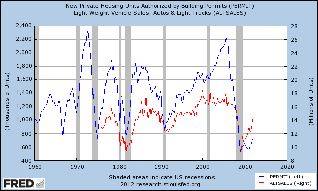
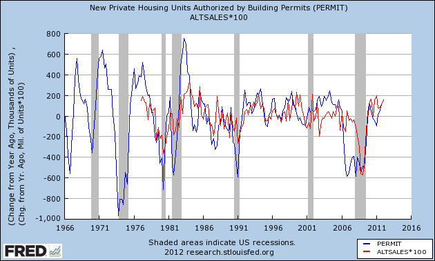
Let's look at this three ways. First here are the raw numbers of housing permits (left scale) and vehicle sales (right scale), measured quarterly to limit some of the noise. Both peaked well before any recession started, even in the case of the brief expansion in the middle of the 1980-81 "double dip":


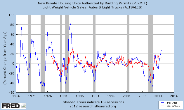
Now, here's the same data measured YoY on a quarterly basis. We get the same result - in this case, that the YoY decline fell below zero in all cases (with the exception of a 25,000 YoY increase in car sales YoY just before the 1981 half of the double-dip):


Finally, here's another look at quarterly data measured YoY, except this time measured by percentage instead of by number sold. Again, we get the same result:


Both home sales and car sales are strengthening, not weakening, through the first quarter. Even in the double dip, both house and car sales peaked two quarters before the onset of the second recession. In all other cases, at minimum, both have peaked at least 3 quarters in advance of a new recession. This tells us the economy should be strengthening, not weakening, in the months ahead.

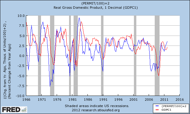
I've also mentioned that if for every 100,000 YoY improvement in housing permits (blue), generally speaking there is a 1% improvement in GDP several quarters later (red). The recent YoY improvement in GDP is following that script:


 The continuing strength in housing and car sales suggests that improvement should continue, with YoY GDP growth rising to a level somewhere around 3%.

CNBC and "parliamentary issues"

  - by New Deal democrat

Via Stan Collender, we learn that CNBC has signed onto the approved Village line about the outcome of the Simpson-Bowles' deficit commission, with reporter Jeff Cox claiming that "the commission had agreed to a report to reduce the deficit."

When Collender pointed out to Cox that the Commission had not agreed to any report at all,
His email back to me said that the fact that the recommendation (he called it a "report") didn't get the required votes was "a parliamentary issue" and that I was "overheated" about it not being approved.
I don't know about you, but I'm ready to celebrate.  For example --
- I'm sure glad that we have an Equal Rights Amendment for women.  After all, the fact that enough states didn't ratify it is just "a parliamentary issue."

- It is a crowning glory of 20th Century American foreign policy that we participated in the League of Nations.  The fact that the Senate refused to ratify the Treaty of Versailles is just "a parliamentary issue."

- The presidency of Al Gore from 2001-2008 was a great success.  The fact that his popular majority didn't translate into a majority by the Electoral College is just "a parliamentary issue."
If he hadn't been so overweight during his lifetime, Mark Haines would be spinning in his grave.


Morning Market Analysis; It's Getting Very Ugly Out There ....

Last week, the markets dropped again.  Overall, the technical situation continues to deteriorate.  The charts below show the depth of the damage.


The 60 minute chart of the QQQs is illustrative of the overall breakdown.  Prices gapped lower twice at the beginning of the month.   Prices consolidated in the 63.5-64.5 range through the 16th.  Starting mid last week, prices were clearly in a strong downtrend.  Note that prices were moving lower with no relief rally.  Also note that the MACD has been negative for most of the month and is currently in a downtrend.


The IWMs broke through support in the 78 area and are now below the 200 day EMA.  The shorter EMAs are all lower.  Prices are now targeting the 38.2% Fib level.  All the technical indicators are negative; the MACD is dropping, the CMF shows little to no volume coming into the markets and the Bollinger band width is increasing, telling us that volatility is increasing.


The underlying technicals of the QQQ are the same as the IWMs.  Prices have moved from tehe 68 price level to 60.81 and are now at the 200 day EMA and 50% Fib level.


The SPYs are now below the 200 day EMA are are looking for support at Fib levels.

The markets are now in full-blown correction mode, largely caused by the EU situation, but also as a result of the slowing US economy.  There are two levels of support on the daily charts that are now crucial: the 200 day EMA and the lowest Fib level.  Should prices breech these levels on one average, the possibility increases  for a breach by the other averages.  At that point a complete retracement of the December - April rally is extremely likely. 


Saturday, May 19, 2012

Why is Gas Demand Dropping?

Let's look at this from an economic perspective: 

     The length of time that people have to respond to price changes also plays a role. A good example is that of gasoline. Suppose you are driving across  the country when the price of gasoline suddenly  increases. Is it likely that you will sell your car and  abandon your vacation? Not really. So in the short  run, the demand for gasoline may be very inelastic.   
     In the long run, however, you can adjust your behavior to the higher price of gasoline. You can buy  a smaller and more fuel-eficient car, ride a bicycle, take the train, move closer to work, or carpool with other people. The ability to adjust consumption patterns implies that demand elasticities are generally higher in the long run than in the short run.

Samuelson, Paul A (2009-04-08). Economics (Page 66). Business And Economics. Kindle Edition.

First, consider this chart:


Look at this chart as a time series; start with the line at the far left, move to the right and than when you reach the farthest point on the right, go back and start with the red line.  Put another way, gas prices have been high for about a year -- and that's before we take the 2008 price spike into consideration,

which would lengthen the time out a bit more.  That means that consumers have had several years to adapt their behavior to the reality of high gas prices.  As professor Samuelson observes, over time demand becomes more elastic as people have the opportunity to change their behaviors.  Hence we get this:


Dropping demand.

Weekly Indicators: it's the annual May Europanic, but US growth remains intact edition


- by New Deal democrat

Monthly data reported in the last week was mixed, due to revisions in the prior month's data. Retail sales were up, just barely. There was no consumer inflation. Housing permits fell sharply, but only because the prior month's numbers were revised even more sharply higher. This caused the Index of Leading indicators to record a slight decline. Housing sales are in a definite uptrend. Industrial production rose strongly, but less so taking into the negative revision to the prior month. Regional manufacturing reports were mixed with NYS up strongly, and Philly in contraction.

The high frequency weekly indicators this week, with one exception, were neutral to positive as the Oil choke collar disengages due to the now-annual ritual of late spring Europanic.

Let's start with the exception. Rail traffic was mixed again this week. The American Association of Railroads reported a -1.3% decrease in total traffic YoY, or -8,100 cars. Non-intermodal traffic was down by -15,200 cars, or -5.2% YoY. Excluding coal, this traffic was up 5,800 cars. Ethanol-related grain shipments were also off, as were chemicals, metals, and scrap. Intermodal traffic was up 7,100 carloads, or +3.1%. Railfax's graph of YoY traffic continued to show that the YoY improvement in hauling of cyclically sensitive materials remains strong. Oddly, it remains baseline, non-cyclical shipments that are declining, and declining ever more sharply.

Housing was mixed but at slightly higher recent levels:

The Mortgage Bankers' Association reported that the seasonally adjusted Purchase Index fell -2.4% from the prior week, and was down slightly, -1.0% YoY. The Refinance Index jumped 13.0% with record low mortgage rates. This index continues to be near the upper end of its 2 year generally flat range.

The Federal Reserve Bank's weekly H8 report of real estate loans, which had been negative YoY for 4 years, turned positive over one month ago. This week, real estate loans held at commercial banks was flat w/w, and their YoY comparison declined -0.1% to +0.9%. On a seasonally adjusted basis, these bottomed in September and remain up +1.6%.

YoY weekly median asking house prices from 54 metropolitan areas at Housing Tracker were up +2.4% from a year ago. YoY asking prices have been positive now for almost 6 months. Median current list prices are now higher than at any point last year. Either this indicator will turn, or the Case-Shiller repeat sales index is likely to turn within the next several months. I do not see how the divergence between the two can continue much longer.

Employment related indicators were also neutral to positive:

The Department of Labor reported that Initial jobless claims rose 2,000 to 370,000 last week. The four week average fell 4000 to 375,000. It seems more likely that in April we saw a quirk of seasonality rather than a more ominous sign.

The Daily Treasury Statement for the first 13 days of May showed $87.7 vs. $95.6 B for April 2011. This has everything to do with the month starting on a Tuesday rather than a Monday. Compare Monday through Wednesday in the equivalent period and this year is $4.0 B ahead of last year. For the last 20 reporting days (4 x each day of the week), $132.7 B was collected vs. $129.6 B a year ago, an increase of $3.1 B, or +2.4%. This reverses last week's decline, but is still a weak advance.

The American Staffing Association Index remained at 93 for the third week. It remains two to three points below the all time records from 2006 and 2007 for this week of the year.

Same Store Sales continue to be solidly positive.

The ICSC reported that same store sales for the week ending May 12 fell -0.8% w/w, but were up +4.5% YoY. Johnson Redbook reported a 3.7% YoY gain. Shoppertrak reported a gain of 12.0% YoY after last week's YoY decline of -2.7%. The 14 day average of Gallup daily consumer spending turned positive again this week at $71 vs. $68 in the equivalent period last year.

Money supply was mixed:

M1 fell -1.5% last week, and also fell -0.6% month over month. Its YoY level increased to +16.5%, so Real M1 is up 14.2%. YoY. M2 was flat for the week, and was up +0.4% month over month. Its YoY advance rose slightly to +9.6%, so Real M2 increased to +7.3%. Real money supply indicators continue to be strong positives on a YoY basis, although they have had a far more subdued advance since September of last year.

Bond prices rose and credit spreads were flat:

Weekly BAA commercial bond rates fell .07% to 5.08%. Yields on 10 year treasury bonds also fell .07% to 1.88%. The credit spread between the two remained even at 3.20%. Strongly falling bond yields mean that fear of deflation is strong. Spreads have been widening for the last month until this week.

Finally, the energy choke collar is disengaging:

Gasoline prices fell for the fourth straight week, down another .04 to $3.75. Oil fell almost $5 this week, $96.13 to $91.48. Oil prices are now below the point where they can be expected to exert a constricting influence on the economy. Since gasoline prices follow with a lag, we can expect gasoline to fall to that point in about a month as well. The 4 week average of Gasoline usage, at 8692 M gallons vs. 8864 M a year ago, was off -1.9%. For the week, 8971 M gallons were used vs. 9048 M a year ago, for a decline of -0.9%. Gasoline usage is moving to parity with the reduced levels that began to be established one year ago.

Turning now to high frequency indicators for the global economy:

The TED spread remained at 0.390, near the bottom of its recent 3 month range. This index remains slightly below its 2010 peak. The one month LIBOR rose slightly to 0.240. It is well below its 12 month peak set 3 months ago, remains below its 2010 peak, and has returned to its typical background reading of the last 3 years.

The Baltic Dry Index rose slightly from 1138 to 1141. It is about 1/3 of the way back from its February 52 week low of 670 to its October 52 week high of 2173. The Harpex Shipping Index rose another 5 points from 440 to 445 in the last week, and is up 70 from its February low of 375.

Finally, the JoC ECRI industrial commodities index fell sharply for the second week in a row, from 122.82 to 120.25. This indicator appears to have more value as a measure of the global economy as a whole than the US economy.

When the US is in a recession, that doesn't mean that every single state's economy is contracting. Texas or Washington state might be doing well, for example. The sharp declines in the JoC ECRI index and treasury bond yields seem to be all about Europanic. The global economy as a whole might be slipping into contraction thanks largely to austerian stupidity in Europe (but note that global shipping rates appear to have bottomed).

But when we look at the up to the moment indicators for the US, we see a slow improvement in housing, refinancing of mortgages at lower rates, consumer purchases remaining strong, payroll taxes modestly improving, the Oil choke collar loosening, and both industrial and retail consumers of energy focusing like lasers on efficiency. On the other hand, rail traffic is an actual drag, even if there are very good reasons for the decline that are longer-term economic positives. In short, the US economic expansion appears intact.

Friday, May 18, 2012

More Signs of the Global Slowdwon

Last week, the Bank of Korea decided to leave rates unchanged.  Here is the relevant section from their policy statement:
Based on currently available information, the Committee considers some economic indicators in the US to have sustained their trends of improvement, but economic activities in the euro area to have remained sluggish. Growth in emerging market economies has continued to exhibit signs of weakening, due mostly to slowing exports. Going forward the Committee expects the global economy to sustain its recovery, albeit at a moderate pace, and judges that risk factors still exist―including the resurgence of sovereign debt problems in Europe stemming from the heightening of political uncertainty, the deepening economic slowdown there, and the geopolitical risks in the Middle East.
Another report from the bank added this:
The financial and economic conditions at home and abroad that formed the backdrop to these monetary policies are set out in what follows. In the world economy, first of all, the trend of recovery has shown signs of faltering as the negative impacts on the real economy of the continued deterioration of sovereign debt problems in Europe during the latter half of 2011 have spread to emerging market countries
Consider the following chart in combination with the preceding statements:


The key here is the slowing of EDEs, largely as a result of slowing exports.  Remember, emerging economies have two primary products: labor and raw materials.  But in order for those goods/services to have value, there must be demand from the emerging world.  If that is slowing, we see a ripple effect more though the world economy.
Consumer price inflation fell to 2.5% in April, and core inflation dropped compared to the previous month as well. The Committee does however recognize the presence of potentially destabilizing factors, such as the ongoing high inflation expectations and the geopolitical risks in the Middle East. In the housing market, the decline in sales prices gathered pace somewhat and the rise in leasehold deposits slowed in Seoul and its surrounding areas, while in the rest of the country both sales and leasehold deposit prices sustained high rates of increase similar to those in the previous month.
And from a second report:
The upward trend of global inflation flattened out, thanks to the stabilization of international commodity prices and the easing of demand side pressures in line with the world economic slowdown. High inflation expectations and a renewed rise ofinternational oil prices, due to geopolitical risk in the Middle East, nevertheless have remained as potentially destabilizing factors to prices
The chart above shows that global prices are decelerating, largely as a result of dropping demand.

Condolences to Mish

- by New Deal democrat

 Mike Shedlock's wife Joanne has passed away.

Bonddad and I have each written any number of pieces critical of some of Mish's economic analysis.  But that is small in the grand scheme of things. We are all human beings with a small and finite time to live.

 Condolences to Mish and his family.  I will be writing a check to the ALS in her memory.
-------
From Bonddad:

From all who write on the blog, our sincerest and deepest sympathies.  

Morning Market Analysis; The Weakness Continues


All of the above charts show that markets are getting hit harder.  MACDs are dropping; Bollinger Band width is increasing which indicates increased volatility.  The IWMs (top char) have fallen through support and are now at the 50% Fib level; The QQQs have fallen through support and are now at a Fib fan level (and are also just above the 200 day EMA); the SPYs are at the 200 day EMA.  Also note yesterday's volume spike. 

This is what a correcting market looks like.


At the same time, money is flowing into the Treasury market as a safe haven bid.  The entire curve is rallying, catching the safety bid. 

This is the direct result of the EU situation, along with a weakening US economy. Put another way; it's getting very ugly.


Thursday, May 17, 2012

Inflation -- the Non-Threat

Consider this chart from the latest EU monthly update:


In the EU area, prices changes are stabilizing.  Ini the US and UK, they're dropping.  Japan is seeing a price increase, but they're in desperate need of price increases.

Let's look at some charts from around the world:


While core US CPI is rising, the decrease in total CPI will help to slow the rise.


Australian CPI is clearly dropping


China's inflation rate has clearly dropping, while the EU's rate has stabilized.


Brazilian inflation is also on a downward path.


India remains the primary problem area, with inflation over 8% on average for the last year or so.  In addition, it appears their inflation is picking up, according to the latest inflation report.  However, they're one of the only countries experiencing this.


Why has ECRI stopped discussing their Leading Indicators?

- by New Deal democrat

ECRI's Lakshman Achuthan made the rounds of the business TV shows last week once again reiterating their call that a recession has already begun or else will begin within the next next month and a half.  Curiously missing form those appearances -- as well as his numerous other appearances over the last few months -- was any detailed discussion of what ECRI's leading indicators, especially its long leading indicators, currently forecast. Virtually all of the discussion has been of coincident indicators, and indeed coincident indicators measured on a (lagging) YoY basis rather than their real monthly values.

I do not believe the omission of their leading indexes is an accident. More on that below, but first let's look at the latest evidence cited in favor of imminent recession.

In all of his appearances Achuthan cited three measures -- real personal income, real final sales, and payrolls -- out of the four that typically define expansions vs. recessons. Let's look at them first.

Here is a graph of real personal income YoY since the end of the 2001 recession.  Achuthan points out, accurately, that it is lower than it has been at the start of most prior recessions:

Photobucket

What he didn't say was that it is also at levels seen throughout 2002 and into 2003, and also briefly in 2006, when no recession occurred. In fact, in none of the times when this level has preceded recessions have households been refinancing debt at lower amounts as they have been doing quite robustly for many months now - but exactly as they were in 2002. Further, while payroll growth YoY declined slightly in the last couple of months, income turned slightly up YoY last month.

It is unclear which measure of sales the NBER uses in their determinations. The St. Louis FRED measures real retail sales in their "tracking the economy" series, as opposed to manufacturers and trade sales(h/t thiazole). In the following graph I've plotted both YoY real retail sales (in blue) and manufacturers and trade sales (in red):

Photobucket

Again, it is clearly correct that manufacturers and trade sales have declined YoY quite substantially in the last year -- to a level that is equal to the YoY they held during most of the last expansion (and indeed during much of the 1990s expansion as well). You will also note that real retail sales lead manufacturers and trade sales, and turned negative in advance of them before the last recession - very unlike what they are showing now. In fact, for the last several months YoY growth in real retail sales growth has been increasing.

It is also correct that in the last two months, nonfarm payroll growth as declining YoY (measured against March and April 2011's 250,000 readings, two of the biggest gains in 5 years):

Photobucket

In the next two months, however, the comparisons will be with May and June 2011 which featured payroll growth of 54,000 and 84,000 respectively. If we get less than that, we won't need experts to tell us that we are in trouble, but if we get more, then YoY payroll growth is going to turn north again.

Last but by no means least, the fourth important coincident indicator of recession vs. expansion, namely industrial production, was reported yesterday. Here's a graph going back all the way to the end of the 2001 recession:

Photobucket

Industrial production, to put it politely, does not coincide with the notion that it is declining YoY. To the contrary, the trend for the last year has been increasingly positive YoY. In fact the 2010-2012 trend looks very similar to the 2002-04 trend coming out of the previous recession. As of right now industrial production is growing at a faster rate than at any time in the entire 2002-07 expansion.

In summary, two (and possibly three) of the coincident measures of recession, measured YoY for growth, are increasing, not decreasing.

But what I really wanted to point out here is that while ECRI has been pounding the table about coincident indicators measured YoY for the last few months, they have been almost entirely silent about their leading indicators.

ECRI's public Weekly Leading Index (WLI) is  only one of at least three leading indexes that they use.  Their founder, Prof. Geoffrey Moore, also proposed a Short (monthly) Leading Index and and Long Leading Index.  Up until late 2009, their Long Leading Index (LLI) was also freely available at their site (and a google search will quickly turn up many graphs of the LLI).  But the LLI has disappeared into the black box for the last 2 1/2 years.

ECRI certainly is not afraid to mention the direction of their LLI when it suits them. When ECRI made their recession call in September 2011, they were vociferous that their LLI had been declining since "before the Arab spring." In fact, since Prof. Moore published the components of the LLI in his 1992 book, we can look to see what the components of the LLI have been doing for the last 2+ years. Here they are, normed to 100 for easy comparison of their bottoms:

Photobucket

As you can see, housing permits, YoY Real M2, corporate bond yields (inverted), and corporate profits all hit soft spots at the end of 2010 into the first half of 2011 -- and all have rebounded thereafter:

The decline of the LLI into early 2011 was actually quite similar to their decline in the year 2000:


Aside from which component declined the most (bonds in 1999 vs. housing permits in 2010), the other big difference in the two periods is that it was two years before the LLI rebounded to prior levels after falling in 2000, whereas in 2011 it took only about a  year, with all of the components moving significantly higher in the third quarter.

Whereas I read these indicators as foretelling a slowdown in the first half of this year, with a 2001 style recession being the worst case scenario, followed by renewed growth in the second half, in his recent appearances Achuthan appears to have softened his call to a 2001 style recession being the most likely scenario. It's worth pointing out, however, that in the past ECRI's WLI growth index turning positive has always been contemporaneous with the end of a recession - and it did turn positive for about 5 weeks before declining to -0.1 in the last two weeks:

Photobucket

(h/t Doug Short)(As an aside, it is going to stink again this week mainly because of Europe, which has caused US treasuries to decline strongly in yield thus increasing credit spreads, and also causing commodity prices to tank - but that's another story).

So why has ECRI stopped mentioning their Long Leading Indicators? Perhaps because they are telegraphing growth in the latter part of the year, and ECRI is are looking for definitive confirmation from other indicators as to whether or not the recession that they see will be short-lived. By the way, in addition to the Conference Board, whose latest LEI was just released this morning, the Philadelphia Fed also maintains a Leading Index for the United States, which can be seen here. Neither one forecasts a recession starting in 2012.

Morning Market Analysis: Asia Falling

I'm traveling today and tomorrow, so I'm a bit pressed for time.  However, the charts below are extremely important.  All the markets in the Asian area are falling and are at important technical levels.  Most importantly, the selling has accelerated over the last few days.


The Chinese market has been in a downtrend for the last two months.  Prices moved lower in March, rallied a bit through April and have been moving sharply lower for the entire month after hitting resistance at the 200 day EMA.  The EMAs are now bearishly aligned.  The next level of support is in the 33.5 area.


The Singapore market moved through support in the 12.4 area and is now looking for support at various Fib levels. Momentum is decreasing as is the CMF and volatility is increasing. 


The Taiwanese market is also moving lower on decreasing momentum.  Prices are now below the 200 day EMA.  If prices move through the 12 price handle, the next target is the 11 area.


The South Korean market has dropped sharply over the last few trading sessions as it has moved through the 200 day EMA.  The CMF is dropping along with the MACD.  Also note the volatility is increasing. 


The Australian market has moved through the 22.50/22.75 level and is now at the 38.2% Fib level.  Momentum is decreasing, as is the CMF.  Also note that prices are below the 200 day EMA level.


The Japanese market has moved through support around the 200 day EMA.  The EMAs are moving lower, momentum is declining and volatility is increasing.

These markets tell a a simple story.  Money is leaving risk markets in the Asian rim.


Wednesday, May 16, 2012

Hiring leads firing: the short term unemployed

  - by New Deal democrat

One of the statistical quirks found by Prof. Geoffrey Moore, the founder of ECRI, is that even though the data is only monthly rather than weekly, short term unemployment (0 - 5 weeks) usually bottoms before initial jobless claims.  At least insofar as the limited data set I've been able to examine, that is true.  Short term unemployment bottomed first prior to 5 of the last 7 recessions.

In view of the theme that the rate of hiring generally leads the rate of firing, that makes sense.  As the economy weakens towards recession, while the rate of firing may not go up, or at least not by much, more and more of those recently laid off are unable to find new jobs quickly.

Beyond that, at least since the 1960s, there is a good measure of how much a deterioration of short term unemployment is necessary before the economy enters recession.  In each and every case, with a lag time of not more than 7 months, and usually much shorter, the number of short term unemployed rises by at least 300,000.  It remained 150,000 or more above its bottom in the month that the economy entered the recession.

This is tough to show graphically, but here it is from the 1960s through the early 1990s:

Photobucket

One thing that's important to point out, though, is that an increase of 300,000 in the short term unemployed doesn't always presage recession.  Sometimes it just shows some weakness (as in 1976 and 1984).  Put another way, an increase of 300,000 is a necessary but not sufficient condition.

Until last year, the maximum increase in the short term unemployed prior to a recession was 500,000.  Now let's look at this same relationship since the late 1990s:

Photobucket

The relationship continues.  But note what happened last year.  Between March and June the number of short term unemployed increased by over 600,000 -- and it remained above 300,000 through September.

As I've pointed out a number of times, the long leading indicators for the economy did hit a particularly weak spot between late 2010 and early 2011.  The short leading indicators plummeted between May and September.  It's no wonder, seeing this spike in short term unemployment, that ECRI believed the US may have already entered recession, or if not, it was "imminent" last September.

There's no doubt that the general trend since then has been down.  On the other hand, we have not established a new low, and this year's numbers have been about 100,000 to 137,000 above the April 2011 low.  Unless and until we establish a new low,  this signal is not giving us an "all clear."