Tuesday, June 3, 2008

Treasury Market Roundup

It wouldn't be a Bonddad entry if I didn't mention something about charts. So, let's see what they say.


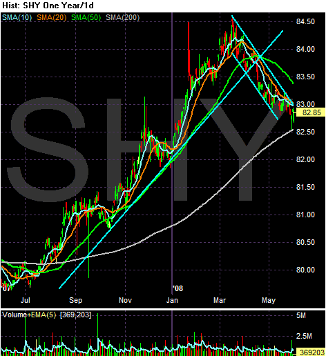
The short-end of the curve started to rally at the end of last summer. This was largely because Treasuries are seen as a safe investment. As the credit markets were melting down investors become worried about return of capital rather than return on capital. That's why they bid up the short end of the Treasury curve. But the credit markets have started to thaw a bit and people have started to move money back into the market which has dropped Treasury prices. Note the SHYs are approaching crucial support at the 200 day SMA.

Also regarding the SMAs, notice the following:

-- The shorter SMAs are below the longer SMAs

-- All the shorter SMAs are moving lower

-- Prices are below the SMAs, which will further lower the SMAs

These are bearish developments on the chart and indicate further declines.
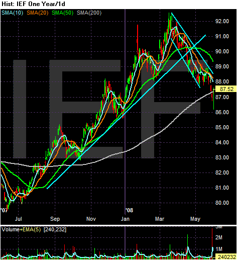


The mid-section of the Treasury curve rallied along with the short end of the curve at the end of last summer. Note the solid rally. There is a solid trend line and prices moved higher and then sold-off back to the trend line. But this section of the Treasury market has also sold off starting in early May, and has really had a downhill move as the markets have risen. This indicates money is simply moving from the Treasury market to the stock market. As with the SHYs, notice the market is right around the 200 day SMA, marking the line between bull and bear market.

-- The shorter SMAs are below the longer SMAs

-- All the shorter SMAs are moving lower

-- Prices are below the SMAs, which will further lower the SMAs

These are bearish developments on the chart and indicate further declines.
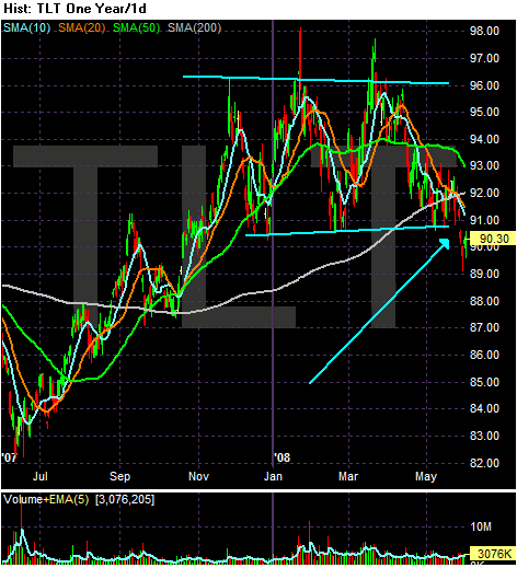


On the TLT's notice the long part of the Treasury market has been trading in a range since the end of last year. Also note it has recently broken through support of that trading range. Also note the following:

-- The 10 and 20 day SMA are both headed lower

-- The 10 and 20 day SMA just crossed below the 200 day SMA

-- The 50 day SMA just went negative

-- Prices are below the 200 day SMA (bear market territory)

-- Prices are below all the SMAs

The bottom line with all the chart is for further declines in the Treasury market.

Monday, June 2, 2008

Today's Markets

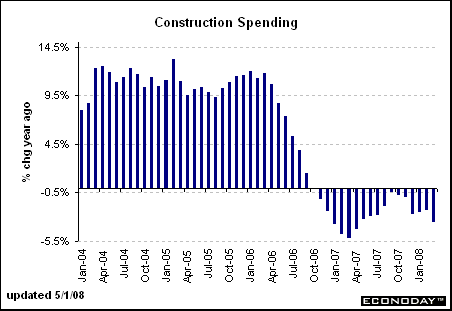
What a way to start the week. First, we learned the financials are not doing that well, with Wachovia and Washington Mutual both firing or limiting their respective executives powers. That reminded people that things are not that good in the financials. S&P cut their ratings on Lehman, Merrill and Morgan Stanley, stating, "The outlooks on the large financial institutions sector in the U.S. are now predominantly negative". And then we got this news about construction spending and manufacturing:

Dark clouds continue to hang over the economy: The manufacturing sector shrank for the fourth consecutive month, construction spending has been falling for more than two years, future orders are down and prices are skyrocketing.

The few bright spots, such as strong exports, may be the only things between us and a protracted recession, analysts said on Monday.


As a result, the markets tanked hard.


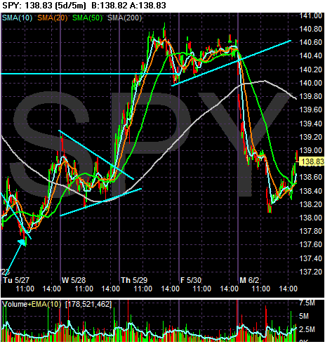
The SPYs dropped hard at the open, evened out and dropped again before rallying a bit. But the rally was pretty unimpressive considering the size of the morning hit the market took. Most likely it was bottom fishing going on. Also note the market wiped out a majority of the last five days trading gains.


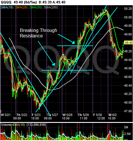
The QQQQs also broke trend a five day uptrend today, following a trading pattern similar to the SPYs.


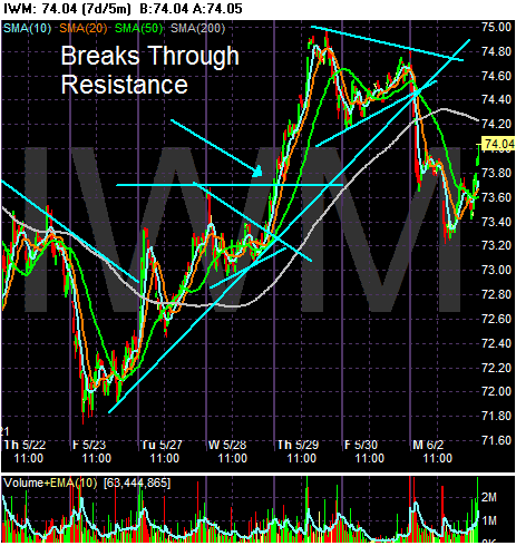
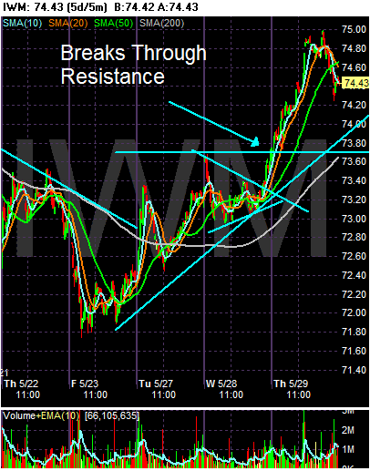
The IWMS have been rallying since a week before Friday. That rally is now gone with today's action.

Consumers Are Scrambling for Cash

From the WSJ:

As consumers max out their credit lines and banks clamp down on lending, many older and middle-class Americans are resorting to pricey, often-risky alternatives to stay afloat. Some are depleting their retirement accounts, tapping 401(k)s for both loans and hardship withdrawals. Some new fast-cash options allow homeowners to squeeze equity from their houses -- without the burden of monthly payments. One new product offers a one-time payment. In exchange, the company shares in as much as 50% of any future gain or loss in the property's value, typically collecting proceeds when the house is sold.

Americans are resorting to these more extreme measures due to the combination of dwindling jobs, falling home prices, shaky credit markets and a sharp run-up in food and energy prices. Consumer confidence hit a 28-year low in May, according to the latest Reuters/University of Michigan survey of consumer sentiment. Consumer spending and income inched up 0.2% in April from March, but after adjusting for inflation were flat, government data show.


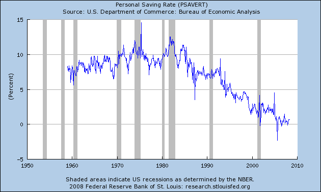
Let's back-up in time a bit. Here is a chart of the personal savings rate from the St. Louis Federal Reserve:


The official savings rate is essentially income less all possible expenses. The logic is people spend and then save. Notice that at the beginning of this expansion, people were already spending practically everything they made. That situation has only become worse.

At the same time, real median household income has dropped:


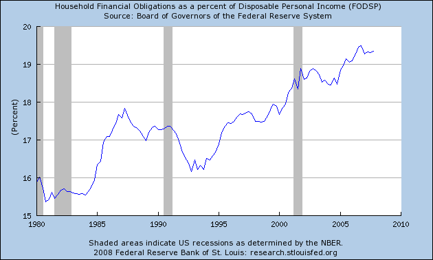
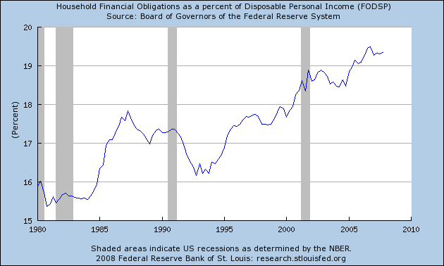
Over the course of this expansion consumers have been stretching their finances in a big way, thereby increasing the household financial obligations ratio.


Put those three conditions together and you already get a consumer that is strapped for cash.

Now we learn that consumers are stretching their already meager savings to maintain their already overstretched lifestyles. Simply put, that is not a good development at all.

Personal Incomes and Spending Slow


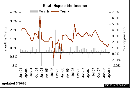
The good news from the report is the year over year number popped up. However, considering the overall trend for the last 9 months has been negative we'll need at least another month (or two) of data before we can say whether or not the trend has changed.


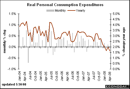
On he expenditure side, it looks as though the trend is down since the end of the summer with a bump up last month and a move lower this month. Considering the high price of gas and a slowing job market, that makes a bit more sense.

From Bloomberg:

``Consumers are spending cautiously,'' said Michael Moran, chief economist at Daiwa Securities America Inc. in New York, who correctly forecast the gain in spending. ``The economy is in a grey area between recession and slow growth.''


Regarding incomes, not the following points from the AP:

The Commerce Department reported Friday that consumer spending barely budged in April, rising a tiny 0.2 percent, and income growth was just as weak, increasing a similar 0.2 percent.

The growth in incomes, restrained by four straight months of job losses, would have been just 0.1 percent had it not been for the first wave of economic stimulus payments the government started sending out April 28.


The AP also noted the low position of consumer sentiment, which is probably restraining growth:

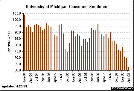
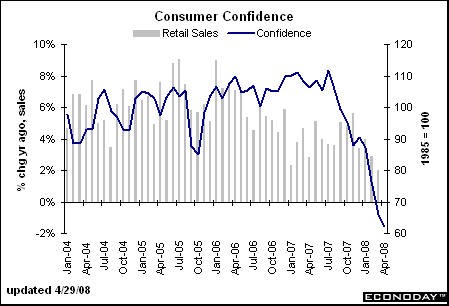
The Reuters/University of Michigan survey of consumer sentiment dropped for a fourth straight month in May, hitting a 28-year low of 59.8, down from a reading of 62.6 in April. The May level was the lowest since June 1980, when Jimmy Carter was in the White House and consumers were being battered by a recession and soaring gasoline prices.


I've posted these charts a few times, but it bears repeating: consumers are not happy:


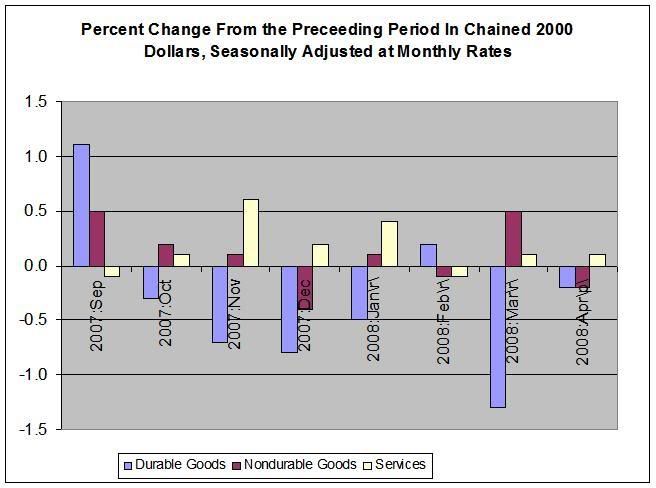
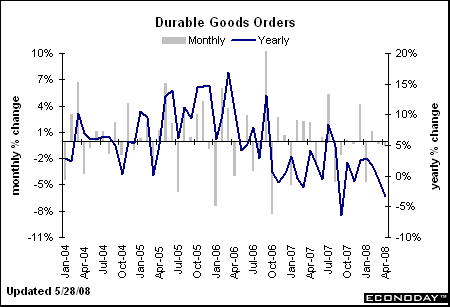
Here's an interesting chart, culled from the actual data.


Notice this is chained (inflation adjusted) numbers. Note that durable Goods orders have been down for the 6 of the last 8 months. Assuming that people buy more durable goods when they are confident about the future, this is not a good sign.

The bottom line is this news is not good considering 2/3 of the economy comes from consumer's spending.

Market Mondays

Let's take a look at the charts to see what they say.


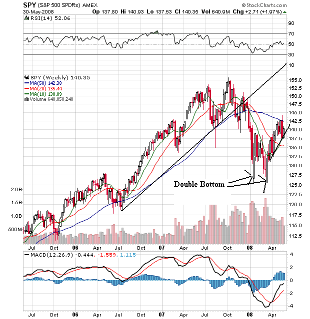
The SPYs started to rally at the end of 2006, and hit a point in 2006 that formed the basis of their long-term trend line. The market continued to rally until the market drop of last summer when all the news about the credit markets started to hit. The market dropped until the beginning of this year when it formed a double bottom. Since the Bear Stearns bail-put we've been rallying.


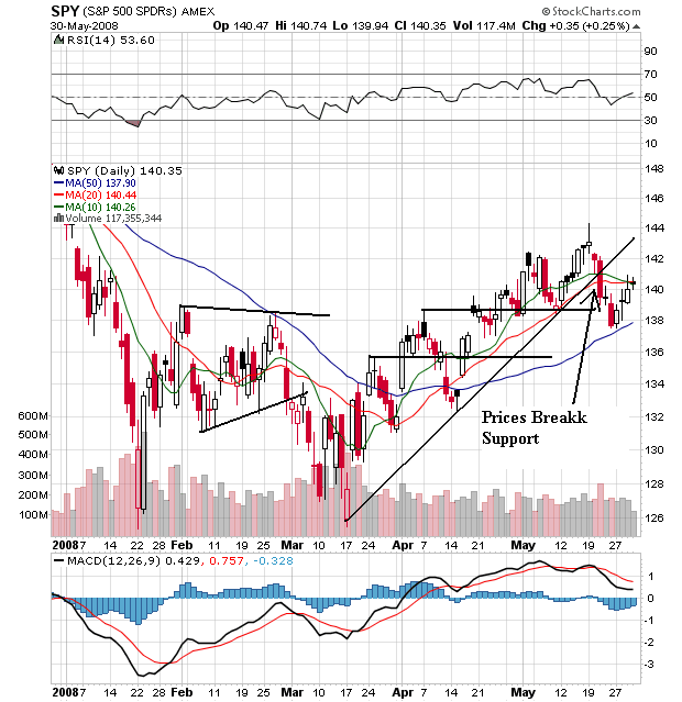
On the daily chart, notice the following:

-- Prices rallied from mid-March, but broke the trend line in mid-May.

-- The 10 day SMA is turning lower and is about to cross below the 20 day SMA

-- The 20 day SMA is now moving sideways.

-- Prices are now below the 10 and 20 day SMA


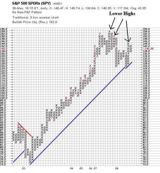
The main point of the SPYs P&F chart is the series of lower highs it has formed since the market top.


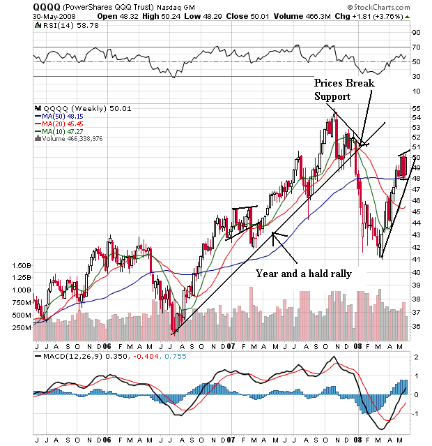
On the QQQQs weekly chart, notice that prices rallied from mid-2006 to the end of the summer in 2007. Then the market dropped until the end of the 1Q2008. The QQQQs have been rallying since then, although they have been consolidating for the last few weeks.


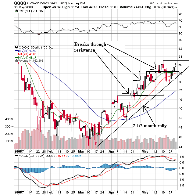
On the daily chart, notice that prices have been moving higher since mid-March, breaking through previous resistance. Also note the short-term SMAs are all moving higher and the shorter SMAs are above the longer SMAs. Also note the prices are above the SMAs.


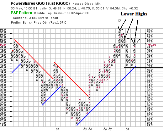
On the P&F chart notice these two points.

-- We've seen a period of lower highs, and

-- We've seen a strong rally over the last two months


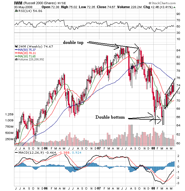
On the weekly chart of the IWMs, notice that prices rallied from the end of 2005 until the end of the summer of 2007, when they formed a double top. Prices formed a double bottom in 2008 and have been rallying since.


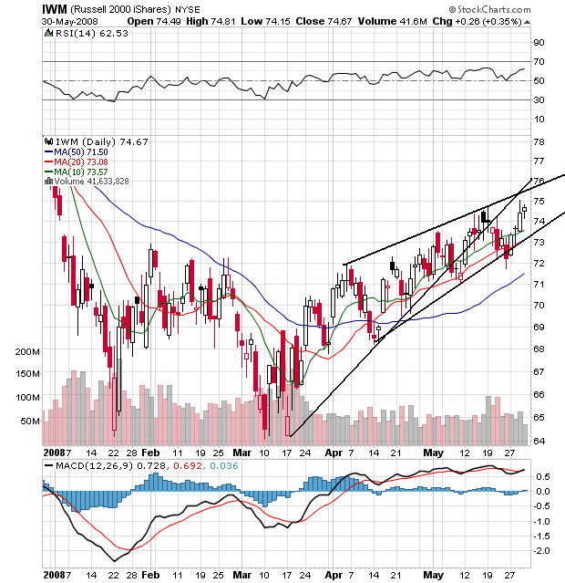
On the daily chart, notice that prices broke the rally that started in mid-March, but are still in an upward sloping trend. On the SMAs, notice they are all moving higher with the shorter above the longer and prices above all the SMAs.


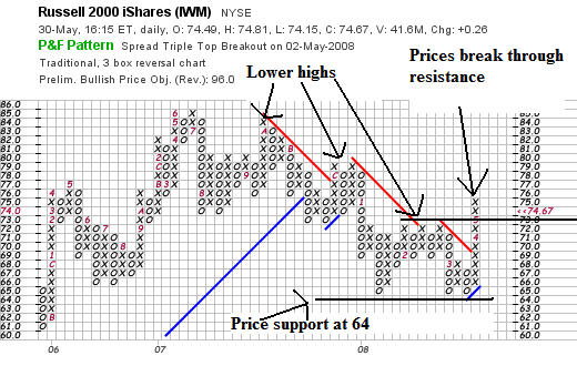
On the P&F chart, notice the series of lower highs until the recent rally.
So - let's sum up:

-- On the P&F charts all the charts have printed a series of lower highs. That's bearish. However, the IWMs breakout throws a bit of a wrench into that theory.

-- On the daily charts, the SPYs have broken their upward trendline, as have the IWMs (although the IWMS continue to move higher. In contrast, the QQQQs continue to have a bullish profile.

The market does not say big reversal, but it's also not saying big rally either. This appears to be a wait and see market.
Friday, May 30, 2008

Weekend Weimar and Beagle

Usually there is a picture here of Mr. and Mr$. Bonddad's dogs. But Bonddad is writing this from his Iphone because BD is current at his new house getting it ready for the "big move". So -- there aren't any pictures, just a statement that it's the weekend and it's time to think about anything aside from the markets.

See you on Monday

Quarterly Banking Profile Roundup

The FDIC has released its Quarterly Banking Profile. Here are the salient points.

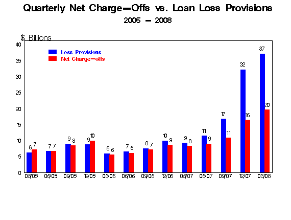
Deteriorating asset quality concentrated in real estate loan portfolios continued to take a toll on the earnings performance of many insured institutions in first quarter 2008. Higher loss provisions were the primary reason that industry earnings for the quarter totaled only $19.3 billion, compared to $35.6 billion a year earlier. FDIC-insured commercial banks and savings institutions set aside $37.1 billion in loan-loss provisions during the quarter, more than four times the $9.2 billion set aside in first quarter 2007. Provisions absorbed 24 percent of the industry's net operating revenue (net interest income plus total noninterest income) in the quarter, compared to only 6 percent in the first quarter of 2007. The average return on assets (ROA) was 0.59 percent, falling from 1.20 percent in first quarter 2007. The first quarter's ROA is the second-lowest since fourth quarter 1991. The downward trend in profitability was relatively broad: slightly more than half of all insured institutions (50.4 percent) reported year-over-year declines in quarterly earnings. However, the brunt of the earnings decline was borne by larger institutions. Almost two out of every three institutions with more than $10 billion in assets (62.4 percent) reported lower net income in the first quarter, and four large institutions accounted for more than half of the $16.3-billion decline in industry net income.


Let's break this down into smaller chunks of information.

Higher loss provisions were the primary reason that industry earnings for the quarter totaled only $19.3 billion, compared to $35.6 billion a year earlier


Earnings were cut nearly in half because of the increased loan loss provisions.

FDIC-insured commercial banks and savings institutions set aside $37.1 billion in loan-loss provisions during the quarter, more than four times the $9.2 billion set aside in first quarter 2007.


Banks set aside nearly 4 times the amount of money for losses on a year over year basis. That can only mean one thing -- credit quality is seriously deteriorating.

Provisions absorbed 24 percent of the industry's net operating revenue (net interest income plus total noninterest income) in the quarter, compared to only 6 percent in the first quarter of 2007.


Loan loss provisions are literally sucking the life out of the industry right now.

The average return on assets (ROA) was 0.59 percent, falling from 1.20 percent in first quarter 2007. he first quarter's ROA is the second-lowest since fourth quarter 1991


ROA has fallen in half over the last year.

And the problems mount:

Following restatements by banks, the FDIC revised the industry’s net income for the fourth quarter of last year from $5.8bn to $646m – the lowest since the end of 1990.

Meanwhile, the FDIC said the number of “problem” banks rose in the first quarter from 76 to 90, with combined assets of $26.3bn. Three US banks have failed this year, compared with three for the whole of last year and none in 2005 and 2006.

Ms Bair said she expected more bank failures but emphasised that the number of problem institutions remained well below the record levels of the savings and loan crisis of the 1980s and 1990s – when one in 10 banks were in that category.

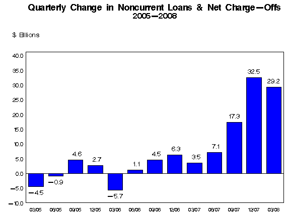
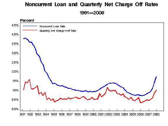
However, she said one worrying trend was the declining “coverage ratio”, which compares bank reserves with the level of loans that are 90 days past due. This ratio fell for the eighth consecutive quarter, to 89 cents in reserves for every $1 of noncurrent loans, the lowest level since the first quarter of 1993.


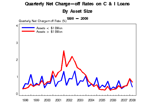
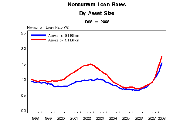
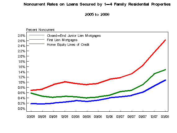
Here are some graphs from the FDIC report.


This report says one thing:

“While we may be past the worst of the turmoil in financial markets, we’re still in the early stages of the traditional credit crisis you typically see during an economic downturn,” she said, adding: “What we really need to focus on is the uncertainty surrounding the economy . . . and again it is all about housing.”
Forex Fridays

Let's take a look at the charts of the three biggies -- the dollar, the euro and the yen.


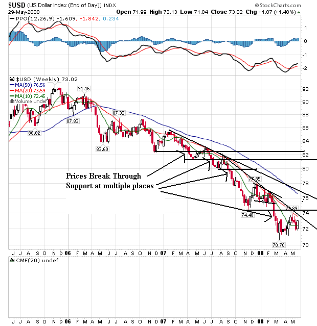
On the weekly dollar chart, notice that prices have been falling through support areas for the better part of two years. Also note the 20 and 50 week SMA are both heading lower, although the 10 day SMA is leveling out. Also note prices and the 10 day SMA are tangled up. But the 20 week SMA has privided strong upside resistance for the last year and a half.


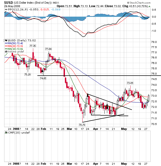
On the daily chart, notice the following:

-- Prices and the SMAs are bundled in a very tight range, indicating indecision.

-- The 50 week SMA is about to turn positive.

-- Prices have broken through all the SMAs and may be headed higher.


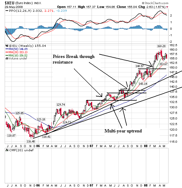
On the euro's weekly chart, notice it's the mirror image of the dollar chart. The euro has been rising for the better part of two years right now. Prices have continually broken through upside resistance to make new highs. Also notice the SMAs are all moving higher with the shorter SMAs above the longer. This is a bullish chart.


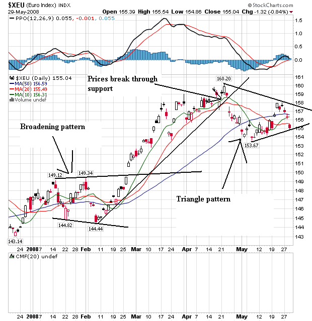
On the daily chart, notice the euro formed a broadened bottom from mid-January to the end of February, rallied until the end of April and has since been forming a triangle consolidation pattern. Also notice that prices and the SMAs are bunched together, indicating a lot of indecision on the part of traders regarding where to send the euro next.


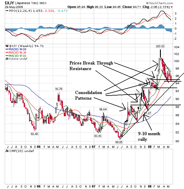
On the weekly yen chart, notice that prices have been sharply rising since the end of last summer. Prices moved through resistance on several occasions, but then fell back usually in pennant patterns. Note the 10 week SMAs has turned lower and is about to cross the 20 week SMA. Also note that prices are right below the 20 week SMA and recently fell through this important technical indicator.


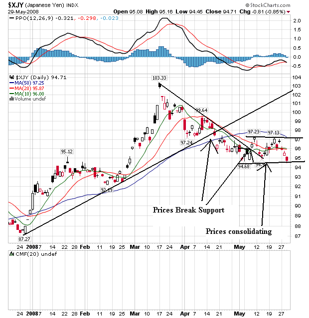
On the daily chart, notice that prices rallied from the beginning of the year until the beginning of April. Then prices fell until the beginning of May when they started to move sideways. Also notice that prices and the SMAs are bunched together right now, indicating a lack of direction.

Thursday, May 29, 2008

Today's Markets

Two big pieces of good news today. Oil dropped more than $4 (when was the last time I wrote that. In addition, the economy grew at a .9% clip in the first quarter, which was slightly higher than originally reported. But consumers only increased their spending at a 1% rate which is not that encouraging. The FDIC released the Quarterly Banking Profile, which was not that good.


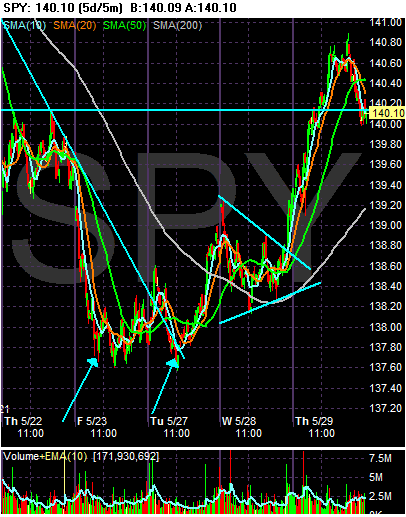
On the SPYs, notice the double bottom that formed on Friday and Tuesday. The market rose a touch from this formation, consolidated in a triangle pattern on Wednesday and then rallied hard today on the GDP and oil news. Also note the SPYs ended the session right at technical support levels.


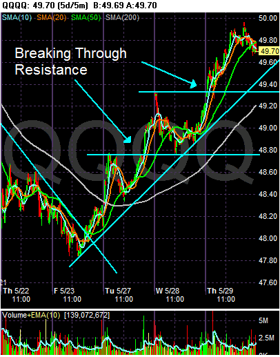
On the QQQQs, notice there is a much better chart in play. The market has been rising and then consolidating gains since Friday of last week.


The IWMs are more in the line of the SPYs, largely because of their triangle consolidation a few days ago.

It's the Debt, Stupid

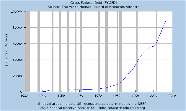
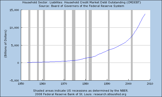
One of the first trends I noticed with the latest US expansion is the record amount of debt that was involved. Simply put -- this was a borrow and spend expansion like nobody's business. I'm not the only one who has noticed:

Is Kevin Phillips right that something funny is going on in the economy? Yes, although just how funny is less clear.

The numbers do suggest he's correct about one thing at least: public and private debt has indeed reached unprecedented levels.

Recently, we described Phillips' thesis, in his new book "Bad Money: Reckless
Finance, Failed Politics, and the Global Finance of American Capital" that the U.S. economy has been run by a Washington-Wall Street mercantilist alliance for the benefit of the finance sector. See column.

Phillips doesn't flat-out predict that the resulting distortions will result in a crash. He says it's too early to say. But he meaningfully quotes a number of authorities, such as Yale economist Robert Shiller, to the effect that it will.

Phillips relies heavily on charts, which we like.
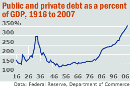
In this column, we look at one that is at the heart of his book: public and private debt as a fraction of Gross Domestic Product.

It looks like a barbell, with peak debt of 299% in 1933 falling to below 150% from the 1950-1980s, spiking again to a recent 353%. We've checked the numbers -- updating them to 2007 -- and he's right.


Let's look at a few charts to see what we're talking about.


Total federal debt is huge.

Consider the following numbers from the Bureau of Public Debt:

09/30/2007 $9,007,653,372,262.48
09/30/2006 $8,506,973,899,215.23
09/30/2005 $7,932,709,661,723.50
09/30/2004 $7,379,052,696,330.32
09/30/2003 $6,783,231,062,743.62
09/30/2002 $6,228,235,965,597.16
09/30/2001 $5,807,463,412,200.06
09/30/2000 $5,674,178,209,886.86

The current total is $9,393,275,739,477.56

The the government isn't the only one borrowing.


Total household debt is spiking, leading to


An increase in the household financial obligations ratio.

This has led to the following chart, which is from the original story above:


That can't be good.

Sorting Out All the Spin in Durable Goods

There are times when I could literally just scream at the incredible amount of political bullshit that goes on with economic numbers. It just boggles the mind and frustrates the analysis. So, instead of relying on the news media to inform us, we are now faced with the task of sorting through the noise. What fun indeed.

According to the Census Bureau:

New orders for manufactured durable goods in April decreased $1.0 billion or 0.5 percent to $214.4 billion, the U.S. Census Bureau announced today. This was the third decrease in four months and followed a 0.3 percent March decrease. Excluding transportation, new orders increased 2.5 percent. Excluding defense, new orders decreased 0.3 percent.


This is where the first issue comes in. Notice we have the "ex-transportation factor" to deal with. Transportation orders represent about 25% of the durable goods numbers. In addition, transportation orders are very volatile. For example, suppose Boeing gets an order for 25 planes in a particular month. That would spike the overall numbers really high. But that reading would be a bit unrealistic as well because who knows when Boeing would get another order. So -- we usually get the numbers with and without the transportation variable.

What everyone is thrilled about is the ex-transportation number of +2.5%. That made everyone thrilled. But buried in the news headline is this information:

The 4.2% increase in nondefense capital goods excluding aircraft followed three monthly declines in a row. Analysts pointed to export markets, a source of strength for the U.S. with domestic demand weakening.


Given that piece of information, it's just as likely that the increase was a one time event that occurred as overall orders were going down rather than up. At best, the most we can hope for with that piece of information is to wait until next month to see if the upward trend continues.

And then there is this:

Orders rose 4.2% for machinery, 2.8% for primary metals and a record 27.8% for electrical equipment. Orders fell 1.3% for fabricated metals and 1.5% for computers and electronics.

The concentration of strength in orders for electrical equipment prompted Goldman Sachs economists to express some caution "against ascribing too much significance to this report."


So -- the jump is from a few specific areas of the report, not an overall jump in all or a majority of orders. That should tell us something. Reuters adds the following to that number:

However, electrical equipment orders surged 27.8 percent, the steepest increase on record, which analysts attributed to strong overseas demand that has been driven by a weak U.S. dollar. Machinery and primary metals orders also rose.

"The strength of global demand has greatly dampened the extent of the slowdown in manufacturing production, and in the light of today's orders numbers, it will continue to do so," said Nigel Gault, chief U.S. economist at Global Insight.


So -- overseas orders are probably responsible. This has been a good story for the US economy over the last half-year or so -- the increase in exports.

So, let's put all of these facts together to see what we come up with.

Durable goods orders ex-transportation increased 2.5% last month. This was the only increase in this figure in the last four months. Increases in machinery, precious metals and electrical equipment were responsible for the increase in the ex-transportation numbers. The most likely reason for the increase is the long-term downward trend of the dollar which makes US exports cheaper overseas.
Some analysts cautioned not to read too much into this increase because of the small number of areas in the report that contributed to the increase.


In addition, let's look at the general business background to see if all of this excitement about one number is warranted:


First -- the year-over-year change in durable goods is negative.


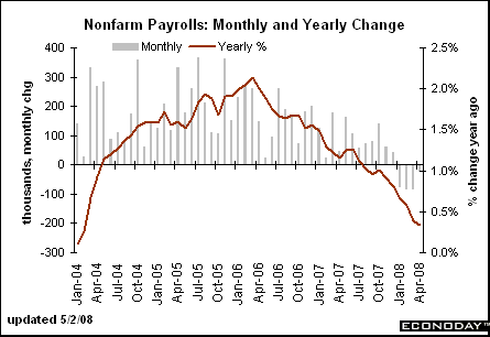
Companies are doing so well they are shedding workers, and


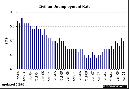
The unemployment rate is increasing


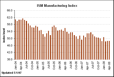
The ISM manufacturing number is below 50 and has been there a few months. This indicates we're in a contraction.


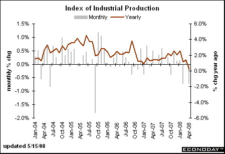
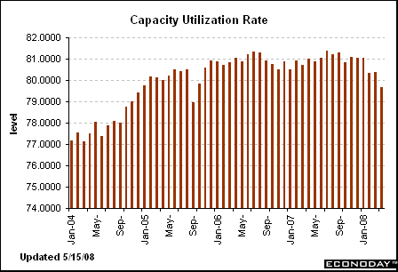
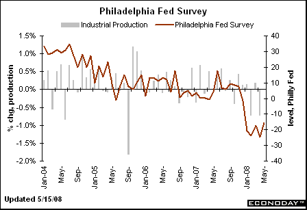
industrial production is dropping, as is


Capacity utilization


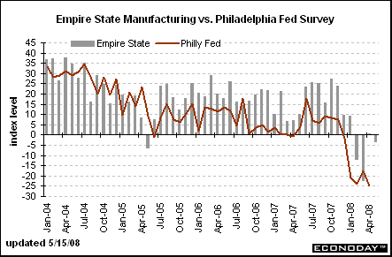
The Philly Fed is not doing as, and neither is the


Empire state survey


Construction spending is weak, as are


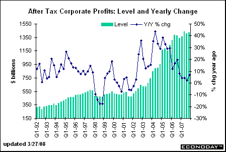
After tax corporate profits.

All of the above information says the number was a fluke and not the beginning of a trend. That could change. However, the great weight of the available evidence says no.