Tuesday, July 1, 2014

Ebay, Part 1: The Balance Sheet

    One of my favorite guilty pleasures is looking at guitars on EBAY.  I've never purchased an instrument on line (and probably never would).  But, this activity got me thinking about EBAY as a company and potential investment, which first led me to the stock's chart.  Shifting to a weekly time frame, we get this picture:


Ebay was trading between the upper 40s and upper 50s for most of last year.  Momentum has been declining and the CMF indicates volume is starting to flow out of the stock.  This is not an encouraging picture from a technical perspective.

     Then there is the relationship between EBAY and the SPYs:


The chart above shows EBAY/SPY.  The declining nature of this relationship indicates the SPYs are outperforming EBAY.  Clearly there is something about the company the market does not like, which led me to look at EBAYs' financials.

     In the following analysis, I downloaded a spreadsheet of Ebay's balance sheet, income statement and cash flow from Morningstar.com.  

     Let's start by looking at the company's balance sheet starting with the liquidity position and beginning with the composition of its cash:


Over the last five years, Ebay has changed the composition of its cash holdings, slowing increasing the percentage of investments relative to cash.  In 2009, the percentage of securities to cash was 19%.  This percentage increased to 50% in 2013.  The 10-K offers the following explanation of the firm's investment policy:

Short-term investments, which may include marketable equity securities, time deposits, certificates of deposit, government bonds and corporate debt securities with original maturities of greater than three months but less than one year when purchased, are classified as available-for-sale and are reported at fair value using the specific identification method. Unrealized gains and losses are excluded from earnings and reported as a component of other comprehensive income (loss), net of related estimated tax provisions or benefits.

Long-term investments may include marketable government bonds and corporate debt securities, time deposits, certificates of deposit and cost and equity method investments. Debt securities are classified as available-for-sale and are reported at fair value using the specific identification method. Unrealized gains and losses on our available-for-sale investments are excluded from earnings and reported as a component of other comprehensive income (loss), net of related estimated tax provisions or benefits.

Certain time deposits are classified as held to maturity and recorded at amortized cost. Our equity method investments are investments in privately held companies. Our consolidated results of operations include, as a component of interest and other, net, our share of the net income or loss of the equity method investments. Our share of investees' results of operations is not significant for any period presented. Our cost method investments consist of investments in privately held companies and are recorded at cost. Amounts received from our cost method investees were not material to any period presented.

We assess whether an other-than-temporary impairment loss on our investments has occurred due to declines in fair value or other market conditions. With respect to our debt securities, this assessment takes into account the severity and duration of the decline in value, our intent to sell the security, whether it is more likely than not that we will be required to sell the security before recovery of its amortized cost basis, and whether we expect to recover the entire amortized cost basis of the security (that is, whether a credit loss exists). We did not recognize an other-than-temporary impairment loss on our investments in 2013, 2012, or 2011.


The 10-k does not break down investment holdings, except to note they are short-term.

Next, let's turn to the company's liquidity ratios:


All of EBAYs' short term liquidity measures -- from the more liberal current ratio (assets/liabilities) to the more conservative cash ratio (cash/short term liabilities) -- are declining.  What's important about this decline is it can't be attributed to a shifting of assets from cash to investments.  If that were the case, we'd see a decline in the cash ratio but an increase in the quick ratio.  Instead, all are moving lower.

     However, this is not a fatal development.  In fact, it's by design.  The defensive interval ratio has never fallen below 1 in the last five years.


 In addition, the company has a large credit facility.  From their 10-K: We also have a $3.0 billion revolving credit facility, under which we maintain $2.0 billion of available borrowing capacity in order to repay commercial paper borrowings in the event we are unable to repay those borrowings from other sources when they come due. As of December 31, 2013, no borrowings or letters of credit were outstanding under this revolving credit facility and, accordingly, $1.0 billion of borrowing capacity was available for other purposes permitted by this credit facility.  

     The next issue to discuss is the growth of receivables, which is shown in this chart:


Receivables have increased as a percentage of assets from 37.69% in 2009 to 55.61% at the end of last year.  As a result, we've seen a decrease in cash from 58.44% to 38.76%.  Over the same period, Ebay has been increasing its payment business, which explains some of the increase.  However, the increase doesn't explain the entire growth, seen on the chart below in comparison to the growth in receivables.


In two years, receivables and payments grew at similar rates.  However, in 2011 and 2012 receivables growth far out-stripped the growth in payments.

     Another way to look at the growth in receivables is receivables as a percentage of various assets:


It's obvious that Ebay is expanding its revenue streams and is developing payment systems for this purpose.  However,  Ebay's core competency is online auctions.  In getting into the payments business, Ebay is become a de facto lender -- albeit to a large number of extremely small creditors.  Peter Lynch called this type of activity "de-worsification," which implies the company is expanding its business into a market segment that it knows little about.

     On the balance sheet, we also have the LTD/assets ratio, which is clearly under control:


     And finally, there is book value.  I use two methods of calculating this number: the straight assets-liabilities and a revised method in which I strip out all goodwill and assume receivables are sold at 75 cents on the dollar.  Both of these values have been increasing a solid rates for the last five years:


     Ebay's balance sheet is financially solid.  Over the last five years they have shifted a larger percentage of their cash assets into securities with the hopes of increasing their short-term yield.  Despite declining liquidity ratios, their defensive interval is still solid, indicating they have more than enough cash on hand.  Book value has been growing at a good clip and the LTD debt/assets ratio's highest level over the last 5 years is 11%.  The one area of concern is the growth in receivables, which could indicate the company is relaxing credit standards at the expense of prudent management.  It could also be a sign the company is moving away from its core competency of online auctions.


Monday, June 30, 2014

Australian Interest Rate Decision Preview

This is up over at XE.com.

http://community.xe.com/forum/xe-market-analysis/australian-decision-preview-no-change-inflationary-pressures-are-contained

There really is only 1 issue in 2016


 - by New Deal democrat

Who gets to make appointments to the Supreme Court from 2017 through 2020? There really is no other issue.

And no whining about stare decisis, if it is a Democrat.  Once again today the revanchist 5 indicated that a long-time precedent, this time from 1977, should not longer be treated as valid.  What goes around, comes around.

[regular economic blogging will resume shortly]

The state of the housing market, May 2014


 - by New Deal democrat

As I wrote last week in discussing existing home sales at XE.com, the housing market tends to cycle in a regular order:
  • 1st, interest rates turn
  • 2nd, permits, starts, and sales turn
  • 3rd, prices turn
  • 4th, inventory turns
Now that we are half the way through 2014, let's look at where each of those points in the cycle stands.

Interest rates

First, here is a graph, covering the last 30 years, of the YoY% mortgage rates (inverted so that higher rates give a lower value, blue) vs. housing permits, YoY change in 100,000's (red):


Interest rates on mortgages went up about 1.4% between May and July of last year.  On 16 of 19 occasions since the end of World War 2, that big a change led to a YoY decline of at least -100,000 in permits. In this case, housing permits have gone sideways, with small YoY% declines in several months, including May, since the beginning of this year.  

In May mortgage rates equalled their lowest in almost a year.  Since that appears to have had a big effect on housing activity in May, here is a close-up of the last five years of the YoY% change in permits (red, left scale) and rates for a 30 year mortgage (blue, right scale):


As you can see, these generally are mirror images of one another.

I suspect the situation this year is analogous to the late 1960's, when Boomers first reached adulthood and the existing aparment stock was nowhere near adequate to the task.  Multi-unit starts skyrocketed, despite higher interest rates, while single family homes languished. It was an era of generally rising interest rates, and any temporary decline was met with heightened housing activity.

Permits, starts, and sales

Second, here is a graph of the change, in thousands, YoY of starts (blue), permits (red), new home sales (green), and existing home sales (orange) (note that the St. Louis FRED does not track pending home sales):


Next, here is the YoY% change in the same four statistics:


Both of these graphs show the clear deceleration in the housing market through 2013 and through March 2014.  Whether the spike in starts and new home sales in April and May means the trend has bottomed, or whether these are payback for particularly bad winter season reports, remains to be seen.

This morning we got the final report, pending home sales, which surged by +6.1% in May compared with April, but was still down -5.2% YoY.

More specifically, through May 2014:
  • Permits are down -7% from their October 2013 high
  • Starts are down -9% from their November 2013 high
  • New home sales just blew past their previous June 2013 high
  • Existing home sales are down -5% from their July 2013 high
  • Pending home sales are down -7% from their June 2013 high
As I wrote last week, May new home sales were as big an outlier to the upside as March was originally reported to the downside.  March was subsequently revised about 10% higher.  So we should be mindful of revisions, and I think the best way to look at the number is to average March through May, which combined are only about 1% higher YoY.

Today's pending home sales report also adds unusually useful information.  In the late 1960s and 1970s, the era of rising interest rates, buyers would pick and choose when to buy, and would pounce whenever there was a meaningful, if short term, did in rates.  In May of this year, mortgage rates got as low as 4.12%, the lowest since June 2013 but for one week in October.  Since pending sales are based on contract signings, it is likely that buyers jumped in response to these low rates.

Further, just as in the late 1960's, when Boomers first entered the market, now it is Millennials. Now as then, it is only multi-unit (apartment) construction that is carrying the recovery in housing this year. Single family home starts and sales have completely stalled.  Here is a graph of single family permits (blue) compared with 5 unit or higher permits (red) since January 2013:


It is easy to see that it is multiunit construction, especially beginning in the second half of 2013, that is entirely responsible for any continuing increase in residential construction. Single family home construction and sales have gone essentially nowhere since the beginning of 2013.

Prices

Prices continue to increase, but YoY the price gains are decelerating, and in the case of existing home sales the non-seasonally adjusted data shows May 2014 prices below June and July 2013 prices.  So let's start by showing the YoY% change in median prices in the Case Shiller 20 city index:


The YoY% change in median prices for new homes (red) and existing homes (blue): shows the same deceleration:


Finally, it is worth noting that the same deceleration is also showing up in the data at Depatment of Numbers Housing Tracker. I used this database of asking prices, which is updated weekly, to call in real time both the top of the housing boom in 2006, and the bottom of the housing bust in 2012.  What is particularly noteworthy is that in 2006, it was the asking prices for houses in the 75th percentile (more expensive homes) which turned first.  Now prices for those same more expensive houses are showing the most deceleration of all, as shown in this table, which shows the YoY% change for each percentile of houses for sale nationwide:

Month

25th
percentile
50th
percentile
75th
percentile
Jun 2013
6.3
7.4
7.5
Sep 2013
12.0
10.9
7.9
Dec 2013
13.3
11.2
7.8
Mar 2014
13.8
10.7
6.3
Jun 2014
14.3
10.9
5.9

Inventory

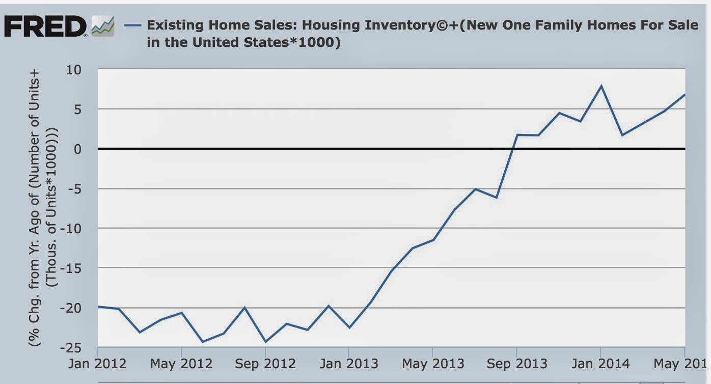
With housing prices still increasing, albeit at a reduced rate, we would expect to find more inventory entering the market, as potential sellers hope to take advantage of the improved pricing situation.  And that's exactly what we find. Below is the graph of combined new and existing home inventories:


The inventory of houses for sale is not just increasing, but it is increasing at an accelerating rate YoY.


In summary, examining interest rates, sales, prices, and inventory in order:
  • With interest rates turning slightly lower YoY, there will probably be renewed vigor in housing permits, starts, and sales by the end of this year.  We have either already seen the interim bottom in permits, starts, and sales, or will shortly.
  • Decelerating and/or YoY declining sales have existed long enough for prices gains to decelerate, although they haven't turned negative.  The median price for existing home sales, however, may turn negative in the next 2 months.
  • Although prices are decelerating, they are still higher YoY and thus inventory is continuing to pour onto the market.  This will probably continue, but will begin to decelerate between now and the end of this year.
Interest rates have turned, sales are bottoming, prices are increasing at a quickly decelerating rate, and inventory is still increasing smartly.  As per the normal order.


Sunday, June 29, 2014

A thought for Sunday: towards a leading index for wage growth


 - by New Deal democrat

A nerd's work is never done.  I owe XE.com a column on margin debt from 3 months ago.  I owe Angry Bear a column on 401(k)'s that is still in its first draft stage.  I haven't finished comparing low vs. high wage job historical recoveries to see if this expansion has been different in quality, or just severity, in terms of the distribution of jobs creatted.  As I've mentioned before, if you knew how little time I really have after regular obligations, you'd be surprised I am able to post at all.  Despite that, I am going to add on a new challenge.

The two most important economic issues to average Americans are jobs and wages.

A lot of work has been done as to leading indicators for jobs.  For example, the Conference Board has an Employment Trends Index which it calculates from public data sources, and leads the jobs report by about 6 months (It's still rising, by the way).  Back in 2009, I wrote extensively about other economic indicators which telegraphed subsequent jobs growth (in particular real retail sales and the ISM manufacturing index), and used them to predict that jobs would hit bottom at the end of that year.  Depending on which data revision is current, I was either spot on or off by two months.  Since job are one of the four big coincident indicators, the Index of Leading Indicators itself is a decent first approximation of what will happen with job growth in the near future.

But almost no publicly available research appears to have been done to determine reliable leading indicators for nominal or real wage growth.  Most of the discussions about wages tend to be negative, as in, "when will wage growth require the Fed to raise interest rates?"  Even the one allegedly leading index I found, the "Bllomberg BNA wage trend indicator" (blue in the graph below), actually lags wage growth (red):


Secularly wages have been stagnant for almost 15 years.  In fact, wages now are below wages in the 1970s in real terms.  Cyclically real wages actually rose during the Great Recession due to the temporary collapse in gas prices.  With the rise in gas prices, real wages fell into 2012, and with the general sideways movement in gas prices since, real wages have very slowly risen.

It would be valuable to be able to confidently forecast the direction of real wages over the next 6 to 12 months.  Along with jobs, it is the big concern of most average Americans.  I've done some preliminary work, and found a few surprising correlations, enough to be able to at least make a back of the envelope forecast.  As time permits, I hope to lay this all out for you in the next month or so, and do a lot more research during the rest of this year to refine an approach towards establishing a leading index for wage growth.


Saturday, June 28, 2014

International Week in Review: The US' Big Whiff Edition

This is up over at XE.com

http://community.xe.com/forum/xe-market-analysis/international-week-review-us-big-1q-whiff-edition

Weekly Indictors for June 23 - 27 at XE.com


 - by New Deal democrat

My Weekly Indicators column is up at XE.com.

As I point out there, my summary reads like a broken record, but if so it is a good broken record!

Friday, June 27, 2014

Mid-cycle consumer spending shift continues


 - by New Deal democrat

Early in economic expansions, YoY real retail sales growth far outstrips YoY PCE growth. As the economy wanes into contraction, YoY real retail sales grow less and ultimately contract more than YoY.   Retail sales minus PCE's are always negative BEFORE the economy ever tips into recession. That's 11 of 11 times. Further, in 10 of those 11 times (1957 being the noteworthy exception), the number was not just negative, but was continuing to decline for a significant period before we tipped into recession. This makes perfect sense, as retail sales generally include many far more discretionary purchases. As the economy accelerates, consumers make more discretionary purchases. As it slows, the more discretionary retail purchases are the first things cut.

Here's the update based on yesterday's personal spending report:


It appears that the mid-expansion transition is taking place this year, similarly to 2005 in the last expansion.

Thursday, June 26, 2014

John Hinderaker and Steve Hayword -- Please Stop Commenting On the Economy. Really.

John -- this is getting embarrassing for you.  Yesterday, you tried to offer a commentary on the 1Q GDP numbers, arguing policy was the reason.  You went so far as to note Canada's GDP grew while ours shrank despite the same weather conditions (gee -- where on earth did you get the idea to use Canada as a comparison?). 

However, once again, your analysis was, well, wrong.  Todays' Financial Times notes that weather and health care spending were the big culprits for the slowdown. 

Bloomberg (which is used by everybody in the financial world) noted:

The first-quarter slump is “not really reflective of fundamentals,” said Sam Coffin, an economist at UBS Securities LLC in New York and the best forecaster of GDP in the last two years, according to data compiled by Bloomberg. “For the second quarter, we’ll see some weather rebound and a return to more normal activity after that long winter.”

...

The weather earlier this year also hampered production at factories, which had trouble obtaining materials in time. Since then, assembly lines have become busier.


There is also the fact that inventory builds subtracted 1.7% from the GDP number as well.  This number is a big statistical outlier in that specific data series, meaning we're again looking at a one off. 


This analysis is being offered by, well, everyone in the economics commentary field -- except you.  As usual, your analysis is the outlier.

Really, John, don't you think it's time to just call it a day and stop writing about economics?

And not to be outdone, we have Steve Hayward with this quote from an AEI economist:

The Fed has uttered not a word about the very weak GDP numbers and their implications for its rosy prediction of 3% growth. Nor has it said anything about possible changes in Fed policy aimed at sustaining growth. The Fed Chairman, Janet Yellen, chose instead to look ahead to a growth rebound based on stronger growth of consumption and investment. The Fed’s only policy option, if it can be called that, is to talk about further delaying the first rate increase in interest rates that it mandates. Markets have set that date at about mid-2015. No doubt it will slip further to early 2016 given the weakness of the US economy.

Really?  You might want to look on the Federal Reserve website where we have this from May 7

The economy has continued to recover from the steep recession of 2008 and 2009. Real gross domestic product (GDP) growth stepped up to an average annual rate of about 3-1/4 percent over the second half of last year, a faster pace than in the first half and during the preceding two years. Although real GDP growth is currently estimated to have paused in the first quarter of this year, I see that pause as mostly reflecting transitory factors, including the effects of the unusually cold and snowy winter weather. With the harsh winter behind us, many recent indicators suggest that a rebound in spending and production is already under way, putting the overall economy on track for solid growth in the current quarter. One cautionary note, though, is that readings on housing activity--a sector that has been recovering since 2011--have remained disappointing so far this year and will bear watching.

While the AEI guy may be stating the Fed should make an "emergency announcement" about the report, it's important to note the Fed just doesn't do that, barring say a financial crisis like the Lehman bailout.  There is a very high possibility that such a statement would spook the markets further rather than providing any kind of balm.

In addition, the Fed has lowered their growth projections for the rest of the year, largely in response to the 1Q report.

Steve -- again, and like John, you're embarrassing yourself.  You really should stick with politics.


Wednesday, June 25, 2014

Two notes about Q1 GDP


 - by New Deal democrat


As an initial matter, as Business Week pointed out:
The big surprise in the first quarter was the dip in health-care spending. The U.S. spent $6.4 billion less on health care in the first quarter than in the last quarter of 2013. Government statisticians initially forecast a 9.9 percent increase in health-care spending—and what we got was a 1.4 percent decline. Considering all the millions of previously uninsured people who are gaining access to health insurance under the Affordable Care Act, how can they be shrinking so dramatically?

Health-care costs overall have been increasing more slowly in recent years compared with the pace before the 2007-09 recession. ....

[T]he Bureau of Economic Analysis ... [, t]o estimate the effect of Obamacare in the first quarter,... initially relied on trends in Medicaid spending, because it could not directly capture spending by people newly enrolled in private insurance.
In recent years, 15% of the entire US GDP has been spending on health care.  Reining in that spending has been something of a Holy Grail, and the Affordable Care Act a/k/a ObamaCare. was supposed to at least partially achieve that.  Since this was the first quarter that its effect had to be measured for GDP purposes, we are in terra incognita, and so was the BEA as indicated in the above quote.

So a deceleration or outright decline in health care costs is we have been trying to achieve, and over the long term that will have a negative effect on GDP.  That  being said, that money should show up as savings or spending elsewhere. 

The bottom line is, the big decline in health care spending may actually be a net good, at least over the longer term, but only  somebody with deep-in-the-reeds knowledge of health care spending is going to be able to figure that out.

-------
But to my main point, one of the things I used to point out in late 2009 and 2010 was that YoY measures miss turning points. By the time a series is up/down YoY, the turning point could have been 3, 6, or 9 months ago.

For example, even after today's Q1 GDP revision, YoY GDP is still up 1.9%.

I mention this because most of my "Weekly Indicators" are tracked YoY.  There's no choice, because most have seasonality and aren't adjusted for that. So I always am on the lookout for substantial acceleration/deceleration.

At the worst point of Q1 in February, a number of the indicators were actually negative YoY.  Since mid-March, not only have they returned to being positive YoY, but some have had the best readings in about 3 or 4 years.  Below I am showing the negative reading from my "Big Chill""Weekly Indicators" column at the epicenter of the weakness in February, and comparing that with the readings last week (in parentheses):

Consumer spending
  • ICSC +0.3% w/w.  UNCHANGED YoY (+3.1%)
  • Gallup daily consumer spending 14 day average at $77 down -$3 YoY (-$6, but hit a 6 year high about 4 weeks ago)
Steel production from the American Iron and Steel Institute
  • -1.9% YoY  (+1.4%)
Transport
 Railroad transport from the AAR 
  • -4,100 carloads down -1.5% YoY (+2.2%)
  • -1,500 carloads down -0.9% ex-coal (+7.6%)
  • -2,000 or -0.8% intermodal units (+6.3%)
  • -6,200 or -1.2% YoY total loads (+6.1%)
Shipping transport
Housing metrics
Mortgage applications from the Mortgage Bankers Association:
  • YoY purchase applications down -17% (-15%)
Real estate loans, from the FRB H8 report:
  • -1.0% YoY (+0.9%)
Oil and Gas:
  • Usage 4 week average YoY down -1.6%  (+2.9%)
JoC ECRI Commodity prices
  • -0.48 YoY (+6.04)
Mortgage applications still stink, but virtually every other metric has completely turned around

Now here is a thought experiment:  what if Q2 YoY GDP reflects that same trend?  Here's a list of real GPP, in $trillions, beginning in Q1 2013, with the q/q change in parentheses after:

Q1 2013  $15.58 
Q2 2013  $15.68 
Q3 2013  $15.84 
Q4 2013  $15.94 
Q1 2013  $15.82

If Q2 is up only 2% YoY from Q2 2013, that will be $15.99, a +1.1% increase from today's Q1 number, or +4.4% q/q annualized.  If it were to return to the increasing trend line of +1.33% quarterly real growth from the prior 3 quarters of 2013 it had before Q1 2014, that would be $16.31, a +3.1% increase, or +12% q/q annualized!!! (not gonna happen, but worth pointing out).

By no means do I claim any expertise in calculating GDP, but if the strong YoY readings I have seen in the last couple of months in my weekly column show up in Q2 GDP, then I wonder if a +4% or even +5% Q2 GDP is in the cards.


Yes, the 1Q GDP Number Was an Anomaly

This is over at XE.com

http://community.xe.com/forum/xe-market-analysis/yes-first-quarter-gdp-figure-was-anomaly

Is Target's Yield At 3.6% Worth The Risk?

One of the nice things about dividends is they provide a cushion for annual returns; if a stock is yielding 3.6% then we only need to see a 5% gain in a security to a decent annual gain.  And, when the company paying the dividend is one of the largest US retailers, taking a deeper look makes sense.

The retail environment has been extremely difficult for US retailers since the end of the recession.  Let's start by looking at a chart of real personal consumption expenditures:


Above is a chart of the year over year percentage change in real PCEs.  In most of the previous expansions, we see the number fluctuating a bit below the 5% line.  However, since the end of the last recession, we've seen that number halved to about 2.5%.  This lower level of demand has impacted the results of all retailers, making them attractive shorts:

Among the 62 retail stocks within his team's coverage, 14 stocks had short interest of 15% or greater, which is the highest number of companies above the 15% threshold in the post-recession period. Of the 14 stocks with high short interest, those that have been shorted the longest have seen the largest stock price declines.

Target is the third largest discount retailer by market cap, coming in behind Walmart and Costco.  When looking at a retailer, the first statement I look at is the cash flow statement to see two things: are they generating cash and is it sufficient to cover annual investments?  The average of Target's investment activities for the last three years is $2.9 billion while the median number is $3.2 billion.  The lowest amount of cash flow from operations we've seen over the last five years is $5.2 billion, so they've generating more than enough cash from operations.  In fact, the lowest margin they've had of operating minus investing funds over the last 5 years is $1.2 billion.  This margin gives them a greater degree of flexibility with their funding structure, allowing them to use multiple financing options depending on cost and availability. 

The growth in their income statement margins is less than impressive:


We see a slow pace of overall revenue growth for fiscal years 2011-2013.  According to Reuter's, Target's pace of growth is far below that of its industry (which has a 10.8% growth rate over the last five years).  Given Target's size (I don't expect one of the largest retailers to grow at that pace) , I don't think slow growth rate is fatal, but more an indication of its position as one of the biggest retailers in the country.

Also note that operating and net margins are under pressure.  Retailing is by definition a low margin business, with the industry's average net margin coming in at 4.44%.  However, we would expect a large retailer to have a bit more control over its margin, given its ability to pressure venders etc.. 

The obvious culprit of the disastrous results last year is the data breach which occurred in the 4Q.   The company's latest 10-K offers the following on that issue:

As previously disclosed, we experienced a data breach in which an intruder stole certain payment card and other guest information from our network (the Data Breach). Based on our investigation to date, we believe that the intruder accessed and stole payment card data from approximately 40 million credit and debit card accounts of guests who shopped at our U.S. stores between November 27 and December 15, 2013, through malware installed on our point-of-sale system in our U.S. stores. On December 15, we removed the malware from virtually all registers in our U.S. stores. Payment card data used in transactions made by 56 additional guests in the period between December 16 and December 17 was stolen prior to our disabling malware on one additional register that was disconnected from our system when we completed the initial malware removal on December 15. In addition, the intruder stole certain guest information, including names, mailing addresses, phone numbers or email addresses, for up to 70 million individuals. Our investigation of the matter is ongoing, and we are supporting law enforcement efforts to identify the responsible parties.

Expenses Incurred and Amounts Accrued 

In the fourth quarter of 2013, we recorded $61 million of pretax Data Breach-related expenses, and expected insurance proceeds of $44 million, for net expenses of $17 million ($11 million after tax), or $0.02 per diluted share. These expenses were included in our Consolidated Statements of Operations as Selling, General and Administrative Expenses (SG&A), but were not part of our segment results. Expenses include costs to investigate the Data Breach, provide credit-monitoring services to our guests, increase staffing in our call centers, and procure legal and other professional services.

In addition to the costs, there is the potential for protracted litigation related to the breach.

But Target's issues run deeper.  A Recent story on the ouster of their CEO offers a good, in-depth report of the problems, highlighting a big change in corporate culture under the new CEO that de-fanged the company's internal drive for innovation.  And their attempt to expand into Canada has not gone as well as it should have, creating more headaches and problems.

However, despite the rather negative view of their income statement margins in the above chart, Target generated $72.2 billion in revenue in 2013, which was a little more than 1% below their 2012 gross number.  And as they're a big box retailer, they're not going away anytime soon.  Yes, annual sales totals may drop further, but they're not going to go crashing through the floor.  And, the lowest EDITA they're printed in the last 5 years is $6.4 billion with the largest annual interest expense being $1.2 trillion.  This means the dividend payment (which was a little over $1 billion in their most recent year) is safe.


The weekly chart shows a security that has declined about 17% from its high of 71.4.  By most valuation measures (price to sales, price to book etc..) the company is undervalued.  At this level, with a dividend far above that of its industry, this look like a decent level for a dividend play.  But, assume you'll hear more bad news about internal management and the cyber-issue going forward.  In other words, treat this like an income play with a turnaround component. 


On Q1 GDP: bookmark the Doomer shreiking and wailing


 - by New Deal democrat

When the final revision of  1st quarter GDP is released this  morning, it's gonna stink.   Just like it looked like it was gonna stink back in February when I wrote in a Weekly Indicator column that the contemporaneous data looked like that during a recession.

There will be full-throated excited shreiking and wailing, because they just know that it means we are DOOOOOMED!!!

Bookmark their steamy lamentations, because when 2nd quarter GDP is announced one month from now, there'll be crickets.

Tuesday, June 24, 2014

What's behind the blowout in new home sales?


 - by New Deal democrat

I have a new post up at XE.com looking at this morning's positive blowout of new home sales.

I think the best way to look at this number is to average it with March and April.  It's a volatile number, and probably had a lot to do with the 10 month lows in mortgage rates last month.

Doomer Discovers Infrastructure Spending

Wow.  I'm amazed.  A doomer has discovered the US hasn't done much infrastructure spending since the end of the great recession.

Sometimes a stopped watch is right.

Of course, we've been talking about this for over four years now.  See here and here and here and here and here and here and here.

But -- we're corporate shills, paid by the man.  They're pure as the driven snow.

Yet Another Doomer Fail

Just a quick note (picking up NDD's slack).

On Sunday we were told over at the great Orange Satan, "Which means the housing market rally has literally topped out and won't be coming back any time this year. I seriously doubt that the economic forecasts have accounted for that."

Today we learned, "This is the highest sales rate since May 2008.  Even with the increase in sales over the previous two years, new home sales are still just above the bottom for previous recessions...
This was well above expectations of 441,000 sales in May, and sales were up 16.9% year-over-year."
Now, there are issues with the housing market.  Affordability is becoming a problem in some areas (San Francisco comes to mind) and with the lack of meaningful income growth, some people are getting priced out of the market, which will lower demand.  And interest rates are becoming an issue.
However, doomers have one perspective: "WE'RE GOING TO DIE!!!!!!!!!!"  Unfortunately, economic analysis requires an understanding of nuance, which is clearly lacking on their part. 

--------

NDD here:  Well, ummm, in fairness, I don't have a big problem with that diary, insofar as I forecast a  housing slowdown since late last year, and the most popular piece I've ever had picked up at Business Insider was when I wrote that the cutoff in extended unemployment benefits would have a nasty impact on the economy, particularly in the first quarter.

That writer also believes that 2Q 2014 GDP is likely to be negative, but if you follow my Weekly Indicators column, you won't be surprised that my opinion is, if 2Q GDP comes in negative, that means Hell has officially Frozen Over. No bleeping way.

P.S.  I'll have a post up later today discussing today's new home sales number.  It'll be nuanced ....


Japan's Employment Situation Is On Solid Ground

This is over at XE.com

http://community.xe.com/forum/xe-market-analysis/japans-employment-and-wage-situation-solid-ground

Monday, June 23, 2014

The housing cycle: how today's existing home sales, prices, and inventory fit


 -by New Deal democrat

I have a new post up at XE.com looking at today's existing home sales report.

There is a cycle to housing sales, prices, and inventories, with interest rates taking the lead.

Today's report enables me to show you and overall view of the order in which these metrics rise and fall.  At this point I think we can make a pretty decent forecast about what the rest of the year holds for the hsouing market.

UK Market Breaking Through Resistance

Since the first of the year, the UK economy has been the best performing of the group of 7 economies.  Growth is strong, inflation is falling and the BOE has even begun to hint it will raise interest rates sooner then anticipated. 


As the weekly UK chart shows, the latest price candle has moved through short-term resistance.  The underlying structure of the chart is still very bullish: all EMAs are moving higher, the shorter EMAs are above the longer EMAs, prices are above the EMAs and prices are using EMAs for technical support.  Also note the solid give and take between buyers and sellers for the during of this chart; advances are met with sell-offs, leading to a nice chart of generally higher lows and higher highs.


Prices moved more of less sideways for most of May, consolidating recent gains.  This allowed the MACD to drop, creating more technical room on this indicator for a price advance.  The MACD has also recently given a buy signal in conjunction with prices moving through short-term resistance.

Sunday, June 22, 2014

Greg Mankiw: as duteous to the vices of plutocracy as badness would require


 - by New Deal democrat

There is a drastic moral difference between those who write garbage analysis because they are mistaken, and those who write garbage analysis that is loathesome.  Greg Mankiw embarrasses Harvard with an "analysis" of inherited wealth that not only showcases the execrable insistence of many economists to utterly dismiss historical evidence, and utterly dismiss evidence of actual human behavior from the other social sciences, but also is so facile that it fatally fails even by its own logic.

Vile and illocigal.  What's not to like?

Here's Mankiw's premise:
So what? What’s wrong with inherited wealth? From a policy perspective, ... one might worry that inherited wealth makes things worse. Yet standard economic analysis suggests otherwise.
Mankiw starts with the truism that people love their children, but then blithely asserts, with not a scintilla of evidence, that
each person’s utility depends not only on what happens during his own lifetime but also on the circumstances he expects for his infinite stream of descendants, most of whom he will never meet.
Right now we  already have a big problem for Mankiw's analysis.  DNA studies have suggested that after 1000 years, all Europeans are related to one another. All are descended from Charlemagne.

So, if ultimately everybody is your descendant, and if inherited wealth gives people a leg up on consumption, wouldn't you make sure that everybody alive today inherited from you, the better to ensure that there was the maximum economic growth over the next 1000 years?  That way, by the time everybody is your descendant, they will have the biggest economic pie possible to consume.

By the way, Mankiw's argument certainly means that the wealthy will be using all their economic muscle to prevent global warming from visiting catastrophe on humanity, a/k/a their descendants 100's and 1000 years from now.  Oh, wait, they're not.

Apparently "intergeneration altruism" doesn't go out infinitely like Mankiw reasons.  But there I go bringing empirical social science into the discussion.  Macho macroeconomists like Mankiw don't need no stinkin' empirical facts.

In addition to "Intergenerational altruism,"
.... According to a recent study, if your income is at the 98th percentile of the income distribution ... the best guess is that your children, when they are adults, ... will enjoy higher income than average, but much closer to that of the typical earner. ....
Thus,
Because of regression toward the mean, they expect their descendants to be less financially successful than they are. Hence, to smooth consumption across generations, they need to save some of their income so future generations can consume out of inherited wealth.

The poor, on the other hand, don't leave inheritances because they are broke, they consume all of their bread crumbs now because they know their descendants will be able to eat cake:
[Contrarily, regression to the means means that for the bottom half of the income distribution, t]heir descendants will very likely rank higher than they do. Even those near the middle can expect their children and grandchildren to earn higher incomes as technological progress pushes productivity and incomes higher. Only for those with top incomes does the combination of intergenerational altruism, consumption smoothing and regression toward the mean lead to a significant role for inherited wealth.
Notice that intergenerational altruism has disappeared from the analysis of why the poor don't leave inheritances, and both intergenerational altruism and regression toward the mean have disappeared from the analysis of middle class bequests. Mankiw's argument is ultimately that of "intergenerational consumption smoothing uber alles.

Which is really interesting, because the reason Mankiw gives for the desirability of such intergenerational smoothing is
People ... exhibit “diminishing marginal utility”: The more you are already consuming, the less benefit you get from the next increase in consumption. Your utility increases if you move from a one- to a two-bathroom home. It rises less if you move from a four- to a five-bathroom home.
STOP RIGHT THERE.   What Mankiw saying is that the further you go down the income scale, the greater the increased good from each dollar. (So much for not being able to do interpersonal comparisons of utility.)  Right here we have a fatal problem for Mankiw's argument.  If a dollar increases more happiness the further you go down the income scale -- which is plainly Mankiw's assertion in the above quote -- then utility is maximized by ensuring that estates are distributed to the poorest in society, not by ensuring as much as possible the wealth of the descendants of the rich.

Of course Mankiw doesn't really mean that.  Every economist worth their salt will tell you that you can't compare the subjective happiness among two or more people.  Well, whatever you need to do to arrive at the predetermined result, which is:
When a family saves for future generations, it provides resources to finance capital investments .... 
Because ... increased capital raises labor productivity, workers enjoy higher wages. In other words, by saving rather than spending, those who leave an estate to their heirs induce an unintended redistribution of income from other owners of capital toward workers. ... Those of us not lucky enough to be born into one of these families benefit as well, as their accumulation of capital raises our productivity, wages and living standards
[my emphasis]

And there you have it.  The entire linchpin of Mankiw's argument in favor of inherited wealth is that higher labor productivity leads to higher wages.  Since I have no doubt that Mankiw is familiar with graphs like this:


It isn't that he doesn't know that for the last 40 years, his linchpin assertion has been shown to be empirically false.  It's that he doesn't care.  Which is a far more serious issue.

So, to sum up, Mankiw makes an argument that is contradicted by well established empirical psychology (g*d I would like to march economists like him down to their universities' psychology departments and force them, Clockwork Orange-like, to memorize actual empirical facts about human behavior), is contradicted by history including the economic history of the last 40  years, and fails fatally on its own merits.

To the contrary, if we accept Mankiw's own assertions about marginal utility and caring about ultimate descendants, then society ought to confiscate as much of estates as is possible consistent with a "Laffer curve" type analysis, i.e., we confiscate right up to the point where a wealthy person gets less pleasure from viewing their increasing financial statements than they are pained by the fact
that the wealth shown in those statements will be spread among society at large after their deaths.


No, Business Insider, consumer credit is not a leading indicator


 - by New Deal democrat

I think I am going to have to start a list of rules called How to Spot Crappy Economic Analysis on the Internet.  One such rule would be "Ignore any analysis that only includes a chart going back one recession."

Regrettably, Joe Weisenthal of Business Insider, who is a thoroughly decent guy and has cited me favorably in the past, is the prime example of this type of crappy analysis this week, and even more regrettably, his crappy analysis got favorable treatment by my friend Jeff Miller of a Dash of Insight.

On Friday, Weisenthal highlighted the recent acceleration in bank lending to consumers as the "best news of the week" because "The total amount of loans and leases held at commercial banks in the United States just hit yet another post-crisis high," citing this graph:


He then went on to say that  "More exciting, perhaps, is the year-over-year change in the amount of total credit," and provided this graph of the YoY% change in consumer credit:


This analysis is so bad, it is even contradicted right within the first graph above.  Take a look at when the prior peak was, and the time period of the upward trend to that peak.  Weisenthal's graph shows that consumer credit grew for almost a year into the worst recession in the last 75 years, and peaked in the middle of that recession. Furthermore, it continued to decline for more than two years after the recession ended.

Wow!  Some forward-looking indicator, huh?

But, in reference to my rule, let's take a look at what the long-term graphs of bank loans for consumer  credit, going back over 40 years, show.

Here's Joe's first graph extended back 40 years (log scale to better show the trend):


This graph shows that bank loans for consumer credit have risen into every single recession in the last 40 years, and remained flat for a period after the recession ended.

Looking at the same data YoY, as Joe's second graph does, make the lagging pattern even more clear:


The YoY% change in bank loans to consumers has typically peaked shortly before, or even after the start of, recessions.  It almost always continues to decline until well after the recession is over.

The simple fact is, bank credit rises, even accelerates, well into recessions, and decelerates or declines well after recessions have ended.

Weisenthal's conclusion that:
Credit is the lifeblood of the economy. We're now well past the cold winter, and the trend of more and more loans and leases being made is a sign of an economy hitting into high gear
is just flat out wrong.  History shows that "the trend of more and more loans being made" is a sign of an economy that has been in high gear.

It is not a forward looking indicator at all.