Thursday, April 24, 2014

The "rental affordability crisis" is real, but it's about declining real wages, not a bubble in rents


 - by New Deal democrat


Earlier this week there was a post at another site about the "rental affordability crisis."  Claiming there was a bubble in rents as well as housing, the writer called me out by link for my ridicule of Doomers who see a bubble every time a metric goes up.

HIs analysis of the issue was wrong.  The shame is, he highlighted a real, serious problem.  But in his zeal to find yet another bubble, he overlooked the real story, of how declining real wages in the two lowest quintiles have created real hardship for renters in that group.

Let's start with the fundamental mistake that the writer made. He wrote:
"Things are expected to continue getting worse, as rents will outpace the rate of inflation (not to mention incomes) for years to come."
In support of that assertion, he provided the following graph of median asking rents:
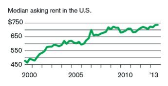

You can probably immediately see the problem, just by looking.  The huge increase in rents took place from 2000 through 2008. Rents have varied by only +/-5% since then.  And that's exactly what the data, compiled by the Census Bureau, shows.  The data series goes back to 1988, and below is a chart of nominal asking rents vs. median weekly wages, compiled by the BLS, showing that real rents declined in the 1990s as wages increased, then soared in the 2000 - 2008 period, and have been below that peak ever since:

Year Median
Asking Rent
Usual weekly
earnings
Rent as %
of earnings
Real median
asking rent
198833038286649
1992 40143792 677
1993 422450 88 690
200047856884658
2002 545 60790 717
2004 620629 99 777
200972373299797
2012 72176594 740
2013   Q1 718770 93 722
2013  Q273577695741
2013  Q3 73677895 738
2013  Q4 746782 95 746

Note that from 2000 to 2009, real median rents rose 17.8%, from .84 to .99 of wages.  By January 2013 that was back down to .93, but by the end of 2013 had risen to .95.  

The final column above shows "real" asking rents (rents deflated by the CPI), and indicates that rents haven't even kept up with inflation for the last 5 years (although they increased more than inflation in 2013).  There simply is no bubble in rents.

So what's the big deal?  The problem is that, while median wage earners aren't having a problem, the decrease in real wages in the bottom two quintiles is putting them in a real bind.

The Wharton School of the University of Pennsylvania's public policy brief that is the source of the "rental affordability crisis" information says:
According to data from the U.S. Census, half of all renters, and 83 percent of renters with incomes under $20,000, paid more than 30 percent of their incomes in rent in 2011.
 ....
[D]emand for rental apartments has grown and apartment construction has not kept pace. Between 2010 and 2013, the national apartment vacancy rate fell by half, from 8.0 percent to 4.3 percent,.....
....
...  [But i]ncome growth has failed to keep pace with rental growth over the last decade. At the national level, between 2000 and 2011, growth in REIS rent exceeded the growth in median renter income by the affordability rate to fall further.
Instead, the greatest decline in affordability has occurred amongst low-to-middle income households. [For example, i]n Atlanta, the share of households with incomes between $20,000 and $35,000 in year 2010 dollars who paid at least 30 percent of their incomes in rent rose from about 20 percent in 1980 to more than 80 percent in 2012....Even households in the $35,000 to $50,000 real income tier have experienced declining affordability rates, albeit not to the same degree....However, the highest income groups in the data – households making $50,000 or more in real terms—have experienced little decrease in affordability.

[my emphasis]

In other words, the problem isn't a bubble in rents. The problem is that even when rents have not kept pace with inflation, the income of the typical household that rents has experience a real decline.  The Harvard Joint Housing Center points out [pdf] that in 2010, 70% of all rental households had below the median of household income, and 40% of renters were in the in 25% of household income.

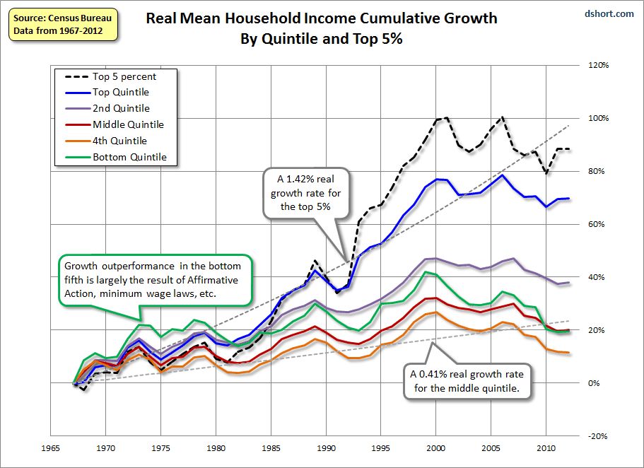
And what has happened to the bottom two quintiles of income earners?  They have fallen further behind the median and the upper 2 quintiles, as shown in this well-known graph of income by quintiles last updated by the Census Bureau in 2011:


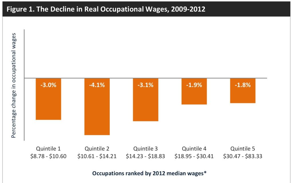
And as the Employment Law Project pointed out last June, since 2009 real incomes of the bottom two quintiles - and particularly the fourth quintile -- fell the most in real terms through 2012:
 

A recently released study by the Harvard Joint Center for Housing Studies noted that "Between 2000 and 2012, real median rents rose nationwide by 6%.  However, over the same time period, the real median income of renters fell by 13%."

In other words, even though rents have failed to keep up with inflation since 2008, and even if they have declined as to real median weekly wages since then, they have continued to increase in real terms compared with the falling real incomes of the bottom two quintiles who make up the typical renter household.  Rental prices have failed to go up more in the last several years not because of a lack of demand, but because higher rents are simply out of the reach of the typical renter.

It's a shame that the writer of that piece was so focused on the idea that there must be a bubble in rentals and housing that he completely overlooked this very real problem. It demonstrates in yet another way that falling real incomes among the lower middle class and working class are destroying the American dream. 

US' Slow Recovery Is Still Intact

All of the coincident indicators are still increasing.

http://community.xe.com/forum/xe-market-analysis/us-slow-recovery-still-intact

Wednesday, April 23, 2014

Increased interest rates, asking prices taking a serious bite out of home sales


 - by New Deal democrat

I have a new post up at XE.com on new and existing home sales.  Total home sales are off -13.5% from their peak 9 months ago, as higher interest rates and an overshoot on increasing home prices is taking a serious bite out of the market

Yield Curve Is Flattening


Above is a chart of the difference between the 30 and 5 year CMTs -- constantly maturing treasuries.  Since the beginning of December, this spread has been declining. 


The reason for the decrease is a rally in the long-end of the curve as the 30 year CMT has decreased from ~ 3.9 to ~3.5, or a decrease of about 40 basis points.  That tells us that traders don't see inflationary pressures.

Tuesday, April 22, 2014

Treasuries Are the Surprise Year to Date Winner

When the Fed announced an end to the quantitative easing program, the treasury market sold off.  The reason is simple: the largest buyer of treasuries had announced they were leaving the market.  However, since January 1, treasuries have outperformed the market as a whole.


When we compare long treasuries, SPYs, commodities (DBC) and the dollar (UUP) since January 1, treasuries again outperform.

Monday, April 21, 2014

The state of housing: an update on permits and starts, and a look ahead


 - by New Deal democrat

One of my key mantras is that I don't fight with the data.  Sometimes there is an obvious asterisk (e.g., the government shutdown, or particularly severe weather, e.g., Sandy), but as a general rule trying to make the data fit your worldview will lead you astray.

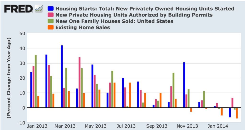
With that in mind, much as it pains me to say it, while housing starts and sales have been trending down as I thought they would:


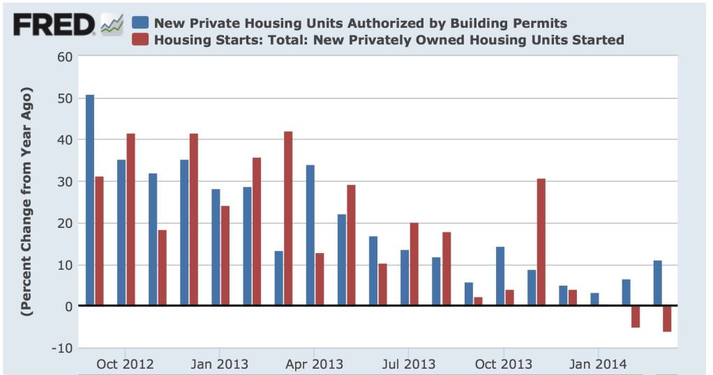
the best and most forward looking indicator, housing permits, has reversed course and trended upward in the last two months:


Last year I pointed out that on 15 of 19 occasions in the last 60 years, when there had been a 1% increase in interest rates, housing permits had decreased YoY by at least -100,000.  One time, in 2000, permits decreased only -62,000.  The three remaining times appear to be cases of "buy now or be forever priced out," in which the housing market levitated for awhile, and then crashed all the harder.

So here is what YoY interest rates (inverted) and housing permits YoY look like updated through March:


While permits have certainly decelerated, they have resolutely not turned negative, something that I absolutely thought would have happened by now.

(By the way, it's not like any of these have approached Bill McBride's forecast of a 20% average gain for 2014 over 2013 either.  He may win his bet with me due to an isolated month of YoY comparisons, in particular June or July, where starts and sales in 2013 posted horrible numbers.  But from here on in permits would have to exceed 1.1 million in a month for Bill to win the bet on that basis, and that seems very unlikely.  And for the record, Bill is the nicest blogger there is and we are on good terms.  This is a friendly bet for charity.)

So why have permits held up?  A lot of the data is exactly what I'd expect to see as permits roll over.  And there are reasons to think that the tow month YoY increase in permits might be an artifact of the unusually severe winter.

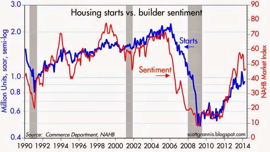
To begin with, builders appear to be seeing an actual slowdown.  Here's homebuilder sentiment compared with housing starts (h/t Scott Grannis):


Note that the two generally move in the same direction, and homebuilder sentiment has decreased in the last few months.

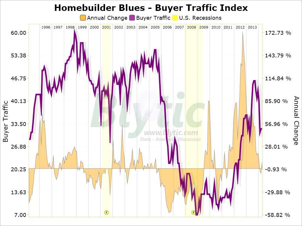
More significantly, here is a graph of buyer traffic (via Paper Economy):


Buyer traffic appears to have decreased in the last few months, and is now basically flat YoY.  This certainly does not look like what I would expect to see if there were to be an increase in housing starts or sales.

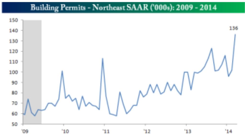
As to the unusual winter shifting permits in some regions from January and February to March, here are permits in the Northeast:


It looks pretty clear that there were several months of depressed winter data, followed by a huge rebound as the weather broke in March.  Although I won't post it, a similar but smaller rebound occurred in the Midwest, while  the South was negative YoY in March.

So there is reason to believe that the increasing trend in permits YoY since January might be an artifact of the unusually severe winter.

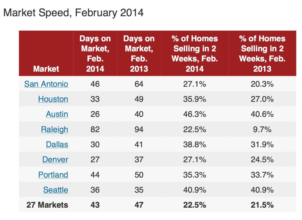
But on the other hand, in support of the reslience of housing permits, the below quote from this article in Redfin points out that several markets are experiencing outright booms:
While the housing market has cooled in many major cities since last year, other cities have only gotten hotter. In certain areas of Texas, North Carolina, Colorado and the Pacific Northwest, homes are selling like hotcakes thanks to strong job and population growth, worsening inventory shortages and ... relative affordability.
And here is the accompanying chart showing the stats:


If there is a migration from high-priced to low-priced housing markets, this could be ameliorating the increase in mortgage rates.

Yet another factor may be the changing rent-vs.-own ratio.  According to the US Census Bureau (pdf), while housing prices declined by about 1/3 from top to bottom, and have made up less than half of that decline since, median rents have remained within 5% of $700 per month since 2008.  In the last few quarters of 2013, they rose to the top end of that range.  In metro areas with relatively expensive rentals, buying a house may be more attractive.

Still, as noted by Realty Trac, the increase in mortgage rates has raised the minimum down payment to buy a house by about 20%:
The income needed to qualify for a median-priced home in the fourth quarter of 2013 was $41,500, up from an average minimum income of $34,250 a year earlier. (That minimum assumes you'll spend no more than 25 percent of your household income on your mortgage.)
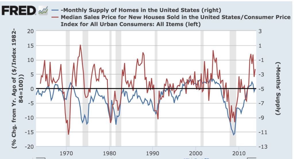
 Not coincidentally, the number of months' supply of houses has been slowly rising.  In this week's reports of new and existing home sales, I will be particularly looking to see if this increase continues.  There does not appear to be any magic number, as the below graph indicates, which compares the median house price change YoY (left scale) with the monthly supply of houses (inverted, right scale):


In the 1960s, 5 months supply was enough to bring prices increases to a halt.  In the 1970s and 1980s, it was more like 7 months.  In 2006, it was between 5 and 6 months' supply.

April and May of last year were particularly strong months for housing permits.  If they are going to turn negative, those are the months where they should do so. If double-digit price increases continue, and affordability rapidly declines, then as with the prior 3 occasions, delaying the day of reckoning will only make it a harder fall.

So tomorrow and Wednesday, I will be paying particular attention to the median price months' supply of both new and existing homes.  Is there evidence that the market has not withstood the most recent price increases?  In the case of new homes, there is already evidence that there has been a peak, and YoY price increases may have ended.  Is the months' supply steady, or is it increasing further?   An increase in the months' supply is evidence supporting that there is or shortly will be a pullback in building.


Latin American Markets Rebound


Latin American markets sold off in tandem when the Fed announced the end of QE, which basically reversed the flow of "hot money" funds leaving the US into development markets.  Also hurting these economies is the Chinese slowdown, as many of these countries supply raw materials to the Chinese economy. 

But LA has made some impressive strides in its own right, which were heavily discounted in the sell-off.  Traders have obviously reassessed these markets and are again committing funds.

Chile and Colombia are understandable bets; both countries are on fairly decent economic footing.  Brazil is a bit more of a puzzle, as there hasn't been much good news from that country since the first of the year.  And Argentina has some issues, especially with its publicly released economic numbers that make me question its market strength.


Here's a chart of the regions performance over the last year.

Sunday, April 20, 2014

A thought for Sunday: the legacy of a fateful choice


 - by New Deal democrat

Bonddad's  weekly international summary, below, is well worth a read at XE.com.  In it he describes the deflationary danger of the pro-creditor/pivot to austerity choices that were made in the developed world.

The below quote, from Larry Summers describing his "secular stagnation" theme,  in particular leapt out at me:
 in such a situation falling wages and prices or inflation at slower-than-expected rates is likely to worsen economic performance by encouraging consumers and investors to delay spending, and to redistribute income and wealth from higher spending debtors to lower spending creditors.
 In 2008-09, we could have bailed out debtors, or we could have bailed out creditors.  Had we bailed out debtors, the debtors could have used that bailout money to renegotiate, pay down, or pay off their debts to the creditors, and then both would be made reasonably whole.  Bailing out creditors rescued them, but didn't cancel the debt, and so debtors still had to deleverage and pay off the debts, a painful and slow process.

At that critical juncture, none other than Larry Summers had the most powerful position possible to argue in favor of bailing out debtors, but did not do so.  We chose creditors, and we've been paying the price since.

Friday, April 18, 2014

No, the ratio of "employer-to-employer flows" does *NOT* prove the job market isn't improving


 - by New Deal democrat

Mike Konczal of the Next New Deal has a post up claiming to show that even the currently employed are struggling to find jobs, and therefore there has been no jobs recovery.  Like many Doomish arguments, it suffers from "proving too much."  The author finds some metric either flatlining or going down since 2009, therefore conditions are not improving.  The author never thinks through the implications of the same data showing the exact same thing for previous economic expansions.  That's Konscal's problem here.

Konczal says:
Even those who have been unemployed zero weeks are having trouble finding jobs in this economy. And this is important evidence against the idea that the labor market is doing better than people realize if you just ignore the long-term unemployed.
....  If the economy is heating up significantly and the long-term unemployed aren’t capable of taking jobs, then the EE transition rate should be increasing. So how is it doing?
.... If the economy was heating up and the unemployed or those out of the labor force couldn't take jobs, we would expect this to increase
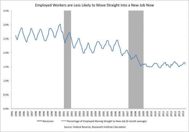
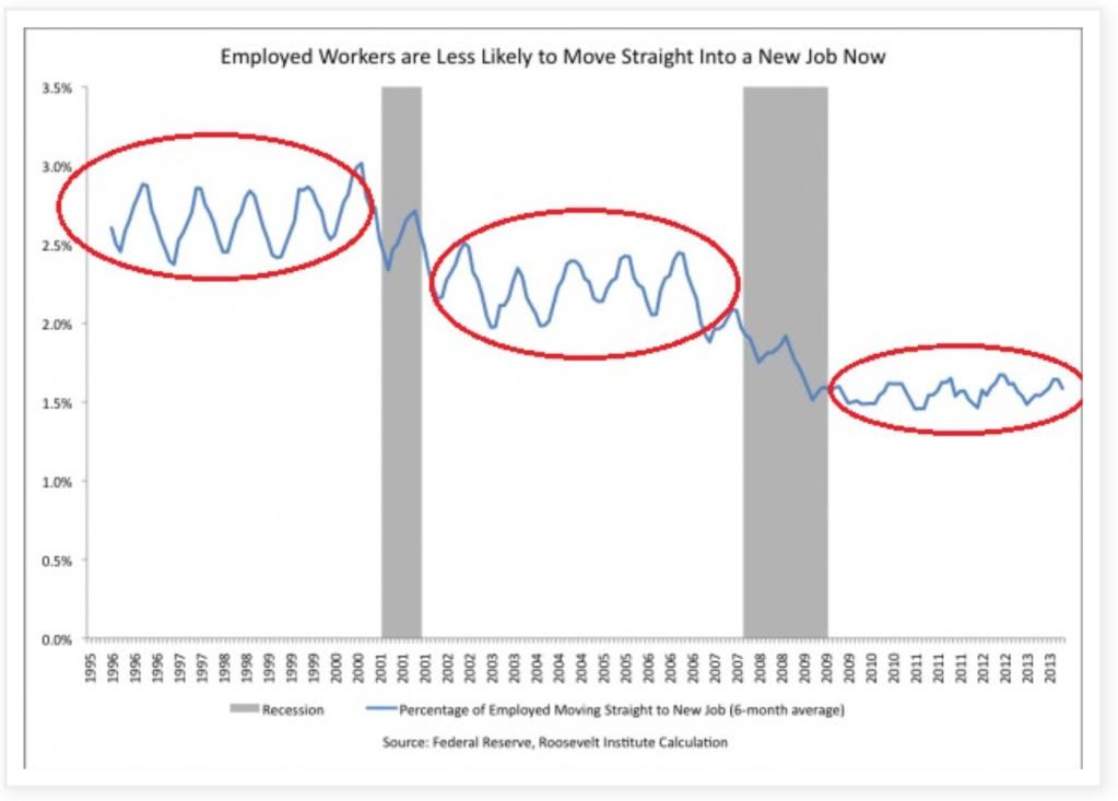
Here's the graph Konczal uses to support his conclusion:


Except here's the problem:  the graph just isn't flatlining since 2009 to the present.  It also flatlines from 2003 to 2008, and even more tellingly, from 1994 to 1999 - during the biggest economic boom since the 1960s (highlighted below):


 Is Konczal seriously contending that "the labor market wasn't improving" during the biggest boom in the last half century?

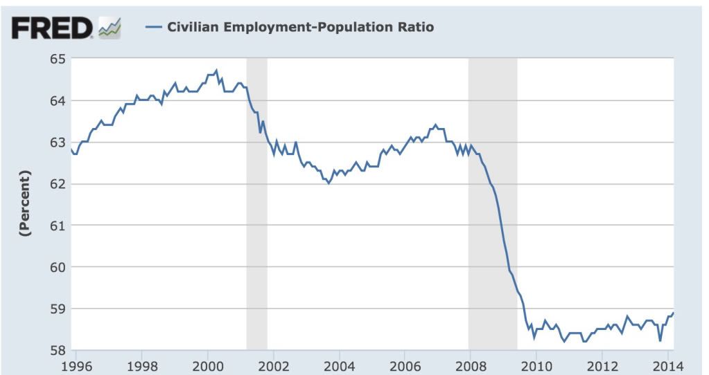
The "stair-step down" trend in Konczal's graph reminded me of another, namely, the employment to population ratio.  Here is that graph for the same period of time:


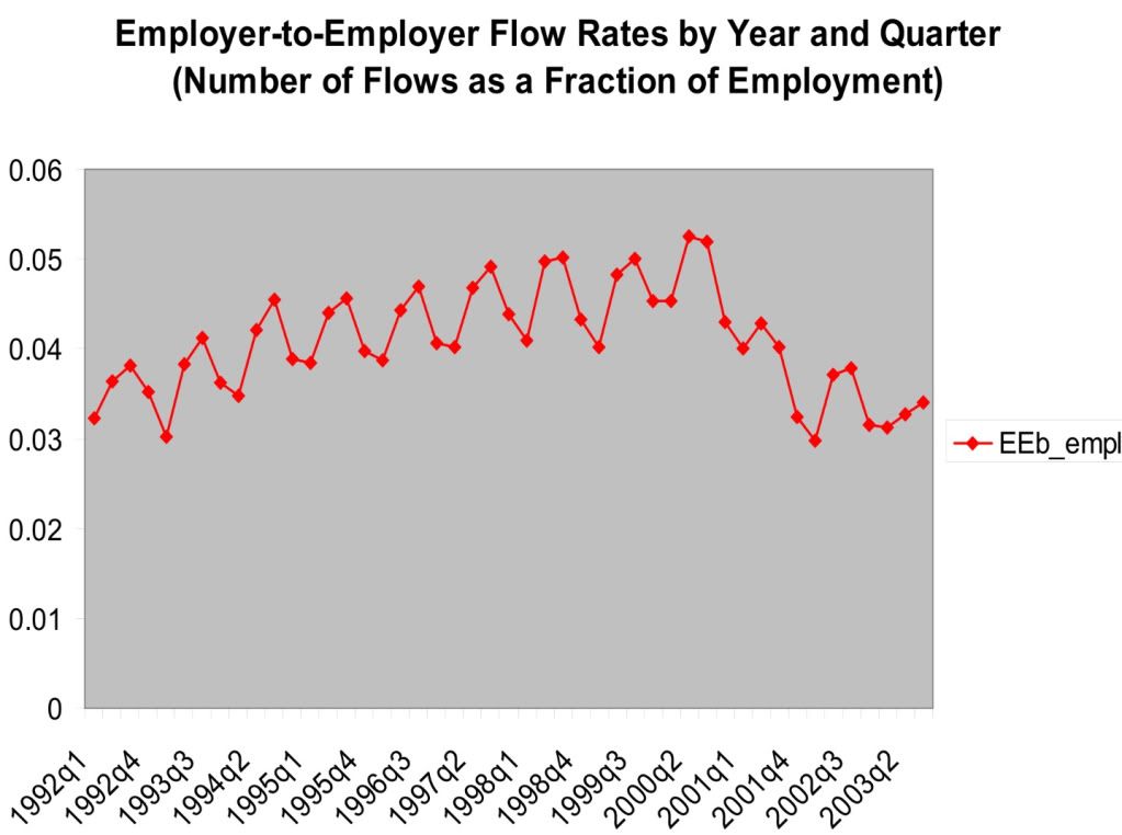
As it turns out, that isn't a coincidence.  The Census Bureau also took a detailed look at this data in 2006 (pdf).  Here's their graph showing the data up until that point:


Notice how closely the data tracks the employment to population ratio.  Unlike Konczal's graph, the Census Bureau's graph does slightly increase during the mid-1990s.  This is likely due to the fact that the two graphs are measuring slightly different things: Konczal's graph measures the "percentage of employed moving straight to a new job" on a 6 month basis, while the Census Bureau's graph measures "number of flows as a fraction of employment" on a quarterly basis.

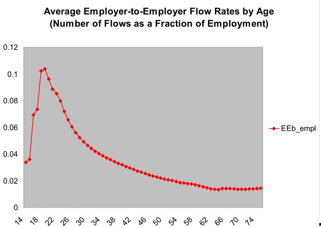
Konczal's problem is that he entirely fails to take into account the effect of demographics.  Here's the Census Bureau's graph showing how employer to employer flows skew by age:


A huge percentage of employer to employer flows comes from people in their 20's.  The percentage declines sharply as we move into the 30's and continues to gradually decline thereafter until about age 60.

So what Konczal has failed to account for is the huge distortion in the demographics of the work force caused by young people staying in college longer, and by the Boomer generation skewing the median employment age much higher into the age group that wants nothing more than to hang on to their current job until retirement age.

In other words, Konczal's graph appears to be another manifestation of the employment to population ratio, and not say anything about the relative strength of this job recovery.  (My position remains, there has been a jobs recovery, it just hasn't been strong enough.)  His data is sound, but his conclusion is faulty because it proves too much.

Thursday, April 17, 2014

A note about the strong rebound in March economic data


 - by New Deal democrat

I have a post up at XE.com about the recent run of excellent March economic data.

Thoughts On Inflation In Light of Yellen's Comments Yesterday

This is up over at XE.com

http://community.xe.com/forum/xe-market-analysis/thoughts-us-inflation-light-yellens-comments

Coke and Pepsi Now Tied Over the Last 10 Years


When I was a kid, I assumed that coke was the stronger brand.  In retrospect, that impression was probably created by the "Pepsi challenge" marketing plan when I was kid (this was the 1970s).

But flash forward to the last 10 years and you wind up with a tie game between the performance of both stocks.  Pepsi was the winner during the previous expansion.  The two had similar performance in '08, Coke eventually outperformed Pepsi from 11-13, but now the two are more or less tied.


Tuesday, April 15, 2014

Real retail sales set new high: real wages decline


 - by New Deal democrat

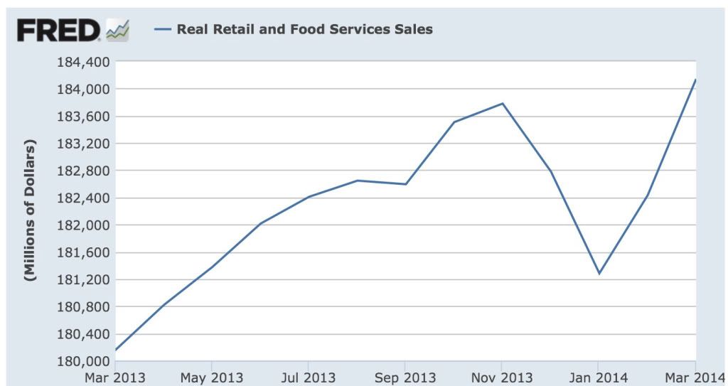
Based on the March reports, I can now update two of my frequent metrics:  real retail sales, and real wages.

March inflation was only +0.2%, which still caused a small increase in the YoY measure.  This is almost all due to the price of gas, which had already hit its 2013 high in early March, whereas gas is still increasing seasonally this year.

Real retail sales hit a new high in March:


so the expansion is intact.

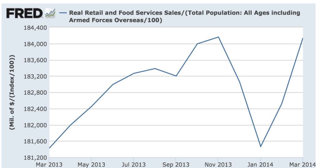
Since real retail sales per capita tend to hit their peak a year or more before any recession, let's look at that measure as well:


Here we haven't quite made a new high.  Note that we had a similar decline in 2012 before sales per capita hit their stride again.

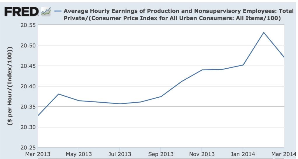
Finally, with the -$.02 decline in average hourly earnings in March, real wages took a significant hit:


Real wages are still up YoY, and there is no sign that the trend is changing.  Still, the average American household could use a raise, particularly since the increase in interest rates last year have brought refinancing to a screeching halt.


Monday, April 14, 2014

Indian Market Rallying on Election Hopes


India is in the middle of national elections.  There is strong hope that a technocratic politician will win be nominated prime minister and that his pro-business orientation will help to break the log-jams inherent in Indian politics.

Right now markets have topped out at highs established in early May of last year.  However, the uptrend remains firmly intact.

For more on this, see the NY Times coverage which has been very informative.


Saturday, April 12, 2014

Weekly Indicators for April 7 - 11 at XE.com


 - by New Deal democrat

My Weekly Indicators post is up at XE.com. The run of springtime positive data continues.

Friday, April 11, 2014

Putting stock margin debt in a longer term historical context


 - by New Deal democrat

I have a new post up at XE.com discussing the issue of record margin debt in stocks.  The CHARTS OF DOOM that you've probably seen only go back to about 1990.  What happens when we go back to the 1960s and 1970s, or even the 1920s and compare?

--------
For those of you who are long-term readers and remember us from our Daily Kos days, I wanted to add a note. One thing that makes my blood boil is when a person of modest means and very limited financial knowledge is panicked by a Doomer post, and asks them questions like, "I'm so scared.  What should I do with my 401k?  Should I cash it out?"

Literally I have messages bookmarked where the Doomers were bearish on stock in June 2009.  That's how bad the level of analysis has been.  I recall a top ranked diary from someone called "Stranded Wind" who argued that the FDIC was about to go bankrupt in July 2008 and actually wrote
Run, don’t walk, to your bank and get the funds you have clear of this mess before it gets any worse.
That diary got 610 comments and 345 recommends.  People actually followed his advice.  A full three years later he got banned after it was discovered that he apparently had a much darker side.

Well, the diaries in the last couple of weeks have given rise to some similarly panicked comments.  Anything is possible, but the panic these people spread has some real world consequences among their less informed readers.


Thursday, April 10, 2014

QQQ's In Short Term Downtrend


The QQQs have broken their nearly year-long uptrend and are currently trading in a downward sloping channel.

Tuesday, April 8, 2014

"Prices will fluctuate:" why progressives (and everybody else) should care about corporate profits and stock prices


 - by New Deal democrat

I was minding my own business yesterday when my attention was called to a diary on the Rec list at Daily Kos.  Didn't I disagree?

Well, actually, not really.  Although the conclusions hardly call out for breathless Doom-and-Gloom OMG IT"S GONNA CRASH!!!

Which is in stark contrast to the "stocks don't matter" (but only if they are going up) mantra of the Pied Piper of Doom.

But this is a good time to point out why, even if you are a card carrying leftie progressive, you ought to care about the direction of corporate profits and stock prices:  because for as long as records have been kept, they have reliably foretold the direction of jobs.  If corporate profits and stock prices are going up, there is an extremely high probability that jobs are going to be added to the economy.  If corporate profits and stock prices are going down, there is an excellent chance that a lot of people are going to be laid off, soon.

Although the data goes back many decades, here is a close up of the last 10 years of corporate profits (red, right index) and jobs (blue, left index):


And here is a close up of the last 10 years of stock prices (red, right index) and jobs (blue, left index):


The problem progressives (and many others too) have with the economy is that almost all of the gains have gone to producers, and almost none to labor.  We could have profits and stock prices going up at a slower rate, and still have increasing jobs as well as increased middle and working class incomes - not to mention spending on improving our infrastructure.

At the moment there is some concern among the financial press that corporate profits in the 1st quarter actually declined.  And because I care a lot about jobs, that means I am concerned too.

Before I conclude, a few comments about that diary yesterday.  Here's the conclusions the diarist actually made:
 [E}very time the overall price of stocks have gotten this expensive in the past there has been a crash.

 So is it really a radical suggestion to say that we are overdue for a severe stock market correction/crash?

Like stocks, when [houses] get expensive the risks switch to the downside.

Does this mean that the economy is about to collapse? That there is nothing ahead but doom-and-gloom?  No. But it does mean that there is almost no chance that we will avoid a serious stock market correction before the 2016 election. What's more, housing will soon be topping, if it hasn't topped already. Both of these things will be putting pressure on the banks and the economy in general.
Except for the breathless invocation of a "crash," I don't really disagree with this person.  Later on he defined "crash" to mean a 20% correction in stock prices at some point in the next 2 1/2 years.  Since stocks have corrected by at least 19% in more than half of the last years where there has been a midterm election alone, as shown by this graph:


And since stocks have declined by 20%+ on average about once every 4 years going back to 1900, a prediction of a 20% correction at some time before the end of 2016 is really just saying "stock prices will fluctuate normally."  Indeed, I've described in several posts how corporate profits tend to lead stock prices, and prices have increased about 20% more than corporate profits in the last 18 months.  Unless there is a real surge in corporate profits this year, a 20% correction in stock prices would hardly be unusual.  As to the increase in margin debt, that tells us nothing about timing.   All it does show - and it is significant - is that the more the leverage, the faster the decline might occur, when it does (because leveraged players in trouble have to unwind positions quickly, and can't hold them).

As to housing, for almost 6 months already, I've been forecasting an outright decline at some point this year, to the tune of -100,000 in permits or starts.  Last month starts were -62,000 YoY, and on a seasonally adjusted basis, all housing series have declined from their recent peaks.  As this graph of housing permits vs. the Case Shiller house price index shows:


sales peak and trough before prices.  If prices overshoot (and in at least some metro areas they almost certainly have), they will correct once sales start to dry up and inventory accumulates, as may already be happening in, e.g., Phoenix (h/t Calculated Risk:


So yes, there is reason to be concerned about housing, and reason to be concerned that stock prices will fall.  At some point housing, stock prices, and corporate profits are all going to have peaked, and then layoffs will cause an actual loss of jobs in the economy.  But the odds of an actual downturn in the economy with actual sustained job losses this year are virtually nil.


Staples Outperforming Discretionary


Above is a chart showing the ratio of consumer discretionary stocks to consumer staples stocks.  Discretionary stocks were outperforming from 04/13 until recently when the relationship broke down.  This indicates a change in the risk appetite among traders, at least in the short term.

More Signs Of A Short-Term US Market Top

On the weekly charts below, notice that all the MACDs have given a sell signal and "rolled over," meaning they are moving lower.


Saturday, April 5, 2014

Friday, April 4, 2014

The ECB's Over-Reliance On Future Projections At the Expense of Current Data

This is over at XE.com

March jobs report: new highs in aggregate hours worked, private sector jobs


- by New Deal democrat

In March 192,000 jobs were added to the US economy.  The unemployment rate was unchanged at  6.7%. January and February were revised upward by +35,000.

As usual, first, let's look at the more leading numbers in the report which tell us about where the economy is likely to be a few months from now. These were mixed but with a tilt towards positive.
  • the average manufacturing workweek rose from 40.8  hours to 41.1, returning to its 2013 high. This is one of the 10 components of the LEI, and will contribute towards a strong positive number.

  • construction jobs increased by 19,000. YoY 151,000 construction jobs have been added.

  • manufacturing jobs fell by -1,000.

  • temporary jobs - a leading indicator for jobs overall - increased by 29,000.

  • the number of people unemployed for 5 weeks or less - a better leading indicator than initial jobless claims - rose to 2,461,000, compared with December's 2,255,000 low.

Now here are some of the other important coincident indicators filling out our view of where we are now:
  • The average workweek for all nonsupervisory workers rose by 0.3 hours from 33.4 hours to 33.7 hours.

  • Overtime hours increased from 3.4 to 3.5 hours.

  • the index of aggregate hours worked in the economy rose by 0.7 from 106.4 to 107.1. This is a new post-recession high and close to an all-time high.

  • The broad U-6 unemployment rate, that includes discouraged workers increased from 12.6% to 12.7%.

  • The workforce rose by 503,000. Part time jobs rose by 434,000.
Other news included:
  • the alternate jobs number contained in the more volatile household survey increased by 476,000 jobs.  The household survey jobs numbers had been lagging the establishment survey numbers, but as expected this difference has now been entirely made up, with the household survey showing a 2,351,000 increase in jobs YoY.

  • Government jobs fell by -1,000.

  • January was revised up from 129,000 to144,000.  February was also revised up by 22,000 to 197,000  Upward revisions happen in expansions, and after a weak spot in late 2013, these revisions in the last several months have all been positive.

  • average hourly earnings decreased  $.01 to $24.30. The YoY change is +22%.  As a result, YoY average real wages probably fell slightly in March, given the expected slight rise in consumer prices due to the weakening of the Oil choke collar.

  • the employment to population ratio rose from 58.8% to 58.9%, and has risen +0.4% YoY. The labor force participation rate also from 63.0% to 63.2%, but has declined 0.1% YoY.  The usual  caveats about discouraged workers and Boomer retirements apply.
  • the number of people who are not in the labor force but want a job now (the best measure of long time discouragement) totals 3,050,000.
This report had the best internals of any report in the last six or so months. Aggregate hours, overtime hours, and the manufacturing workweek, all of which had been weakening, made up all of their losses and in at least one case set a new high.  Counting by hours vs. jobs, almost all of the losses in the recession have been made up. Private sector jobs have now also made up all of their recession losses.

Wages remain a weak point, and the usual participation rate debate will continue.  We still are in the hole by several million jobs considering the population increase in the working age population since 2007, and the decline in wages in March does nothing to help consumer spending.


Thursday, April 3, 2014

A maturing expansion: auto sales; PCE's v. real retail sales


 - by New Deal democrat

One of the themes of economic data this year is that the expansion is mature.  I'm not expecting to get materially better than it has been for the last several years, and while I see continued expansion throughout this year, I am on the lookout for signs of longer term deterioration.

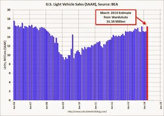
Which brings me first of all to March vehicle sales.  The good news is, these made a new post-recession high of 16.4 million annualized.  Here's Bill McBride's graph:


New vehicle sales have in the past peaked at least half a year before any economic downturn.  So the new high is yet more evidence that the expansion will continue through this year.

But even taking March into account, first quarter 2014 vehicle sales were essentially equal to fourth quarter 2013 sales.  So if there was pent-up demand because of the hard winter, there was no evidence of an increase of demand in the last 6 months.

Even this isn't really bad.  Vehicle sales can plateau for a long time during an expansion without materially declining.  It simply emphasizes the point that this looks like a mature expansion.

Which brings me secondly to an update of my comparison of PCE's and real retail sales.  In all cases since World War 2, in the earlier part of an expansion the YoY% increase in real retail sales exceeded that of PCE's.  In the latter part, the reverse is true.  Since PCE's include more spending on necessities compared with retail sales, it makes sense.  People cut down more on discretionary spending first, before they cut back on necessities.

Here, the news is that for the second month in a row in March YoY PCE's have now exceeded YoY real retail sales:


This is absolutely not a sign of DOOOOM!!!  But it is the kind of thing I expect to see late in an expansion.

This month as usual I will pay a lot of attention to housing reports. And first quarter earnings will start to be reported, and the reports I have read so far are forecasting relative weakness in this long leading indicator.  We'll see.


Wednesday, April 2, 2014

A cautionary note about employment


 - by New Deal democrat

A lot of positive anticipation seems to be building about Friday's employment report, with many people predicting 190,000 or even above 200,000.  Most of these optimistic scenarios seem to be built around the recent weeks' rebound in weekly and March data, e.g., vehicle sales.

There may indeed be a post-winter rebound, but I remain cautious about the next few months.

In the first place, initial claims have a good record of anticipating the unemployment rate with a one or two month lag:


While initial claims dropped to near post-recession lows by the end of March, the unemployment rate is more likely to reflect the January and February increases in layoffs.

Secondly, the jobs report tends to move in the direction of real retail sales with a few months' lag.  Let's first look at jobs and real retail sales as a YoY% change averaged by quarter to cut down on some of the noise:


Since the above quarterly look ends with last December, now let me show the same data on a m/m basis:


In December through February, real retail sales took quite a hit on a YoY basis.  It's likely those poor comparisons are like to show up in the monthly jobs report at some point between now and mid-year. A negative month is well within the range of reasonable probability.


Reported corporate profits as a leading indicator for stock prices: an updated look


 - by New Deal democrat

I have a new post up at XE.com updating a previous comment on corporate profits as a long leading indicator for the economy compared with stock prices as a shorter leading indicator.

Is It Time To Become Positive About the EU?

This is over at XE.com

Italian And Spanish ETFs Break Though Resistance


Both the Italian and Spanish ETFs have been consolidating for the last 2-3 months.  The Italian (top chart) in an upward sloping wedge and the Spanish in an ascending triangle.  Right now, neither break is particularly convincing.  The break out days' candles are crosses rather than strong bars.  The lack of a strong bar is more problematic because of the high volume of the Spanish break-out day.


Adding to the concern is the broader EU ETF, which has yet to break out. 

Before making a move here, wait until we get broader confirmation.

Monday, March 31, 2014

Yellen Looks At A Far Broader Set of Employment Data

This is over at XE.com

Defensive Sectors Outperforming Since January 1


Since the first of the year, utilities and health care have outperformed consumer discretionary, consumer staples and the financial ETFs.

US Markets Appear to be Making A Short-Term Top


The IWMs have fallen through short-term support.  Momentum is declining and the CMF is showing a slight volume outflow.  Prices are below the short-term EMAs.  The logical target is the upward sloping trend line.


The QQQs are right below the trend line on declining momentum with a slight volume outflow.  Prices are below the short-term EMAs with the shorter EMAs all moving lower.


The DIAs appear to have printed a double top with momentum declining and the CMF weak.