Monday, July 11, 2011

Equity Week in Review and Preview of the Upcoming Week/Month

Last week, I wrote the following about the stock market:
At this point, we should acknowledge that the stock market is a leading indicator. The question now becomes, was this week's advance a sign that equity traders think the worst is over, and therefore it's time to get into the action? The weakness in the Treasury market last week would bear this out, as would the rise in the oil market and copper's recent advance through key resistance areas. However, I'm personally not sold on a third or fourth quarter rebound yet. Consumer spending is weakening, global manufacturing is softening, emerging economies are increasing interest rates (US exports have been strong during the recovery) and Washington is full of idiots doing everything they can to screw up the economy. I would need to see an advance through previous highs on multiple indexes (with the Russell 2000 being one) before I'm sold on the veracity of this rally.
In short, the issue for the market was, "is this a technical bounce for an oversold market, or is it the beginning of new advance in the market?" Last week added evidence that the former is the case. First, consider this chart of the 10 day, 5 minute chart:


In the preceding week, prices advanced strongly whereas last week, prices moved sideways.


Prices have clearly advanced beyond key resistance levels and the shorter EMAs have advanced through the longer EMAs -- all of which are also rising. However, last week's candles were weaker and appeared to be stalling in their upward advance.


All of the technical indicators are showing a rally -- the A/D and CMF indicate money is flowing into the market at an increased pace, and the MACD shows increased momentum. However, consider the following two additional charts:


Neither the QQQs nor the IYTs -- which were both at important technical levels -- advanced beyond those levels.

Part of last week's action could simply be a consolidation of gains after a strong advance. This is standard market behavior. However, Friday's employment report should put the kabash on any strong upside rally in anticipation of economic acceleration in the third and fourth quarter. The pace of job growth is slowing, not advancing, and indicates there are problems underneath the economic surface. Any advance beyond resistance levels should be viewed suspiciously at this point until the fundamental picture improves.

Saturday, July 9, 2011

Weekly Indicators: Stall vs. double-dip edition

- by New Deal democrat

The monthly data reported this week included both factory orders and ISM services positive, but slightly weaker than expected.

Of course, the 800 pound gorilla in the room was the awful June payrolls report that matched an equally awful downwardly revised May report, that I told you to expect. Manufacturing hours, one of the 10 LEI, declined .3. It is at least possible that the LEI could be negative for the second time in 3 months, depending on housing permits. Perhaps even worse, for the second time in 7 months, there was actual wage deflation, albeit tiny. I don't suppose I need to pull out the history books to tell you that wage deflation in the presence of huge debt is lethal.

Back in January I foresaw this midyear stall, due to Oil and contractionary fiscal policy. The weekly indicators started to show the deterioration as early as March. Because of this, I haven't been caught up in any mood swing from complacency to dread, so I see no need to change my opinion going in to the end of the year now. For that, let's make the first high frequency weekly indicator this week, money supply:

M1 was up 0.5% w/w, up 0.5% m/m (comparing the entire month), and up 12.8% YoY, so Real M1 was up 9.4%.
M2 was up 8.4% w/w, up 0.8% m/m (comparing the entire month), and up 5.5% YoY, so Real M2 was up 2.1%.
Real M1 remains very bullish, while Real M2 remains stuck in the caution zone under 2.5%. At the same time, it is worth noting that Real M2 is not deteriorating.

Going back over 90 years, beginning with the 1920-21 recession and including the Great Depression, there has NEVER been a recession in the face of both a positive yield curve and positive real M1. Never. In fact, if we don't believe we are tipping into actual deflation, then the positive yield curve alone has a perfect record.

So let's turn to the other high-frequency weekly indicators. Do they show a stall, or actual contraction:

The BLS reported that Initial jobless claims last week were 418,000. The four week average decreased slightly to 424,750. We appear to have stabilized in a range between 410,000 - 430,000.

The American Association of Railroads reported that total carloads were up 7000 to 523,000 YoY, or a mere 1.3% YoY for the week ending July 2. Intermodal traffic (a proxy for imports and exports) was up 6000 carloads, or 2.5% YoY. The remaining baseline plus cyclical traffic was up less than 1000 carloads, or 0.3%. This series is very close to turning negative on a carload basis. (Note: The AAR has terminated Railfax's license. Railfax broke out cyclical vs. baseline traffic - and had great 13 week and 104 week graphs - whereas the weekly AAR report does not. I will try to recreate and continue to report on that breakout).

The Mortgage Bankers' Association reported that seasonally adjusted mortgage applications increased 4.8% last week. It was 11.7% higher than this week last year. This is the sixth week in a row that YoY comparisons in purchase mortgages were positive. Except for the rush at the two deadlines for the $8000 mortgage credit, these are the first YoY increases since 2007. Refinancing decreased 9.2% w/w.

The American Staffing Association Index rose 1 point to 88. This trend of this series is still rising, but since the beginning of this year is just barely better than a stall.

The ICSC reported that same store sales for the week of July 2 increased 3.5% YoY, and increased 1.5% week over week. This is the best YoY comparison in over a month. Shoppertrak reported a 1.6% YoY increase for the week ending July 2 and a WoW increase of 3.5%. YoY weekly retail sales numbers had been slowly weakening for a month or so, but this week is the second week of a rebound.

Weekly BAA commercial bond rates spiked .16% to 5.88%. Yields on 10 year treasury bonds spiked a nearly identical .15% to 3.11%. This was probably due to the ending of QE2. This does not show any relative increase in distress in the corporate market.

Adjusting +1.07% due to the 2011 tax compromise, the Daily Treasury Statement showed that for the first 4 days of July 2011, $39.1 B was collected vs. $33.0 B a year ago. For the last 20 days, $133.5 B was collected vs. $128.4 B a year ago, for an increase of $5.1 B, or 4.0%. Use this series with extra caution because the adjustment for the withholding tax compromise is only a best guess, and may be significantly incorrect.

YoY weekly median asking house prices from 54 metropolitan areas at Housing Tracker showed that the asking prices declined -4.5% YoY. The areas with double-digit YoY% declines increased by one to 8. The areas with YoY% increases in price remained at 7. This remains consistent with the hypothesis that in nominal if not real terms housing prices may bottom as early as this winter.

None of the above series are showing outright contraction. Only one weekly indicator - and it is a significant one - is sounding a true alarm bell:

Oil finished over $95 a barrel on Thursday, back slightly above the level of 4% of GDP which according to Oil analyst Steve Kopits is the point at which a recession has been triggered in the past. Gas at the pump rose $.01 to $3.58 a gallon. Gasoline usage at 9309 M gallons was -1.5% lower than last year's 9449. This is the second week in a row that gasoline usage has been significantly less than last year. This is especially disconcerting with the price of gas being near its 4 month lows.

As of now, both the LEI and the weekly indicators show only a slowdown or stall. It will probably take true idiocy from Washington to push us into a significant contraction. Which means, unfortunately, it remains a significant possibility.

A Closer Look At Employment, Pt II; Educational Achievement and Unemployment


The above chart to me is still the most important chart of the unemployment series. It tells us that the higher the educational achievement, the lower the unemployment rate. In addition, it also tells us that in the current US economy, the specialization that comes with higher education is valued and important and frankly, a requirement.

Consider this in contrast with yesterday's post on goods producing jobs -- which are typically associated with lower educational attainment. In this recession, the less educated have taken a tremendous hit.

Friday, July 8, 2011

Weekend Pitbull

Yes -- it's been awhile since I've posted any pictures. Life has been really busy over the last few months. In addition, we have a new, sad dog story to tell.

About a month ago, my wife and I found a stray pit bull in our back alley way. She was starving -- you could see her ribs. So, we started to feed and water her in the AM and PM. She stayed in the alley (it was overgrown with lots of vegetation, so there were plenty of cool places for her to lie down) mostly resting. Our vet gave us antibiotics and flea medication. After about a week and a half, she came up to us and let us pet her. She had no hair, infected eyes and was generally suffering from issues related to malnutrition. We named her Lita and Lita Ford (one of the original members of the band the Runaways, because, she's a runaway).

About two weeks ago, we gave her a small tranquilizer to calm her and got her to our vets where she's been ever since. In general, she's in pretty good shape. She has mites which in conjunction with overall stress caused her hair loss. Her eye infection is clearing up and she's feeling better -- she's far more curious about people and responds well to other dogs and the people at the clinic.

The only problem is my wife and I can't keep her. We already have three dogs and that's about the extent of what we can do. So -- if you'd like to take in a pit and know the breed, please leave your name in the comments. And now -- without further adieu -- here is Lita:


Where Will Growth Come From in the Second Half?

Yesterday, I noted that I see "muddling" growth of around 2% in the second half of the year, due to a variety of factors. Here I will outline various benchmarks that I need to see in order to reverse that prediction.

1.) Employment growth is a must. Initial claims have to move below 400,000 for a sustained period, and private sector job growth must begin to print in the 150,000/175,000 range. One of the primary reasons for low levels of consumer confidence is the unemployment situation. If the buying public sees consistent improvement in these numbers, we can expect some improvement in sentiment, which will lead to an increase in consumption.

2.) Emerging economies have to move to a growth oriented footing -- or at least move onto a neutral footing. Starting about six months ago, China started hitting the breaks on their economy. Brazil and India followed suit in short order. As I pointed out yesterday, Brazil now has an inverted yield curve and India's is flattening. As these economies are the prime drivers of growth, they have to return to a more growth oriented mode. Unfortunately, the reason for the rate increases is respective domestic inflationary pressures, which means we probably won't see rate decreases in the near future.

3.) Washington has to move away from its austerity obsession and look at creating jobs. We've been over the infrastructure argument half a million times, but it bears repeating. Half of those currently unemployed are construction and manufacturing employees. An infrastructure program would get those people employed. If you don't want to float government debt for it, repatriate overseas corporate profit and use some of the funds to open an infrastructure bank. An no -- austerity does not lead to growth.

Employment Report: Sucks Wind

From the BLS:

Nonfarm payroll employment was essentially unchanged in June (+18,000), and the unemployment rate was little changed at 9.2 percent, the U.S. Bureau of Labor Statistics reported today. Employment in most major private-sector industries changed little over the month. Government employment continued to trend down.

.....

Total nonfarm payroll employment was essentially unchanged in June (+18,000). Following gains averaging 215,000 per month from February through April, employment has been essentially flat for the past 2 months. Employment in most major private-sector industries changed little in June, while government employment continued to trend down.

In June, average hourly earnings for all employees on private nonfarm payrolls decreased by 1 cent to $22.99. Over the past 12 months, average hourly earnings have increased by 1.9 percent. In June, average hourly earnings of private-sector production and nonsupervisory employees declined by 1 cent to $19.41. (See tables B-3 and B-8.)

The change in total nonfarm payroll employment for April was revised from +232,000 to +217,000, and the change for May was revised from +54,000 to +25,000.


On a scale of 1 to 10, this is a 1. We added jobs. But not really any.

Thursday, July 7, 2011

Friday Dollar Analysis

Last week, I wrote the following about the dollar:
I'm still thinking the dollar is forming some type of bottom at this time. The EU situation appears to be at a head, giving the market "closure."
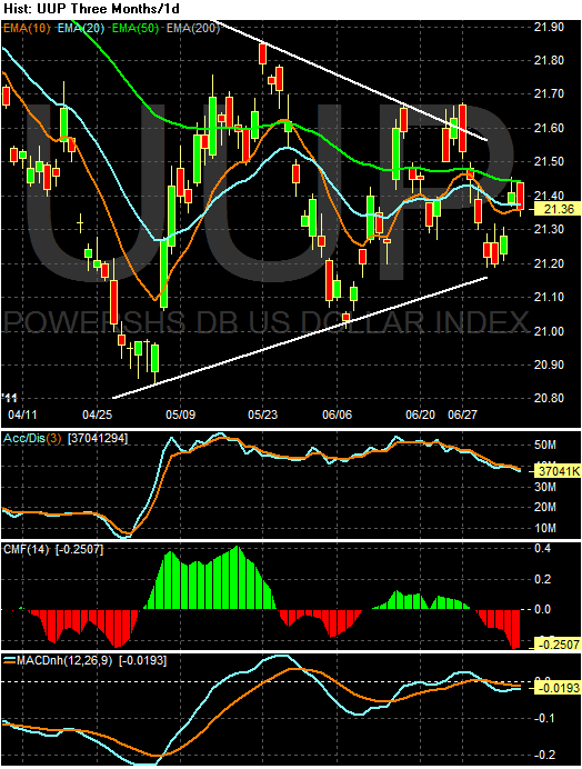
This week, the dollar continued its consolidation


The dollar is forming a classic triangle consolidation pattern right now, complete with decreasing volume. Note the EMAs are all tightly bundled and moving near horizontally.


Notice the A/D line indicates fresh money has not entered the market, which is confirmed by the low reading of the CMF. Also note the MACD is vacillating around a "0" reading right now.

This is a classic consolidation pattern in action.

The facts about Social Security and chain weighted CPI

- by New Deal democrat

There is a small furor in the political blogosphere today about Obama offering to index Social Security benefits to the "chain-weighted" CPI vs. the CPI for all urban workers, or CPI-W (the traditional measure). There is a lot of misinformation or poor information out there, including an article at the Great Orange Satan claiming that the resulting cut would only be 14 cents a month for the average recipient. Here are the facts.

Data for the chain weighted CPI has only been collected since December 1999. During the first 10 years, while the CPI-W rose 30%, the chain-weighted version rose 26.6%. On an annualized basis, that is 2.45% vs. 2.20%. In other words, so far chain-weighted CPI has averaged 0.25% less a year.

The diary on G.O.S. appears to take the 10-year average and then divide by 10, with an example that under the current system, a $1044 monthly benefit would rise to $1075.32 (a 3% increase). The diary claims that under the chain-weighted system, the payment would only go down 10 cents a month, to $1075.22. This is nonsense, it posits a change of .001%, not the .25% based on the evidence of the last 10 years.

In fact, under a chain weighted system, as opposed to the hypothetical 3% increase, the chain-weighted increase would be to $1071.77.

That's still only $3.55 a month.

The problem is, the changes are cumulative. Each year the chain-weighted index falls back further and further.
By the end of 10 years, the .25% loss of the chain-weighted increase would result in a net loss of 3.4%.
After 20 years, the loss is 5.4%.
After 30 years, the loss is 8.3%.
After 40 years, the loss is 11.1%.
After 50 years, the loss is 14%. And so on.

Hence David Dayen calculated the cumulative loss to a person retiring in 2012 would sustain a $500 loss in the year they turned 75, and a $1000 loss in the year they turned 85 under the chain-weighted system.

A tail-end boomer retiring in 2022 would face the $1000 cut by the time they turned 75.
A Gen-Xer retiring in 2032 would start out with the $1000 cut and it would get worse from there.
An early Millenial retiring in 2042 would start out with a $1500 cut a year compared with present benefits.

Those are the facts. I will leave you to your own opinion. BTW, feel free to educate the DKers, since I won't be cross-posting this.

Expect *another* poor nonfarm payrolls report tomorrow

- by New Deal democrat

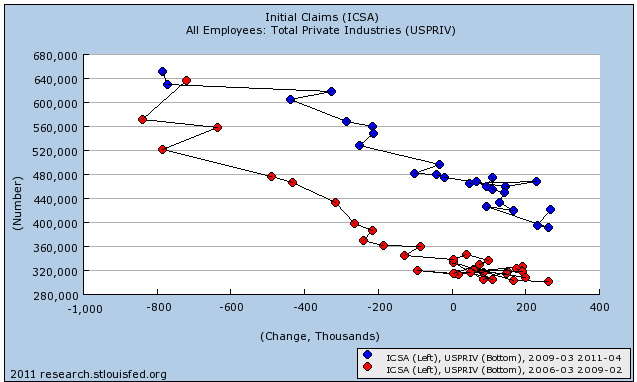
Last month, when the consensus was for a payrolls gain of about +150,000, I said to expect a report more like +50,000. I based this on the difference between how payrolls behave in the face of rising initial jobless claims vs. falling claims. For your reference, here is the scatter graph I ran last month comparing initial jobless claims vs. nonfarm payrolls, which includes the deterioration in jobs leading up to and into the recession in red vs. the improvement during the recovery in blue:


It simply makes a world of difference whether you are deteriorating into recession, or in recovery coming out of recession, leading to very different scatterplots as above (the same pattern is true for every other postwar recession).

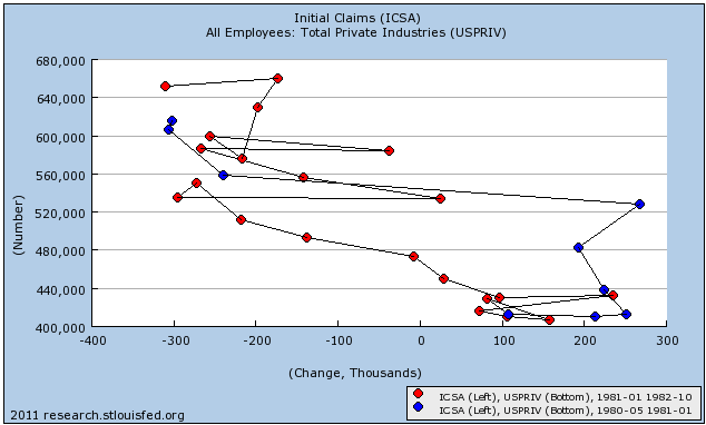
As I have previously noted, we only have one true example of a double-dip, and that is the failed 1980 recovery turning into the 1981-82 recession. Here is the scatter graph for that double dip, showing the abortive recovery (blue) and the double-dip (red):


Given the continuing initial claims in the 410,000 - 430,000 range, the poorer (red) trend on the scatterplot graphs is the one we should be referencing. More accurately, while we don't know what a new "red line" might be developing, it is almost certain to be to the left of the recent recovery "blue" line. Even with the "summer stall" last year, where GDP only fell to +1.7%, nonfarm payrolls fell into and remained in 5-digit territory.

Predicting the nonfarm payrolls number is admittedly a mug's game - there is variability of something like +/-125,000 around any estimate. This month the consensus is still for +110,000 private payrolls, and +80,000 total (meaning 30,000 lost government jobs). Unlike last month, both of these estimates look to be "in the ballpark." At the same time, a number similar to last month's looks more likely to me, and a larger loss of government jobs (which has happened in both June 2009 and June 2010). Let me put it this way: the range of reason includes a negative overall number for the first time in over a year.

Don't Expect a Second Half Rebound

The general thought process of most analysts argues for a stronger second half of the year. I am not so optimistic for the following reasons:

1.) Gas prices will not stay low. As I mentioned in today's oil market analysis, there is little hope for a continued period of low oil prices; the fundamentals of the market are simply far too bullish. Barron's article on the oil market last week summed up the basic situation:

Despite the recent 20% decline from April highs, new highs on crude, heating oil, diesel fuel, jet fuel and gasoline seem likely over the next 12 months. Following some further easing over the summer, the second leg of the long-term bull market in petroleum–the first occurred in 2007-08–probably will begin this fall.

As oil producers' spare capacity gradually declines to worrisome levels, the average monthly price could reach a record $150 per barrel by next spring, with spikes to $165 or $170. With this, $4.50-a-gallon gasoline will become the norm. That will put a huge dent in consumer wallets, while ramping up the desirability of fuel-efficient cars.

The continued short-term easing of oil prices should benefit the economy over the summer, only to exact a much larger payback later. The projected oil shock of spring 2012 will hurt the economic expansion, but not kill it, pruning about 1.5 percentage points from quarterly growth in real gross domestic product.

As such, I believe the choke hold of high oil prices will continue to exact growth concessions from the economy.

2.) The EU situation is continuing to lower overall confidence. Earlier this week, Portugal's debt was cut to junk status and there is already talk of problems with the Greek bail-out package. At this point, there is little reason to see this situation getting noticeably better -- that is, better to the point where it is no longer hurting overall confidence. Add to that the ECB is now hawkish on interest rates, and you have an added economic braking mechanism to contend with.

3.) The jobs market in the US continues to fluctuate around 9% unemployment, and initial new claims remain above 400,000. Washington is acting like its 1938 all over again, which will do nothing but hurt economic growth in the short-run as well as negatively impact confidence in the economy. Simply put, Washington is doing literally everything wrong right now, and the net result will be diminished growth.

4.) As I pointed out yesterday, Brazil now has an inverted yield curve, India's is flattening and China is raising rates and reserve requirements to lower overall inflation. In short, the central banks of the economies that drove world wide growth are raising rates to slow their respective economies. This will add to lower growth in the US, which has relied on exports to drive the last two years of expansion. We've already seen a wave of PMI slowdowns across Europe as a result.

5.) With the end of QEII, the largest buyer of treasury securities has left the market. The end result has been rising interest rates.

I seriously hope my analysis is wrong on this -- and if you see bright spots, please let me know. I just don't see any right now. At best, I see a muddling growth fluctuating around 2%.


Thursday Oil Market Analysis

Last week, I wrote the following about the oil market:
My long-term prediction for oil is for prices to again move higher and stay there because of the macro level supply/demand situation (see the link above for the charts). However, right now the chart has to move through a fair amount of technical resistance. Prices have to advance through the EMAs and several resistance levels. I would give prices through July or mid-August to accomplish that feat before moving into higher territory.
At the heart of my analysis is this basic situation:
The oil market is caught between two different issues. In the short-term, there is concern about the pace of expansion. Lower growth = lower oil demand = lower prices. However, as I pointed out above, there has been a strong, fundamental, long-term shift in the world's oil demand as countries like India and China have grown with their demand supplementing US/EU demand, providing a long-term floor under prices. But currently, these countries are also tying to slow growth due to increased inflationary pressures within their respective countries. In other words, there is currently a great deal of negative sentiment weighing down oil prices.


With 2 billion more people now demanding oil -- and supplies incredibly tight -- there is little hope for continued downward pressure on oil prices.

Simply put, there is tremendous amount of pressure on oil prices to move higher, with little to no reason for them to move lower. As such, arguing for higher oil prices is a no brainer.

Let's take a look at the chart:


Prices have sold-off for several reasons. First, the IEA coordinated a massive release of oil to offset lost production due to the Libya situation. In addition, for the last month there has been concern about the pace of economic recovery, leading traders to sell net long positions. However, we are now right in the middle of the summer driving season which will add upward pressure to prices. Additionally, nothing has changed in the supply and demand situation to warrant a change in the overall outlook.

On the chart, prices are now moving through several layers of technical resistance after their sell-off. However, they have already moved through the 10 and 20 day EMA as the MACD has printed a buy signal. The 10 day EMA is moving higher and the 20 day EMA is moving sideways. The next layers of resistance are the 50 day EMA and the 97.5/98 price level.

As I wrote last week, moving through this many layers of technical resistance takes time. I gave it about a month, which I still think seems like an adequate amount of time make this move. As such, I still see prices moving higher for the summer and for prices to be back over $100 within a month.

Wednesday, July 6, 2011

Brazil's Yield Curve is Inverted

From Bloomberg:


This is not what you want to see in an economy that is driving world growth.

China Raises Rates Again

From Bloomberg:

China raised benchmark interest rates for the third time this year after inflation accelerated to the fastest pace since July 2008.

The one-year deposit rate rises to 3.5 percent from 3.25 percent, effective tomorrow, the People’s Bank of China said on its website today. The one-year lending rate will increase to 6.56 percent from 6.31 percent.

Today’s move may fuel concern that monetary tightening will trigger a slowdown in the world’s second-biggest economy. A manufacturing index fell in June to the lowest level in 28 months on weaker growth in orders and output.

Inflation “is the Chinese authorities’ top policy priority for the near future,” Peng Wensheng, a Hong Kong-based economist with China International Capital Corp., said before the announcement.

I highlighted the increase in BRIC countries' interest rates yesterday. This is obviously more of the same. These economies are driving world growth. As they raise their rates, their economies will slow, hurting US growth.

The yield curve and pre-WW2 recessions

- by New Deal democrat

This continues my look at leading indicators as they may apply to pre-WW2 deflationary recessions. I have already looked at BAA bonds, housing starts, commodity prices, and the stock market. Today I will look at the yield curve.

Since 1960, the yield curve, in conjunction with "real M1," accurately foretold 8 of 8 recessions with no false positives. This is the "Kasriel Recession Warning Indicator" (named for Paul Kasriel of the Northern Trust Company). This indicator has also worked in reverse. If both the yield curve and real M1 were positive, the economy was expanding.

Two and a half years ago, I wrote a 5 part series, Economic Indicators during the Roaring Twenties and Great Depression, to see how well the Kasriel indicator worked before 1960. This series was sparked in large part by the most unnerving economic graph I've ever seen, from Ned Davis Research, the most relevant part of which is reproduced below:


In this graph, Fed Funds rates (pre-1935 rates are from the NY Fed) are in green, and long term government bond rates are in red (you can ignore the other two). As you can see, for virtually the entire period beginning in late 1929 and continuing right through the Great Depression and into the 1950s, the yield curve was resolutely positive. And yet that period coincided with the two worst downturns in the last 100 years, as well as three other recessions.

With help from a paper by a fellow named Ben Bernanke, I was able to reproduce graphs of long term interest rates (green), the fed funds rate (blue), and the CPI (red). Here they are for the 1920's:


And here they are for the early 1930's:


The result is, the yield curve inverted and accurately signaled the inflationary recession of 1920-21, the 1926 recession, and the onset of the 1929 "great contraction," but utterly failed to forecast its continuation, or the 1938 recession, or the two immediate post-WW2 recessions.

Of particular note, from early 1928 until late 1929, the yield curve was inverted. In fact, during 1929, with fed interest rates 6% over the CPI, the inverted yield curve (with long term bonds ~1.5%-2.5% under short term rates), was the most serious inversion until 1981 when Paul Volker killed inflation by raising interest rates some 9% over the inflation rate.

To sum up: in deflationary recessions, a positive yield curve is useless. An inverted yield curve in the face of deflation, however, does accurately signal the onset of a deflationary recession.

A Noted Increase in the Calls for Infrastructure Spending

From Hedge Fund Manager Barton Biggs:
Instead, Mr. Biggs, former chief global strategist for U.S. investment banking powerhouse Morgan Stanley, demanded the U.S. government temporarily return to ideas used in the Great Depression as a way to get the country back to higher growth.

"What the U.S. really needs is a massive infrastructure program … similar to the WPA back in the 1930s," he says.

The plan would be to employ some of the many unemployed people, jump start the economy, as well as help catch up with Asia, which is building state-of-the-art infrastructure from new mechanized port facilities to high-speed trains.

He suggested financing such building through the sale of U.S. Treasuries.

From Bill Gross of PIMCO:

Additionally and immediately, however, government must take a leading role in job creation. Conservative or even liberal agendas that cede responsibility for job creation to the private sector over the next few years are simply dazed or perhaps crazed. The private sector is the source of long-term job creation but in the short term, no rational observer can believe that global or even small businesses will invest here when the labor over there is so much cheaper. That is why trillions of dollars of corporate cash rest impotently on balance sheets awaiting global – non-U.S. – investment opportunities. Our labor force is too expensive and poorly educated for today’s marketplace.

In the near term, then, we should not rely solely on job or corporate-directed payroll tax credits because corporations may not take enough of that bait, and they’re sitting pretty as it is. Government must step up to the plate, as it should have in early 2009. An infrastructure bank to fund badly needed reconstruction projects is a commonly accepted idea, despite the limitations of the original “shovel-ready” stimulus program in 2009. Disparate experts such as GE’s Jeff Immelt, Fareed Zakaria, Jeffrey Sachs and Paul Krugman believe an infrastructure bank to be an excellent use of deficit funds: a true investment in our future. While the current administration admits that the $25 billion in Recovery Act spending on infrastructure only created 150,000 jobs, it also stabilized and improved this nation’s productivity for years to come. Clean/green energy investments also come to mind, most of which require government funding and a government thrust in order to create millions of jobs.

From Larry Summers:

Larry Summers, the outgoing director of the White House National Economic Council, said the US must ramp up spending on domestic infrastructure to drive the economic recovery.

Speaking at the Financial Times’s View from the Top conference in New York, Mr Summers called it a “short-term imperative and a long-term macroeconomic imperative” that the US government increase infrastructure investment. He said that a combination of low borrowing costs, cheap building costs and high levels of unemployment in the construction sector made this the ideal time to rebuild roads, bridges and airports.

What's interesting is the financial people don't seem to be concerned with fixing the deficit; they view the overall threat to growth as the primary problem facing the economy right now.

Treasury Tuesdays

Last week, I wrote the following about the Treasury market:
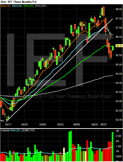
The fact that the long end of the curve didn't follow the belly higher is interesting. That and the continued deterioration in the TLT's technicals tells me the long end of the curve is selling off -- or at least holding even for awhile. I'm not convinced the IEFs are going to maintain a strong rally here, largely because the long-end of the curve is not following through. As such, I don't see the IEFs current move higher continuing. That would analysis would change if the TLTs break higher to new levels.
The Treasury market sold-ff last week. Yesterday, the WSJ today reported on the sell-off thusly:
The three-month run-up in Treasurys prices may be running out of steam—if the market isn't poised for an outright reversal. The longest selling streak in months has persuaded some analysts that yields have reached the bottom.

U.S. Treasury debt has sold off after a set of weak government debt auctions in the past five sessions—and has done so on notable trading volume. Until that point, prices had rallied since early April, fueled by a drumbeat of soft U.S. economic data and alarming headlines out of Europe.

On June 27, the benchmark yield touched a 2011 low of 2.842%. It has since catapulted above 3.20%. The 0.342 percentage-point jump in the past five sessions is the largest weekly advance since August 2009, prompting some analysts to suspect the bull run may be fizzling out. Bond yields move inversely to prices.

Goldman Sachs Group chief interest-rate strategist Francesco Garzarelli, on Thursday said he believed the Treasurys rally is over, as U.S. economic activity is expected to pick up in the second half of the year. He isn't the only one.

Barring any bad news from Europe, "we suspect the bottom is in," said Eric Green, chief U.S. rates strategist at TD Securities. He specifically pointed to the past months of weak data giving way to stronger economic growth and more attention to inflation.

Chris Ahrens, interest-rate strategist at UBS, says he sees yields pushing higher. "After a steady downward path since early April, it marks an important moment for the bond markets," he said. "The pressure is going to be on data to prove the more constructive [economic] scenario."

I'm not sold on the second half recovery story yet; although the recent action in the equity, copper and bond markets indicate traders are certainly buying into the argument. I do think the end of QEII is having a pronounced effect as the largest buyer of debt is effectively leaving the market. Let's take a look at the charts:

The 5-minute IEF chart shows the strength of the downtrend over the last 10 days. I've included Fibonacci retracement levels, as I would expect some type of rebound trade this week.


Prices have clearly moved below the 10, 20 and 50 day EMAs on an increase in volume. The 10, and 20 day EMA are both moving lower, and the 10 day EMA has crossed below the 20 day EMA. Prices have broken the upward sloping trend line. I would expect prices to rebound into the 10 or 20 day EMA before continuing their move lower with a price target of the 200 day EMA.


The TLT chart is slightly more bearish, as the 50 day EMA is also moving lower and prices are right below the 200 day EMA. However, notice the drop-off in volume as prices have moved lower these last two days, indicating the market may be using the 200 day EMA as a place to "pause" and catch its breath.

Given the low trading volume and the price action around the 200 day EMA, I'm thinking the TLTs will pause here or rebound into the EMAs. However, I think the IEFs are targeting the 200 day EMA. Given the Fed's departure, I believe the Treasury market is moving lower for the time being.

Tuesday, July 5, 2011

BRIC Economies Are Raising Short-Term Interest Rates

Consider the follow charts of short-term rates in China, Brazil and India:


Three of the four BRIC countries are hiking interest rates to combat inflation. Higher rates = lower growth.

Economic Week in Review

On Monday's I'm going to start looking at the previous week's major economic releases, analyzing the numbers along the same lines as used in the Fed's Beige Book. The reason is simple: this will help us all digest the news in a way that helps us understand the macro-level direction of the economy. Unlike NDD's higher frequency analysis, this will focus on the largely coincidental economic numbers that are released monthly and in some cases quarterly.

Consumer spending: Real personal consumption expenditures dropped .1%. The primary reason for the decrease is a drop in both non-durable and durable goods expenditures, which was caused by a drop in auto purchases. Real PCEs have now dropped the last two months, after a strong rise starting in early 2009. Consumer sentiment is still weak, as evidenced by both a drop in the Conference Board's number and the University of Michigan consumer sentiment number.
Link
Manufacturing: The ISM number surprised on the upside, but the new orders number was weak, as was the overall production number. In addition, the Chicago PMI also surprised on the upside. However, as I'll show later today, emerging economies are raising short-term interest rates, thereby slowing their respective economies. We've also seen signs of a slowdown at the global level in manufacturing, leading me to conclude this months numbers were abberations in an otherwise slowing manufacturing environment.

Real Estate: The good news here is the Case Shiller number increased, indicating the housing market may be bottoming. As I noted last week (see also here and here) -- and as NDD has also pointed out (see this post as well)-- it appears the housing market is closer to a bottom than conventional wisdom implies.

While the good news last week was Greece avoiding a default, the overall tenor of most reports was negative. Consumer sentiment is slipping, causing a drop in spending. Since this is 70% of US GDP, this is hardly a good development. Globally, manufacturing is in a slowdown, largely caused by emerging economies raising interest rates to control inflation.

Equity Week in Review and Preview of the Upcoming Week/Month

Last week, I wrote the following about the markets:
Right now, the 200 day EMAs are providing enough technical support to allow the markets to "catch their breath" from the recent sell-off. Traders have understandable concerns about the pace of recovery and the Greek debt situation. However, the disciplined pace of the sell-off and the stalling of the descent at the 200 day EMA indicate there is enough bullish sentiment to give the market pause -- at least for now.

However, a strong, multiple market break (involving 2 of the 3 major averages) below the 200 day EMA would be a watershed moment for this market. Should that happen, I would wait for a rebound into an EMA and then short.
I obviously did not see the strength of last weeks advance. Take a look at this five minute chart:


That is an incredibly strong rally that lasted for the entire week. All the EMAs are moving higher, prices are using the EMAs for technical support and there is a strong uptrend in place. The chart is printing a series of higher highs and higher lows -- a classic rally chart.


Prices have clearly bounced off the 200 day EMA and moved through all the EMAs. All the EMAs are moving higher, and the 10 day EMA has crossed over the 20 day EMA. Also note the strength of the bars, especially Friday's. Four of the five bars last week have very long bodies, indicating prices advanced throughout the day. There was also a nice bump up in volume for the last three trading days of the week. The fact the market did not sell-off on Friday is incredibly encouraging.


The A/D and CMF all indicate that money is flowing into the market, and the MACD indicates momentum is increasing.


The above chart shows possible support levels in case of a market pullback, which would be expected after a strong rally like that which occurred last week.

This week's rally was caused by three factors: first, we had end of the quarter fund manager window dressing, which forced managers with extra cash to put it to work. Second, the Greek vote agreeing to new austerity measures means the problems caused by the EU periphery have abated at least for now. Third, the market was oversold.

At this point, we should acknowledge that the stock market is a leading indicator. The question now becomes, was this week's advance a sign that equity traders think the worst is over, and therefore it's time to get into the action? The weakness in the Treasury market last week would bear this out, as would the rise in the oil market and copper's recent advance through key resistance areas. However, I'm personally not sold on a third or fourth quarter rebound yet. Consumer spending is weakening, global manufacturing is softening, emerging economies are increasing interest rates (US exports have been strong during the recovery) and Washington is full of idiots doing everything they can to screw up the economy. I would need to see an advance through previous highs on multiple indexes (with the Russell 2000 being one) before I'm sold on the veracity of this rally.

Monday, July 4, 2011

Happy Fourth of July

We'll be back tomorrow morning when the markets open

Friday, July 1, 2011

Weekly Indicators: manufacturing and commercial construction improve edition

- by New Deal democrat

Monthly data released this week showed relief from the manufacturing slowdown, as the Chicago PME rebounded to a strong 61.0 and the ISM manufacturing survey also rebounded to 55.3. The employment, new orders, and vendor delivery components were also up slightly.

New construction spending was mixed, with residential construction in May down 2%, but nonresidential construction up 1.2%. Residential construction is meandering near the bottom of a 3% range established since last July, while nonresidential construction has essentially been flat so far this year (i.e., it appears to be bottoming).

Real personal income was flat, and real personal spending decreased -0.3% in May, indicating further impact of high gas prices, and consumer confidence and University of Michigan consumer sentiment were both down. The Case-Shiller house index also declined, but but not as much as expected.

The high-frequency weekly indicators were also mixed this week.

Let's start with the good:

YoY weekly median asking house prices from 54 metropolitan areas at Housing Tracker showed that the asking prices declined only -3.5% YoY. This is the best reading since May 2007. The areas with double-digit YoY% declines decreased by three to 7. The areas with YoY% increases in price increased by four to 7. This adds more weight to the belief that in nominal if not real terms housing prices may bottom as early as this winter.

The ICSC reported that same store sales for the week of June 25 increased 3.0% YoY, and increased 2.9% week over week. This is the best YoY comparison in a month. Shoppertrak failed to report this week.

Other series remained in their recent range:

M1 was up 0.5% w/w, up 0.2% m/m, and up 12.5% YoY, so Real M1 was up 9.1%.
M2 was up 0.3% w/w, up 0.5% m/m, and up 5.2% YoY, so Real M2 was up 1.8%.
Real M1 remains very bullish, while Real M2 remains stuck in the caution zone under 2.5%

The BLS reported that Initial jobless claims last week were 428,000. The four week average increased slightly to 426,750. We appear to have stabilized under 430,000.

The Mortgage Bankers' Association reported that seasonally adjusted mortgage applications decreased 3.0% last week. It was 4.5% higher than this week last year. This is the fifth week in a row that YoY comparisons in purchase mortgages were positive. Except for the rush at the two deadlines for the $8000 mortgage credit, these are the first YoY increases since 2007. Refinancing decreased 7.6% w/w despite a decline in mortgage rates.

Topping the weak or bad numbers is the report from Railfax, which was up a mere 1.3% YoY for the week. Baseline traffic is actually down 662 carloads from a year ago. Cyclical traffic was also down, 7141 carloads YoY. Intermodal traffic (a proxy for imports and exports) was the only component up this week, at +19,128 carloads YoY. This series is very close to turning negative on a carload basis.

Oil was near $94 a barrel midday Friday, right at the level of 4% of GDP which according to Oil analyst Steve Kopits is the point at which a recession has been triggered in the past. Gas at the pump fell for the sixth week in a row, declining $.08 more to $3.57 a gallon. Gasoline usage at 9261 M gallons was -2.2% lower than last year's 9462. This is the first time in five weeks that gasoline usage has been significantly less than last year.

The American Staffing Association Index remained at 87 for the third week in a row This series is just barely above a stall, and is a significant danger sign. It is weaker than early 2007, but not trending down as during the recession.

Weekly BAA commercial bond rates remained the same at 5.73%. This compares with yields on 10 year treasury bonds decreasing .01% to 2.99%. The continuing decline in treasury rates shows fear of deflation, and the relative increase in corporate rates shows a slight increase in relative distress in the corporate market.

Adjusting +1.07% due to the 2011 tax compromise, the Daily Treasury Statement showed that for the first 21 days of June 2011, $135.2 B was collected vs. $136.5 B a year ago, for a decrease of $1.3 B YoY. For the last 20 days, $134.8 B was collected vs. $115.9 B a year ago, for an increase of $18.9 B, or 15%. Use this series with extra caution because the adjustment for the withholding tax compromise is only a best guess, and may be significantly incorrect.

While much of the data shows a stall, almost none of it shows any actual decline in economic activity. Housing and Oil prices continue to appear to be moving in the right direction. Contractionary fiscal policy coming out of Versailles remains the biggest risk.

Have a happy and safe Fourth of July weekend!

Stock prices and pre-WW2 recessions

- by New Deal democrat

This continues my look at leading indicators as they may apply to pre-WW2 deflationary recessions. I have already looked at BAA bonds, housing starts, and commodity prices. Stock market prices, in the form of the S&P 500, of course are part of the modern set of LEI. How did they perform in the Roaring Twenties and Great Depression? Let's have a look.

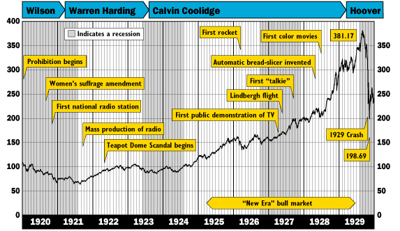
Here is a graph of the DJIA (the S&P 500 wasn't created until later) during the Roaring Twenties:


The 1920-21 recession was very much like the 1981-82 recession. High inflation during WW1 was broken via a deep but short-lived bust. Thereafter while the stock market did accurately top and bottom before the peak and trough of the 1923 recession, it rose right through the 1926-27 recession and infamously topped in September 1929 after the downturn that became the Great Depression had already begun.
For a more detailed look, here is a chart of the yearly highs and lows of the DJIA, with the date of those highs/lows in parenthesis, compared with recession dates:

YearYr. high (date)Yr. low (date)Recession dates
1920108.76 (Apr) 66.75 (Dec) 1/20-
192181.50 (Dec) 63.90 (Aug) - 7/21
1922103.43 (Aug) 78.59 (Nov) -
1923105.38 (Mar) 85.76 (Oct) 5/23-
1924120.51 (Dec) 88.33 (May) -7/24
1925159.39 (Nov)115.00 (Mar) -
1926166.64 (Aug) 135.20 (Mar) 10/26-
1927202.40 (Dec) 152.73 (Jan) -11/27
1928300.00 (Dec) 191.33 (Feb) -
1929381.17 (Sep) 198.69 (Nov) 8/29-
1930294.00 (Apr) 157.51 (Dec) cont.
1931194.36 (Feb) 73.79 (Dec) cont.
193288.78 (Mar)41.22 (Jul) cont.
1933108.67 (Jul) 50.16 (Feb) -3/33
1934110.74 (Feb) 88.57 (Jul) -
1935148.44 (Nov)96.71 (Mar)-
1936184.90 (Nov) 143.11 (Jan) -
1937194.40 (Mar) 113.64 (Nov) 5/37-
1938159.51 (Nov) 96.95 (Mar) -6/38
1939155.92 (Sep)121.44 (Apr) -
1940152.80 (Jan)111.84(Jun) -


The DJIA did make a trough in 1932 before the end of the contractionary part of the Great Depression, and did both peak and trough before the economic peak and trough of the 1937-38 recession.

Of the 9 total economic peaks and troughs in this period, the DJIA was a leading indicator 5 times, coincident 2 times, and missed one recession altogether. In short, useful but not perfect.

Manufacturing Slowdown is Global

Over the last two months or so, we've seen a variety of US manufacturing indexes show signs of a slowdown. However, the slowdown is not limited to the US

From Bloomberg

Manufacturing growth is slowing in from China to Europe, creating a dilemma for central bankers considering higher interest rates to combat inflation.

China’s factory index fell to the lowest level since February 2009, while in the 17-nation euro area, a gauge slipped to to an 18-month low. German manufacturing expanded at the weakest pace in 17 months, while Italy, Ireland, Spain and Greece contracted.

“There is a broad-based slowdown taking place in the manufacturing sector,” Silvio Peruzzo, an economist at Royal Bank of Scotland Plc in London, said by telephone. “But it’s still too early to jump on the view that we’re heading toward an environment where activity will be contracting.”

Europe’s debt crisis and slowing U.S. growth are damping demand for goods, putting pressure on policy makers to delay further rate increases even as prices gain. Inflation quickened to the fastest pace since 2008 in China, exceeded 20 percent in Vietnam last month and prompted protests in India. Euro-area inflation remained at 2.7 percent in June, exceeding the European Central Bank’s 2 percent ceiling for a seventh month.

Inflation pressures have prompted Asian central banks to be among the quickest to withdraw monetary stimulus as growth accelerated following the global recession in 2009. India, South Korea, Thailand and Taiwan raised their benchmark rates last month to contain rising prices, while China ordered lenders to set aside more cash as reserves.

See also this article from the WSJ

The article highlights the basic global themes we've seen over the last few months.

1.) Inflation is accelerating in emerging economies -- the same economies that are now the engine of global growth. As inflation has accelerated, emerging economy central banks have raised their respective rates. In fact -- we've seen emerging market's bond markets go inverted over the last few months.

2.) Not mentioned in the article -- but of equal importance -- is the effect of the Japanese earthquake, which has negatively impacted a variety of manufacturing issues.

3.) The US appears be hitting a slowdown caused by a lack of consumer confidence. With unemployment still high, job growth weak, gas prices high and political paralysis the standard method of conflict resolution in Washington, consumers appear to be lessening their spending on all but necessities at this point. As this makes up 70% of GDP growth, the overall impact is quite negative.


Thursday, June 30, 2011

Friday Dollar Analysis

Last week, I wrote the following about the dollar:

The A/D line shows a big move into the market in early May, but not much since. The CMF confirms the lack of movement into the market. The MACD shows increasing momentum, but note the current peak is lower than the last, indicating overall declining momentum right now. While the 10 and 20 day EMAs are still below the 50 day EMA, the shorter EMAs are now moving sideways rather than lower. They are also intertwined. The downward angle of descent on the 50 day EMA is also lower.

The chart is showing many signs of a reversal in progress.

The story in the currency markets for the last few weeks has been the Greek situation. Any story that was Greek resolution negative moved the euro lower and the dollar higher while the opposite was true. It is interesting to note the dollar is probably forming a bottom at an apex of the Greek vote story.

Let's start by looking at the really long view:


Last year, the market formed a head and shoulders pattern. In addition, since the top in mid-2010, prices have formed a down/up/down, lower high/lower low pattern. Currently, prices are forming a triangle pattern.


The above chart shows the consolidation in more detail. First, note the EMAs are moving closer together, which is usually a sign of market consolidation.


The jump in the A/D four weeks ago shows a big volume spike -- but nothing since then. The CMF indicates that money flowing into the market is evening out, while the MACD shows a slowing momentum.

I'm still thinking the dollar is forming some type of bottom at this time. The EU situation appears to be at a head, giving the market "closure."

Special Bonddad blog midyear graph-reading contest

- by New Deal democrat

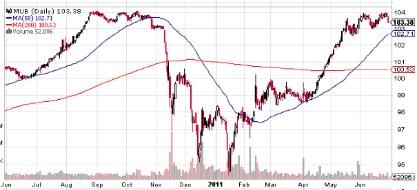
Today is June 30, and that means tomorrow starts a new fiscal year for most states. Which means it certainly is about time for Meredith Whitney's forecast of 50 to 100 significant municipal defaults totaling about $100 billion this calendar year, to start kicking in. Let's pull up a graph of a Municipal Bond index fund for the last year and see how far it's plummeted:


Oh, wait ....

So your special midyear graph-reading contest is, on what two dates did the Pied Piper of Doom predict that "the shit may, indeed, be hitting the fan concerning ... the truly dire straits of the finances of at least some of our country's states and municipalities," and specifically tout Whitney's prediction of a "meltdown" above?

Hint: he at least managed not to bottom-tick the price this time.

P.S. As of the most recent data, state tax collections continue to surprise to the upside, although that still doesn't make up for the loss of federal assistance.

Treasury Market Selling Off?

From the WSJ:

For the third consecutive session, Treasury investors on Wednesday balked at buying new bonds at a large government-debt auction, sending prices lower and yields higher.

The yield on the benchmark 10-year note reached 3.11%, its highest since May 25. Yields on the 10-year note have risen every day this week, adding about 0.24 percentage point since Friday and sparking speculation that the bull run in the bond market may have passed its peak.

The Treasurys on sale on Wednesday were $29 billion of seven-year notes. That followed sales of two- and five-year notes, all of them showing low levels of demand in the private sector and among foreign buyers.

The poorly received auctions raised eyebrows ahead of Thursday's official finish of the Federal Reserve's second bond-buying initiative, a $600 billion "quantitative easing" program widely known as QE2.

This is something I've been writing about for the last few week (see here, here and here).


Small Business Lending Heating Up?

From Reuters:

Borrowing by small U.S. businesses rose at a record pace in May, data released by PayNet Inc on Thursday showed, a sign that economic growth is poised to pick up in coming months.

The Thomson Reuters/PayNet Small Business Lending Index, which measures the overall volume of financing to U.S. small businesses, rose 26 percent in May from a year earlier, PayNet said.

The index is now at its highest since July 2008, two months before the collapse of Lehman Brothers and the near derailment of the world financial system.

.....

"If small businesses are taking these kind of chances, taking risks, making long term investments, they are seeing some long-term opportunities on the horizon," PayNet founder Bill Phelan said in an interview. "That's got to be a big positive sign for the economy."

Separate data also released on Thursday showed small business loan defaults at their lowest in five years, tying records set in April and May 2006.

Accounts in moderate delinquency, or those behind by 30 days or more, fell in May to 1.95 percent from 2.06 percent in April, PayNet said on Thursday.

Accounts 90 days or more behind in payment, or in severe delinquency, fell to 0.59 percent in May from 0.63 percent in April.

I have never heard of Paynet, but thought this was an interesting development in light of recent news.

Wednesday, June 29, 2011

Thursday Oil Market Analysis

Last week, I wrote the following about the oil market:
The oil market is caught between two different issues. In the short-term, there is concern about the pace of expansion. Lower growth = lower oil demand = lower prices. However, as I pointed out above, there has been a strong, fundamental, long-term shift in the world's oil demand as countries like India and China have grown with their demand supplementing US/EU demand, providing a long-term floor under prices. But currently, these countries are also tying to slow growth due to increased inflationary pressures within their respective countries. In other words, there is currently a great deal of negative sentiment weighing down oil prices.
On the same day, the IEA announced a coordinated effort to release oil from various strategic oil reserves in an effort to lower prices, which in fact happened.

The above analysis still stands: there are short-term issues that are hitting oil prices, but longer term supply and demand are still incredibly tight. Professor Hamilton summed up the basic issue in his article on the release:

In any case, the deed is now done, and the IEA has run an interesting experiment for us in how oil markets function. But I would recommend against further SPR sales, regardless of the final outcome of the current effort. The reason is that I see the long-run challenge of meeting the growing demand from the emerging economies as very daunting, and in my mind is the number one reason we're talking about an oil price above $100/barrel in the first place.

A one-time release from the SPR, or even a series of releases until the SPR runs dry, does nothing whatever to address those basic challenges.

And the growing demand from emerging markets is the primary underlying force in the oil market right now, which I believe is putting a floor under oil prices.

That being said, let's take a look at the chart:

The price chart is still negative. All the EMAs are moving lower and prices have been using the EMAs are technical resistance. Also notice that the EMAs have fanned out, obtaining a bit of distance from each other. The MACD is also weak; it's in negative territory and has shown little advance over the last month. However, it is about to give a buy signal.

My long-term prediction for oil is for prices to again move higher and stay there because of the macro level supply/demand situation (see the link above for the charts). However, right now the chart has to move through a fair amount of technical resistance. Prices have to advance through the EMAs and several resistance levels. I would give prices through July or mid-August to accomplish that feat before moving into higher territory.

June YoY house price declines least since May 2007

- by New Deal democrat

Consider two different scenarios by which house prices could still decline 25% in real, inflation-adjusted terms, from the present:

(1) nominal prices decline 5% a year for 5 years, and inflation is 0% over that time.
(2) nominal prices do not decline at all over the next 5 years, but inflation is 5% a year.

Both of those give us "real" price declines of 25%, but with very different results, and very different amounts of pain.

In the first scenario, more and more homeowners are "underwater" with houses not worth what they paid for them, and not even worth the outstanding mortgage amount. They are unable to sell, since they can't bring cash with them to the closing table to make up the difference. More and more allow their houses to slide into foreclosure, thus increasing the shadow inventory of bank-owned houses.

In the second scenario, however, no more homeowners whatsoever are "underwater." Even better, mortgage payments - and purchases - are made with inflated currency. There is no further incentive to hand in the keys and walk away from the house, and shadow inventory is worked off.

Needless to say, the second scenario is a lot less painful than the first one and yet accomplishes the same result.

Over the last several weeks, I've read more and more commentary suggesting that at least nominal prices in the housing market might start to make a bottom. Now that we have the most recent Case-Shiller report (from April, but really a February, March, and April average), and the final June asking price data from Housing Tracker, which accurately showed the turn at the top of the market in 2006, let's take a look at whether housing prices may better fit the first or second scenario.

Here is the updated chart of YoY% change in asking prices from Housing Tracker's 1,000,000+ home database:

Month2007 2008 2009 2010 2011
January ----7.5%-11.5%-5.8%-8.7%
February ----7.8%-12.0% -5.2%-8.4%
March ----8.3% -10.9%-5.0%-7.3%
April -2.7% -8.6%-9.6%-5.0%-6.8%
May -3.5% -9.1% -8.1%-5.0%-5.6%
June -5.0%-9.8%-7.0%-5.0%-4.4%
July -5.4% -10.4%-6.1% -5.1%---
August -6.0% -10.6%-5.5%-6.1%---
September -6.2% -11.1%-5.1%-6.6%---
October -6.7% -11.4% -4.5%-7.0%---
November -6.6%-11.7%-4.5%-6.7%---
December -7.2% -11.4%-5.6% -7.8%---


The YoY -4.4% decline in June is the smallest YoY decline since May 2007. Here is the same information (through 2 weeks ago) shown graphically (h/t Silver Oz):


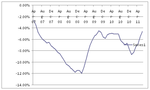
In comparison, here is the YoY% change up through the February - April average in the Case-Shiller 20 city index:


Over the time period of comparison, the Housing Tracker trend in asking prices has appeared to run 1 to 4 months ahead of the Case-Shiller sales data. Keep in mind that the most recent Case-Shiller data compares sales from a period when buyers and sellers wanted to close quickly to take advantage of the $8000 housing credit, with a period one year later where there is no credit. Even so, it looks like the YoY% change may be close to bottoming.

I fully expect the Case-Shiller series to bottom out in YoY% terms within the next several months, and to mirror the more current better YoY comparisons in the Housing Tracker database. In other words, it continues to look like the second scenario set forth above is going to be closer to the truth, and among the possibilities, that's good news.

Quick Update on the Equity Markets

Consider this chart from Bespoke Investment Group regarding the last two days of equity price action:


Notice that the rally has been led by more speculative areas of the marker -- technology and consumer discretionary.

Consider this in line with the treasury market, which should absorb the outflow of money from the stock market in the event of an equity sell-off. For the last few weeks, the Treasury market rally has shown decreasing momentum (see here and here), with the long-end of the curve moving sideways and the belly of the curve rallying a bit. At the same time, the stock market has found support at the 200 day EMA (see here and here). The question now becomes -- is this rally in the markets the beginning of a new trend, or a simple relief rally from the sell-off?

There are several possible scenarios. This chart from Channels and Patterns Blog offers a very realistic possibility.


That chart makes sense if the market becomes bearish on the second half outlook. While many economists have lowered their growth projections, the consensus is still for second half growth, albeit below trend. However, should we continue to see bad news for the foreseeable future, this is a real possibility.

A second possibility is the current sideways action is a rectangle consolidation, which traders are using to consolidate gains, and take some profits off the table. This makes sense if the current Treasury market stall is caused by a change in growth perceptions rather than concern about a possible default.

Either way, the markets are very much in a "wait and see" mode.

The Economic Ball's In Washington's Court -- And That Ain't Good

As I see current economic events, the real story actually lies in Washington.

First, recent economic news has been poor. It started with high commodity prices squeezing margins and consumers. At the same time, we saw international growth engines India, Brazil and China raise interest rates and reserve requirements to slow their economies, thereby also muting the increased demand caused by their growing economies. In the US, consumers have switched focus from mass consumption to paying down debt and a frugal approach to buying, making the slowing demand from India and China that much more important as it creates a slight vacuum for macro-level, international demand.

This was followed by the shock of Japan's earthquake, which more or less completely threw-off global supply chains for consumer electronics and autos. This added further downward momentum to the manufacturing cycle, which was one of the strongest ares of the domestic economy. At the same time, the budget talks were then getting underway with every event being reported as if the situation were in a cage match.

In short, all action appears to be on hold until Washington solves (and I use that word in the most liberal manner possible) the current budget impasse. As I pointed out yesterday, this is creating a tremendous amount of uncertainly as both possible "solutions" offer little to no real help for the economy in the short-run. As such, I think most major economic players are moving into a disaster mentality, conserving capital and putting all major plans on hold.

Tuesday, June 28, 2011

Wednesday Commodity Round-Up


The long-term gold chart shows that prices have broken one uptrend, but the longer trend started last year is still in place. Prices have technical support in the 144 and 140 area.


Prices are now below the 10, 20 and 50 day EMA. The 10 and 20 day EMAs are both moving lower, and the 10 day EMA has crossed below the 20. The 50 day EMA is now moving sideways. Also note that after peaking in late April, prices have yet to approach previously established highs.


While the A/D line shows a slight increase in inbound money, the CMF and MACD are both moving in negative directions. These two indicators tell us that momentum is decreasing and less and less money is flowing into the market.

Gold appears to be in a holding pattern right now. As commodity prices have dropped, the need for inflation protection has also dropped. However, there is still a fair amount of economic uncertainty, putting a bud under prices.

A Note on Home Prices


Click on the above chart for a larger version.

The above is from the latest Case Shiller home price index. Notice the area in the black square. Note particularly that is has been around this level for the last two years or so. Finally, notice that prices have been in a fairly tight range for this period.

There's been an awful lot of talk/hype/pixels spilled lately regarding home prices. The above chart tells us that home prices have been fairly stable for the last two years. In fact, as NDD has pointed out, home prices may be far closer to stabilizing than previous thought.