Showing posts with label ECRI. Show all posts

Thursday, March 1, 2012

Calling BS on ECRI's recession call defense

- by New Deal democrat

Last Friday ECRI spokesman Lakshman Achuthan appeared on CNBC, CNN and Bloomberg television to defend his firm's 5 month old recession call. In the face of almost universal agreement that economic data has improved in the last few months, Achuthan insisted that it was beyond dispute that the real indicators had weakened, saying:


Since our recession call five months ago, the definitive, hard data used to determine official recession dates have gotten worse, not better, despite the consensus view that things have been improving. Okay? Since we made that call in late September, not a forecast, just looking at the incoming data.... those [are] key, hard facts. Nobody can get away from these no matter what you try to do.....

.... the hard data -- not a forecast, these are facts -- in plain English, economic growth is at its worst reading since early 2010. We are not cherry-picking the data. This is what is used to officially date the business cycle. They're the official, specific determinants of the business cycle.

.... the continued weakening in economic growth is consistent with our recession call from five months ago.
I call Bullshit.

Achuthan based his argument on the performance of GDP and also the NBER's coincident measures of recession vs. expansion -- output, sales, income, and jobs. He also rightly noted that the monthly payrolls report actually lags slightly (note: specifically, it has always lagged real retail sales, which turn first), thus he focused on industrial production, sales, and income, saying that these as well as the GDP figures were hard data, not forecasts, and they were getting worse.

So here is a graph of GDP, normed at 100 at the bottom of the great recession:


Does that look like it's getting worse to you?

Now, here is a graph of industrial production, real retail sales, and real disposable personal income, averaged together, also normed at 100 at the bottom of the great recession:


Does that look like it's getting worse to you?

In fact, the real coincident data doesn't look like it's getting worse because it's not getting worse!

Achuthan's argument was based entirely on the second derivative of the coincident indicators. In other words, they're getting better, but they're getting better at a worse rate. Not only that, instead of relying on real-time month over month or quarter over quarter data, his argument was based on year over year trends.

Frequently it is necessary to use YoY data because much data is seasonal (e.g., housing sales, rail carloads). Other times it is useful to describe longer term trends by smoothing out the data. But where seasonally adjusted data exists, the use of YoY trends badly lags turning points -- exactly the opposite of what ECRI claims to be doing. And it makes a crucial difference in analysing their argument.

To show you how, let's first look at YoY% growth in GDP, a graph used by Achuthan:


This seems to support ECRI's claim that the coincident indicators are getting worse (although, as others have already shown, similar declines have happened as recently as 1987, 1993, and especially 1996 without demonstrating any imminent recession).

Now let's look at the same data, not YoY but quarter over quarter:


The real-time non-lagging GDP data shows improvement since the dismal first quarter of 2011.

Finally, let's compare the two. In the graph below, quarter over quarter GDP growth, annualized, is again shown in red exactly as above, and compared with the YoY% GDP growth in blue:


It is crystal clear that the red series of q/q GDP change turned first before and after both the 2001 and 2008 recessions. And yet Achuthan is basing his case that we are on the cusp of a recession not on the more forward looking red q/q series but on the lagging blue YoY series!

Let's do the same thing with sales (blue), output (red), and income (green). First, here's the graph of YoY% change


All of these show a decline in the second derivative, in the case of real disposable income, all the way to zero.

Now here is the same data, not YoY, but month over month (added together for simplicity):


Again, quite a different picture emerges. Last spring in particular was weak, but there has been improvement since then.

This, then, is the core of the argument Achuthan made: we're going into a recession because, after a stall last spring, the rebound since hasn't been as strong as the months that immediately preceded the stall.

This is as backward-looking an argument as can be, and hardly something I would expect from a group that prides itself on its forward looking indicators. Let me be more blunt: contrary to Achuthan, "the definitive, hard data used to determine official recession dates" by the NBER are not the YoY lagging metrics he relied upon, but rather the month over month and quarter over quarter metrics I have compared them with above. They are not "getting worse" as claimed by Achuthan, but improving as I have shown.

In fact during the Bloomberg and CNN interviews, leading indicators weren't mentioned at all. In response to a direct question during the CNBC interview, there was only one brief mention of leading indicators "in the aggregate" still supporting ECRI's call, with no further elucidation.

This is a severe problem with ECRI's black box methodology. Since he doesn't want to give away any of his firm's secrets, he is reduced to making his public argument by relying on lame lagging data.

With gas prices nearing $4 a gallon already, ECRI may yet get their recession before the end of 1H 2012, but if they do it won't be for the reasons cited by Achuthan. As I pointed out yesterday, there's is a very good bearish case to be made, based on a consumer who is probably near exhaustion, and ECRI does apparently believe in that argument, based on the headline to a proprietary article on their site. Too bad Achuthan didn't actually make that argument, and couldn't show why he believes it will prove correct.
Thursday, February 2, 2012

Hussman's, ECRI's (initial) recession warnings invalidated

- by New Deal democrat

The two primary proponents of the view that a new recession is beginning have been ECRI and John Hussman. As of now, we can say that Hussman's own metric invalidates his recession call, and that ECRI's initial recession call was also inaccurate.

While I have great respect for ECRI, when they made their initial recession call in September 2011, I wondered if they had misinterpreted a transient if violent downturn in manufacturing and consumer confidence, due mainly to the debt ceiling debacle and the consequent downgrading of US bonds, for typical short term leading indicators of recession. We can now say that it indeed appears to have been the case.

ECRI issued its private recession warning to clients on or about September 23, and went public with the warning on September 30. Their statement was unequivocal, Laksham Achuthan saying that recession was "imminent," and that he was
confident that the recession either began in the third quarter, which ends today, or will begin in the fourth quarter....

"We may be in a recession today already, or it may start in the next month or two."
[CNBC video with quotation embedded here.]

Achuthan also made it clear that he was relying not on GDP, but rather on the traditional NBER standards for determining a recession: industrial production, payrolls, real retail sales, and real personal income.

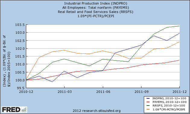
Well, the 4th quarter data is in, and here's where those four metrics stand:


All four finished 2011 at post recession highs. While certainly revisions to data are frequent, it will take some serious revising to cause enough of this data to turn negative to claim that a recession did begin by the end of last year. While subsequently ECRI backtracked and has revised the call to say a recession will begin by the end of June, their initial call must be regarded as busted.

Now let's turn to John Hussman. On August 8, 2011, John Hussman officially issued his "recession warning," saying that
the composite of economic and financial evidence we presently observe has always and only been associated with ongoing or immediately impending recessions. This is not an opinion or a viewpoint, but a fact of the data. "Always and only" is the Bayesian equivalent of "certainty"
The evidence he cited is the following composite, which he had set forth one week earlier, on August 1, 2011. The composite -- updated with my comments in italics -- is as follows:
1: Widening credit spreads: An increase over the past 6 months in either the spread between commercial paper and 3-month Treasury yields, or between the Dow Corporate Bond Index yield and 10-year Treasury yields.

NDD comment: this component is still in effect, as credit spreads have not significantly improved since falling in August, but this condition may be violated in about six weeks if there is no further deterioration.

2: Falling stock prices: S&P 500 below its level of 6 months earlier. This is not terribly unusual by itself, which is why people say that market declines have called 11 of the past 6 recessions, but falling stock prices are very important as part of the broader syndrome.

NDD comment: This condition has been violated as of one week ago. The S&P 500 is higher now than it was 6 months ago, and yesterday came within a hair of a 6 month high.

3: Weak ISM Purchasing Managers Index: PMI below 50, or,

3: (alternate): Moderating ISM and employment growth: PMI below 54, coupled with slowing employment growth: either total nonfarm employment growth below 1.3% over the preceding year (this is a figure that Marty Zweig noted in a Barron's piece many years ago), or an unemployment rate up 0.4% or more from its 12-month low.

NDD comment: This condition has also been violated as of the January ISM report of 54.1. If January nonfarm payrolls exceed 122,000, there will be a second violation as payroll growth will be more than 1.3% YoY. The unemployment rate has fallen by 1/2% in the last half year.

4: Moderate or flat yield curve: 10-year Treasury yield no more than 2.5% above 3-month Treasury yields if condition 3 is in effect, or any difference of less than 3.1% if 3(alternate) is in effect (again, this criterion doesn't create a strong risk of recession in and of itself).

NDD comment: This condition is still in effect. Of course, it was also in effect during most of the 1930's 10% YoY New Deal expansion, the entire 1940's, and the start of the 1950's -- coinciding with the strongest growth of the last 100 years.
Now, it's possible that there are differing levels for these 4 metrics signaling "recovery" for Hussman vs. their "recession" signals as claimed above, but if so Hussman should explain what those different recovery levels are. Otherwise, as of now, two of the four necessary metrics metrics making up his composite based on which he predicted an "imminent recesson" 6 months ago have been violated. Thus the original basis for his recession warning is also no longer valid.

As for the immediate future, the simple question is: can you really have a recession when housing (permits close to 3 year highs) and cars (sales at 3 1/2 year highs) won't play along? On a related note, this morning's initial jobless claims number of 367,000 was the first week not affected by seasonality, and tells us that the recent drop was very real. If the relationship between initial jobless claims numbers and payrolls for this recovery continues to hold, then we should expect January's payrolls report tomorrow to be similar to December's number -- generally, somewhere in the vicinity of +200,000.

Thursday, December 29, 2011

An examination of the model for ECRI's black box

- by New Deal democrat

Two weeks ago, an article I wrote, A Peek inside ECRI's black box gained considerable traction. There I examined a number of data series which likely generated ECRI's recession warning in September, using as my starting point the work of ECRI's founder, Prof. Geoffrey Moore, who in a 1961 manuscript set forth a number of leading indicators that predicted recessions and recoveries both before and after World War 2. A commenter at Seeking Alpha, dlamba, suggested reading Prof. Moore's later work, "Leading Indicators for the 1990's" (1991) in which he laid out in considerable detail his 1980's research into both Long and Short leading indicators, and also suggested a high-frequency Weekly Leading Index which, while slightly less reliable, could be updated in a much more timely and frequent fashion.

The book itself describes the research and the results thereof, as well as setting forth the methods by which values for each indicator were computed. A description of all of that, and the present values of each indicator, are beyond the scope of this post. Instead, let me simply describe the data that as of 1990, Moore recommended for each index.

Moore proposed 4 Long Leading Indicators:

Real M2
Dow Jones Bond Average
Housing Permits
The ratio of price to unit labor cost in manufacturing

These turn negative at least 12 months before the onset of recession, and on average 14 months before, and turn positive on average about 11 months before the end of a recession.

He also proposed 11 Short Leading Indicators:

S&P 500 stock price index
Average workweek in manufacturing
Layoff rate under 5 weeks
Initial claims for unemployment insurance
ISM manufacturing vendor performance
ISM manufacturing inventory change
Journal of Commerce change in commodity prices
Change in deflated nonfinancial debt
New orders for consumer goods and materials
Dun and Bradstreet change in business population
Contracts and orders for plant and equipment

On average these turn negative about 8 months before the onset of recession and turn positive 2 months before the end of a recession

Finally, he proposed a Weekly Leading Index made up of indicators whose values could be computed weekly, or if monthly were reported at the beginning of the next month. While this index would be a little less reliable than the two others, it would have the advantage of being more timely. It's components are:

Real M2
Dow Jones Bond Average
S&P 500 stock price index
Average workweek in manufacturing
Layoff rate under 5 weeks
Initial claims for unemployment insurance
ISM manufacturing vendor performance
ISM manufacturing inventory change
Journal of Commerce change in commodity prices
Dun and Bradstreet new business formation and large business failure
Real estate loans, deflated, growth rate

Many of these are the same as on the Long and Short Leading Indicator list, but are calculated weekly for purpose of the weekly index. On average these turn 12 months before the onset of a recession and turn positive three months before the end of a recession

Prof. Moore also set forth a series of signals that could be used to predict recessions and recoveries (p. 76):

"The first signal of recession occurs when the six-month smoothed growth rate in the leading index first declines below 2.3%. The second signal requires the leading index growth rate to fall below -1.0% and the coincident index to fall below 2.3%. The third signal is set off when the leading rate is below zero and the coincident below -1.0%. ... [T]he first signal of recovery ... is set off when the six month smoothed rate of change in the leading composite first goes above +1.0%."

In case it isn't clear from the above quote, in a recent interview Lakshman Achuthan explicitly stated that it is a decline in the coincident indicators -- nonfarm payrolls, industrial production, real income, and real retail sales -- rather than a decline in GDP, that defines a recession for them.

At its website, ECRI maintains that it "refined" the above indicators throughout the 1990's both before and after its founding in 1995. My examination of the Long Leading Indicators in the above list, for example, strongly suggests that at least one of those has subsequently been replaced.

I will examine the forecasting record, up to the present, made by each of the 3 above indexes, in future posts.

Thursday, December 22, 2011

The Great ECRI vs. LEI smackdown: it's about Bonds, Corporate Bonds

- by New Deal democrat

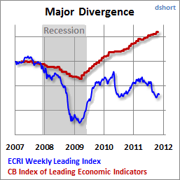
A month ago I noted the deep difference between the Conference Board's LEI, and ECRI's WLI. The Conference Board has been calling for continued growth in the months ahead, while ECRI has remained steadfast in its recession call. Doug Short has called it The Great Leading Indicator Smackdown. This graph from his blog shows the major divergence between these two leading indicators since late 2008:


With this morning's LEI of +.5, the schism continues. At least one of these forecasts is wrong, possibly spectacularly so.

The source of the divergence is primarily almost certainly how the two sets of indicators measure bonds. Almost everybody acknowledges that the bond market is an important leading indicator, but in the last 5 years depending on your measure, the nature of that forecast differs markedly.

The Conference Board very transparently states that it is the yield curve -- the difference between long term and short term treasuries -- that it measures. In fact, it is one of the two weightiest elements of the LEI. The yield curve has been relentlessly and substantially positive since late 2007, and is the biggest contributor, along with real M2 and the stock market, to the LEI's almost continuous positivity since spring 2009.

ECRI, of course, uses a "black box", but we know from at least as late as 1992 that its founder, Prof. Geoffrey Moore, considered bond prices generally to be a "long leading indicator," i.e., a measure of how the economy was likely to perform at least 6 to 12 months later. ECRI's current spokesman, Lakshman Achuthan, has specifically indicated in at least one interview that the yield curve, however, is not one of their measures.

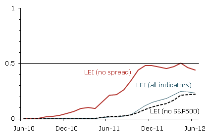
How and whether bonds are measured makes all the difference in forecasts for 2012. The San Francisco Fed (h/t our former co-blogger Invictus) has pointed out that if you remove the yield curve from the LEI, the forecast for late 2011 and early 2012 becomes flat at best (graph measures chances of recession):


But it seems that ECRI goes beyond that and actually does include at least one if not two alternate measures of the bond market in its long leading indicators (USLLI) and/or the WLI: a broad bond index such as the Dow Jones Bond Average or BAA bonds; and credit spreads, i.e., the difference in yields between government and corporate bonds. In fact, as I'll show below it seems all but certain that ECRI does give heavy weight to the latter (credit spreads).

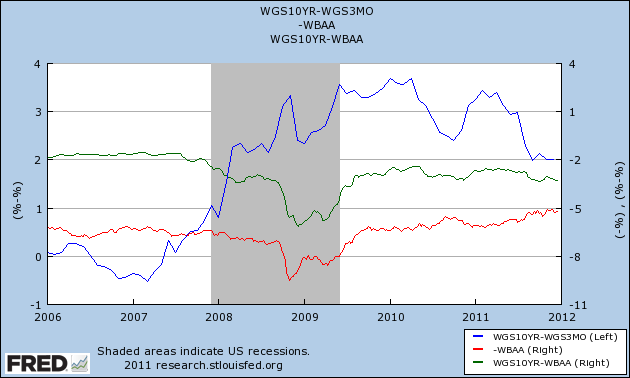
First of all, here is a graph measuring the yield curve (blue, left axis) vs. BAA corporate bonds (red, right axis) and the credit spread (green, right axis) since the beginning of 2006:


The yield curve inverted in early 2006 and remained inverted until spring 2007, accurately forecasting a recession one year later. Since the end of 2007, however, it has been strongly positive. Contrarily, both corporate bonds and credit spreads were flat going into 2007 and began to deteriorate after April, and reached their nadir in approximately November 2008 (probably not incidentally, ECRI is on record that its USLLI and WLI bottomed at this time).

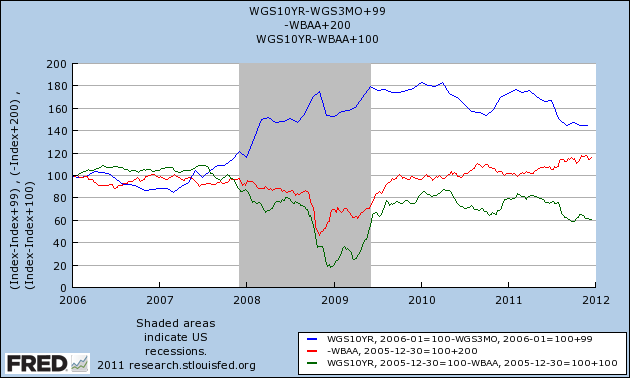
Here is an alternate view of the same data norming all three measures to 100 at the beginning of 2006:


The yield curve remains steadfastly positive, although less so than previously, while BAA bonds (and the DJ Corporate Bond Index, not shown) turned down in late 2010 before turning up again earlier this year. Meanwhile, the credit spread peaked in April 2010 and has been deteriorating almost consistently since then.

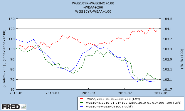
Here is a close-up of the same data, beginning in January 2010 (note I've moved the yield curve to the right axis):


The yield curve remains positive - even though it tracks a similar trajectory to credit spreads. Corporate bond prices as measured by BAA bonds or the DJ Corporate Bond Index have been improving. Only credit spreads continue to deteriorate. They must be one of the important sources of the divergence between ECRI and the LEI.

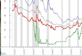
We'll find out who is right next year. In the meantime, I leave you with the following graph and information. Here is a close-up of a portion of a graph from Ned Davis Research published in early 2008, showing long term government bonds (red) vs. short term government bonds (green):


With the near-exception of 1931 as the Fed defended the gold standard, the yield curve never inverted between 1929 and 1954. In other words, bluntly speaking, in times of deflation, a positive yield curve is not terribly predictive.

P. S.: By contrast, an inverted yield curve in the presence of deflation has only happened twice in the last 90 years -- 1928 and 2006-07. Which is why I call it
the Death Star.

Wednesday, December 14, 2011

A peek inside ECRI's black box

- by New Deal democrat

Lakshman Achuthan's loud reiteration of ECRI's recession call last week, especially in the face of recent positive economic surprises, certainly has commanded attention. ECRI has an impressive record, especially their incredibly gutsy call in the midst of economic freefall in March 2009 that the "great recession" would bottom that summer. It did.

But ECRI's forecasts are surrounded by suspicion because of its (understandable) lack of transparency. The elements of both the Long Leading Index and the Weekly Leading Index, which it apparently uses in tandem to make its forecasts, are understandably kept in the proverbial black box, otherwise how could it charge its subscribers?

While I claim no proprietary knowledge of any of ECRI's methods, its history, hints about what is and is not in the indexes that have been dropped over time, and some reverse engineering can give us a glimpse inside their black box. So, what is it that ECRI is seeing, that didn't just to make their recession call three months ago, but to stick with it despite signs of a recent rebound?

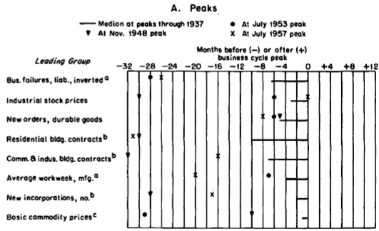
A good place to start is with the work of Prof. Geoffrey Moore. ECRI was founded by him, and is based on decades of work on economic indicators he performed while at Columbia University. While some of his indicators apparently did change over time, we do know that he believed that some persisted from well before World War 2. As a reminder, here is a chart he himself published in 1961 explaining a number of leading indicators that functioned equally well borth before and after the War:


The above graph and the information contained in Moore's article make it fairly clear that he leaned heavily towards manufacturing and commodity data in his index.

Since stock prices were one of the leading components of his work, let's start with those. Here is a graph of the S&P 500 for the last 12 months:


Stocks fell 20% in August, and have only regained about 1/2 of that loss since then. They are still below their level of 6 months ago. John Hussman apparently relies in part on this metric as well in making his recession call.

If our stock market is below where it was 6 months ago, those of two of our trading partners are even worse. Here's a one year graph of Europe:


And here's a three year graph of China:


Europe isn't even half the way back from its low to its 12 month high. It's down about 30% from that peak. China is even worse. The Shanghai stock market has generally been in a downtrend for the last 2+ years, and Shanghai appears to be the stock market that now leads the rest of the world. These suggest that our economy will continue to import weakness from both of these sources.

Based on Moore's graph above, and based on its proven long leading relationship, another component of ECRI's long leading index is likely to be housing. According to work done by Prof. Edward Leamer, housing appears to turn about 12 to 15 months before the top of the business cycle. While housing permits have recently turned up mildly (red below), here is what they looked like 12 months ago (blue):


The post housing credit nadir was in January of this year, meaning we can expect it to feed through into the first quarter or so of 2012 before abating.

Another item believed to be a part of ECRI's long leading index is corporate profits. Sure enough, when we take corporate profits, and adjust for inflation by using the PPI, corporate profits routinely top out about 1 year or so before the onset of recession, as shown in this graph:


While corporate profits rose in the 2nd and 3rd quarters, they are still below their 2010 post recession peak when adjusted for producer price inflation.

A comparison of commodity prices (red) vs. consumer price inflation (blue) is consistent with the idea that when companies are unable on a sustained basis to pass on increased costs to consumers, then companies cut back, commodity prices fall, and more than consumer prices which also fall as demand temporarily decreases. Once companies are able to profit again, the recession abates:


In past work I have found that in the case of deflationary busts (with at least 3 consecutive months of decreasing prices), the recession typically bottoms at the point where the YoY deflation rate reaches its nadir, as for example happened in June 2009:


Here is a bar graph showing GDP over the same period of time as the graph above. You can see that deflation typically occurs during or just after the slowdown as measured by GDP:


As the gasoline price spike of November 2010 through April 2011 is gradually replaced in YoY inflation statistics (as to which recall that Prof. James Hamilton of UCSD has found that increases in gas prices have their biggest effect on the economy 12 months later), we may be starting a brief period of monthly deflation in line with the deflationary periods shown above. This is consistent with the paradigm of corporate cutbacks in the face of declining profit margins. In this regard, Jeff Miller of A Dash of Insight worryingly tells us that forward corporate earning estimates have indeed stalled.

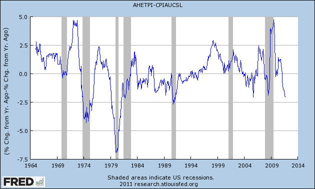
Further to this point, recently I have also noted that when real wages fail to keep up with consumer price inflation, in the absence of the ability to borrow or to refinance, consumers have little choice but to cut back. And real wages have indeed failed to keep up with consumer inflation in 2011:


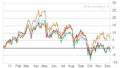
The above discussion of corporate and consumer slowdowns brings us to commodity prices, another indicator cited by Prof. Moore as a short leading indicator. Here is Bloomberg's graph of commodity prices using various indexes for the last 12 months:


Measured by any index these peaked in about April and have generally been in decline since. Unlike other indexes which also plummeted this past summer, such as consumer confidence, commodity prices have continued to fall, again probably influenced by the deteriorating conditions in Europe and China. They made new 6 month lows shortly before ECRI made its official recession pronouncement, and have generally continued to fall since.

Another leading indicator cited by Prof. Moore that is somewhere between a short and long leading indicator is new orders for durable goods. A perfect example of this is auto sales. Again, while these have recently improved considerably (red), 6 months ago they were undergoing a temporary slump:


Finally, let's look at one last short leading indicator believed to form part of ECRI's index, credit spreads. As shown in this graph starting in 2000, credit spreads between BAA corporate bonds (blue) and 10 year treasury bonds (red) tend to widen just before and during recessions. Indeed, at least during the beginning part of a recession, business weakness may cause corporate bond yields to spike, while treasury yields decline given their status as a safe haven:


Here is a close up of the same data for the last 12 months:


As you can see, credit spreads began to widen in spring, and opened up much wider in August. Like commodity prices, they have not rebounded much at all since then.

To summarize: all of the above information grows out of the work of Prof. Geoffrey Moore, and/or interviews or statements that Lakshman Achuthan has made at one point or another. It represents a best guess as to what at least some of the data in their black box is showing ECRI. You can see that, taken together, it makes a very powerful bearish case for the onset of recession at some point probably no later than Q2 2012.

Am I persuaded? Not yet. Housing permits have indeed been in a small uptrend for the last 10 months, and car sales in a strong one for the last five. The Dow Jones Corporate Bond Index also continues to be in a small but definite uptrend. Consumer confidence is improving. Initial jobless claims are decreasing. YoY money supply, both M1 and M2, are also strongly positive. Manufacturing employment remains slightly positive.

Even more importantly, the decline in commodity prices, particularly oil, while showing weakness in Europe and Asia, is a boon to American consumers.

In short, three months after ECRI's recession call, I don't yet see weakness crossing either the Atlantic or the Pacific sufficiently to create a recession here.


Thursday, October 14, 2010

Mish vs. ECRI vs. Krugman one year later: One helping of crow for Prof. Krugman?

- by New Deal democrat

As Barry Ritholtz pointed out at the time, exactly one year ago today a very specific intellectual challenge was made. It started with Mish strongly challenging ECRI's record of predicting recessions.

Subsequently, Prof. Paul Krugman wrote:
Michael Shedlock has an awesome takedown of ECRI’s claim that its indicators (a) have successfully predicted turning points in the past (b) point to a sold recovery now. I’d add that this is a really, really bad time to be relying on conventional indicators.

Why? Basically, because in a zero-interest rate world — the three-month rate was .066% last I looked — especially one that’s suffered from a collapse of the shadow banking system, conventional indicators don’t mean what they usually mean. Increases in the monetary base aren’t especially expansionary. The yield curve more or less has to slope up, even if no recovery is expected. And so on.

So historical correlations, to the extent that they exist — and as Shedlock points out, ECRI is claiming a much better record than it really has — can’t be counted on to prevail. There’s really no alternative to making fundamental analyses of the macro situation.
Lakshman Achuthan of ECRI responded with a very specific challenge:
we fully expect the current economic recovery to prove to be stronger than the last two, at least through mid-2010....

While we don’t necessarily expect our clarifications to change your views about the near-term course of the business cycle, we would hope that if, a year from now, ECRI’s leading indexes are proven to have been correct, you would publicly acknowledge the same. After all, the proof is in the pudding.
It is exactly one year later today. So, was "the current economic recovery stronger than the last two, at least through mid-2010?" The data is in, and we have an answer.

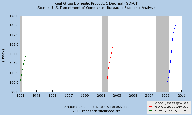
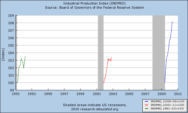
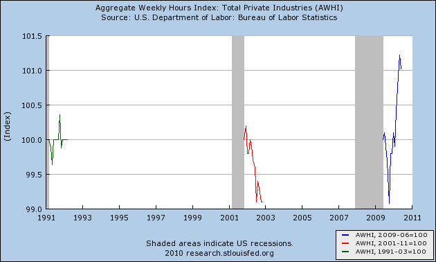
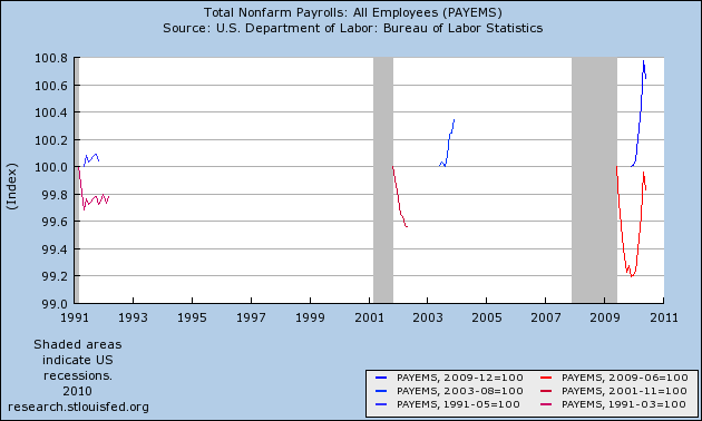
To judge the issue, I am relying on the indicators chosen by the NBER to gauge the end of recessions: GDP, Industrial Production, Real retail sales, Nonfarm payrolls, Aggregate hours worked, and Real income. As of June 30 of this year, here is how they stacked up against the last two recoveries:

Here is real GDP:


This is no contest. Judging based on 12 months from the end of the 3 recessions as decided by the NBER, the year between June 30, 2009 and June 30, 2010 showed the strongest GDP growth.

There is also no contest when it comes to the first 12 months after the recession bottom as to Industrial Production:


The same is true of real retail sales:


Perhaps surprisingly, aggregate hours worked also improved more strongly in the twelve months between June 30, 2009 and June 30, 2010 in comparison with the last two recoveries:


But the biggest surprise of all is the one measured by nonfarm payrolls. In the graph below, the blue line measures payrolls growth for a period of 6 months from the lowest post-recession reading of the "jobless" recoveries (most recently, December 2009 through June 2010). The red line, by contrast, measures job growth (or not) in the twelve months since the official NBER bottom:


I expected the two different modes of measurement to yield very different results. Instead, either way, the present recovery through June 30, 2010 has been stronger for jobs than either of the last two.

Finally, here is real income:


Although it is difficult to tell from the graph, real income was stronger in the first year of the recovery from the 1990 recession than at present.

That makes the final score: ECRI 5, Krugman 1.

So, will Prof. Krugman publicly acknowledge, as requested by ECRI last year, that their forecast was correct, and that contrary to his assertion then, "There[ ] really [is an] alternative to making fundamental analyses of the macro situation?"