- by New Deal democrat
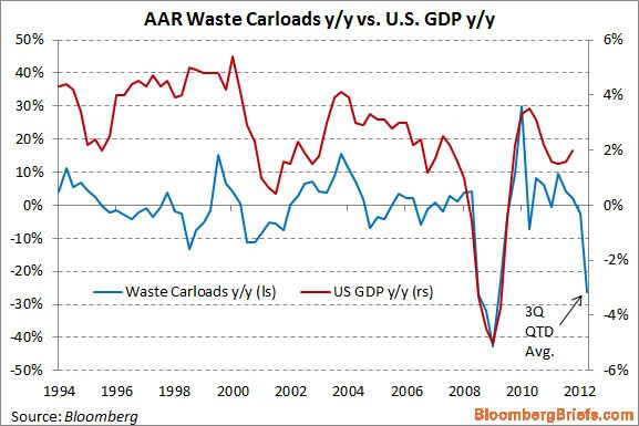
In the last few days, the following graph has gotten a lot of attention, in particular from Ezra Klein, who discussed it last night on MSNBC:

This graph purports to show that, based on railroad hauling of trash, the economy is tanking this quarter.
Being a nerd, when I saw the graph I did some research. It turns out that the graph is very misleading. In the first place, it is computed on a quarterly basis - except for this quarter, in which it is YoY only for the first 6 weeks of this quarter vs. the first six weeks of the third quarter of 2011 (note the latest value in the graph is labeled "QTD" or "quarter to date.").
Further, since it is YoY, you have to check to see if the real anomaly is in the last year vs. this year. And when you do that, you find out that there was a huge bump in railcar hauling in July and August of last year of scrap metal (I haven't found any particular reason why at this point). This year is about 1.5% ahead of 2010 for the comparable 6 weeks, but in 2011 scrap metal hauling was about 32% ahead of 2010 for the same 6 week period. In the final 7 weeks of the quarter, (particularly in September) of last year, scrap metal hauling was much more subdued compared with 2010.
More specifically, the information on the graph above comes from lines 18 and 19 of the weekly AAR report, the same report I describe every Saturday in my "Weekly Indicators" column. Here's the total of rail carloads for the first 6 weeks of the third quarter in 2010, 2011, and this year for line 18, scrap metals:
- 2010: 21,071
- 2011: 27,769
- 2012: 21,392
Now here's the same totals for line 19, municipal waste:
- 2010: 23,279
- 2011: 19,546
- 2012: 18,223
Thus, there was actually a much more severe contraction for the same 6 week period last year, -12.1%, in municipal waste hauling than this year, due to increasing recycling efforts, apparently without causing an economic crash. Put another way, last year a large contraction in municipal waste hauling acted largely to counterbalance the anomalous surge in scrap metal hauling. This year a much smaller decline in municipal waste hauling is amplifying the return to prior trend in scrap metal hauling.
By contrast, here are the number of rail carloads for the remaining 7 weeks of the third quarter in 2010 and 2011 for scrap metals:
- 2010: 30,034
- 2011: 33,205
And here are the totals for the remaining 7 weeks for municipal waste:
- 2010: 27,612
- 2011: 24,320
In the last seven weeks of the third quarter last year, scrap metal hauling was only up +10.6%, and municipal waste was down -12.0%. So for the full quarter last year, the YoY increase of scrap metal and municipal waste combined was only +2.8%.
But the comparison of the first 6 weeks vs. the final 7 weeks of the third quarter last year -- which was huge -- isn't reflected in the graph.
Had the graph compared apples to apples, there would have been a huge increase last year balanced by an equal decrease this year. If you're not going to do that, then you have to wait to see how the entire third quarter plays out - which would deprive you of the trashy sexy graph of DOOM!
So here's the moral of the story of the alleged trash indicator: garbage in, garbage out.