This is an update on several trends I've been tracking, one that helps explain the relatively anemic job gains in the recovery, and two that forecast changes in the unemployment rate.
First, here is an updated graph of aggregate hours (blue) vs. total payrolls (red) measured from their pre-recession top.
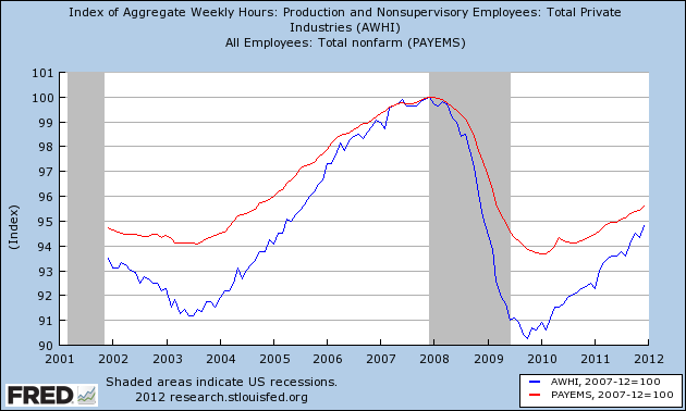
You can see that the economy shed almost 10% of all hours worked, while only about 6% of jobs were lost. Since then, aggregate hours have improved at a much higher rate than jobs have been added. If the current trend continues, at some point in the next 6 to 9 months, it is likely that aggregate hours will catch up with jobs. From that point forward I would expect job growth to more closely mirror the growth of hours in the economy.
Second, here is the graph from Thumbcharts showing initial jobless claims for the last 6 month period vs. the same 6 months one year prior, showing that it leads the unemployment rate measured the same way.
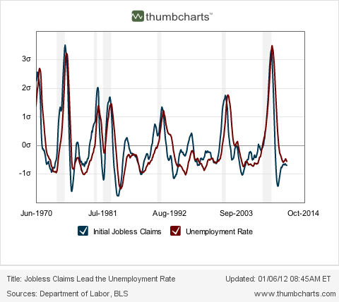 ;
;The thumbcharts graph strongly suggests that the unemployment rate will continue to be well below it was in the last half of 2009 (i.e., under 9%) and probably will decline further from its current level.
The third graph is a comparison of initial jobless claims as a percentage of the population vs. the unemployment rate, again showing how the first leads the second. This is a graph I began running in December 2010 when I was totally surprised by the close and long-lasting fit (although there has been a slight drift upward over the long term in the unemployment rate vs. claims):
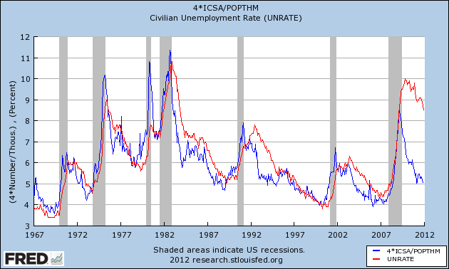
Here's what I said in March 2011:
This graph argued [in December 2010] that the unemployment rate was far too high compared with initial claims. Since then the unemployment rate has declined 0.9%!!! As population-adjusted initial claims has consistently led the unemployment rate for almost 50 years, this graph suggests that further declines in the unemployment rate in the coming months are likely. If so, the dramatic drop in the unemployment rate could be the surprise economic story of 2011.Here's a close-up of the last few years:
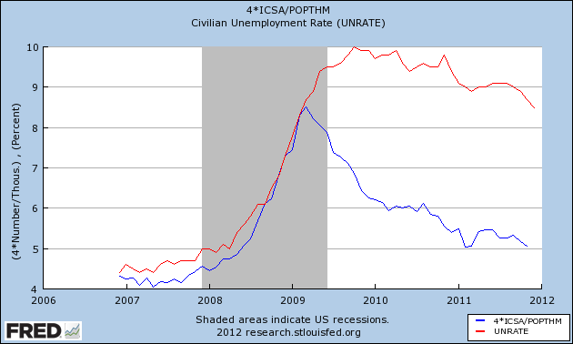
Well, maybe it wasn't the economic surprise of the year, but it certainly was lower than just about everyone was forecasting. Please note that the December initial jobless claim rate data isn't included in the graph, and since this leads the unemployment rate, it strongly argues for a further decline in the employment rate in the next few months. An unemployment rate under 8% by election day is certainly not out of the question.