Today, it was announced that AOL (which I use to call America on Hold) will buy the Huffington Post. As you may know, I use to blog over there, but haven't contributed in more than a few years.
Here's my question: the deal is worth $300 million. Will she be sharing the booty with any of the bloggers? This looks to me like a great time for a special dividend.
Monday, February 7, 2011
The Dumbest Blog Post of the Year Goes To: Zero Hedge
I am going to make an early award for dumbest blog post of the year for this absolutely moronic piece showcasing the complete inability of the author to comprehend the data he is looking at. The sadder part of all of this, was while I was trying to find out just who the hat tipped individual was who came up with the stupid graph in the first place (a John Poehling according to ZeroHedge), I noticed that many other blogs picked this retarded screed up and ran it as some sort of fact. The only "fact" from this piece is that whoever came up with the "period 13 adjustments" to the non-farm payroll data likely did so in an office in the same building in Virginia where we filmed the moon landing.
Here is the telling quote from the above referenced tripe:
"Yet what could possibly be the biggest tell in the BLS tendentious spin of data comes courtesy of the BLS "period 13" data reporting, which is the full year adjustment the BLS gives at the end of every single year (it can be pulled from BLS data series CEU0000000001). And as John Poehling shows after parsing the data, in 72 years, there have been just 5 positive adjustments. And curiously, of these 5, the two largest ones by a huge margin occurred in the prior 2 years: 2008 and 2009, when year end adjustments (subsequently revised lower in the interim) added a total of 2.2 million jobs for the current administration. In 2010 there was no such luck, as the period 13 revision took out 1,243,000 jobs from the running total."
Let me debunk this as quickly as I can. The "period 13" that the author cites is nothing more than the yearly average of the employment data. Thus, in most years in which we added employment, the "period 13" (hereafter known as the annual average) will be lower than the December number. In years where we began the year with more employees than we ended it (like 08 and 09), the annual average will be higher than the December number. Look at that, simple math (this isn't even statistics, it is 3rd grade reading comprehension and math skills). We can only hope that whoever this "John Poehling" is that ZeroHedge gives credit to for coming up with this crap is not in fact managing anyone's money.
In other words, there is no such thing as a period 13 revision.
Update: It looks like Zero Hedge at least took the responsibility to pull this embarrassingly inaccurate post (sadly, it can still be found elsewhere on the blogosphere).
Update II: You can still find the article in full here. People would rather post things that agree with their worldview than take the time to see if what they are posting has any basis in fact/reality it seems.
The Disappointment Syndrome Redux (Or: if I don't toot my own horn, who will?)
- by New Deal democrat
One month ago I described the disappointment syndrome, writing that
In fact, leaving aside the yearly revisions for now, every single initial report in 2010 except one was revised higher. Here are the initial and final monthly jobs numbers (in thousands) excluding census, showing total revisions, for all of 2010:
(p)=preliminary
Now let's add in the yearly benchmark revisions:
(p)=preliminary
Even after the reductions due to the annual benchmarking, 9 of the 12 months still had upward revisions compared with the initial estimate, with the median revision being +27.
In that regard, here is the scatter graph of the monthly average of initial jobless claims compared with payrolls (using private jobs to avoid census distortions), updated by the benchmark revisions:

Note Friday's "disappointing" figure, and also that November and December, after revisions, are no longer "disappointing" at all but instead are firmly in mid-trend.

One month ago I described the disappointment syndrome, writing that
... with no more than three exceptions, every initial report on nonfarm payrolls in 2010 has been "disappointing." Two months later, after upward revisions, they have usually been in line with initial expectations. But by that time the econo-punditocracy has moved on to disappointment with the newly-current initial nonfarm payrolls report.Specifically, two months ago, expectations of private payrolls on the order of 90,000 or even better were raised by good ADP and TrimTabs estimates. Yet the initial report was a "devastating" 39,000. I said then that the November jobs report will probably be revised considerably higher:
Take a deep breath. .... The odds are very good that [the November jobs report] will be revised significantly higher in the next two months. .... The median final revision of the Jan-Sep initial reports has been +53,000. All but two of the nine that have been finally revised have increased by at least +46,000. A revision of +53,000 to November would give us +92,000.So, here we are two months later, with the final revisions for November in. And the final number is .... [insert drum roll here] :
92,000.
It's true that even a blind squirrel finds a nut every now and then, but I happen to think it means that you are reading the right blog. More to the point, how much commentary was there Friday pointing out that November's jobs report turned out not to be "disappointing" at all? None.
In a similar vein, in December, most estimates were for 150,000 or more jobs to be added. Instead, there was a "disappointing" 103,000 initial report. Note that after the first revision, close to half of that ground has been made up.
In a similar vein, in December, most estimates were for 150,000 or more jobs to be added. Instead, there was a "disappointing" 103,000 initial report. Note that after the first revision, close to half of that ground has been made up.
| Month | Initial | Final | net change |
|---|---|---|---|
| Jan | -29 | +5 | +34 |
| Feb | -52 | +23 | +75 |
| Mar | +114 | +160 | +46 |
| Apr | +184 | +247 | +63 |
| May | +20 | +21 | +1 |
| Jun | +100 | +50 | -50 |
| Jul | +2 | +77 | +75 |
| Aug | +60 | +113 | +53 |
| Sep | -18 | +53 | +71 |
| Oct | +151 | +210 | +59 |
| Nov | +39 | +92 | +53 |
| Dec | +103(p) | +121(p) | +18(p) |
(p)=preliminary
Now let's add in the yearly benchmark revisions:
| Month | Initial | Final after Benchmark revision | net change |
|---|---|---|---|
| Jan | -29 | -48 | -19 |
| Feb | -52 | -51 | +1 |
| Mar | +114 | +144 | +30 |
| Apr | +184 | +211 | +27 |
| May | +20 | +47 | +27 |
| Jun | +100 | +33 | -67 |
| Jul | +2 | +94 | +92 |
| Aug | +60 | +55 | -5 |
| Sep | -18 | +31 | +49 |
| Oct | +151 | +171 | +20 |
| Nov | +39 | +92 | +53 |
| Dec | +103(p) | +121(p) | +18(p) |
(p)=preliminary
Even after the reductions due to the annual benchmarking, 9 of the 12 months still had upward revisions compared with the initial estimate, with the median revision being +27.
There is thus every reason to believe that January's "disappointing" +36,000 job report will be less disappointing in two months' time, and given that the BLS's establishment survey tends to undercount jobs early in recoveries, we should expect the pattern to continue.
In that regard, here is the scatter graph of the monthly average of initial jobless claims compared with payrolls (using private jobs to avoid census distortions), updated by the benchmark revisions:
Note Friday's "disappointing" figure, and also that November and December, after revisions, are no longer "disappointing" at all but instead are firmly in mid-trend.
Finally, with regard to the benchmark revisions, here is a graph from Tim Iacono:
Note that the benchmark revisions reached back 5 years, in some cases making revisions greater than 50,000 in either direction well before the "official" benchmarked period began in March 2009. Despite that, the overall pattern is completely intact. Thus, so long as we don't get too caught up in any one month's figure, we can expect that the trend we believed we had before Friday will still prove to have been the trend in 3 months, a year, and several years' time.
Here is that trend, averaging jobs by quarter:
| Quarter | Average Job gain/loss |
|---|---|
| 4Q 2009 | -135 |
| 1Q 2010 | +15 |
| 2Q 2010 | +97 |
| 3Q 2010 | +60 |
| 4Q 2010 | +128 |
The jobs recovery is proving to be a long, slow, hard slog, but we are still improving.
Jobless Recoveries Compared, Part 1
The US economy is currently experiencing its third jobless recovery, or more accurately, recovery where the drop in the unemployment rate lagged the end of the recession by over a year. This phenomena started with recovery of the early 1990s, and continues with the current recovery. What I want to do is look at the employment data from the three recoveries to see what information we can glean.
Before I go forward, let me state this: I will be using relative levels to look for patterns -- that is, all data will be compared from the same level. I understand -- and am fully cognizant -- that the current situation is worse than the previous two recoveries. However, by putting the information into relative terms, we can compare the data to see what is different this time around which is the entire point of this exercise.
First, for a comparison of the unemployment rates and initial unemployment claims in absolute levels for the last 40 years, see this link.
Let's start with the 4-week moving average of initial jobless claims:

The above chart shows the performance of the 4-week average of initial jobless claims for the first 20 months of the recovery. I have "normalized" the performance to better compare. Interestingly enough, the 4-week moving average has performed better (it has dropped the farthest) during this recovery. This is good news, largely because the number is in fact much higher.
Let's turn to the unemployment rate:

The above chart shows the unemployment rate, normalized to a scale of 100 to better compare the performance of the different recoveries. Notice that after 20 months the absolute performance of the unemployment rate is in fact the best of the three jobless recoveries on record, as the unemployment rate spiked after the end of the two previous recessions.
Let me reiterate: I am well aware the numbers for this recovery are far worse for both the above numbers. That is not the point of the above charts. Instead, I want to compare the performance of both numbers to previous jobless recoveries to see if we are witnessing something different this time around. Despite the high absolute numbers, we are seeing the best performance on a comparative basis in both initial unemployment claims and the unemployment rate when compared to the last two recoveries.


Friday, February 4, 2011
Weekly Indicators: Late edition
- by New Deal democrat
The big news of the week was the employment report, showing a "disappointing" +36,000 increase in jobs in January. Meanwhile, the separate household survey showed that the unemployment rate dropped 0.4% to 9.0%. Yesterday there was a lot of head scratching. Today there are two good summaries making sense of it all from Prof. James Hamilton and Dean Baker.
The employment report contrasted with extremely strong, multi decade highs in the ISM and Chicago manufacturing reports, and a very strong non-manufacturing report as well. Meanwhile personal income and spending both rose. Slightly more autos were sold in January than December. Residential and nonresidential construction both declined in January, but it seems increasingly likely that nonresidential construction has already bottomed.
I plan on getting down deep into the weeds with several posts dissecting the employment information next week (one of which will explain the quotes around the word "disappointing" above).
Meanwhile, Here is this week's high frequency data:
The BLS reported initial jobless claims of 415,000, and the 4 week moving average rose slightly to 430,500. The trend to under 400,00 claims is for now halted.
The Mortgage Bankers' Association reported an increase of 9.5% in seasonally adjusted mortgage applications last week, which still has this series below recent highs, and essentially in a flat range since last June. Refinancing increased 11.7%, but is still near its lowest point in a year, due to higher mortgage rates.
Gas at the pump decreased 1 cent to $3.10 a gallon, while Oil ended the week at about $89 a barrel. Gasoline usage was lower than last year, by 54,000 barrels a day. This is the first negative YoY reading in a while, and suggests that gas prices may be beginning to "bite" (or it could just be particularly lousy weather).
The American Staffing Association Index increased 1% to 90 for the week ending January 23. This was 14% higher than a year ago, and only about 9% below the peak January levels from 2008. This is once again the closest so far the index has come to pre-recession levels.
Railfax showed seasonal improvement as would be expected. Total rail shipments were 6.6% higher in the week ending January 29 than during the same week last year. Shipments of waste and scrap metal and auto shipments remain at last year's levels. In general rail traffic is still improving YoY, but the rate of that improvement has been decreasing for months. If the YoY comparisons remain week for a couple more weeks, then the slowdown cannot be dismissed.
The ICSC reported that same store sales for the month of January increased 4.2% YoY. Shoppertrak reported that sales rose 4.3% YoY for the week ending January 29, even though they declined 6.1% from the week before.
Weekly BAA commercial bond rates fell slightly to 6.08%. This has been in a range within 0.20% for over two months. This compares with a 0.02% decline in the yields of 10 year treasuries, which have also been in a tight range for over a month.
M1 was up 0.5% w/w, up 0.6% M/M and up a strong 9.4% YoY, so Real M1 is up 8.0%. M2 was down 0.4% w/w, up 0.1% M/M and up 4.2% YoY, so Real M2 is up 2.8%. Both of these are in ranges where economic expansion has always taken place.
A reminder that on a trial basis I am using Matt Trivisonno's +1.07% adjustment to withholding data this year vs. last year, due to the recent payroll tax political deal. So adjusting, the Daily Treasury Statement showed adjusted receipts for the month of January of $154.3 B vs. $140.4 B a year ago, for a gain of almost +10% YoY (although this January had one more reporting day).
Drive carefully if you are in an area of snow and ice, and have a nice weekend!
Is There Something Wrong With the BLS Employment Model?
The following is pure conjecture. I have do data to support my central thesis.
A commenter recently posted this observation:
1.) The recession of 2008 was incredibly severe. According to the latest data, the economy lost over 8 million jobs. There was a period when the economy was shedding over 600,000 jobs/month. This could throw off any statistical gathering service.
2.) Starting sometime over the last 12 months, we have the great wave of baby boom retirements beginning. This will greatly alter the employment data in God knows how many ways, along with the underlying assumptions of employment data collection.
I bring this up because of an email conversation I had today where all the participants explored the idea the BLS is simply trying to figure out what is going on right now and not having any answers regarding the employment situation. In addition, there is the question of whether or not the standard BLS methodology is out of sync with the current economic situation.
This does not mean that the employment situation is better than reported. For all we know, if the above situation is accurate, the employment situation could be worse. But the last few employment reports have been downright from a variety of angles.
Ultimately, we don't know if the above statement is accurate or not, so please do not take it as anything but an open question to which we will probably never have an answer. However, given the severe shocks to the economy over the last 2-3 years and the underlying changing dynamic of the labor force, we may also be dealing with a time when the numbers almost seem completely and totally random (i.e. they have no underlying logic/sense to them).
A commenter recently posted this observation:
Is there something wrong with the BLS methodology?Let me make two observations.
I wouldnd't say this except for the fact that its data now seems to be providing what are outliers to other data, even other data related to employment.
The other thing to consider is that the BLS really didn't pick up the move into recession jobs wise in 2008. Years later, those numbers have in some cases been massively revised downward.
1.) The recession of 2008 was incredibly severe. According to the latest data, the economy lost over 8 million jobs. There was a period when the economy was shedding over 600,000 jobs/month. This could throw off any statistical gathering service.
2.) Starting sometime over the last 12 months, we have the great wave of baby boom retirements beginning. This will greatly alter the employment data in God knows how many ways, along with the underlying assumptions of employment data collection.
I bring this up because of an email conversation I had today where all the participants explored the idea the BLS is simply trying to figure out what is going on right now and not having any answers regarding the employment situation. In addition, there is the question of whether or not the standard BLS methodology is out of sync with the current economic situation.
This does not mean that the employment situation is better than reported. For all we know, if the above situation is accurate, the employment situation could be worse. But the last few employment reports have been downright from a variety of angles.
Ultimately, we don't know if the above statement is accurate or not, so please do not take it as anything but an open question to which we will probably never have an answer. However, given the severe shocks to the economy over the last 2-3 years and the underlying changing dynamic of the labor force, we may also be dealing with a time when the numbers almost seem completely and totally random (i.e. they have no underlying logic/sense to them).
BLS + 36,000, Unemployment at 9%
From the BLS:
Let's go to the data, starting with the household survey:
Interestingly enough, the civilian non-institutional population decreased from 238,889 to 238,704. This is basically the entire population of people who could be working, save those not in prison or in the military. So in January, the largest population group used in BLS calculations decreased. This is, frankly, a bit odd.
The civilian labor force decreased by 504,000 (153,690 to 153,186). This is the denominator in several important calculations. However, the total number of unemployed also decreased by 622,000 (from 14,485 to 13,863). This makes a large percentage of the drop from 9.4% to 9% a legitimate drop in the unemployment rate.
Also, expect to hear about the "not in the labor force" number which increased from 85,199 to 85,518 or an increase of 319,000. Before we start hyperventilating, let's remember the definition of the word:
Finally, the number of employed increased from 139,206 to 139,323, or an increase of 117,000.
So, the household report shows a large decline in both unemployed and the civilian labor force, making the drop in the unemployment rate a legitimate drop.
Looking at the establishment report, we see the following.
Goods producing industries added 18,000, with the drop in construction (32,000) offset by an increase in manufacturing (+49,000).
Private services increased by 32,000. There was a dearth of hiring in all industries and a surprise drop in transportation and warehousing (-38,000).
Average weekly hours decreased (34.3 to 34.2), but average hourly earnings increased from ($22.78 to $22.86). The decrease in hours is concerning, as there is already a tremendous amount of slack in this number which needs to be absorbed before we see job creation pick-up.
However, the increase in earnings was large enough to offset the decrease in hours, sending average weekly earnings higher ($781.35 to $781.81).
Overall, I'd give this report a 3.5 on a 1 to 10 scale. While the drop in the unemployment rate is encouraging, it's not due to job creation, but the beginning of the baby-boomer retirement wave. In addition, total hours worked is still low, meaning employers have a fair amount of slack they can take up before adding to payrolls.
The unemployment rate fell by 0.4 percentage point to 9.0 percent in January, while nonfarm payroll employment changed little (+36,000), the U.S. Bureau of Labor Statistics reported today. Employment rose in manufacturing and in retail trade but was down in construction and in transportation and warehousing. Employment in most other major industries changed little over the month.
Let's go to the data, starting with the household survey:
Interestingly enough, the civilian non-institutional population decreased from 238,889 to 238,704. This is basically the entire population of people who could be working, save those not in prison or in the military. So in January, the largest population group used in BLS calculations decreased. This is, frankly, a bit odd.
The civilian labor force decreased by 504,000 (153,690 to 153,186). This is the denominator in several important calculations. However, the total number of unemployed also decreased by 622,000 (from 14,485 to 13,863). This makes a large percentage of the drop from 9.4% to 9% a legitimate drop in the unemployment rate.
Also, expect to hear about the "not in the labor force" number which increased from 85,199 to 85,518 or an increase of 319,000. Before we start hyperventilating, let's remember the definition of the word:
Persons who are neither employed nor unemployed are not in the labor force. This category includes retired persons, students, those taking care of children or other family members, and others who are neither working nor seeking work. Information is collected on their desire for and availability for work, job search activity in the prior year, and reasons for not currently searching.Remember -- we're seeing the beginning of the baby boomer retirement now. This will have a profound impact on employment numbers going forward.
Finally, the number of employed increased from 139,206 to 139,323, or an increase of 117,000.
So, the household report shows a large decline in both unemployed and the civilian labor force, making the drop in the unemployment rate a legitimate drop.
Looking at the establishment report, we see the following.
Goods producing industries added 18,000, with the drop in construction (32,000) offset by an increase in manufacturing (+49,000).
Private services increased by 32,000. There was a dearth of hiring in all industries and a surprise drop in transportation and warehousing (-38,000).
Average weekly hours decreased (34.3 to 34.2), but average hourly earnings increased from ($22.78 to $22.86). The decrease in hours is concerning, as there is already a tremendous amount of slack in this number which needs to be absorbed before we see job creation pick-up.
However, the increase in earnings was large enough to offset the decrease in hours, sending average weekly earnings higher ($781.35 to $781.81).
Overall, I'd give this report a 3.5 on a 1 to 10 scale. While the drop in the unemployment rate is encouraging, it's not due to job creation, but the beginning of the baby-boomer retirement wave. In addition, total hours worked is still low, meaning employers have a fair amount of slack they can take up before adding to payrolls.


Thursday, February 3, 2011
The Economy Has Turned the Corner
Last year the economy was doing well until two events occurred: the EU situation and the gulf oil spill. Those two events pushed back progress and began talk of a double dip recession. However, by late summer or early fall, it became obvious that talk of the impending drop into the fiery pits of hell were overblown. But, there was still a dearth of data to show the economy had turned the corner.
Now one can make the argument.
Let's start with top line economic growth. The economy has now printed six quarters of GDP growth. Simply put, economies grow in an expansion, not a contraction.
Next, let's turn to retail sales. The Christmas season was the best in several years. More importantly, consumer spending is now at levels higher than the previous expansion, and retail sales have been printing some strong numbers for the last several months. The data indicates the consumer has returned and with the savings rate fluctuating between 5%-6%, there is plenty of ammo to keep spending.
Next, look at manufacturing, which the recent Beige Book also indicates is doing well. However, we've had two great data prints this week -- the first from Chicago and the second from the ISM -- indicating that manufacturing is on track -- in fact, more than "on track;" on fire. A cheaper dollar and strong overseas growth should help manufacturing to keep the momentum up.
Services are also in decent shape, although not as good as manufacturing. This does not mean they are in a recession, but it does mean that on a scale of 1 to 10, they're probably 6.5; they're in OK shape, but also appear to be turning the corner. However, with an expanding economy, this sector should continue improving. (UPDATE: The latest ISM was strong as well, printing a stronger number).
Employment also finally seems to be improving. While weekly initial claims have jumped around for the last month, the problems have been administrative, but fundamental. The last two ADP reports have been good and while the BLS data has been weaker, NDD has correctly noted the data has been positive for some time and all the revisions have been positive.
Housing is still a basket case and will continue to be for for some, largely because of a massive inventory overhang. But if that hasn't killed the recovery yet, then it probably won't.
In short, the data (I know, those pesky facts again) indicate the economy has expanded for over a year and most of the underlying components are improving. There has been enough data over a long enough period of time to indicate we're turned the corner.
Jobs and Jobless Claims: tomorrow all we knew changes
- by New Deal democrat
This morning the BLS reported weekly initial jobless claims of 415,000. The 4 week average is 430,000. For now we have answered the question as to whether jobless claims would continue to decline under 400,000, or were simply establishing a new plateau -- it is the latter. The new plateau is a range between 410,000 at the low end and 450,000 at the high end. I would want to see at least 2 weekly reports under 395,000 before considering that a change from this new range is taking place.
Based on the correlation between jobless claims and payrolls over the last two years, that means monthly payrolls of between +100,000 and +260,000 (+/-100,000!!!) with a midpoint of +180,000 if the relationship were linear. Since it really isn't, probably we are looking at a midpoint of more like +150,000, with a large variance
All of which is prologue to the point that we can probably toss a large part of what we thought we knew about job creation in the last 2 years into a cocked hat tomorrow, when the BLS announces its yearly revisions that match actual payroll reporting from tax payments to the data. Officially this will only correct the results from March 2009 to March 2010, but the BLS will re-estimate all of the numbers since then as well. While we know that we will find out that 2009 was even worse than reported so far (by about 330,000), the real puzzle is what will happen to 2010's monthly payroll reports. Since the BLS tends to underestimate jobs in the first year of a recovery, it is just as likely that they will be revised higher as lower.
Until then, one last time with current data, here is a graph of initial jobless claims (through last week) plotted against payrolls:
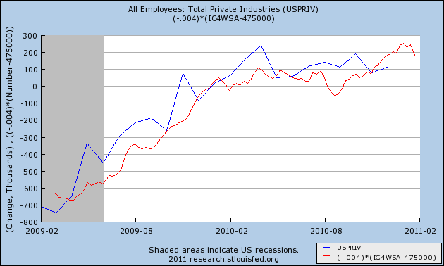
(note: linear equation is Payrolls = -4 times the difference from 475,000 New Jobless Claims )
This morning the BLS reported weekly initial jobless claims of 415,000. The 4 week average is 430,000. For now we have answered the question as to whether jobless claims would continue to decline under 400,000, or were simply establishing a new plateau -- it is the latter. The new plateau is a range between 410,000 at the low end and 450,000 at the high end. I would want to see at least 2 weekly reports under 395,000 before considering that a change from this new range is taking place.
Based on the correlation between jobless claims and payrolls over the last two years, that means monthly payrolls of between +100,000 and +260,000 (+/-100,000!!!) with a midpoint of +180,000 if the relationship were linear. Since it really isn't, probably we are looking at a midpoint of more like +150,000, with a large variance
All of which is prologue to the point that we can probably toss a large part of what we thought we knew about job creation in the last 2 years into a cocked hat tomorrow, when the BLS announces its yearly revisions that match actual payroll reporting from tax payments to the data. Officially this will only correct the results from March 2009 to March 2010, but the BLS will re-estimate all of the numbers since then as well. While we know that we will find out that 2009 was even worse than reported so far (by about 330,000), the real puzzle is what will happen to 2010's monthly payroll reports. Since the BLS tends to underestimate jobs in the first year of a recovery, it is just as likely that they will be revised higher as lower.
Until then, one last time with current data, here is a graph of initial jobless claims (through last week) plotted against payrolls:
(note: linear equation is Payrolls = -4 times the difference from 475,000 New Jobless Claims )
ADP + 187,000
From ADP
This was another strong report this week. We've had two great reports from the manufacturing sector and now a report that shows employment growth.
The downward revision is disappointing, but its still in the 250,000 range, meaning its still a win.
Private-sector employment increased by 187,000 from December to January on a seasonally adjusted basis, according to the latest ADP National Employment Report® released today. The estimated change of employment from November to December was revised down by 50,000 to 247,000 from the previously reported increase of 297,000. This month’s ADP National Employment Report suggests solid growth of private nonfarm payroll employment heading into the New Year. The recent pattern of rising employment gains since the middle of last year appears to be intact, as the average gain over December and January (217,000) is well above the average gain over the prior six months (52,000). Strength was evident within all major industries and across all size business tracked in the ADP Report.
This was another strong report this week. We've had two great reports from the manufacturing sector and now a report that shows employment growth.
The downward revision is disappointing, but its still in the 250,000 range, meaning its still a win.
Yesterday's Market


So -- let's review.
1.) The market is still moving higher, although the higher risk averages (QQQQs and IWMs) are weakening. Essentially, the rally is getting long in the tooth, but the basic economic numbers have been incredibly strong this week, giving further upward momentum to the market.
2.) The Treasury market continues to consolidate. There is a strong big from the Fed and political events, but not enough to send the market higher. In addition, political events are keeping a safety bid underneath.
3.) The dollar is approaching key technical support. This will place a bid into the commodity markets, which are already moving higher from supply/demand issues.
Wednesday, February 2, 2011
ISM Prints Strong Number
From the ISM:
Let's take a look at the anecdotal component of the report:
1.) Commodity prices are increasing, hurting input costs
2.) Overseas markets are stronger then anticipated, with the weaker dollar helping (which also hurts commodity price inputs)
3.) There is still reluctance for hiring.
Here are some of the more important component parts of the report:
"The manufacturing sector grew at a faster rate in January as the PMI registered 60.8 percent, which is its highest level since May 2004 when the index registered 61.4 percent. The continuing strong performance is highlighted as January is also the sixth consecutive month of month-over-month growth in the sector. New orders and production continue to be strong, and employment rose above 60 percent for the first time since May 2004. Global demand is driving commodity prices higher, particularly for energy, metals and chemicals."Like the recent Chicago PMI, this report is also strong. Numbers are the highest in years and the vast majority of industries are expanding.
Of the 18 manufacturing industries, 14 are reporting growth in January, in the following order: Petroleum & Coal Products; Primary Metals; Apparel, Leather & Allied Products; Wood Products; Computer & Electronic Products; Transportation Equipment; Fabricated Metal Products; Machinery; Paper Products; Miscellaneous Manufacturing; Chemical Products; Furniture & Related Products; Food, Beverage & Tobacco Products; and Electrical Equipment, Appliances & Components. The four industries reporting contraction in January are: Textile Mills; Printing & Related Support Activities; Plastics & Rubber Products; and Nonmetallic Mineral Products.
Let's take a look at the anecdotal component of the report:
Here we see the following concerns:
- "Continued weakness in the dollar is having a negative effect on the components we purchase overseas and increasing our material costs." (Transportation Equipment)
- "Lead times are increasing significantly, and commodity pricing is starting to increase." (Chemical Products)
- "January/February sales will be decent, and we see a strong March. We're cautiously optimistic but reluctant to hire." (Fabricated Metal Products)
- "Business is still slow with no pick-up in sight." (Furniture & Related Products)
- "We continue to see unexpected strength in many non-U.S. markets." (Fabricated Metal Products)
1.) Commodity prices are increasing, hurting input costs
2.) Overseas markets are stronger then anticipated, with the weaker dollar helping (which also hurts commodity price inputs)
3.) There is still reluctance for hiring.
Here are some of the more important component parts of the report:
Manufacturing continued to grow in January as the PMI registered 60.8 percent, an increase of 2.3 percentage points when compared to December's seasonally adjusted reading of 58.5 percent. A reading above 50 percent indicates that the manufacturing economy is generally expanding; below 50 percent indicates that it is generally contracting.
A PMI in excess of 42.5 percent, over a period of time, generally indicates an expansion of the overall economy. Therefore, the PMI indicates growth for the 20th consecutive month in the overall economy, as well as expansion in the manufacturing sector for the 18th consecutive month. Ore stated, "The past relationship between the PMI and the overall economy indicates that the PMI for January (60.8 percent) corresponds to a 6.4 percent increase in real gross domestic product (GDP) on an annual basis."
.....
ISM's New Orders Index registered 67.8 percent in January, which is an increase of 5.8 percentage points when compared to the seasonally adjusted 62 percent reported in December. This is the 19th consecutive month of growth in the New Orders Index. A New Orders Index above 52.1 percent, over time, is generally consistent with an increase in the Census Bureau's series on manufacturing orders (in constant 2000 dollars).
.....
ISM's Production Index registered 63.5 percent in January, which is an increase of 0.5 percentage point from the December reading of 63 percent (seasonally adjusted). An index above 51 percent, over time, is generally consistent with an increase in the Federal Reserve Board's Industrial Production figures. This is the 20th consecutive month the Production Index has registered above 50 percent.
Simply put, this is another stellar report from the manufacturing sector.
Has Nonresidential Construction bottomed?
- by New Deal democrat
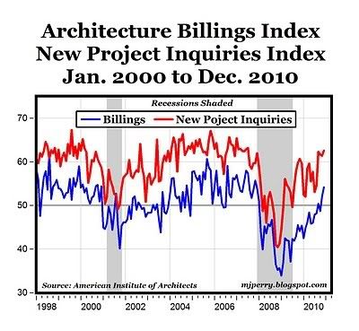
Lost in usual chatter about the monthly decline in private nonresidential construction spending reported for December yesterday, was the fact that it may have already bottomed last July. Indeed, back in September I asked Is Nonresidential construction stabilizing? and concluded that "it looks like it is time to watch for a bottom," reasoning from an improving AIA architectural billings diffusion index that
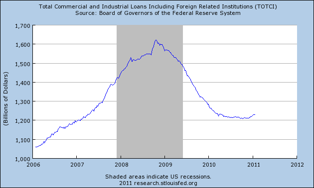
In September I also cited in support of the analysis, that Commercial and Industrial loans from banks looked like they were bottoming. This too has been confirmed by more recent data:
Now here is the graph (h/t Tomorrow's Economy Today) for both residential (blue) and nonresidential (red) spending:
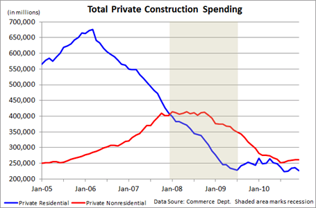
Notice that for the last six months, nonresidential spending has essentially been flat - and the lowest reading was actually in July. In any event, what is clear is that its 2 year decline from mid-2008 has been broken.
One of the reasons for more optimism about how the economy will perform in 2011 is that it will no longer be fighting against a decline in both residential and nonresidential spending. In fact both may begin to show at least some increase. Which also means at least a few construction jobs - finally - being added to payrolls as well.
Lost in usual chatter about the monthly decline in private nonresidential construction spending reported for December yesterday, was the fact that it may have already bottomed last July. Indeed, back in September I asked Is Nonresidential construction stabilizing? and concluded that "it looks like it is time to watch for a bottom," reasoning from an improving AIA architectural billings diffusion index that
This makes me think that the AIA index may be similar to the ISM manufacturing index. Both are diffusion indexes, with 50 being the dividing point between most businesses reporting an increase vs. a decrease. But the ISM says that its index signals expansion before the index reaches 50. Several months' readings at 46 (the actual number may even be lower, I didn't go back and check), are sufficient to signal expansion. The 2002-03 readings of the AIA index suggest the same may be the case.The AIA architecture billings index has only improved since then. It now shows absolute improvement rather than subsiding declines, a trend that has picked up steam in the last couple of months:
In September I also cited in support of the analysis, that Commercial and Industrial loans from banks looked like they were bottoming. This too has been confirmed by more recent data:
Now here is the graph (h/t Tomorrow's Economy Today) for both residential (blue) and nonresidential (red) spending:
Notice that for the last six months, nonresidential spending has essentially been flat - and the lowest reading was actually in July. In any event, what is clear is that its 2 year decline from mid-2008 has been broken.
One of the reasons for more optimism about how the economy will perform in 2011 is that it will no longer be fighting against a decline in both residential and nonresidential spending. In fact both may begin to show at least some increase. Which also means at least a few construction jobs - finally - being added to payrolls as well.


Tuesday, February 1, 2011
Tax Burden the Lowest in 50 Years
From USA Today:
Federal, state and local income taxes consumed 9.2% of all personal income in 2009, the lowest rate since 1950, the Bureau of Economic Analysis reports. That rate is far below the historic average of 12% for the last half-century. The overall tax burden hit bottom in December at 8.8.% of income before rising slightly in the first three months of 2010."The idea that taxes are high right now is pretty much nuts," says Michael Ettlinger, head of economic policy at the liberal Center for American Progress. The real problem is spending,counters Adam Brandon of FreedomWorks, which organizes Tea Party groups. "The money we borrow is going to be paid back through taxation in the future," he says.
Individual tax rates vary widely based on how much a taxpayer earns, where the person lives and other factors. On average, though, the tax rate paid by all Americans — rich and poor, combined — has fallen 26% since the recession began in 2007. That means a $3,400 annual tax savings for a household paying the average national rate and earning the average national household income of $102,000.
This tax drop has boosted consumer spending and the economy, which grew at a 3.2% annual rate in the first quarter. It also has contributed to the federal debt growing to $8.4 trillion.
Taxes paid have fallen much faster than income in this recession. Personal income fell 2% last year. Taxes paid dropped 23%. The BEA classifies Social Security taxes as insurance payments and excludes them from the tax calculation.
This is a debate the country needs to have in the worst way: the overall tax burden. Yet every time we try, we're told tax increases are simply off the table. Unfortunately, there is only one way to balance the budget right now: cutting spending and raising taxes at the same time.
Chicago ISM Screams Higher
From the ISM:
For more on manufacturing, see this summation of the latest Beige Book numbers.
Going forward, there are two big road bumps.
1.) China slowing down: China has been a big driver during the current expansion. However, they are seeing higher then desired inflation levels, meaning their central bank is going to start increasing rates. The country will still be growing at strong rates; just not record breaking rates.
2.) Commodity prices: input prices are increasing, but with high unemployment there is little ability to pass the increases onto purchasers. There is some slack in the system according to the latest capacity utilization numbers, but that won't last forever. In addition, the latest Beige Book report indicated that in some districts, capacity utilization is near pre-recession levels.
January 2011: The Chicago Purchasing Managers reported the CHICAGO BUSINESS BAROMETER improved to its highest level since July 1988, indicating expansion for a sixteenth consecutive month.This is a great report, plain and simple. It indicates the manufacturing sector is starting to hit on all cylinders.BUSINESS ACTIVITY:
- PRICES PAID indicated increased inflation, increasing to the highest level since July 2008;
- EMPLOYMENT strengthened to a height not seen since May 1984;
- NEW ORDERS increased to the highest point since December 1983;
- PRODUCTION improved with NEW ORDERS to the strongest level since 2004;
For more on manufacturing, see this summation of the latest Beige Book numbers.
Going forward, there are two big road bumps.
1.) China slowing down: China has been a big driver during the current expansion. However, they are seeing higher then desired inflation levels, meaning their central bank is going to start increasing rates. The country will still be growing at strong rates; just not record breaking rates.
2.) Commodity prices: input prices are increasing, but with high unemployment there is little ability to pass the increases onto purchasers. There is some slack in the system according to the latest capacity utilization numbers, but that won't last forever. In addition, the latest Beige Book report indicated that in some districts, capacity utilization is near pre-recession levels.


Subscribe to:
Posts (Atom)