This is the second of three posts in which I dissect last Friday's jobs reports. On Monday I showed that, even after the BLS benchmark revisions, there was gradual improvement in the jobs reports, and that "the disappointment syndrome" caused almost everybody to overlook that final revisions two months after the original reports showed most monthly jobs reports in line with estimates. As usual, it is always best to average these reports over a 2 or 3 month period to deal with anomalies such as mid-January's unusual southern snowstorm.
But the big head-scratching Friday was how to square the meager 36.000 jobs created as shown in the establishment report with the big drop in unemployment from 9.4% to 9.0% in the household report.
To begin with, you may recall that several months ago I showed that, over the last 45 years, the rate of initial jobless claims (new claims divided by population) almost always could predict within 2% the unemployment rate about 3 months later. The exceptions were during the big recessions of 1974 and the double dip 1980 and 1981 recessions (in which the new claims rate overpredicted unemployment), and this recovery (in which the new claims rate underpredicted unemployment by about 4% as of November!) Here's the graph I ran then:
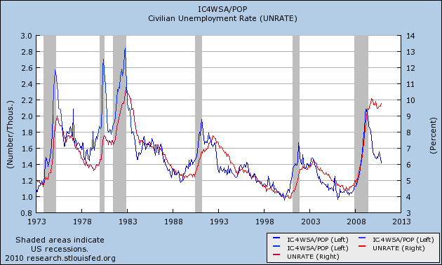
Take a look at the same graph updated through January:

The big decline in the unemployment rate still puts it about 3% above predicted rates, but supports the correlation's continued viability whereby the initial jobless claims rate is a leading indicator for the unemployment rate.
I also ran a graph, courtesy of Thumbcharts, that compared the 6 month average of new jobless claims with the same data from the year before, and similarly compared the average unemployment rate for the last 6 months with that of a year before. Here is that graph from two months ago:

The graph showed that in every case except for the 1980-1982 "double dip," a decline of 10% as measured of initial jobless claims was followed within 10 months by a similar decline in the unemployment rate
Here is the same graph now:

In this series too the leading relationship between initial claims and the unemployment rate is continuing to manifest itself.
These two series suggest that the decline in the unemployment rate is no fluke. While based on fundamental analysis of the economy, many forecasters were predicting that the unemployment rate would not get down to 9% until the end of 2011, instead it hit that rate in the first month. Further, since the historical relationship between these two series has not fully been resolved (i.e., the unemployment rate is still significantly higher than that predicted by initial jobless claims), one place to look for an economic surprise in the coming months is whether the unemployment rate continues to decline much more quickly than had been anticipated.
Finally, while the leading relationship described above suggests that the surprise decline in the unemployment rate is no fluke, it doesn't tell us *why* the unemployment rate declined as it did, and if the reasons are good news or bad. There are probably three main factors at work. That will be described in my next post.
Take a look at the same graph updated through January:
The big decline in the unemployment rate still puts it about 3% above predicted rates, but supports the correlation's continued viability whereby the initial jobless claims rate is a leading indicator for the unemployment rate.
I also ran a graph, courtesy of Thumbcharts, that compared the 6 month average of new jobless claims with the same data from the year before, and similarly compared the average unemployment rate for the last 6 months with that of a year before. Here is that graph from two months ago:
The graph showed that in every case except for the 1980-1982 "double dip," a decline of 10% as measured of initial jobless claims was followed within 10 months by a similar decline in the unemployment rate
Here is the same graph now:
In this series too the leading relationship between initial claims and the unemployment rate is continuing to manifest itself.
These two series suggest that the decline in the unemployment rate is no fluke. While based on fundamental analysis of the economy, many forecasters were predicting that the unemployment rate would not get down to 9% until the end of 2011, instead it hit that rate in the first month. Further, since the historical relationship between these two series has not fully been resolved (i.e., the unemployment rate is still significantly higher than that predicted by initial jobless claims), one place to look for an economic surprise in the coming months is whether the unemployment rate continues to decline much more quickly than had been anticipated.
Finally, while the leading relationship described above suggests that the surprise decline in the unemployment rate is no fluke, it doesn't tell us *why* the unemployment rate declined as it did, and if the reasons are good news or bad. There are probably three main factors at work. That will be described in my next post.