Let's start with a 5-day, 5-minute chart of the IWMs. This is the worst performing index of the DIAs, SPYs and QQQQs over the last week and 10 days, indicating traders are moving away from risk.
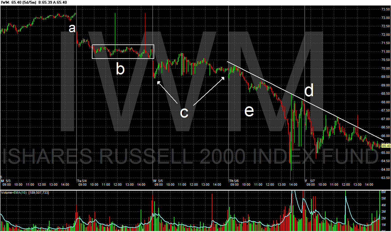
Prices gapped down lower on Tuesday, but spent the majority of the day in a tighter range (b). On Wednesday, prices formed a slight arc, opening lower, moving to a high in mid-trade, but then moving lower at the close. Thursday was the infamous "fat-finger" day, a day in reality the SEC and various exchanges are still trying to figure out. But the price decline continued into Friday.
Notice the continued escalation of selling volume toward the end of the week.
A standard bear market correction is considered to be 10% (give or take). Both the QQQQs and IWMs are already there. The QQQQ have fallen from a high of ~50.60 to a close on Friday of 45.63 -- a fall of 9.88%. The IWMs have fallen from a high of ~74.50 to a close of Friday of 65.44, or a fall of 12.16%.
Also note all indexes experienced a massive volume spike at the end of last week. Some might call thie a "selling climax," where a ton of sell orders hit the market as everybody simply says, "get me the hell out of here." Frankly, I don't think this is the end of the selling as Europe is still working out its issues.
Let's turn now to the Treasury market which caught a bid last week -- especially the long-term end of the curve.

The uptrend that started at the beginning of April (a) is still intact. However, last week we saw two gaps higher (b) -- indicating there was a tremendous bid in the market. Also note that prices are now above the 200 day EMA, indicating the TLTs are now in a bull market. The short-term EMAs are bullish -- all are moving higher and the shorter are above the longer. additionally, the 10 day EMA is about the 200 day EMA. Finally, like the equity markets, the bond market saw a massive spike in volume last week (d), indicating there was a tremendous flight to quality.

However, while there is tremendous momentum right now (a), the A/D line is dropping.

Note we see the same drop with the on balance volume indicator.
Let's turn to gold, which, like the Treasury market and the dollar, has caught the safety bid.

The EMA picture is very bullish: the shorter EMAs are above the longer EMAs, all the EMAs are moving higher and prices are above all the EMAs.

Prices broke out of a triangle consolidation pattern (a), returned to the top line of the pattern as a test (b) and then broke through previous highs to move higher. Also note the higher volume over the last few days as money has moved into the market.

Finally, we have increasing momentum (a) and a big influx of money into the market (b).
Let's move to the dollar.

First, the dollar is in a clear uptrend (a). The EMAs are bullish -- shorter above longer, all moving higher and prices above all the EMAs. Prices have moved through upside resistance (c) and have printed some large gaps over the last week on high volume. BUT

The A/D line is decreasing and the Chaiken money flow indicates that money is moving out of the security. What does this mean?
Technical divergences -- situations when prices and indicators are moving in different directions -- can indicate a possible change in trend. Here, we have two declining volume indicators, which tells us the breadth of the dollar rally might not be as wide as we would like. Also note the last gap could be an exhaustion gap -- the final big upside move before a trend changes. If so, we'll know soon enough.