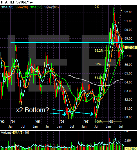
Let's start with the "super-long" view to get an idea about where we are in the big picture.
Prices meandered from 2003-2005 as money flowed into the stock markets. Traders had not reason to engage in a massive sell-off because inflation was under control. At the same time, there was no reason to rally because the economy was expanding. So sideways was the primary direction.
From mid-2005 to the beginning of 3Q 2006 the market sold-off big time, losing about 10%. Then the market rallied and sold-off again, bottoming at the beginning of 3Q 2007. This was the formation of a double bottom in the IEF chart. Starting in the 3Q of 2007 we get the credit crunch rally, as traders started to move into the government debt market in a big way. Hence the run-up from $80 - $92. Investors were looking for return of capital rather than return on capital. Since the topping of that rally (more on that in a minute) the market has sold-off, originally to the 50% Fibonacci level and now is working with the 38.2% level.
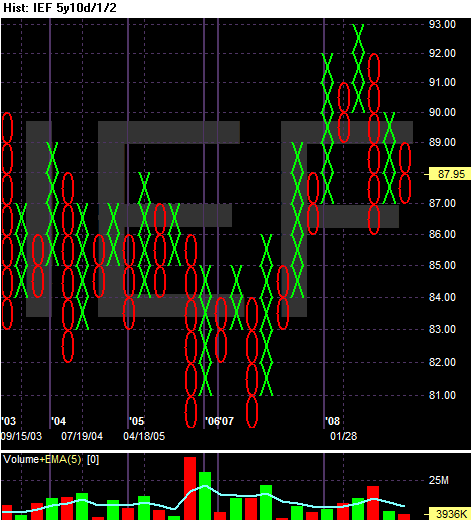
The P&F chart shows the market had a slightly downward moving bias from 2003 - 2007. Note this chart really shows the double bottom along with the strength of the credit crunch rally. Notice in the 2007-2008 rally that price moved higher and the sold-off by a few points, only to then move higher.
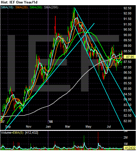
The year chart also clearly shows the credit crunch rally. Prices continually moved through previously established price levels and then sold-off to consolidated gains. Notice how prices used the 50 day SMA as support during this rally. Also note the timing of the sell-off -- the Fed's backstopping the Bear Stearns buyout. This event signaled the Fed was not going to let the market "self-correct" but instead the Fed was going to take an active role in the "correction". In other words, the bail-outs were beginning.
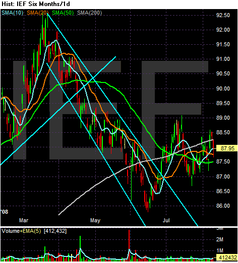
The 6 month shows the sell-off. Prices moved lower for three solid months, holding within a trend channel. Also note the shorter SMAs moved below the 50 day SMA in late April signaling a confirmation of the trend reversal. Also note that prices eventually dipped below the 200 day SMA which is typically bear market territory.
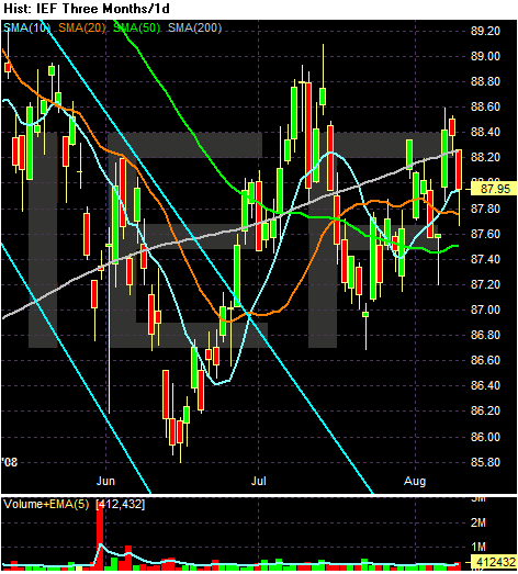
The three month chart is sending a very confusing message.
-- Prices are bunched around the 200 day SMA and have been for the last month or so.
-- The SMAs and prices are configured very tightly.
-- The 200 and 20 day SMA are moving higher whereas the 20 is moving a bit lower and the 50 is moving up a bit. In other words there is no clear signal about market direction at this point.