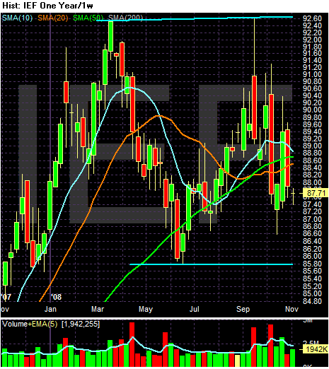
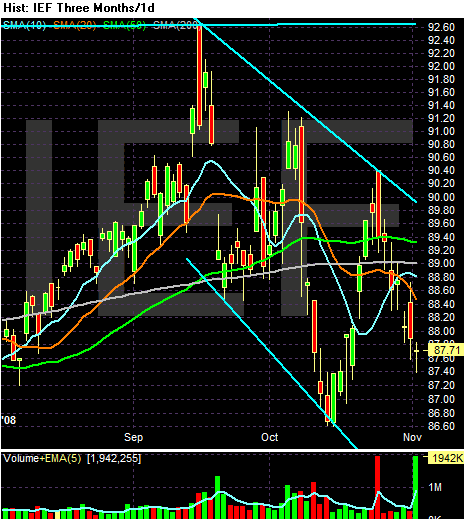
Secondly, let's look at the Treasury market. I use the IEF -- the ETF that represents the 7-10 year of the curve -- as a proxy for the market.

In last week's installment, I noted that I think the market is going to either move sideways or lower. As this yearly chart shows, the market has likely made a double top with the first top occurring in mid-March and the second occurring in mid-September. Remember the yield and price are inversely related. Therefore there is a naturally occurring floor for Treasury prices. Because of inflation adjustments I just don't think we'll see the Treasury market rally higher than the 92 area on this chart that we've seen twice this year.

On the daily chart, the main issue is the bunched-up nature of the SMAs. I use the SMAs as trends; when they are this bunched up it tells me there is a great deal of confusion about where traders want to take the market. Note the following:
-- Prices have been gyrating around the 200 day SMA since mid-September. Before that he had a clear rally as indicated by the then existing relationship between the SMAs.
-- The SMAs are all within a point of each other
-- The 50 and 200 day SMAs (the longer averages) are moving sideways.