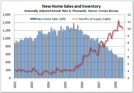
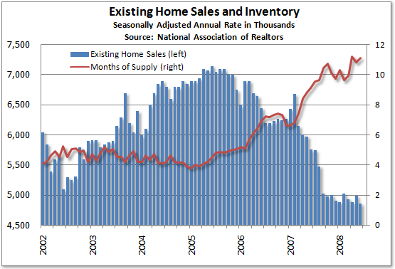
On both of these charts, note that the pace of sales as stabilized. In the case of new homes for a few months and in the case of existing homes for about 10 months. So, do these charts mean the housing market is starting to stabilize? Not yet:
This graph is from Calculated Risk:

So long as prices are in free fall (or cliff diving) we're nowhere near out of the woods.