Sunday, March 4, 2007

S&P Top 10 Stocks

Here is a list of the second set of top 5 stocks in the S&P 500. Collectively these stocks represent about 7.5% of the overall average. They are listed from the largest to smallest as a percentage of the average.

Photobucket - Video and Image Hosting

Photobucket - Video and Image Hosting

Photobucket - Video and Image Hosting

Photobucket - Video and Image Hosting

Photobucket - Video and Image Hosting

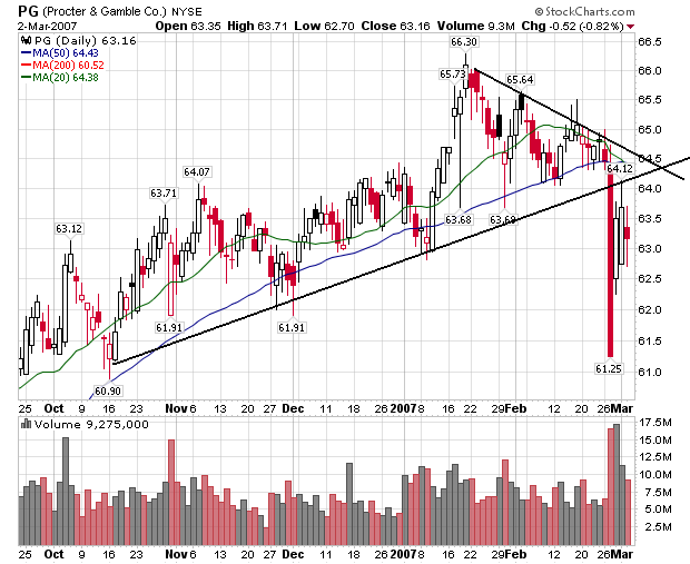
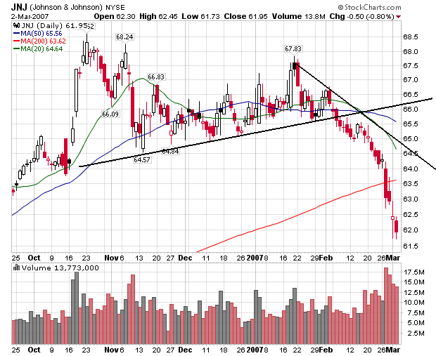
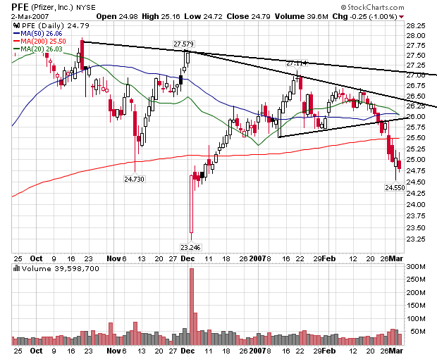
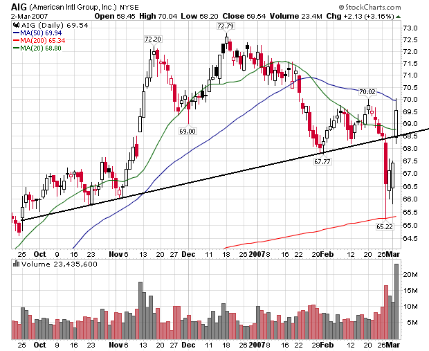
With the exception of AIG, all of these stocks are in clear downtrends. When you combine these charts with the top 5 S&P stocks you get a pretty dismal picture of the big S&P positions: 8 of the 10 largest caps in the index -- representing about 20% of the average -- are in downtrends. Citigroup is close to a downtrend and the only reason AIG is in an uptrend is an incredibly favorable special circumstance YOY earnings performance (Last year AIG's earnings were low because of a legal settlement).

1 comment:

Robert D Feinman said...

Since I don't believe in technical analysis I guess I shouldn't be criticizing its use, however...

One of things wrong with the charts is that they use inconsistent scaling, this tends to attach more important to small variations in price. I think it would be much more (visually) revealing if the charts were all scaled similarly. This means that they should start at zero and the vertical scale should be semi-log or percentage based. If one wants to highlight some changes at the top (which in reality only represent less than a 10% change) then this should be shown as a supplementary chart or pop up or some other secondary display.

People tend to focus too much on small changes when the scale is in dollars and not zero based. I suppose the day traders like to focus on small movements, but it seems to me the purpose of this site is to discuss the bigger issues so keeping things in perspective would be appropriate.