Saturday, August 17, 2019
Weekly Indicators for August 12 - 16 at Seeking Alpha
- by New Deal democrat
My Weekly Indicators post is up at Seeking Alpha.
The data continues to be dominated by a steep decline in long term interest rates. These have both inverted further portions of the yield curve and reinvigorated the housing market.
As usual, clicking through and reading should not only be educational for you, but put a penny or two in my pocket to reward me for my efforts.


Friday, August 16, 2019
Positive July housing permits and starts
- by New Deal democrat
The housing starts and permits report this morning for July adds to the positive data looking forward to H2 2020 (or, possibly, less bad - but that’s another discussion).
First, here are overall permits (red) and starts (blue):
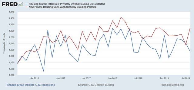
While the very volatile starts declined, the slightly more forward looking and less volatile permits rebounded off their low to a 6 month high.
The less volatile single family permits (red) and starts (blue) were even more positive:
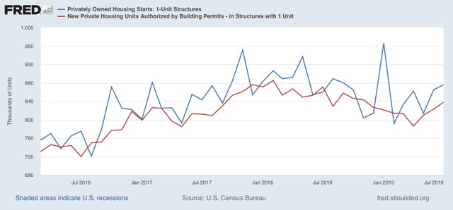
Single family starts were at an 8 month high. The more forward looking and least volatile single family permits made a 9 month high.
Lower interest rates are now clearly feeding into the housing construction market. This is a positive 12+ months out.
There are two issues. The first is whether house prices advance so quickly that they eat up the savings purchasers would otherwise pocket. This is the “housing choke collar” theory I have recently advanced. The second is that this in no way negatives the potential for a recession this winter, much as the advance in housing in 2000-01 did not prevent the 2001 producer led recession.
Thursday, August 15, 2019
Industrial production, jobless claims, and retail sales
- by New Deal democrat
As I noted this morning, a slew of important data was released. Let me deal with the “normal” weekly and monthly data in this post.
First, industrial production continues to languish, down significantly from the end of last year, whether measured in total or just as to manufacturing:
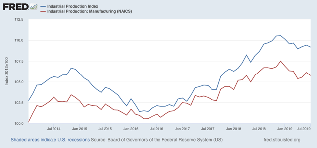
The saving grace here is that it has not declined as much as it did during the 2015-16 “shallow industrial recession” which was not sufficient to cause the economy as a whole to contract.
Second, initial jobless claims rose, and are (slightly) higher YoY for the first two weeks of August:
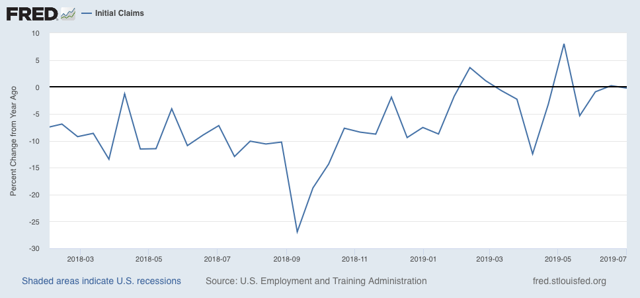
The 4 week average is only about 6% higher than their trough this past April:
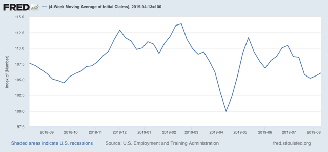
The four week average of continuing claims, which is much less volatile, is about -2.5% lower than it was a year ago. Should it turn higher YoY, that would be a yellow flag; if it were to reach 10% higher, that has always meant recession:
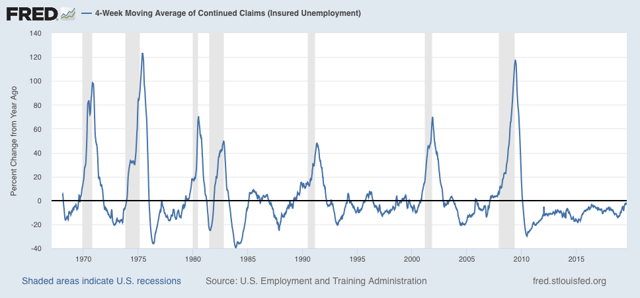
For now, jobless claims are just showing a slowdown.
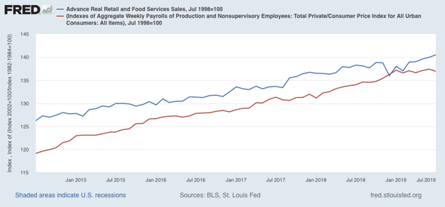
Finally, real retail sales (blue) rose 0.4% to another new high in July:
Here’s the longer term look for the past 20+ years:
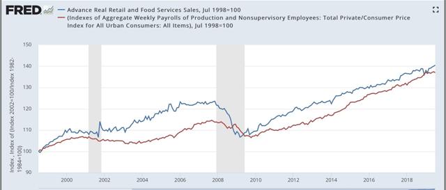
The red line is real aggregate payrolls. Since sales tend to lead payrolls (note the former flattened out about 6 months before the latter prior to each of the last two recessions), this is an encouraging sign.
A couple of other recent data points also suggest that the consumer continues to be in decent shape. The NY Fed’s report on consumer debt delinquencies was released this week, showing a slight decline to expansion lows:
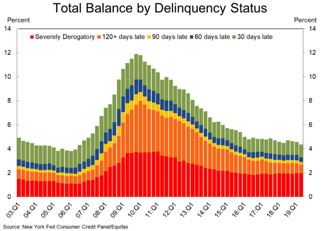
If the consumer were getting stressed and ready to cut back, I would expect this metric to be rising.
Also, the American Banking Association’s report on consumer bankruptcies showed only a small uptick from expansion lows during the 2nd Quarter:
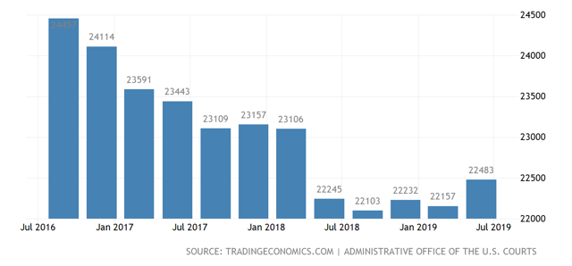
Right now the consumer, relatively speaking, is doing pretty well. If we are on the cusp of a recession, it is almost certainly going to be producer led.
Quick hits on a major Thursday economic news blitz
- by New Deal democrat
There has been a ton of significant economic news this morning. I’m not going to be able to get to all or even most of it in depth. So I am going to leave a quick rundown here.
Starting with the positive:
-nominal retail sales up +0.6%, up +0.3% in real terms, up +0.2% Per Capita. This is another new high and suggests the US consumer continues to be in good shape (relatively speaking). Note that much of this apparently has to do with Amazon “Prime Day” purchases, and if the seasonal adjustments are off, this could easily be a false positive.
-Both the NY and Philly Fed indexes higher, including new orders for both. No indication here that manufacturing is rolling over.
-The manufacturing component of industrial production higher, again suggesting that manufacturing is not rolling over (although this is still below its December high point).
The negative:
- overall industrial production was negative - again! Industrial production as a whole has remained in a decline off its high in December of last year. This is the premier coincident economic indicator, even more than payrolls.
- initial jobless claims higher YoY on both a weekly and monthly measure. It is not more than 10% higher than its recent lows, so overall is a neutral not a negative.
- the 2 year to 10 year treasury spread briefly inverted again this morning, although once again it has rebounded to positive.
-a MAJOR negative: unit labor costs for the last five years revised higher, meaning that adjusted corporate profits (a long leading indicator) peaked back in 2014, and were almost 15% lower than that as of Q1 of this year. The placeholder proprietors income is also slightly lower through Q2 than its peak in Q4 of last year.
I’ll try to post one or two things in detail later.
Wednesday, August 14, 2019
A note on the stock and bond markets
- by New Deal democrat
No economic data releases today, but a little kerfluffle in the markets.
First of all, in case you missed it, the 10 year to 2 year bond spread briefly inverted early this morning. Here’s the screenshot from CNBC:
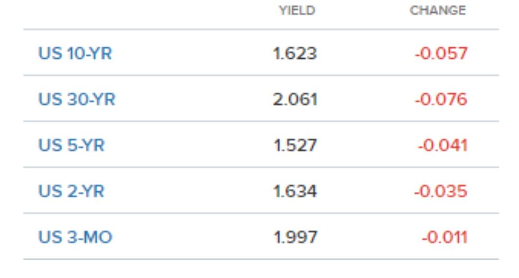
As I say, it was brief. As I type this, the spread has reverted to normal.
But another significant spread inverted yesterday, and has remained inverted today: the 30 year bond vs. the Fed funds rate. The Fed funds rate is currently at 2.12%, and beginning yesterday afternoon, the 30 year bond yield went lower than that. As I type this, the long bond is yielding 2.05%, an all-time low. Here’s the lifetime chart:
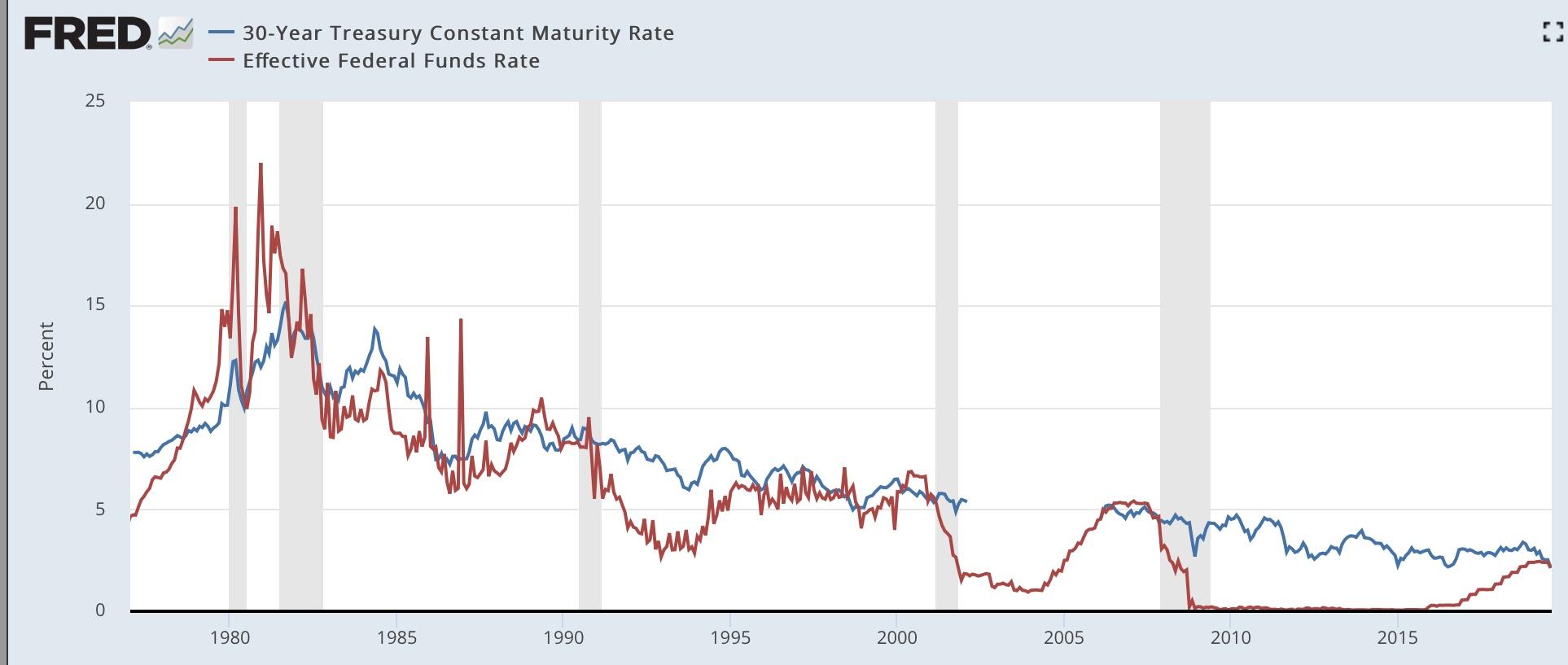
As a caution, note that this spread also inverted for a few days several times in the mid-1980s and mid-1990s, as well as for a month and a half in 1998, without signaling recession. Most importantly, the Fed acted swiftly in 1998 to cut rates.
As it did last December when the first portions of the yield curve inverted (in the 2 to 5 year range), the stock market is taking this badly:
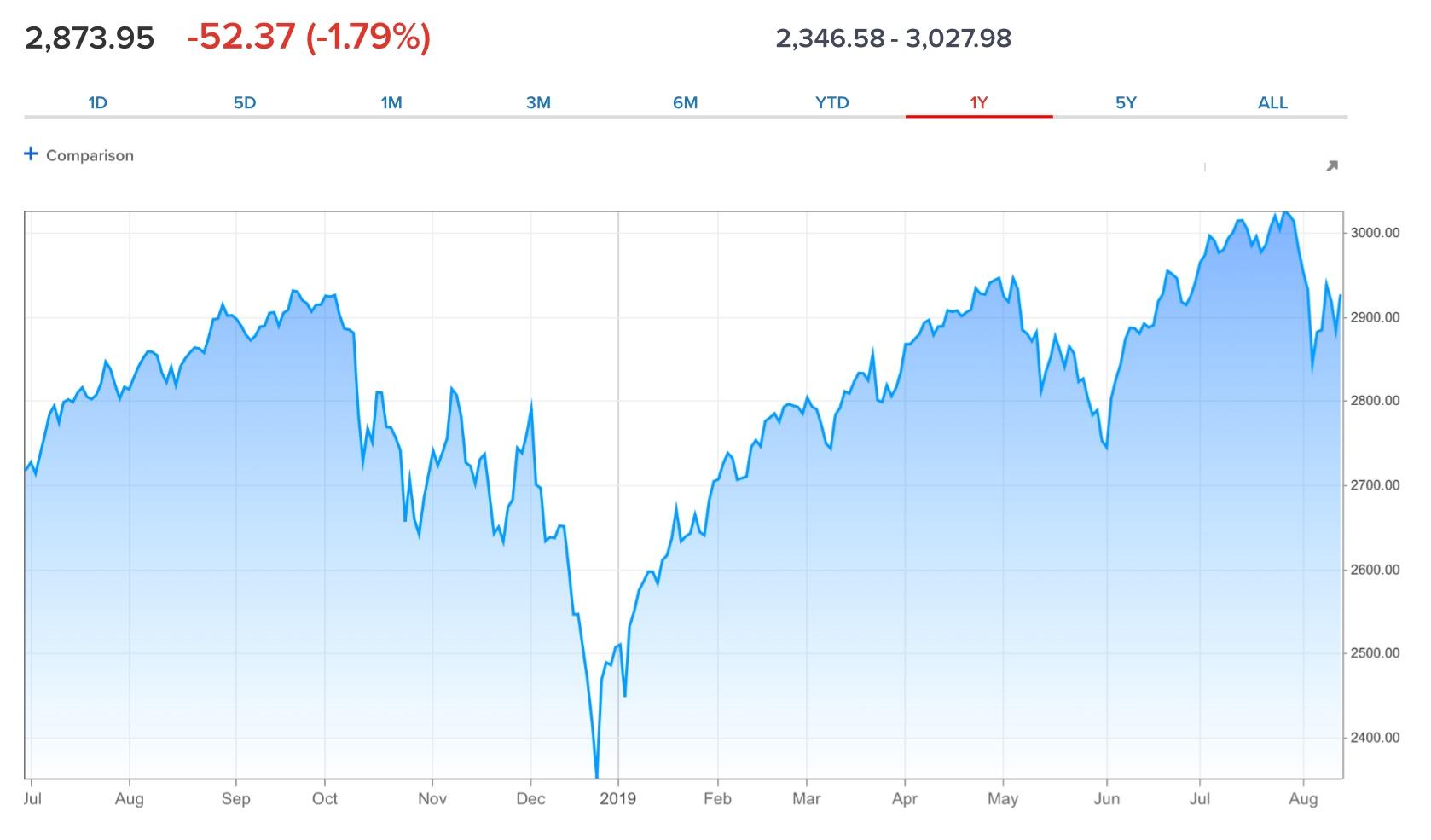
The stock market is up over 20% since that bottom.
Here is my takeaway from this morning:
1. The more portions of the bond yield curve invert, the stronger the negative signal.
2. BUT, we still have the counter-examples of 1966 and 1998, where the inversions were met with fiscal stimulus (1966) or prompt interest rate cuts (1998) and no recession occurred.
3. Even if the yield curve is signaling a recession in the near future, it doesn’t mean there is one arriving imminently. A strong stock market sell-off like December’s would be an overreaction.
4. If the further yield curve inversions mean a recession this coming winter, we ought to be seeing signs of either consumer weakness in retail sales (reported tomorrow) or corporate profits (reported for Q2 in two weeks in the revised GDP report).
I plan on doing a more detailed look at the consumer tomorrow after retail sales for July come out.
Tuesday, August 13, 2019
Real average and aggregate wage growth for July 2019: yellow flag for aggregate wages
- by New Deal democrat
Now that we have the July inflation reading, let’s take a look at real wages.
First of all, nominal average hourly wages in June increased +0.2%, while consumer prices increased +0.3%, meaning real average hourly wages for non-managerial personnel decreased -0.1%. This results in a slight decline of real wages to 97.0% of their all time high in January 1973:
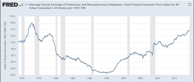
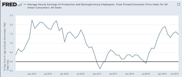
On a YoY basis, real average wages were up +1.5%, a decline from their recent peak growth of 1.9% YoY in February:
Updated through July, real aggregate wages - the total amount of real pay taken home by the middle and working classes - are up 28.7% from their October 2009 low:
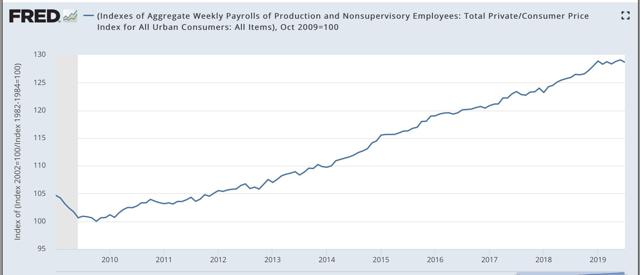
For total wage growth, this expansion remains in third place, behind the 1960s and 1990s, among all post-World War 2 expansions; while the *pace* of wage growth has been the slowest except for the 2000s expansion.
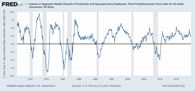
Finally, two months ago I raised a concern that real aggregate wages had decelerated sharply this year, writing that “real aggregate wage growth has typically decelerated by 1/2 or more from its 12 month peak just at the onset of recessions, although there have been 3 false positives coincident with slowdowns.” Last month that concern disappeared. As of this month it re-appeared, as YoY growth has declined to 2.2% vs. 4.9% at the beginning of this year, and is actually -0.2% below its level in January:
Still, we have had two similar declines already during this expansion, so I would characterize th is metric as a yellow flag vs. a red flag at this point.
Monday, August 12, 2019
My preliminary long leading forecast through midyear 2020
- by New Deal democrat
This post is up at Seeking Alpha.
This is my first look at economic conditions into next summer. I suspect that it is contrary to most punditry that you will read.
In any event, as usual clicking over and reading helps reward me for the effort I put in to this endeavor.
Saturday, August 10, 2019
Weekly Indicators for August 5 - 9 at Seeking Alpha
- by New Deal democrat
My Weekly Indicators post is up at Seeking Alpha. Corporate bond yields made another new expansion low, which is a big deal.
As usual, clicking over and reading should be educational for you, and puts a couple of pennies in my pocket to reward me for my efforts.
Friday, August 9, 2019
Q2 Credit conditions were decidedly mixed
- by New Deal democrat
Credit conditions are one of my categories of long leading indicators. I track the Chicago indexes weekly, but the more comprehensive Senior Loan Officer Survey only comes out once per quarter.
The 2nd Quarter Survey was published earlier this week. I have a post describing what it shows up at Seeking Alpha.
As usual, clicking on the link at reading should give you good information, and reward me with a little jingle.
P.S. I have all the graphs queued up and ready for my long leading forecast through midyear 2020. Now I just have to get motivated enough to write all the descriptions....
Wednesday, August 7, 2019
Notes on the June JOLTS report: weakness but no imminent downturn
- by New Deal democrat
I’m still on vacation, so continue to expect light posting. But I thought I’d take a look at the one piece of data that came out this week, the June JOLTS report.
First of all, the “hiring leads firing” mantra continues to be true:
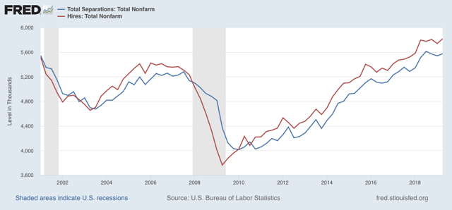
[Note: data averaged quarterly to cut down on noise.] Interesting that hiring has been essentially flat for a full year, and total separations (“firing”) for the past three quarters.
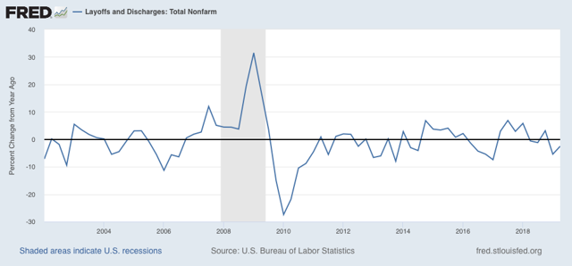
But the layoffs and discharges part of separations continues down YoY, a good thing, and what initial jobless claims and the unemployment rate also show, if weakly:
But the relative weakness of the employment situation show up in the YoY% changes in hiring, voluntary quits, and job openings (all normed to zero at their current levels in the below graph):
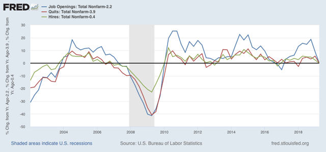
Note that the changes aren’t as bad as during the 2015-16 shallow industrial recession, or immediately before the 2007 recession (they’re more like 2006 levels).
I thought I’d extend Monday’s graph of monthly manufacturing, residential construction, and temporary job changes back through the weak 2015-16 period and compare that as well:
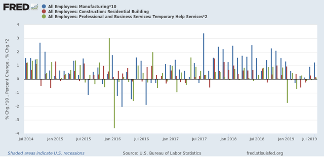
The “shallow industrial recession” featured more negative manufacturing and temporary jobs months than this year so far.
Again, the takeaway is weakness, but no imminent downturn.
Monday, August 5, 2019
Scenes from the July employment report
- by New Deal democrat
First things first: I’m on a vacation for part of this week, so don’t be surprised if there are no postings for a few days.
The July employment report continued a string of good headline numbers with weak leading internals. Let’s take a look.
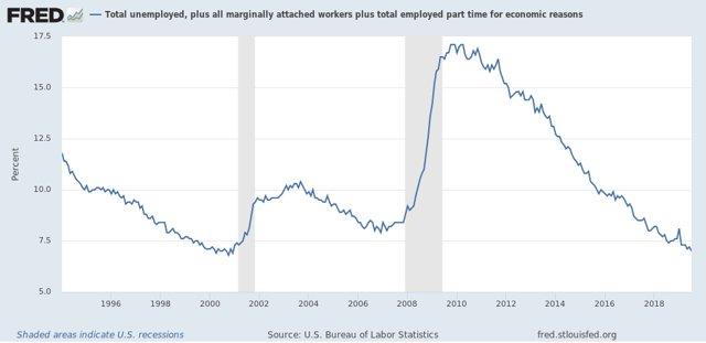
In the good news department, the U6 underemployment rate declined to yet another new expansion low of 7.0%. This is mainly due to the continuing decline in the involuntarily part time employed. The only three months it has been better than that since the modern series started were three months in the year 2000:
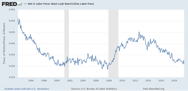
When we go further and take a look at those who aren’t even in the labor force, because they aren’t looking for a job, but say they want a job now, we’re about 0.2% above the 2000 lows and about 0.5% above the all-time lows in 2007:
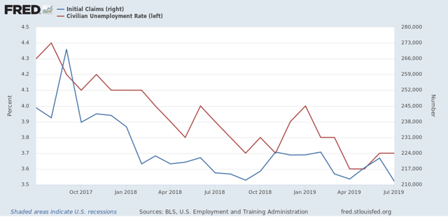
Also, as initial jobless claims continue to trend slightly downward YoY, the U3 unemployment rate is likewise trending slightly downward as well (remember that the former generally leads the latter by a month or two):
Now to the bad news. I’ve been tracking manufacturing, residential construction, and temporary jobs since the beginning of the year, since these three sectors tend to lead the rest. While manufacturing employment has picked up in the last two months - something of a puzzle, because the ISM readings have been down - construction and temp employment continue close to zero gains, which are way down compared with last year:
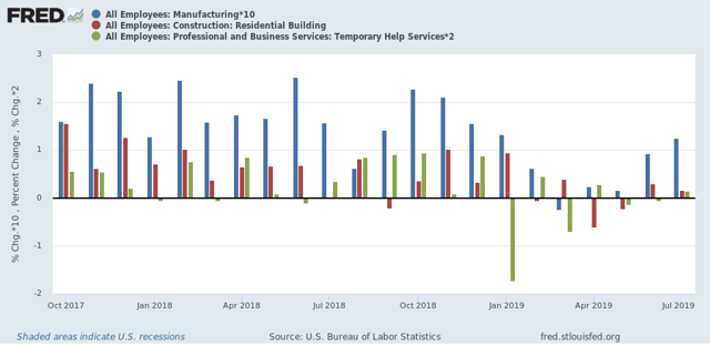
Temporary jobs in particular have not made a new high since last December.
Gains in the broader goods producing category has also decelerated sharply, although they are still positive YoY. I would expect this to turn negative before any recession were to begin:
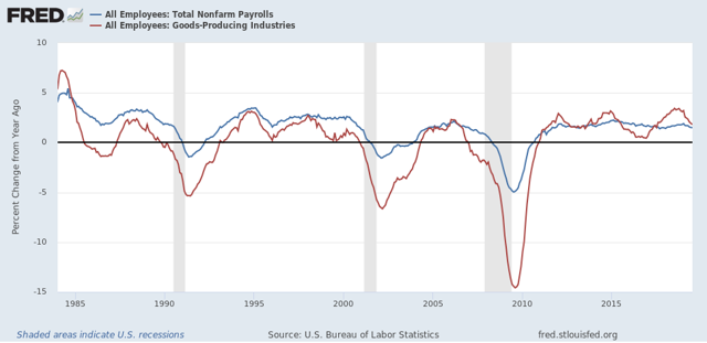
Finally, the average manufacturing work week is one of the ten items in the Index of Leading Indicators. These are down -0.9 hours since their peak in April of last year. In the past this has almost always meant a recession. The best way to show you this graphically is the YoY comparison, which is down -0.7 hours, so I’ve added +0.7 to make that the zero line:
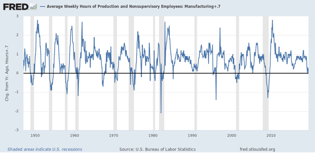
Hours have been down this much or more for 10 of the last 11 recessions. There are only three false positives (1952, 1966, and 1995) for readings this low for more than one month.
In summary we have good present conditions, with leading indications of at very least a slowdown still ahead.
Saturday, August 3, 2019
Weekly Indicators for July 29 - August 2 at Seeking Alpha
- by New Deal democrat
My Weekly Indicators post is up at Seeking Alpha.
That corporate bond yields fell to new expansion lows yesterday is a BFD.
As usual, clicking over and reading helps reward me for the effort I put in, as well as giving you up to the moment information.
Friday, August 2, 2019
July jobs report: good headline masks signs of serious producer-led slowdown
- by New Deal democrat
HEADLINES:
- +164,000 jobs added
- U3 unemployment rate unchanged at 3.7%
- U6 underemployment rate declined -0.2% from 7.2% to 7.0% (NEW EXPANSION LOW)
Leading employment indicators of a slowdown or recession
I am highlighting these because many leading indicators overall strongly suggest that an employment slowdown is coming. The following more leading numbers in the report tell us about where the economy is likely to be a few months from now. These were very mixed this month.
- the average manufacturing workweek fell -0.3 from 40.7 hours to 40.4 hours. This is one of the 10 components of the LEI, and will have a big negative impact. THIS IS A SERIOUS DECLINE.
- Manufacturing jobs rose by 16,000. YoY manufacturing is up 157,000, a deceleration from last summer’s pace.
- construction jobs rose by 4,000. YoY construction jobs are up 202,000, also a deceleration from last summer. Residential construction jobs, which are even more leading, rose by 4000.
- temporary jobs rose by 2200.
- the number of people unemployed for 5 weeks or less rose by 240,000 from 1,961,000 to 2,201,000. The post-recession low was three months ago.
Wages and participation rates
Here are the headlines on wages and the broader measures of underemployment:
Here are the headlines on wages and the broader measures of underemployment:
- Not in Labor Force, but Want a Job Now: fell by -279,000 from 5.322 million to 5.043 million
- Part time for economic reasons: declined by -363,000 from 4.347 million to 3.984 million (NEW EXPANSION LOW)
- Employment/population ratio ages 25-54: down -0.2% to 79.5%. This has now declined -0.4% from the peak at the beginning of this year.
- Average Hourly Earnings for Production and Nonsupervisory Personnel: rose $.04 from $23.42 to $23.46, up +3.3% YoY. This is still a slight decline from the recent YoY% change peak. (Note: you may be reading different information about wages elsewhere. They are citing average wages for all private workers. I use wages for nonsupervisory personnel, to come closer to the situation for ordinary workers.)
Holding Trump accountable on manufacturing and mining jobs
Trump specifically campaigned on bringing back manufacturing and mining jobs. Is he keeping this promise?
Trump specifically campaigned on bringing back manufacturing and mining jobs. Is he keeping this promise?
- Manufacturing jobs rose an average of +13,000/month in the past year vs. the last seven years of Obama's presidency in which an average of +10,300 manufacturing jobs were added each month.
- Coal mining jobs declined -100, an average of 8 jobs(!)/month in the past year vs. the last seven years of Obama's presidency in which an average of -300 jobs were lost each month
Other important coincident indicators help us paint a more complete picture of the present:
- Overtime declined -0.2 hours to 3.2 hours.
- Professional and business employment (generally higher-paying jobs) rose by 31,000 and is up +367,000 YoY.
- the index of aggregate hours worked for non-managerial workers declined by -0.2%
- the index of aggregate payrolls for non-managerial workers rose by 0.1%
Other news included:
- the alternate jobs number contained in the more volatile household survey rose by 283,000 jobs. This represents an increase of 1,324,000 jobs YoY vs. 2,246,000 in the establishment survey. This survey, which has been negative three months this year, was a major disconnect from the establishment number. The household survey has a tendency to turn first, and this month it showed up in the establishment survey.
- Government jobs rose by 16,000.
- the overall employment to population ratio for all ages 16 and up rose 0.1% to 60.7% m/m and is up 0.2% YoY.
- The labor force participation rate rose 0.1% from 62.9% to 63.0% m/m and is up +0.1% YoY.
SUMMARY
This was a decidedly mixed report, but the big positives were in the coincident category, while the biggest negatives were in the leading category.
The positives included a new low in the underemployment rate, including a new low in involuntary part time employment, and continuing if modest gains in the three most leading job categories. The household jobs number also has jumped higher for the second month in a row.
But the negatives were more important in my opinion. Most importantly, the average manufacturing workweek declined seriously, and is down -1.0 hour from its peak, which has almost always presaged a recession. Overall goods producing jobs were only up 16,000, a pathetic share of the total market. The prime age employment to population ratio is now in a significant declining trend from its January peak. Revisions also continued to be negative, and the YoY change in the household jobs survey remains much lower than the establishment survey, two trend changes that have a tendency to change at turning points. The YoY change in the establishment survey is also decelerating.
So, while the headline jobs number continues to be quite good, the underlying internals continue to be most consistent with a producer-led serious slowdown.
Thursday, August 1, 2019
July ISM manufacturing, June residential construction both better than expected
- by New Deal democrat
We got two important leading indicators this morning. Both were better than expected.
First, July data started out with an ISM manufacturing index reading that declined slightly to 51.2, but remained above the neutral level of 50.0. Even more important, the new orders subindex rose slightly to 50.8:
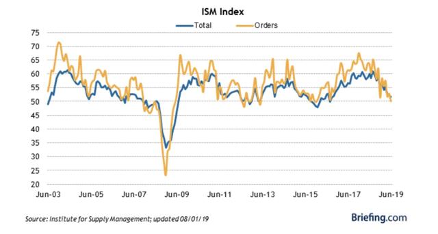
Manufacturing as measured by this index, as well as the regional Fed indexes, has been slow, but has doggedly resisted going into contraction.
June construction spending declined, as did the component of residential construction. But the good news here is that there were substantial upward revisions to the last few months, so the final number was about 1% higher than the initial reading for last month:
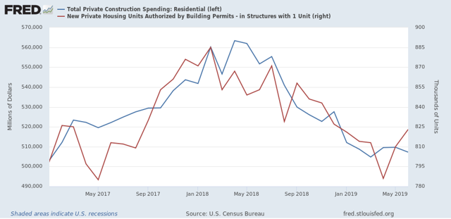
Construction spending follows permits and starts with a lag, but is much less noisy. I don’t think we’ve reached bottom yet in this metric, but with the revisions the June number has to be treated as a positive.
One last thing: looking ahead to tomorrow’s employment report, the American Staffing Index had the worst YoY reading of the year so far this week, at -3.7%:
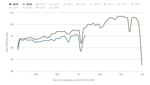
So I’m expecting weak numbers for the leading manufacturing, residential construction, and temporary employment sectors tomorrow, at least as compared with last year, with the most likely negative number being in temporary employment.
One last thing: looking ahead to tomorrow’s employment report, the American Staffing Index had the worst YoY reading of the year so far this week, at -3.7%:
So I’m expecting weak numbers for the leading manufacturing, residential construction, and temporary employment sectors tomorrow, at least as compared with last year, with the most likely negative number being in temporary employment.
Initial claims for July remain lower, thus positive
- by New Deal democrat
I have started to monitor initial jobless claims to see if there are any signs of stress.
My two thresholds are:
1. If the four week average on claims is more than 10% above its expansion low.
2. If the YoY% change in the monthly average turns higher.
Here’s this week’s update. [NOTE: I’ll add the relevant graphs later.] UPDATE: graphs added.
My two thresholds are:
1. If the four week average on claims is more than 10% above its expansion low.
2. If the YoY% change in the monthly average turns higher.
Here’s this week’s update. [NOTE: I’ll add the relevant graphs later.] UPDATE: graphs added.
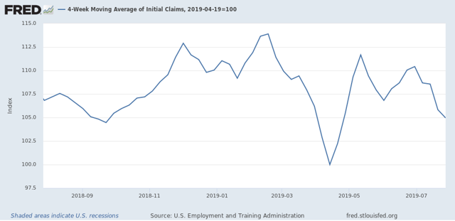
Initial jobless claims last week were 215,000. This is in the lower part of its range for the past 18 months. As of this week, the four week average is 5.0% above its recent low:
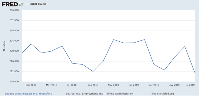
Last July, initial claims averaged 215,250. Thus the monthly YoY comparison, at 211,500, or -2.7% lower, and so also remains positive:
Finally, let’s compare the YoY% change in initial claims (blue) with continuing claims (red):
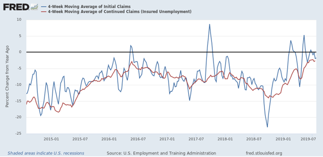
Comparisons have been getting closer to crossing the threshold from lower to higher, but for the past several weeks have trended a little lower, which is more positive. This. week the comparison was -2.7% YoY. So far - this is most consistent with the 1984, 1994, and 1996 slowdowns, and not a recession.
Wednesday, July 31, 2019
The housing choke collar
- by New Deal democrat
I have a new post up at Seeking Alpha, discussing how, even though sales went down last year, and have already bottomed, house prices have as usual, followed into decline with a lag.
Beyond that, I discuss the concept of a “housing choke collar,’ similar to the “oil choke collar” I used to write about in 2010-14, whereby prices repeatedly approach the tipping point of unaffordability, causing sales to drop off, causing interest rates and prices to decline, making housing more affordable ... and the cycle repeats.
One item that didn’t make it into that article, because I was trying to be concise and not digress, was this graph of the median income of renters that Kevin Drum posted a couple of weeks ago:
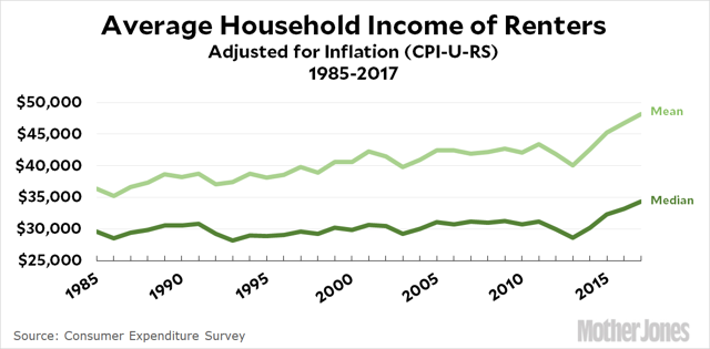
Kevin Drum has repeatedly been trying to make the case that, really, housing hasn’t gotten expensive at all compared to historical values — and gotten a lot of blowback (correctly, imo). His take on the above graph is that it shows that renters aren’t stressed at all.
I think the graph actually shows that buying a house has gotten so expensive that it has been prices out of an increasing slice of middle-class incomes, and so people higher up the income scale have been forced into renting.
Anyway, as usual clicking over and reading my piece at Seeking Alpha should bring you up to date on the housing market, and helps me out for my efforts with a little cash in my wallet.
Tuesday, July 30, 2019
June 2019 personal income and spending
- by New Deal democrat
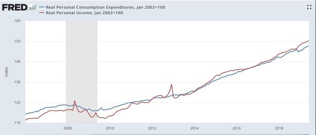
The wage-earner/consumer remains in decent shape, and a lack of inflation (continued low gas prices!) continues to be able to hide a multitude of sins. That’s the message from this morning’s June report for personal income and spending.
Nominally, income rose +0.4%, while spending rose +0.3%. Since inflation as measured by the PCE price index only increased 0.1%, that means both real income and real spending rose +0.3 and +0.2%, respectively:
Here’s the same data YoY:
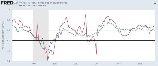
As I’ve written about many times over the past ten years, earlier in the cycle retail sales tend to grow more than the broader measure of personal spending; later in the cycle retail sales decelerate first. Here’s what that looks like updated through June:
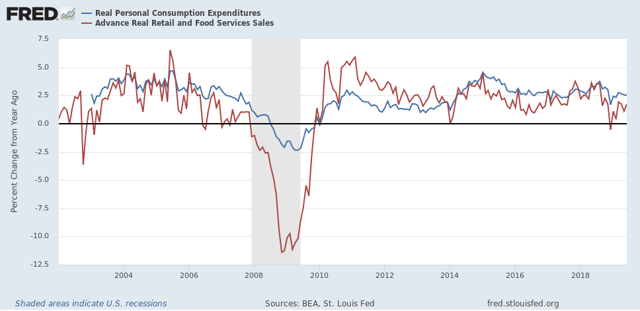
This continues to look like a later-cycle consumer who is in pretty decent shape for the moment. And probably will be until either inflation picks up, or international trade weakness bleeds into a broad producer-led slowdown.
One final note. Something interesting is happening with the savings rate (i.e., the percentage of their income that people don’t spend) — it has been gradually rising, by a total of 2%, over the past several years. Why is that interesting? Because, here is the long term picture:
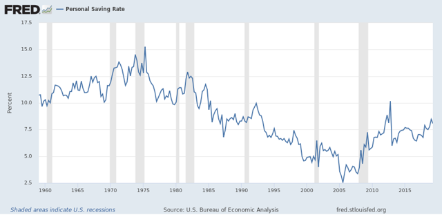
An increase in personal saving over the course of an economic expansion is something that hasn’t happened in almost 50 years! I’m not sure what exact dynamic is in play, so I won’t commment further. But it is very interesting, and I’m mulling it over.
Monday, July 29, 2019
Trump’s trade wars can still lead to a producer led recession
- by New Deal democrat
I wrote a piece last week for Seeking Alpha explaining that, while the consumer side of the economy is doing reasonably well, a recession could still com in via the producer side.
https://seekingalpha.com/article/4278010-producer-led-recession-remains-viable
As usual, clicking over and reading should be educational for you, and puts a penny or two in my pocket.
Thus, the idea that no recession can happen absent a 20% YoY slide in new home sales is not correct. In fact, the 2001 recession happened with only a 10% decline from the very top to bottom in sales (and less than that YoY) that ended about 6 months before the recession even began. The decline in new home sales from top to bottom in 2018 was similar.
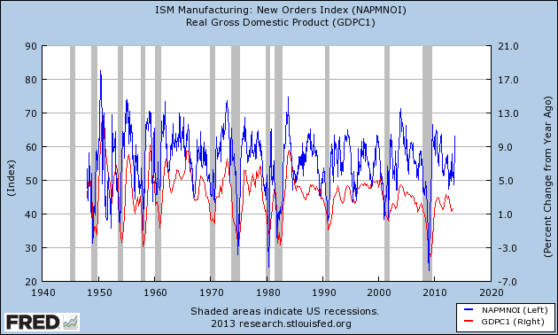
One item that didn’t make it into that post was to note that the ISM manufacturing index, especially the new orders subindex, should give early warning of any producer downturn.
ISM won’t let FRED publish their data anymore, so here’s a graph I created back in 2012 or so showing the relationship going all the way back to 1948. Note that the new orders subindex can decline to about 45 and still be a false positive. In 2000-01, it declined to 40 before the recession actually began:
As of last month it stood at exactly 50.0, as shown in the more updated graph of the new orders subindex from Briefing.com:
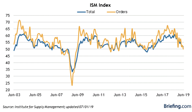
The July ISM index will be released on Thursday. The average of the regional Fed indexes is a hair above 0, with the final region - Texas - due to report later this morning. I’ll update the average once they report.
UPDATE: New orders in the Texas manufacturing survey increased slightly. This is enough to keep the average of the five regions just slightly positive.
UPDATE: New orders in the Texas manufacturing survey increased slightly. This is enough to keep the average of the five regions just slightly positive.
Saturday, July 27, 2019
Weekly Indicators for July 22 - 26 at Seeking Alpha
- by New Deal democrat
My Weekly Indicators post is up at Seeking Alpha.
The short leading indicators have been particularly noisy recently, and they changed again in the past week.
As usual, clicking over and reading not only should be educational for you, but helps reward me with a penny or two for my efforts.
Friday, July 26, 2019
Both long leading components of Q2 GDP declined UPDATED with revisions and further comments
- by New Deal democrat
The headline number for the first estimate of real GDP in Q2 2019 was 2.1%, as I’m sure you’ve read elsewhere.
As is usual, I’m not so interested in what is, after all, what the view in the rear view mirror is, as what the leading components can tell us about what lays ahead.
In that regard, both leading components of GDP declined.
- Real private fixed residential investment declined at a -1.5% rate annualized. This is the 6th quarter in a row of a decline in that number. In the past half century, declines this long have typically been seen either right before or right after a recession has started - although the magnitude of the decline has been smaller.
UPDATE: Here is private fixed residential investment measured both nominally and in real terms as a share of GDP:
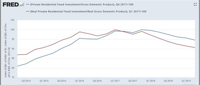
UPDATE: Here is private fixed residential investment measured both nominally and in real terms as a share of GDP:
Nominally this is down about 5% from peak; in real terms about 10%. This is far short of what is typically the case typically going into recessions, but it *is* on par with the producer-led 2000-01 period.
- Proprietors income (a proxy for the more reliable corporate profits, which won’t be released until next month) rose 0.6% nominally. Since the GDP deflator rose 2.2%, this means that “real” proprietors income declined. UPDATE: the 2.2% figure was annualized. Thus the “real” number was essentially flat, but is below its recent peak of Q4 2018:
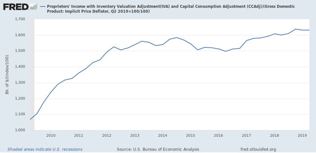
I will update later once graphs are available. For now, the important takeaway is that one long leading indicators in the GDP release declined, and the second was flat but below peak level, *consistent with* (but not necessarily implying) a recession either being imminent, or possibly not occurring until next year.
Subscribe to:
Posts (Atom)