This is over at XE.com
http://community.xe.com/forum/xe-market-analysis/international-week-review-japanese-and-eu-slowdown-works-edition
Saturday, May 17, 2014
Are skyrocketing rents and increased food prices behind the decrease in tax withholding?
- by New Deal democrat
Earlier today in my Weekly Indicator column I highlighted the anomaly of an outright YoY decline in tax withholding.
The Treasury Department's daily tax withholding report isn't an estimate like nonfarm payrolls or GDP that is subject to substantial revision. It is bedrock hard data. And just by virtue of nominal average wage increases YoY, it should be up about 2%. Instead, since April 1, the daily reports have been consistently negative, and now the 20 day average has turned negative as well.
Almost all of the other incoming weekly and monthly economic reports have been quite positive. For example, consumer spending has really picked up this spring. More particularly, April nonfarm payroll growth was nearly +300,000. So what's going on?
It could be that the jobs numbers for the last couple of months are going to be revised downward. Big time. But we've also just hit a post-recession low in layoffs, via initial jobless claims. Has hiring really screeched to a stop?
Here is my preliminary guess, and it is only a guess, but this story fits the data.
One way to get a decrease in withholding taxes in the face of increasing jobs, is if workers decide to take more deductions. In essence workers would be trading less of a refund next year for more cash in the pocket now.
And there are several excellent reasons why they might have done so in the last few months.
First of all, due to the government shutdown last October, the IRS had to delay processing of tax refunds. It started 10 days later than planned, on January 31. I suspect the delays continued. Most significantly, Walmart reported its 1st quarter profits were lower than expected:
The big discount retailer said its results were hurt by bad weather and a delay in tax refunds caused by last fall's government shutdown.
Not only were tax refunds delayed, but the prices for two basic need - food and shelter - increased significantly in the first quarter, especially for renters. Food prices are up 2.7% so far this year.
More importantly than that, with apartment vacancy rates just above 12 year lows in the first quarter, rents have skyrocketed. The first quarter's median asking rent nationwide is $766, up 2.7% in that quarter alone, and up 6.7% YoY. (I wrote a few weeks ago that rent wasn't in a bubble, based on statistics through the end of 2013, and while I still wouldn't call it a bubble, this first quarter jump has got to be putting a real squeeze on working class renters).
Faced with a big increase in rent, and significant increases in food prices, together with a delay in receiving tax refunds, have a significant number of working class families decided to trade next year's tax refund for the ability to pay for food and rent now, but decreasing the amount of money withheld in their paychecks?
It's only a guess, but it fits the data.


Friday, May 16, 2014
Single family vs. multi unit housing permits and starts: it's still not different this time
- by New Deal democrat
As I pointed out in my earlier post today, housing starts are considerably more volatile than permits. In fact, they're about twice a volatile: a 200,000 change in starts is just as likely as a 100,000 change in permits. This morning, reported housing starts were up +224,000 YoY. But the biggest change in permits in the last 6 months has been +107,000 YoY in November.
As I wrote last year, 16 of 21 times since the end of World War 2, an increase in interest rates of 1% or more has led to a decrease of -100,000 in housing permits (a 17th time, in 2001, the change was -62,000). In January, I examined the exceptions to the rule, finding that they typically involved scenarios where the saying, "Buy now or be forever priced out" was a powerful scenario.
A lot of the commentary today has focused on how much of the increase in housing starts in April was multifamily (5+ units) vs. single family homes. In view of that, I thought I'd go back and examine how single family vs. multifamily permits and starts played out both in general and during those 4 "exceptions to the rule" periods over the last 50+ rules.
And it turns out this time really isn't different. On all 4 occasions where an increase in interest rates did not lead to a significant decrease in overall housing starts, the effect on single family vs. multifamily units was - unlike most periods - profoundly different.
Below are 4 graphs, showing housing permits for single family homes (blue), multifamily units (green) vs. interest rates measured by 10 year treasuries (inverted so that an increase shows as a negative, red). The first three are measured as YoY% changes in 20 year or so increments. The 4th is measured in changes of 100,000 units, focused on the last 10 years:


If you click on the first three graphs and examine them, you'll find out that typically single and multifamily permits move in unison. With the exception of 1994, all of the other exceptions -- 1962, 1967-78, 1978, and 2004-05 -- coincided with significant increases in interest rates.
In other words, the first sign of stress in the housing market due to rising interest rates has generally been a shift from single family to multifamily building. And that is what has happened in the last year as well, as single family permits have actually turned negative YoY in the last few months. It is the multifamily segment (as you recall, rental vacancies are at all time lows on the order of 3%, and rents have outpacing inflation since the beginning of 2013), which is holding up the market.
In the prior "exceptions to the rule," eventually housing permits and starts followed interest rates. I still think the best rule of thumb is that "it's not different this time."
Congratulations to Bill McBride
- by New Deal democrat
As I suspected, housing starts rebounded strongly from their last two months and blew past the 1,023,000 number that would give Bill McBride the win on our friendly bet. Starts are the more volatile of the two series, and tend to follow permits by a month or two.
This is also more evidence that this past winter was a real factor in holding down the economy, and there has been a "Spring spring" in almost all of the data.
So, Congratulations to Bill McBride, and it will be a pleasure to make a contribution to the late Tanta's memorial fund.
The interesting thing is, the trend on the most leading indicator of the two - housing permits - continues its deceleration, even if it has not turned negative. I'll post the graph showing this below as soon as the St. Louis FRED updates their data.
UPDATE: The regional breakdowns make it clear that the huge increase in starts was due mainly to the severe winter in the Northeast and Midwest holding back demand until April.
Here's the m/m and YoY breakdown in starts by region:
Northeast: 139 vs. 108 m/m (+28.7%); vs. 78 YoY (+78.2%)
Midwest: 216 vs. 152 m/m (+42.1%); vs. 154 YoY (+40.3%)
South: 486 vs. 479 m/m (+1.5%); vs. 411 YoY (+18.2%)
West: 231 vs. 208 m/m (+11.1%); vs. 205 YoY (+12.7%)
If, as I did yesterday with real retail sales, we average January through April and compare the total YoY, we get an average of 922,000 starts in 2013 vs. 961,000 starts in 2014, for a gain of +4.2%.
UPDATE #2: As promised, here is a graph of the YoY% change in permits and starts since 2011:

Notice that the decelerating trend in permits is still very much intact. Note also this month included revisions to the 2013 numbers, indicating that permits were actually negative YoY two months ago.
Next, here is a graph of the percentage change m/m between permits (blue) and starts (red) (squared so that the sign in each is positive. It does not affect their relative volatility at all):

Note that starts are much more volatile than permits.
So, there is still the issue of whether this is a one-off due to the spring rebound from the unusually severe winter, or whether the decelerating trend (as evidenced YoY in permits) will continue.
Thursday, May 15, 2014
A true mixed reading on another long leading indicator
- by New Deal democrat
I have a new post up at XE.com discussing real retail sales per capita, which typically peak about one year or more before the economic cycle rolls over.
The spring spring may have given us a new peak, but the longer term decelerating trend is intact.
Will Bill McBride win our housing bet tomorrow?
- by New Deal democrat
Tomorrow April's housing permits and starts will be reported, and there's a decent chance that Bill McBride will win our bet on housing.
Not because housing is suddenly on a roll, but because April 2013 was one of the two worst housing starts numbers of last year, at 852,000 (only June was worse at 835,000). Housing starts are also more volatile than permits, and tend to follow permits by a month or two.
Since permits have had two decent months in February and March, starts are likely to follow, aided by the spring springback from winter's poor data. Anyway, the high for starts since the housing bust was 1,024,000 back in December. There's a decent chance starts equal or beat that in April, and if so Bill will win our bet (a 20% YoY increase would be 1,023,000).
As to permits, April 2013 saw 1,005,000 issued. The estimates suggest that tomorrow we will see the first YoY decline in permits in 3 years.
We'll see then.
Wednesday, May 14, 2014
Japanese ETF Breaks Through Resistance

Since the beginning of February, the Japanese ETF has been trading in a downward sloping triangle pattern as traders have begun to slightly discount the long term effects of "Abenomics." However, yesterday prices broke through upside resistance, indicating there may be a change in trader's perceptions of the Japanese economic situation. Also note the increased CMF and rising MACD accompanying the move.
On the downside, prices are still below the 200 day EMA as are the shorter EMAs.
Tuesday, May 13, 2014
Why Austerity Doesn't Work
This is over at XE.com
http://community.xe.com/forum/xe-market-analysis/why-austerity-does-not-work
http://community.xe.com/forum/xe-market-analysis/why-austerity-does-not-work
Indian Market Hits Yearly High on Election News

News that Modi will win the Indian election has rallied Indian shares to yearly highs. However, there are questions as to whether the voters' expectations for his term are too high.
Monday, May 12, 2014
Take the Dows Record High With A HUGE Grain of Salt


Yes, the Dow closed at a record high. However, the QQQs (NASDAQ, top chart) and IWMs (Russell 2000, lower chart) are both correcting. That makes the Dow's record high suspect.
Sunday, May 11, 2014
This is still the graph that scares me
- by New Deal democrat
Two years ago I ran a post entitled, "This is the graph that scares me," featuring the below graph of median wage growth:

Below is an abbreviated version of what I wrote then:
----------------------
It has been running at under 2% at all times since the financial collapse of 2008.
So, even if inflation runs at the very modest rate of only 2% (and for most of the time since the bottom of the recession in 2009, it has been higher than that), more than half of all workers fail to keep up.
You simply cannot have a durable economic expansion where most workers are consistently falling behind.
Lower mortgage rates in the last several years has enabled a huge number of consumers to refinance ... [and therefore] the average household has a lower carrying cost of debt, compared with their income, than at any point in the last 30 years.
In the past 30 years,as shown in this graph of mortgage rates, which highlights those periods where interest rates are higher than they were 3 years prior in red, once households have been able to refinance, it took at least 3 years without new lows being established, before the economy fell back into recession.
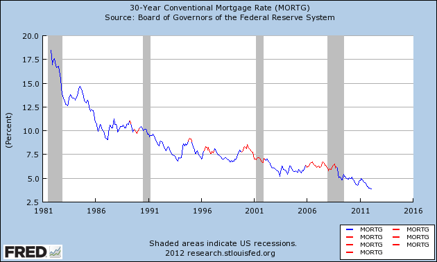
We just set new lows.
It's difficult to imagine any further round of refinancing once this one is done. Can rates really go much lower?
If median wage growth doesn't improve soon, there will be no escaping another recession once the effect of refinancing has run its course ....
This time around, we managed to escape without actual wage deflation (although laid off workers may not have been able to find work at the same salary they were making previously). I doubt we will be so lucky a second time ....
--------------------------
Two years later, we can see that mortgage rates bottomed only a few months later in July 2012. We'll hit the "red zone" of three years later 14 months from now.
Meanwhile, YoY growth in median wages rose as high as 2.5%, but has recently fallen back under 2% again.
You have probably noticed the increasing caution in my outlook over the last few months. That second graph in particular is what is in the back of mind. Real median wages have not made a new high. Refinancing has stopped cold with increasing interest rates. It doesn't look like there is some appreciating asset that average families can cash in or borrow against to sustain more spending.
So I watch with increasing concern to see if the long leading indicators start to turn south, as they normally would at least one year in advance of an economic downturn. Interest rates, real private residential spending as a share of GDP, and possibly corporate profits deflated by unit labor costs already have.
This week we will get updated readings on two more: real retail sales per capita and housing permits.
Saturday, May 10, 2014
Weekly Indicators for May 5-9 at XE.com
- by New Deal democrat
This was another week of nearly uniformly positive contemporaneous economic data. The "Spring spring" has continued into May.
Friday, May 9, 2014
A third long leading indicator probably turned negative in Q1 2014
- by New Deal democrat
Corporate profits deflated by unit labor costs. This post is up over at XE.com.
Thursday, May 8, 2014
In which I am a semi-wet blanket about that 401(k) story
By now you've probably all read at a bunch of blogs about how IRS data shows that Americans increased their borrowing from or cashed out their 401(k)'s in recent years, all of which feature these graphs:

A truthful headline for these graphs would be "During and right after the Great Recession, Americans increasingly tapped their 401(k)'s." While the original Bloomberg piece was fairly careful, some of the later iterations have sloppily or ambiguously used the present tense (see, e.g., Barry Ritholtz, “Tapping your 401(k)?”).
Which is simply not correct. This data is in no way contemporaneous data. The most recent reading is THREE YEARS OLD. And the most recent, three-year-old, data, shows a significant improvement from the four-year- old data.
It’s also worth pointing out that the series isn’t population adjusted, which is a non-trvial difference, and the 38% increase in the number of IRS returns incurring the penatly is faiirly consistent to the ~60% increase in the unemployment rate from 6% to 10%.
What the graphs show is that those borrowing from or cashing out their 401(k)'s went up as unemployment went up, peaked about when unemployment peaked, and came down in 2011 as unemployment started to recede. We have absolutely no idea what has happened in the last 3 years, and furthermore it is a reasonable bet that 401(k)’s were raided less and less as the unemployment rate continued to go down.
All of this seems non-contoversial to me. Which leads me to my next question: would the alarm be the same if we still had a well functioning pension system for most people? 401(k)’s are basically “rainy day” funds where the target rainy day is retirement. Obviously we should expect that people who have emergencies are going to tap their rainy day funds. Is that by itself really a problem? – Or only because 401(k)’s have largely replaced rather than supplemented traditional pensions?
In my opinion the alarm shouldn’t be that people tapped into their 401(k)’s as the unemployment situation worsened. The alarm should be that 401(k)’s are a dismal (and to some extent intentional) failure as a replacement for the traditional pension. No company should be allowed to offer a 401(k) that does not include a substantial company match, or is in lieu of or bigger than its traditional or defined contribution pension, or is not as generous percentage-wise as its stock option or other incentive program for senior executives.
That, it seems to me, is the disgrace. Not that people cashed out or borrowed from 401(k)’s more in 2008-11 than they did in 2002-06.
The Failure of Austerity: Spain
This is over at XE.com
http://community.xe.com/forum/xe-market-analysis/failure-austerity-spain
http://community.xe.com/forum/xe-market-analysis/failure-austerity-spain
Wednesday, May 7, 2014
Real median wages for occupational employment decline -0.6% in 2013*
- by New Deal democrat
Most of the measures of real wages that I have tracked bottomed either in the beginning of 2013 or in late 2012, so this one comes as a bit of nasty surprise. With an asterisk.
Every year in May, the BLS, in cooperation with state workforce bureaus, compiles a list of median wages for hundreds of occupations. In the last few years, these have shown that jobs in the 4th quintile, i.e., the lower middle class or working poor, have taken the biggest hit.
Like other measures of real wages, they reached a peak at the end of the last recession when gas prices were under $1.50 a gallon and thus mild nominal increase in wages were paired with about a -1% deflation in overall prices.
With gas prices stabilizing in the last 3 years, I certainly expected even small nominal wage increases to lead to an increase in this measure of wages as well.
Not so. As of May 2013, the median wage in the US was $16.87. In 2012 it had been $16.71, but adjusting for inflation, that becomes $16.98, which means that real wages were down -0.6%.
Now here is why there is an asterisk. The result is likely due to the way the BLS conducts the survey, as explained in this technical note: the 2013 results are due to results obtained over 6 surveys from November 2010 through May 2013. That means the survey period coincided almost perfectly with the trough in other wage measures.
If we treat the survey as an average of wages from late 2010 through early 2013, then the continued decline makes sense. Unfortunately we won't have a comparison until one year from now.
Unit labor costs up YoY, gain in first quarter
- by New Deal democrat
I have a new post up at XE.com reporting on unit labor costs, which were just reported for the first quarter.
Last year, you may remember, I teed off on reporter David Cay Johnston, who did some sloppy Doomish reporting on 1Q 2013's number.
Most measures of real median wages increased in the first quarter of this year. I'll put up a comprehensive post updating all of the data series at some point in the next week.
Subscribe to:
Posts (Atom)