Tuesday, December 1, 2015

November ISM index confirms intensified deflationary pulse. Can the Fed listen?


 - by New Deal democrat

For the last month in my "Weekly Indicators" column, I have been writing about an intensified deflationary pulse in the US economy.  For example, one month ago in my summary I wrote:

"Several intensified trends are emerging.  The positive trend is increased spending by US consumers as imported deflation finally teams up with a little improvement in wage growth. The negative trends are increased downturns in rail, shipping, and steel - i.e., that part of the US economy most exposed to global weakness - which have been joined by intensified strength in the US$ and a nascent upturn in interest rates courtesy of an anticipated December rate hike by the Fed."

This renewed pulse has now shown up in the November ISM index, which fell to a 3 year low of 48.6.  This is actual bad news, showing an economy that is near contraction.  The silver lining is, we have seen plenty of times before where the ISM index fell to this level without the economy going into recession.  In the below graphs I subtracted 48.6 from the reading, so that the November reading is at the 0 line.  Here is 1948- 1980:


and here is 1981 - present:


A level between 48 and 50 way associated with an oncoming recession 10 times -- and just a mid cycle correction another 8 times.

The simple fact is, the US$ has been accomplishing a tightening without the Fed hiking rates at all.  Here is the chart of the broad trade-weighted US$ since it began its ascent in July 2104:


In November it surged again to new highs.

At some point if the industrial recession becomes deep enough, it could overcome the still-growing consumer economy.   The strengthening US$ was certainly a factor in the 2001 recession:


 At present, however, unlike 2001, neither the yield curve nor housing nor real money supply are playing along. 

But this is a potent reason for the Fed to pull back on their rate hike plans.

Monday, November 30, 2015

New home sales vs. housing permits - how unusual is the divergeance?


 - by New Deal democrat

I have a new post up at XE.com .  The latest housing data from October shows a new high in single family housing permits, but new home sales haven't made a new peak since February.  What gives?  I take a look at the historical record, and find an interesting nerdy nugget.

Saturday, November 28, 2015

Weekly Indicators for November 23 - 27 at XE.com


 - by New Deal democrat

My Weekly Indicator column is up at XE.com .  The intensified deflationary pulse that we have seen in the last several months continues.

Friday, November 27, 2015

Corporate profits (through Q3 2015) as leading indicator for quarterly stock prices


 - by New Deal democrat

I have an update up at XE.com, comparing corporate profits through Q3 with stock prices.

Wednesday, November 25, 2015

Updating two mid-cycle consumer spending patterns


 - by New Deal democrat

Three years ago, I identified a consistent pattern whereby retail sales grew faster than the broader category of personal consumption expenditures early in an expansion, but slower later in an expansion.  Retail sales constitute about 50% of PCE's.  Note, however, that real retail sales are much more volatile. And, as this graph below (subtracting YoY PCE growth from YoY real retail sales growth through 1997) shows, in a very specific and non-random way:


Retail sales minus PCE's are always negative before the economy ever tips into recession. That's 11 of 11 times. Further, in 10 of those 11 times (1957 being the noteworthy exception), the number was not just negative, but was continuing to decline for a significant period before we tipped into recession.

So what does it look like now?  Here is the updated graph of the YoY% change in real personal consumption expenditures (blue) vs. real retail sales (red):


This strongly suggests we are in the late stages of the economic expansion.  Both are decelerating YoY, retail sales more than personal consumption expenditurres.

Secondly, the YoY% growth in personal consumptioin expnditures on durable goods tends decelerate before spending on non-durable goods.  Here is the graph of that relationship through the 1980s:


and here it is through the present:


This also suggests that we are getting later in the cycle, but interestngly, durable goods are holding up much better than nondurable goods.  

At the same time, none of these have turned negative -- just less positive.  There is no imminent threat of a downturn.

Tuesday, November 24, 2015

Revised Q3 GDP: there's good news, and there's bad news


 - by New Deal democrat

I have a new post up at XE.com discussing this morning's revisions to Q3 GDP.

While the revision was positive, the news regarding long leading indicators was significantly mixed.

Monday, November 23, 2015

One long term indicator changes to Yellow


 - by New Deal democrat 

One long leading indicator has turned from green (positive) to yellow (caution): mortgage rates.

Since middle class wages peaked in the 1970s, the ability to refinance debt at lower interest rates has been an important coping mechanism.  Particularly since the 1980s, whenever 
  •  real wages have stagnated,
  •  the effects of refinancing debt have dwindled, and
  •  the ability to cash in an appreciated asset has stalled,
the middle class has retrenched by curtailing its debt load, thereby bringing about a recession.
(You can read a post from me on this, dating from the blogosphere's primitive era, here.)

As the below graph shows, each of the last 3 recessions has occurred after a period of 3 years (red) where mortgage rates have failed to make a new low:


The failure of mortgage rates to make a new low is not the *signal* for a recession.  Rather, it has been a necessary predicate.

As the below graph of mortgage rates and refinancing applications from Mortgage News Daily shows, we just passed the 3 year marker since rates made a new low during the week of November 19, 2012:


As a result, refinancing applications are stuck near their lows.  The boost to consumer spending from the last bout of refinancing has run its course.

In the 1980s and 1990s, the great long term bull market in stocks gave rise to the ability to cash in that asset.  But stocks have failed to make a new high in 6 months and have been basically flat all year:


In the 2000s, of course, it was home equity that was cashed out.  The below graph of the Case Shiller index shows that, in an apples to apples comparison of pair counts, house prices have gained little this year, and are well below their 2006 highs:


Fortunately, largely due to the collapse in gas prices, real wages have made new highs several times this year:


On a YoY basis, gas prices have continued to decline.  And we are now finally at the point in the labor market recovery where some upward pressure on wages should start to materialize.

Through the 3rd quarter, there is no sign of household debt retrenchment:


So there is no sign of any imminent downturn.  And so long as real wages continue to improve, the economic expansion should continue.

But the fundamentals underlying improvement to the lot of the middle class have moved into the yellow, "caution" zone.

Saturday, November 21, 2015

Weekly Indicators for November 16 - 20 at XE.com


 - by New Deal democrat

My Weekly Indicators post is up at XE.com .

The recent intensification in commodity delcines, the dollar surge, and globally depressed commerce is continuing.

Thursday, November 19, 2015

Comparing total real labor compensation growth across economicexpansiions


 - by New Deal democrat

With few exceptions, people don't get a job for social reasons.  They go to work each day in order to earn money to purchase necessities, discretionary goods, and to save for future needs.  In short, they work because of cold, hard cash. 

That's why I think the defining element of a labor market recovery after a recession is not the number of jobs created, but rather the amount of cold, hard cash it is delivering to workers.  That is measured by real aggregate wages.  This number is the product of average hourly earnings for nonsupervisory workers, times average hours worked, times the number of jobs, and then divided by the consumer price index
As of the last employment report, we are now exactly 6 years past the trough in real aggregate wages from the Great Recession.  So how does the current expansion stack up?  Here are the graphs of all economic expansions going back to 1964 (the inception of the series) with the result indexed to 100 at the bottom.  First up is the big picture from 1964-present:


Here is our current expansion:


The current expansion trails three others.  The best is 1964-70:


The next best is the 1990s tech boom:


And the 3rd is the Reagan era of the 1980s:


But the current expansion also is better than 3 others.

Here is the early 1970s:


Here is the late 1970s:


These two delivered more wage growth initially, but it didn't last because the economy fell back into recession quickly.  

But the worst by any measure is the George W. Bush expansion of a decade ago:


This delivered weaker wage growth, over a short period, and fell back into the worst recession in 75 years.

So here is the handy comparison chart of real aggregate wage growth during all of the expansions of the last 50 years:


Trough Peak #months Real wage
growth %
  Wage growth
at 6 years  
1/64*  8/6967* 30.2 
28.5%
11/705/7430   18.5   12.4%***
4/753/79 47 20.8 
11.4%*** 
7/801/81 62.4 
n/a
11/8210/8983 21.6    20.1% 
2/9211/00  10533.8   23.3%
4/03 9/07 53 10.5 
9.5% 
10/097/15**   69** 17.8** 
17.8%
*start of series

**to date

***Measured through the next recession, as recovery was short-lived


Bottom line: the current expansion isn't great, but it hasn't been poor either.  If it lasts another year or so, it may overtake the 1980s to land in third place.

Wednesday, November 18, 2015

Psssst! Single family housing permits at nearly 8 year high


 - by New Deal democrat

Don't tell anybody!  I have a new post up at XE.com, showing how single family vs. multi-unit construction have gone in separate directions, due to the continuing distortions of the NYC program that ended in June.

Tuesday, November 17, 2015

Industrial production: oil patch down, manufacturing at new high


- by New Deal democrat

You will probably read some commentary from the usual suspects about how yet another negative industrial production number means that We Are DOOMED!

But it looks rather different when we take out the Oil Patch.  Below is a graph of overall industrial production (blue), manufacturing production (red), and mining production (green), all normed to 100 as of last December:


Yes, industrial production as a whole is showing a shallow recession.  But, despite the big hit to exports due to the strong US$, manufacturing production made a new all-time high in October.  The Oil Patch continues to hurt in a big way, and this is what is bringing down the overall number.

In short, the broader US economy continues to move forward.

UPDATE:  Below is a graph of manufacturing employment (red) vs. mining employment (green), both normed to 0 as of last December as well:


Although it has taken a small hit in the last few months, manufacturing employment is still up since last December.  Mining, on the other hand, is sucking wind.  The net decline has been about -100,000 jobs, or about -10.000 a month.  This has not been nearly enough to overcome the continued growth in services employment.

The US is primarily a service economy, and the hit to the Oil Patch is just not enough to take it down.

Monday, November 16, 2015

ECRI's "Deceptive" wage growth is actually pretty common


 - by New Deal democrat

I have a new post up at XE.com .

ECRI has some new commentary claiming that wages are only growing because aggregate hours are declining, to which I say, "Huh?!?"  The historical record says this isn't uncommon at all.

Saturday, November 14, 2015

Weekly Indicators for November 9 - 13 at XE.com


 - by New Deal democrat

My Weekly Indicators piece is up at XE.com .  The deflationary pulse intensified further this week.

Friday, November 13, 2015

As the global deflationary pulse intensifies, the SS US Eonomy takes on more water


 - by New Deal democrat

I have a new post up at XE.com.  There has been a renewed deflationary pulse in the global economy, and as a result, the US economy has taken on more drag.

Thursday, November 12, 2015

JOLTS Hires and Quits turn negative YOY; Labor Market Conditions Index uninspiring


 - by New Deal democrat

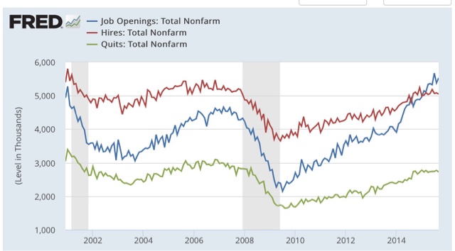
When it comes to the monthly JOLTS reports, most commentators in my opinion are missing the big story, focusing only on the job openings number without paying attention to the pattern of this series during the 2002-07 expansion.  And when it comes to that pattern, we have had an important change of trend.

Here are openings (blue), actual hires (red), and quits (green) since the inception of the JOLTS series:


Keep in mind that, while this series looks extremely useful, because there is only 15 years of history, there is only one complete business cycle with which to compare.  During that cycle, both hiring and quits peaked well before job openings. As shown above, the peaks in hiring and the trough in voluntary quits, was the first signal that the expansion was decelerating.

Now let's zoom in on the YoY% change in last 3 years:


While job openings have skyrocketed, both actual hires and quits stalled, and this month both turned negative YoY for the first time since the 1-month 2012 pause.

This is an important indication that we are past mid-cycle. 

Further, there is a labor market disconnect, as employers are not filling a record number of openings.  As to why those openings are going unfilled, I have seen a fair amount of survey information where employers are complaining of not being able to find appropriately skilled candidates. Just yesterday we got the National Federation of Independent Business's report, in which the respondents labeled the inability to find qualified applicants as their number 2 concern (behind the perennial #1 taxes), ahead of the amount of sales:  


Here's a similar graph from Deutsche Bank that is making the rounds:


I suspect that there are one or both of two clauses missing in the reasoning cited by small business owners and HR managers, as in:  "We are not able to find skilled candidates [for the wage we want to pay and/or because we refuse to pay for any on-the-job training]."  From the aforementioned NFIB report, note that the percentage of employers who have *planned* higher wages has generally stagnated for the last year:


There has been an uptick in the last couple of months -- but note there is still a lower percentage of employers planning to raise wages than during most of the last 3 expansions!

Finally,  I have also recently started paying more attention to the Fed's Labor Market Conditions Index (blue in the graph below), which appears to be a good leading indicator for YoY payroll growth (red):


While there were some huzzahs! that there were upward revisions to the last 6 months in this index, the above graph shows that, in context, it is not pointing to strong payrolls growth in the months ahead.  Rather, I expect each such report to be lower than the conquerable report one year ago.  This simply reinforeces the argument that we are past mid-cycle (as the YoY% growth in jobs generally peak near mid-cycle).

In short, I continue to be underwhelmned by JOLTS reports where job openings don't translate into actual hires.  Hopefully the October jobs report, along with the NFIB report on planned wage hikes, indicates that the dam is finally beginning to break, and increased wages will translate into increased actual hiring.

Wednesday, November 11, 2015

5 graphs for 2015: October update


 - by New Deal democrat

At the end of last year, I highlighted 5 graphs to watch in 2015.  We are now 10 months through the year, so let's take another look.

#5.  Mortgage refinancing

After a mini-surge at the end of January (light brown in the graph below) due to low mortgage rates, refinancing applications fell back to their post-recession lows during spring. With a decrease in rates in summer and autumn, there was a small increase, but we are still nowhere near the level of refinancing we saw in 2010 and 2012.  Mortgage News Daily has the graph:   


Over the last 35 years, refinancing debt at lower rates has been an important middle/working class strategy.  There is little room left for that strategy.


 #4 Gas prices

Here is a graph of average hourly wages divided by gas prices (blue) since the bottom in gas prices in  1999:


How long must a worker labor in order to buy a gallon of gas?  After skyrocketing in the lead-up to the Great Recession, gas prices collapsed, helping the consumer start to spend again on other things at the bottom of that recession.  The steep drop in gas prices late last year took us almost all the way back to that bottom.  Just as in 1986 and 2006, at first consumers saved the money, but once they loosened their pursestrings, the economy responded.

#3 Part time employment for economic reasons

 Next is a graph of part time workers for economic reasons expressed as a percentage of the labor force.  This is one of the big positive stories of the year.  Over the last 10 months, this has fallen by about 0.8% or 1,300,000:


In the longer view, this is  still 1.5% (about 2.25 million) above the boom level of 1999 and about 1.0% (1.5 million) above the level of 2007, but is at least finally close to its 1994 - 2007 range:


#2 Not in Labor force but want a job now:


This moved generally sideways during the first quarter, improved nicely for the next few months, but slid back in the last 2 months:


It is now only 300,000 above its post-recession low of November 2013 (just prior to Congress's cutoff of extended unemployment benefits) and about 1.6 million, or 1.1% of the workforce, above its 1999 and 2007 lows.

 #1 Nominal wage growth 

After 3 poor readings last August, December, and February, YoY growth in nominal wages for nonsupervisory personnel fell  back close to their post-recession lows before rebounding this spring.  In October YoY growth finally cracked 2% to the upside.  In the below graph, I have s ubtracted 1.9% fromYoY nominal wage growth, and 10.3% fromcthe U6 unemployment rate, to set both to zero at their current levels:


In the 1990s and 2000s, nominal wage growth started to accelerate when the broad U6 unemployment rate fell to 9.9% and 9.7% respectively.  The increase in YoY growth in wages last month coincided exactly with U6 falling from 10% to 9.8%. 


 In summary, 10 months into the year we finally have improvement in 4 of the 5 metrics, some more than others:  
  • Involuntary part time employment has declined substantially.  
  • Low oil prices have continued to benefit consumers.  
  • Wage growth, driven in part by the decline in the broad unemployment rate, has finally started to improve.
  • Although the decline has stalled in the last several months, over the year there has been a decrease in the number of people not even in the labor force, but who want a job now.
  • Refinancing is still at low ebb.  For the economic expansion to continue for a substantial time, we must either see a new low in rates (very unlikely), or real wages must continue to grow (at the moment looking likely).


Still,  if current trends continue, we won't achieve real, full employment like 1999 or even  2007 for about another 2 years! 

Tuesday, November 10, 2015

Expect the boom in apartment construction - and rents - to continue


 - by New Deal democrat

I have a new post up at XE.com .

Between stagnant wages and increasing demand from the large Millennial generation, multi-unit housing construction has continued to boom.  Rent increases don't look like they are set to abate either.