Monday, July 9, 2012
Morning Market Analysis
The 5-minute QQQ chart shows an opening gap lower in Friday caused by the payrolls report. Prices continued to move lower until noon when prices stabilized. Prices moved sideways until 2:30 when we saw a small rally begin.
The 30 minute charts shows that prices were moving higher all last week until the payrolls report sent the market lower on Friday.
The chart of the three major averages is actually moderately encouraging. The IWMS spiked last week, before falling lower on Friday. However, as this is the risk based market, the upward move indicates traders may be looking at accepting a bit more risk in their portfolios. The QQQs and SPYs are also moving higher, although they are each doing so in a far more disciplined manner. The good news in these charts is the move higher, albeit at an incremental pace. I think the best description for the latest move is "grinding."
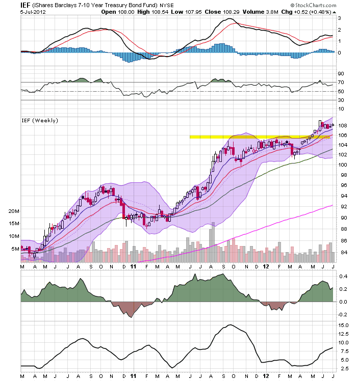
Last week I noted that the treasury yield curve was still rallying across maturities, indicating that the safety bid was still in play. The above charts of the corporate bond market show the exact same scenario: across the maturity spectrum, prices are still rallying, telling us traders/investors are reaching for safety.
The oil market rallied in response to the EU's financial announcement at the end of the preceding week. Prices continued their rally until they hit the 50 day EMA on Thursday. This was followed by the weak US employment report on Friday, which told traders that the world's largest oil consumer was still mired in weak growth. As a result, prices dropped to the 10 and 20 day EMA price levels.
After rallying in response to the EU situation in early May, The dollar has traded in a sideways pattern, moving between 22.4 and 23. The shorter EMAs tell us that prices have little momentum going forward.
Sunday, July 8, 2012
Weekly Indicators remain weakly positive edition
- by New Deal democrat
Monthly data reported last week included the fourth straight weak jobs number at +80,000. The unemployment rate remained at an unacceptable 8.2%, Hourly earnings did increase, as did the average workweek. Construction spending increased, as did factory orders, although the general trend for durable goods and factory orders has been sideways for close to a year. Car sales also improved over May, although they are below the January through April level. ISM services weakened but remained in expansion. ISM manufacturing actually contracted. This is really weak data, although most of it remains positive.
Again and again the theme this week for the high frequency weekly indicators is that they were weakly positive. Let's start with the jobs-related numbers.
Employment related indicators were weak:
The Department of Labor reported that Initial jobless claims fell 12,000 from the prior week's unrevised 386,000 to 374,000 last week. The four week average fell 1000 to 385,750. The rise in jobless claims in the last several months is a serious concern, but there remains some question of whether there is a seasonal adjustment issue or whether something more ominous is going on, as we had a similar rise during the second quarter of 2011.
The Daily Treasury Statement for the last 20 days ending July 3 showed $136.6B vs. $125.9B for the same period in 2011, an increase of $10.7B, or +8.5%. This should be taken with an extra grain of salt due to the potential impact of payments around the July 4 holiday.
The American Staffing Association Index remained at 93. This index has been flat for the last two months, mirroring its 2nd quarter flatness last year. Despite that, due to the July 4 artifact it is extremely close to its all time high for this week of the year. A decline next week due to the same artifact is likely.
Rail traffic turned mixed again:
The American Association of Railroads reported a +1.8% increase in total traffic YoY, or +9,200 cars. Non-intermodal rail carloads were down -2.5% YoY or -9700, as coal hauling again fell YoY. Intermodal traffic was up 16,500 or 7.0% YoY. Eleven of the 20 carload types were negative YoY, the highest since the recovery began. The spreading of weakness in rail hauling is very concerning.
Same Store Sales have weakened significantly.
The ICSC reported that same store sales for the week ending June 23 were up 0.2% w/w, and were up +1.4% YoY. Johnson Redbook reported a 1.7% YoY gain. Shoppertrak reported a +3.5% YoY gain after a 2.9% YoY gain the week prior. The 14 day average of Gallup daily consumer spending at $70 was barely positive compared with $69 last year. This is the fourth week in a row in which consumer spending has weakened significantly, barely if at all improving YoY. A few months back I noted that YoY consumer spending had consistently run better than 2.0% for the duration of the recovery. Gallup has now declined under that for the entire month. and both the ICSC and Johnson Redbook reports are under 2%. In June at long last the consumer wavered.
Housing reports were mixed:
The Mortgage Bankers' Association reported that the seasonally adjusted Purchase Index rose -.6% from the week prior, and was down approximately 7% YoY, back into the middle part of its two year range. The Refinance Index fell 8.4%, but it still near its 3 year high set two weeks ago.
The Federal Reserve Bank's weekly H8 report of real estate loans, which turned positive YoY in March after having been negative for 4 years, this week rose 0.2%, and the YoY comparison improved to +1.1%. On a seasonally adjusted basis, these bottomed in September and remain up +1.2%. The YoY growth rate has generally weakened in the last month.
YoY weekly median asking house prices from 54 metropolitan areas at Housing Tracker were up + 2.6% from a year ago. YoY asking prices have been positive for more than 7 months, remain higher than at any point last year, and at their maximum seasonal point on a seasonally adjusted basis. Only the possibility that the long-in-coming foreclosure tsunami might finally materialize remains as a reason to think we have not seen the bottom in housing prices.
Money supply was also weakly positive and is now being compared with the inflow tsunami of one year ago:
M1 rose +0.1% last week, and was flat month over month. Its YoY growth rate declined to +15.0%, so Real M1 is up 13.3%. YoY. M2 rose +0.6% for the week, and was up 0.6% month/month. Its YoY growth fell again to 8.7%, so Real M2 grew at +7.0%. Real money supply indicators after slowing earlier this year, have increased again, but YoY comparisons are started to wane as expected.
Bond prices were mixed and credit spreads declined:
Weekly BAA commercial bond rates decreased by .02% to 5.00%. With the exception of one week, these are the lowest yields in over 45 years. Yields on 10 year treasury bonds remained flat at 1.64%. The credit spread between the two fell to 3.36%, an improvement from its 52 week low set two weeks ago. The recent collapse in government bond yields shows fear of deflation due to economic weakness. Corporate yields have finally followed, a good sign.
The energy choke collar remains disengaged:
Gasoline prices fell for the eleventh (and probably last) straight week, down another .08 to $3.36. Oil prices per barrel wound up nearly neutral for the week, closing Friday at $84.45, off 52 cents from last week. Oil prices remain well below the point where they start to constrict the economy, and gasoline has followed. The 4 week average of Gasoline usage, at 8918 M gallons vs. 9315 M a year ago, was off -4.3%. For the week, 8846 M gallons were used vs. 9001 M a year ago, for a decline of -1.7%. The 4 week average is a significant YoY decline; however, June and early July of 2011 were the only months after March 2011 where there was a YoY increase in usage, so the YoY comparison now is especially difficult. If this decline persists past the middle of July, it will be a red flag, so it is a good sign that the one week difference was slight.
Turning now to high frequency indicators for the global economy:
The TED spread rose 0.1 to 0.39, in the middle of its recent 4 month range. This index remains slightly below its 2010 peak. The one month LIBOR remained even at 0.246. It has risen slightly above its recent 4 month range, it remains well below its 2010 peak, and has still within its typical background reading of the last 3 years. Even with the recent scandal surrounding LIBOR, it is probably still useful in terms of whether it is rising or falling.
The Baltic Dry Index rose another 117 from 1040 to 1157. It is 487 points above its February 52 week low of 670, although well below its October 2011 peak near 2200. The Harpex Shipping Index fell for the fifth straight week from 438 to 435, but is still up 60 from its February low of 375.
Finally, the JoC ECRI industrial commodities index continued to rebound from its recent cliff-dive, up from 114.53 to 117.78. This is still near its 52 week low. Its recent 10%+ downturn during the last few months remains a strong sign of all that the globe taken as a whole is slipping back into recession.
With the exception of housing, money supply, and the daily treasury statement, weakness has grown widespread. At the same time, only one item in the US has actually has turned negative -- the diffusion of negative YoY rail carloads. All the others have generally remained positive on a weekly, monthly, and yearly basis. At the same time, renewed slight weakness in shipping rates, the continued slump in the JoC ECRI index (although it has rebounded slightly), and the continued records lows in US interest rates strongly suggest the world as a whole has slipped back into contraction. The US remains the "least worst" economy.
Friday, July 6, 2012
Weekend Weimar, Beagle and Pit Bull
NDD will have the weekly indicators up on Sunday, not Saturday.
First of all, below are two pictures of Lita the pit bull; they're obviously before and after . When we found her in our alley, she was about 15 pounds underweight, no hair and with some kind of infection in her eye. Now she's just a big baby; it's like having a really affectionate defensiveman from a hockey team.
And here are the other three:
First of all, below are two pictures of Lita the pit bull; they're obviously before and after . When we found her in our alley, she was about 15 pounds underweight, no hair and with some kind of infection in her eye. Now she's just a big baby; it's like having a really affectionate defensiveman from a hockey team.
And here are the other three:
No, Really, the US' Infrastructure is in Crap Shape and Costing Us Big Time
From Taylor Marsh:
And it's not just in Houston -- it's all over:
Yes, it costs to bury power lines, as David Frum addresses, but it’s not like there isn’t an economic whallup that comes with the crash of a rampaging storm. From Frum:Folks -- this really isn't that complicated. The US infrastructure is falling apart. Here is the report card from the American Society of Civil Engineers:
1. There’s reason to think that industry estimates of the cost of burying wires are inflated. While the U.S. industry guesstimates costs, a large-scale study of the problem conducted recently in the United Kingdom estimated the cost premium at 4.5 to 5.5 times the cost of overhead wire, not 10. [...]3. Costs can only be understood in relation to benefits. As the climate warms, storms and power outages are becoming more common. And as the population ages, power failures become more dangerous. In France, where air conditioning is uncommon, a 2003 heat wave left 10,000 people dead, almost all of them elderly. If burying power lines prevented power outages during the hotter summers ahead, the decision could save many lives. [...]…and have you heard about America’s unemployment, the latest bad news hitting Monday on manufacturing? This from Frum, a Republican: Burying power lines is a project that could put many hundreds of thousands of the unemployed to work at tasks that make use of their skills and experience. Do I hear an amen?
That Americans won’t join in together to do something so simple as burying power lines, which requires investing in an infrastructure that prepares us for what climate change will continue to deliver, is another sign of our diminishing greatness.
Because of the Tea Party and Republicans no one has to dare mention “climate change.” Just talk about the economic hardship of people who lose their entire refrigerator of food because they don’t have a generator, causing even more economic fallout we don’t need. Talk about the deaths due to extreme heat, when people are left without air conditioning, the inconvenience of businesses that lose capital amid the extreme weather, patterns that show no signs of abating.
2009 GradesAs an example, I live in Houston, Texas. There isn't a street in my neigborhood that doesn't need major repair -- as in, tear the street up and lay down a new street type of repair. And I'm living in the 4th largest city in the US -- and one that is doing pretty well economically.
America's Infrastructure
And it's not just in Houston -- it's all over:
Inland waterways quietly keep the nation's economy flowing as they transport $180 billion of coal, steel, chemicals and other goods each year — a sixth of U.S. freight — across 38 states. Yet, an antiquated system of locks and dams threatens the timely delivery of those goods daily.Right now, the 10-year treasury is yielding 1.63%. The US could borrow $1 trillion for infrastructure spending at an annual cost of $16.3 billion -- that's a steal in corporate finance land. That means that for this to make sense, the annual rate of return on the investment would have to be a mere $20 billion. And considering the jobs and increased efficiency that would result, it's easy to make the claim that the IRR would be far higher than $16.3 billion/year -- especially over the long term (as in 20+ years).
Locks and dams raise or lower barges from one water level to the next, but breakdowns are frequent. For example, the main chamber at a lock on the Ohio River near Warsaw, Ky., is being fixed. Maneuvering 15-barge tows into a much smaller backup chamber has increased the average delay at the lock from 40 minutes to 20 hours, including waiting time.The outage, which began last July and is expected to end in August, will cost American Electric Power and its customers $5.5 million as the utility ferries coal and other supplies along the river for itself and other businesses, says AEP senior manager Marty Hettel......Freight bottlenecks and other congestion cost about $200 billion a year, or 1.6% of U.S. economic output, according to a report last year by Building America's Future Educational Fund, a bipartisan coalition of elected officials. The chamber of commerce estimates such costs are as high as $1 trillion annually, or 7% of the economy......Inland waterways, for example, carry coal to power plants, iron ore to steel mills and grain to export terminals. But inadequate investment led to nearly 80,000 hours of lock outages in fiscal 2010, four times more than in fiscal 2000. Most of the nation's 200 or so locks are past their 50-year design life......The biggest railroad bottleneck is in Chicago. A third of the nation's freight volume goes through the city as 500 freight trains jostle daily for space with 800 passenger trains and street traffic. Many freight rail lines crisscross at the same grade as other trains and cars — a tangle that forces interminable waits. It takes an average freight train about 35 hours to crawl through the city. Shipping containers typically languish in rail yards several days before they can be loaded onto trains.Manufacturers, in turn, must stock more inventory to account for shipping delays of uncertain length, raising product costs about 1%, estimates Ken Heller, a senior vice president for DSC Logistics. Caterpillar has built two multimillion-dollar distribution centers outside the city to increase its freight volumes so it can get loading priority at rail yards......Highways, meanwhile, suffer from Congress's failure in recent years to assure long-term funding for a federal trust fund that pays for upgrades. The fund kicks in about $42 billion a year, but that goes largely to maintenance, and the fund is expected to temporarily run out of money in 2013.Among those affected is UPS. The giant courier says that if each of its 95,000 U.S. vehicles is delayed an average five minutes a day for a year — a realistic figure — it costs the company $103 million in added fuel costs, wages and lost productivity.Con-way, one of the largest trucking companies, often builds an extra day of travel into shipping schedules to ensure it meets customers' exacting just-in-time delivery demands, says Randy Mullet, head of government relations. Customers pay a premium for that.In Texas, worsening delays on Interstate 35 between San Antonio and Dallas, much of which has only two lanes each way, forces regional grocery chain H-E-B to charge about 15 cents more for a gallon of milk, says Ken Allen, a former H-E-B executive and now a consultant for the company......The nation's 600,000 bridges are also falling behind. Nearly a quarter are classified as "structurally deficient" or "functionally obsolete," according to the Federal Highway Administration. As of the end of last year, more than one in 10 were closed or had weight limits that barred trucks. For Illinois corn grower Paul Taylor, such a restriction on the Pearl Street bridge in Kirkland means he must drive three extra miles to deliver his corn to a grain elevator, raising his costs by about 5 cents a bushel.Many unrestricted bridges, meanwhile, are strained, especially at border crossings. The busiest in North America is the 83-year-old, four-lane Ambassador Bridge, the only direct link between Detroit and Canada. The bridge, already impaired by its capacity, often closes lanes for repairs and empties onto a busy city street in Windsor, Ont. Delays, typically lasting two hours, are exacerbated by a Customs checkpoint that's not large enough for the traffic volume.U.S. auto companies store extra parts at factories and closely space deliveries so that if one truck is sidetracked, another isn't far behind, says Kevin Smith, senior vice president for consulting firm Sandler & Travis. Ford Motor told a state legislative committee last fall that such maneuvers, along with extra freight expenses, add up to $800 to the cost of a vehicle.
Did the BLS Just Republish the May Jobs Report?
The BLS released the June Employment Situation Summary this morning, which showed (Establishment Survey) job creation of 80,000 and private sector payroll growth of 84,000. The April jobs number was revised down to 68,000 (from 77,000) and the May jobs number was revised up to 77,000 (from 69,000). Both the regular workweek and manufacturing workweek edged up by .1 hours for the month. The Household Survey showed an unemployment rate of 8.2% with job creation of 128,000. The labor force participation rate remained at 63.8% on a gain of 156,000 and the employment-population ratio remained at 58.6. Overall this report (when compared to recent months) was about the same, showing anemic growth (but still growth) and little change to the unemployment rate. The best news out of this report (in my opinion) was that the May number received an upward adjustment (albeit small) and that the workweek grew a bit. Other than those points, this report continued on the recent weakness in job creation we have seen since April. Read on for more analysis.
Since the seasonal adjustments have been called into question by just about everyone lately, let's take a look at the non-seasonally adjusted numbers from this report. The June Establishment Survey showed job creation (NSA) of 391,000, which means the seasonal adjustment subtracted 311,000 jobs from the NSA number. Also of note is that private sector NSA job creation for June was 815,000, while NSA government jobs posted a loss of 424,000 jobs for the month.
It is also interesting to note that in the last year the number of people 65+ who have left the labor force is 1.47 million (and yes, those people count when determining the labor force participation rate and employment-population ratio).
So, while job growth appears to have stagnated during the 2nd quarter, it also appears to have potentially stabilized at relatively low levels of job creation, hopefully allowing us to skirt another contraction in employment and potential contraction in the economy.
Since the seasonal adjustments have been called into question by just about everyone lately, let's take a look at the non-seasonally adjusted numbers from this report. The June Establishment Survey showed job creation (NSA) of 391,000, which means the seasonal adjustment subtracted 311,000 jobs from the NSA number. Also of note is that private sector NSA job creation for June was 815,000, while NSA government jobs posted a loss of 424,000 jobs for the month.
It is also interesting to note that in the last year the number of people 65+ who have left the labor force is 1.47 million (and yes, those people count when determining the labor force participation rate and employment-population ratio).
So, while job growth appears to have stagnated during the 2nd quarter, it also appears to have potentially stabilized at relatively low levels of job creation, hopefully allowing us to skirt another contraction in employment and potential contraction in the economy.
Morning Market Analysis
Both the Italian (top chart) and Spanish (bottom chart) markets have broken through resistance lines and are meandering higher. Neither rally is particularly strong; instead, prices are now caught around the 50 day EMA. However, the underlying technicals are improving; momentum is increasing as is the volume inflow. The shorter (10 and 20 day) EMAs are both moving higher, with the 10 either crossing or about to cross the 50.
The German and French markets are directly similar to the Italian and Spanish markets.
The above four charts show us that there is some buying on the European side -- but, given the overall weakness of the trends, I'd assume it's mostly technical in nature (traders buying a weak market only because it's weak).
The entire US treasury curve (short end to long end) is still at elevated levels, largely as a result of the safety bid in the market. Until we see these levels move lower, we're not going to see a meaningful rally in the markets.
Weekend Weimar, Beage and Pit Bull
First of all, below are two pictures of Lita the pit bull; they're obviously before and after . When we found her in our alley, she was about 15 pounds underweight, no hair and with some kind of infection in her eye. Now she's just a big baby; it's like having a really affectionate defensiveman from a hockey team.
And here are the other three:
Thursday, July 5, 2012
A forecast between Scylla and Charybdis
- by New Deal democrat
I really set myself up for failure in January with my forecast for this year of weakness in the first half, most likely in the first quarter and probably as bad as 2006 but not quite as bad as the recession of 2001, followed by strength in the second half. That's a really narrow passage to navigate!
A nuanced forecast like that also means I'm not being uniformly bullish or bearish, and at least when my stuff gets cross-published at places where nuance isn't exactly a prized commodity it isn't a ticket to popularity.
Initial strength has been followed by progressive weakness that started with a poor March payrolls report. Consumers whose incomes in real terms have fallen in the last two years have started to increase their savings again, meaning less consumption and a slowdown in that major component of the economy. Despite that, I'm still expecting the weakness to end this summer sometime, partly because
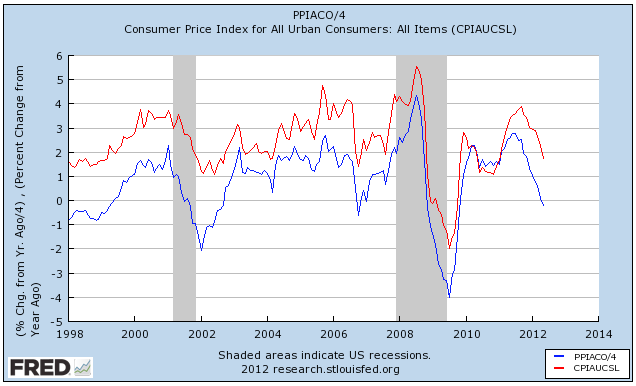
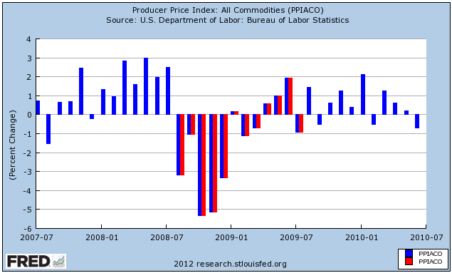
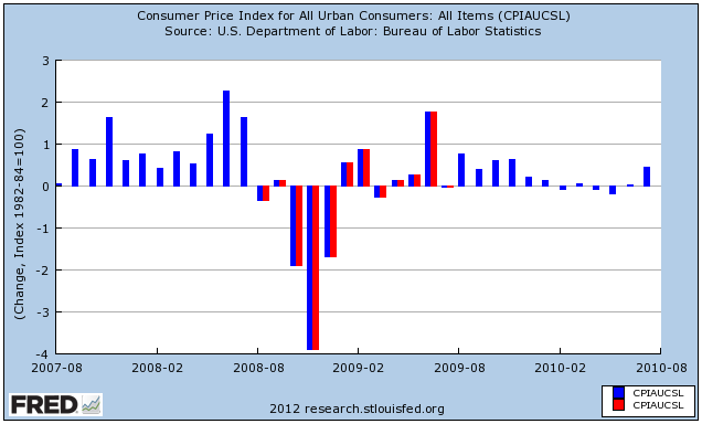
As you can see, YoY consumer and producer prices both bottomed out immediately after the bottom of both recessions - 2 months later in the first, 1 month later in 2009.
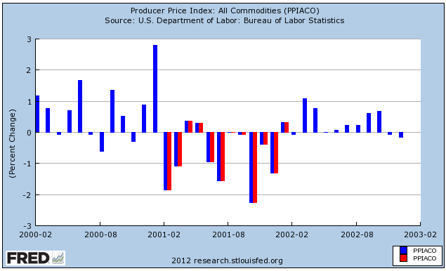
Since 11 of the 12 data points in a YoY comparison stay the same with each new month, another way to look at this comparison is to compare any given data point with the same month one year before. If the newer year is higher/lower than the same month the year before, then the YoY comparison is also higher/lower.
First let's do that with the 2001 recession, which ended in November 2001, and producer prices. The year during which YoY comparisons were almost uniformly weaker is shown in red. So note, for example, that the last red line (January 2002) shows less inflation than January 2001, but the next month (February 2002) shows more inflation than than February 2001.

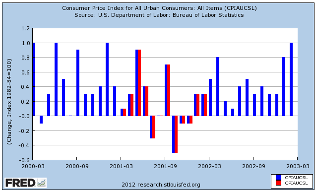
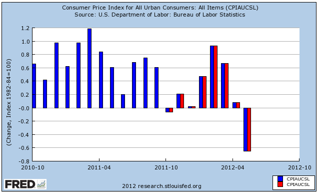
Next let's look at the 2001 recession and consumer prices. Notice that we get the same pattern:

Next let's look at the 2008-09 Great Recession, and producer prices. Note the same pattern, with the last red line representing July 2009, one month after the recession, showing less inflation than July 2008. August 2009, the first blue line thereafter, shows more inflation than August 2008.

Next, here are consumer prices for the Great Recession. Again we get the same pattern:

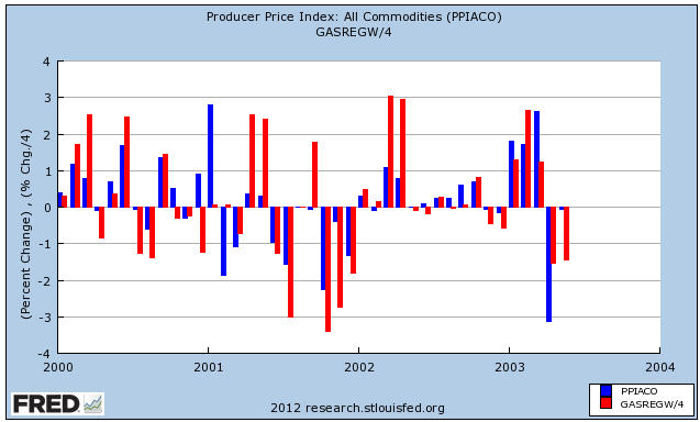
One reason I harp on gasoline prices so much is that they are the primary driver of monthly changes in both producer and consumer inflation. Here are producer prices in the early 2000s (blue) compared with the changes in gasoline prices (red) (again, I've scaled down gasoline price changes simply to better show the comparison):

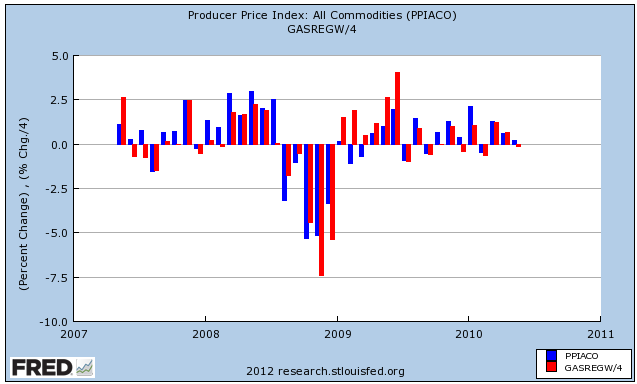
Here they are for the time leading up to, during, and right after the Great Recession:

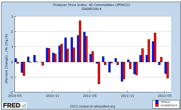
And here they are since the beginning of 2011:

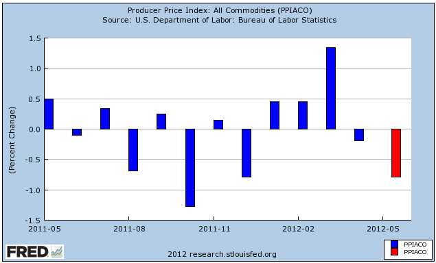
Keeping in mind that gasoline prices have been the main driver of the rate of change in inflation, here are producer prices for the last 2 years:

and here are consumer prices:

The red lines in both above graphs represent those months in which YoY inflation has been decreasing.
Barring a Lehman Brothers type catastrophe, I can't see deep deflation continuing for the rest of the year. That would require a decline of more than 10% further in gas prices to take us under $3.00/gallon for a national average, and that means about $60 a barrel for Oil. If that isn't going to happen, then the YoY comparison is going to start turn positive by about September, and based on past patterns that means the weakness bottoming out some time this summer, and stronger growth resuming thereafter.
I really set myself up for failure in January with my forecast for this year of weakness in the first half, most likely in the first quarter and probably as bad as 2006 but not quite as bad as the recession of 2001, followed by strength in the second half. That's a really narrow passage to navigate!
A nuanced forecast like that also means I'm not being uniformly bullish or bearish, and at least when my stuff gets cross-published at places where nuance isn't exactly a prized commodity it isn't a ticket to popularity.
Initial strength has been followed by progressive weakness that started with a poor March payrolls report. Consumers whose incomes in real terms have fallen in the last two years have started to increase their savings again, meaning less consumption and a slowdown in that major component of the economy. Despite that, I'm still expecting the weakness to end this summer sometime, partly because
- (1) the long leading indicators of housing permits and starts, interest rates, and money supply all turned positive by the second quarter of last year and have continued to be positive. By the time 18 months passes, all of those should be filtering through to improvement in the overall economy.
- (2) gasoline prices hit their seasonal peak at about the same level as last year, and have already backed off over 10%, putting more money in consumers' pockets, and
- (3) past patterns of inflation and deflation suggest that when YoY price deflation is at its worst, that is when the economy is at its slowest, improving thereafter.

As you can see, YoY consumer and producer prices both bottomed out immediately after the bottom of both recessions - 2 months later in the first, 1 month later in 2009.
Since 11 of the 12 data points in a YoY comparison stay the same with each new month, another way to look at this comparison is to compare any given data point with the same month one year before. If the newer year is higher/lower than the same month the year before, then the YoY comparison is also higher/lower.
First let's do that with the 2001 recession, which ended in November 2001, and producer prices. The year during which YoY comparisons were almost uniformly weaker is shown in red. So note, for example, that the last red line (January 2002) shows less inflation than January 2001, but the next month (February 2002) shows more inflation than than February 2001.

Next let's look at the 2001 recession and consumer prices. Notice that we get the same pattern:

Next let's look at the 2008-09 Great Recession, and producer prices. Note the same pattern, with the last red line representing July 2009, one month after the recession, showing less inflation than July 2008. August 2009, the first blue line thereafter, shows more inflation than August 2008.

Next, here are consumer prices for the Great Recession. Again we get the same pattern:

One reason I harp on gasoline prices so much is that they are the primary driver of monthly changes in both producer and consumer inflation. Here are producer prices in the early 2000s (blue) compared with the changes in gasoline prices (red) (again, I've scaled down gasoline price changes simply to better show the comparison):

Here they are for the time leading up to, during, and right after the Great Recession:

And here they are since the beginning of 2011:

Keeping in mind that gasoline prices have been the main driver of the rate of change in inflation, here are producer prices for the last 2 years:

and here are consumer prices:

The red lines in both above graphs represent those months in which YoY inflation has been decreasing.
Barring a Lehman Brothers type catastrophe, I can't see deep deflation continuing for the rest of the year. That would require a decline of more than 10% further in gas prices to take us under $3.00/gallon for a national average, and that means about $60 a barrel for Oil. If that isn't going to happen, then the YoY comparison is going to start turn positive by about September, and based on past patterns that means the weakness bottoming out some time this summer, and stronger growth resuming thereafter.
Morning Market Analysis; BRICs Signaling Turnaround?
The Brazil ETF bottomed in the second half of May and has been trading in the 50-53 price range since. However, notice the increase in both the MACD (signaling an increase in momentum) and CMF (indicating an inbound flow of money). The 10 and 20 day EMAs are now moving more sideways than down, indicating the overall trend has at least turned neutral. Prices are right below the 50 day EMA. A move through the 54 price level would signal a change of overall trend.
The Russian ETF has many of the same characteristics as the Brazilian ETF, but here prices have moved through resistance a bit above the 26 price level. In addition, the 10 day EMA has crossed above the 20 day EMA and prices are above the 50 day EMA. There is resistance at the 28 price level (from levels established in early May).
Building on the advancement of the Russian market, the Indian market is just a but further along in its rally, with prices firmly about the 50 day EMA and approaching the 200 day EMA. The shorter EMAs are now approaching the 50 day EMA. Prices are in the middle of the Fibonacci retracement levels where they typically get caught in some type of resistance.
The Chinese chart is more closely aligned with the Brazilian chart; prices here have yet to make a big break-out.
Two of the emerging economies stock markets (Russia and India) have emerged from their bottom and are now rallying higher. Two others (Brazil and China) are close to moving through resistance. This is welcome news in the overall picture.
Wednesday, July 4, 2012
My wishes for America's 236th birthday
- by New Deal democrat
Whatever its other problems, the America of my youth was exuberantly optimistic. We had it better than any generation of humanity before us ever and we knew it, we had the world by the cojones and we knew it, and the future beckoned with wonders so long as we didn't blow it up in nuclear Armageddon.
Now I see a despondent and almost fatalistic "99%" on the one side, and a bitter, surly, and xenophobic rump on the other. There is no optimism in the reactionary radicalism that has ascended to power, it is all social Darwinism in a nasty and brutish war of all against all. There is really no more pretense that continuation down the ideological path we have trod these last 30 years will improve the lot of most people; rather, there is only the brute assertion that the masses are moochers who deserve their fate.
But I can dream, and here are the birthday wishes I would like to see come true for America on its 236th anniversary:
1. Infrastructure spending to replace our crumbling roads, bridges, water and sewer systems.
2. A new WPA to labor at all the government tasks that have been cut, until such time as unemployment drops to 6%.
3. The reinstatement of Glass-Steagall to separate investment banking from FDIC insured banking, and the breaking up of any remaining financial institutions which are "too big to fail."
4. The reinstatement of state usury laws. If for example a Delaware based company wants to offer credit to someone in Nebraska, they should have to abide by Nebraska's usury limits. Five years ago I used to get pushback on the theory of individual responsibility. That didn't exactly work out in the housing bubble, did it? Were only the spendthrifts laid off in the recession? Too much individual debt in the aggregate destroys the innocent and the spendthrift alike.
5. The conviction and imprisonment of the financial wrongdoers, no matter how high and mighty.
6. Repeal of the Bankruptcy "Reform" Act's ridiculous privileging of student loans.
7. Limitation of the Senate filibuster. If the old men want to filibuster, then they should actually have to stay up day and night to do so. Kibuki filibusters should be abolished, and other filibustering too except perhaps for a small number per session or perhaps limited to Supreme Court nominees with their lifetime appointments.
8. The reversal of Citizens United and its corporate corruption of the political process,
9. Replacement of part of the income tax with a revenue neutral Value Added Tax or similar, which would prevent the capture of all the profits gleaned from lower labor costs in the developing world by the uppermost corporate management and large shareholders, and instead give the US Treasury the means to ameliorate the costs of labor arbitrage to the benefit of average workers.
10. A law prohibiting states from offering tax incentives and abatements to out-of-state firms to relocate businesses. This is almost identical to one of the vices in the Articles of Confederation that led to the calling of a Constitutional Convention (European sovereigns were playing the 13 states off against one another for commercial treaties). Similarly, a phasing out of tax incentives that can be offered to sports franchises, in order to end the blackmailing of cities. Both of these are needed to stop the race to the bottom.
11. The prohibition of gerrymandering, whereby officeholders choose their constituents. Either an independent commission must be entrusted with the task, or else state and federal electoral districts must conform as closely as possible to pre-existing county and municipal boundaries.
12. A countercyclical balanced budget amendment, that would mandate surpluses in good times and deficit spending in recessions, enforced against the Congress by either the Courts or better yet, the States.
I'm sure there are a host of other festering excesses that I have missed. In the meantime, here is an American Tune for our time:
Tuesday, July 3, 2012
Bonddad Linkfest
- Feeling the heat (WaPo)
- France needs unprecedented spending cuts (FT)
- Turkey looks to have a soft landing (FT)
- Poland defies EU slowdown (FT)
- USDA downgrades corn crop (Agrimoney)
- Are we seeing the top in the corn markets (Agweb)
- RBA's interest rate decision (RBA)
- French manufacturing weak (Markit)
- UK manufacturing subdued (Markit)
If a Republican Congress had passed the ACA, and a Republican president had signed it, how would the SCOTUS have voted?
- by New Deal democrat
After all, Obamacare is similar to Romneycare, which in turn is based on a Heritage Foundation plan.
If you don't think the vote would have been the same, then it must be true that at least some Justices voted for purely partisan reasons.
h/t DougJ at Balloon Juice
ISM manufacturing contraction and recessions
- by New Deal democrat
The June ISM manufacturing report yesterday was a stinker, there's no sugar-coating it. The contraction in the New Orders sub-index will cause a significant downdraft in the Conference Board's June Index of Leading Indicators.
But does a contracting ISM report mean recession now, or later in the year? The answer to the first question is almost certainly not, and as to the second, the answer is more likely not, although the odds based on past data approach 50/50.
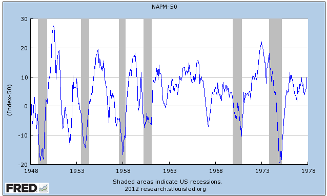
Since the record started in 1948, the report has declined from over to under 50 a total of 32 times. Of those times, 11 were associated with the onset of recession and 3 more occurred during a recession after a brief period above 50. That means the ISM manufacturing index has slipped under 50 a total of 18 times when no recession followed, meaning that a one month contraction in the index was associated with no recession a little more than 50% of the time.
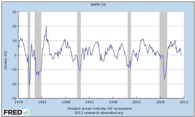
Here is the graph of the ISM index, subtracting 50 so that a positive number means expansion and a negative number, contraction, first from 1948 through 1977:

And here is from 1978 to the present:

There have been many false contractionary readings, notably in the 1950s, 1960s, early 1980s, 1990s, and 2003.
Further, even in those cases where the ISM manufacturing index was associated with the onset of recession, the median lead time was 5 months. The mean lead time was 4 months. Only 4 times was the turn coincident with or after the onset of recession. In other words, while the negative number is of considerable concern as to later in the year, almost certainly it does not mean that a recession already began by the end of the first half of the year.
P.S.: Today vehicle sales for June will be reported. Don't be fooled by YoY comparisons. Total sales, seasonally adjusted, are expected to come in under 14 million. If that's the case, it's bad news since from January through April, the SAAR was over 14 million. If it's under last month's 13.7 rate, meaning it is the worst number of this year, it should be seen as being as bad as yesterday's ISM report.
UPDATE: New vehicle sales for June were reported at a 14.08 million rate. That's still below the first four months of this year, but comfortably above May. Not great, but not bad.
Grain Prices Are No Longer Contained
Over the last few weeks, we've gotten reports that drought and high temperatures are hurting the current grain crop. As a result, we're seeing price spikes across the grains complex. Corn (top chart) has moved through the 6.80 level and now has a lot of open real estate before it hits yearly highs. Soy beans (middle chart) are now at yearly highs, while wheat (bottom chart) has broken through the 7.00/7.20 level.
Morning Market Analysis
After the strong performance on Friday, we need to look and see if there is any follow-through. On that front, there is good and bad news. The good news is the Russell 2000 (IWM) rallied beyond resistance. As this is the higher risk area of the equity market, this move is bullish. However, we didn't see any follow-through on the other markets, which is not good. Ideally, we need to see the QQQs and/or the SPYs make a move higher in conjunction with the IWMs.
All told, the above charts don't bode well for a lot of follow-through in the broader market.
Monday, July 2, 2012
Bonddad Linkfest
- Drop in US corn crop health has further to go (Agrimoney)
- Corn prices could test record highs (Agrimoney)
- Drought behind 50 cent price jump (Agweb)
- Bond yields are still at or near record lows (BB)
- EU unemployment increases to 11.1% (BB)
- Chinese manufacturing indexes drop on EU and US weakness (BB)
- HSBC's Chinese manufacturing index (Markit)
- EU manufacturing shows continued weakness (Markit)
It's a Small World After All
Over the last few weeks, I've noted the overall global slowdown (see here and here). Today's ISM report -- which shows the first manufacturing contraction since 2009 -- highlights this trend. Consider the following anecdotal comments:
In short, other economies are slowing, which is now bleeding into the US economy.
The latest news from both China and the EU is not encouraging.
- "Business is still strong, with some nagging question whether it will be sustained." (Machinery)
- "The economy and general business seem to be getting better even though recent data say otherwise." (Fabricated Metal Products)
- "Significant raw materials price correction underway." (Plastics & Rubber Products)
- "Local labor market shows no signs of slowing down. Competition for technical services/skilled craft remains tight." (Petroleum & Coal Products)
- "Overall demand signals from sales forecast are trending down in all regions." (Computer & Electronic Products)
- "Although our shipments are up year over year and from prior month, we can feel some head winds, especially from Europe. We are watching our expenses very tightly and being cautious." (Apparel, Leather & Allied Products)
- "Business continues to exceed forecast in all markets." (Primary Metals)
- "Economy seems to be slowing slightly due to concerns in Europe; however, production has not changed a great deal." (Transportation Equipment)
- "Business has started to show signs of slowing." (Furniture & Related Products)
- "Slowing world economies, particularly China, are reducing 3Q and later orders and drastically dropping some raw material prices." (Chemical Products)
In short, other economies are slowing, which is now bleeding into the US economy.
Is Housing the Stealth Story of 2012?
Ever since I've been blogging, housing has been a troubled market. I started blogging in mid-2004, and started in earnest in 2005. Sometime after that, I realized that housing was in a bubble -- not because of prices but because of the enormous amount of mortgage debt that was flooding the US economy. Then we had the bubble followed by the crash. So, for the last 6-7 years, housing has been a disaster.

However, there are more and more signs that it is changing. I originally put this idea together in the post, Will Housing Save Us? where I argued that housing had spent the last three years correcting from the bubble and, as such, it was time to revert to the norm. NDD also posted a great series of articles in response to Barry Ritholtz's bearish housing analysis here, here, here and here.
Now, consider the following:
From the latest new home sales report:
First, national inventory figures are far more normal now:
As this chart from Calculated Risk shows, total inventory is now at the upper levels of the pre-bubble levels. In addition, we're starting to see that real estate markets from across the country are starting to heat up. As the blog Carpe Diem has noted, Double-Digit Gains in Sales and/or Prices Have Now Been Reported in 33 Metro or State Markets in June. Granted, these advances are from low levels. But, they are advances across a broad swath of cities. He added an additional seven more news stories to the previous total in this post. Also note this story: Builder Confidence Reaches 5-Year High in June; Framing Lumber Prices Are Back to 2006 Levels.
Also consider this post:
However, there are more and more signs that it is changing. I originally put this idea together in the post, Will Housing Save Us? where I argued that housing had spent the last three years correcting from the bubble and, as such, it was time to revert to the norm. NDD also posted a great series of articles in response to Barry Ritholtz's bearish housing analysis here, here, here and here.
Now, consider the following:
From the latest new home sales report:
There are broad-based shortages of inventory in the lower price ranges in much of the country except the Northeast, and in the West supply is extremely tight in all price ranges except for the upper end. "Realtors® in Western states have been calling for an expedited process to get additional foreclosed properties onto the market because they have more buyers than available property," Yun added. Widespread inventory shortages also are found in much of Florida.Let's take this information with a grain of salt, largely because NAR economists aren't known for presenting information in a non-biased manner. The above information is consistent with the following pieces of information.
First, national inventory figures are far more normal now:
As this chart from Calculated Risk shows, total inventory is now at the upper levels of the pre-bubble levels. In addition, we're starting to see that real estate markets from across the country are starting to heat up. As the blog Carpe Diem has noted, Double-Digit Gains in Sales and/or Prices Have Now Been Reported in 33 Metro or State Markets in June. Granted, these advances are from low levels. But, they are advances across a broad swath of cities. He added an additional seven more news stories to the previous total in this post. Also note this story: Builder Confidence Reaches 5-Year High in June; Framing Lumber Prices Are Back to 2006 Levels.
Also consider this post:
"For the fourth month in a row, the RE/MAX National Housing Report is showing an increasing Median Home Price. In May, home prices were 6.1% higher than those in May 2011. Home sales also rose above the mark set last year by a significant 12. 8%. With 42 surveyed metros showing increases in BOTH sales and prices, the recovery of 2012 appears to be taking hold in all regions of the country. For 11 months in a row, home sales have exceeded the level of the same month a year ago. Inventory continues to fall significantly lower than the previous year, with a 26.6% drop from May 2011. The related Months Supply and Days on Market figures are also trending lower."And then we have this post from the Washington Post's Wok Blog:
The housing market was the first domino to fall in the financial crisis, and it’s been one of the last to recover. But there are a few signs that things may finally be starting to look up, as home sales and housing prices have been creeping upward.It's odd using the term "housing" and "recovery" in the same sentence. I think the extended bearish nature of the market is what is leading some observers to doubt the possibility of a recovery this time around. And, as in all things, skepticism can help to clarify arguments. However, there are more and more signs that housing could be the stealth story of the year.
First, there’s been a consistent rise in the price of distressed homes since the end of 2011. “That’s something we haven’t seen before,” economist Jared Bernstein points out. “If it sticks, it obviously provides support to overall home prices.”
.....
Housing sales have also been recovering, albeit less steadily, as JPMorgan’s Michael Feroli points out in a research note this week. “The gain in pending home sales occurred in all four regions of the country, and the region with the biggest increase — the West, up 14.5% — was the region that had the biggest tumble back in April,” he wrote.
Subscribe to:
Posts (Atom)