Wednesday, September 4, 2024

July JOLTS report: relentless deterioration?


 - by New Deal democrat


The JOLTS survey parses the jobs market on a monthly basis more thoroughly than the headline employment numbers in the jobs report. In July, it painted a picture of what looks like pretty relentless deterioration.

The theme for three of the four data series I track was the same: job openings, hires, and quits, all had their lowest or second lowest readings since the start of 2021. In the case of the “second worst” hires and quits numbers, it was only because last month’s numbers were even lower.

Specifically, job openings (blue in the graph below), a soft statistic that is polluted by imaginary, permanent, and trolling listings, declined 227,000 to 7.623 million. Actual hires (red) rose 273,000 to 5.521 million (vs. a pre-pandemic peak of 6.0 million). Voluntary quits (gold) rose 63,000 to 3.277 million. In the below graph, they are all normed to a level of 100 as of just before the pandemic:


Both hires and quits are significantly below their immediate pre-pandemic readings, by -7.9% and -5.4% respectively.

To put them in a wider historical context the below graph shows all three series from their inception in 2001. But because the US population has grown almost 20% since then, I divide by the prime age population over the same time. I have also normed the current values to the zero line to better show the historical comparison:
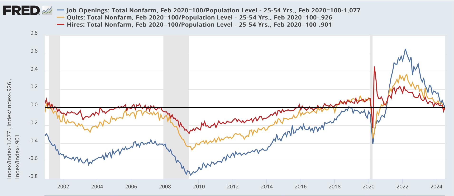


On the one hand, hires, even on a population adjusted basis, are better than almost any time before the pandemic except 2005-06 and 2017-19. But note they are also at a level equivalent to during the 2001 recession. Quits are better than at any time before the pandemic except for just before the 2001 recession and 2018-19. This suggests to me that the real, “hard data” jobs market is still positive, and not weak by historical standards. It’s just not as strong as we have become accustomed to over the past several years.

Meanwhile, layoffs and discharges increased to their highest level since late 2020 except for several months in early 2023:


The above graph also shows the monthly average of initial jobless claims (red). It appears that layoffs and discharges did pick up the post-pandemic seasonality shown in the  summer increase during May through July.

Finally, the quits rate (blue in the graph below) has a record of being a leading indicator for YoY wage gains (red). For over half a year the quits rate had stabilized. That has no longer been the case in the past two months, as it also is at its lowest point since late 2020:


As you can see above, this forecasts continued deceleration in nominal wage gains, down to 3.5% YoY or even lower in the coming months. Unless consumer inflation moderates further as well, this will put some financial pressure on ordinary workers (not a negative, just significantly less positive).

Tuesday, September 3, 2024

Manufacturing and construction together suggest weak but still expanding leading sectors


 - by New Deal democrat


As usual we start the month with two important reports on the leading sectors of  manufacturing and construction.

First, the ISM manufacturing index showed contraction yet again, with the headline number “less negative” by way of increasing from 46.8 to 47.2, and the more leading new orders subindex declining sharply by -2.8 from 47.4 to 44.6:


Including August, here are the last sis months of both the headline (left column) and new orders (right) numbers:

MAR 50.3. 51.4
APR 49.2   49.1
MAY 48.9. 45.4
JUN 48.5. 49.3
JUL. 46.8. 47.4
AUG 47.2. 44.6

Because manufacturing is of diminishing importance to the economy, and was in deep contraction both in 2015-16 and again in 2022 without any recession occurring, I now use an economically weighted three month average of the manufacturing and non-manufacturing indexes, with a 25% and 75% weighting, respectively, for forecasting purposes.

The three month average of the headline manufacturing number is 47.5. The average for the new orders component is 47.1  For the past two months, the average for the non-manufacturing headline has been 51.1 and the new orders component has been 49.8. That means on Thursday the threshold for the August non-manufacturing numbers is 50.2 and 51.6 respectively for the economically weighted average not to forecast recession.
  
If the news for manufacturing seems a little grim, the status of construction spending is better.

In nominal terms, total construction spending declined -0.3% in July, while the more leading residential construction spending declined -0.4%. Here’s the long term picture:


A post-pandemic close-up shows that spending appears to have been topping for the last 4 months:


But the picture looks better once we adjust for the cost of construction materials:


So deflated, total construction spending rose 0.7% for the month and is at its highest level since 2007. Residential construction spending rose 0.2% for the month and is also at its highest level since 2007, except for three months at year-end 2021.

I do not see the US economy falling into recession unless either both construction and manufacturing are in synchronous decline, or else at least one of them contracts very sharply. While manufacturing is on the brink, that is not the case with construction at this point. Basically the picture is of weak, but overall still slightly positive leading sectors of the economy.

Monday, September 2, 2024

For Labor Day: 4 measures of worker wage growth


 - by New Deal democrat


On this Labor Day, it is fitting to update the economic state of ordinary workers. There is a variety of economic data series to track both average and median wages:

Without further ado, here is the update for all four. Average hourly wages are updated through July; the other three are updated through the end of Q2. All series are normed to 100 as of February 2022; the nominal series are deflated by the CPI:


It is important to keep two things in mind. 

First, with the exception of the “Employment Cost Index,” which follows wages on offer for each given type of employment, all are subject to the distortion that arose from the much bigger layoffs of low wage service workers during the pandemic lockdown era than office workers. This boosted the averages, since more high wage workers were employed.

Second, all of the measures suffered from the spike in gas prices from $3 to $5 as Putin threatened, and then invaded Ukraine. After June 2022, as gas prices retreated back down towards $3 again, all of the measures benefitted.

Of the four, only one - the Employment Cost Index - is below its pre-pandemic level, down -1.7%. This is not nearly as negative as it may seem at first blush, since the Boom in job availability meant that many workers switched jobs to higher paying occupations.

That is reflected in the other three indexes. Real average hourly wages are up 3.8%. Real median usual weekly earnings and real hourly compensation are both up 0.3%.

This improvement in real earnings for workers since June 2022 is reflected in the recent increase in consumer confidence about the economy, and is also reflected in the improvement in the “incumbent” political party’s prospects in November.

Happy Labor Day to all.

Saturday, August 31, 2024

Weekly Indicators for August 26 - 30 at Seeking Alpha


 - by New Deal democrat


My “Weekly Indicators” post is up at Seeking Alpha.

There were two noteworthy events this past week. First, the 10 year minus 2 year Treasury spread briefly normalized during the week, on Wednesday, and ended the week only inverted by 1 basis point  (.01%). Second, almost *all* of the coincident indicators are now positive.

As usual, clicking over and reading will bring you up to the virtual moment as to the state of the economy, and reward me a little bit for organizing the information for you.

Friday, August 30, 2024

July personal income and spending: an excellent report, with only one fly in the ointment


 - by New Deal democrat


The monthly personal income and spending report is now the most important report of all, except for jobs. That’s becuase it tells us so much about the state of the consumer economy. It is the raw material for several important coincident indicators that the NBER looks at, as well as several leading indicators on the spending side.


To the numbers: in July nominal personal income rose 0.3%, and spending rose 0.5%. Since PCE inflation rose 0.2%, real income rounded to an increase of 0.2% and real spending to 0.4%:


Since spending on services tends to rise even during recessions, the more important component to focus on is real spending on goods. This rose 0.7% to a new all-time high. Real spending on services also increased 0.2% to an all-time high as well:


Prof. Edward Leamer’s business cycle model indicates that spending on durable goods tends to peak first, before nondurable or consumer goods. In fact both rose in real terms, by 1.7% and 0.2% for the month, respectively:


As indicated above, PCE inflation was relatively tame, at +0.2%. On a YoY basis, PCE inflation is 2.5%:


While this measure appears to have stopped declining YoY, it has been stable only slightly higher than the Fed’s target.

If there is a fly in the ointment, it is that the personal saving rate declined another 0.2%, to 2.9%. This is the lowest post-pandemic rate of saving except for the month of June 2022, and is lower than at any other point since the turn of the Millennium except for the 2005-07 timeframe, as shown in the below graph which norms the current rate to zero:


The positive of this number is that it indicates increasing consumer confidence. The negative of this number is that consumers are very vulnerable to any adverse shock.

Finally, as indicated above this report goes into the calculation of two important coincident indicators. The first is real personal income less government transfer payments. This rose 0.2% to another all-time record:


Second, with the usual one month delay, real manufacturing and trade sales rose sharply, by 0.4%, also to their highest level ever excluding last December:


In short, this was an excellent report, with all of the important leading and coincident metrics increasing to records or near-records. It is indicative of a healthy economy both now and for the immediate future. As indicated above, the only fly in the ointment is that the very low savings rate is leaving consumers vulnerable to any future financial shock (of which there is no present sign).

Thursday, August 29, 2024

Jobless claims: almost all good


 - by New Deal democrat


The news about initial and continuing jobless claims was almost all good this week.


Initial claims declined -2,000 to 231,000, and the four week moving average declined -4,750 to 231,500, the lowest since early June. Continuing claims increased by 13,000 to 1.868 million:


As usual, more important for forecasting purposes are the YoY% changes. In that regard, initial claims were down -1.3%, and the four week moving average down -5.6%. While continuing claims remained higher by 2.7%, this is the lowest YoY% increase in 18 months:


All of these forecast continued economic growth. Additionally, the hypothesis that the increase in late spring and early summer was due to unresolved post-pandemic seasonality appears firmly confirmed; as is the fact that the temporary increase to 250,000 in late July was due to Hurricane Beryl’s affect on Texas claims. I won’t bother with the graph, but initial claims in Texas have returned to normal levels. The only negative in this entire report is that continuing claims in Texas remain elevated by about 20,000 YoY, or 14.5%.

That continuing claims in Texas remain elevated is likely to show up in next week’s employment report, as to which here is the latest updated forecast:


On a monthly basis, initial claims have continuously remained lower than they were a year ago. For almost all of the past 60 years, this would reliably forecast that the unemployment rate would not rise higher than it was last autumn, i.e., roughly 3.8%. It is almost certain that the additional increase in the unemployment rate is related to diminished employment prospects for recently arrived immigrants. Because of the continued Beryl effect in Texas, the increase in continuing claims there is likely to be reflected in an increase in the number of total unemployed in the August jobs report next week.

Finally, in review of the near new record highs in the stock market this week, here is my updated “quick and dirty” short leading forecast for the economy, which relies upon stock prices and jobless claims (YoY, inverted in the graph below):


The quick and dirty model indicates not a hint of recession.

Wednesday, August 28, 2024

Domestic factory orders and production vs. real imports as economic forecasting tools


 - by New Deal democrat


Over the past year, I have downgraded the importance of manufacturing indicators as a forecasting tool for the economy as a whole. This post explores why, and suggests a revised tool that may be a helpful short leading indicator.


On Monday, durable goods orders rebounded sharply in July from their abrupt June decline. Still, as shown in the graph below, growth in both new factory orders and core capital goods orders has stalled in the past year:


In the past 30 years, such as stall has not been unusual, as shown by the YoY% changes in each:


New factory orders and core capital goods orders similarly stalled - or even declined YoY - in 1998, and most of the entire period from 2013-19, including what I called the “shallow industrial recession” of 2015-16. And yet in none of those periods did a wider economic downturn happen.

This quite simply has to do with the rise of imports in the US economy. Below is a graph of domestic manufacturing production (blue) vs. the real value of imports in GDP (red), both normed to 100 as of Q1 of 1972 (log scale to better show trends over time):


We can see that imports took off in the 1980s and never looked back, even as domestic manufacturing production made its all time peak over 15 years ago in 2007. In fact in this post-pandemic expansion, production has not even equaled its peaks during the 2010s.

Here’s a close-up of the last ten years normed to 100 as of Q1 of 2017:


Even though domestic manufacturing has stalled in the past year, real imports have grown by 5.4% during that time.

This suggests that real imports might be more important than domestic production is signaling broad economic weakness, because they are so attuned to consumer spending.

And here is the historical look at the quarterly change in both domestic manufacturing production and real imports, first from 1972 through the 2001 recession:


And this is from just before the 2001 recession through 2019:


On most of the occasions before a recession occurred, real imports turned down one Quarter before domestic manufacturing production. In one instance it was simultaneous, and only before the 2001 recession did domestic production turn down first. At the same time, note that there are several false positives, such as 1984 and 2016, where there were brief and shallow declines in both metrics without a recession occurring.

Now here is the post-pandemic close-up:


There was another false positive in late 2022, but as of the end of Q2 this year, both metrics are positive, with domestic production up 0.6%, and exports up 1.9%. 

Along with economically weighting the two monthly ISM reports to better capture any flagging in services, keeping track of whether imports are signaling weakness along with domestic production appears a useful addition to the forecasting arsenal.

Tuesday, August 27, 2024

Repeat home sale indexes show continued decelation in house price inflation, more comfort room for Fed to cut rates


 - by New Deal democrat


This morning we got the repeat home sales price data from the FHFA and Case Shiller. And the news was good, especially in the slightly leading FHFA Index.

This is of heightened importance compared with normal historical times. That’s because to reiterate, my focus is looking for any movement towards rebalancing between new and existing home sales. As to existing home sales, this means increasing inventories and more stable or even slightly declining prices, and we did see another increase in inventory earlier this week. In the repeat sales index, I am looking for signs that price increases might be abating. 

And abating they are - slowly. On a monthly basis, the FHFA showed prices *declilning* -0.1% in the three month average through June after being unchanged in May. In the Case Shiller national index, which tends to lag by a month or so, prices increased 0.2% during the same period. Outside of late 2022, these are the lowest monthly  price changes since the pandemic lockdown months:


On a YoY basis, both indexes are up 5.4%. This is the lowest reading since December in the Case Shiller index, and the lowest since last July in the more leading FHFA index:


For the entire first half of this year, both indexes are up only 2.3%, for a 4.6% annual rate. As you can see from the above graph, that rate would be absolutely typical for an annual increase before the pandemic.

Becase the house price indexes lead the shelter component of the CPI (Owners Equivalent Rent, black in the graph below) by 12-18 months, this also means we can expect continued (if slow) deceleration in that very important component of consumer prices as well:


Specifically Owners Equivalent Rent, which is 25% of the entire CPI, should continue to trend towards 3% YoY increases in the months ahead.

Most people expect the Fed to cut rates by at least 1/4% later this month, and this report should give them a further reason for comfort to do so.

Monday, August 26, 2024

The state of the consumer, August 2024


 - by New Deal democrat


One of my alternate systems for forecasting recessions is what I call the “Consumer Nowcast.” This is a fundamentals-based system that looks at all the likely potential sources of consumer spending (which is 70% of the economy) and asks whether or not they have been stymied.

At the present moment, the answer is pretty decisive.  I have posted this as an article at Seeking Alpha, exploring the relevant metrics and coming to a firm conclusion, albeit a nowcast only and not a forecast.

Saturday, August 24, 2024

Weekly Indicators for August 19 - 23 at Seeking Alpha


 - by New Deal democrat


My “Weekly Indicators” post is up at Seeking Alpha.

This week, for the first time in several years, the number of long leading indicators improved just enough for me to move the rating from “negative” to “neutral.” And the short leading indicators are lopsidedly very positive.

As usual, clicking over and reading will bring you up to the virtual moment on the economic data, and reward me a little bit for categorizing and organizing it for you.


Friday, August 23, 2024

New and existing home sales for July: the rebalancing is underway


 - by New Deal democrat


I figured this month I would report on new and existing home sales at the same time, since they have been reported only one day apart, and I have been looking for a rebalancing of the market between the two, which means *relatively* more existing vs. new home sales, firming in new home vs. existing home prices, and more inventory growth in existing homes vs. new homes. 

To cut to the chase, it looks like that rebalancing is beginning to happen. With that in mind, let’s check the data.

Let me start by reiterating the big picture: mortgage rates lead sales, which in turn lead prices. Further, new home sales are the most leading of all housing metrics, but they are noisy and heavily revised. The much less noisy single family permits lag them slightly.

Mortgage rates declined to near 12 month lows in July (gold in the graph below), and unsurprisingly, new home sales (blue) increased. In fact they increased to the highest level in 2.5 years with the exception of one month. If this holds up after revisions, it bodes well for an increase in single family permits (red), which are much less noisy, but typically slightly lag sales, in the next few months as well:


Meanwhile prices (brown in the graph below), which are not seasonally adjusted, increased 3.1% m/m, but more importantly declined -1.4% YoY. Prices of new homes have been well behaved recently, being down YoY in all but 3 of the last 15 months (vs. sales, blue, YoY):


And inventory has very likely peaked, as it has been generally flat for the past half a year, and was down 1% in July:


In short, for new home sales, lower mortgage rates have worked their typical magic, increasing sales and putting a lid on inventory, while prices have slowly moderating from their extreme levels of several years ago.

Turning to existing home sales, which are about 90% of the total market, yesterday they too increased slightly, and remain within the range they have been in for the past 18 months. Lower mortgage rates will likely cause further increases in this metric in the next month or two:


Prices here have also moderated, relatively speaking. They were higher YoY by 4.2%, but down from their peak of 5.4% in April. Here’s what their non-seasonally adjusted trajectory looks like for the past five years:


Meanwhile, inventory has made substantial progress towards normalization in the last several months, as shown in this graph cribbed from WolfStreet:


Last month II summed up new home sales by writing that “I expect existing home inventory to continue to rise sharply until prices stop rising faster than prices for new homes. Meanwhile sales for both will continue their existing flat to slowly decreasing trend until mortgage rates are significantly lower.”

And for existing home sales I wrote, “What we are looking for is rebalancing in the housing market. For that to happen, we want the inventory of existing homes to increase, prices to stabilize, and sales to gradually pick up.”

In July, with lower mortgage rates, the trend in new home sales broke, and existing home sales will likely shortly follow. Inventory of existing homes has indeed continued to rise significantly, especially in comparison to flat to slightly declining inventory of new homes. Price increases in existing homes have moderated somewhat, but need to go much further before the normal balance with new home sales is restored. 

We still have a long way to go, but the rebalancing is underway.

Thursday, August 22, 2024

As the Debby effect dissipates, initial claims remain positive for the economy


 - byNew Deal democrat


For the last several months, jobless claims have been buffeted first by unresolved post-pandemic seasonality, and then also by the effect of Hurricane Debby on claims in Texas. The first is now abating, and the second has ended, as this week claims in Texas declined to their typical level last year at this time.


To the numbers: initial claims rose 4,000 to 232,000, while the four week moving average declilned -750 to 235,000. With the typical one week delay, continuing claims rose 4,000 to 1.863 million:


The YoY% change removes the effects of unresolved seasonality, and is the best metric to use for forecasting. Measured this way, initial claims were down -3.7%, and the four week average down -4.4%. Continuing claims were up 3.7%, the fifth best reading in almost 18 months:


Thus, jobless claims remain is a positive short leading indicator for the economy, while the persistent slight increase recently in continuing claims tells us that it is slightly weaker than previously.

Here is the updated comparison with the unemployment rate:


This year has departed from the near-universal relationship of the past 60 years in which initial claims led the unemployment rate. What this tells us is that a significant portion of the people telling the BLS that they are unemployed were not previously working. They are either new entrants, or re-entrants, to the labor force, and very likely recent immigrants. In other words, the rise in the unemployment rate is not telling us that there is a recession, but rather that the wave of recent immigrants, who easily found employment during the 2021-22 Boom, are having a harder time finding a job now.

Wednesday, August 21, 2024

Preliminary benchmark revisions wipe out 30% of jobs growth in the past 16 months


 - by New Deal democrat


Every month I write about the Jobs Report. But while it is timely, it is only an estimate. There is an actual census of over 95% of all employers that also gets reported, called the QCEW, and it is the “gold standard” of actual jobs growth (or loss). Its two drawbacks are that it is not seasonally adjusted, and it is reported almost 6 months after the end of the quarter it updates.


Which is a lengthy introduction to saying that it was just reported through March of this year this morning. More importantly, the BLS preliminarily re-benchmarked all of its data beginning in March of last year.

And which is a further introduction to saying that, as expected, job growth was a lot less late last year and earlier this year than we originally thought.

To wit, according to the QCEW, job growth was only 1.3% YoY through March (sorry, no graph, just the chart):


This compares with the official payrolls data showing 1.9% YoY growth through that same period:


Note that the two are consistent through last June. It is beginning last July that there is a major divergence, with payrolls estimating 2.1% job growth and the QCEW only showing 1.7% growth.

The actual total preliminary revision to job growth over this period was -818,000. Note that the biggest hits were to manufacturing (-125,000), retail (-129,00) leisure and hospitality (-150,000), and professional and business services (-358,000 !). These four areas made up over 750,000 of the 818,000 decline:


Here’s what the “official” total jobs gain since March of last year looks like:


But instead of a nearly 3 million gain, this is going to be raised down to only about a 2 million gain - a loss of about 30% of the total official gain.

Here is what the other “official” gains look like in the 3 sectors hardest hit by the reivions:


*All but one* of these sectors will be revised to show losses. Manufacturing will be down -96,000 YoY as of this past March, retail down -45,000, and professional and business services down -202,000. Only leisure and hospitality will still show a gain, of 296,000 (vs. 446,000).

Note that this is not the “final” benchmark revision, which we’ll get at the beginning of next year. So the numbers are not going to change yet in the official payrolls report. 

The bottom line is that, while this is not recessionary, it takes the “pretty good” growth over the last 16 months, and revises it to mediocre growth.

Tuesday, August 20, 2024

How restrictive are “real” interest rates?


 - by New Deal democrat


This post is inspired by a Xtweet from Paul Krugman this morning, in which he pointed out that if we measured inflation the same way it is done in Europe, the Yoy% change would be only 1.7%. That got me wondering, since the primary difference is how shelter inflation is measured, just how restrictive is current Fed policy across a number of the most important inflation measures?


Let’s begin by reviewing what the current YoY% changes in consumer prices are using the harmonized index (red), CPI les shelter (gold), headline CPI (dark blue) and core CPI (light blue):


As I pointed out when the CPI was reported last week, ex-shelter consumer prices are only up 1.8% YoY, while headline inflation was 2.9%, and the core measure was 3.2%.

The Fed funds rate has remained at 5.33% for the past year. That means that the “real” Fed funds rate for headline inflation is 2.4%, 2.1% for core inflation, and 3.6% for both CPI less shelter and the harmonized index:


That’s certainly tight compared with the previous few years. But how does it compare historically? Below I subtract the current “real” Fed funds rate to show each metric at the 0 line, and divide into two segments better to show the historical record:


Before 1982, the current “real” Fed funds rate is higher than at any time except in the year or so before recessions, and also during the 1966 slowdown. Since the turn of the Millennium, it is also higher than at any time except for the lead-up to the Great Recession. On the other hand, the real rate was higher durning almost all of the 1980s and mid- to late-1990s.

Since the 1980s and 1990s are remembered as periods of prosperity, is that such a big deal?

Well, remember that during both of these decades interest rates, and in particular mortgage rates, were in an almost persistent rate of decline. Indeed, it is only when they stopped declining for 3 years or more that recessions occurred:


By contrast, mortgage rates have been at or close to 15 year highs for the past two years.

In other words, going back 60 years, “real” interest rates have only been this high in the year or two before recessions, except for those periods when households could free up more cast to spend by refinancing their mortgages at lower rates.

It is hard to escape the implication that if the Fed does not start lowering rates very soon, it has brought about recessionary conditions.

Monday, August 19, 2024

Real hourly wages, median income, and aggregate payrolls: update for July


 - by New Deal democrat


It’s a slow economic news week, so don’t be surprised if I play hookie tomorrow or Wednesday.


In the meantime, now that we have July’s inflation data, we can update some “real” consumer well-being indicators.

First, real average hourly wages for nonsupervisory workers rose 0.1% in July to a new all-time high excluding April through June 2020:


It has risen 3.8% since its pre-pandemic all-time high, and 3.0% from its June 2022 post-pandemic low (when gas prices were $5/gallon).

Meanwhile, Motio Research has updated their monthly calculation of real median household income through June. It is also at an all-time high excluding the months of  March through August 2020:


Note this includes pandemic stimulus payments as well as wages, which is why it surged during the early months of the pandemic.

Finally, real aggregate payrolls for nonsupervisory workers - the best measure of the collective buying power of America’s middle and working class - declined -0.1% in July from its all-time high in June:


Although, per the BLS, Hurricane Beryl did not affect the employment or unemployment numbers for July, there is some indication that it *did* impact the number of hours worked, which declined -0.2%. This decline in hours explains why aggregate payrolls declined, even though real wages per hour worked increased.

If real aggregate payrolls fail to make a new high in the next couple of months, that would be cause for some concern, since the peak in this metric is a short leading indicator for recessions.

But all in all, real income in July continued the recent run of good news.

Saturday, August 17, 2024

Weekly Indicators for August 12 - 16 at Seeking Alpha


 - by New Deal democrat


My “Weekly Indicators” post is up at Seeking Alpha.

With the bond market anticipating Fed rate cuts ahead, it has already lowered mortgage rates somewhat on its own. That has led to a jump in new applications, and to an even bigger spike in refinancing.

As usual, clicking over and reading will bring you up to the virtual moment as to the economic data, and reward me a little bit for my efforts in organizing it for you.