Friday, July 20, 2012
Morning Market Analysis
Let's start with the entire US grains complex, which shows prices are now at yearly highs. All have moved through key resistance levels and have incredibly bullish alignments in their EMAs. At some point, prices that are going parabolic like this have to come back to earth -- or at least fall to the 10 or 20 day EMA. However, given the weather situation, this will only be a buying opportunity.
The dollar is trading in a sideways pattern, with 23 providing resistance and 22.4 providing support. The decreasing MACD is a sign of consolidation; as prices moved higher, momentum increased, but now as prices consolidated, momentum slows. The 50 and 200 day EMAs show us that the overall trend is still higher (both are rising), but the CMF indicates traders are leaving the market -- which, given the overall price level, is probably a sign of some profit taking from the May rally.
The weekly chart of the junk bond ETF shows that people are still reaching for yield. The EMA picture is still rising and the MACD has given a sell signal. The only negative on the chart is the CMF, but that is close to moving into positive territory.
Thursday, July 19, 2012
Ben's Testimony, the Beige Book and Consumer Spending
Over the last few days, Bernanke has spoken to Congress and the Fed has released the Beige Book. In addition, we've seen a lot of soft numbers come from the US over the last few months. As such, let's start looking at a macro view of the US economy. Consider this a "you are here" type of overview.
From the testimony:
The top chart shows that on an inflation-adjusted basis, the US economy is now larger than before the recession. This shows that, despite complaints about the recovery (which are warranted and justified) the economy is in fact growing. The second chart shows the year over year percentage change in growth. For the last four quarters, this number has been at or below 2%, which is very weak.
Overall, real PCEs are clearly higher than their pre-recession levels. In general, this data set has moved continually higher, with a few periods of leveling off -- noticeably in early 2011 and over the last 4 months.
Services comprise about 65% of PCEs. First, the overall trend is clearly higher, with current levels being higher than their pre-recession levels. However, the second half of last year we see a leveling off of purchases, which lasted for about 5-7 months depending on how you classify it. But purchases have moved higher since.
Non-durable goods comprise about 23% of PCEs. Here we see there was a complete stall of purchases for an entire year in 2011. But they are still higher than their pre-recession levels.
The durable goods data is more volatile, which is to be expected. Overall, durable purchases are higher now than at their pre-recession peak. However, over the last five months -- with the exception of three months ago -- this data has stalled. This is concerning, as it indicates that consumers are holding back on spending for big items, which tells us consumers are getting cautious about the future.
Real retail sales are not doing well. First, as the chart shows, there has been a general leveling off for the last 5-7 months, depending on how you classify the phase "leveling off." In addition, consider these two charts from Tim Duy:
The top chart shows the YOY percentage change in retail sales without gas and auto sales. The chart shows a sharp drop outside of these two, key purchases. The bottom chart is more of a rolling average, and it shows that sales are dropping sharping on a short term basis. Again, this has very negative implications for the economy.
Above we have light vehicle and truck sales. While this data set has been over 14 million/annually for 5 of the last 6 months, the pace of the overall trend has clearly leveled off. But this is a hard set to read. It could be that consumers are simply buying fewer cars total now considering the overall economy, meaning this figure won't hit pre-recession levels. Or, it could me increased caution on the part of consumers.
Now, let's take a look at income.
The top chart shows real DPI, while the bottom chart shows real DPI less transfer payments. There is actually good news in these charts. First, real DPI has increased over the last three months after a long period of leveling off. In addition, real DPI less transfer payments is showing a similar increase.
The retail sales figures are especially troubling, as they show a depressed sector with diminishing consumer activity. And the numbers presented by Tim Duy are downright scary. However, overall PCEs -- which are a larger data set -- are fair. The overall rate shows an increase, largely because of service and non-durable purchases. My guess is that people are purchasing services they can't do themselves and are finally replacing non-durable goods that have worn out over the last few years. The durable goods numbers -- along with the car sales numbers -- also add to the concern, as they show the consumer is starting to clip his wings regarding big purchases.
From the testimony:
The U.S. economy has continued to recover, but economic activity appears to have decelerated somewhat during the first half of this year. After rising at an annual rate of 2-1/2 percent in the second half of 2011, real gross domestic product (GDP) increased at a 2 percent pace in the first quarter of 2012, and available indicators point to a still-smaller gain in the second quarter
The top chart shows that on an inflation-adjusted basis, the US economy is now larger than before the recession. This shows that, despite complaints about the recovery (which are warranted and justified) the economy is in fact growing. The second chart shows the year over year percentage change in growth. For the last four quarters, this number has been at or below 2%, which is very weak.
Household spending has continued to advance, but recent data indicate a somewhat slower rate of growth in the second quarter. Although declines in energy prices are now providing some support to consumers' purchasing power, households remain concerned about their employment and income prospects and their overall level of confidence remains relatively low.From the Beige Book
Most Districts reported modest increases in retail spending on a year-over-year basis, but many reported slower growth in recent months compared with earlier in the year; however, Boston and Cleveland reported sales as flat, and New York cited softer sales. There were a few reports that high summer temperatures negatively affected sales. Sales of big-ticket household goods were strong in the Richmond, Chicago, Kansas City, and Dallas Districts, while sales were reportedly flat for home furnishings and major appliances in the San Francisco District. Boston reported that sales for furniture and electronics had slowed, and retailers in the New York District reported that home goods sales were weak. Reports from luxury-goods retailers were mixed. Firms in the Philadelphia, Atlanta, and Chicago Districts reported that sales of high-end goods remained strong, while retailers in the Kansas City and San Francisco Districts indicated demand had softened, and those in the Cleveland District noted that sales of luxury goods had slowed. Most Districts reported that vehicle sales remained robust. Demand was high for fuel-efficient vehicles in particular. Looking forward, merchants in the Boston and Philadelphia Districts were concerned that economic uncertainty could result in restrained sales growth, while retailers in the Cleveland District anticipated that the third quarter will be higher compared with year-ago levels. Kansas City noted that merchants there expected further strengthening in the coming months.
Overall, real PCEs are clearly higher than their pre-recession levels. In general, this data set has moved continually higher, with a few periods of leveling off -- noticeably in early 2011 and over the last 4 months.
Services comprise about 65% of PCEs. First, the overall trend is clearly higher, with current levels being higher than their pre-recession levels. However, the second half of last year we see a leveling off of purchases, which lasted for about 5-7 months depending on how you classify it. But purchases have moved higher since.
Non-durable goods comprise about 23% of PCEs. Here we see there was a complete stall of purchases for an entire year in 2011. But they are still higher than their pre-recession levels.
The durable goods data is more volatile, which is to be expected. Overall, durable purchases are higher now than at their pre-recession peak. However, over the last five months -- with the exception of three months ago -- this data has stalled. This is concerning, as it indicates that consumers are holding back on spending for big items, which tells us consumers are getting cautious about the future.
Real retail sales are not doing well. First, as the chart shows, there has been a general leveling off for the last 5-7 months, depending on how you classify the phase "leveling off." In addition, consider these two charts from Tim Duy:
The top chart shows the YOY percentage change in retail sales without gas and auto sales. The chart shows a sharp drop outside of these two, key purchases. The bottom chart is more of a rolling average, and it shows that sales are dropping sharping on a short term basis. Again, this has very negative implications for the economy.
Above we have light vehicle and truck sales. While this data set has been over 14 million/annually for 5 of the last 6 months, the pace of the overall trend has clearly leveled off. But this is a hard set to read. It could be that consumers are simply buying fewer cars total now considering the overall economy, meaning this figure won't hit pre-recession levels. Or, it could me increased caution on the part of consumers.
Now, let's take a look at income.
The top chart shows real DPI, while the bottom chart shows real DPI less transfer payments. There is actually good news in these charts. First, real DPI has increased over the last three months after a long period of leveling off. In addition, real DPI less transfer payments is showing a similar increase.
The retail sales figures are especially troubling, as they show a depressed sector with diminishing consumer activity. And the numbers presented by Tim Duy are downright scary. However, overall PCEs -- which are a larger data set -- are fair. The overall rate shows an increase, largely because of service and non-durable purchases. My guess is that people are purchasing services they can't do themselves and are finally replacing non-durable goods that have worn out over the last few years. The durable goods numbers -- along with the car sales numbers -- also add to the concern, as they show the consumer is starting to clip his wings regarding big purchases.
Miserly growth hangs on despite poor real retail sales, deflation
- by New Deal democrat
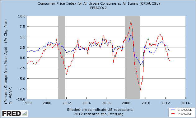
As I've noted several times recently, one sign of economic strength or weakness is shown by comparing YoY consumer prices (blue in the graph below) vs. commodity prices (red, amplitude divided by 2 better to show the comparison). Usually before a recession there will be a rise in inflation, with the more upstream producer and commodity prices spiking higher than consumer prices. As the economy weakens into and through a recession, the more upstream prices fall more than consumer inflation, and their bottom marks the end of the recession. Here's an updated graph from 1998 to the present, showing that pattern for both the 2001 and 2008-09 recessions, as well as the weakness in 2006 (in which one quarter of GDP was just barely positive, and we had one month of job losses plus two of tiny gains):
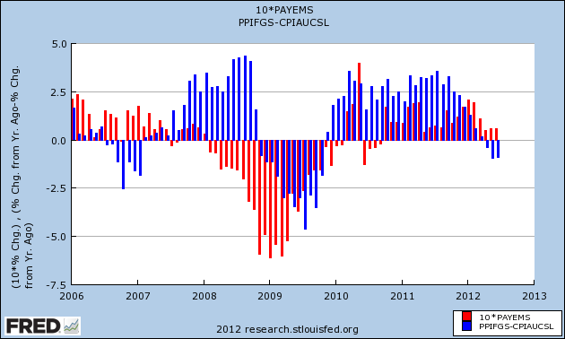
Another way to give you a better look is to subtract YoY consumer prices from producer prices (blue in the graph below). A negative result shows weakness, a positive result shows strength. Then we compare with monthly job gains or losses (red). Here is an updated graph the period of 2006 to the present:

In 2006 YoY price weakness did not result in actual job losses, except for one small loss in one month. At this point in the cycle in both 2001 and 2008 there were job losses. This year, as in 2006, job gains have remained positive even in the face of YoY price weakness.
I suspect we will have at least two more months of declines in YoY inflation, as the July and August 2011 CPI numbers of +.3% and +.3% are replaced, and hence further economic weakness. After that the 2011 monthly readings were essentially 0, so unless something truly awful happens, I expect the relative weakness to end.
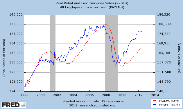
We got another slap in the face earlier this week as real retail sales for June fell -0.5%, meaning almost a 1% decline since March. As I wrote back in 2009 when the recession was bottoming out, real retail sales are the "holy grail" precursor of job growth or losses, consistently changing direction a number of months in advance. Then it was an optimistic sign. Not now. Here's real retail sales (blue, right scale) v. payrolls (red), left scale) since 1998:
That real retail sales have turned south is definitely a bad sign. On the other hand, note that we had deeper declines in both late 2005 and 2006 without job losses (except for one month, mentioned above).
In other words, while growth is lousy, we aren't necessarily tipping into contraction.
Morning Market Analysis
The US markets are all rebounding and are all back within an upward sloping channel. All are also above their respective 200 day EMAs. However, the momentum readings for all -- while positive -- are weak. In contrast, we see that volume is again flowing into the markets in the form of a rising CMF. But don't read too much into the rally. The Treasury market is still absorbing a ton of capital, keeping equity money on the side -- at least for now.
The Chinese market is still moving sideways, consolidating losses and building a possible base from which to rally. The shorter EMAs are moving sideways, but the longer ones (50 and 200 day) are both moving lower. Money is moving into the market, although this is probably traders "nibbling" for the sake of a longer term position.
The Indian market continues to grind higher, as prices are still in a gentle, upward sloping channel. They hit resistance just above the lowest Fib level, but this is to be expected. The EMAs are trying to attain a more bullish stance, but aren't there yet. Like the US rally, this looks like a "grinder higher" rally, rather than a "euphoric buying" rally, meaning that unless there is a fundamental change in the underlying economy, I wouldn't expect this rally to move strongly higher.
Wednesday, July 18, 2012
More on the Oil choke collar and payrolls
- by New Deal democrat
A commenter on yesterday's post said that to correlate oil prices and payrolls was "silly" and further that "if you showed data going back to the first half of 2008, you would have noted that oil went up dramatically while the US economy was losing a significant number of jobs every month at the same time."
Indeed, 2006 was another time that Oil approached, but did not cross the threshold where it would cause actual economic contraction, although as we all remember in the frst half of 2008 it certainly did.
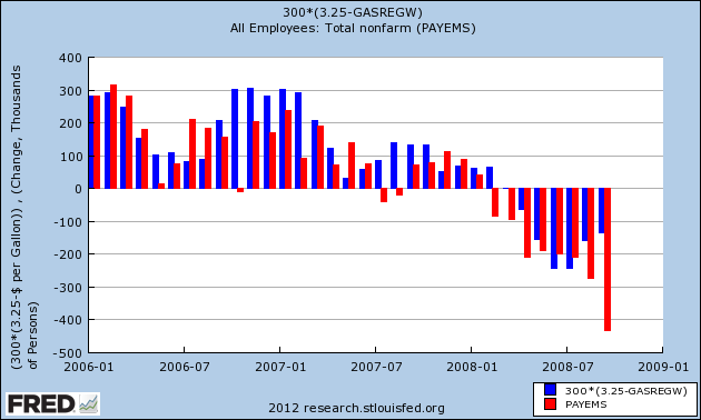
So here is the same graph as I ran yesterday, using $3.25 vs. $4 as the inflection point for the price of a gallon of gasoline, from the beginning of 2006 up until September 2008:
I submit that the correlation appears very similar to the graph I ran yesterday of 2010 to the present. In fact, the commenters argument about early 2008 very much supports my point.
By no means am I saying that Oil prices are a single variable determining job growth or losses. Rather, it appears that absent an overwhelming outside event like 9/11 or Lehman Brothers, Oil prices are an important input especially as they approach or exceed the inflection point where the choke collar tightens, and my explain the apparent new "seasonal distortions" of the last several years.
A commenter on yesterday's post said that to correlate oil prices and payrolls was "silly" and further that "if you showed data going back to the first half of 2008, you would have noted that oil went up dramatically while the US economy was losing a significant number of jobs every month at the same time."
Indeed, 2006 was another time that Oil approached, but did not cross the threshold where it would cause actual economic contraction, although as we all remember in the frst half of 2008 it certainly did.
So here is the same graph as I ran yesterday, using $3.25 vs. $4 as the inflection point for the price of a gallon of gasoline, from the beginning of 2006 up until September 2008:
I submit that the correlation appears very similar to the graph I ran yesterday of 2010 to the present. In fact, the commenters argument about early 2008 very much supports my point.
By no means am I saying that Oil prices are a single variable determining job growth or losses. Rather, it appears that absent an overwhelming outside event like 9/11 or Lehman Brothers, Oil prices are an important input especially as they approach or exceed the inflection point where the choke collar tightens, and my explain the apparent new "seasonal distortions" of the last several years.
Brazil Continues Lowering Rates
Last week, Brazil lowered its interest rate from 8.5% to 8%. This is yet another cut in a long series of cuts as shown in this chart:
To explain the move, let's first look at overall GDP:
This is the chart that is sending the overall warning signal to the to central bank. Overall growth continues to move lower. This courttrend has been in place for over two years, now standing near 0%. Simply put, this is a chart that requires action.
Bolstering the urgency of the GDP chart is the overall, year-over-year decline in industrial production. This trend is strongly lower, and has been in place for the last half year.
Also consider this information:
This chart is essentially giving the central bank permission to lower rates. Notice the continued and strong decline starting in mid-2011 and continuing until now. Brazil was long plagued by high rates, which explains why they have some of the highest rates in the world.
Brazil's policy dilemma is best explained by the following quote from the Financial Times:
To explain the move, let's first look at overall GDP:
This is the chart that is sending the overall warning signal to the to central bank. Overall growth continues to move lower. This courttrend has been in place for over two years, now standing near 0%. Simply put, this is a chart that requires action.
Bolstering the urgency of the GDP chart is the overall, year-over-year decline in industrial production. This trend is strongly lower, and has been in place for the last half year.
Also consider this information:
The Economic Activity Index of the BCB (IBC-Br) incorporates estimates for the monthly production of the three sectors of the economy, as well as for taxes on products, and constitutes an important coincident indicator of economic activity. Considering seasonally adjusted data, the IBC-Br decreased by 0.4% in March, the same change observed in February, after a fall of 0.3% in January. Thus, the indicator increased 0.15% in the first quarter of 2012, quarter-over-quarter, and increased 1.1% year-over-year. In twelve months, the growth rate has been slowing since November 2010, and reached 1.8% in March. On its turn, the Consumer Confidence Index (ICC), from Getúlio Vargas Foundation (FGV), recorded slight decline in May, after reaching, in April, the highest level of the series started in September 2005. The Confidence Index Sector Services (ICS) decreased in April, after recording increases in February and MarchLet's next look at the inflation excerpts the most recently released central bank policy minutes from the May 29th meeting. Remember that in looking at these, we have about a month and half's worth of information missing. I'll fill in the blanks wherever possible.
Monthly inflation measured by the Extended Consumer Price Index (IPCA) reached 0.64% in April (0.21% in March and 0.45% in February), resulting in the seventh consecutive retreat of twelve-month trailing inflation,Here is a chart of overall inflation rate:
which moved from 5.24% in March to 5.10% in April (6.51% in April 2011). Market prices inflation increased 5.63% in the twelve months through April (6.84% in April 2011), while regulated prices inflation reached 3.73%
(5.73% in April 2011). Regarding market prices, it bears highlighting that tradable goods inflation increased 3.36% in the twelve months through April, while inflation related to non-tradable goods increased 7.69%, compared to 6.03% and 7.55% in the same period of 2011, respectively. Specifically on services, inflation in this segment reached 0.77% in April, after rising 0.52% in March, totaling 8.00% in the twelve months through April (down from 8.57% registered in April 2011). In short, despite the fact that services inflation still remains at high levels, the set of available information suggests a declining trend of inflation on a twelve-month accumulated basis towards the inflation target.
This chart is essentially giving the central bank permission to lower rates. Notice the continued and strong decline starting in mid-2011 and continuing until now. Brazil was long plagued by high rates, which explains why they have some of the highest rates in the world.
Brazil's policy dilemma is best explained by the following quote from the Financial Times:
After the first decade of the century, in which everything seemed to fall into place for Brazil, policy makers are now abruptly being forced to rethink the country’s strategic direction. The issue at stake: what kind of economy does Brazil want and how big the role of the state should be?
“We want to consume like US consumers, we want to have the public services of the Europeans but we want to grow like an emerging market, so something has to give,” said Ilan Goldfajn, chief economist at Itaú, Brazil’s largest private sector bank.
It is a question troubling not just Brazil but all emerging markets. With the European, US and Japanese models looking battered, there are few global gold standards left to guide policy makers through the gathering storm clouds. Indeed, the next few years will be critical for the direction of the world economy as each of the Bric nations – Brazil, Russia, India and China – is tempted to revert to old socialist or statist habits to protect jobs and markets.
Morning Market Analysis
The German market -- which fell about 22% (from 23-18) -- is now moving higher. However, this is more of a technical move, as traders seek to purchase undervalued securities. Also note the bullish MACD and CMF reading. But, considering the overall EU situation, I wouldn't expect to see this average move strongly higher in the near term.
The UK market is in a similar position. It fell a little over 16% and is now moving higher. Prices are now above the 200 day EMA, with the shorter EMAs currently caught in the 200 day EMA. Money is flowing into the market, volatility is down, but momentum is weakening. Again, this looks more like a safety rally -- a safe, well-established market getting a capital inflow at the expense of say, Italy or Spain.
After falling almost 16%, the Japanese market rebounded to the 38.2% Fibonacci level, with prices being a little above the 200 day EMA. However, prices are now moving lower, and are again below all the EMAs. Momentum has given a sell signal, the the CMF shows a volume inflow. Again, this looks like a well-established market attracting capital because it is considered safer than say, Indonesia.
Industrial metals have been decreasing for the last six months. However, it could be argued a bottom is being formed. Firs,t the 10 and 20 day EMAs are moving sideways -- although the longer EMAs are still moving lower. The CMF is positive and the MACD is rising (although still negative). The key to this analysis is if prices move below the 17.50 level.
Oil appears to be beginning a rally. Prices bottomed in late June, but have rallied a bit since. Prices are now about the 10, 20 and 50 day EMA. The shorter EMAs are rising and the 10 has crossed over the 20. Momentum is increasing and money is moving into the market.
Tuesday, July 17, 2012
Bonddad Linkfest
- Bernanke shifts focus to unemployment (BB)
- Spain's latest auction has lower rates (BB)
- 5-year treasury set to extend rally (BB)
- S&P 500 at inflection points (BP)
- Eu inflation stable at 2.4% (Eurostat)
- EU trade balance at 6.9 billion euros (eurostat)
- Empire state manufacturing slightly positive (FBNY)
- UK inflation moves lower (ONS)
- Recruitment intensity is low (Next New Deal)
- A survey of new literature on balance sheet recessions (Next New Deal)
The Worst Drought in 50 Years Hits Agricultural Prices
From the Washington Post:
A drought gripping the Corn Belt and more than half the United States has reached proportions not seen in more than 50 years, the government reported Monday, jacking up crop prices and threatening to drive up the cost of food.Read the whole thing. But when a story like this goes national, it's a very big deal.
Though agriculture is a small part of the U.S. economy, the shortfall comes as the nation struggles to regain its economic footing. Last week, the Agriculture Department declared more than 1,000 counties in 26 states as natural-disaster areas.
About 55 percent of the continental United States is now designated as in moderate drought or worse, the largest percentage since December 1956, according to the National Climatic Data Center, and the outlook is grim.
“The drought could get a lot worse before it gets better,” said Joe Glauber, chief economist at the Agriculture Department.
The Oil choke collar and seasonal distortions
- by New Deal democrat
It looks like the idea that new seasonal distortions have been introduced into jobless claims and payroll data since the Great Recession, making 1st quarter numbers better, and 2nd quarter numbers worse, has some merit. I wonder, however, if the force behind that new distortion might be the Oil choke collar.
For the last 2+ years, the price of Oil has oscillated around the point where it significantly constricts economic growth. When growth takes off, Oil goes over $100/barrel. This chokes off growth, which causes Oil to retreat to under $80/barrel. This in turn releases consumer spending into the broader economy, which tries to attain escape velocity. Which causes Oil to go back over $100/barrel.
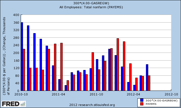
It turns out that, for the last several years, the price of a gallon of gasoline, with about a one month lag, correlates well with the monthly employment report. For every $.10 the price of gas is less than $4.00 a gallon, 10,000 jobs are added to the economy the next month. Here's the graph:

Of course, these are very limited data points, and correlation does not mean causation. In fact it only seems to be valid near the inflection point between expansion and contraction. Note the bars at the left, and also note that during the latter part and just after the Great Recession, cheap gas correlated with horrible jobs reports - but probably was part and parcel of why those reports got "less worse" at the end of the recesson. In any event, the hypothesis that it is the Oil choke collar behind the new seasonal distortions in the data certainly seems to have some merit.
It looks like the idea that new seasonal distortions have been introduced into jobless claims and payroll data since the Great Recession, making 1st quarter numbers better, and 2nd quarter numbers worse, has some merit. I wonder, however, if the force behind that new distortion might be the Oil choke collar.
For the last 2+ years, the price of Oil has oscillated around the point where it significantly constricts economic growth. When growth takes off, Oil goes over $100/barrel. This chokes off growth, which causes Oil to retreat to under $80/barrel. This in turn releases consumer spending into the broader economy, which tries to attain escape velocity. Which causes Oil to go back over $100/barrel.
It turns out that, for the last several years, the price of a gallon of gasoline, with about a one month lag, correlates well with the monthly employment report. For every $.10 the price of gas is less than $4.00 a gallon, 10,000 jobs are added to the economy the next month. Here's the graph:

Of course, these are very limited data points, and correlation does not mean causation. In fact it only seems to be valid near the inflection point between expansion and contraction. Note the bars at the left, and also note that during the latter part and just after the Great Recession, cheap gas correlated with horrible jobs reports - but probably was part and parcel of why those reports got "less worse" at the end of the recesson. In any event, the hypothesis that it is the Oil choke collar behind the new seasonal distortions in the data certainly seems to have some merit.
Morning Market Analysis
The consumer staple sector is in the middle of a rally. Prices consolidated between April and July, trading between the 33.25 and 34.25 levels. At the beginning of July, prices moved higher. Note the bullish orientation of the EMAs (all are rising, shorter above longer and prices above all). Money is flowing into the market and momentum is positive.
The utilities sector is also rallying. For the last month, prices have formed an ascending triangle pattern. Also note the bullish EMA picture. A move higher would signal a continued rally. The MACD reading may be a signal of cooling down, not selling off (this type of pattern is common in consolidation patterns).
The health care sector rallied from the beginning of June until the beginning of July, when it was caught at the levels established in early April. Prices have been treading water since. However, notice the bullish EMA picture along with massive volume inflow, indicating higher highs are probably on the way.
The preceding three sectors -- all considered safe and/or low beta sectors -- are some of the better performing sectors over the last week, month, three month and six month period. This tells us that investors are moving into safer sectors, further showing that there is a lot of concern out there regarding the economy.
Above are the charts for the corporate curve, in weekly charts, with the top chart being the short part of the market, the middle chart being the intermediate and the bottom being the long end. Like the treasury market, all three market sectors are rallying, and have been for the last two years. As with the treasury market, this tells us that investors are reaching for yield because of the treasury market and safety, again confirming that traders are deeply concerned with the underlying economy.
Monday, July 16, 2012
Bonddad Linkfest
- Democrats threaten republicans with fiscal cliff (WaPo)
- More on the fiscal cliff situation (Politico)
- Why are Romneys polls slipping (BP)
- Why the Bain debate matters now (TPM)
- Indian inflation drops to 5-month low (FT)
- Price pressures appear contained (FT)
- US retail sales drop .5% (Census)
- Consumer sentiment at lowest since December (Marketwatch)
- Lower Lows Ahead (Alphaville)
- The devaluation chorus sings again (Grumpy Economist)
Grain Price Spikes and Food Inflation
Over the last few weeks, we've seen big price spikes in the grain complex, caused by drought in the US. In this post, I'm going to look at how this bleeds through to over consumer prices.
First, food prices comprise 14.14% of overall CPI. Breaking that number down, food at home is responsible for 8.53% while food away from home is responsible for 5.61%. Cereals and grains total a small portion of overall CPI, only accounting for 1.22%. However, grain prices will also have an impact on dairy (grains are fed to cows) and meats and poultry prices. However, these two categories account for .89% and 1.9% of total CPI respectively.
Let's take a look at the data.
Above is a chart of bakery and cereal product prices on a year over year and non-seasonally adjusted basis going back to the Great Depression (the non-seasonally adjusted data goes back far longer than the seasonally adjusted data). Notice that we've been through episodes of price spikes before, which is to be expected. This data set is especially vulnerable to natural events.
Above is a chart comparing bakery and cereal prices with CPI, both on a year over year and non-seasonally adjusted basis (bakery is blue, CPI is red). Notice there is a general, positive relationship between the two data sets, telling us that these bakery and cereal prices are important determinants in the CPI equation.
Above is a year over year chart of the year over year percentage change in bakery and cereal goods compared with the overall CPI. This is a seasonally adjusted series.
First, food prices comprise 14.14% of overall CPI. Breaking that number down, food at home is responsible for 8.53% while food away from home is responsible for 5.61%. Cereals and grains total a small portion of overall CPI, only accounting for 1.22%. However, grain prices will also have an impact on dairy (grains are fed to cows) and meats and poultry prices. However, these two categories account for .89% and 1.9% of total CPI respectively.
Let's take a look at the data.
Above is a chart of bakery and cereal product prices on a year over year and non-seasonally adjusted basis going back to the Great Depression (the non-seasonally adjusted data goes back far longer than the seasonally adjusted data). Notice that we've been through episodes of price spikes before, which is to be expected. This data set is especially vulnerable to natural events.
Above is a chart comparing bakery and cereal prices with CPI, both on a year over year and non-seasonally adjusted basis (bakery is blue, CPI is red). Notice there is a general, positive relationship between the two data sets, telling us that these bakery and cereal prices are important determinants in the CPI equation.
Above is a year over year chart of the year over year percentage change in bakery and cereal goods compared with the overall CPI. This is a seasonally adjusted series.
Morning Market Analysis
Let's start with a look at the entire US treasury curve, which shows that the safety bid is still very much in play. The short end (top chart) is caught in a trading range after a rally in mid-March. Considering there is very little upside room in this part of the curve thanks to inflation, this makes sense. The two intermediate charts (IEIs and IEFs) are both in the middle of a rally that started in early April and the long end of the market (the TLTs) is approaching highs established at the beginning of June.
The point of this discussion is to highlight that as long as the safety bid is this strong, risk based assets will have less cash to support their prices.
The IWMs are, oddly enough, the average that is doing the least badly. On Thursday, it held support at its lower trend line and still remains above the 200 day EMA. The biggest technical challenge is the MACD, which is about to give a sell signal. However, the CMF tells us money is moving into the market and volatility is decreasing.
In contrast to the IWMs, we have the QQQs and SPYs. Both of these indexes fell below support on Thursday. Each rallied on Friday, but this was after their respective MACDs gave a sell signal. On the positive side, both have decreasing volatility and increasing volume inflow.
When looking at these three averages together in combination with the underlying economic fundamentals, the conclusion is for, at best, a reluctant rally higher. Most likely, I'd expect sideways action or a move to test the 200 day EMA. Bolstering this analysis is the movement within the market; health care, staples and utilities are some of the better performing sectors over the weekly, monthly and three month time periods. In contrast, consumer discretionary, technology, basic materials and industrials are at the bottom of the pack.
Subscribe to:
Posts (Atom)