- by New Deal democrat
Today doesn’t just mark the end of 2019, but the end of the 2010’s as well. So it’s only suitable that I post the one chart that I think most explains the economy over the past 10 years.
In terms of public policy, that chart would be of the continual explosion of income and wealth inequality, particularly at the very top 0.1% or 0.01% of the distribution.
But in terms of explaining why the economy has chugged along at roughly 2% GDP growth every year for 10 years, with no recession, the below graph, that was part of my year-end review last week, sums it up nicely. Here it is again, the YoY changes in the Fed funds rate and the YoY% change in the price of gas:
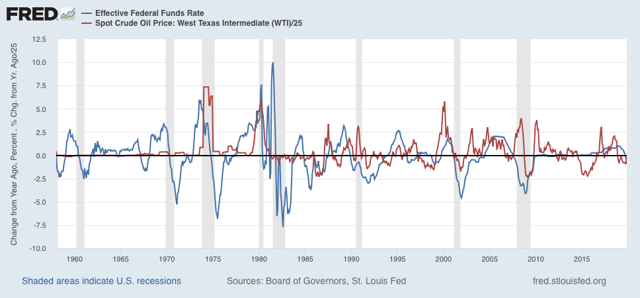
Every recession in the past 60 years has been preceded by a spike in short term interest rates, the price of oil, or both. Although not shown, if I went back before the Fed started using interest rate policy as a tool in the late 1950s, I could take a similar graph of short term commercial paper interest rates and the YoY% change in the price of commodities back about 150 years and the same pattern would obtain.
What generally kills economic growth is either a sharp change in the cost of financing and/or a sharp increase in the costs of inputs. In the 2010’s we never had either. In 2018 we came close, particularly in a YoY change in gas prices, but it was an increase from a very low level, and it didn’t last that long.
This very long moderation in both interest rates and important commodity prices is the most basic explanation for the fact that the expansion that started in 2009 is still going on as we begin 2020.
See you on the other side. In the meantime, Happy New Year!