With the release of producer and consumer inflation figures yesterday and today, it is safe to say that the period of maximum weakness forecast by the downturn in the long leading indicators over a year ago has begun. Notice I didn't say "recession." Neither the increase in initial claims yesterday, nor the inflation data, causes me to re-think that position I just re-examined within the last month (a period of weakness now, followed by relative strength later in the year). But weak data is likely to persist for several months at least.
First, let's briefly look at initial jobless claims. Prof. Dean Baker says not to panic, the increase is due to the non-winter winter distorting seasonal patterns.
That may be true, but on the other hand, there may be a different seasonality at work. The below graph includes the last 2 years of claims, and highlights April through June last year and claims since April 1 of this year in red:
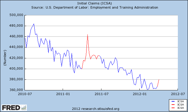
It may be that the recent re-jiggering of seasonal adjustments was incomplete, or it may reflect increased layoffs due to the seasonal increase in gasoline prices tightening the choke collar on the economy.
Next, let's examine commodity, producer, and consumer prices. What is noteworthy is that, after a period of heightened commodity and producer price inflation, those are now declining on a YoY basis to the point where they are equal to or below consumer inflation. As of today, YoY CPI is +2.7%. YoY Commodity inflation is now +2.6%, and producer prices YoY are +2.8%. In the past, as I will describe more below, when the rate of commodity and producer price inflation goes from higher than to lower than consumer inflation, it has almost always coincided with weakness.
The inflation data isn't leading, it is coincident. But by examining the last few periods of weakness, we can get a very good idea how long it is likely to persist. (Note: the graphs below do not include this morning's CPI data).
First of all, here's a look at YoY consumer prices (blue), finished producer prices (red) and commodity prices (light green) since 1996 (note: I've divided the change in commodity prices by 2 for better scale only):
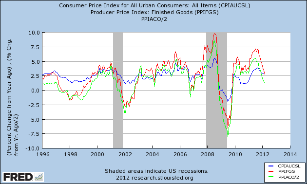
Notice that there have been 4 periods of relatively weak commodity and producer prices since 1996. Notice further that just prior to both recessions since then, commodity and producer prices ran much hotter than consumer prices. They crossed consumer prices about 1/3 of the way into each recession, and each recession ended when YoY commodity and producer price changes were at their lowest. This by the way is also exactly the pattern for the pre-WW2 deflationary recessions, including both the Great Contraction of 1929-32, and the Recession of 1938. That YoY commodity and producer price changes have now become weaker than YoY consumer prices tell us we have entered the period of maximum weakness.
In the next few graphs, I've subtracted producer prices from consumer prices. Thus a negative reading is a period when producer prices are growing faster than consumer prices. In the first, these are compared with YoY GDP (red):
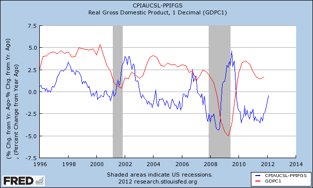
Negative readings don't always mean negative GDP (remember the importance of consumer debt refinancing at lower rates). But when producer and commodity prices suddenly become weaker than consumer prices, at minimum a bout of weakness (1998, 2002, 2006) if not recession (2001, 2008) follows.
Next is the same relationship, except that the comparison is with quarterly changes in GDP:
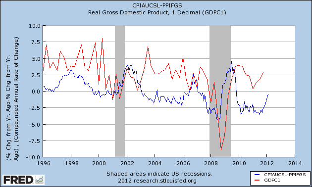
When we make this substitution, we get a noisier relationship, but on the other hand you can see that quarterly GDP changes track the relative weakness or strength of consumer vs. producer prices very closely, as in only one or two quarters later.
Since it is weakness in inflation-adjusted wages that in part triggers the economic weakness, next let's compare real wages (red) with producer vs. consumer prices:
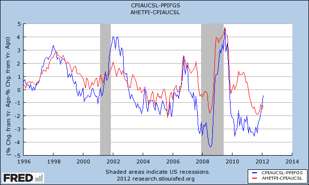
Note that once again, while there is noise, the two tend to move in tandem. Thus as producer prices weaken, we should expect to see real wages improve.
How long will the weakness last? As I've repeated above, the weakness bottoms almost exactly when producer and commodity prices are at their YoY weakest. That isn't as difficult to predict as it may seem. In each of the 4 periods of relative weakness since 1996 shown in the first graph above, the weakest point came within one month of exactly one year after the highest monthly producer and commodity price reading. The last 5 years of commodity (red, dividing by 2 for scale) vs. consumer (blue) price changes are shown in the bar graph below:
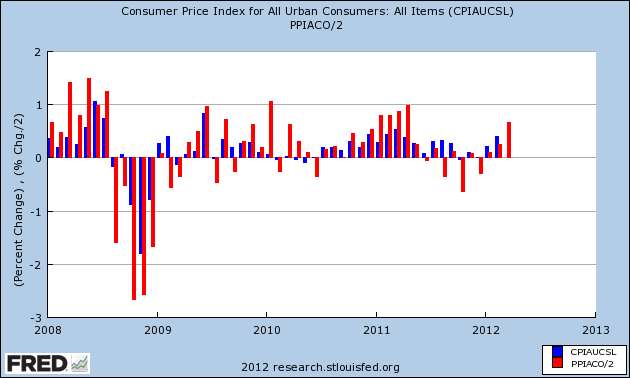
In 2008, the last strongly inflationary month was July. Barring a deflationary spiral, it wasn't too difficult to foresee that the maximum YoY reading in commodity prices would be July 2009. Based on past deflationary recessions, including the Great Depression, that meant the "Great Recession" was likely to bottom in about that month. That was a strong contributing factor in my ability to foresee when that recession would bottom in advance.
In 2011, the last strong inflationary month was April. Unless there is a severe recession, it is unlikely that YoY commodity prices will continue to decline after July, or September at the latest. Better real wages and improving business profitability caused by the greater decline in commodity prices should assert themselves beginning at that time. That means this period of weakness should start to abate sometime during the summer -- i.e., too short and too shallow to be considered a recession.