According to the NBER, the expansion of the early 1950s lasted from the fourth quarter of 1949 to the second quarter of 1953. As such, this seems like an appropriate time to look at the expansion's overall characteristics to see what happened at the macro level.
The above chart is total, real GDP which increased from a little over $1.9 trillion to about $2.5 trillion, or an overall increase of about 20%.
The above chart shows the continuously compounded annual rate of change in GDP. The expansion started with a strong rate of growth, clocking in at over 10% for three quarters. Growth slowed down a bit in 1951, but we still see growth at 5% plus. 1952 showed very slow overall growth rates, with one final bang left at the end of 1952 and the beginning of 1953.
The above chart -- from the Federal Reserve's 1954 report -- highlights the importance of government spending to the expansion. A fair amount of this is due to spending for the Korean War effort. Regardless, this chart shows the importance of government spending to the economy.
In addition, the tax burden was hardly oppressive.
The top chart is the unemployment rate, while the bottom chart is real disposable personal income. The two are inter-related. Unemployment was at incredibly low levels -- it sat at right around 3% for most of the expansion. As a result, business had to increase wages. In addition, the US workforce was far more unionized -- in fact, there was a national steel strike in the fall of 1952 that shut down the economy, which also forced concessions for wages.
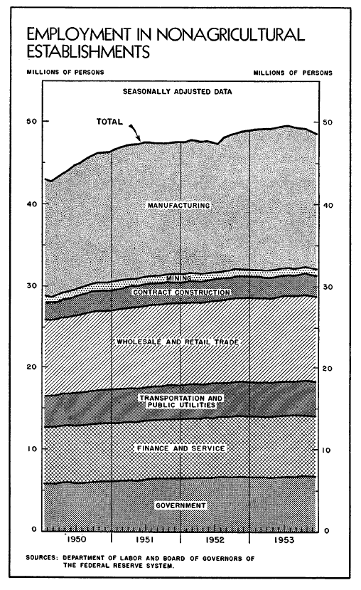
The above chart shows the break-down of the US labor force. Simply eyeballing the chart, we see that manufacturing comprises the largest percentage of the labor force. In fact, the labor force was about 40% "blue collar" -- construction and manufacturing.
The above chart from the 1954 Economic Report to the President puts the overall ways growth, personal consumption expenditures and retail sales in perspective -- as does the following table:
I forget where I learned about the post-WWII pent-up consumer demand. But this chart really highlights the overall rate of growth of consumers purchases for the period. TV sets increased from 179,000 annual output in 1947 to 7.2 million in 1953. Air conditioning units increased from 43,000 to a little over 1 million over the same period. During this period in US history, we see a mammoth increase in the sale of goods related to forming a home.
The two charts above are from the 1954 ERP, and show that household formation was an underlying factor for the vast majority of PCEs. The top chart breaks PCEs down into their familiar durable/non-durable/service sub-parts. Notice that durables remained pretty constant, which non-durables and services increased pretty sharply. In the lower chart, we see that expenditures related to housing are a big part of the increase in the PCE sub-parts.
The above chart of interest rates shows that money was actually pretty cheap for the period. And while we do see an upward drift to all the rates as the expansion progressed, this is standard, for a few reasons. Investors sell bonds to move into riskier assets, which is something they do as the expansion moves forward. In addition, inflation expectations usually increase at the end of an expansion, as the economy moves into overdrive.
The above chart shows credit growth. First, residential mortgage financing increased strongly in all three years -- again showing that household formation one of the primary themes of this expansion. However, consumer credit also expands in 1952 and 1953, which also explains the growth in non-durable purchases. Businesses sold more debt and equity as the expansion wore on, substituting this financing for bank loans.
Industrial production rose sharply in 1950, maintained a steady output until the steel strike of late 1952, and then moved higher into 1953, largely to play catch-up from the production lost due to the strike. Wholesale prices peaked in early 1951 and then moved lower for the remainder of the period. Consumer prices, however, moved higher. It should be remembered that the economy was under price controls as a result of the Korean War.
Above is a chart of the YOY percentage change in private residential fixed investment. Look at the explosion that occurred in 1950. This number was negative in late 1951 and early 1952, but that's in comparison to some incredibly high numbers. By late 1952 and early 1953, the index is back printing YOY changes around 10% (although these are in comparison to low numbers in the preceding four months). However, it's the surge at the beginning of the expansion that really explains a great deal -- for example, the continued increase in household service expenditures in the PCE numbers, or the steady furniture sales numbers. Also remember that real estate loan growth was consistent for this expansion, increasing between 8.8% and 9.4% for the years 1951-1953. This tells use that home purchases were a big part of the economic dynamic.
The above information confirms that in the early 1950s, the US economy was kicking into high gear. With a combination of the Korean War spending and pent-up consumer demand, all cylanders were firing.


