- Where gridlock meets politics
- A year before the elections, the mood is very dour
- Most of the unemployed no longer receiving benefits
- Junk bond market shows better times ahead
- Credit Unions Poach Clients
- Euro area retail sales from .7% in September
- German industrial production drops 2.7% in September
- Greek government reaches deal
- Sarkozy proposes another austerity budget
- Income mobility drops in the US
Monday, November 7, 2011
Bonddad Linkfest
No Virgina, the CRA/GSE's Didn't Cause the Financial Crisis
One of the things that drives me nuts is when -- regardless of a point being thoroughly and completely dis-proven and debunked -- it still makes it's way into political discussion. Of course, most of the time these things pop up (the world isn't warming, evolution is only a theory) from some whack-job who can't handle the complexity of the modern world, and instead pines for a simpler idealized day (which of course, never really existed, but that doesn't stop them from thinking it existed). Or, they're just plain stupid. Either way, it's an attempt to obfuscate the basic data in furtherance of some meme.
Case in point: the CRA caused the melt-down. I love this theory. Never mind that the CRA was passed 25 years prior to the melt-down (that's one hell of a delayed reaction), nor the fact that real estate bubbles popped up all over the world (did Spain also have a CRA?) No -- these objective data points are not relevant! All government is bad, so the CRA is bad and that's that.
Thanks to Barry over at the Big Picture, we have a really nice explanation/takedown of this moronic talking point. Let's start with Barry's column from the Washington Post. Barry's done this thing called research, or "diligent and systematic inquiry or investigation into a subject in order to discover or revise facts, theories, applications." He's written a thing called a book. Be careful, as the results are nuanced (a subtle difference or distinction in expression, meaning, response). Here is the chain of events from Barry's Washington Post column:
Then, of course, there is this report from the Minneapolis Federal Reserve and this from the Washington Fed.
So -- if you still believe that -- despite the overwhelming body of factual data listed above -- that the CRA and GSEs caused the financial meltdown, you are formally admitting that
Case in point: the CRA caused the melt-down. I love this theory. Never mind that the CRA was passed 25 years prior to the melt-down (that's one hell of a delayed reaction), nor the fact that real estate bubbles popped up all over the world (did Spain also have a CRA?) No -- these objective data points are not relevant! All government is bad, so the CRA is bad and that's that.
Thanks to Barry over at the Big Picture, we have a really nice explanation/takedown of this moronic talking point. Let's start with Barry's column from the Washington Post. Barry's done this thing called research, or "diligent and systematic inquiry or investigation into a subject in order to discover or revise facts, theories, applications." He's written a thing called a book. Be careful, as the results are nuanced (a subtle difference or distinction in expression, meaning, response). Here is the chain of events from Barry's Washington Post column:
1.) Fed Chair Alan Greenspan dropped rates to 1 percent — levels not seen for half a century — and kept them there for an unprecedentedly long period. This caused a spiral in anything priced in dollars (i.e., oil, gold) or credit (i.e., housing) or liquidity driven (i.e., stocks).For those of you that want to switch the argument to "the GSEs" caused the market, here is another complete and thorough refutation from Barry's Blog:
2.) Low rates meant asset managers could no longer get decent yields from municipal bonds or Treasurys. Instead, they turned to high-yield mortgage-backed securities. Nearly all of them failed to do adequate due diligence before buying them, did not understand these instruments or the risk involved. They violated one of the most important rules of investing: Know what you own.
3.) Fund managers made this error because they relied on the credit ratings agencies — Moody’s, S&P and Fitch. They had placed an AAA rating on these junk securities, claiming they were as safe as U.S. Treasurys.
4.) Derivatives had become a uniquely unregulated financial instrument. They are exempt from all oversight, counter-party disclosure, exchange listing requirements, state insurance supervision and, most important, reserve requirements. This allowed AIG to write $3 trillion in derivatives while reserving precisely zero dollars against future claims.
5.) The Securities and Exchange Commission changed the leverage rules for just five Wall Street banks in 2004. The “Bear Stearns exemption” replaced the 1977 net capitalization rule’s 12-to-1 leverage limit. In its place, it allowed unlimited leverage for Goldman Sachs, Morgan Stanley, Merrill Lynch, Lehman Brothers and Bear Stearns. These banks ramped leverage to 20-, 30-, even 40-to-1. Extreme leverage leaves very little room for error.
6.) Wall Street’s compensation system was skewed toward short-term performance. It gives traders lots of upside and none of the downside. This creates incentives to take excessive risks.
7.) The demand for higher-yielding paper led Wall Street to begin bundling mortgages. The highest yielding were subprime mortgages. This market was dominated by non-bank originators exempt from most regulations. The Fed could have supervised them, but Greenspan did not.
8.) These mortgage originators’ lend-to-sell-to-securitizers model had them holding mortgages for a very short period. This allowed them to get creative with underwriting standards, abdicating traditional lending metrics such as income, credit rating, debt-service history and loan-to-value.
9.) “Innovative” mortgage products were developed to reach more subprime borrowers. These include 2/28 adjustable-rate mortgages, interest-only loans, piggy-bank mortgages (simultaneous underlying mortgage and home-equity lines) and the notorious negative amortization loans (borrower’s indebtedness goes up each month). These mortgages defaulted in vastly disproportionate numbers to traditional 30-year fixed mortgages.
10.) To keep up with these newfangled originators, traditional banks developed automated underwriting systems. The software was gamed by employees paid on loan volume, not quality.
11.) Glass-Steagall legislation, which kept Wall Street and Main Street banks walled off from each other, was repealed in 1998. This allowed FDIC-insured banks, whose deposits were guaranteed by the government, to engage in highly risky business. It also allowed the banks to bulk up, becoming bigger, more complex and unwieldy.
12.) Many states had anti-predatory lending laws on their books (along with lower defaults and foreclosure rates). In 2004, the Office of the Comptroller of the Currency federally preempted state laws regulating mortgage credit and national banks. Following this change, national lenders sold increasingly risky loan products in those states. Shortly after, their default and foreclosure rates skyrocketed.
1. Private markets caused the shady mortgage boom: The first thing to point out is that the both the subprime mortgage boom and the subsequent crash are very much concentrated in the private market, especially the private label securitization channel (PLS) market. The Government-Sponsored Entities (GSEs, or Fannie and Freddie) were not behind them. The fly-by-night lending boom, slicing and dicing mortgage bonds, derivatives and CDOs, and all the other shadiness of the mortgage market in the 2000s were Wall Street creations, and they drove all those risky mortgages.For further complete and total dedunking, there are these two links (here and here)
Here’s some data to back that up: “More than 84 percent of the subprime mortgages in 2006 were issued by private lending institutions… Private firms made nearly 83 percent of the subprime loans to low- and moderate-income borrowers that year.”
As Center For American Progress’s David Min pointed out to me, the timing doesn’t work at all: “But from 2002-2005, [GSEs] saw a fairly precipitous drop in market share, going from about 50% to just under 30% of all mortgage originations. Conversely, private label securitization [PLS] shot up from about 10% to about 40% over the same period. This is, to state the obvious, a very radical shift in mortgage originations that overlapped neatly with the origination of the most toxic home loans.”
2. The government’s affordability mission didn’t cause the crisis: The next thing to mention is that the “affordability goals” of the GSEs, as well as the Community Reinvestment Act (CRA), didn’t cause the problems. Randy Krozner summarized one of the better studies on this so far, finding that “the very small share of all higher-priced loan originations that can reasonably be attributed to the CRA makes it hard to imagine how this law could have contributed in any meaningful way to the current subprime crisis.” The CRA wasn’t nearly big enough to cause these problems.
I’d recommend checking out “A Closer Look at Fannie Mae and Freddie Mac: What We Know, What We Think We Know and What We Don’t Know“ by Jason Thomas and Robert Van Order for more on the GSEs’ goals, which, in addition to explaining how their affordability mission is a distraction, argues that subprime loans were only 5 percent of the GSEs’ losses. The GSEs also bought the highly rated tranches of mortgage bonds, for which there was already a ton of demand.
3. There is a lot of research to back this up and little against it: This is not exactly an obscure corner of the wonk world — it is one of the most studied capital markets in the world. What has other research found on this matter? From Min:
Did Fannie and Freddie buy high-risk mortgage-backed securities? Yes. But they did not buy enough of them to be blamed for the mortgage crisis. Highly respected analysts who have looked at these data in much greater detail than Wallison, Pinto, or myself, including the nonpartisan Government Accountability Office, the Harvard Joint Center for Housing Studies, the Financial Crisis Inquiry Commission majority, the Federal Housing Finance Agency, and virtually all academics, including the University of North Carolina, Glaeser et al at Harvard, and the St. Louis Federal Reserve, have all rejected the Wallison/Pinto argument that federal affordable housing policies were responsible for the proliferation of actual high-risk mortgages over the past decade.
The other side has virtually no research conducted that explains their argument, with one exception that I’ll cover below.
4. Conservatives sang a different tune before the crash: Conservative think tanks spent the 2000s saying the exact opposite of what they are saying now and the opposite of what Bloomberg said above. They argued that the CRA and the GSEs were getting in the way of getting risky subprime mortgages to risky subprime borrowers.
My personal favorite is Cato’s “Should CRA Stand for ‘Community Redundancy Act?’” from 2000 (here’s a write-up by James Kwak), which argues a position amplified in its 2003 Handbook for Congress financial deregulation chapter: “by increasing the costs to banks of doing business in distressed communities, the CRA makes banks likely to deny credit to marginal borrowers that would qualify for credit if costs were not so high.” Replace “marginal” with Bloomberg’s “on the cusp” and you get the same idea.
Bill Black went through what AEI said about the GSEs during the 2000s and it is the same thing — that they were blocking subprime loans from being made. In the words of Peter Wallison in 2004: “In recent years, study after study has shown that Fannie Mae and Freddie Mac are failing to do even as much as banks and S&Ls in providing financing for affordable housing, including minority and low income housing.”
5. Expanding the subprime loan category to say GSEs had more exposure makes no sense: Some argue that the GSEs had huge subprime exposure if you create a new category that supposedly represents the risks of subprime more accurately. This new “high-risk” category is associated with a consultant to AEI named Ed Pinto, and his analysis deliberately blurs the wording on “high-risk” and subprime in much of his writings. David Min broke down the numbers, and I wrote about it here. Here’s a graphic from Min’s follow-up work, addressing criticism:
Even this “high risk” category isn’t risky compared to subprime and it looks like the national average. When you divide it by private label, the numbers are even worse. Private label loans “have defaulted at over 6x the rate of GSE loans, as well as the fact that private label securitization is responsible for 42% of all delinquencies despite accounting for only 13% of all outstanding loans (as compared to the GSEs being responsible for 22% of all delinquencies despite accounting for 57% of all outstanding loans).” The issue isn’t this fake “high risk” category, it is subprime and private label origination.
The Financial Crisis Inquiry Commission (FCIC) panel looked carefully at this argument and also ended up shredding it. So even those who blame the GSEs can’t get the numbers to work when they make up categories.

Then, of course, there is this report from the Minneapolis Federal Reserve and this from the Washington Fed.
So -- if you still believe that -- despite the overwhelming body of factual data listed above -- that the CRA and GSEs caused the financial meltdown, you are formally admitting that
- you are stupid,
- you are a dolt,
- you are a moron,
- you are a trained seal who claps and barks when the appropriate words and phrases are uttered,
- Your grandparents were closely related, they had multiple male and female children who inter-married and you are their offspring
- You are proof that lobotomies are still conducted on a regular basis
- You have sniffed more glue than should be humanly possible
- Look -- there's a black helicopter (I thought they only flew at night....)!
- That evolution may be working backwards
- Contact sports require head gear
Morning Market

On the SPY's notice that since the arrow, the vast majority of the bodies have been small -- indicating there is a small difference between the opening and the closing prices. Last week shows an especially sharp example with a few gaps but very little intra-day action.

In contrast, the IWMs show a bit more intra-day volatility, but again, over the last week, the bodies are all very small, indicating a lack of conviction on the part of the bulls or the bears.

Finally, notice the QQQs have been moving sideways for a little under a month.

On the year-long chart of the SPYs, prices have hit the 61.8% Fib level (right around 126), which is also an important technical level established earlier this year. Prices are fluctuating around the 200 day EMA, but there really is little direction overall. Instead, we see a lot of sideways price action.
Saturday, November 5, 2011
Weekly indicators: autumn rebound continues edition
- by New Deal democrat
The big monthly data was obviously Friday's payrolls number. While the +80,000 headline number was still anemic, the internals fared considerably better, with jobs in the two prior months revised 100,000+ higher, aggregate hours increasing strongly, the manufacturing workweek increasing, and the U6 unemployment rate declining, among other things. Auto sales in October recorded another strong month. The ISM non-manufacturing index was fair. The only worrisome number was the ISM manufacturing index, just barely above contraction for the second month in a row.
The high frequency weekly indicators had another generally good week with a few soft patches, continuing their substantial rebound from their brief contraction of late August and September.
Last week I noted that gasoline usage had dropped precipitously YoY (nearly 10%). This week the dramatic YoY decline in usage continued, down -5.5% YoY, at 8518 M gallons vs. 9015 M a year ago. The 4 week moving average is off 4%. This may be evidence that consumers have permanently altered their gasoline usage habits towards more conservation (h/t commenters). Oil closed at $94.50 a barrel on Friday. This is at its recession-trigger level. Gas at the pump declined $.01 to $3.45 a gallon. Measured this way, we probably are still about $.20 above the 2008 recession trigger level.
Total rail traffic has improved substantially in the last month after having turned negative for 6 of 12 weeks during the summer. The American Association of Railroads reported that total carloads increased 5.0% YoY, up about 26,100 carloads YoY to 551,700. Intermodal traffic (a proxy for imports and exports) was up 10,800 carloads, or 4.6% YoY. The remaining baseline plus cyclical traffic increased 15,200 carloads or 5.2% YoY.
The weekly jobs data continued to improve. The BLS reported that Initial jobless claims fell 5,000 to 397,000. The four week average declined to 404,500. The four week average remains close to its best reading in over 3 years.
The American Staffing Association Index remained at 91 last week. In the last couple of months, this series has resumed its upward trajectory, but remains lower YoY.
Tax withholding improved for the second week. Adjusting +1.07% due to the 2011 tax compromise, the Daily Treasury Statement showed that for the 20 days making up the reporting month of October, $139.1 B was collected vs. $131.3 a year ago, a gain of $7.8 B or 5.9%.
Weekly BAA commercial bond rates decreased .05% to 5.36%. Contrarily, yields on 10 year treasury bonds rose .08% to 2.28%. This is the fourth week in a row of decreasing spreads between the two rates, a good sign, as is the decreased fear of deflation shown in treasuries.
Retail same store sales remained positive. The ICSC reported that same store sales for the week of October 29 increased 3.0% YoY, and 0.7% week over week. Shoppertrak reported that YoY sales rose 4.7% YoY and were down -2.2% week over week. Through thick and thin, the consumer has not rolled over this year.
Housing was mixed. The Mortgage Bankers' Association reported that seasonally adjusted purchase mortgage applications increased 1.8% last week. On a YoY basis, purchase applications were down -2.1%. This is back in the range that purchases mortgage applications have had been in for the 15 months beofre September. Refinancing decreased 0.2% w/w. Refinancing has been very volatile and affected by small changes in interest rates.
Meanwhile, YoY weekly median asking house prices from 54 metropolitan areas at Housing Tracker showed that the asking prices declined -1.1% YoY. The areas with YoY% increases in price decreased by two to 15. The areas with double-digit YoY% declines increased by one (Orange County, CA) to 3. This was the first relatively weak report in months.
Finally, as to money supply, M1 declined again last week, down -1.2%.. It remains up (barely) 0.2% m/m, and 20.0% YoY, so Real M1 was up 16.1%.
M2 also declined, down -0.4% w/w. It remained up 0.4% m/m, and 9.9% YoY, so Real M2 was up 6.0%. The YoY increase in both M1 and M2 remains near historic high levels. It will be interesting to see what continues to happen to these two series in the next several weeks, as a gauge of confidence as to whether the Euro situation is truly on its way to being solved.
With the exception of weekly money supply and housing prices, all the weekly reports were positive, some strongly so, this week. It is worth noting that the anomaly of terrible consumer confidence and positive consumer spending continues. For now, the indicators show an economy continuing its expansion.
Friday, November 4, 2011
Bonddad Linkfest
- Greek PM loses Majority
- Greek's biggest fear is a run on the banks
- The EUs Greek Ultimatum
- US banking tested by latest market strains
- Russia set to join WTO
- SEC expects further CDO related cases
- Record Chinese corn harvest won't meet demand
- Bernanke hints at new stimulative efforts
- GOP blocks infrastructure bill
- Greece scraps referendum plan
- Economists react to jobs report
Manufacturing and Services Still Expanding
From the ISM

While the index took a large dive earlier this year, it has remained positive, although just slightly so for the entire year.
1.) Input prices are decreasing
2.) Uncertainty is increasing
3.) Demand is dropping, but not crashing.
There were a few other good points in the report
1.) New orders were above 50 -- which is positive
2.) Production was 50.1 - just slightly expansionary
3.) Employment was at 53.5 -- also positive.
Let's turn to the services number
Here's the chart of the composite index:

The index has been in the same place for the last seven months.
"The PMI registered 50.8 percent, a decrease of 0.8 percentage point from September's reading of 51.6 percent, indicating expansion in the manufacturing sector for the 27th consecutive month. The New Orders Index increased 2.8 percentage points from September to 52.4 percent, indicating a return to growth after three months of contraction. The Prices Index, at 41 percent, dropped 15 percentage points, and is below the 50 percent mark for the first time since May 2009 when it registered 43.5 percent. Inventories decreased to 46.7 percent, which is 5.3 percentage points below the September reading of 52 percent. Comments from respondents are mixed, indicating positive relief from raw materials pricing and continuing strength in a few industries, but there is also more concern and caution about growth in this uncertain economy."Here's a graph of the composite index

While the index took a large dive earlier this year, it has remained positive, although just slightly so for the entire year.
The anecdotal information tells the following stories
- "Starting to see some deflation on raw materials." (Chemical Products)
- "Overall industry volumes remain flat vs. previous month. Uncertainty in supply chain is increasing due to lower volumes vs. historical." (Electrical Equipment, Appliances & Components)
- "International: contraction in demand for our products is driving mitigation of excess material on order. Contract manufacturers are adjusting their resources accordingly." (Machinery)
- "Business is very strong, both domestically and internationally." (Fabricated Metal Products)
- "With metal prices declining, we are seeing some short-term forecast strength. If metal pricing increases again, this strength is expected to disappear again." (Primary Metals)
- "Auto industry still strong." (Transportation Equipment)
- "Business is slowing — not crashing — but uncertainty and caution is the order of the day." (Plastics & Rubber Products)
- "Retail branded business is slower than expected due to consumers continuing to move to private label- and store-brand products for price advantage. Raw material supplies are in good shape, but prices are staying stubbornly higher than expected." (Food, Beverage & Tobacco Products)
1.) Input prices are decreasing
2.) Uncertainty is increasing
3.) Demand is dropping, but not crashing.
There were a few other good points in the report
1.) New orders were above 50 -- which is positive
2.) Production was 50.1 - just slightly expansionary
3.) Employment was at 53.5 -- also positive.
Let's turn to the services number
"The NMI registered 52.9 percent in October, 0.1 percentage point lower than the 53 percent registered in September, and indicating continued growth at a slightly slower rate in the non-manufacturing sector. The Non-Manufacturing Business Activity Index decreased 3.3 percentage points to 53.8 percent, reflecting growth for the 27th consecutive month. The New Orders Index decreased by 4.1 percentage points to 52.4 percent. The Employment Index increased 4.6 percentage points to 53.3 percent, indicating growth in employment after one month of contraction. The Prices Index decreased 4.8 percentage points to 57.1 percent, indicating prices increased at a slower rate in October when compared to September. According to the NMI, eight non-manufacturing industries reported growth in October. Even though there is month-over-month growth in the Employment Index, respondents are still expressing concern over available labor resources and job growth. The continued strong push for inventory reduction by supply management professionals has resulted in contraction in the Inventories Index for the first time in eight months. Respondents' comments are mixed and reflect concern about future business conditions."
Here's the chart of the composite index:

The index has been in the same place for the last seven months.
The overall tenor of the above comments is one of continued activity with a slightly negative bias. There is no indication that businesses are growing strongly, but there is also no indication that businesses are contracting either. There is caution, but but no collapse.
- "Business is fairly flat, with a slight increase noted for the month." (Health Care & Social Assistance)
- "Sales are increasing slightly, but are still lower than they have been historically." (Public Administration)
- "Some slowdown in the last month." (Finance & Insurance)
- "Business is steady, with a lot of price competition at the selling end of our business." (Agriculture, Forestry, Fishing & Hunting)
- "The poor economy is creating a drag on expected revenue through the end of this year." (Information)
- "Overall, we are still growing, but we are beginning to see some cautiousness reflected in our customers." (Wholesale Trade)
The October Jobs Report is Better Than You Think
The BLS just released the Employment Situation Summary for October 2011 and while the headline Establishment Survey number of 80,000 was a bit below expectations, the internals of the report are much better than the headline would have us believe.
Let us turn to the Household Survey for the yeoman's work of this report, as this survey shows that the unemployment rate (U-3) declined by .1 to 9.0%. Now, while that isn't a big decline, it at least was caused by both an increase in the number of employed (up 277,000) and a decrease in those unemployed (down 95,000). This also occurred while the labor force expanded by nearly 200,000 people and the "not in the labor force" number barely increased (up about 20,000, which is good because retirements are adding to this number every month). In other words, jobs were created, the unemployed got some of them, and more people looked for work this month than last.
Also in this report, we saw U-6 decline by .3 to 16.2%, which is likely in part related to the decline (of over 300k) of people employed "part-time for economic reasons". And since unemployment didn't increase, we can reasonably assume that many of these people may have indeed had their hours increased as opposed to having received a layoff notice.
Finally, in the good news department were the positive revisions to prior months, with August going up from 57,000 to 104,000 (remember all those headlines about 0 jobs that month) and September going up from plus 103k to plus 158k.
In the bad news department (although to some I guess this is good news), government jobs declined by 24k in the Establishment Survey in October, with the bulk of those coming at the state level.
Overall, while this report isn't exactly spectacular, considering where we have been and all the talk of a double dip recession it is actually reasonably decent. Couple that with the much improved internals of the report (specifically the Household Survey), the recent GDP numbers, and the recent declines in initial claims, and we have some reason to be hopeful about the remaining two months in the year.
Morning Market

Yesterday, I noted it was possible to look at the 10 day, 5-minute chart as a forming head and shoulders pattern. Yesterday's rally eliminated that possibility, with the market now in a slight uptrend.

The daily chart prints a clear picture, however. My guess is the market is actually consolidating at important technical levels, catching its breath as it digest the Greek situation. We have seen some wild gyrations, but notice the overall weakness of 5 of the last 6 days' candles. Also note that volume hasn't spiked, indicating a lack of conviction/emotion in the market


While gold caught a small bid over the last few days -- and while it still remains above it's long-term trend line -- there is a lack of volume indicating a lack of interest.
Overall, the daily moves this week can be seen as part of a larger consolidation move in all the markets. The equity markets rallied strongly a starting a few weeks ago, and now traders are taking profits and reassessing their positions. The treasury market sold off, but now, again, traders are looking at the recent price action in terms of the larger picture to see what might come next.
Thursday, November 3, 2011
the Keynes/Chicago Jobs Split
From the NY Times:
This is actually a pretty good explanation of the big policy differences between the two camps.
I would also add that there is a big difference in the way both camps perceive government, with the Keynseans believing government can do some good things whereas the Chicago school seems to be hostile to the government in general.
One reason we have so few ideas about job creation is that up until recently, the U.S. economy had been growing so well for so long that few economists spent much time studying it. (They’re trying to make up for it now. See the chart on the next page.) With no new theories, Democrats dusted off the big idea from the Great Depression, John Maynard Keynes’s view that government can create jobs by spending a lot of money. The stimulus, however, has to be borrowed, and it has to be really, truly huge — probably something like $1.5 or $2 trillion — to fill the gap between where the economy is and where it would be if everyone was spending at pre-recession levels. The goal is to goad consumers into spending again. And President Obama’s jettisoned $400 billion jobs package, hard-core Keynesians argue, is nowhere near what it would take to persuade them.
Many Republicans follow the more fiscally conservative University of Chicago School, which argues that Keynesian stimulus can’t heal a sick economy — only time can. Chicagoans believe that economies can only truly recover on their own and that policy interventions only slow the recovery. It’s a puzzle of modern politics that Republicans have had electoral success with a policy that fundamentally asserts there is nothing the government can do to create jobs any time soon.
This is actually a pretty good explanation of the big policy differences between the two camps.
I would also add that there is a big difference in the way both camps perceive government, with the Keynseans believing government can do some good things whereas the Chicago school seems to be hostile to the government in general.
Uh oh: YoY gasoline usage down 5%, worst since October 2008
- by New Deal democrat
Last week I noted that weekly gasoline usage was down almost 10% YoY. Because the series can be noisy, it was suggested that the 4 week moving average might be a better guide to the trend. Well, this week's data was released yesterday, and here is the graph showing gasoline demand for the last two years:
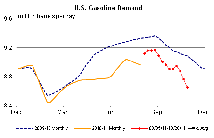
The 4 week moving average is now off nearly 5%. In fact, the graph doesn't really do the downturn justice. By compariing the EIA gasoline demand weekly raw data, we can see that demand actually held up quite well (as in, within 1 or 2% YoY compared with 2010) through June. As gasoline prices were near $4 a gallon in April, and up about $1.50 a gallon, or +40% YoY, it made sense that consumers were cutting back.
But the decline in usage intensified in July, and now at -5% YoY is the worst since the mid-September through mid-October 2008 period when we were being told that we faced Economic Armageddon. And like that decline, this one is occurring despite an ongoing decline in gasoline prices (down about $0.50 since April).
Something's happening here, but what it is ain't exactly clear. The most obvious candidates are:
1. demand destruction. But if so, why is consumer spending, as measured by the Gallup daily survey, holding up so well?
2. energy efficiency. But have we really bought so many hybrid vehicles to make that big a difference?
3. the weather. OK, we did have a strange Nor'easter that pummeled the northern and western suburbs of the Megalopolis, but that was one day only.
4. random stuff just happens. Always a possibility, but this seems unlikely given at least three weeks in a row of awful YoY comparisons.
I don't have any single great explanation. But something is clearly going on as far as I can tell, and hopefully some other bloggers will take a serious look for which explanation is the most important.
Last week I noted that weekly gasoline usage was down almost 10% YoY. Because the series can be noisy, it was suggested that the 4 week moving average might be a better guide to the trend. Well, this week's data was released yesterday, and here is the graph showing gasoline demand for the last two years:
The 4 week moving average is now off nearly 5%. In fact, the graph doesn't really do the downturn justice. By compariing the EIA gasoline demand weekly raw data, we can see that demand actually held up quite well (as in, within 1 or 2% YoY compared with 2010) through June. As gasoline prices were near $4 a gallon in April, and up about $1.50 a gallon, or +40% YoY, it made sense that consumers were cutting back.
But the decline in usage intensified in July, and now at -5% YoY is the worst since the mid-September through mid-October 2008 period when we were being told that we faced Economic Armageddon. And like that decline, this one is occurring despite an ongoing decline in gasoline prices (down about $0.50 since April).
Something's happening here, but what it is ain't exactly clear. The most obvious candidates are:
1. demand destruction. But if so, why is consumer spending, as measured by the Gallup daily survey, holding up so well?
2. energy efficiency. But have we really bought so many hybrid vehicles to make that big a difference?
3. the weather. OK, we did have a strange Nor'easter that pummeled the northern and western suburbs of the Megalopolis, but that was one day only.
4. random stuff just happens. Always a possibility, but this seems unlikely given at least three weeks in a row of awful YoY comparisons.
I don't have any single great explanation. But something is clearly going on as far as I can tell, and hopefully some other bloggers will take a serious look for which explanation is the most important.
Morning Market

The IWMS (The Russell 2000) has broken the shorter uptrend. Yesterday's rally took prices right to the trend line hitting upside resistance.

The SPYs may be forming a head and shoulders formation, which would mean lower prices are in the cards. Typically, I like more defined head and shoulder patterns, but the general price moves are head and shoulder"ish."

In contrast to the SPYs and IWMs, the DIAs are more bullish. While prices did break a short-term trend line, they also fell to technical support and have moved higher.
The equity markets are in a difficult place. While the US data is getting a bit better -- and while the fear of a double dip recession have faded -- Greece's announcement on Monday that it would put austerity to a referendum qualifies as a "one step back" news development, literally sucking the wind out of the bulls' sales.


The 10-day 5-minute chart shows that action in more detail; we can see that over the last two day prices have consolidated in a narrow range (103.8 - 104.6), digesting the quick move higher.
As I noted yesterday, the Greek announcement was a fundamental game changer. The charts show the markets are tying to digest the news.
Wednesday, November 2, 2011
Bonddad Linkfest
- Athens vote threatens bail-out deal
- US auto sales at 13.26 million
- Rising food prices to hit holiday spending
- Tax impasse threatens super-committee
- Are inflation pressures here to stay?
- AIG pays treasury $972 million
- September restaurant performance improves
- US corn export estimates are too low
- Drought index
- Thai flood forces Honda to cut production
October housing prices: more evidence of a bottom
- by New Deal democrat
Last month I discussed house prices with the provocative title It's time to admit that house prices have stopped falling October's data only adds further confirmation to that trend. The Case Shiller 10 and 20 city indexes both remained higher than their March lows. Here is the 20 city index (from March 2009 to emphasize the post-crash results, including the effects of the $8000 housing credit):

You may notice the "kinks" in the March 2010 and 2011 data. It's possible that there is a slight problem with the seasonal adjustment for that month. Deleting March, here is how the same graph looks:

With that adjustment, it looks like the trend is that the fall in prices, while not over, is probably within 1% of its bottom.
While the Case Shiller indexes report comparable sales prices, Housing Tracker reports asking prices in 54 metropolitan areas. I follow these because they showed the peak in the housing market at the beginning of 2006 before the Case Shiller sales prices did, and because since then they have led trend changes in the Case Shiller reports by about 4 to 6 months -- which makes sense, since houses are put on the market with asking prices months before they go under contract.
Housing Tracker's data for October is in, and it continues to show that the YoY rate of declines has decreased, now only -0.9% YoY. Here's the updated chart:
Note that the YoY% decline in asking prices bottomed in January of this year. A YoY graph of the Case Shiller data shows that the change in YoY% decline in sales prices bottomed in May and June:

It is important to note that YoY data will not turn positive (or negative) until months after the bottom (or top). For example, nonfarm payrolls bottomed in February 2010. The YoY number did not turn positive until 5 months later, in July. Since Housing Tracker's numbers aren't seasonally adjusted, we have to go with the YoY result, but it is a virtual certainty that at some point in the last 12 months, an actual bottom has already been established.
Why do I track housing prices? In addition to the fact that conventional wisdom, while solidly entrenched, appears to be wrong, it makes a huge difference as to whether any further declines in the housing market are nominal, or only occur after adjusting for inflation (Shiller himself believes another 15% or more decline in real terms is likely, and I do not have any reason to disagree with that).
Sellers who bought a house for $250,000 10 years ago, saw the value increase to $500,000 and then fall all the way back to $250,000 in nominal terms can, even if inflation continues to erode the value of their house by 20% in real terms, still sell their house without bringing cash to the table. On the other hand, sellers whose further depreciation of 20% is nominal (to $200,000), must bring $50,000 to the closing table. You can see that the two scenarios make an enormous difference in the ability of sellers to move, and the likely increase (or not) of foreclosures.
Indeed, comparing nominal Case Shiller values with "real" values adjusting for average wages paid since the beginning of 2000, shows that in real terms, house prices are still falling by about 3% a year - meaning that the average wage earner can afford about 3% more house on an annual basis. Note also that the average wage will buy you more house than at any point since the series began:

Another 4 years of similar real declines will get us to Shiller's 15%+ number -- without any further nominal decline in prices at all.
Last month I discussed house prices with the provocative title It's time to admit that house prices have stopped falling October's data only adds further confirmation to that trend. The Case Shiller 10 and 20 city indexes both remained higher than their March lows. Here is the 20 city index (from March 2009 to emphasize the post-crash results, including the effects of the $8000 housing credit):
You may notice the "kinks" in the March 2010 and 2011 data. It's possible that there is a slight problem with the seasonal adjustment for that month. Deleting March, here is how the same graph looks:
With that adjustment, it looks like the trend is that the fall in prices, while not over, is probably within 1% of its bottom.
While the Case Shiller indexes report comparable sales prices, Housing Tracker reports asking prices in 54 metropolitan areas. I follow these because they showed the peak in the housing market at the beginning of 2006 before the Case Shiller sales prices did, and because since then they have led trend changes in the Case Shiller reports by about 4 to 6 months -- which makes sense, since houses are put on the market with asking prices months before they go under contract.
Housing Tracker's data for October is in, and it continues to show that the YoY rate of declines has decreased, now only -0.9% YoY. Here's the updated chart:
| Month | 2007 | 2008 | 2009 | 2010 | 2011 |
|---|---|---|---|---|---|
| January | --- | -7.5% | -11.5% | -5.8% | -8.7% |
| February | --- | -7.8% | -12.0% | -5.2% | -8.4% |
| March | --- | -8.3% | -10.9% | -5.0% | -7.3% |
| April | -2.7% | -8.6% | -9.6% | -5.0% | -6.8% |
| May | -3.5% | -9.1% | -8.1% | -5.0% | -5.6% |
| June | -5.0% | -9.8% | -7.0% | -5.0% | -4.4% |
| July | -5.4% | -10.4% | -6.1% | -5.1% | -4.2% |
| August | -6.0% | -10.6% | -5.5% | -6.1% | -2.8% |
| September | -6.2% | -11.1% | -5.1% | -6.6% | -1.7% |
| October | -6.7% | -11.4% | -4.5% | -7.0% | -0.9% |
| November | -6.6% | -11.7% | -4.5% | -6.7% | --- |
| December | -7.2% | -11.4% | -5.6% | -7.8% | --- |
Note that the YoY% decline in asking prices bottomed in January of this year. A YoY graph of the Case Shiller data shows that the change in YoY% decline in sales prices bottomed in May and June:
It is important to note that YoY data will not turn positive (or negative) until months after the bottom (or top). For example, nonfarm payrolls bottomed in February 2010. The YoY number did not turn positive until 5 months later, in July. Since Housing Tracker's numbers aren't seasonally adjusted, we have to go with the YoY result, but it is a virtual certainty that at some point in the last 12 months, an actual bottom has already been established.
Why do I track housing prices? In addition to the fact that conventional wisdom, while solidly entrenched, appears to be wrong, it makes a huge difference as to whether any further declines in the housing market are nominal, or only occur after adjusting for inflation (Shiller himself believes another 15% or more decline in real terms is likely, and I do not have any reason to disagree with that).
Sellers who bought a house for $250,000 10 years ago, saw the value increase to $500,000 and then fall all the way back to $250,000 in nominal terms can, even if inflation continues to erode the value of their house by 20% in real terms, still sell their house without bringing cash to the table. On the other hand, sellers whose further depreciation of 20% is nominal (to $200,000), must bring $50,000 to the closing table. You can see that the two scenarios make an enormous difference in the ability of sellers to move, and the likely increase (or not) of foreclosures.
Indeed, comparing nominal Case Shiller values with "real" values adjusting for average wages paid since the beginning of 2000, shows that in real terms, house prices are still falling by about 3% a year - meaning that the average wage earner can afford about 3% more house on an annual basis. Note also that the average wage will buy you more house than at any point since the series began:
Another 4 years of similar real declines will get us to Shiller's 15%+ number -- without any further nominal decline in prices at all.
Thoughts on Greece's Announcement -- Or, Just When You Thought It Was Safe To Get Back in the Market ...
Last week, everything looked pretty good. US GDP came in at 2.5% -- not great, but certainly not terrible. And the leaders in Europe actually came up with the framework of a plan to deal with the Greek situation. Frankly, I breathed a sign of relief, and thought, "this looks like the end of the turmoil."
Little did I know the Greek leader would announce he would put austerity measures to a public vote. Now, I understand what he's getting at -- he wants the tough measures to meet with public approval so he can move forward. Theoretically, this will give him the mandate to continue making the tough cuts that Greece, frankly, needs to make.
But what he didn't consider (or maybe he did and simply looked the other way) was this: "what are the effects if the vote fails, and what will happen to the financial markets in the interim period?" The answer is pretty damn ugly -- or, at least more of the same high volatility trading we've been seeing for the last few months. And more importantly, if the vote fails, Greece has probably guaranteed a very messy default which threatens a large number of financial institutions. In short, failure of the vote would really hurt the markets and the macro-economic environment in an incredibly negative manner right at a time that we really don't need it.
In short, this is a bone-headed move that has little upside and massive downside. Thanks. No, really, thanks for this.
Morning Market
So much for the risk on trade. After Greece announced it would put austerity to a national vote, the risk on trade died quickly and painfully.


The SPYs dropped sharply, gapping lower, moving through the 10, 20 and 200 day EMA. Prices rallied to the 200 day EMA, but fell back. Also note the increased volume spike.

In contrast, we saw the Treasury market gap higher on strong volume. About the only good thing on this chart from a "risk on" perspective is that prices printed a very narrow candle which many traders consider a reversal pattern.

Finally, we see the dollar has rallied from the 21.20 are to the 200 day EMA, moving through all the shorter EMAs (10, 20 and 50 day) to settle right around the 200 day EMA.
So -- what does all this mean, really? First, two days of technical action is really pretty meaningless in the bigger, longer run picture. However, the Greek announcement is a huge game changer, which I'll explain in the next post. The bottom line is the fundamental backdrop against which we look at the technical market indicators (or through it), has changed in a significant way -- and not in a good way.
Tuesday, November 1, 2011
Bonddad Linkfest
- Australia cuts interest rates
- UK economy rebounds -- but don't expect it to last
- UK expects an increase in unemployment as government jobs are cut
- Eastern Europe sees lower growth
- Consumer spending came on lower income growth
- China PMI drops
- Greece to hold public referendum
- Bernanke needs a Volcker moment
- Should food and energy prices take a larger role in Fed's inflation calculations?
- Commodities drop on China and Greek news
About the Lack of Business Confidence ...

Above is a chart from the St. Louis Fed that shows total investment in equipment and software. If businesses were really concerned about uncertainty, we wouldn't be seeing this level of investment activity - which is actually quite strong.
Coalition Wanted A Gas Tax Increase to Fund Infrastructure
From Politico:
What they could have done is fund the spending with a short-term increase in borrowing (remember, interest rates have been incredibly low for some time) and then tied a tax increase to an economic marker such as, "when GDP grows at over 3% for a period of X quarters, the gas tax will increase by Y and the funds will be specifically targeted to infrastructure." But, that just wasn't going to happen.
For the first time in two decades, major transportation groups have banded together and made a request that, in other circumstances, would be considered crazy — “Tax us … NOW.”
But the answer from Congress and the White House has been a resounding “No!”
What they could have done is fund the spending with a short-term increase in borrowing (remember, interest rates have been incredibly low for some time) and then tied a tax increase to an economic marker such as, "when GDP grows at over 3% for a period of X quarters, the gas tax will increase by Y and the funds will be specifically targeted to infrastructure." But, that just wasn't going to happen.
Morning Market
Yesterday, I commented that this week would be a good time for the market to pull back from its latest rally in order to catch its breath. That's what happened yesterday.

On the 10 day, 5-minut chart, prices are still in an upward sloping patter just barely. Yesterday, prices gapped lower at the open, traded sideways for most of the session, and then moved lower, selling off at the end of the day. This is generally a bad sign, as it indicates traders don't want to hold positions overnight for fear of negative events.

On the daily chart, yesterday's sell-off took prices down to the trend line, but on weak volume.

However, prices are right at the 10 day EMA and still have technical support from the 200 day EMA.

The big move came in the Treasury market, where the long-end of the curve rallied strongly on a slight uptick in volume. Yesterday's bar gapped higher at the open and closed at its high -- an extremely bullish development.
From the equity/bond perspective, yesterday was one day of trading, so reading too much into the events should be avoided. However, it's also important that a lot of technical change did occur in a single trading period, as it shows that traders have an itchy trigger finger.

After peaking earlier this year, gold sold-off and consolidated along the long term trend line. Over the last few days it ha spiked higher.

The 3 month charts shows that prices and the EMAs are in a tight range, indicating indecision on the part of traders. Also note the lack of volume, showing diminishing enthusiasm. Gold is in a holding pattern right now.
Subscribe to:
Posts (Atom)