Thursday, January 7, 2010

BLS: Economy shed -85,000 jobs in December

The bleeding of jobs during the Great Recession continued in December to the tune of (- 86,000) (subject to revisions - more on that later) after adding a revised +4,000 jobs in November.
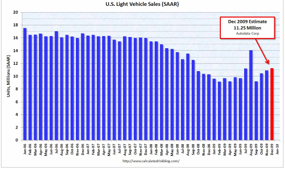
So the Recovery remains "jobless" for at least one more month.

[Note: the graphs below do not include this morning's data, but are current through last month. I will substitute the December graphs as soon as they become available]

I. After gaining jobs for two months, services (where 85% of Americans work) were reported to have lost (- 4,000). Job gains were reported in professional positions +50,000, including both health and education. Retail showed a gain of +4,000. Temporary jobs - typically added while employers wait to see if the economic improvement is more sustainable - went up for the 5th month in a row, by +47,000.
The BLS report continues to track reasonably close to the private ADP survey, and out of line with the private ISM manufacturing and non-manufactuing surveys.
Manufacturing lost (-27,000) jobs. Construction, in the epicenter of the economic downturn, continued to shed jobs at (- 53,000), mirroring the lackluster performance of home sales and the continuing plunge in nonresidential construction.
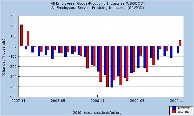
This is generally a continuation of the trend that began two months ago, when services jobs (red in the graph below) first showed growth in the payrolls report, but goods producing jobs (manufacturing + construction) (blue in the graph below)were still negative (a pattern seen at the end of past recessions).


As many of you already know, in fact there are two surveys -- the "establishment" survey which polls businesses, and has received much criticism for its "birth/death" adjustment; and the "household" survey, conducted by the Census Bureau, which polls households, and does not have any such adjustment. The two do not measure the exact same thing (e.g., self-employment is not counted by the BLS), but track each other closely over time. Typically the household survey turns simultaneously with or one or two months ahead of the establishment survey.
The household survey (blue in the graph below vs. red for the establishment survey) turned positive last month, but this month returned to (-589,000).

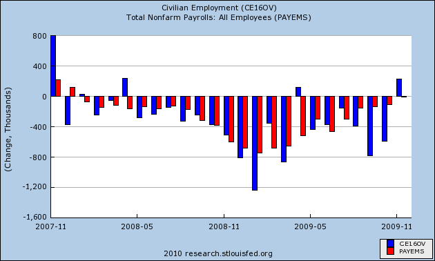
This means the household survey has not yet turned.

II. The other big number reported this morning is the unemployment rate, which remained at 10.0%.

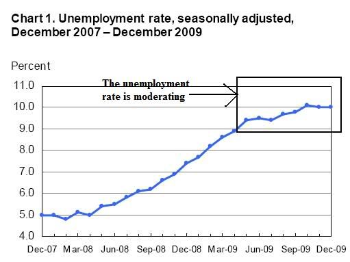
The alternative U6 number rose slightly from 17.2% to 17.3%This is in large part a reflection of the fact that discouraged workers continue to leave the economy. The labor participation rate (how many people participate in the jobs economy) fell to 64.6%. Keep in mind that the unemployment rate is the last thing to turn positive in an economic recovery.

III. While the above are the headline numbers, there are other aspects of the report that are also very noteworthy. The aggregate number of hours worked in the economy bottomed in Ocotber, improved in November, and remained the same in December.

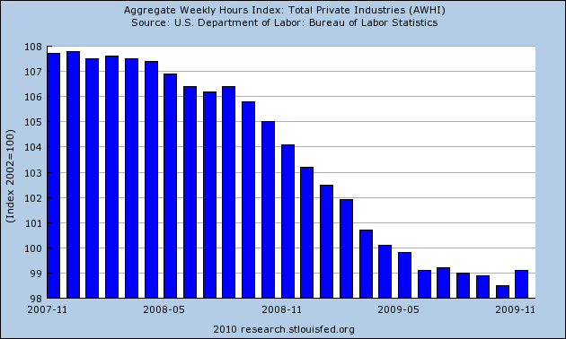
This means that in addition to hiring, hours of work are also increasing. It is also a measure relied on in part by the NBER to date the end of Recessions.


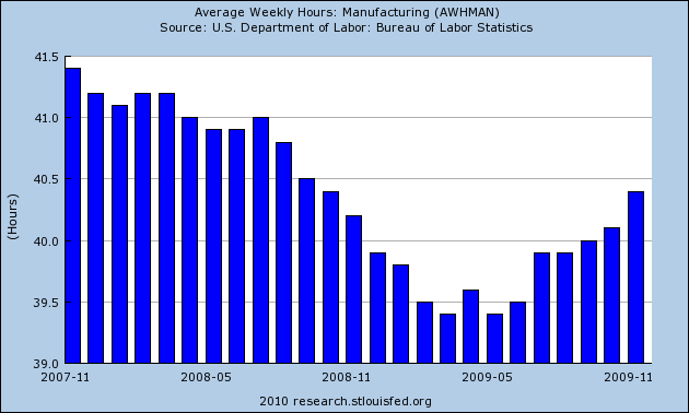
Another noteworthy item is the average number of hours worked in manufacturing. This is one of the 10 Leading Economic Indicators I refer to. It turned up back in the summer, and is an item I said to watch in terms of the possibility of a V-shaped recovery. It has risen substantially since then, but remained even at 40.4 hours from November to December:


One more statistic thought to lead employment is hours worked in overtime, as typically employers will add to overtime in their workers before they hire new ones. This also reamined the same at 3.4 hours:


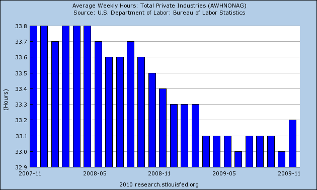
The overall average workweek, which includes services and other jobs as well, remained constant at 33.2 hours:


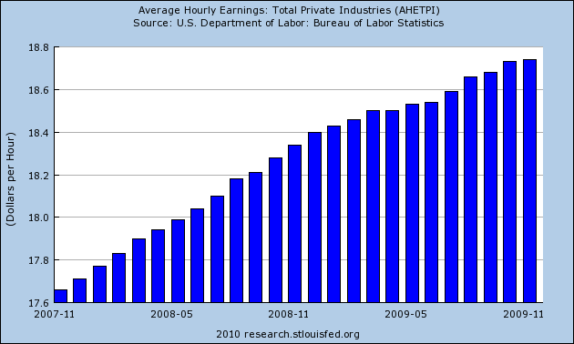
Hourly earnings also increased 0.2%, in line with expectations.


At least on a temporary basis, this is a discouraging report. Expectations were for essentially a 0 number this month. Remember I mentioned at the beginning the upward revision into positive territory of November? That was the 8th time in 9 months that the initial report had been revised higher. I recall the Septemeber report which was initially seen as a very discouraging (-269,000) jobs lost, but two months later was revised to (-175,000). The forward looking parts of this report continue to show improvement (more temporary hiring) or remained intact (overtime, manufacturing hours). The payroll series is notoriously noisy, and the trend -- which is obviously even if we just average over 2 months -- remains that jobs will be added shortly.

Back in September, I said that it was likely that jobs would bottom in November or December, +/- 1 month. While it may be proven false in a month or two, I believe that it remains a reasonable forecast.

Today's Market


On both charts above, notice that prices are poised to move higher in the event of a good jobs number. Both have positive momentum and volume inflows. Both have recently moved through key resistance levels as well. Now all we need is a good jobs numbers

Pre-BLS Numbers, Pt. 2

Earlier today NDD emailed me and asked me to add some charts to the story below (he was away from his computer). I thought the story was fine, but he pressed on. So, I pulled up the ADP employment report which I had never really looked at. So first, let's look at the ADP/BLS comparison.

It's important to remember one big difference between ADP and the BLS: ADP does not include government employees. But with that in mind, notice that in general ADP tracks the BLS' numbers. They seem to jockey for overall position, but in general move in the same direction.

Let's look at ADP in more detail.


First, notice the ADP and BLS reports generally track each other.


The BLS has service employment increasing last month by 58,000. In the latest ADP survey we see an increase of 12,000. So these series agree that service industries are starting to hire again.

As NDD points out, this is in contrast to the ISM service report which had this to say in its latest report:

Employment activity in the non-manufacturing sector contracted in December for the 23rd time in the last 24 months. ISM's Non-Manufacturing Employment Index for December registered 44 percent. This reflects an increase of 2.4 percentage points when compared to the 41.6 percent registered in November. Four industries reported increased employment, 12 industries reported decreased employment, and two industries reported unchanged employment compared to November. Comments from respondents include: "Decrease in occupancy equals decrease in employment" and "Continuing to aggressively manage costs down."

The industries reporting an increase in employment in December are: Other Services; Retail Trade; Finance & Insurance; and Public Administration. The industries reporting a reduction in employment in December — listed in order — are: Arts, Entertainment & Recreation; Real Estate, Rental & Leasing; Mining; Management of Companies & Support Services; Information; Wholesale Trade; Transportation & Warehousing; Accommodation & Food Services; Construction; Utilities; Health Care & Social Assistance; and Professional, Scientific & Technical Services.


The logical conclusion from the ISM report in relation to the BLS/ADP report is the 4 industries that are hiring did so in greater numbers than the 12 that were reporting a decrease in employment. Note that this ISM report is for December (the holiday season) and one of the areas of hiring was retail employment. However, also note that finance and insurance were hiring in the ISM survey and that "professional and business service" employment increased by 86,000 in the BLS survey. In short, it appears as though the professional services sector is very important right now.

In contrast, manufacturing employment is still in the dumps:


But it's important to place this number in historical perspective with two other data points. First, here is a chart of total manufacturing jobs going back to 1979:


Notice that after the last recession we lost about 2.5 million manufacturing jobs that never came back. However --


Overall production (the red line with the arrow underneath it) continued to increase during the 2001 expansion. In other words, the US was making more "stuff," only with fewer people. I would expect that trend to continue after this expansion as well. This means we have two choices regarding the displaced manufacturing workers. Either get more manufacturing business going or retrain them.

However, the BLS and ADP data is in contrast with the ISM Manufacturing survey:

ISM's Employment Index registered 52 percent in December, which is 1.2 percentage points higher than the 50.8 percent reported in November. This is the third month of growth in manufacturing employment, following 14 consecutive months of decline. An Employment Index above 49.7 percent, over time, is generally consistent with an increase in the Bureau of Labor Statistics (BLS) data on manufacturing employment.

Seven of the 18 manufacturing industries reported growth in employment in December in the following order: Apparel, Leather & Allied Products; Printing & Related Support Activities; Petroleum & Coal Products; Paper Products; Transportation Equipment; Machinery; and Electrical Equipment, Appliances & Components. The eight industries that reported decreases in employment during December — listed in order — are: Wood Products; Textile Mills; Miscellaneous Manufacturing; Nonmetallic Mineral Products; Plastics & Rubber Products; Food, Beverage & Tobacco Products; Chemical Products; and Fabricated Metal Products.

In order to coordinate this data with the BLS/ADP data, the logical conclusion is that the number of employers shedding jobs (8 industries) are doing so at a faster rate than those that are adding jobs (7 industries).

Finally, we have initial unemployment claims:


Back in the late spring/early summer, this was one of the first economic numbers that got me thinking the worst was over. Well, it is still moving in the right direction.

Taking all the data into consideration we get the following points:

1.) Service are employment is increasing, despite the numbers from the ISM non-manufacturing survey.

2.) Manufacturing employment is probably going through another round of attrition. That is,, manufacturers are using the current downturn to again shed workers.

3.) Initial unemployment claims continue to move lower.


A Look At Treasury Yields


Click for a much larger image

This is from Singer's Market. Notice the clear implication that Treasury yields are forming a complex head and shoulder's pattern and that rates will soon be moving higher.

This is in line with the general Treasury market consensus regarding the Treasury market this year -- that yields are moving higher.

A Great Conspiracy: The Plunge Protection Team

Recently, a very poorly researched marketwatcharticle which includes the great quote:
Biderman acknowledged that he had no direct evidence that the Fed and other agencies have intervened in the stock market.

has been making the rounds recently as if proof that somehow this "plunge protection team" is rigging the market upward through illegal (or at least government sponsored) equity purchases. Of course, this is not only false on the facts, but it is absurd in reality.

The Working Group on Capital Marketswas established by Executive Order 12631 by President Reagan in response the the 1987 stock market crash and created an advisory group consisting of Secretary of the Treasury, the Chairman of the Federal Reserve, the Chairman of the SEC, and the Chairman of the CFTC (notice that private banks aren't on the team). This group was essentially tasked with ensuring that a future market meltdown wouldn't bleed over into the general economy through the creation of a panic (ie run on banks or a liquidity crisis in the markets). While many have charged this group with directly intervening in the stock market, none have been able to offer any concrete (or even remotely tangible) proof of this occurring.

A great Washington Post article from 1997 sums up the goals of what it labeled the Plunge Protection Teamas follows:
The Working Group's main goal, officials say, would be to keep the markets operating in the event of a sudden, stomach-churning plunge in stock prices -- and to prevent a panicky run on banks, brokerage firms and mutual funds. Officials worry that if investors all tried to head for the exit at the same time, there wouldn't be enough room -- or in financial terms, liquidity -- for them all to get through. In that event, the smoothly running global financial machine would begin to lock up.

Again notice how no mention is made to bankers being a part of this team.

The conspiracy theory that we have seen recently (and ironically throughout most of the market collapse) purported by market bears (who have been burned) is that the Plunge Protection Team (PPT) enters the stock market and buys shares whenever the market falls (or doesn't fall as the case may be). These accusations are so absurd in their lack of empirical support that a diary like this should never have to written in the first place. If this PPT was so powerful, how did the market ever fall from 1500+ to 666 in the first place? That fact alone should send the CTers away, but apparently it doesn't. Second, if the PPT was so omnipotent in their ability to perfectly understand the market, why was Lehman ever allowed to fail when it could have been purchased by the other PPT members for around $10 billion (which is far less money than it would take to manipulate the stock market and would have saved their own stock values from collapsing). Finally, the amount of cash needed to turn a plunge around would be so big that it would be easily noticed and able to be empirically shown as proof.

Instead of proof, what we have is an inane conspiracy theory that like its brethren (the faked moon landing, the lack of gold in Fort Knox, the birthers, etc) has absolutely no proof whatsoever and more importantly has a much more logical explanation....that when markets panic (ie blood in the street) is a great time to buy. In this case, after a long fall to 666 those left in stocks were not selling under any conditions and many intelligent investors saw the blood in the streets and began to buy. Under circumstances like these it is very easy for the market to go up (and quite quickly, although no quicker than many other historical bear market rallies). As a matter of fact even well known bears like Barry Ritholtz were calling for a market rally back in March of this year (is Barry on the PPT?).

Where the PPT was likely involved in this economic panic was back in 2008 when the decision was made to raise FDIC deposit insurance limits and to extend that protection to money market funds in an effort to stop runs. Those types of decisions are exactly what the PPT was designed to do and it appears they were quite successful in stopping an all out panic from ensuing. Sure, those policies had an impact on the stock market (although you wouldn't have known it if you continued to hold), but they were hardly direct injections of cash into the markets that the CTers would have you believe are being made after some secret phone call from Bernanke to JP Morgan.

Once again, what the conspiracy theorists lack in evidence they make up for in their zealous defense of their conspiracies.

Pre-BLS Employment Potpourri

- by New Deal democrat

This morning brought the final Initial Jobless Claims report for December. The BLS reported that seasonally adjusted claims increased slightly to 434,000 from last week's revised 433,000. Non-seasonally adjusted claims were 645,571, an increase of 88,000 from the week before, and well below the 731,958 in the same week last year. The four-week moving average fell to 450,250.

Claims at this time of year are notoriously volatile, reflecting seasonal hiring and firing. The big firing is right now, in a week or two we will see how the trend looks without the seasonal input. That initial claims will rise back above 450,000 at that time would not be surprising at all, but the overall declining trend would remain firmly intact. In the meantime, initial jobless claims are still 31% below their peak of 658,750 last April 3, consistent with actual job growth. Keep in mind, howver, that during the week the BLS made its jobs survey that will be reported tomorrow, the number of initial jobless claims was 480.000.

Monday and yesterday we had a flurry of private employment surveys, including the ISM manufacturing and non-manufacturing indices, the ADP employment report, and the Challenger jobs survey. You can pick and choose whatever you want from these numbers, depending on a bullish or bearish spin, but there are a few trends that are consistent. I'll give you the raw reports first, then distill the similarities/differences.

The Challenger jobs survey showed that
Big U.S. companies announced 45,094 job reductions in December, the fewest since the recession began two years ago. December's total was down 10% from November's 50,349 and down 73% from December 2008.

In the fourth quarter, companies announced just 151,121 job reductions, the fewest since early 2000 and down 67% from the fourth quarter of 2008.
On the other hand, the ADP jobs report
showed large businesses with 500 employees or more shed 34,000 jobs and medium-size businesses lost 25,000 workers in December. Small businesses that employ fewer than 50 workers cut 25,000 jobs.

Service-sector jobs added jobs, by 12,000, the first increase since March 2008, while factory jobs dropped 43,000.
On Monday, the ISM manufacturing report's employment index came in at 52, indicating that more employers were hiring new employees than planning layoffs. The overall index came in at 55.9, the highest since before the recession and above the 53.0 reading which in the past has coincided with actual job growth.

But on Wednesday, the ISM non-manufacturing report's employment index remained firmly mired in contraction, at 43.0, a rebound from the prior month, but still slightly below October's reading of 43.7. This index has consistently been the most negative of all indices, and best shows the small business pessimism that Invictus has reported a number of times emanating from the NFIB, which represents small businesses. With the exception of exports, however, all other indices -- production, new orders, vendor deliveries -- all showed expansion and improvement, the first time all of the other indices have been above 50 since the onset of the recession two years ago. Furthermore, the ISM said:

Respondents' comments vary by industry and, for the most part, are either neutral or slightly more optimistic about business conditions."
* "Economy seems to have leveled off with expectation of an upswing in our business in Q1 2010." (Professional, Scientific & Technical Services)
* "There has been a slight upturn in our business activities; however, it is not entirely attributable to any one particular source." (Public Administration)
* "The environment seems to be improving, but we will continue to be cautious as we look forward." (Retail Trade)
* "The current economic conditions are continuing to have a flat or negative effect on our business." (Wholesale Trade)
* "No items in short supply; suppliers looking to set up agreements for 2010 with quarterly or semiannual price reviews." (Arts, Entertainment & Recreation)
Now, let's break out some consistencies and discrepancies among the reports. First of all, notice that the ISM and ADP reports in particular contradict one another.
* ISM has been showing increasing employment in manufacturing for several months. ADP continues to show contraction.
*But in services, it is ADP that is now showing expansion, while the ISM shows continued significant contraction.
*The ISM report is most in sync with the NFIB's suggestion that job losses are now relatively concentrated in small businesses. The ADP report, however, suggests no such concentration.
*The ADP report suggests a negative jobs report Friday from the BLS. The Challenger report, with its striking assertion that the last 3 months have seen the fewest layoffs in almost the last 10 years, argues for a strong BLS report tomorrow, and is very strong evidence of my thesis that employers have been "hoarding" jobs.

What is consistent across almost all of the reports is continued improvement from October to November to December (the outlier is ISM non-manufacturing). In other words, the trend towards positivity is plain and is intact. This does not necessarily mean a positive number in the jobs report tomorrow from the BLS. The BLS jobs survey is quite noisy from month to month, and it would not be a surprise if the November report of -11,000 were an outlier from the general trend. But we should expect a BLS report considerably better than October's -111,000. I would expect a range anywhere from about -70,000 to +80,000, with the midpoint of the distribution somewhere just to the positive side of 0, per my previous research. On the other hand, J.P. Morgan economists have reported that in the last year, the ADP payrolls number has averaged 62,000 below the BLS number, which would suggest the midpoint of the distribution for tomorrow's report is -22,000.


Wednesday, January 6, 2010

Thursday Oil Market Round-Up


A.) Since late December there have been 4 gaps higher in the oil market.

B.) The EMA picture is turning decidedly bullish: the 10, 20 and 50 day EMA are moving higher, the 10 day EMA has crossed over the 20, 50 and 200 day EMA, the 20 day EMA has crossed over the 50 day EMA and the 10, 20 and 50 day EMA are moving higher.

C.) Volume has been increasing for the last week+.


The 10 day chart shows some more detail

A.) Prices have gapped higher three times in the last 10 days.

B.) After gapping higher, prices consolidated in an 80 cents range.

C.) After gapping higher prices again consolidated in a narrow (60 cents) range.


A.) Momentum is increasing as is

B.) The A/D line.

Today's Market


A.) The Transports broke through upside resistance but then broke their trend.

B.) Prices are consolidating about the trend line.


A.) Momentum has turned negative, but

B.) We're not seeing a huge cash outflow from the market yet, although we the A/D has edged down over the last few days.

An Update re Federal Tax Receipts

- by New Deal democrat

In comments to an earlier post of mine today, our very favorite troll showed up to take "Bonddad" to task for overlooking the precipitous decline in Federal tax receipts, demonstrating that we were touting a "recovery-less recovery."

Our troll no doubt read a post that originated with Lee Adler of the Wall Street Examiner, who has blogged about this a number of times. Lee Adler and Russ Winter of that site are pretty smart cookies (Lee was one of the few people who called the 2008 market crash a few weeks ahead of time). Unfortunately, they decided to go to a $$$ subscription-based service, and their readership plummeted (including me). Even more unfortunately - for them - it appears they have been bearish throughout the last 9 month rally.

Lee Adler's point is that Federal tax receipts are still down year-over-year, so of course there is no recovery. Unfortunately (there's that word again), this is a classic case where simply citing YoY numbers misses important turning points.

Let's look at what the Federal tax receipts actually show. The raw data is available, on a daily basis, at this page at the US Treasury's website. Below is a chart of the month-end data from September through December 2008 and 2009, with the %age change:

Month / $Billions 2008 / $Billions 2009 / YoY % change

September 142,759 / 128,216 / -12.3%
October....142,514 / 117,170 / -17.8%
November. 135,620 / 127,673 / - 5.8%
December..167,634 / 154,923 / - 7.8%

Let's review:
1. The absolute bottom was in October
2. The maximum YoY% decline was in October.
3. In 2008, November's receipts were less than October's.
4. In 2009, November's receipts were more than October's.

Historically, treasury receipts bottom one to two quarters after the end of a recession. (After all, businesses don't start paying withholding taxes until *after* they hire new workers, right?).

Conclusion: Most likely, October was the bottom for tax receipts.

Looks like the Doomers are going to have to move the goalposts again.

For The Love of God .. Can We Get Any Dumber?

From Marketwatch:

Charles Biderman, chief executive of TrimTabs Investment Research, is the latest and most credible person to charge that the Federal Reserve and the Treasury (in league with top Wall Street firms) is rigging the stock market on a daily basis.

In a special report released Tuesday, Biderman said the $6 trillion increase in U.S. stock-market capitalization since March can't be explained by the usual sources of funds flowing into the market -- such as mutual funds, direct retail investment, pension funds, hedge funds or foreign purchases. Read more about Biderman's theory.

The only logical explanation for the extent of the rally, he suggested, is secret buying by a government committee known colloquially as the Plunge Protection Team. It's like the dark matter that astrophysicists conjecture must be there, even if we can't detect it.

The PPT was established by President Ronald Reagan in 1988 after the 1987 stock crash to coordinate the government's response to market meltdowns. It consists of the Fed chairman, the Treasury secretary, the head of the Securities and Exchange Commission and the head of the Commodity Futures Trading Commission.


But here's the absolute best part of the story:

Biderman acknowledged that he had no direct evidence that the Fed and other agencies have intervened in the stock market. But he worried about what will happen to the market if the PPT has been buying and suddenly stops


He has no proof -- none, nada. He admits he has no proof. And yet he goes out and spouts this crap. And then -- Marketwatch gives him an audience. When did Marketwatch become Daily Kos?

Here's a news flash for you. It's right from the book, Winning on Wall Street. When interest rates go down, buy stock. Why? Because financing for companies is now cheaper, so it costs less to expand. That's econ 101. No -- that's before econ 101.

Previewing December Real Retail Sales

- by New Deal democrat

As most of you know, my analysis is geared towards when will the economy start to add back jobs? It may have been last month.

With yesterday's release of December auto sales and ICSC same store sales, we have enough to make a rough guess of December real retail sales, which I have described as the "Holy Grail" leading indicator for job growth.

Auto sales were up ~3% from November to 11.25 Million annualized (and the best showing since Black September 2008). Here's the graph (h/t Calculated Risk):


Meanwhile, the ICSC reported sales the week after Christmas up 1.5% WoW and 2.5% YoY. December is probably going to be up about 0.6% from November and about 2.0% YoY. Here's a graph of both WoW and YoY same store sales for 2009 (h/t Retail Sails):


Auto sales constitute about 1/4 of all retail sales. That gives us a weighted average of about +1.2%. I'm going to knock that number down by 1/2 to 0.6% because increases in auto sales recently haven't directly translated into the equivalent increase in the official retail sales number. Subtract 0.2% for estimated December inflation, and you get a Real Retail Sales increase of +0.4%. That's about +2.2% from the April smoothed bottom, or about a 3.3% annualized rate. Now, that's just a back-of-the-envelope guesstimate, so simply figure it is going to be a decent positive number.

Together with Monday's good ISM manufacturing data, which probably presages a decent increase in Industrial Production in December, and all of the ingredients (with the possible exception of the ISM non-manufacturing report) appear to have come together for an actual positive jobs report.

Pending Homes Sales Drop; Factory Orders Up

From the National Association of Realtors:

The Pending Home Sales Index,* a forward-looking indicator based on contracts signed in November, fell 16.0 percent to 96.0 from an upwardly revised 114.3 in October, but is 15.5 percent higher than November 2008 when it was 83.1.


Click for a larger image.

Let's make a few observations.

The drop occurred in November when it looked as though the first time homebuyer tax credit would expire. That is what is probably behind this number. Also note that with the credit the index saw 9 months of increases. That tells us that with the reinstatement of the credit we should see this number moderate over the next few months. In other words, the fundamental situation in this market has clearly changed for the better.

From Marketwatch:

In a further sign that the U.S. factory sector is emerging from recession, businesses stepped up their demand in November for capital equipment to expand production, the Commerce Department reported Tuesday.

Factory orders increased 1.1% in November, greater than the 0.8% expected by economists surveyed by MarketWatch. See Economic Calendar.

This is the seventh increase in the past eight months.

October's orders were revised higher by two-tenths of a percent to 0.8%.


As noted on this blog over the last ~6 months, the manufacturing sector has been continually improving from its extreme lows at the end of last year/beginning of this year. Notice the strength in these numbers: this is the 7th increase in 8 months. That's very strong. Here's a chart:


Wednesday Commodities Round-Up


A.) This is the first upward sloping trendline of the copper chart. Prices broke this trendline at the end of September/early October.

B.) This is the second trendline of the copper chart. While prices broke this trendline in December, they have since rallied above it.

C.) Along the way we prices have consolidated in various standard consolidation patterns.


A.) The EMA picture is very bullish. Prices are above the EMAs, all the EMAs are moving higher and the shorter EMAs are above the longer EMAs.


A.) Momentum is increasing again. Also note it is advancing from a low/weak level.

B.) The A/D line has been advancing for the last 6 months. This tells us money is moving into the security.

Tuesday, January 5, 2010

Today's Market


Click for a larger image

A.) Prices broke through upside resistance today.

B.) the MACD has given a buy signal -- but it's a weak buy signal. The overall trajectory of the signal line is weak. Ideally, we'd like a far steeper line.

C.) The A/D line has been in a range while prices consolidated. The good news is that we haven't seen a big drop -- people have not sold en masse.

Krugman the Politician

From the NY Times:

As you read the economic news, it will be important to remember, first of all, that blips — occasional good numbers, signifying nothing — are common even when the economy is, in fact, mired in a prolonged slump. In early 2002, for example, initial reports showed the economy growing at a 5.8 percent annual rate. But the unemployment rate kept rising for another year.

And in early 1996 preliminary reports showed the Japanese economy growing at an annual rate of more than 12 percent, leading to triumphant proclamations that “the economy has finally entered a phase of self-propelled recovery.” In fact, Japan was only halfway through its lost decade.

Such blips are often, in part, statistical illusions. But even more important, they’re usually caused by an “inventory bounce.” When the economy slumps, companies typically find themselves with large stocks of unsold goods. To work off their excess inventories, they slash production; once the excess has been disposed of, they raise production again, which shows up as a burst of growth in G.D.P. Unfortunately, growth caused by an inventory bounce is a one-shot affair unless underlying sources of demand, such as consumer spending and long-term investment, pick up.


Krugman is essentially arguing that the current economic news is in fact a "blip" -- good news that is transitory, largely because of the "inventory bounce." He then argues that the good news will all go away soon. But let's look a little further. What's his proof? Notice how there is no mention of a specific set of numbers from the current economic news which bolsters his argument. He is merely saying "it's happened before." Using Krugman's logic we might as well bet on the Florida Marlins to in the World Series this year. Why? They've won it before.

What Krugman is really saying -- and what he should have outright said -- is we're not out of the woods yet and we need to guard against thinking we are out of the woods. That would have been an entirely appropriate argument to make. This is an argument against "getting comfortable" with the current situation when in fact the economy still has a long way to go.

Let me also add, I stand by my statement that the economy is clearly mending. In my 2009 year in review I made the following conclusions:

So in conclusion,

1.) Manufacturing is making a strong recovery.

2.) Housing is on the mend, although there is still work to be done

3.) The consumer is spending again, although weakly

4.) It appears the economy will start to create jobs over the next few months

5.) The economy grew in the third quarter

In short, the recession is clearly over. However, growth is weak. But, considering where we started the year, we're actually doing pretty well.


Click on the link to see the reasoning behind the conclusion. Agree or disagree as you like. But if you disagree -- please provide data instead of your (or someone else's) opinion.

No Virginia, the Government Isn't Manipulating Economic Statistics

One of the greatest themes around the economic blogsphere is the government is manipulating the numbers to make things look better than they are. However, this is an easily debunked claim.

The latest source for this claim is a story from the New York Times. Here are the first three paragraphs from that story:

A widening gap between data and reality is distorting the government’s picture of the country’s economic health, overstating growth and productivity in ways that could affect the political debate on issues like trade, wages and job creation.

The shortcomings of the data-gathering system came through loud and clear here Friday and Saturday at a first-of-its-kind gathering of economists from academia and government determined to come up with a more accurate statistical picture.

The fundamental shortcoming is in the way imports are accounted for. A carburetor bought for $50 in China as a component of an American-made car, for example, more often than not shows up in the statistics as if it were the American-made version valued at, say, $100. The failure to distinguish adequately between what is made in America and what is made abroad falsely inflates the gross domestic product, which sums up all value added within the country.


Let's look at the third paragraph in detail, especially the opening sentence. "The fundamental shortcoming is in the way imports are accounted for." So, the issue is not with an entire group of statistics but with the way we count imports. The net effect of this problem?

The statistical distortions can be significant. At worst, the gross domestic product would have risen at only a 3.3 percent annual rate in the third quarter instead of the 3.5 percent actually reported, according to some experts at the conference. The same gap applies to productivity. And the spread is growing as imports do.

So -- the very worst reading of the data as it currently exists would have subtracted .2 from US GDP. And that's the worst reading of the distortion -- the worst. And yet, this news article has been cited as proof that the official US government statistics are way off.

Then there is "Shadowstats." . Many people cite them as proof positive the US government is distorting the data. For example, here is a chart of their CPI calculation.


However, there is a big problem with claiming the blue line is the correct measurement of inflation. It comes in the form of bond yields:


If the blue line on the shadowstats graph were the correct inflation measure, bond yields would be at least 400 basis points higher. Why? If shadow stats were correct, then bond investors would have been losing money for most of the 2001-2008 period because inflation was higher than the stated interest rate on the 10-year Treasury bond. Simply put, investors would not put up with that and instead would have sent yields far higher for the last decade. Yet they did not. That tells us that Shadow stats CPI number is wrong.

And if there was a grand conspiracy regarding US economic statistics, where are the academic papers specifically showing why certain numbers are wrong? For example, go the National Bureau of Economic Research and the social science research network. Then search both for "birth/death model." According to literally the entire economic blogsphere this statistical adjustment to the establishment job numbers is an abomination (Except A Dash of Insight who explains why the criticism is unwarranted here, here and here.) Yet there are no papers from academics on why this number is wrong. Type in "US import prices" and you get the same thing -- nothing. Simply put, there is no huge outcry from the people who should be doing that -- academics.

In summation, we have the following points:

1.) The New York Times story that supposedly shows a massive conspiracy regarding government statistics has been taken massively out of context.

2.) Shadow Stats is bunk, plain and simple. Or to quote professor Jim Hamilton:

Why do people continue to give credibility to an operation like Shadowstats? Now that's something that I'd like to hear explained.


3.) The people who should be publishing papers showing the massive distortions in US government numbers aren't publishing those papers.

In short, the claim the numbers are cooked is great for headlines to drive traffic to your site, but that's about it.

Global Manufacturing Rebounding

From the WSJ:

In Asia, where countries in large part weathered the downturn better than their Western counterparts, manufacturing is heating up inflation concerns.

The HSBC purchasing managers' index for India hit its highest level since May, and for China rose to the highest level in 20 months. The reports Monday came as Asian countries considered dialing back fiscal-stimulus efforts and easy monetary policies adopted during the crisis.

Australia's central bank was among the first to raise its key policy rate, and market watchers were waiting to see whether such recovering nations as India and South Korea would follow suit.

Purchasing managers' indexes for Germany, Italy and France also rose. In Britain, the manufacturing sector expanded at its fastest pace in more than two years, indicating the U.K. economy may have emerged from recession in the fourth quarter.

Why is this important?

Manufacturing's share of the U.S. economy is much smaller than it was in the 1980s. But it remains an important bellwether, highly sensitive to changes in the economy. Many nonmanufacturing businesses -- from car dealers to long-haul truckers -- rely on its good health to survive.

Manufacturing is still a good indicator of when an economy is turning around. That's why we look at it.


Treasury Tuesdays


Notice the following on the month long IEF chart.

1.) There are a total of 20 candles on the chart. 12 are bearish (red).

2.) There are 8 gaps down on the chart

The price EMA picture is extremely bearish: prices are below all the EMAs, all the EMAs are moving lower and the shorter EMAs are below the longer EMAs.


A.) Momentum is clearly decreasing and

B.) Money is starting to flow out of the ETF

Monday, January 4, 2010

Today's Market


The above charts are of the Russell 2000 and the Russell micro-cap. Both of these indexes jumped today. This is good news. There indexes are good risk proxies.

Market Mondays, Continued


A.) This is the first trend line supporting the DIAs, which the index broke in late October

B.) The second trend line is still intact.

C.) Volume has been decreasing, however ...


Note that current volume levels are still higher than those that existed in the 2001+ rally.


A.) Momentum is negative.

B.) Volume inflows are still positive.


A.) The EMA picture is bullish. The shorter EMAs are above the longer EMAs and prices are above the EMAs. Finally -- all the EMAs are moving higher.

The good: Prices are still in an uptrend, the EMA picture is positive and volume has not flown out of the market.

The neutral: upward price movement has started to move in a more sideways direction.

The Bad: momentum just isn't there right now. Declining volume may be an issue.

Revisionist History and the Housing Bubble

Following Ben Bernanke's speech discussing the role that a lack of regulation played in the creation of the housing bubble versus the conventional wisdom that the Fed's low interest rates caused the bubble (a position of Bernanke's that I agree with), I wanted to delve a little deeper into this topic and show just why blaming the low interest rates for the housing problem is not only wrong, but a revisionist history.

First, we must recognize when the housing bubble actually began. This is important because bubbles need to be stopped early in their creation in order to be able to eliminate potential draconian economic side effects of popping a bubble that is already in its blow off top phase. This graph of housing prices clearly indicates that the housing bubble really began in the mid-late 90's when housing decoupled from inflation in a meaningful way.
house prices v inflation
Sure, the acceleration in prices didn't reach its peak until the 2004-2006 period, but by then any popping of the bubble would have had (as we now know) severe economic consequences and thus the fed would have needed to act much sooner in the process to minimize economic pain (remembering that acting to reduce home prices/appreciation wouldn't have been exactly a popular move).

Next, we need to examine the issue of subprime lending as a cause of the housing bubble. The following graph details both the cash volume and percent of originations that were subprime by year.
subprime originations
As you can clearly see, subprime didn't go nuts until 2004, which was the beginning of the blow off top and really only occurred about a year before we hit peak pricing. This would have left the Fed with very little time to act prior to the bubble bursting on its own and again, due to price appreciation having run wild prior to that already, would have made the Fed look like it was taking punitive action home-owning America.

Now, let's get on to the crux of the issue, which is the Fed's 1% interest rate that supposedly caused the housing bubble to corrupt our economy. The graph below shows the fed funds rate versus the 10-year treasury yield (which is important since many loans are tied to the 10-year).
Fed Funds Rate Vs 10 year
The graph clearly shows that the 10-year yield didn't move up even when the fed rapidly increased rates beginning in 2004 (again, right before the bubble peak), which implies strongly that something else was keeping interest rates low besides the Fed (maybe it was our huge trade deficit?). So, the idea that the Fed's low interest rates caused the housing bubble by keeping mortgage rates too low seems less than accurate, especially when one also considers that the housing bubble began in the mid-late 90's interest rates were still well in excess of 7.5% (for a 30 year mortgage).

Another argument that has seemed to gain steam is that somehow the Fed's low interest rate policy of the 2001-2004 period forced investors to seek high yields, which then directly lead to the blow off in the housing bubble. This is again leaves out the regulation bit, since the ratings agencies should have prevented the sub-prime securitizations from being tagged AAA and again gets us back to the yield on the 10 year, which was quite stable even after the Fed raised rates in 2004. It seems to me like the much bigger problem was that we had a world awash in dollars from our consumer spending that had to go somewhere and they ended up in treasuries. And finally, it shouldn't be the job of the Fed to give bond funds investment options.

Finally, all this revisionist thinking completely ignores the fact that the US economy was in a recession/jobless recovery during this period of low interest rates and that tightening at the time would have lead to a much deeper recession that would have been blamed (rightly so) on the Fed (much like the 1982 recession). Going after house prices during the recession would have been politically impossible at a time when there was no job creation, stocks had just fallen sharply, and overall inflation was still low. To top all of that, it may not have had an effect anyways since even when the Fed did tighten, longer term rates stayed low. May this serve as a reminder to those calling for interest rate hikes now, you may be right in the long term, but the Fed has shown that it will choose growth over potential down the road inflation/bubbles.

A Comment on Glass Houses

First thing Friday morning, like clockwork, the right-wing spin machine will go into overdrive with an update of a graphic (see immediately below) from the Obama team's (Romer & Bernstein) January forecasts regarding the projected unemployment rate with and without the stimulus package (and what has "really" happened). It is cited far and wide on nonfarm payrolls day (just watch Sean Hannity) as an example of Team Obama's incompetence and/or failed stimulus. I hereby call bullshit, for the simple reason that the Bush team's economic forecasts (see Table 1-1 below) make Team Obama look like a bunch of geniuses.

To those who are so inclined, you might want to point the right wingers to the following table, which comes straight out of the February 2008 (month three of the recession) Economic Report of the President, and turned out to be pure fantasy (e.g. "In 2009 and 2010 real GDP growth is projected at 3 percent, thereafter slowing, while the unemployment rate is projected to remain stable and below 5 percent in the 2009–10 period."):

The Bush team's forecasts on GDP, the unemployment rate, and nonfarm payrolls (to cite what's truly important) are so laughably off the mark one has to wonder what -- if any -- modelling they were doing (e.g. a 4.8 percent unemployment rate in 2010, adding 1.3 million jobs in 2008 and another 1.5 million in 2009?). Further, a more realistic assessment in early 2008 could have provided our "leaders" (there's a joke) with a better roadmap to navigate the downturn. These forecasts should be categorized under "Those Who Live in Glass Houses."

Enough of the absurd partisan idiocy. It's petty and counter productive. Those who want to make hay with the Romer/Bernstein forecasts -- which they will, just wait until Friday -- first need to explain the hideously pathetic forecasts put forth by Team Bush. Feel free to drop explanations for Table 1-1 (above) in comments. So by all means, bring it. Otherwise, just STFU. Seriously.

December ISM Manufacturing expands faster, employment growing

The Institute for Supply Management's December Manufacturing Index came out, rising at a slightly greater rate than expected. The summary is as follows:

PMI 55.9 53.6 +2.3 Growing Faster
New Orders 65.5 60.3 +5.2 Growing Faster
Production 61.8 59.9 +1.9 Growing Faster
Employment 52.0 50.8 +1.2 Growing Faster
Supplier Deliveries 56.6 55.7 +0.9 Slowing Faster
Inventories 43.4 41.3 +2.1 Contracting Slower
Customers' Inventories 35.0 37.0 -2.0 Too Low Faster
Prices 61.5 55.0 +6.5 Increasing Faster
Backlog of Orders 50.0 52.0 -2.0 Unchanged From Growing
Exports 54.5 56.0 -1.5 Growing Slower
Imports 55.0 51.5 +3.5 Growing Faster

The Index indicates that the "OVERALL ECONOMY" has now been growing for 8 months, and manufacturing for 5.

-----------

The Index has now grown faster than in either of the past "jobless recoveries" for the last 3 months, and is growing faster than at any time since before the recession. Employment also continues to expand. The forward leading components of New Orders, Production, and Vendor Delieveries all show continuing strength going forward.

With specific regard to jobs, this report adds support for the idea that more likely than not, Friday's jobs report will show the first growth in employment in over two years.

In summary, this is a good report.

Market Mondays, Continued


A.) The IWMs bottomed in March like all the other averages on extremely heavy volume.

B.) After rallying from the bottom they ran into resistance around the 200 day EMA. At first the average consolidated in a triangle pattern and next in a downward sloping pennant pattern.

C.) After rallying above the 200 day EMA, prices again consolidated in a broadening pattern.

D.) This is where the IWMs diverge from the other averages. In September and October the averages formed a double top. This is a classic reversal pattern. And notice that after falling through support, prices fell to a shade above the 200 day EMA.

E.) After falling, prices rebounded and are now about the previous highs established in the double top.


A.) There are two trend lines with the IWMs. Prices violated the first one in September.

B.) But the second one is intact.

C.) Note that momentum is increasing as is

D.) The accumulation/distribution line.


Finally, notice the EMA picture is bullish -- all the EMAs are moving higher, the shorter EMAs are above the longer EMAs and prices are above all the EMAs.

The IWMs are a good proxy for the risk trade -- that is, when people are willing to take on more risk they will put money to work in small cap stocks. That's why the double top and following rebound are so interesting. Did the risk market blow off some steam and then start rallying again? And more importantly -- will that lead the market higher?

The Good: The uptrend is still in place. The EMAs are bullish. Momentum is increasing. Money is flowing into the shares.

The Neutral: Prices have recently fallen to the support line established by the second high of the double top. Support needs to hold at this level;

The Bad: The volume drop-off at the end of the year. But, that is pretty standard for end of the year trading.

Market Mondays

I hope everybody had a safe new years eve. Let's start out the new year with a look back at all the indexes starting with the NASDAQ.


There are two trend lines for the QQQQs. A -- which the index broke in September and B which is still good. However, also note the declining volume for the rally (C). This is very important because it tells us that people are less and less excited about the market.

However, consider this longer term chart (which you will have to click to see the point):


Above is a chart that highlights the QQQQs daily volume over the last 6 years. I have drawn a red line from the lower points in November and December of this year going backwards. Notice how the low point in this rally's volume is consistent with volume prints from 2004 and 2005. In other words, you could argue that from a volume perspective we're returning to normal.


There are two sets of consolidating patterns. The first (A) occurred around the 200 day EMA. The first consolidation pattern -- a triangle -- occurred right around the EMA, which the second approached the 200 day EMA from above. The second set of consolidating patterns are simple corrections and consolidations that occurred within the overall upward trend.


A.) Momentum has been decreasing since August, although the MACD moved through the trend line recently.

B.) Note that for the last 4 months we haven't seen a big move into or out of the market -- the overall A/D line has been in a very narrow range.


The EMA picture is bullish: the shorter EMAs are above the longer EMAs, prices are above all the EMAs and all the EMAs are moving higher.


The A/D line dropped in October and has stalled since then. But


The new high new low line continues to rise.


Let's wrap up:

The good: there is still an uptrend in place and the EMA picture is bullish.

The neutral: while the MACD has broken through resistance, we need a bit more time for the trend to be real. In addition, we have a neutral Accumulation/Distribution line. The advance/decline line is borderline neutral bad.

The bad: declining volume for the entire year. However, we could also look at this as a return to more normal volume prints if we compare the volume.