Fourteen months ago, I wrote that
Some time ago, Prof. Brad DeLong of Berkeley, thinking aloud with graph, drew a line across the 1991 and 2001 recessions and recoveries, making a "note to self" that it appeared that Initial Jobless Claims post those recessions had to decline to 400,000 or less before payroll jobs were added. Thus, mused Prof. DeLong, it must be so as well, post this "Great Recession." This "note to self" was subsequently repeated by Bill McBride at Calculated Risk, from which it has now been picked up and repeated at Prof. James Hamilton's site, Econbrowser....Well, we know how that turned out, enabling me to do a little victory dance in March.
IT IS WRONG.
....
I am utterly confident that there will be job growth long before jobless claims fall to 400,000.
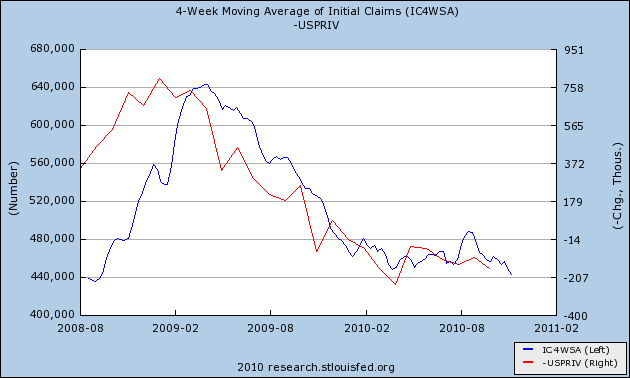
With initial claims finally falling below 440,000 in three of the last four weeks, on Friday I posted this graph, showing initial jobless claims in blue, left scale, and private nonfarm payrolls, inverted, in red, right scale :

Over the weekend, I decided to take a little more sophisticated look at what might be in store if jobless claims are truly breaking out to the downside, and continue to decline to 400,000 or even less, which seems increasingly likely as real retail sales in the last four months have grown at a rate of 10% annualized.
Exactly as I did in my analysis last year, I am comparing this jobs recovery against the job recoveries from the two least severe recessions (1974 and 1982) and using that as the template.
Here is a scatter graph comparing the decline in initial jobless claims from peak to trough (y axis) following the 1974 recession with nonfarm payrolls (x axis):

Here is the same scatter graph for the jobs recovery from the peak of the 1982 recession (note I have deleted two months in 1983 where a strike caused a loss of 1 million jobs in one month and a similar gain the next when the strike ended):

Here is the same graph for our jobs recovery so far (note I am using private jobs only to eliminate distortions due to the census):

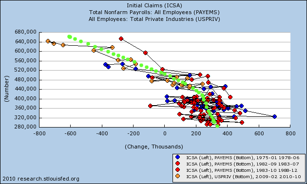
Putting the three jobs recoveries together, here is the scatter graph we get:

Focusing on that part of the graph that only shows the correlation of payrolls for jobless claims under 450,000 gives us this:

While I don't have the software to do this scientifically, the trend line averaging the data from the three jobs recoveries is probably very close to the curved trend line I have drawn in light green:

This suggests that at a monthly average of 440,000 initial jobless claims a week, the average monthly payrolls gain is about 175,000 to 200,000, and gradually increases as initial jobless claims decrease. But there is an awful lot of variance, so that - as the graph immediately above the last one shows - at until such time as jobless claims drop below 360,000, even excepting a few outliers, any given month may give a number as low as ~75,000 or as high as ~350,000.