I had sorta promised an update to my "When will the Economy Add Jobs?" series this week, but since both industrial production and real retail sales will be updated next week, and I think both of them are going to be quite interesting from the jobs perspective, I've decided to defer my update until then. In the meantime, there are three items that shed some other perspectives on the subject.
From the Rockefeller Institute via Barry Ritholtz, here is a graph of Real Retail Sales comparing the last 5 (really 6, since they've combined 1980 and 1981) recessions:
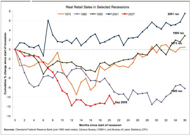
This graph shows nicely the slope of improvement in real retail sales for all of the recessions. Note also the flat sales for the entire 2001-02 period (ex- the post 9/11 arrhythmia), and flat sales after a false start in 1991 -- presaging the "jobless recoveries" of 1992 and 2002-03. We've had flat sales since last December or this March, which may or may not have begun to trend upward with "cash for clunkers." More on this next week.
From the Conference Board, this is their Employment Trends Index (not including the last 2 months - this is the most updated version I could find):
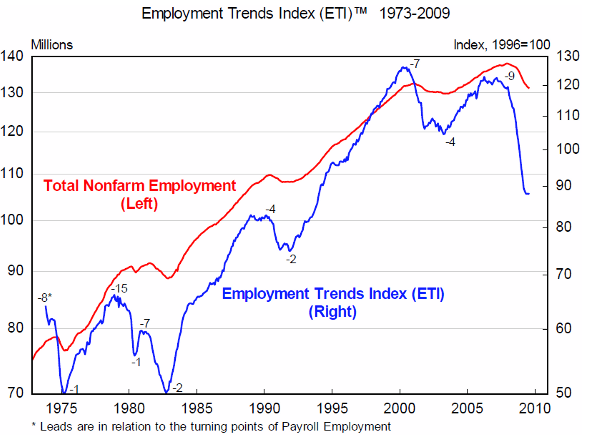
You may recall that I have spent a lot of time researching leading indicators specifically for jobs. It turns out the Conference Board has also done that, and last year they premiered this Index as their leading indicator. Note that at previous troughs, it has turned 1-4 months before the BLS jobs number. The ETI made a bottom in August, and has been up the last two months (from 88.3 to 89.3). Interestingly, the Conference Board's Senior Economist, Gad Levanson said: “The Employment Trends Index has likely turned a corner in September, and the historical relationship between the index and employment suggests that job losses will end in early 2010,” i.e., 5 or more months later. I suspect this has something to do with the strength of the rebound or fear of a "false dawn," but they're not saying.
Finally, this is graph from Prof. James Hamilton at Econbrowser, showing the percentage of the average US consumer's budget that goes to energy purchases:
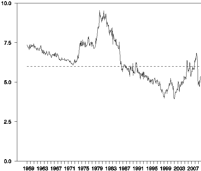
Hamilton says that:
When this share rises above 6%, it seems to become a more significant factor. The consumer energy expenditure share peaked [in 2008] at 6.8%, but collapsing energy prices subsequently brought it back down to 4.7%. The resurgence in oil prices this summer had pushed that share back up to 5.4% in September [2009].
He also says:
What do these estimates imply looking forward...? The relation ... assumes that there is a threshold effect before the next oil price shock would begin to do its damage. According to that relation, oil has to get back above $130....
I have included this graph because I believe (as do many others) the price of Oil is the most serious challenge to the sustainability of the economic expansion.
The entire article is well worth reading, and I encourage you to click on the link and go over and do so. This past "Great Recession" was maybe half really an Oil Shock, and Hamilton's research backs that up (as he explains in the post I link to). It appears that his research calls for more positive GDP this quarter.
It is also worth recalling that Hamilton's research suggested that there might abruptly be a positive jobs number in October 2009. Silver Oz has indicated that, except for the BLS applying an outsized seasonal adjustment last month, the jobs number would in fact have been +51,000.