The Bonddad Blog
Still nerdy after all these years
Tuesday, July 3, 2007
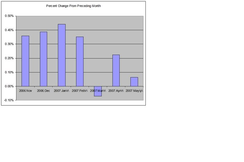
More On PCEs
Here is a chart of the month over month percent change in personal consumption expenditures in chained 2000 dollars. Notice the drop-off.
Also see
The Big Picture
and
Calculated Risk
Newer Post
Older Post
Home