- by New Deal democrat
[Note: I am having a major issue with formatting photos today, which will be readily apparent. I will fix this as soon as I am able.]
This is the second part of my discussion of the likely US trajectory of the BA.2 Omicron subvariant. Part one was Friday, and if you missed it,
here is the link.
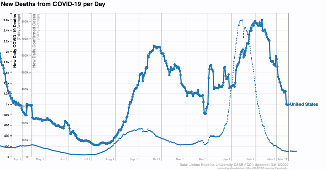
First, a brief update. Cases in the US are now slightly below 30,000. This is the lowest since last August except for two days after Thanksgiving. Deaths have declined to 866. If deaths, like cases, decline over 96% from their Omicron peak, that will mean there will be only about 100 deaths per day in about a month.
To quickly refresh, there have been many warnings about the new BA.2 wave which has overtaken much of Europe, specifically including the UK, and warning that the same is in store for the US.
The truth appears to be more complicated. As I wrote on Friday, “the data she has collected demonstrate that BA.2 is very much an Omicron, rolling in and out like a tsunami. Like BA.1, the BA.2 variant causes peak infections by or very shortly after it approaches 100% of all infections.” To cut to today’s chase, the course of BA.2 in any given area depends on the level of previous infection by BA.1:
- Where BA.2 overtook BA.1 very quickly, there was only 1, more intense and longer lasting, wave.
- Where BA.2 only overtook BA.1 after a long time, there were relatively few people left who BA.2 could reach, resulting in a “long tail” of declining cases, but no new wave.
- Only where BA.2 overtook BA.1 after its peak, but - probably because of better mitigation efforts - there were lots of people left who BA.2 could reach, has there been a new wave. The
Let’s start with the 26 countries in the EU. Like me, you’ve probably seen the graph showing cases rising sharply in some EU countries. Here’s what the entire Union, plus the UK, looks like:
1. There are a number of countries in the EU - Norway, Sweden, Denmark, Poland, Lithuania, Latvia, Estonia, Hungary, Bulgaria, Czechia, and Spain - where no increase has happened at all, and in fact cases are decreasing.
2. There are 15 countries where cases bottomed and started increasing between February 24 and March 9, the majority of which were between March 1 and March 3.
3. Of those 15, 6 - Ireland, Belgium, the Netherlands, Cyprus, Finland, and Portugal - appear to have already peaked, generally about 2 to 2.5 weeks after the increase began. Their increases varied but generally were in the range of a 75% to 100% increase from a low level (I.e., don’t freak out over the percentages).
4. That leaves 9 of 20 European countries still increasing, less than 3 weeks after the new “waves” began. In several of those - the UK, Germany, Austria, Greece - the rate of increase appears to have slowed substantially. In the remaining 5, notably in France and Italy, the wave is continuing in full force.
So let’s be clear: BA.2 has not started a new “wave” everywhere. And where it has caused a new wave, it appears to be short, as in 2 to 4 weeks from trough to new peak.
Like Friday, I am indebted to Emma Hodcraft, Ph.D. of the Institute of Social and Preventive Medicine at the University of Bern, Switzerland, on whose data of infection prevalence by variant for many countries and for all jurisdictions in the US is found at
Covariant.org, for the below information, including graphs.
Let’s start with Scenario 1:
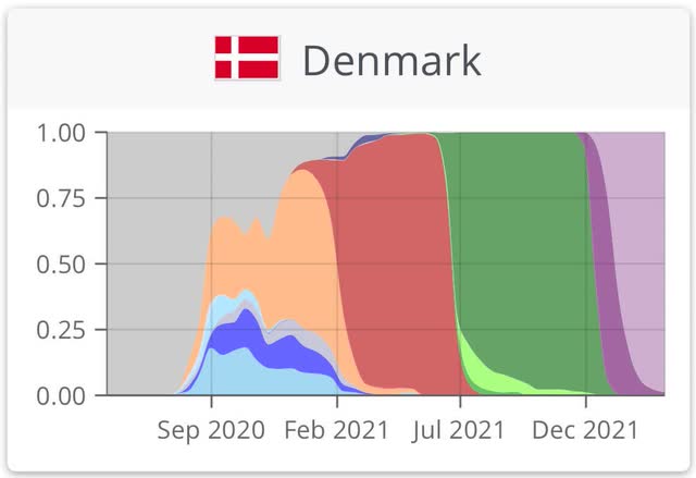
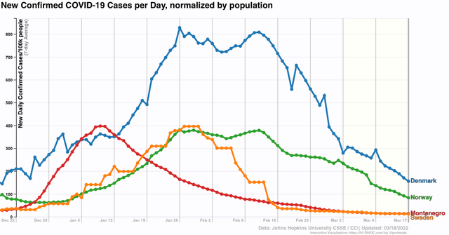
Where BA.2 overtook BA.1 very quickly, there was only 1, more intense and longer lasting, wave. Here is a graph for Denmark, in which the BA.2 variant almost completely replaced BA.1 no later than the end of February, after only a short time (about 1 month) during which BA.1 was dominant:

Now, here is the graph of cases in Denmark:
As you can see, the uptrend lasted longer than in most countries. But Denmark has had an uninterrupted downtrend since.
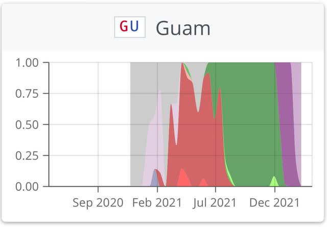
Similarly, here is her graph of the US territory of Guam in the Mariana Islands:

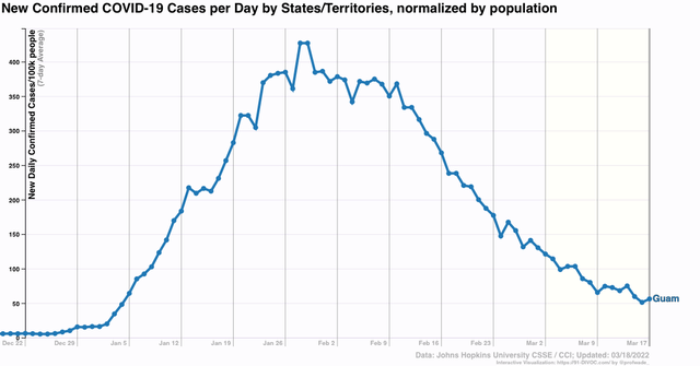
And here is Guam’s case graph (note that Guam only peaked at the end of January, and its peak lasted 3 weeks, vs. the shorter, sharper peaks in states that will be discussed below):

G
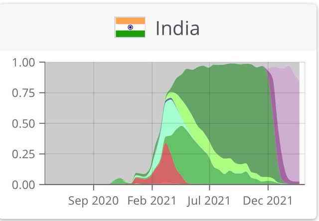
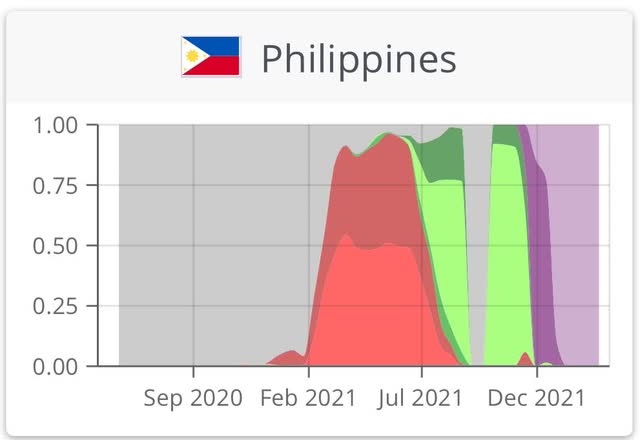
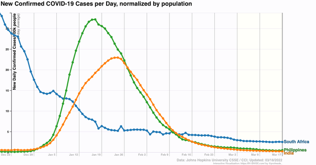
Similar trends occurred in the Nordic countries of Sweden and Norway, and in India and the Philippines.
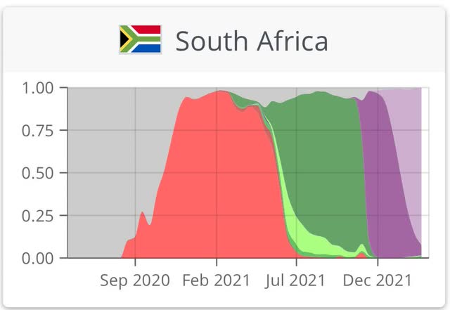
But perhaps the poster child for this is South Africa, which famously was the first country in which BA.1 was identified. The wave lasted a slightly longer time, but was supplanted by BA.2 two months ago:
Here are cases for South Africa:

South Africa hasn’t experience a new wave, either; just a “long tail” of a slow decline in cases which remains significantly above their level before BA.1 struck.
This brings us to Scenario 2: Where BA.2 only overtook BA.1 after a long time, there were relatively few people left who BA.2 could reach. A good example of this is Spain:
Spain’s experience with BA.1 has lasted over 3 months, and BA.2 is only gradually taking over:
Here is Spain’s level of cases:
Spain is still experiencing a slow decline, with no sign of a BA.2 wave, even though BA.2 currently makes up over 1/3rd of all cases.
Next, let’s look at Scenario 3:
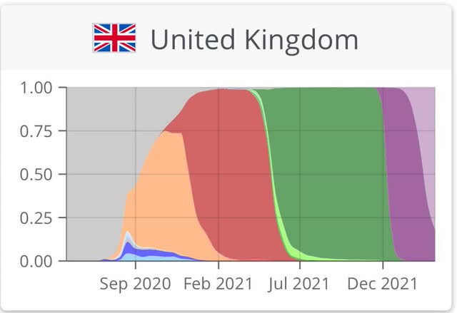
where BA.2 overtook BA.1 after its peak, but - probably because of better mitigation efforts - there were lots of people left who BA.2 could reach, has there been a new wave.This is best demonstrated by one of the present scary examples, the UK. According to the most recent UK government data I have seen, BA.2 accounts for 90% or more of all new COVID infections. It should be essentially 100% within about a week. Here is the relevant graph:

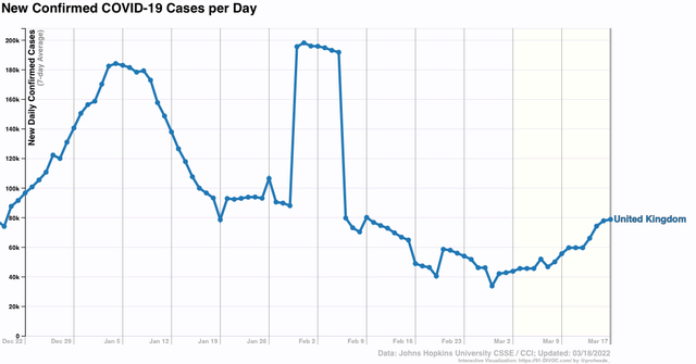
And here is the UK’s case count:
Here is the week over week change in average daily cases:
As you can see, the rate has slowed already in the past few days. In the last 5 days, cases are only up 10%, vs. 50% 5 days ago.
In other words, the countries of Europe where there is a new, identifiable BA.2 wave are ones where the BA.1 wave did not last as long, or was not as intense, as others. BA.1 had peaked, but had not yet burned through the vulnerable population.
In contrast, the original Omicron wave began in the UK only about 5 days before that in the US. But the UK’s peak began 8 days before the US, and lasted only about 6 days before beginning a sharp decline, vs. 15 days in the US:
And here is the US’s graph of the prevalence of BA.1 and BA.2:
BA.1 hit hard and lasted 3 months before BA.2 started to kick in. In other words, the US’s graph looks closest to Spain’s, where there has been no BA.2 wave, just a long tail of slow decline.
Let’s look at a few US States. BA.2 is already a majority of cases in Connecticut:
After a brief uptick almost two weeks ago, Connecticut has fewer cases than at anytime except for summer 2020 and summer 2021.
Currently BA.2 is running over 33% in NY:
New York has begun to show an increase in cases over the past week:
Finally, here is Florida:
BA.2 has barely begun there, and cases continue very low:
Put this together and I am expecting BA.2 to result in an experience between that of the UK and South Africa: an increase in cases, but not so pronounced as in the UK, where cases doubled in the first half of March. Once BA.2 becomes virtually 100% of all US cases, probably around late April, cases will recede again.