Saturday, January 27, 2018
Weekly Indicators for January 22 - 26 at XE.com
- by New Deal democrat
My Weekly Indicators post is up at XE.com. Aside from more mixed long leading indicators, there has been this anomalous decline in rail and steel.


Friday, January 26, 2018
Leading components of Q4 GDP forecast continued growth in 2018
- by New Deal democrat
This morning's release of Q4 2017 GDP was in line with estimates, rising 2.7% on a preliminary basis. As usual, my attention is focused less on where we *are* than where we *will be* in the months and quarters ahead.
There are two leading components of the GDP report: real private residential investment and corporate profits. Because the latter will not be released until the second or third revision of the report, I make use of proprietors' income as a more timely if less reliable placeholder.
So let's take a look at each.
The news on real private residential fixed investment was mixed. Measured both by itself (blue), and by the more precise method of its share of the GDP as a whole (red), residential investment rose. But although it came close, it has not made a new high since three quarters ago:

Proprietors' income was clearer, breaking out to another new high:

Together these are pretty strong evidence that the economy will continue to expand through the rest of 2018.
One final note: although the GDP reports have been good for the last three quarters, I'm not expecting any big positive breakout. This goes back to the relative flatness or restrained growth in housing. The below two graphs show the leading relationship between housing permits (using the less volatile single family measure) and GDP broken up into two roughly 30 year periods:


The YoY% change in permits for the last 3 years has been roughly 10% (divided by 4 for purposes of scale in the above graphs shows a number of ~2.5%). While there is certainly not a 1:1 relationship in the numbers, continued roughly 2.5% YoY growth of GDP for the next few quarters is a reasonable projection.
Thursday, January 25, 2018
Housing: sales and prices accelerate in Q4 2017
- by New Deal democrat
With the exception of rental vacancies and pricing, which should be released next Tuesday, with the morning's release of new home sales we now have a good look at the very forward-looking housing market through the end of 2017.
Both sales and prices have started to accelerate. This post is up at XE.com.
Wednesday, January 24, 2018
A note on December existing home sales
- by New Deal democrat
First of all, sorry for the light posting this week. There's not much news until tomorrow and Friday, and yesterday was a travel day. So.....
While existing home sales are about 90% of the entire housing market, they are the least important economically, because of their much more limited impact since they do not involve any new construction.
That being said, December's existing home sales, at 5.57 million annualized, were only 1% above last December's pace. First and foremost, that's a matter of higher mortgage rates this year. In fact, mortgage rates haven't made a meaningful new low since 2013 -- although they briefly neared that low in late 2016 -- and that has shown up in a gradual deceleration of the pace of sales since that time, as show by Bill McBride's graph below:


Here is a close-up of the last three years from FRED, excluding today's report, which hasn't been posted yet:


Here's the same data YoY, compared with housing starts in red, averaged quarterly to cut down on the volatility:
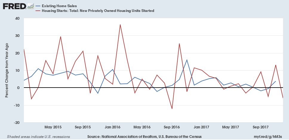
The same pattern of decelerating growth is shown in both series.
Although sales turn before either prices or inventory, the consistent price increases and lack of inventory are playing a role in this deceleration, contra which is the demographic tailwind.
Tomorrow the more important, and leading (but very volatile) new home sales report will be released. I am expected a significant downward revision in November's blowout number.
Tuesday, January 23, 2018
Recent increased interest rates probably won't derail housing
- by New Deal democrat
In the last couple of weeks, long term interest rates have moved significantly higher. As of yesterday, the 10 year bond closed at roughly 2.66%, its highest yield in 3 1/2 years. If this move is sustained for a few months, I expect it to have an effect on the housing market, but how much?
Here is an updated variation on a graph I have run many times over the last 5 years: the YoY change in the 10 year treasury bond, inverted (blue), versus the YoY% change in housing permits for single family homes (green). I'll explain the red line below:

In general, the housing market responds first and foremost to interest rates. So when interest rates rise (shown as a negative YoY in the graph), permits historically have fallen.
But in this expansion, permits have responded by decelerating increases rather than by actual declines. A decent estimate is that the demographic tailwind of the large Millennial generation arriving at home-buying age is that it has added 7.5% growth YoY vs. what we would otherwise expect. That is what is shown by the red line in the graph above.
I still expect a few months of restrained *YoY* growth (not m/m, which has already increased to new highs) before improvement in that metric.
But the above graph does not show the uptick in rates this month, so the below is the same graph, limited to the last year, but with daily values in treasury rates:

The bottom line is that the recent increase in rates isn't enough to derail the housing market. I suspect that rates would have to go above their 2013 high of 3.03% for that to happen.
Finally, there is another factor to consider, which is monthly mortgage payments. As I pointed out several months ago, monthly mortgage payments got downright cheap at the bottom of the housing market, and still are quite reasonable compared with their 2005 highs. Here's an update graph of real, inflation-adjusted mortgage payments from Core Logic:

This is probably also a factor in why housing has responded relatively tepidly to changes in interest rates. Especially with soaring rents and constrained supply, owning is -- relative to renting -- still a bargain. It will probably take another 10% increase in real monthly carrying costs for that to become at all comparable to its surge during the housing bubble.
Sunday, January 21, 2018
Saturday, January 20, 2018
Weekly Indicators for January 15 - 19 at XE.com.
- by New Deal democrat
My Weekly Indicators post is up at XE.com.
The new 40 year low in jobless claims was overshadowed by the jump in interest rates.
Friday, January 19, 2018
The intensity of Fed rate hikes as a precursor to recessions
- by New Deal democrat
Between 1931 and the mid-1950s, the yield curve never inverted, and yet there were 5 recessions (1938, 1945, 1948, 1950, and 1954). In particular, the 1938 "recession within the depression" was one of the worst of the 20th century.
So in a low inflation and low interest rate environment, where the yield curve may not invert, are there other signals from the bond market that are reasonably reliable?
A month ago I noted that spreads between corporate bonds and government securities have a very spotting record during more deflationary eras.
Today let's approach the issue from another angle. Is there something about the *intensity* of Fed moves that correlates with recessions? Below is a graph of the YoY change in the Fed funds rate since 1955, minus 1.5%, so that a YoY increase of 1.5% in the Fed funds rate = 0:

Twelve to eighteen months prior to 8 of the last 9 recessions, the Fed increased rates YoY by 1.5% or more.There were 4 false positives, two of which involved hikes of 1.5% or 1.75% (1962 and 1966), and one potentially false negative (a 1.5% increase in the Fed funds rate preceded the 1957 recession by 21 months). In the case of the false positives, there were slowdowns in GDP growth even though there was no outright recession.
So, in the most generous interpretation, a YoY Fed rate hike of 1.5% or more is almost certain to be followed by a slowdown, and more often than not by a recession. That's pretty decent even if not perfect.
That suggests that the very gradual Fed rate hikes of the last several years need not give us much concern. And indeed there is one (and only one) episode in the last 60 years that seems to bear this out. In the first half of the 1960s, the Fed gradually raised rates from 1% to 5% (blue line in the graph below):

These rate hikes coincided with economic growth of between 5% to 10% annually! Only when the Fed increased the pace of their hikes beginning in late 1965 did a slowdown occur, as shown by annualized real GDP in the graph below:

Of course, correlation is not causation, and one obvious candidate for causation is that the Fed is simply reacting to an increase in inflation either already underway or correctly anticipated. To check this, the below two graphs show the YoY% change in inflation, together with the YoY change in the Fed funds rates:
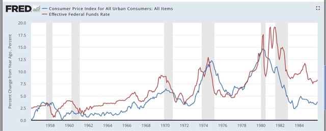

Indeed, with a few exceptions, sharp 1.5%+ increases in the Fed funds rate YoY tend to occur along with equally sharp increases in inflation.
But there are several exceptions, all having to do with the low interest rate environment.
In the first place, as recently as 2011, inflation rose from 1% to 3.8%. The Fed stood pat. No recession occurred.
Now let's take a look at the 1950s:

Here we have two completely different examples. In the period of 1954-57, the Fed hiked rates by a total of 2.25% while inflation went from negative to just under 4%. In contrast, during the inflationary 1960s-1980s period, the Fed raised rates by 2% or more multiple times without a recession ensuing.
In contrast, in the 1958-60 period, inflation remained under 2%, but the Fed aggressively raised rates from under 1% to 4%, and a recession ensured.
What we are left with is, even without looking at the yield curve, we can say that *either* a sharp rise in interest rates, *or* a sharp rise in inflation, almost always precedes to a slowdown, and more often than not precedes a recession. Right now, we have neither.
Thursday, January 18, 2018
A quick note on housing permits and starts
- by New Deal democrat
I'll do a more detailed analysis next week, once new home sales are reported, but for now a quick synopsis about December housing permits and starts:
- single family permits (the least volatile, most forward looking metric) made another new high
- total permits are just slightly below their October high
- the three month moving average of the more volatile housing starts made a new high save for the three month average from 10 months ago.
YoY interest rates are no longer a drag on the market, and I am impressed with the strength of the demographic tailwind. While not perfect, this was a very positive report.
Wednesday, January 17, 2018
Industrial production and retail sales both had strong 4th Quarters
- by New Deal democrat
Whether due to a bounce from hurricane interruptions, or some other reasons, both real retail sales and industrial production have now completed very strong 4th Quarters.
Together they point to a good GDP print next week.
This post is up at XE.com.
Monday, January 15, 2018
Minority unemployment: progress vs. prejudice
- by New Deal democrat
On this Martin Luther King Day, let's take a look at minority unemployment. This got a little attention earlier this month when the December jobs report showed the smallest gap ever between the unemployment rates of blacks and whites.
On this Martin Luther King Day, let's take a look at minority unemployment. This got a little attention earlier this month when the December jobs report showed the smallest gap ever between the unemployment rates of blacks and whites.
So let's start by confirming the good news. Indeed last month saw the smallest gap ever between the unemployment rates of the two groups:

The secular trend over the last 40 years has been very slow progress, as the relative low in unemployment from the early 1970s was superseded in the 1990s, which in turn was superseded by that of the 2000s, and now that too has been eclipsed. But of course, the black unemployment rate has for that entire time been higher than that for whites.
Next, let's compare black and Latino unemployment:

Similarly, for the entire forty year period, the rate of African American unemployment has been higher than that of Latino unemployment. What is most telling is that this metric hit a low point over 20 years ago. Since 1995 the proportion of Latino unemployment has decreased compared with black unemployment.
I believe this has had important political consequences. Like African American unemployment, the Latino unemployment rate has risen relative to white unemployment during and after recessions, and improved as expansions continues. Unlike black unemployment, however, Latino unemployment never blew out in the late 1970s and 1980s, and more strikingly, in both of this and the last expansion has come within 1.2% of white unemployment:

On the one hand, while we don't have any historical statistics that I am aware of with earlier immigrant groups, I suspect that Latinos hare having a typical immigrant experience: the first generation establishes the beachhead, and the second and thir d generations approach the employment norms of the majority natives.
But on the other hand, I think this has played a significant role in the backlash that gave us Donald Trump. Remember that the single issue which most changed in importance motivating voters between 2012 and 2016 was immigration:
On the one hand, while we don't have any historical statistics that I am aware of with earlier immigrant groups, I suspect that Latinos hare having a typical immigrant experience: the first generation establishes the beachhead, and the second and thir d generations approach the employment norms of the majority natives.
But on the other hand, I think this has played a significant role in the backlash that gave us Donald Trump. Remember that the single issue which most changed in importance motivating voters between 2012 and 2016 was immigration:

Considering that employment in smaller metro areas and rural ares has not grown so strongly during this expansion, and especially bearing in mind that roughly 1/4 of the Latino population (about 12 million of 48 million) are undocumented workers or illegal aliens, depending on your preference, I suspect that the ethnic backlash by Trump voters and the relatively good performance of Latino vs. white unemployment is not a coincidence.
Finally, in view of the continued difference between black and white unemployment rates, I wanted to take a look at how that breaks down by education, since the disparity in college educations may be one reason for the difference in in the rates.
But that isn't the case. Here are two separate graphs of unemployment, one of which also includes Latinos and Asians, and the other of which brakes down education by 5 levels:


When we consider that even with a conquerable education, the rate of black unemployment is still above that of Latino unemployment, and that black college graduates have an unemployment rate equivalent to that of whites who don't even have an associates degree, I am afraid that racial prejudice still plays a role in the jobs market.
Sunday, January 14, 2018
Saturday, January 13, 2018
Weekly Indicators for January 8 - 12 at XE.com
- by New Deal democrat
My Weekly Indicators post is up at XE.com.
This week a lot of the data was affected by holiday seasonality, because it was for the week of New Year's Day.
Friday, January 12, 2018
Real wages in 2017
- by New Deal democrat
Now that we have the report on consumer prices for December, let's take a look at what happened with real wages in 2017.
Consumer prices increased +0.1% in December, and wages for non-managerial workers rose 0.3%, This for that month the average worker earned 0.2% more.
For the year, the nominal wages of non-managerial workers rose 2.4%, while prices increased 2.1%, meaning that for the entire year workers saw a whopping 0.3% increase in real pay:
Consumer prices increased +0.1% in December, and wages for non-managerial workers rose 0.3%, This for that month the average worker earned 0.2% more.
For the year, the nominal wages of non-managerial workers rose 2.4%, while prices increased 2.1%, meaning that for the entire year workers saw a whopping 0.3% increase in real pay:

Here's a close-up of the last 5 years:

But because inflation accelerated slightly in the second half of the year, and nominal pay increases slackened, real pay has actually decreased roughly -0.8% since peaking in July, and is barely up at all over the last 24 months.

Next let's take a look at the real aggregate pay that non-managerial workers earned in 2017. I like this measure because it tells me how much the economy as a whole has delivered to the middle and working class during the economic expansion. Here's the graph:

For the entire expansion, real aggregate pay has increased ~23%. On a YoY basis, aggregate real payrolls increased about 2.5%, about the average for this expansion:

In other words, consumers have more money in the aggregate, but only because the number of hours and jobs in the economy has increased, and almost not at all because their individual hourly pay increased in real terms in 2017.
Thursday, January 11, 2018
Hiring leads firing: adding initial jobless claims to the mix
- by New Deal democrat
In yesterday's post, I pointed out that, in the JOLTS data, hiring leads firing.
A more frequent and timely measure of firing is the weekly initial jobless claims, which also almost always turn significantly in advance of recessions. I have a post up at XE.com, looking at hiring vs. firing this way.
Wednesday, January 10, 2018
JOLTS report confirms November payrolls strength
- by New Deal democrat
I'm changing my presentation of JOLTS data somewhat compared with the last year or two. At this point I've pretty much beaten the dead horses of (1) "job openings" are soft and unreliable data, and should be ignored in contrast with the hard "hires" series; and (2) the overall trend is that of late expansion but no imminent downturn.
So let's start a little differently, by comparing nonfarm payrolls from the jobs report with what should theoretically be identical data: total hires minus total separations in the JOTLS report, monthly (first graph) and quarterly (second graph):


While there can be a considerable disparity in any one month, once we start looking longer term there is an incredibly tight fit.
For our immediate purposes, it's likely that the strength in the JOLTS hiring data over the last several months is the same trend as the very good post-hurricane October and November jobs reports, both of which showed that more than 200,000 jobs had been added. While any given month can be off significantly, it's a fair bet that when the December JOLTS report is released in one month, it too will be weaker, just as was the December jobs report.
Next, my mantra is that hiring leadis firing, so that part of the presentation is still important. To reeiterate, the major shortcoming of this report is that it has only covered one full business cycle. In that cycle, in acord with my mantra, hires peaked and troughed before separations:

Here's what this data looks like monthly for the last 24 months:

Just as at the bottom of the Great Recession, at the end of the "shallow industrial recession" of 2015, hiring (red) troughed first, followed later in 2016 by separations (blue). With hiring up, I expect the level of separations to also increase (note some of these are voluntary) in the next few months as well.
Further, in the previous cycle, after hires stagnated, shortly thereafter involuntary separations began to rise, even as quits continued to rise for a short period of time as well:

[Note: above graphs show quarterly data to smooth out noise]
Here are hires vs. separations on a monthly basis for the last 24 months:

While quits remain at expansionary high levels, they seem to have stagnated in the last 6 months. With hiring increasing again, if the pattern from the last decade holds, I would expect quits to improve somewhat as well.
Meanwhile the good news is that involuntary separations have fallen in the last several months, even if we average the last two. At the same time, they remain above thei bottom they established a year ago:
Once again the report yesterday was a good one, mirroring November's jobs report, but on the other hand, it is very consistent with being late in the cycle. Since hiring leads firing, what I am looking for next is at what point dies hiring stagnate, and will it be confirmed by continued stagnation in quites?
Tuesday, January 9, 2018
A US economic Boom in 2018?
- by New Deal democrat
For the last several years, I have tried to identify several graphs that most bear watching over the ensuing 12 months. This year, in addition to watching bond yields like everybody else, the data that most bears watching, it seems to me, can be summed up in the question: Is the US economy about to enter a Boom?
The recent economic news has almost all been good. In particular the unemployment rate has dropped as low as 4%. Meanwhile, the GOP certaionly believes -- I most certainly don't -- that the recent tax changes are going to unleash a torrent of Capex spending and wage increases (as opposed to mergers, acquisitions, stock buybacks and executive pay bonanzas).
So, is the economy on the verge of firing on all cylinders?
The recent economic news has almost all been good. In particular the unemployment rate has dropped as low as 4%. Meanwhile, the GOP certaionly believes -- I most certainly don't -- that the recent tax changes are going to unleash a torrent of Capex spending and wage increases (as opposed to mergers, acquisitions, stock buybacks and executive pay bonanzas).
So, is the economy on the verge of firing on all cylinders?
There is no standard definition of a Boom. But since I am a fossil, in my lifetime I have experienced two times when it certainly felt like the economy was working extremely well and on a very broad basis: the 1960s and the late 1990s tech era. The "good times" feeling of both eras was palpable. Employment was rampant and average people felt that their situations were going well.
What distinguished those to eras from all the other economic expansions? I found five markers that stand out, and two that, oddly, didn't.
Let's start with the first marker: the unemployment rate (note that the U6 underemployment rate wasn't reported in its current configuration until 1994, and so is not helpful). In both the 1960s and the late 1990s, the unemployment rate hit 4.5% or below for extended periods of time:

While these weren't the only two periods of low unemployment, they are among those that stand out, in particular vs. the 1970s and 1980s, none of which expansions hit such a low mark.
Now let me examine the two markers that didn't make the cut. You would think that industrial production and capacity utilization would be making strong new peaks during Booms vs. other expansions. But that isn't the case. industrial production (blue, left scale below) has made new peaks during each expansion, while capacity utilization (red, right scale) has been relentlessly declining:

What does stand out at least somewhat is the duration and rate at which industrial production grew during both Booms. During both the 1960s and 1990s, production grew at or over 4% a year for extended periods of time, not just right after the end of a recession

So the rate of growth of industrial production is the second marker of a Boom.
The third and fourth markers iare the rate of growth of real average earnings for non-managerial employees, both individually and in the aggregate. During the two Booms, in contrast to other expansions, real average hourly earnings also grew at roughly 1% YoY or better:

Meanwhile, real aggregate earnings grew at a rate of 4% YoY or better:

Here's what three of those markers look like when put together in one graph:


The fifth and final marker of a Boom -- probably as the byproduct of the first four -- is an increase in the YoY rate of inflation:

So, to summarize, when they occur together, the five markers of an economic Boom are the following:
1. An unemployment rate under 4.5%
2. YoY industrial production growth of at least 4%
3. YoY real wage growth of at least 1%
4. YoY real aggregate wage growth of at least 4%
4. YoY real aggregate wage growth of at least 4%
5. Increasing YoY inflation.
As we begin 2018, only the first and last markers are present: we have low unemployment, and at least temporarily, the YoY inflation rate is higher than it was a year ago. But industrial production is not growing as fast as either of the last two Booms, and real wage growth has continued to be lackluster.
Based on my lieffetime experience, while the US economy is currently doing pretty well in general, it is not anywhere near a Boom, at least not yet.
I'll continue to track these indicators during 2018.
Monday, January 8, 2018
Sunday, January 7, 2018
Weekly Indicators for January 1 - 5 at XE.com
- by New Deal democrat
My Weekly Indicators post is up at XE.com.
There was a very positive start to 2018.
Sorry about the late posting -- computer issues.
Friday, January 5, 2018
December jobs report: late cycle mediocre growth reasserts itself
- by New Deal democrat
HEADLINES:
- +143,000 jobs added
- U3 unemployment rate unchanged at 4.1%
- U6 underemployment rate rose +0.1% from 8.0% to 8.1%
Here are the headlines on wages and the chronic heightened underemployment:
Wages and participation rates
- Not in Labor Force, but Want a Job Now: rose +43,000 from 5.265 million to 5.308 million
- Part time for economic reasons: rose +64,000 from 4.851 million to 4.915 million
- Employment/population ratio ages 25-54: rose +0.1% from 79.0% to 79.1%
- Average Weekly Earnings for Production and Nonsupervisory Personnel: rose $.0.07 from $22.23 to $22.30, up +2.3% YoY. (Note: you may be reading different information about wages elsewhere. They are citing average wages for all private workers. I use wages for nonsupervisory personnel, to come closer to the situation for ordinary workers.)
Holding Trump accountable on manufacturing and mining jobs
Trump specifically campaigned on bringing back manufacturing and mining jobs. Is he keeping this promise?
Trump specifically campaigned on bringing back manufacturing and mining jobs. Is he keeping this promise?
- Manufacturing jobs rose by +25,000 for an average of +17,500 a month vs. the last seven years of Obama's presidency in which an average of 10,300 manufacturing jobs were added each month.
- Coal mining jobs fell -400 for an average of -63 a month vs. the last seven years of Obama's presidency in which an average of -300 jobs were lost each month
The more leading numbers in the report tell us about where the economy is likely to be a few months from now. These were mixed.
- the average manufacturing workweek fell -0.1 hour from 40.9 hours to 40.8 hours. This is one of the 10 components of the LEI.
- construction jobs increased by +30,000. YoY construction jobs are up +210,000.
- temporary jobs increased by +7,000.
- the number of people unemployed for 5 weeks or less decreased by -18,000 from 2,253,000 to 2,235,000. The post-recession low was set over two years ago at 2,095,000.
Other important coincident indicators help us paint a more complete picture of the present:
- Overtime was unchanged at 3.5 hours.
- Professional and business employment (generally higher- paying jobs) increased by +19,000 and is up +488,000 YoY.
- the index of aggregate hours worked in the economy rose by 0.1% from 115.9 to 116.0.
- the index of aggregate payrolls rose by 0.7% from 172.2 to 172.9.
Other news included:
- the alternate jobs number contained in the more volatile household survey increased by +104,000 jobs. This represents an increase of 1,267,000 jobs YoY vs. 2,055,000 in the establishment survey.
- Government jobs rose by 2,000.
- the overall employment to population ratio for all ages 16 and up was unchanged at 60.1 m/m and is up + 0.3% YoY.
- The labor force participation rate was unchanged m/m and is also unchanged YoY at 62.7%
SUMMARY
This was a mediocre but not bad report. There was growth in almost all sectors of employment. Participation measures were positive. Aggregate payrolls and hours increased.
But there were concerning signs of late cycle deceleration as well. The underemployment rate increased for the second month in a row, and the unemployment rate is up from two months ago. Involuntary part-time employment and those outside of the workforce who want a job now both increased. And wage growth is actually declining.
Bottom line: after several months of post-hurricane bounces, we are back to a late cycle dynamic.
Subscribe to:
Posts (Atom)