Saturday, September 19, 2015
Weekly Indicators for September 14 - 18 at XE.com
-by New Deal democrat
My Weekly Indicator post is up at XE.com. There was some fluctuation among the coincident indicators this week, but with the Fed decision, the reaction of interest rates takes center stage.


Friday, September 18, 2015
Some Friday good news: real retail sales and real aggregate wage growth
- by New Deal democrat
I have not been a happy camper here at Camp Bonddad this week. First, contrary to my expectation, the Census Bureau reported that real median household income actually *declined* by about -0.5% for the prime working age 25-54 cohort. The main reason, apparently, was a seemingly random increase in the percentage of non-family households, which disproportionately consist of low wage earners.
Then the same Census Bureau wreaked havoc with housing permits, perhaps the most important among long leading indicators. These went from making new highs several times in the second quarter, to no new high having occurred since 10 months ago. Did I mention, these are invaluable for looking at the economy 12+ months out? So, suddenly, we are only 2 months away from no new highs for a year. Awesome. Except, oh by the way, housing starts still show the improvement, as do the non-seasonally adjusted numbers, even after the latest revisions. Would it really be too much effort to supply us with an explanation?
So let me point out two things which *did* go right this week, courtesy of a -0.1% decline in CPI: real retail sales and real aggregate wages.
First of all, real retail sales made a new high:
Then the same Census Bureau wreaked havoc with housing permits, perhaps the most important among long leading indicators. These went from making new highs several times in the second quarter, to no new high having occurred since 10 months ago. Did I mention, these are invaluable for looking at the economy 12+ months out? So, suddenly, we are only 2 months away from no new highs for a year. Awesome. Except, oh by the way, housing starts still show the improvement, as do the non-seasonally adjusted numbers, even after the latest revisions. Would it really be too much effort to supply us with an explanation?
So let me point out two things which *did* go right this week, courtesy of a -0.1% decline in CPI: real retail sales and real aggregate wages.
First of all, real retail sales made a new high:

This bodes well for employment growth in the coming months, since consumer spending leads jobs. Since population increases by a little under +0.1% per month, this means real retail sales per capita, a long leading indicator, also made a new high in August.
Secondly, real aggregate wages also grew, bringing total growth over this economic expansion to +17.0%:

For comparison purposes, here is the Reagan expansion of the 1980s:

At this point (5 years, 9 months into the employment expansion) in the 1980s, real aggregate income was up +18.5%. Our present expansion isn't quite so good for aggregate real wages, but not too shabby either.
To bring this full circle, here is a regression of real aggregate wage growth vs. real median household income:

Note that this year was one of the two biggest outliers to the negative. Typically based on real aggregate wage growth we should have seen decent growth to real median household income.
Thursday, September 17, 2015
Housing permits: in which I have a bone to pick with the Census Bureau
- by New Deal democrat
When you make a revision of over 25% to one month's data, that turns a surge into a crater, but the non-seasonally adjusted data still shows a surge -- such that the YoY data, which ought to be unaffected by seasonal adjustments, is out of whack by 35% (!!!), don't you think you owe your readers an explanation?
Well, Census Bureau, I"m looking at you.
Here's what housing permits (red) and starts (blue) looked like one month ago:

Permits had spiked to over 1.3 million in June, which was due, we were told, to the expiration of a program in NYC that required permits to be issued no later than June 30.
Now here is the same graph updated with this morning's data:

The spike in seasonally adjusted permits is completely gone, replaced by a crater. This is no small revision. Rather, housing permits for June have just been revised down by 25% -- a full quarter of the total! That's one heckuva revision!
How unusual is this big a revision? Well, here's a comparison of the numbers through last month, with the revised numbers through this month:

Like I said, that's one heckuva revision!
OK, revisions happen. Fair enough. But notice that starts -- an actual, physical event -- still reflect a significant increase in the last few months. It's one thing if permits were never acted upon with actual starts, but here we have suddenly non-existent permits leading to actual starts!
What's more, the summer surge in permits still shows up in the revised non-seasonally adjusted data:

Since, presumably, the issue here is a seasonal adjustment, the discrepancy ought to disappear if we compare YoY data. Umm, not quite:

The wholesale deletion of the NYC permits has created a 30% discrepancy in the YoY comparisons of seasonally adjusted vs. non-seasonally adjusted data!
Considering housing permits is perhaps the single most important long leading indicator, and with the revisions this morning completely wiping out any progress since last fall, it seems to me that the Census Bureau has some explaining to do. I have looked in vain for any explanatory note in this morning's release. It's possible I missed it, of course, but at least one other blogger has confirmed to me that they did not see any such note either.
So excuse me, Census Bureau, but I have a bone to pick with you.
Wednesday, September 16, 2015
Census Bureau: mixed results for prime working age median income(UPDATED x 2)
- by New Deal democrat
Real life intrudes, so I can't do a detailed analysis now, but this morning the Census Burreau came out with their annual update on median household income for 2014.
The headline is that real median household income for all households decreased by -1.5% in 2014. But the number of people aged 35 - 54 decreased by about 150,000, while the number of households with people over 65 grew by about 900,000. Since median income for "over 65" households was only about $39,000, while prime working age median income was about $66,000, that significantly distorts the overall number.
Here are the numbers for the 3 prime age working decades:
25- 34 +1.8%
35-44 -2.9%
45-54 -1.3%
That is still a slight overall decline.
As I anticipated, the numbers are the year-long average, not year-end to year-end. Thus, for example, the calculated inflation rate was +1.5%, even though at year end 2014 the CPI was only up about +0.6% YoY.
Interestingly, a decline in real incomes for men working full time was more than the increase in real median income for women working full time:

I'll have more later once I am able to take a more detailed look. Overall this certainly looks like a disappointment.
UPDATE: According to Reuters:
Edward Welniak, chief of income statistics for the Census Bureau's housing and household economic branch, attributed the leveling of median income in part to a 1.2 million increase last year in non-family households, which typically have much lower income than family households.
"What we see there then is this increase in households at the lower end of the income distribution tended to hold down median household income," he told reporters.
Interesting.
UPDATE 2: Following up onthe Reuters article, I went back and, sure enough, real median income of al family households increased across the board. Nonfamily households, specifically those consisting of a man, are responsible for the entire decline:

I have no diea what is behind this anomalous increase in sincgle male householdss. My first guess would be young men moving out on their own, but age group 25-34 was one of the few to show an actual increas in income. Perhaps an increase in younger (i.e., under 25 men moving out of the basement?
Another important breakdown is income across the board including part-timers, vs. income of full-timers only. The median wage for male full-timers actually fell slightly, while that of full-time women workers rose slightly -- but not enough to overcome the deficit by men.
Even more interestingly, despite that, the real median income for all workers including part-timers rose:

In other words, the rise in incomes among wage-earners in 2014 is not being driven by raises, but rather by the conversion of part-timers to full-time work, and/or by the increase in hours worked by part-timers. This is important information. It explains why median weekly income has been flat to declining, while median hourly income has been increasing.
"At the mouth of one witness he shall not be put to death"
- by New Deal democrat
"At the mouth of two witnesses, or three witnesses, shall he that is worthy of death be put to death; but at the mouth of one witness he shall not be put to death." - Deuteronomy 17:6
Tomorrow night the state of Oklahoma is set to execute Richard Glossip for the murder of a former boss. A coworker admittedly was the actual killer. There is no physical evidence tying him to the crime.
He is being executed based on the testimony of a single witness: the triggerman claims Glossip put him up to the job.
This is a case where the wisdom of the ancients remains true. Human nature has not changed. Nobody's life should depend on the perceived credibility of a single other person, particularly where that single person has an incentive to be untruthful. Where are the Christian fundamentalists now?
Tuesday, September 15, 2015
Don't sweat industrial production
- by New Deal democrat
When CNBC breathlessly reported industrial production this morning, it was with words to the effect that it was "the biggest decline in almost two years," On the contrary, while it supports the idea that the US is in a "shallow industrial recession," it does nothing to suggest that there are broader problems.
In the first place, with last month revised upward by +0.3, the net loss is only -0.1. Secondly, as shown by the graph below, we have improved off of this spring's readings, although there certainly remains a slight downtrend from last fall:

More importantly, when we decompose the number into manufacturing (blue in the graph below) and mining (red):

we see that manufacturing remains in an uptrend. The big decrease is mining, i.e., it is all about the Oil patch. (Production by utilities was up this month).
In short, not great, but not too shabby either.
P.S. I'll waith to comment on the retail sales number until I see this months's CPI.
P.S. I'll waith to comment on the retail sales number until I see this months's CPI.
Monday, September 14, 2015
Sunday, September 13, 2015
Powerline: Utterly Shameless
This is just too rich.
Powerline was one of several conservative blogs that broke the "Rathergate" story. Several weeks before the 2004 presidential election, Dan Rather and CBS news reported something negative about George Bush's Texas National Guard duty. I don't remember what it was, but Rather based the story on a set of documents. Somehow several conservative blogs including Powerline obtained the documents and determined they were forged. IIRC correctly, Time magazine named them blog of the year.
Here's a link to the Wikipedia entry for more detail.
The conservative blogs used this story to further the"liberal bias" meme.
Here's the best part of this. Earlier this year, John Hinderker of Powerline wrote five stories titled, "What happened to Harry Reid?" Over the course of the five articles, Hinderker theorizes several possibilities about how Reid got his black eye. At some point, he ran a story based on a source who, well, lied to Hinderaker. The "source" revealed his deception to a Nevada newspaper:
In the pages of the Las Vegas Sun, a man named Larry Pfeifer announced that he had successfully duped a conservative blogger into running a story that Senate Minority Leader Harry Reid's recent injuries to his eyes and face were the result of a dustup with his own family.
Hinderaker would have recognized Pfeifer's name; he had published Pfeifer's account on Power Line only a few weeks earlier.
Initially sporting the alias "Easton Elliott," Pfeifer had approached Hinderaker claiming that he witnessed Reid's brother, Larry, talk about pummeling a family member while sharing at an
Alcoholics Anonymous meeting. (Eventually, Pfeifer told Hinderaker his real name.)
Rather lost his job because of the story. Hinideraker is still writing for Powerline. I'm sure the boys at Powerline they have formulated some type of juicy rationalization to describe the difference between Hinderaker and Rather. But, they're the same fact pattern.
Why is this important now? Because Powerline is cranking up a series of posts on the movie "Truth" which is based on the Rathergate story. I'm sure there will be lots of reminiscing about how important their blog was to the story.
There will probably be no mention of Hinderaker's Dan Rather impersonation earlier this year.
http://www.powerlineblog.com/archives/2015/03/what-really-happened-to-harry-reid-part-2.php
http://www.powerlineblog.com/archives/2015/01/ok-so-what-really-happened-to-harry-reid.php
http://www.powerlineblog.com/archives/2015/04/what-really-happened-to-harry-reid-part-3.php
http://www.powerlineblog.com/archives/2015/04/what-really-happened-to-harry-reid-part-4-reid-changes-his-story.php
http://www.powerlineblog.com/archives/2015/04/what-really-happened-to-harry-reid-part-4-reid-changes-his-story.php
Powerline was one of several conservative blogs that broke the "Rathergate" story. Several weeks before the 2004 presidential election, Dan Rather and CBS news reported something negative about George Bush's Texas National Guard duty. I don't remember what it was, but Rather based the story on a set of documents. Somehow several conservative blogs including Powerline obtained the documents and determined they were forged. IIRC correctly, Time magazine named them blog of the year.
Here's a link to the Wikipedia entry for more detail.
The conservative blogs used this story to further the"liberal bias" meme.
Here's the best part of this. Earlier this year, John Hinderker of Powerline wrote five stories titled, "What happened to Harry Reid?" Over the course of the five articles, Hinderker theorizes several possibilities about how Reid got his black eye. At some point, he ran a story based on a source who, well, lied to Hinderaker. The "source" revealed his deception to a Nevada newspaper:
In the pages of the Las Vegas Sun, a man named Larry Pfeifer announced that he had successfully duped a conservative blogger into running a story that Senate Minority Leader Harry Reid's recent injuries to his eyes and face were the result of a dustup with his own family.
Hinderaker would have recognized Pfeifer's name; he had published Pfeifer's account on Power Line only a few weeks earlier.
Initially sporting the alias "Easton Elliott," Pfeifer had approached Hinderaker claiming that he witnessed Reid's brother, Larry, talk about pummeling a family member while sharing at an
Alcoholics Anonymous meeting. (Eventually, Pfeifer told Hinderaker his real name.)
Rather lost his job because of the story. Hinideraker is still writing for Powerline. I'm sure the boys at Powerline they have formulated some type of juicy rationalization to describe the difference between Hinderaker and Rather. But, they're the same fact pattern.
Why is this important now? Because Powerline is cranking up a series of posts on the movie "Truth" which is based on the Rathergate story. I'm sure there will be lots of reminiscing about how important their blog was to the story.
There will probably be no mention of Hinderaker's Dan Rather impersonation earlier this year.
http://www.powerlineblog.com/archives/2015/03/what-really-happened-to-harry-reid-part-2.php
http://www.powerlineblog.com/archives/2015/01/ok-so-what-really-happened-to-harry-reid.php
http://www.powerlineblog.com/archives/2015/04/what-really-happened-to-harry-reid-part-3.php
http://www.powerlineblog.com/archives/2015/04/what-really-happened-to-harry-reid-part-4-reid-changes-his-story.php
http://www.powerlineblog.com/archives/2015/04/what-really-happened-to-harry-reid-part-4-reid-changes-his-story.php
Saturday, September 12, 2015
Weekly Indicators for September 7 - 11 at XE.com
-by New Deal democrat
My Weekly Indicators post is up at XE.com. Despite global weakness, US domestic data remains decent.
Thursday, September 10, 2015
Forecasting 2014 Median household income
- by New Deal democrat
Next week the Census Bureau will release its report on 2014 median household income.
Since I have proposed that a reasonable and more up-to-date model for median household income of the 25-54 primary working age cohort is to take average hourly income and divide it by the percentage of those 25-54 who are employed (i.e., thier employment-poulation ratia), and then norm by inflation, I wanted to put out this forecast now, and we will see how it pans out next week.
The below graph gives two alternative values: red if the calculation is based on year-end values, and blue if the calculatioin is based on average values of the course of the year:

I believe the Census Bureau will use the average over the year, so the blue line is the more likely estimate. As you can see, it makes a considerable difference which way we measure.
I'm not pretending that this estimate is exact. As of 2013, the Census Bureau showed a decline of about 8% off the peak, whereas this estimate shows a maximum of 6% in 2011. But if my method works, we should see an increase in median household income in the prime working age group next week, as foreshadowed by the work of Prof. Emanuel Saez.
I'm not pretending that this estimate is exact. As of 2013, the Census Bureau showed a decline of about 8% off the peak, whereas this estimate shows a maximum of 6% in 2011. But if my method works, we should see an increase in median household income in the prime working age group next week, as foreshadowed by the work of Prof. Emanuel Saez.
Wednesday, September 9, 2015
JOLTS report warns job growth may be entering late cycle
- by New Deal democrat
I have a new post up at XE.com. The pattern of job openings, hires, and quits now looks very similar to what it was in summer 2006.
Monday, September 7, 2015
Five graphs for 2015: Labor Day update with 4 bonus graphs
- by New Deal democrat
At the end of last year, I highlighted 5 graphs to watch in 2015. We are now 8 months through the year, so let's take another look.
#5. Mortgage refinancing
After a mini-surge at the end of January (light brown in the graph below) due to low mortgage rates, refinancing applications fell back to their post-recession lows for most of the year. With another small decline in rates in the last 2 months, there has been a "minnier"-surge Mortgage News Daily has the graph:
#5. Mortgage refinancing
After a mini-surge at the end of January (light brown in the graph below) due to low mortgage rates, refinancing applications fell back to their post-recession lows for most of the year. With another small decline in rates in the last 2 months, there has been a "minnier"-surge Mortgage News Daily has the graph:

Over the last 35 years, refinancing debt at lower rates has been an important middle/working class strategy. There is little room left for that strategy. As shown in the first bonus graph below that I first published over 3 years ago, if mortgage refinancing stays turned off too long, and wages don't grow in real terms, then consumer spending falters and so does the economy:

That three year anniversary is now 2 months away.
#4 Gas prices
Here is a graph of average hourly wages divided by gas prices (blue) since the bottom in gas prices in 1999:

#3 Part time employment for economic reasons
#4 Gas prices
Here is a graph of average hourly wages divided by gas prices (blue) since the bottom in gas prices in 1999:
How long must a worker labor in order to buy a gallon of gas? After skyrocketing in the lead-up to the Great Recession, gas prices collapsed, helping the consumer start to spend again on other things at the bottom of that recession. The steep drop in gas prices late last year took us almost all the way back to that bottom. Just as in 1986 and 2006, at first consumers saved the money, but once they loosened their pursestrings, the economy responded.
#3 Part time employment for economic reasons
Next is a graph of part time workers for economic reasons expressed as a percentage of the labor force. In the 8 months of this year, this continued to improve, down about .2% or 320,000:

In the longer view, however, this is still 2% (about 3.2 million) above the boom level of 1999 and about 1.5% (2.25 million) above the level of 2007:

Despite the solid improvement this year, there are still more involuntary part time workers than at any point between 1994 and 2008.
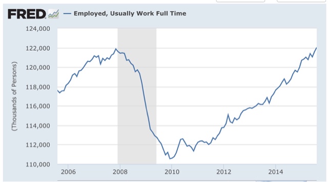
Our next bonus graph takes a broader view of full time vs. part time work, as a percentage of the labor force:

There has also been solid improvement in this comparison this year. We are now equivalent to where we were in 1996 and 2004. That isn't great, but it is no longer poor either.
Our third bonus graph shows that the number of full time jobs have finally exceeded their previous high this past month:
#2 Not in Labor force but want a job now:
This moved generally sideways during the first quarter, but improved nicely in the last four months:
This moved generally sideways during the first quarter, but improved nicely in the last four months:

It is now only 200,000 above its post-recession low of November 2013 (just prior to Congress's cutoff of extended unemployment benefits) and about 1.5 million, or 1% of the workforce, above its 1999 and 2007 lows.
#1 Nominal wage growth
After 3 poor readings last August, December, and February, YoY growth in nominal wages for nonsupervisory personnel fell back close to their post-recession lows before rebounding this spring. Even so, YoY growth has been unable to crack 2% to the upside. In the below graph, I have s ubtracted 1.9% fromYoY nominal wage growth, and 10.3% fromcthe U6 unemployment rate, to set both to zero at their current levels:
After 3 poor readings last August, December, and February, YoY growth in nominal wages for nonsupervisory personnel fell back close to their post-recession lows before rebounding this spring. Even so, YoY growth has been unable to crack 2% to the upside. In the below graph, I have s ubtracted 1.9% fromYoY nominal wage growth, and 10.3% fromcthe U6 unemployment rate, to set both to zero at their current levels:

Compare our present expansion with the previous two. In the 1990s and 2000s, nominal wage growth started to accelerate when the broad U6 unemployment rate fell to 9.9% and 9.7% respectively.
Which brings us to the final bonus graph, a comparison of the U3 and U6 unemployment rates for the last 20 years, again with both values set to zero at their current 10.3% and 5.1% values:

The broad U6 unemployment rate has fallen at an average of -0.1% per month for the last 5 years. Should that continue, we will cross below 10% at the end of this year, implying nominal wage growth would finally accelerate early next year. Since at present inflation is still dead, one can only infer that the Fed's expressed desire to raise interest rates is designed to prevent any such wage growth.
In summary, eight months into the year we have a decidedly mixed bag. On the one hand, there has been no real improvement in either refinancing or wages. Should wage growth not improve, and mortgage refinancing remain dormant, we are likely to run into trouble - at least deceleratiing growth - probably starting next year.
On the other hand, low gas prices continue to be a boon to consumers. Further, involuntary part time employment has improved by about 300,000, and discouraged workers who have completely stopped looking have decreased by about 500,000. Thus, should those trends continue, I do expect wage growth to start to accelerate in about 3 to 6 months. Still, if current trends continue, we won't achieve real, full employment like 1999 or even 2007 for another 1.5 to 2.5 years!
Saturday, September 5, 2015
Weekly Indicators for August 31 - September 4 at XE.com
- by New Deal democrat
My Weekly Indicators post is up at XE.com.
This week particularly highlighted the bifurcation between those parts of the US economy most exposed to the global slowdown, and those most focused on domestic consumption.
Friday, September 4, 2015
August jobs report: Meh headliine, great internals except wage growth still stinks
- by New Deal democrat
HEADLINES:
- 173,000 jobs added to the economy
- U3 unemployment rate fell -0.2% to 5.1%
With the expansion firmly established, the focus has shifted to wages and the chronic heightened unemployment. Here's the headlines on those:
Wages and participation rates
- Not in Labor Force, but Want a Job Now: down -203,000 from 6.135 million to 5.932 million
- Part time for economic reasons: up 158,000 from 6.325 million to 6.483 million
- Employment/population ratio ages 25-54: up 0.1 from 77.1% to 77.2%
- Average Weekly Earnings for Production and Nonsupervisory Personnel: up +0.2% from $21.02 to $21.07, up +1.9%YoY. (Note: you may be reading different information about wages elsewhere. They are citing average wages for all private workers. I use wages for nonsupervisory personnel, to come closer to the situation for ordinary workers.)
The more leading numbers in the report tell us about where the economy is likely to be a few months from now. These were very positive.
- the average manufacturing workweek rose 0.1 hours from 41.7 hours to 41.8 hours. This is one of the 10 components of the LEI and so will affect it positively.
- construction jobs increased.by 3,000. YoY construction jobs are up 217,000.
- manufacturing jobs decreased by -17,000, and are up 128,000 YoY.
- Professional and business employment (generally higher-paying jobs) increased by 33,000 and are up 643,000 YoY.
- temporary jobs - a leading indicator for jobs overall - rose by 10,700.
- the number of people unemployed for 5 weeks or less - a better leading indicator than initial jobless claims - fell by -393,000 from 2,488,000 to 2,095,000, making a new low for this expansion.
Other important coincident indicators help us paint a more complete picture of the present:
- Overtime fell -0.1 hour from 3.4 hours to 3.3 hours.
- the index of aggregate hours worked in the economy rose by 0.4 from a downwardly revised 103.6 to 104.0.
- The broad U-6 unemployment rate, that includes discouraged workers declined -0.1% from 10.4% to 10.3%.
- the index of aggregate payrolls rose by 0.9% from a downwardly revised 123.7 to 124.6.
- the alternate jobs number contained in the more volatile household survey increased by 196,000 jobs. This represents an increase of 2,585,000 million increase in jobs YoY vs. 2,919,000 in the establishment survey.
- Government jobs rose by +33,000.
- the overall employment to population ratio for all ages 16 and above rose +0.1% from 59.3% to 59.4%, and has risen by +0.1% YoY. The labor force participation rate was unchanged at 62.6% and is down -0.3% YoY (remember, this incl udes droves of retiring Boomers).
SUMMARY:
Only two things held this report back from being Totally Awesome! The first is the headline 140,000 private jobs created, but as most readers probably already know, August numbers have had a history of major upward revisions. The second - sigh - once again is wage growth, which despite a 5.1% U3 unemployment rate is unable to crack 2%. This is terrible and continues to bode ill for the next recession whenver it may come. I still expect this situation to improve once the broader U6 unemployment rate, which fell again this month, finally falls below 10%.
Everything else was damn near, well, awesome. Not only did both unemployment rates fall to new lows, so did short term unemployment (a leading indicator), and those not in the labor force but want a job now fell to a new post-recession low save for one month. Involuntary part time workers did go up, but still are at the second-lowest number since the recession. The manufacturing workweek improved Manufacturing and mining employment did fall, but were more than offset by gains elsewhere. Both aggregate hours and payrools also made a new post-recession high.
All in all, a good report.
Subscribe to:
Posts (Atom)