Saturday, September 27, 2014
Weekly Indicators for September 22 - 26 at XE.com
- by New Deal democrat
This week's post is up at XE.com. A little more deceleration from summer's strongly positive data is evident.


Friday, September 26, 2014
Final revision 2Q GDP: 4.6%: you're reading the right blog
As you probably already know, 2Q GDP was revised higher again, to 4.6% This equals the best quarterly reading since the economic recovery began 5 years ago.
Back in June I wrote that the strong rebound in the Weekly Indicators I track were forecasting such a result:
Now here is a thought experiment: what if Q2 YoY GDP reflects that same trend? ....
....If Q2 is up only 2% YoY from Q2 2013, that will be $15.99, a +1.1% increase from today's Q1 number, or +4.4% q/q annualized. If it were to return to the increasing trend line of +1.33% quarterly real growth from the prior 3 quarters of 2013 it had before Q1 2014, that would be $16.31, a +3.1% increase, or +12% q/q annualized!!! (not gonna happen, but worth pointing out).
So, as I say from time to time, you're reading the right blog.
By no means do I claim any expertise in calculating GDP, but if the strong YoY readings I have seen in the last couple of months in my weekly column show up in Q2 GDP, then I wonder if a +4% or even +5% Q2 GDP is in the cards.
A couple of closing comments: on the negative side, even with this revision, the average GDP growth for the first half of the year was only 1.25%. On the positive side, when we track the YoY%
change in GDP growth, it appears that there has been a slowly rising trend since 2011:

It's still worth noting that before 2000, 3% or higher GDP growth was the norm.
Thursday, September 25, 2014
Russell 2000 Continues to Underperform S&P 500

The chart above shows the ratio of the IWMs (Russell 2000) to S&P 500 (SPYs). Since the beginning of the year, his ratio has been declining, indicating a declining risk tolerance on the part of traders.
Wednesday, September 24, 2014
New home sales best since 2008 -- until next month's revision
- by New Deal democrat
I have a new post up at XE.com, about this morning's blowout new sales report, as of now the best since 2008.
Contain your enthusiasm, and bookmark this post for one month from now when the revisions come out.
Tuesday, September 23, 2014
ECRI recession call: unhappy three year anniverary
- by New Deal democrat

(yeah, I know)
It has now been a full three years since ECRI announced that the US was "slipping into recession" "now" and in fact "it might have [already] started." The full catalogue of ECRI's pronouncements can be found in my post one year ago on the two year anniversary of their epic faceplant.
Still, the quantitative and sequential long leading/short leading/coincident/lagging indicator approach they inherited from their founder, Prof. Geoffrey Moore is one of obvious merit. In 2011, they made the human error of reading the temporary air-pocket caused by the debt ceiling debacle as something more lasting.
Last year I made a plea that they consider a "recession 2.0" watch. That watch would be premised on the idea that, even if their existing call is wrong, the new data when it occurs will justify a recession call totally independnent of their pre-existing 2011 recession call.
This is the approach ECRI seems to have adopted, no longer focusing on attempting to justify their 2011 call, but simply looking forward from the data now. I approve.
Sunday, September 21, 2014
Market Review Week of September 15-19
Historically, the market is not overbought, but is clearly expensive. The S&P 500 PE ratio is 19.93 while the dividend yield is 2%. And the price to book value is 2.81. The PE ratio is pretty stretched above the median level (14.5 verses 19.4). All of these numbers tell us what we pretty much already know: we're pretty far into this bull market; we're not going to find any cheap companies.
The IWMs (Russell 2000) continues to be the index to watch for "real" market sentiment.

The market has been consolidating since the Spring with a high in the upper 119s/lower 120s and low of 106s/107s. In addition, a prices are consolidating in a triangle pattern, with trend lines connecting the lows of May and the highs of July. The MACD his been trending lower since the July highs as well as has the RSI. We need to see a strong move above the 120 level or below the 106/107 level to get a better read on what this market really wants to do.
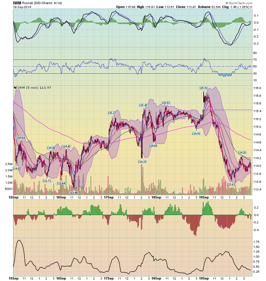
And so long as we're on the IWMS, let's take a look at important moves in the 5 minute weekly chart, comparing the SPYs and the IWMs.

The SPYs were in an uptrend all week. On several occasions they moved off the 200 minute EMA, using it as technical support. The 200 minute EMA was in an uptrend as well.


The IWMs (Russell 2000) continues to be the index to watch for "real" market sentiment.
The market has been consolidating since the Spring with a high in the upper 119s/lower 120s and low of 106s/107s. In addition, a prices are consolidating in a triangle pattern, with trend lines connecting the lows of May and the highs of July. The MACD his been trending lower since the July highs as well as has the RSI. We need to see a strong move above the 120 level or below the 106/107 level to get a better read on what this market really wants to do.
And so long as we're on the IWMS, let's take a look at important moves in the 5 minute weekly chart, comparing the SPYs and the IWMs.
The SPYs were in an uptrend all week. On several occasions they moved off the 200 minute EMA, using it as technical support. The 200 minute EMA was in an uptrend as well.
In contrast, note the sharp sell-off in the IWMs on Friday, and compare that to the SPYs sell off. The IWMs moved through the 200 minute EMA and continued lower until they were near the weekly lows. Only then did they rally. But the rally was only a bit stronger than a dead cat bounce, hitting resistance at the 50 minute EMA. And, the 200 minute EMA moved lower on Friday, in contrast to the SPYs.
Let's continue this comparison/contrast between the SPYs and IWMs by looking at the 30 day charts:
The 30 minute SPY chart can be broken down into two patterns, with the first being a price arc lasting for the first ~2/3 of the chart, as prices rose from the 197.25 level to the 200.6 level and then fell back to the lower 197s. But last week, in anticipation of the Fed's statement, the market rallied for the better part of the week. On Friday the market gapped higher, but then traded a bit lower.
Compare the SPY price chart to the IWMS, which have been in a downward trend printing lower lows and lower highs since the beginning of September. This is a pretty disciplined sell-off, meaning the bull/bear balance is only slightly balanced towards the bears. But it also indicates that risk appetite is weaker than we'd expect, especially if we're anticipating a stronger move higher.
Finally, let's look at the weekly SPY chart:
The overall annual uptrend is intact. Prices consolidated over the past few weeks, but moved through upside resistance on Thursday. The MACD is about to give a buy signal, and the RSI has room to move higher. This chart is pretty bullish. But remember the overall environment discussed above. The market is expensive and there is clearly a diminishing risk appetite that will hold back gains. Overall, we need more fundamentally bullish news such as corporate earnings growth, stronger employment numbers or overall GDP growth to keep moving consistently higher.
A thought for Sunday: the boring devil of an economy you know
- by New Deal democrat
I have always wanted to give readers "value added" -- not just report on the data like you can read at 100 different sites, or expound on a worldview with (intentionally or unintentionally) cherry-picked data. I think I'm pretty good at the economic version of what Wayne Gretsky famously called "skating to where the puck will be," and presumably you do too or you wouldn't be reading me! Since it's Sunday so I can kick off my shoes and pontificate without having to document everything with data. I thought I'd update my view of the bigger picture, since it is something I haven't done in awhile,
1. There is no political will to do anything to assist the economy, e.g., infrastructure repairs and upgrades, assistance to the middle/working classes. Back in 2009, Bonddad and I jointly called for the creation of a new WPA to help ameliorate the worst unemployment situation in 75 years. It become pretty clear by 2010 that none of the things an activist government might have done were going to happen, beyond the 2009 stimulus. I haven't seen the point in arguing in favor of any progressive economic agenda items that not only aren't going to happen before 2016, they almost certainly aren't going to happen before 2020 as things stand now.
The best we can hope for in the foreseeable future is that Washington does no further damage to the average American's well being, with further spasms of austerity (e.g., cutting off extended jobless benefits) or downright recklessness (threatening to refuse to pay the US's bills).
The slow growth is the result of a number of factors: the global race to the bottom, the ever-increasing concentration of wealth, continuing advances in automation, the secular increase in the price of Oil, and an aging population not only in the US but throughout the developed world (older folks don't buy nearly as much new stuff as younger folks who are making a new home and raising children).
The slow growth we've experienced since 2009 isn't going to change for the better in the immediate future. On the other hand, there is no sign that it is about to change for the worse.
3. While we are probably past the middle of the cycle, this is hardly shocking 5 years after the economy started to improve. The typical spending patterns I would expect to see as the cycle wears on have happened - e.g., a slow decline in real consumer spending, and a general plateauing in the purchase of vehicles. But that doesn't mean The End is Near. In fact, one of the noteworthy things I've noticed in the last few months is the virtual disappearance of Doomer commentary. It's so bad I actually have to go over and read Zero Hedge to make sure it still exists.
So let me tell you what I think reasonably could change the present dynamic for better or worse in the near future.
4. What would make the economy come closer to "escape velocity?" Is there anything that is reasonably likely to happen that could give the economy a second wind? I see two candidates:
- Even lower long term interest rates (refinancing, home purchasing). Long term treasuries bottomed at 1.74% in mid 2012. Mortgage rates made a bottom just over 3% shortly thereafter. Corporate bonds yields also made lows in 2012. Recently corporate bonds in particular have come near those lows. A new low in bond yields would send a powerful signal that the expansion is going to continue for awhile, especially with the inevitable new round of refinancing of consumer debt at lower rates.
- Gas prices declining under $3/gallon. Gas prices are like a tax on consumption. The less consumers spend on gas, the more they can both save and spend on other stuff.
- A significant rise in median real wages. This would be nice. I just don't see it in the near future (except as a byproduct of a further fall in gas prices). Hence, not a third candidate.
5. On the other hand, what are the most likely trends that would cause an economic downturn?
- Well, first of all, the reverse of the two items I listed above. Higher interest rates would bite into consumption, as would higher gas prices.
- "Conundrum 2." If the Fed actually starts raising short term rates while long term rates are declining, that would create one of the classic signs of a recession coming - i.e., a flat to inverted yield curve. If it happens in a deflationary environment, that would be even worse. Such a yield curve has only happened twice in the last 90 years -- in 1928 and 2006. That's why I call it the "Death Star."
- The combination of no increase in wages, no new lows in long term interest rates so no refinancing, together with a significant downturn in stock prices lasting several quarters. This is the most likely scenario. By next summer, we will have gone 3 years without consumers having been able to refinance debt at lower interest rates. Since 1981, this has been the sine qua non for a downturn. When the inability to refinance is accompanied by no wage increase, and no increase to new highs in widely held assets, in each case a recession has followed.
At the moment, house prices are still increasing, but not nearly to new highs, and there is very little home equity withdrawal going on, so that is not a source of consumer funds. On the other hand, stocks have been making new highs all this year. This appears to be having a pronounced wealth effect among the affluent to wealthy households that own stocks, and is fueling consumption (although none of that is "trickling down" to the bottom tiers).
In conclusion, unitl one of the above scenarios finally tips the balance, growth will wax and wane. I still think there will be deceleration in the remaining part of this year. An uptick in the first part of next year looks more likely than a continued deceleration.
Saturday, September 20, 2014
Weekly Indicators for September 15 -19 at XE.com
- by New Deal democrat
My Weekly Indicators piece is up at XE.com.
At the beginning of this year, I forecast a deceleration of growth in the latter part of the year. It may be starting to show up.
Friday, September 19, 2014
About recovery, the American people "get it"
- by New Deal democrat
I wanted to pass this on, from Pew Research via Digby.
Asked about whether the American economy is in a recovery, and if so, how strong, here was the breakdown of the replies:

This is the point Bonddad and I have been making for 5 years. Yes, the economy is recovering, yes it is a positive. It's just not good enough. The American people get it.
Thursday, September 18, 2014
August housing permits: apartments are still carrying the market
- by New Deal democrat
I have a new post up at XE.com about this morning's housing report.
Most of the analysis seems to be slightly DOOOMish clickbait. In fact, while this report was poor month-over-month, a longer-term look supports positivity about the coming months.
John Hinderaker: The Great Contrary Indicator
On September 3, 2009, John Hinderaker at Powerline wrote the following:
We’ll let it rest there: hyperinflation or default. One or the other is the inevitable result of the unprecedented irresponsibility of Barack Obama’s administration. Either one is a disaster, not so much for us, but for our children. Obama and his advisers are gambling, evidently, that we don’t care much what happens to our children and grandchildren, or to our country after we’re gone.
Yet today, we have this from Dr. Yardeni:

 Remember gold?
We used to talk a lot about it around these parts, but we've pretty much stopped following it ever since the whole goldbug, Fed-hater thing got so thoroughly discredited.
Anyway, it's not looking so hot. In fact, it kind of looks like death.
And the dollar collapse:

Here's the deal: Mr. Hinderaker has been a great contrary indicator for the past 5 years. Whatever he says, DO THE OPPOSITE. He's that bad
We’ll let it rest there: hyperinflation or default. One or the other is the inevitable result of the unprecedented irresponsibility of Barack Obama’s administration. Either one is a disaster, not so much for us, but for our children. Obama and his advisers are gambling, evidently, that we don’t care much what happens to our children and grandchildren, or to our country after we’re gone.
Yet today, we have this from Dr. Yardeni:
Since Mr. Hinderaker made his inflation prediction, global inflation has been tame to non-existent. (Invictus and I debunked this claim of hyperinflation when it was made. See this article at the Huffington Post)
And the US default?
The budget gap is closing.
This seems like a clue as to where the Obama administration intends to take the economy. If I’m not mistaken, Jimmy Carter did much the same thing: juice the currency, try to stimulate growth and worry about the inevitable inflation later. The problem, of course, is that the federal government’s policies are doing just about everything possible to suppress economic growth. Nothing the Fed can do will make up for an anti-growth, anti-business administration. But it can create inflation, and here’s betting it will. The moral of the story is, look for the dollar to decline sharply. Buy gold.
So -- how is that gold bet paying off? According to today's Business Insider Gold Looks Like Death:
We used to talk a lot about it around these parts, but we've pretty much stopped following it ever since the whole goldbug, Fed-hater thing got so thoroughly discredited.
Anyway, it's not looking so hot. In fact, it kind of looks like death.
And the dollar collapse:
Here's the deal: Mr. Hinderaker has been a great contrary indicator for the past 5 years. Whatever he says, DO THE OPPOSITE. He's that bad
Wednesday, September 17, 2014
The loosening OIl choke collar is helping real wage growth
- by New Deal democrat
I have a new post up at XE.com. Together with the trend of slowly rising wage growth, today's -0.2% CPI reading, fueled by the continued loosening of the Oil choke collar, is just what the doctor ordered.
Tuesday, September 16, 2014
John Hinderaker Can't Even Read A Graph
Now we have the headline "Income Stagnation Under Democrats."
Hinderaker posts this graphic from the Census, claiming it shows Democratic policies lead to a drop in incomes:

Except, of course, that isn't what the graph shows. It shows the incomes rose in the 1980s and 1990s (Democrats and Republicans) and then moved sideways under Bush (who Hinderaker called a genius) and down under Obama. In other words, it rose under a Republican and Democrat, stagnated under Bush and fell under Obama. This is called chart reading, which Hinderaker obviously can't do.
And then there is this:

Hinderaker posts this graphic from the Census, claiming it shows Democratic policies lead to a drop in incomes:
Except, of course, that isn't what the graph shows. It shows the incomes rose in the 1980s and 1990s (Democrats and Republicans) and then moved sideways under Bush (who Hinderaker called a genius) and down under Obama. In other words, it rose under a Republican and Democrat, stagnated under Bush and fell under Obama. This is called chart reading, which Hinderaker obviously can't do.
And then there is this:
The reality is that as the labor force participation rate rose (largely due to women and baby boomers entering the labor force) incomes and the economy expanded. But as the baby boomers started to retire (which is the primary reason for the drop in the LFPR) incomes started to stagnate.
So, Hinderaker can't even read a simple graph correctly. Dear God, but this man is stupid.
Sunday, September 14, 2014
John Hinderaker's Economic Incompetence In One Venn Diagram
Many thanks to both Economists View and Professor Krugman for linking to this piece. If you'd like to read my more serious economic articles, please go over to the XE.com Currency Blog where most of my work is posted now.
I love when John Hinderaker tries to take down Paul Krugman. One of the participants has a Nobel Prize in economics; the other has been consistently wrong about the economy for the better part of 10 years. (In case you're wondering, the "Krugman is a hypocrite" argument was debunked here. As usual, a simply internet search would have revealed that, but Hinderaker was never big on research.)
So, when Hinderaker used a Venn diagram from another blog, I made one of my own. As you may know, Hinderaker was a big proponent of the argument that the Fed's QE would lead to a massive spike in inflation. As I recently noted, Bloomberg calculated the cost of investing based on this advice. Based on their calculations, the "inflation is just around the corner" trade would have lost an investor over $1 trillion dollars. In honor of that little bit of data, I made the following diagram to show just how incompetent Hinderaker is at economics:

I love when John Hinderaker tries to take down Paul Krugman. One of the participants has a Nobel Prize in economics; the other has been consistently wrong about the economy for the better part of 10 years. (In case you're wondering, the "Krugman is a hypocrite" argument was debunked here. As usual, a simply internet search would have revealed that, but Hinderaker was never big on research.)
So, when Hinderaker used a Venn diagram from another blog, I made one of my own. As you may know, Hinderaker was a big proponent of the argument that the Fed's QE would lead to a massive spike in inflation. As I recently noted, Bloomberg calculated the cost of investing based on this advice. Based on their calculations, the "inflation is just around the corner" trade would have lost an investor over $1 trillion dollars. In honor of that little bit of data, I made the following diagram to show just how incompetent Hinderaker is at economics:
Saturday, September 13, 2014
Weekly Indicators for September 8 - 12 at XE.com
- by New Deal democrat
My Weekly Indicators post is up at XE.com.
Will the big decrease in interest rates this year give housing a second wind? Housing permits will assume more than their usual importance when they are reported in the coming week.
Thursday, September 11, 2014
Expect another upward revision of Q2 GDP: over 4.5%?
- by New Deal democrat
You may remember 3 months ago when Q1 GDP was revised all the way down to -2.9%, from an initial report of +0.1%, the main culprit was a sudden and unexpected decline in health care costs. The BEA acknowledged that this came from exactly one report: the Census Bureau's Quarterly Services Report.
I wrote a post confirming something Dean Baker (?) had written: namely, that the same thing had occurred 50 years ago when Medicare was inaugurated. There was a one quarter sudden and anomalous decline in GDP. But then it was followed by a surge in the next quarter.
Well, this morning the Quarterly Services Report for the 2nd quarter was released, and it shows a similar surge in Q2 compared with Q1. Hospital services, which unexpectedly declined -1.3% seasonally adjusted from Q4 2013 to Q1 2014, rose by +2.6% in Q2 2014. The larger aggregate of health care services, which isn't seasonally adjusted in the report, rose +3.0% in the 2nd Quarter, after declining -2.0% in the 1st.
In comparison, the Q1 to Q2 change in 2013 for health services was about 2.2%, and added .4% to GDP.
While I am no maven of the minutiae of how GDP is calculated, nevertheless since 2nd quarter 2014 GDP as presently revised only shows a +.05% contribution by health care, it appears that at very least 2Q 2014 GDP is likely to be revised upward to 4.5% or better.
Even if so, the bad news is that the combined GDP for the first half of 2014 would still only be about +1.2%.
The Conundrumette
-by New Deal democrat
I have a new post up at XE.com.
The unusual big divergence between stock returns (booming) vs. bond yields (falling significantly since January of this year) is trying to tell us something. But what is it?
Wednesday, September 10, 2014
Why has job growth outperformed GDP growth?
- by New Deal democrat
In mt last post, I politely took issue with Dean Baker's claim that August's mediocre jobs number was not an outlier. Rather, I pointed out, for the last 3 /12 years we have had an unusually strong trend in job growth compared with GDP growth.
The YoY percentage of jobs added since World War Two has been about -1.5% less than the YoY percentage growth of real GDP. In other words, if GDP is about 2%, about half of the time there has only been 0.5% job growth or more, and about half the time there has been less than 0.5% growth. Since the beginning of 2011, however, GDP has grown gernerally between 1.5% and 2.5% a year, but job growth has also ben about 1.5% a year -- about 1% higher than that median historical trend.
Here's the graph of YoY jobs - YoY GDP adjusted by 1.5%, so that the long term median is 0, for the last 30 years:

So why have jobs, relatively speaking, so significantly outperformed GDP? Here's my working hypothesis.
Here is a graph you've seen a number of times before. This is a graph of initial jobless claims as a percentage of the entire civilian labor force, plus those who are not in the labor force but want a job now:

What this adjustment does is tell us what percentage of people who hold a job, or want a job, are laid off in any particular week. In this way it takes into account demographics and in particular, the large cohort of Boomers over 55 years old who are retiring in droves.
What you can clearly see is that this ratio is extremely low. Relatively speaking, the rate of layoffs is equal to the lowest in the last 50 years. Another way of looking at this data is that employers are running particularly tight ships. Compared with the entire post-WW2 era, they have pared the number of workers they need down to the absolute minimum for the current level of work.
The next graph is the percentage of all jobs that are temporary jobs:

This graph is just the opposite of the initial jobless claims graph. It is at an all-time high.
Putting this all together, we have an employment environment where, compared with the post-WW2 era, employers have exactly enough employees to cover a regular workload with no slack whatsoever. When the workload increases, the existing workforce is not sufficient to handle it. New workers, with a bias towards temporary workers (who aren't entitled to medical benefits and whose contract can be terminated at any time) need to be employed. This compares with the earlier era where new work meant that the slack in the workloads of existing employees was pared down. The net result is that increased activity (increased GDP) leads to a need for relatively more new hires.
One way to test that is to compare hours worked with jobs created. Once existing workers are pushed to the limit, the only way to increase output is to hire more workers. As it happens, we can test exactly that by comparing aggregate hours worked in the economy (blue) to total jobs (red), and norming each to their prior peak in 2007:

What we see is that aggregate hours increased more than jobs until the entire shortfall was made up by about the beginning of 2012. Since that time, both series have moved in nearly identical trends. While it's not a perfect fit, it suggests that at least since the beginning of 2012, current employees have been fully utilized. Increased output has required additional workers.
It seems to me this is a good explanation for the relative outperformance of job growth vs. GDP growth in the last 3 1/2 years.
Tuesday, September 9, 2014
Powerline Blog Issues No Response to My Request For a Comment On Their Longstanding And Incorrect Inflation Arguments
Since the Federal Reserve engaged in QE, Powerline blog has been one of many voices arguing inflation would result. It hasn't:

Bloomberg wrote an article about the Fed naysayers yesterday that included this calculation:
If you agreed with all the academics, billionaires and politicians who denounced Federal Reserve monetary policy since the financial crisis, you missed $1 trillion of investment returns from buying and holding U.S. Treasuries.
That’s how much the government bonds have earned for investors since the end of 2008, when the Fed dropped interest rates close to zero and embarked on the first of three rounds of debt purchases to resuscitate an economy crippled by the worst recession since the Great Depression.
The resilience of Treasuries represents a rebuke to the chorus of skeptics from Stanford University’s John Taylor to billionaire hedge fund manager Paul Singer and U.S. House Speaker John Boehner, who predicted the Fed’s unprecedented stimulus would lead to runaway inflation and spell doom for the bond market. It also suggests investors see few signs the five-year-old expansion will produce the kind of price pressures that would compel Fed Chair Janet Yellen to side with the central bank’s hawkish officials as they consider when to raise rates.
I wrote an email to Powerline Feedback yesterday:
The writers at Powerline have uniformly argued the Fed’s policy of quantitative easing would lead to massive inflationary pressure.
However, as pointed out in a recent Bloomberg article (see link below), if someone had followed this investment thesis (which would have led them to bet against the US Treasury Market) they would have lost a large amount of money.
Do you have any intention of issuing any type of “mea culpa” regarding your incorrect analysis?
F. Hale Stewart JD, LLM
Bloomberg wrote an article about the Fed naysayers yesterday that included this calculation:
If you agreed with all the academics, billionaires and politicians who denounced Federal Reserve monetary policy since the financial crisis, you missed $1 trillion of investment returns from buying and holding U.S. Treasuries.
That’s how much the government bonds have earned for investors since the end of 2008, when the Fed dropped interest rates close to zero and embarked on the first of three rounds of debt purchases to resuscitate an economy crippled by the worst recession since the Great Depression.
The resilience of Treasuries represents a rebuke to the chorus of skeptics from Stanford University’s John Taylor to billionaire hedge fund manager Paul Singer and U.S. House Speaker John Boehner, who predicted the Fed’s unprecedented stimulus would lead to runaway inflation and spell doom for the bond market. It also suggests investors see few signs the five-year-old expansion will produce the kind of price pressures that would compel Fed Chair Janet Yellen to side with the central bank’s hawkish officials as they consider when to raise rates.
I wrote an email to Powerline Feedback yesterday:
Gentlemen,
The writers at Powerline have uniformly argued the Fed’s policy of quantitative easing would lead to massive inflationary pressure.
However, as pointed out in a recent Bloomberg article (see link below), if someone had followed this investment thesis (which would have led them to bet against the US Treasury Market) they would have lost a large amount of money.
Do you have any intention of issuing any type of “mea culpa” regarding your incorrect analysis?
F. Hale Stewart JD, LLM
They have yet to write anything in response.
In which I politely disagree with Dean Baker about the employment report
- by New Deal democrat
Last Friday Dean Baker wrote that Economists who understand economics didn't see the August Jobs Report as an Outlier, saying:
Actually, the numbers match the market very well. The economy grew at a 1.1 percent annual rate in the first half of the year. Faster growth in the second half of the year might bring the rate for the whole year to 2.0 percent. If we assume that productivity growth is 1.5 percent, this would imply an increase in the demand for labor of 0.5 percent. That translates into 700,000 jobs for the year or roughly 60,000 a month.Let me state right here that, like Bill McBride a/k/a Calculated Risk, I think it most likely that August is simply an outlier. As Jeff Miller pointed out on Sunday, the standard error in this series runs up to 100,000 a month, and as Bill pointed out, even in the best years for job growth, there has always been at least one faceplant.
You can probably see the issue here right off the bat: If Dean is correct that August wasn't an outlier -- that if anything it was above trend at 142,000 -- then what about the last 7 months, in which 1.4 million jobs, or over 200,000 a month were added? Were they all outliers? In a row? In fact, what about the last 3 1/2 years, as I'll show below.
To begin with, if we go back 65 years, all the way to 1948, when we can track both GDP and jobs, there have been 266 quarters in total. When we compare real annualized job growth vs. real annualized GDP growth over those 266 quarters, the median difference is about 1.5%, meaning that in about half of those quarters, real GDP growth exceeded job growth by 1.5%, and in the other half real GDP growth was less than 1.5% higher than job growth. Here's the graph - you'll just have to trust me on the count, unless you want to do it yourself!:

Here's a closer-in look at the last 30 years:

Two things to notice are (1) there is a lot of variability around that 1.5% median, and (2) since the beginning of 2011, job growth has been well above trend in about 2/3 of the quarters, sometimes by over 2.5%.
Here's a slightly different way to look at the same thing. This is the YoY% of real GDP growth (red) compared with the YoY% of job growth (blue):

You can see that job growth has typically been only about 0.5% to 1.0% less than real GDP growth for the last 3 1/2 years, in other words +0.5% to +1.0% higher than the long term trend that is Dean's benchmark.
So my question to Dean Baker is, respectfully, if August isn't the outlier, then what is your explanation for the job growth of ~8.2 million, or nearly 200,000 a month, for the last 3 1/2 years?
I do have a hypothesis, which I'll share in my next post.
Subscribe to:
Posts (Atom)