Tuesday, April 3, 2012

March payrolls: expect ~250,000 gain, 8.2% unemployment

- by New Deal democrat

When all is said and done, employment and income are the two most important measures of the economy. If there are more jobs and better incomes available to a substantial majority of society, the economy is working. When jobs and income are in decline, the society is in serious trouble. While the economy bottomed close to three years ago, progress on both fronts, while real, has been disheartening in comparison with a truly healthy economy.

Still, there has been better progress on the jobs front in the last few months, and it looks like March will be no exception.

While the BLS has rejiggered its seasonal adjustment for initial claims, that hasn't meaningfully affected the trendline with job growth. They may do the same this Friday to payroll numbers. If so, the following discussion applies to the pre- rejiggered figures.

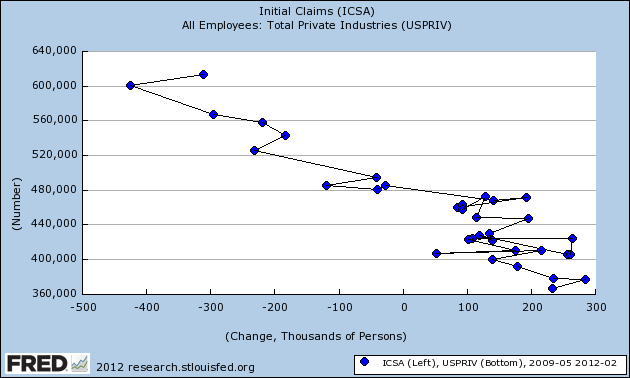
First, let's look at the scattergraph of initial claims vs. private payrolls. Since the average initial claims in March was about the same as for February, I expect a similar number, in the ballpark of 250,000 private sector jobs. If the trend from the last year holds true, February will also be revised upward significantly, also to about 250,000.


Remember, if we were on the cusp of entering an economic contraction, new jobs offered would decline before layoffs increased, meaning the new entries on the scatterplot would shift substantially to the left. Should March come in under 200,000 (again, pre-rejiggering the seasonal adjustments), and should February also be revised down under 200,000, that would be a bad omen. Conversely, if both come in, pre-rejiggering, in line with the established trend, that would suggest that the recovery will continue for near future. With the American Staffing Index of temp jobs rising to its best level since the recession in the last month, and Online Help Wanted ads rising to their highest level ever, a continuation of the trend is the most likely outcome.

The biggest candidate for a positive surprise is the unemployment rate. Had there not been a surge of re-entrants to the labor force last month --i.e., had the labor force remained steady -- the unemployment rate would have dropped to 8.0%.

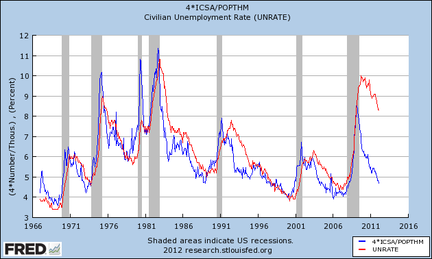
This is the graph of the initial jobless claims rate, (blue) compared with the unemployment rate (red), updated through February:


Keep in mind that the rate of initial claims leads the unemployment rate, and has since records started to be kept.

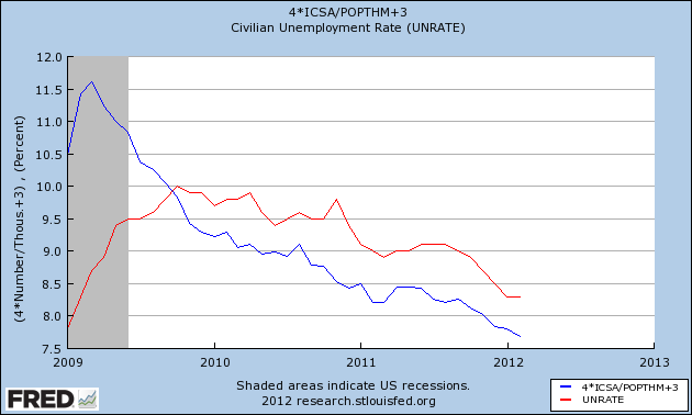
Now here's the close-up for the last 3 years (with initial claims rebased to show the similarities more clearly):


With the rate of initial claims continuing in March at its February rate, expect the unemployment rate to continue to drop. A decline to 8.2% in the U3 unemployment rate looks likely, and a drop to 8.1% well within the range of possibility.

Morning Market Analysis: BRIC Weakness


The Brazilan market ETF hit the 70 price level at the beginning of March, but has been moving lower since.  Prices are now in the 65.5 area (about 8% lower), and are right above support established in late October.  Momentum is declining, as are the shorter EMAs.  Prices are also right at the 200 day EMA. 


The real ETF has also dropped moving from the 21.6 are to 20.25 -- about a 6.25% drop.  Prices are right at the 61.8% Fib level and have been consolidating here for the last half of March.  The EMA picture shows all three shorter EMAs (the 10, 20 and 50) declining. 


The Brazilian yield curve is still pretty steep -- there's about a 200 basis point differential between the short and long end.  There is a very slight inversion at the short end of the curve -- the 3 month is 9.19 and the six month is 9.03.  Also remember the Brazilian Central Bank has been dropping interest rates:


The Russian market is in a very similar situation.  After hitting a high just above 33, prices have been drifting lower and are currently at 31.28 -- a drop of about 5%.  The big issue with this chart is that prices are right at the 200 day EMA with declining momentum but rising volume stats.


The Indian market is in the middle of a downward sloping pennant pattern which is consolidating prices. Prices have moved from the 62 level to 57.51 -- a drop of about 7.25%.  Prices are also right below the 200 day EMA and the shorter EMAs are dropping.  On the good side, the MACD is about to give a buy signal and the volume indicators are rising.


The Chinese market is consolidating in a downward sloping pennant pattern, much like the Indian market.  After rising to just shy of the 41 price level, prices have retreated to 37.09 -- a drop of nearly 10%.  The MACD is declining and the A/D and CMF are rising.

The BRICs are all moving lower.  No one is crashing; but traders are clearly at minimum taking profits from recent rallies and reassessing their respective opinions about these markets. 

Monday, April 2, 2012

Bondad Linkfest

  1. UK manufacturing increases (FT)
  2. Ireland tax protest gaining steam (FT)
  3. Japan's Tankan survey is negative (FT)
  4. Stocks enjoy best 1Q in 14 years (FT)
  5. Crop report highlights (Agrimoney)
  6. Will stocks trade sideways into the spring (Marketwatch)
  7. Consumer spending increases, incomes, not so much (Marketwatch)

Republican Economic Talking Points Are Baseless and Devoid of Fact

First, I want to apologize in advance for this overtly political post.  I hate politics and frankly, have a fair amount of disdain for both political parties.  While I used to be a Democrat, I was basically told I was "too centrist" or "pro business" for their liking and am now an independent.

And while I try and keep politics out of this blog, there are times when it becomes impossible for me to keep my mouth shut.  When the talking points of one side of the political blogsphere are this unhinged from reality, I feel forced to speak up and explain why these points are completely baseless when compared to the underlying data.  By unhinged, I mean this:  

THERE IS ABSOLUTELY NOT ONE BASIS IN FACT FOR ANY OF THE FOLLOWING TALKING POINTS.  IN FACT, THE UNDERLYING DATA INDICATES THE EXACT OPPOSITE IS HAPPENING:

Obama is a Socialist and we are becoming a socialist country: no. If this were true, we'd see a continual increase in government spending influencing the economy.  However, we are not, as evidenced by the following data from the Bureau of Economic Analysis:


The above chart shows the percentage contribution of non-defense federal spending and state and local government spending to GDP growth for the last three years.  First, state and local government spending has actually been subtracting from growth for the 10 out of 12 quarters -- hardly a takeover.  And while government spending did add to growth, the largest contribution to growth as a shopping .4, when the entire economy grew 3.8%, meaning government spending accounted for a whopping 10% of all GDP growth.


In addition, if we were in the middle of a socialist takeover, we'd see an increase in government employment.  In fact, we've see the exact opposite occur -- government jobs have been decreasing since 2009, with the exception of the census hiring in 2010.

If we were really seeing a socialist takeover of the country, this chart would look far different.  Or, put another way:


Businesses have been frozen in their tracks because of government regulation:  No.  If this were true, we'd see absolutely no business investment.  In fact, the exact opposite has been true:


The above chart shows the Q/Q percentage growth in investment in equipment and software.  Yes, we do see a contraction for the first two quarters.  However, we see continual growth for the last 10 quarters.  In addition, we see a few of those quarters clocking in at very strong growth rates.

The tax burden is too high and is choking growth: no.  Actually, the tax burden we currently have is one of the lowest in the last 60 years:


The above chart is from Felix Salmon of Reuters, who noted the following
  • Federal taxes are the lowest in 60 years, which gives you a pretty good idea of why America’s long-term debt ratios are a big problem. If the taxes reverted to somewhere near their historical mean, the problem would be solved at a stroke.
  • Income taxes, in particular, both personal and corporate, are low and falling. That trend is not sustainable.
  • Employment taxes, by contrast—the regressive bit of the fiscal structure—are bearing a large and increasing share of the brunt. Any time that somebody starts complaining about how the poor don’t pay income tax, point them to this chart. Income taxes are just one part of the pie, and everybody with a job pays employment taxes.
  • There aren’t any wealth taxes, but the closest thing we’ve got—estate and gift taxes—have shrunk to zero, after contributing a non-negligible amount to the public fisc in earlier decades.
We (Republicans) care about the deficit: no.  If that were true than the Republican candidates would have proposed reasonable plans to lower the deficit.  In fact, the exact opposite is true.  From the Christian Science Monitor:

According to a new analysis from the non-partisan Committee for a Responsible Federal Budget, none of them would. At least not through the next decade. In fact, compared to what the fiscal watchdog calls a realistic budget baseline (that is, if the government continues on the track it’s on today) all of the GOP candidates, save for Ron Paul, would make matters worse.

Rick Santorum and Newt Gingrich would make things far, far worse. Mitt Romney’s tax and spending plan wouldn’t bend the debt curve very much one way or the other. But, according to CRFB, if he doesn’t find a way to pay for his latest plan to cut tax rates by 20 percent Romney would significantly increase deficits and the debt as well.  

Except for Paul, each of the candidates has the same problem. They have enthusiastically promised to cut taxes in very specific ways—sometimes by vast amounts. But when it comes to offsetting spending reductions or cuts in tax breaks, they mostly offer little more than platitudes.

A few numbers: The group figures that if government policy stays on track, the national debt would grow from 78 percent of Gross Domestic Product today to 85 percent in 2021. Paul would pare that to about 76 percent.

With Romney, the debt would change little from the CRFB baseline but only if he finds tax hikes to offset those 20 percent rate cuts. He has not said what those revenue increases would be, and without them, he’d add about $2.6 trillion to the debt and drive it to about 96 percent of GDP. Santorum would increase the debt by $4.5 trillion to 104 percent of GDP. Gingrich would add $7 trillion to the debt and drive it to 114 percent of GDP.
All of the plans, save Ron Pauls, would increase the deficit.  In other words, taking care of the deficit is in fact the last thing on your mid.

Over the last few years, we've see some surprising studies regarding conservatives.  The latest  is that educated conservatives trust science less and less:
Confidence in scientists has declined the most among the most educated conservatives, the peer-reviewed research paper found, concluding: "These results are quite profound because they imply that conservative discontent with science was not attributable to the uneducated but to rising distrust among educated conservatives."

 "That's a surprising finding," said the report's author, Gordon Gauchat, in an interview. He has a doctorate in sociology and is a postdoctoral fellow at the University of North Carolina at Chapel Hill.
Put another way, the profession that relies on data, evidence and critical thinking is anathema to modern Republicans.  That's not very encouraging. 

In addition, only 6% of scientists consider themselves Republicans:


A profession that deals with facts and data wants absolutely nothing to do with one of the major political parties in the US.  Let that statement sink in as you let it's ramifications manifest.  It's a very scary, 1984ish type of picture that emerges.

For me, the above two data points are by far the scariest, as they show a truly troubling development: data, facts and reasoning are now shunned by a major political party.  At some point in the last round of Republican debates, a questioner asked who either didn't believe in evolution or did believe in creationism.  All candidates raised their hands.  That fact alone should disqualify all for any elected office, from president down to dog catcher.  Think about what these people said with that statement in relation to the modern world that is dominated by technology.  Do any of these candidates want to regularly see a doctor who doesn't believe in natural selection or the scientific method? 

I was originally educated by Jesuits (St. Xavier High School, Cincinnati, Ohio, Go Bombers).  There is one thing they ingrained in me:  Look at the data -- as in facts , as in the hard and objective reality to see what it says.   And yet, one party is now saying, "I don't believe in data as we know it."  That explains their continual reiteration of economics claims which completely ignore reality as expressed by economic numbers. 

The above data points indicate that fundamental tenants of the current Republican economic talking points are false. Government spending is in fact subtracting from growth and government jobs are falling.  This indicates we're not a socialist country.  Businesses are still investing at a strong clip, indicating they're not frozen in their tracks.  The overall tax burden is in fact low.  And no one in the Republican field has put forward a deficit reduction plan that has an ounce of credibility.  In short, Republicans aren't even on the same planet when it comes to the economy. 

The second set of data regarding conservatives and science indicates that data does not mean anything to Republicans.  And that is what has truly terrifying implications for the formulation of policy at the national level.  When one player has absolutely no use for data, it's impossible to negotiate in good faith.


Morning Market Analysis

To review my view of the market:

I am concerned about the rally at this point for the following reasons.  The Chinese market is dropping; it is not a precipitous drop, but it is clearly moving lower.  It is taking the Asian rim with it.  The reason for the FXI drop is a slowdown in Chinese economic data.  In addition, the EU region is also slowing, and is probably in a shallow recession.  Finally, Brazilian Russian and Indian markets are also moving lower, making the US the only equity market rallying.

The question becomes this: can the US enter a period where the economy is self-sustaining?  That's something I'll look at throughout this week.  However, let's take stock of various indexes:


The 30 minute QQQ market sums up the equity price action for the week.  Prices rose in the earlier part of the week, but fell starting on Wednesday and closed the week out weakly.  Overall, prices rose from the 67.2 level to the 68.4 level -- a gain of 1.78%, but fell to the 67.5 level.


The 60 minute QQQ chart shows a few important trends.  First, prices broke an important uptrend last week.  Secondly, momentum (the MACD) is dropping.  Third we see a price cluster around the 67 level, indicating this is an important area of technical support.


The daily QQQ chart shows that prices are still firmly in an uptrend.  The EMAs are bullishly aligned and volume is flowing into the market.  However, momentum isn't rising.  In addition, the Bollinger Bands are widening, indicating we're entering a period of increased volatility.


The Russell 2000 is still mired around the 83 price level.  Also note the declining momentum.  This is the risk based part of the market, indicating traders are concerned about risk at this time.


The transports have the same problem as the IWMs, although the transports resistance area is around the 96.5 area.

The above charts are not fatal by any stretch.  However, remember that we'd like to see a wide swatch of the equity indexes participate in a rally.  That's not happening.  Most importantly, the risk based part of the market -- the IWMs -- are struggling to move higher, as are the transports. 


Saturday, March 31, 2012

Weekly Indicators: springtime getaway edition

- by New Deal democrat

This is a slightly truncated version of Weekly Indicators, as I'm preparing it before leaving on a weekend trip, where I will be doing my part to assist the recovery.

The monthly data releases this week included GDP, which was unrevised. The alternative GDI measure, however, came through very strong for the 4th quarter of last year. Case-Shiller house prices continued to fall. Durable goods rebounded, but did not overcome January's large drop. Chicago's PMI remained strongly positive. Consumer confidence increased. Personal income rose a little. Personal spending rose a lot. The savings rate declined sharply.

Turning to the high frequency weekly indicators , let's start with retail sales and gasoline prices and usage. If the Oil choke collar is causing the economy to constrict, here's where we should be seeing it:

The energy choke collar remains engaged:

Gasoline prices are about 8.7% higher than one year ago while usage continues to be much lower: Oil was about $3 lower at $103.50 Friday morning. Gas at the pump rose another $.05 to $3.92. Gasoline in particular is significantly above the point where it can be expected to exert a constricting influence on the economy. Gasoline usage, at 8710 M gallons vs. 8886 M a year ago, was off only -1.8% YoY. The 4 week moving average remains off -6.1%. The 4 week average is not off sufficiently from its YoY readings from the last 6 months, and the weekly number is the best in months.

Sales remained positive.

The ICSC reported that same store sales for the week ending March 24 fell - 0.5% for the week, but rose +2.7% YoY. Johnson Redbook reported a 3.3% YoY gain. The 14 day average of Gallup daily consumer spending at $78 is the highest spring reading since the recession, and indeed equals the highest at any point except for the holiday season, up 20% YoY.

Between gasoline usage and same store retail sales, as of this week anyway, consumers apparently failed to get the memo that they are supposed to be exhausted.

Turning to housing, the Mortgage Bankers' Association reported that the seasonally adjusted Purchase Index increased +3.3% from the prior week, and was also +1.0% higher YoY. The Refinance Index decreased -4.9% from the previous week, reflecting higher rates and a pause before the new government refinancing assistance program starts.

YoY weekly median asking house prices from 54 metropolitan areas at Housing Tracker were up +3.8% from a year ago. This number peaked at over +4% in February. It remains at odds with the Case-Shiller reports of worsening YoY declines in price for comparable sales, although the NAR, Census Bureau, and FHA average sales prices have also turned positive or within a percent thereof as of their last report. Typically non-seasonally adjusted home sales prices peak in about June, so we should see in the next 3 months whether asking prices capitulate or if comparable sales prices firm.

Employment related indicators were positive or neutral:

The Department of Labor reported Initial jobless claims of 359,000 last week. The four week average declined by 3500 to 365,000, the lowest revised number in 4 years. Had there not been seasonal revisions, which increased recent weeks' numbers by 10,000 +/-1000, this week's report would have been almost exactly the same as last week's. There will be two more weeks where the new seasonal revisions will increase the number compared with the former adjustments, before turning lower later in April.

The American Staffing Association Index increased again by one to 89. It is now well above last year's level is approaching its 2007 level.

The Daily Treasury Statement shows that 20 days into March, $155.9 B has been collected in withholding taxes vs. $151.2 B a year ago, for an increase of 3.1% YoY.

Money supply, however, was flat to negative on a weekly and monthly basis:

M1 fell -0.9% last week, and was lower by -0.2% month over month. On a YoY basis it rose to +17.2%, so Real M1 is up 14.4%. YoY. M2 fell -0.3% for the week, and up only +0.1% month over month. Its YoY advance fell to +9.6%, so Real M2 was up 6.8%. The YoY comparisons are becoming tighter (although still historically high), and have generally stalled on a weekly and monthly basis for the last couple of months, which is becoming noteworthy.

Bond prices and credit spreads both fell:

Weekly BAA commercial bond rates rose +.06% t0 5.34%. Yields on 10 year treasury bonds rose +.11% to 2.32%. The credit spread between the two, which had a 52 week maximum difference of 3.34% in October, declined another .05 to 3.02%. As I have previously said, narrowing credit spreads are not at all what I would expect to see if we were going into a recession. As they are a strong component of ECRI's WLI, this is probably a big part of why their growth index is no longer negative (it is exactly at 0.0). According to Prof. Moore's 1992 book, the first signal of a recovery after a recession is when the growth index rises to 1.0. In another couple of weeks, ECRI may have a lot more 'splainin' to do.

Rail traffic remained negative but with the same explanation.

The American Association of Railroads reported a -11,100 car decline in weekly rail traffic YoY for the week ending March 24, 2012, for a decline of -2.2% YoY. Intermodal traffic was up 10,400 carloads, or +4.2%, but other carloads decreased -21,500, or -7.2% YoY. The entire decline in carloads is still due to coal shipments which were off -23,600 carloads or -17.4%. Railfax's graph of YoY traffic by types remains in a positive trend but deteriorated again this week, also due entirely to the steep decline in coal hauling.

Turning now to high frequency indicators for the global economy (as of Thursday):

The TED spread rose .01 to 0.41. This index remians slightly below its 2010 peak, generally steady for the last 6 weeks, and has declined from its 3 year peak of 3 months ago. The one month LIBOR remained at 0.241. It is well below its 12 month peak set 3 months ago, remains below its 2010 peak, and has returned to its typical background reading of the last 3 years.

The Baltic Dry Index rose 22 to 930. It has risen 280 from its 52 week low, but is still well off its October 52 week high of 2173. The Harpex Shipping Index also rose 3 from 393 to 39 in the last week, up 18 from its 52 week low. 6Please remember that these two indexes are influenced by supply as well as demand, and have generally been in a secular decline due to oversupply of ships for over half a decade. The Harpex index concentrates on container ships, and led at recent tops and lagged at troughs. The BDI concentrates on bulk shipments such as coal and grain, and lagged more at the top but turned up first at the 2009 trough.

Finally, through Thursday the JoC ECRI industrial commodities index fell from 125.74 to 124.47. This is the most significant decline in several months. I have serious questions how well this indicator forecasts the US as opposed to the global economy.

The monthly data showed that the rebound has been real, no recession was "imminent" 6 months ago, and it pretty much takes contraction off the table for Q1 2012 as well. Further, while gasoline prices remain an ongoing concern, and while decreased mining, shipping, and usage of coal (probably due to the non-winter winter) will exert a negative influence on Q1 GDP, the remaining high frequency indicators were virtually all positive again this week. Consumers continuing to hold up is a very good sign for the economy going forward.

Have a good weekend.
Friday, March 30, 2012

Weekend Weimar, Beagle and Pit Bull

It's that time of the week again.  It's time to think about anything except the economy or the markets.  NDD will do an abbreviated weekly indicators this week.  I'll be back on Monday.  Until then ....


ECRI's got some more 'splainin to do

- by New Deal democrat

I feel kind of bad continuing to pick on ECRI. Their 2009 end-of-recession call was a once in a generation bullseye. I appreciate their approach. I even understand, if I don't like, their need for a black box.

But nobody's perfect. I certainly haven't been. And the evidence contrary to their recession forecast continues to accumulate.

First, here's Lakshman Achuthan on Bloomberg, on December 8, 2011:
Achuthan also noted that “the other half of the GDP report,” gross domestic income or GDI (which tends to be the more accurate measure of GDP) was up just 0.3% in the most recent quarter [NDD note: Q2 2011]. The Federal Reserve has observed that when GDP and GDI differ, the GDP figure tends to be revised toward GDI, not the other way around. Achuthan warned that the GDI figures are “a big red recession signal.”
Here's the BEA, yesterday:
GDI Q3 up 2.6%
GDI Q4 up 4.4%
Secondly, today ECRI's WLI rose to 0.0. According to their founder, Prof. Geoffrey Moore:
[T]he first signal of recovery ... is set off when the six month smoothed rate of change in the leading composite first goes above +1.0%."
At the rate the WLI has been rising, it will be above 1.0 in two or three weeks.

And their coincident index, which he relied upon in his March 16 reiteration, climbed above 2.0 in February and apparently climbed further this month.

In fairness to ECRI, two of the four indicators of recession are quite weak -- real income has turned negative since December and industrial production was flat in the last month -- so ECRI's call could still prove correct, but more and more of their own arguments seem to be turning against their forecast.

No, Really, Austerity is A Really Stupid Idea That Hurts Growth

Now that we've gotten the final revision to 4Q GDP, let's take a look at the data for the last two years  to see where we're growing and where we're not.


 The above chart simply shows the percentage change in GDP from the previous quarter.  The first two quarters of 2010 were good, but then we saw a slowdown in the second half 2010.   The first half of 2011 was very slow, but we see a pick-up towards the end of the year.


Overall, we've seen PCEs bounce all over the place.  First, notice that durables goods have grown by strong amounts on a quarter to quarter basis for the last two years.  In contrast, non-durable goods purchases have been weak for the last year, as have service expenditures. Remember that durable goods purchases comprise the smallest amount of PCEs, coming in about 12%.  This charts tells me that people are doing more for themselves -- that is, instead of hiring a landscape service, they're mowing their own yards, etc..

Investment also provides some interesting insight.  First, we see decent quarter to quarter figures in equipment and software (the gold line).  However, investment in CRE (the blue line) is fairly weak.  Residential investment (the green line) is terrible, save for the 2Q10 and last quarter.


Federal government non-defense spending  (the green line) has contracted is four of the last six quarters, and state and local government spending as decreased seven straight quarters.  The only area of government spending where we see any growth is in national defense spending.  


In 2010 we see a big increase in exports in four quarters, while imports increased in three quarters.  However, both export and import growth slowed in 2011.

 The above data tells us some very important information.

1.) Businesses are not scared to invest; in fact, they have been investing at pretty strong rates for the last two years in equipment and software. So, can we please stop with the, "business is scared to do anything" argument?

2.) The quarter to quarter contraction in government spending at the federal and state level is hurting growth. Remember, government investment spending is a component of the GDP equation.  I should also add that in a "socialist" government, we would be seeing the exact opposite.


Morning Market Analysis


The 30 minute QQQ chart shows that this week's price action -- at least so far -- has been a total wash.  Prices rallied on Monday and Tuesday, but retreated on Wednesday and Thursday.   On the chart we see two important price levels: 67.4 -- which was hit near the end of trading on 3/21, and 67.2, which was hit on 3/22/.  Both provide technical support. 


The daily QQQ chart shows the overall rally is very much still intact.  Prices are in a clear uptrend and using the shorter EMAs (10 and 20 day EMA) as technical support.  Momentum is positive and money is flowing into the market.  There is technical support in the 67.24 and 66.25 areas


The IWMs are still having a hard time getting about the 83 price level, which has acted as a center of gravity for the last few weeks.  While the short term (one month) momentum trend is positive, the longer term momentum trend (two month) shows a deceleration.  But, so far, the other technical indicators are positive.


Like the IWMs, the transports are also having a hard time getting above an important technical resistance level, which here is right around 96.5.  Also note the weaker MACD and EMA reading.


In contrast to the equity markets, the treasury market has been rallying for the last 7 days.  Prices are in a clear uptrend; along the way we see several downward sloping patterns to consolidate price action.


The IEFs daily chart shows that prices have now rebounded to the lows of mid-January.  That's a technically important development that indicates the safety trade has returned to a fairly strong degree.


The TLTs are not quite at the rebound levels of the IEFs, but they're approaching those levels as well.

Consider the following: Asian markets are struggling as a result of China's market's drop; the BRIC countries are seeing their markets in a weakened position; the EU markets are hitting resistance; the US treasury market is rallying a bit after an important technical sell-off, and the transports and Russsell 2000 aren't participating in the rally. 

Thursday, March 29, 2012

Bonddad Linkfest

  1. UK Treasury didn't see crisis and needs reform (FT)
  2. Rousseff again criticizes western economies for "currency war." (FT)
  3. Bulls limping into the end of the first quarter (FT)
  4. ECB fails to stem reduction in lending (FT)
  5. Coffee is the worst performing commodity this year (FT)
  6. Durable Goods increase 2.2% (Marketwatch)
  7. SPR release looking more possible (BB)
  8. Yen up on haven flow (BB)
  9. Chinese cotton demand to pick-up (BB)
  10. Rupee drops on lower growth prospects (BB)

So, why are right-wingers on the blog list?

- by New Deal democrat

Some months ago another progressive blogger took a shot at us because some very un-progressive bloggers are on our blog list. And both Bonddad and I have written some very pointed criticism of some of Mish's posts. So, here's why Mish, and Mark Perry, and Scott Grannis (Calafia Beach Pundit) are on the blog list.

The blog list is designed to enable you to use this page as a jumping off point to read most if not all of the interesting economic and investing commentary that is published in any given day. Check in two or three times a day and you can tell very quickly if some good commentary on a point of interest to you has been written. In fact, that's exactly what I do.

Mish is on that list because when he's writing actual data-digging commentary as opposed to gold-buggery or anti-union screeds, he makes me think. For example, this morning there's a good post up comparing commodity indexes with a variety of other indexes. Even if I disagree with his conclusions (which is probably at least 80% of the time), I have to think about why. His posts on the employment to population ratio are very good examples. He ignores Boomer retirements and has never acknowledged the Cleveland Fed and JP Morgan(?) studies. But unless and until you believe you can refute his arguments, they should be thought about seriously. That's a very worthwhile process.

Similarly if Mark Perry or Scott Grannis simply regurgitates some Heritage Foundation talking points, it takes 2 seconds to click away. But both bloggers have been data driven, and optimistic about the economy, for several years. When world trade fully recovered and exceeded its pre-recession levels, nobody else noticed. But they did. As energy exploration in North Dakota started to impact US energy import levels, nobody else noticed. But they did. In short, they are the perfect antitode to permabears.

If you haven't clicked on any of those blog updates that scroll down throughout the day on the right hand side of the page, you really ought to try some out.

Can the US Markets Continue Rallying With the Weekly BRiC Charts Showing Weakness?


The weekly Brazilan chart shows a market in the middle of a correction.  After rallying to the 70 price level, prices have retreated to eh 65 price level, which is right above the 50 day EMA and Fibonacci fan arc.  However, the underlying technicals are still bullish -- the MACD is still rising and the volume indicators show money flowing into the market.  A move through the first Fibonacci fan and th e50 day price level would make the second price fan the most likely price target


 The Chinese market has broken the upward sloping trendline and is now through the 200 week EMA.  However, we also see decent underlying technicals on this market as well.


The Indian market has rallied to just above the 200 week EMA, around the 62 price level, but has now moved to the 55. 7 level, or the 61.8% Fib level.  But again, we see strong underlying technicals.


The Russian market's price action is very similar to the Indian market's price action.  After rallying to around the 34 price level, prices have retreated to the 31 level which is also right around the 200 day EMA.

What's important about all of the developing markets is they are all in retreat to some degree.  While the retreat is not an all around massive sell-off just yet, it does indicate concern on the part of traders regarding the growth prospects for the developing world.  In addition, the Chinese chart should be of considerable concern, as it has dropped below the 200 week EMA and has broken an important, medium term trend line.

Morning Market Analysis

Today I want to focus on the Asian and Australian market to show how "China-centric" these regions equity markets have become.  Over the last month or so, there has been increased talk and analysis to the effect that China is slowing down.  And while the US market is rallying, Asian markets are focusing on China's decreased activity, thereby keeping them lower, or at least preventing them from participating in the US market's rally.


The China ETF hit a high in the 40.5/40.75 area in early February.  After that it moved sideways for a month and is now drifting lower.  Notice that prices are now trading between the 50% and 38.2% Fib level and are in a "lower low and lower high" pattern.  The shorter EMAs (10 and 20) have crossed below the 50, the CMF has dropped and momentum is decreasing.


The Australian ETF has hit the 24 area twice since early February, but is now drifting lower.  However, prices have found support at the 200 day EMA and the shorter EMAs are less bearish.  Plus, the volume and momentum indicators are now slightly bullish -- although prices still have the previous resistance around 24 to get through.


The Hong Kong market hit resistance around the 18.5 handle and is now also drifting lower.  But this chart is more like the Australian chart, which means it is hardly in a "super bearish" stance.  Prices are moving more sideways than down.  The shorter EMAs are tangled, but are still above the 50.  The volume indicators are slightly bullish, but momentum is still decreasing.


The Japanese ETF is forming a loosely configured triangle consolidation pattern.  There is resistance at the 10.2/10.3 level, but we also have a rising trend line supporting prices.  The shorter EMAs are still in a bullish configuration, while the volume indicators are bullish.  Although the MACD is decreasing, it is about to give a buy signal. 


The South Korean market is drifting higher.  There is some solid resistance at the 61 area.  The shorter EMAs are still moving higher, but barely so.  However, the volume indicators are still bullish, although momentum is still weak.

Some of these charts (South Korean and Japan) could be viewed as consolidating after gains, with the others (Hong Kong and Australia) simply moving sideways/slightly higher.  But that has to be seen against the backdrop of the Chinese market, which is clearly moving lower.  There is also the issue of a clearly weakening yen and the possible negative effects that might have on the region. In short, this part of the trading world is not caught up in the US market's latest move higher, which should concern US traders.

Wednesday, March 28, 2012

Bonddad Linkfest

  1. OECD urges EU overall (FT)\
  2. Springtime for US Housing (Marketwatch)
  3. Pending home sales, starts and completions (Big Picture)
  4. The yen's looming day of reckoning (Marketwatch)
  5. Latest German Consumer report (GFK)
  6. Beef prices reach second highest ever (Drover's)
  7. Consumer confidence dips (Marketwatch)
  8. Case Shiller falls (Marketwatch)

Yen At Critical Support Levels; Japan's Economy May Be In the Balance

Consider the following chart:


The above chart is a 10 year chart of the yen.  For the last four years, it has been in an upward trend.  However, it is now just through crucial support levels.   Prices have moved through the 10 and 20 week EMAs and the MACD has given a sell signal.  In short, this chart is looking to drop sharply now.

So, why the move now?  It started when, "Bank of Japan Governor Masaaki Shirakawa indicated on March 13 that the central bank will keep using monetary policy as a tool to tackle deflation."  At that meeting, the bank announced:

The central bank also said it would broaden a lending program to growth enterprises by 2 trillion yen ($24.35 billion), bringing the size of the program to 5.5 trillion yen.

In addition, the lending scheme will be adapted to access U.S. dollar reserves held at the central bank for loans denominated in foreign currencies. The BoJ also announced an arrangement to help small lenders that were ineligible under the original rules of the Growth-Supporting Funding Facility.

Speaking at a news conference later in the day, BoJ Gov. Masaaki Shirakawa told reporters that the boost to the lending program was designed to work in conjunction with the credit-easing moves unveiled last month.
It's continuing because of their weakening trade surplus.  Consider the following charts:


The balance of trade turned negative after the earthquake over a year ago, as this forced Japan to import more oil.  The current account balance -- which is a broader measure of international trade -- just printed a negative number.  In short, one of Japan's primary international advantages may be going away, which means the the yen has to drop.
Japan has lost competitiveness in a swath of industries that it used to dominate. Its automobile industry is losing out to Germany, South Korea and the United States. Japan’s automobile industry used to be competitive in cost and far superior in quality to its global competitors. But the world has changed. The yen EURJPY +0.17%  has dropped below 110 from as high as 160 against the euro. The South Korean USDKRW +0.24%  won was about ten against the yen and is now 13. Cost-cutting cannot offset such a big change in exchange rates. The U.S. auto industry cut its labor costs and debt burden through the government bailout. It is now more competitive than Japan’s.

The automobile industry is the pillar of Japan’s economy. Its decline leaves Japan’s economy nowhere to turn. Indeed, if the auto industry leaves Japan, it will become a poor country
Japan’s electronics industry, still significant to its economy, is losing out big time to its Asian competitors. Nothing hot in electronics is made in Japan now. U.S. companies like Apple AAPL +1.13%  leverage China’s manufacturing sector to turn out hot products. South Korea is embracing the vertically integrated model and churning out competitive products like Japan used to.
Nothing symbolizes Japan’s decline like its electronics industry. It was the envy of the world and had all the ingredients to take the industry into the mobile internet era. Instead, it embraced insulation and made products just for the Japanese market. Now it is almost irrelevant to the outside world. 

.....

Japan has only one way out — a massive devaluation. If the stable national debt is 120% of GDP, the yen needs to be devalued by 40% because devaluation is ultimately equal to the nominal GDP increase. The devaluation is likely to sustain 2% to 3% of nominal GDP growth for Japan beyond the repricing induced increase, which is necessary to restore Japan’s tax revenue. Deflation has caused Japan’s tax revenue to decline as a share of GDP. It can be only reversed through restoring nominal GDP. A devaluation of 40% can restore Japan’s competitiveness against Germany and South Korea, which will lay the foundation for Japan’s industrial recovery. 
Overall, it's not a pretty picture that is emerging.


ECRI unintentionally undercuts its own recession prediction

- by New Deal democrat

Several data series used in economic indicators may have special issues rendering thier signals misleading. Two important ones are both components of ECRI's Weekly Leading Index.

The first is purchase mortgage applications. Yesterday I wrote that the WLI would probably be more positive if ECRI were continuing to include its original real estate measure, the FRB's weekly H8 report. Beyond that, however, purchase mortgage applications, which have been flat to slightly declining for almost the last two years, are in stark contrast to housing permits and starts, which are at or near 3 year highs. For example, housing permits are 200,000 higher than their low point in early 2009.

The difference appears to be explained by the large number of all-cash sales, which ran at 33% in February. Purchase mortgage applications obviously don't pick up these cash sales. And it's housing itself, not mortgages, with which we are mainly concerned when we think of leading indicators. New houses have multiplier effects in construction, landscaping, appliances, tools, and maintenance which play out over several years. If there is an unusually large percent of cash sales, the multiplier effects from those are being completely missed by the WLI.

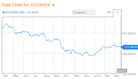
The other element of the index which may be giving a false signal, at least as far as the US economy is concerned, is the JoC ECRI industrial commodities index. This index plummeted beginning last April. It bottomed in December and has risen modestly since:


The question here is, is the index really measuring strength and weakness in the US economy, or is it actually a better barometer of the global economy? After all, prices, supply and demand for industrial commodities is set globally, not locally.

Ironically, the best evidence indicating that the JoC ECRI index is predicting an international rather than a US slowdown comes from ECRI itself, via its presentation on "Yo Yo economies" published last Friday, in which they opined:
The rising export dependence of these [suppliers of suppliers] economies, with growing involvement in global supply networks, makes it increasingly difficult for economies to decouple, especially for suppliers of early-stage goods that have embedded themselves further up the supply chain and farther away from the final consumer. This makes them highly vulnerable to the Bullwhip Effect and at the mercy of cyclical fluctuations in end-user demand growth.
[my emphasis]

First of all, the JoC ECRI index was developed 30 years ago when the US was the dominant factor in commodity usage. If the world has become much more intertwined, i.e., the market for commodities is global, and if supplier economies such as China are the largest purchasers of raw commodities, then it follows that the index is probably primarily measuring strength or weakness in these supplier economies, not in the downstream consumer economies.

Further, it is necessarily true that if supplier economies are especially vulnerable to cyclical fluctuations, then economies which are primarily consumers of end stage goods, like the US, are the least vulnerable. If supplier economies are especially unable to decouple, then it followers that consumer economies are the most likely to be able to approach decoupling.

ECRI makes this point more explicitly elsewhere in their presentation:
[D]eveloping economies are very much subject to the Bullwhip Effect, where small fluctuations in consumer demand growth get amplified up the supply chain into big swings in demand as we move away from the consumer. So, smaller shifts in end consumer demand growth translate into larger fluctuations in intermediate goods demand, and even bigger ones in input material demand, and especially, raw material prices.

Even a modest decline in consumer spending growth in developed economies like the U.S. and Europe can help trigger a significant downdraft in the level of demand from suppliers and, in turn, a serious downturn in the level of demand for “suppliers to suppliers.”
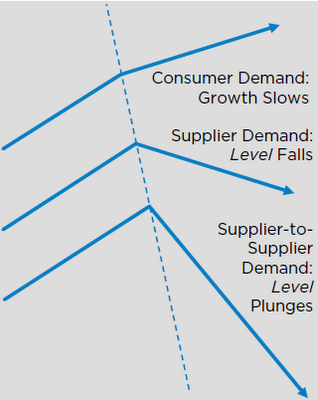
In other words, an absolute contraction in supplier countries can be caused by simply continued growth, but at a slower rate, in a consumer country. Which means that converse is also true: an observed contraction in supplier economies (like China) does not necessarily mean that there is a contraction in consumer economies (like the US). Rather, consumer economies may simply continue to grow, just at a slower pace.

As if that weren't clear enough, ECRI supplies this very helpful graph:


Unless I'm missing something, that arrow at the top for consumer countries in ECRI's diagram is still pointing UP.

So ECRI's own presentation suggests that their own indicator, the JoC ECRI commodities index, forecast a global downturn via its downdraft in the second part of 2011. But just as a recession in the US doesn't necesssarily mean a contraction in, say, Texas, so the global downturn measured by the commodities index may only have forecast slower growth in the US consumer economy.

ECRI's own presentation indicates as much. Oops!