Tuesday, March 20, 2012

Are Higher Food Prices Coming?

Consider the following recent stories

From Agrimoney.com
Concerns over drought in western Europe and North Africa shifted up a gear as Spain's was seen as already damaged, with farms in major UK cereals areas warned of "significant risk", and Morocco seen facing "significant" harvest losses.

"Fears are growing that Europe could face a major drought as water reserves are very low in western Europe," including France, Portugal and Spain, besides Morocco, Agritel, the Paris-based consultancy said.

The comments came as US Department of Agriculture attaches in Madrid warned that Spanish winter grains were "at a very critical situation" after "the driest winter ever recorded", which had seen some areas without rain since the first week of November.

Surface soil moisture in most of Spain's growing regions is below 5mm, when less than 10mm "will not support seed germination or early growth potential", according to the attaches
From Agrimoney.com
Strategie Grains heightened concerns over the danger to European crops from "worrisome" weather even as it downgraded estimates for the region's grains harvest to account for the last threat – cold.

The influential analysis group warned that "with a severe drought already affecting Spain and Portugal and other countries in west Europe facing drought warnings, the weather outlook is worrisome".

"Yield potentials could be very negatively impacted if rains do not materialise soon," with prospects worsened in many areas by the "fragile" condition of plants "as the winterkill was greater than normal and as groundwater reserves have suffered from the 2011 drought".

The alert extended a series of cautions over the risk to crops posed by a dry spell which has seen parts of Spain go without rain since November, and the UK's important cereals growing region of East Anglia suffer its driest winter on record.

Odd weather patterns set-off the price spikes two years ago.  It started in Russia, which eventually banned exports, which led to hoarding on the part of other players.  Since then, high commodity prices have brought new capacity into the market.  But, we're still dealing with a strange weather situation overall.

Why haven't consumers stopped spending?

- by New Deal democrat

As I've noted a number of times, exhausted consumers are the best case for economic pessimism.


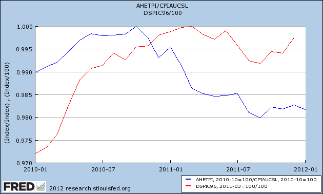
Real wages have declined by about 2% since late 2010. Real disposable income also declined beginning in spring 2011 and did not make up all of the loss by year's end. Meanwhile, those consumers have been faced with yet another spike in gas prices.

So, why haven't consumers thrown in the towel? Part of the answer is that they have spent much of the savings they accumulated since the onset of recession in 2008. Another is that consumers appear to have become singularly focused on energy efficiency, finding ways to cut back on gasoline usage rather than purchases of other products and services.

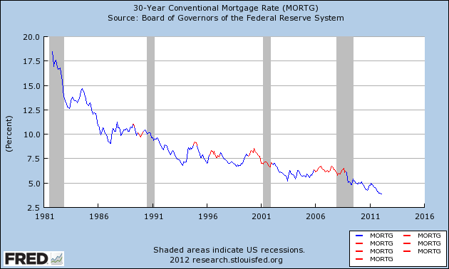
A third important part is refinancing debt at lower interest rates, thus freeing up more disposable income. Since 1981, mortgage rates have almost relentlessly declined, allowing consumers to refinance their debt at lower and lower rates frequently. Most of the time, this has masked the fact that median, and even mean, household incomes, have stagnated or declined. For example, we know that median household income has never equalled its peak in 1999. Despite that fact, recessions, including the severe 2008-09 recession, have only occurred when at least 3 years have passed without consumers having the opportunity to refinance, as shown in this graph of mortgage rates, which highlights those periods where interest rates are higher than they were 3 years prior in red:


All three recessions since the end of the 1981-82 recession have occurred at those times, including 1990, 1999-2001, and 2006-08. Lest you think this is some new metric I'm reporting on in order to justify bullishness, I noted its importance to avoiding recession as early as 2007, saying that Hard Times were near, and it was an important reason why I said a recession looked likely by late 2007.

The importance of the continued ability to refinance debt at lower rates is shown in this graph from Mortgage News Daily showing the amount of refinancing over the last 5 years compared with mortgage rates:


You can see that refinancing slowed to a trickle in 2007, but picked up as rates fell in the latter part of the recession, and again each time rates have made a new low since, including the last 9 months. As a result, household debt as a share of disposable income has resumed its decline as of the most recent release, covering Q4 2011, by the Federal Reserve, shown below:


The household debt ratio (blue) is now down to 10.88%, only 0.28% above the series' all time low. Total financial obligations (red) are down to 15.93%, also only 0.43% above their lowest level since the series began over 30 years ago.

Since 1982 it has been true that, so long as households can refinance at lower rates, a recession has been avoided. This is a crucial piece of the puzzle as to why consumers haven't rolled over and cut back on spending in the last year, putting the economy back into recession.

Exporter's Currencies Signaling Possible Problems

Yesterday, I noted that the BRIC countries are slowing down.  This has been caused by high inflation, which in turn has forced central banks to raise interest rates, thereby slowing each respective economy. Now I want to turn to the currency markets to show the overall impact of this situation.  Several countries are natural exporters: Australia provides raw materials for China, Brazil also provides raw materials, and Canada is a natural exporter.


The Australian dollar broke through resistance established in late October, but couldn't close the deal.  Instead, prices dropped to just below the 20 day EMA.  Now, they have broken the upper channel line of that move.  The MACD is about to give a buy signal, however.


The Brazilian Real (which is itself of BRIC country) has taken the sharpest move lower.  After hitting a 6-month high in February, prices have dropped to the 61.8% Fibonacci level.


The Canadian dollar was rallying until the beginning of February.  Since then, it has traded in a sideways patter.  Prices are near highs, however.

The real is the most bearish chart; the Australian and Canadian dollar charts could just as easily be pauses in a rally.  However, taken as a group, they signal that currency traders are concerned about something.


Morning Market Analysis


The IWMs -- which represent the Russell 2000 - are still at resistance.  To make this a real, overall breakout, we need to see the risk oriented average move higher.  All technical indicators are that it will; we're just not there yet.


Grains have been in an upward trend since the middle of January. Prices have broken through key resistance areas established in mid-October.  In addition, the EMAs are all positive as are the A/D and CMF.  The MACD, however, is neutral.  (I'll have more on agricultural prices later today).


Gold is right at support.  Also note the declining momentum and decreasing CMF.  The shorter EMAs (10 and 20 day EMA) are neutral as well.  I think the real support on this chart is the 50 dary EMA.  This chart is interesting because it's a good proxy for inflation expectations.  A move lower would really send an interesting signal regarding inflation expectations. 


Oil has moved through short-term resistance just below the 107 handle, and is now approached resistance from late February.  All other indicators are neutral to bullish. 


The Brazilian real is in a slightly upward sloping consolidation pattern.  The shorter EMAs are in a tight cluster, while the MACD is about to give a sell signal.  Brazil was the recipient of hot money inflows last year, as low interest rates in the US and Japan led to borrowing in those countries, followed by investment in Brazil at their higher interest rates.  However, slower growth has lowered the real's investment appeal.


The Japanese yen has dropped sharply over the last month, as it became apparent that the Bank of Japan would tolerate a higher inflation rate, in addition to more quantitative easing on their part.  However, prices have clustered around the 118 area, while the MACD is about to give a buy signal.  My guess is we'll soon see a rebound into one of the EMAs as traders start buying on the rebound. 

Monday, March 19, 2012

1955: GDP Overview

This post is part of the Bonddad Economic History Project.  The purpose of this is to go back through the US' economic history and see what happened in each year starting in 1950.  I have links on the side of the blog to previous years writings..


Overall, 1955 as a very good year.  Growth started out strong, coming in at a 12% pave in 1Q, and then slowing at year end, but still coming in at a 2.2% pace.  Throughout the year, PCEs were a primary, driving force of the economy, usually accounting for at least 50% of total growth.  Also note the strong contribution from domestic investment in the first two quarters.  Government spending -- which contributed a large amount to the early decade growth actually subtracted from growth for three of the four quarters.  Finally, exports are also starting to subtract from overall growth during this time.

Let's turn to some of the charts from the Economic Report to the President:


The top chart shows that non-federal outlays were the primary source of growth in 1955, while the bottom chart shows that non-durable goods and service expenditures drove growth, along with business investment.


This shows shows a few important points.  First, in 1953, the Korean War ended, dropping federal spending.  As such, that part of GDP growth slowed.  In its place, we see PCEs and business investment rising, essentially taking the place of weaker federal government spending.

If the BRICs are Slowing, Where Does That Leave The Rest of Us?

Last week, I looked at the BRICs from the Macro level (see Brazil, Russia, India and China).  Today, I want to look at them from a comparison perspective to illustrate what the problem with these counties is.

Let's start with inflation:


All of these countries experienced high inflation over the last two years: Brazil's approached 7.5%, Russia's approached 10%, India's hovered around 9% and China's rose to above 6%.  All of these countries are far more sensitive in commodity inflation: China is a major importer of all commodities, Brazil and Russia are major oil exporters and India is sensitive to agricultural price moves).  As a result: 


All of these countries either kept their interest rates high (Russia) or they increased their rates (Brazil, India and Russia).  As a result:


We're seeing decreased growth in all of these countries (Russia has yet to return to their pre-recession levels of growth).

The good news in the above information is all of these economies are slowing because of higher interest rates.  This means their respective slowdown will probably be shallow and short.  However, it does mean there will be a slowdown.  Expect some of that to bleed over into the US' expansion.    


Consumer spending pattern does not support ECRI's recession call

- by New Deal democrat

This week I want to revisit and update my forecast from the beginning of the year. That forecast boiled down to softness in the first half, possibly including one quarter of negative GDP but escaping a recession, and a stronger second half. Since that time I've written a number of posts considering ECRI's recession call, trying to understand their argument while at the same time noting the wealth of contrary data. Since I don't get to write the headline when my blog posts are republished elsewhere, let me be clear about my current thinking as to ECRI's calls. That is:

1. their original call for a recession by the end of 2011 was wrong. Period. Doubters need to go back and listen to the September interview on CNBC where Lakshman Achuthan was very explicit that the recession would start no later than the next quarter, i.e., 4Q 2011.

2. the jury is out on their revised recession call of recession by the end of 2Q 2012 (although the data continues to tilt away from that view).

3. the original explanation for the revised recession call, made in a series of interviews a few weeks ago, was pathetically lame. The updated explanation last week, which seems to be a direct response to my recent post, was more nuanced and explanatory.

It'll take a number of posts to state my forecast more thoroughly, but today let me address one point. The best bearish case rests on a weakened consumer whose wages have not kept up with inflation, who is now being battered by yet another spike in the price of gasoline. This is an extremely reasonable point, and appears to underlay ECRI's position, which is that economies don't "muddle along" at sub-2% growth. If an economy decelerates under 2% YoY growth, a recession soon follows. Sputtering real personal consumption expenditures show that the economy is now slowing down into reversal.

As it happens, there is a very important contrary example to the sub-2% thesis, but I'll get to that in another post. In the meantime, let's look at real PCE's. First of all, here's a graph that appeared on Business Insider as the graph that makes ECRI scream recession:


PCE's certainly are very weakly positive YoY at this point. The graph suggests that nonfarm payrolls will follow on a YoY basis.

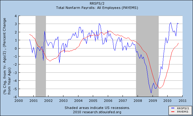
The problem is, real retail sales also lead nonfarm payrolls . Take the YoY% change in real retail sales, divide by two, and you usually come pretty close to the YoY% change in nonfarm payrolls about 6 or so months later, as shown for the last 10+ years in this graph:


Retail sales constitute about 50% of PCE's. It should be no surprise, then, that the two make peaks and troughs simultaneously:


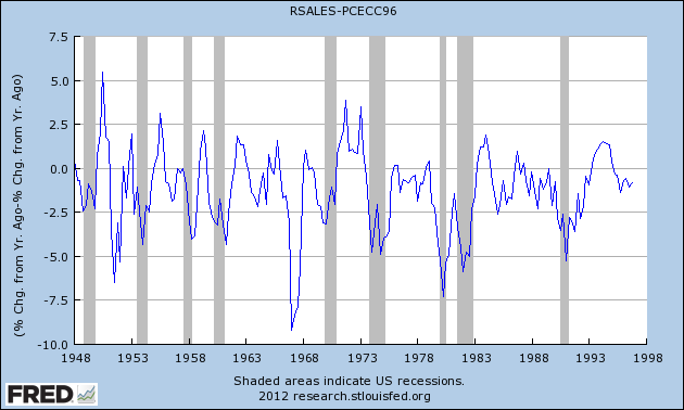
Note, however, that real retail sales are much more volatile. And, as this graph below (subtracting YoY PCE growth from YoY real retail sales growth through 1997) shows, in a very specific and non-random way:


Note that early in economic expansions, YoY real retail sales growth far outstrips YoY PCE growth. As the economy wanes into contraction, YoY real retail sales grow less and ultimately contract more than YoY PCE's. You can see that by noting that retail sales minus PCE's are always negative BEFORE the economy ever tips into recession. That's 11 of 11 times. Further, in 10 of those 11 times (1957 being the noteworthy exception), the number was not just negative, but was continuing to decline for a significant period before we tipped into recession. This makes perfect sense, as retail sales generally include many far more discretionary purchases. As the economy accelerates, consumers make more discretionary purchases. As it slows, the more discretionary retail purchases are the first things cut.

So what does that relationship show now? Since you know I'm a smarta$$ and I'm saving a surprise for last, here's the graph up through the most recent data:


Not only is the relationship not negative, not only is it stable for the last few months, but it remains at a level of positivity that has only been exceeded four times in the last 60+ years (once in the 1940s, once in the 1950s, and twice in the early 1970s).

Despite the perfectly rational bearish argument cited above, the facts on the ground are that consumers are not cutting back on discretionary purchases to preserve other spending. Until they do, consumer spending does not support any claim that a recession has begun or is even imminent.

Morning Market Analysis, Rally On Edition


The big story last week was the sell-off in the treasury market across all maturities.  While all their respective MACDs were signaling a clear lack of overall momentum, we finally see the indexes sell-off, with the IEFs and TLT showing good volume.  All three are also approaching respective support levels (IEF: 119 IEF: 100 TLT 109).  All respective prices have also fallen below the 10 and 20 week EMAs, another bearish development.  One of my concerns with the equity rally was the bond market taking money away.  That is no longer the case.


The IWMs weekly chart shows that prices have risen to near levels reached earlier in the year.  There has not been a dent in any of the technical indicators either, indicating that further highs are in reach.


The IWM monthly chart is even more bullish.  Prices are right in key resistance areas first reached in mid-2007 and again in 2011.  All the underlying technicals are also bullish -- the MACD is rising, the A/D and CMF are rising as are the EMAs.  This chart tells us that unless we see significant technical damage on the daily or weekly charts, the overall trend is higher.


The SPYs weekly chart is also very bullish.  After breaking through resistance at the 135 level, prices slowed their upward gain.  However, last week, we see prices printing an impressive candle with strong underlying techncials.


The QQQs have the exact same underlying technicals as the SPYs, making this chart bullish as well.

The central news last week  was the Fed's statement, which many interpreted as bullish.  This provided the fuel to send the equity markets higher.  However, the real news was the treasury market sell-off.  Treasuries were acting as a safe haven, draining liquidity from the equity markets.  With Treasuries selling off, expect the equity markets to move higher.


Saturday, March 17, 2012

Weekly Indicators: summer in spring edition

- by New Deal democrat

Starting with the monthly reports, retail sales were up strongly, even after accounting for inflation. Industrial production was flat for February, but January was revised significantly higher. Capacity utilization increased, but January was revised down. The Empire State and Philly Fed regional reports were generally positive. YoY inflation at all levels decreased. Consumer sentiment, a leading indicator, declined slightly.

I watch the high frequency weekly indicators because any turning pointwill show up in these indicators first. This week they remained mixed, but generally positive.

Let's review from positive to negative.

Housing reports were positive:

The Mortgage Bankers' Association reported that the seasonally adjusted Purchase Index increased +4.4% from the prior week, although it was still -0.4% lower YoY. This is the third week of a strong rebound from the bottom of its two year range. The Refinance Index decreased -4.1% from the previous week, but was still near its highest level in over half a year.

YoY weekly median asking house prices from 54 metropolitan areas at Housing Tracker were up +3.4% from a year ago. This number peaked at over +4% a month ago. It remains at odds with the Case-Shiller reports of worsening YoY declines in price for comparable sales. Typically non-seasonally adjusted home sales prices peak in about June, so we should see in the next 15 weeks which one of the two metrics is going to turn.

Employment related indicators were positive or neutral:

The Department of Labor reported that Initial jobless claims fell 11,000 to 351,000 last week. The four week average was flat at 355,000. These remain close to the lowest readings in 4 years.

The Daily Treasury Statement showed that for thefirst 11 days of March, $89.8 B was collected wvw. $89.1 B a year ago. In the last 20 reporting days, $163.1 B was collected vs. $162.4 B for the eequivalent 20 day period in 2011, an increase of 0.4%, a very weak advance.

The American Staffing Association Index remained at 87. It remains midway between its 2011 and 2007 levels. Seasonally we want to see this move slightly higher over the next couple of weeks.

Sales remained positive.

The ICSC reported that same store sales for the week ending March 10 rose +2.3% w/w, and also rose only +1.7% YoY. Johnson Redbook reported a 3.3% YoY gain. This week was an improvement, which featured a rare sub-2% YoY reading. After a week of YoY negative readings, the 14 day average of Gallup daily consumer spending returned to weakly positive readings this week.

Money supply was generally positive to flat:

M1 was flat last week, and also fell -0.4% month over month. On a YoY basis it fell to +17.4%, so Real M1 is up 14.6%. YoY. M2 was up +0.2% for the week, and also up +0.2% month over month. Its YoY advance remained at +9.8%, so Real M2 was up 7.0%. In short, real money supply indicators continue slightly less strongly positive on a YoY basis, although not so much as in previous months, and have generally stalled in the last couple of months.

Bond prices fell and credit spreads were flat:

Weekly BAA commercial bond rates rose +.03% t0 5.11%. Yields on 10 year treasury bonds also rose +.03% to 2.00%. The credit spread between the two, which had a 52 week maximum difference of 3.34% in October, reamined at 3.11%. As I have previously said, narrowing credit spreads are not at all what I would expect to see if we were going into a recession.

Rail traffic remained negative but with an explanation.

The American Association of Railroads reported a -4600 car decline in weekly rail traffic YoY for the week ending March 10, 2012. Intermodal traffic was up 9200 carloads, or +4.2%, but other carloads decreased -13,900, or -4.9% YoY. The entire decline in carloads is still due to coal shipments which were off 17,300 carloads or -13.1%. Railfax;s graph of YoY traffic by types remains in a positive trend.

The energy choke collar remains engaged:

Gasoline prices are about 7.5% higher than one year ago while usage continues to be much lower: Oil was steady at $107.06. Gas at the pump rose another $.04 to $3.83. Both of these are significantly above the point where they can be expected to exert a constricting influence on the economy. Gasoline usage, at 8415 M gallons vs. 8830 M a year ago, was off -4.8%. The 4 week moving average is off -7.2%. Both readings, while substantially less than one year ago, are in accord with readings from the last 6 months and unlike last week, do not warn of further weakness.

Turning now to high frequency indicators for the global economy:

The TED spread remained steady at 0.390. This index remians slightly below its 2010 peak, and has declined from its 3 year peak of 2 months ago. The one month LIBOR also remained at 0.242. It is well below its 12 month peak set 2 months ago, remains below its 2010 peak, and has returned to its typical background reading of the last 3 years.

The Baltic Dry Index at 874 was up 50 from 824 one week ago, and up 224 from its 52 week low, although still well off its October 52 week high of 2173. The Harpex Shipping Index was up 10 from 376 to 386 in the last week, up 11 from its 52 week low. Please remember that these two indexes are influenced by supply as well as demand, and have generally been in a secular decline due to oversupply of ships for over half a decade. The Harpex index concentrates on container ships, and led at recent tops and lagged at troughs. The BDI concentrates on bulk shipments such as coal and grain, and lagged more at the top but turned up first at the 2009 trough.

Finally, the JoC ECRI industrial commodities index rose slightly from 126.00 to 126.06. I have decided to report this as part of the indicators for the global economy, which ought to tell you a severe limitation I helieve it has as a barometer of the US economy.

That February real retail sales came in strong as anticipated is a welcome sign that the expansion is continuing. Same store sales were tepid and withholding taxes were weak, however. It is likely that the non-winter winter is playing havoc with railroad statistics, and may be influencing home sales. All that being said, the warning signs from last week were not repeated this week. There is some weakness, but there is no sign of any imminent contraction.

Have a nice weekend.

Friday, March 16, 2012

Weekend Weimar, Beagle and Pit Bull

It's that time of the week.  Stop thinking about the market for a few days.  NDD will post the weekly indicators this weekend; we'll be back full time on Monday.  Until then ...


Is the Wall Street Journal Worth It Anymore?

Sometime over the next few months, my yearly digital subscription for the WSJ comes due.  And, once again, I'm faced with this question:

Is it worth it anymore?

When Murdoch was looking to buy the journal, I wrote a column at the Huffington Post, titled, "Please don't sell the WSJ to Murdoch" when the deal was going through.  Of course, the then owners didn't listen to me (not that they would anyway).  But frankly, I was then very worried about a great newspaper with a pure market and economic perspective being taken over by the Fox News Machine with the requisite lowering of journalistic standards and content that would follow.

Over the last few years, the paper has changed. If I remember correctly, Murdoch wanted to make the WSJ more like an alternative to the NYT -- a paper with a broader focus but with a solid journalistic core.  Unfortunately, the Journal is writing less and less pure economic writing.  Their blogs are OK, but certainly not great.  And I read the paper less and less, instead going to the FT or Bloomberg first and staying there the longest.  I do have to admit that perhaps I should be reading Marketwatch instead, as that probably has more of the content that I really want. 

And frankly, the competition really is that much better.  The Financial Times stands out as the premiere paper in the world financial news arena.  They are hands down, clearly, the best.  And their blogs are AWESOME -- I mean, they have great, insightful content about timely topics.  Then there is Bloomberg, which is also really good -- although I have to admit, I really don't like their website very much.  But they have great, broad economic coverage.  The WSJ comes in a distant (very distant) third to both the preceding sources.  Basically, by diversifying their coverage, the Journal has really gotten away from their core business -- writing insightful articles on economics, the markets and the economy.

At the same time, I've been reading the journal for over 20 years.  I have a tremendous nostalgia for the paper, because it used to be a very good source of pure economic information for the US.  And, if I drop the subscription, I can always pick it up again.

At the same time, I really miss the old journal.  It was a great paper.  While the editorial page was, well, nuts, I never read that.  The rest of section A was great, and the Market section (Section C) was wonderful.  Unfortunately, those days appear to be gone as Murdoch's influence is felt more and more.  And certainly, not for the better.

The BRIC Countries: China

From the CIA Fact Book:


Since the late 1970s China has moved from a closed, centrally planned system to a more market-oriented one that plays a major global role - in 2010 China became the world's largest exporter. Reforms began with the phasing out of collectivized agriculture, and expanded to include the gradual liberalization of prices, fiscal decentralization, increased autonomy for state enterprises, creation of a diversified banking system, development of stock markets, rapid growth of the private sector, and opening to foreign trade and investment. China has implemented reforms in a gradualist fashion. In recent years, China has renewed its support for state-owned enterprises in sectors it considers important to "economic security," explicitly looking to foster globally competitive national champions. After keeping its currency tightly linked to the US dollar for years, in July 2005 China revalued its currency by 2.1% against the US dollar and moved to an exchange rate system that references a basket of currencies. From mid 2005 to late 2008 cumulative appreciation of the renminbi against the US dollar was more than 20%, but the exchange rate remained virtually pegged to the dollar from the onset of the global financial crisis until June 2010, when Beijing allowed resumption of a gradual appreciation. The restructuring of the economy and resulting efficiency gains have contributed to a more than tenfold increase in GDP since 1978. Measured on a purchasing power parity (PPP) basis that adjusts for price differences, China in 2010 stood as the second-largest economy in the world after the US, having surpassed Japan in 2001. The dollar values of China's agricultural and industrial output each exceed those of the US; China is second to the US in the value of services it produces. Still, per capita income is below the world average. The Chinese government faces numerous economic challenges, including: (a) reducing its high domestic savings rate and correspondingly low domestic demand; (b) sustaining adequate job growth for tens of millions of migrants and new entrants to the work force; (c) reducing corruption and other economic crimes; and (d) containing environmental damage and social strife related to the economy's rapid transformation. Economic development has progressed further in coastal provinces than in the interior, and by 2011 more than 250 million migrant workers and their dependents had relocated to urban areas to find work. One consequence of population control policy is that China is now one of the most rapidly aging countries in the world. Deterioration in the environment - notably air pollution, soil erosion, and the steady fall of the water table, especially in the north - is another long-term problem. China continues to lose arable land because of erosion and economic development. The Chinese government is seeking to add energy production capacity from sources other than coal and oil, focusing on nuclear and alternative energy development. In 2010-11, China faced high inflation resulting largely from its credit-fueled stimulus program. Some tightening measures appear to have controlled inflation, but GDP growth consequently slowed to near 9% for 2011. An economic slowdown in Europe, is expected to further drag Chinese growth moving into 2012. Debt overhang from the stimulus program, particularly among local governments, and a property price bubble challenge policymakers currently. The government's' 12th Five-Year Plan, adopted in March 2011, emphasizes continued economic reforms and the need to increase domestic consumption in order to make the economy less dependent on exports in the future. However, China has made only marginal progress toward these rebalancing goals.


Their GDP is broken down thusly:

agriculture: 9.6%
industry: 47.1%
services: 43.3% (2011 est.)
 
Let's look at some macro numbers:


When people think about China, the above charts are what come to mind -- amazingly high levels of growth.  Notice how the recession didn't make a dent in China's GDP trajectory (top chart); the lower chart shows the strength of China's overall growth. 


The above chart of industrial production shows  a big reason for China's growth; they're an industrial juggernaut.


The YOY retail sales growth rates are incredibly strong, although the recent reading is a bit weaker.


The unemployment rate is very low.


The above two charts show the primary problem with China's economy: high inflation, which has led to higher interest rates.