Tuesday, August 10, 2021

Scenes from the July jobs report


 - by New Deal democrat

[Note: I haven’t put up a Coronavirus dashboard in almost a week. I’ll try to get around to that later today or tomorrow. It isn’t *all* bad news.]


Last Friday’s jobs report for July was probably the most uniformly positive report I have seen since I started writing about them going on 15 years ago. Let’s take a look at a few of the most salient items.

First of all, unemployment (blue in the graph below) at 5.4% and underemployment (red) at 9.2% are about where they were in the middle of each of the last 3 expansions:
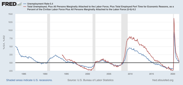

Not a boom, but not bad at all either. This is real progress, and a real positive (note graph is normed at the 0 level equal to the current month in both numbers).

On the other hand, when we look at those who aren’t actively looking, so aren’t counted in either the un- or under-employment rates, but say that they want a job now, we see that the number is close to the worst levels since the series started being reported in 1994:
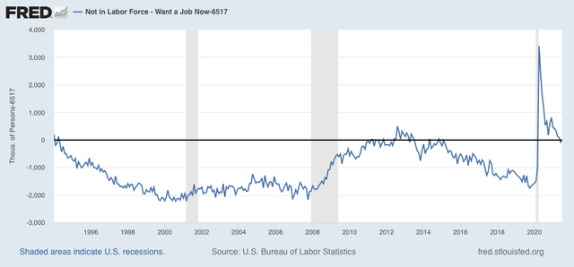

At 6.517 million, that’s about 1 million higher than the number at the midpoint of 2 of the last 3 expansions, and 1.5 million above the 3rd.

If we keep getting very good jobs reports, I expect this number to drop, but gradually, over the next 6 to 12 months.

Turning to the number of jobs added themselves, since the end of last year, we have added 4.318 million jobs:
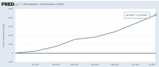

That’s an average of a little over 600,000 per month.

But we are still 5.7 million below where we were in February 2020. In other words, if the current - excellent! - rate of growth continues, it will still take 9 or 10 months to get back to the pre-pandemic levels.
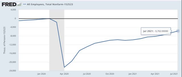

Finally, here’s a look at the jobs deficit is several sectors:
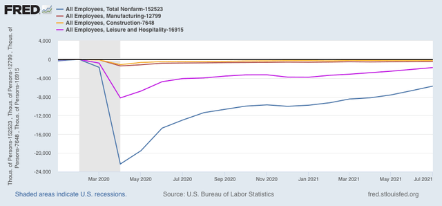

You can see that the total jobs deficit is mainly one in the service sector, especially leisure and hospitality. Manufacturing and construction, relatively speaking, were never hit as hard, and are closer to making up their losses.

The jobs market was actually in quite good shape in the year before the pandemic, with lots of wage pressure due to nearly “full” employment, with lots of marginal and minority workers getting jobs. While it is by no means booming in the absolute sense now, we have made a lot of progress this year, but with a lot more distance still to go, especially in the services sector.

Monday, August 9, 2021

June JOLTS report: at last, new hires (slightly) outpace record job openings

  - by New Deal democrat

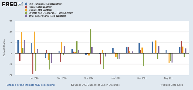
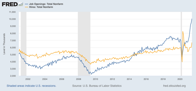
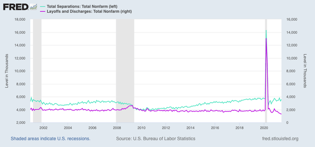
This morning’s JOLTS report for May was the best we have seen since the immediate rebound from the pandemic lockdowns.  There was yet another record level continued all of unfilled job openings, yet another new record low in layoffs and discharges, an enhanced number of people quitting their jobs, and finally - for the first time this year - a huge number of new hires, setting a new m/m record high outside of the immediate lockdown rebound last year.
Here are the month over month percentage changes for each of those metrics:

As noted above, headline job openings (blue), which have been making new all-time records for month, were finally joined by a nearly 700,000 gain in actual hires (gold):


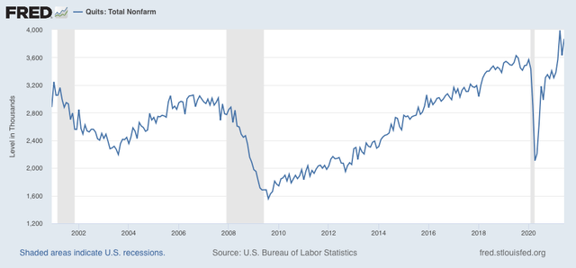
Voluntary quits also rose, and are higher than any other prior month except this past April:


The record number of people voluntarily quitting their jobs (meaning they are not eligible for unemployment benefits) is testimony to the record robustness of the jobs market.
Finally, while total separations (light blue, left scale) are at normal levels, layoffs and discharges (violet, right scale) declined to yet another all time low:


This is a market that is beginning to arrive at a new equilibrium, after having been out of equilibrium for most of this year. Almost nobody is getting laid off, but lots of people are quitting. But the big change is, while there are continued record openings, finally there is hiring outpacing the level of new openings to fill them. 

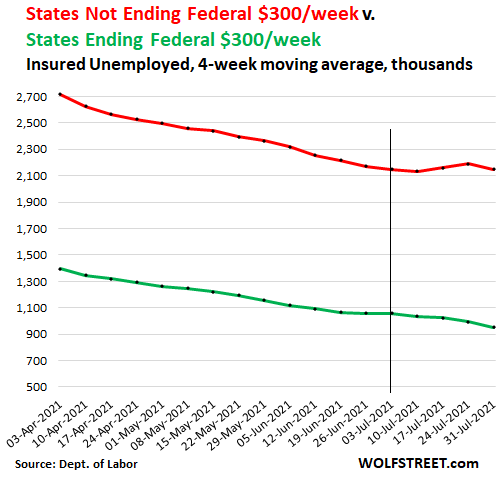
I want to share two other graphs that I came across recently. The first, from Wolf Richter, shows that continued unemployment claims have declined in the aggregate in States that have cut off pandemic unemployment benefits vs. those that have retained them:


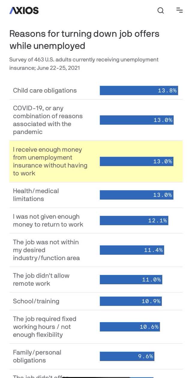
One drawback of this graph is that we can’t tell if the difference is driven by just one or two of the big States, but I think it makes a valid point that is also consistent with this second graph, which I have posted previously but was forwarded to me again last week:


Together, these show that while undoubtedly for some of those people not entering the job market continued pandemic jobless benefits are an issue, for many more the lack of COVID safety in the locale where they live, the unavailability of reasonable-cost child care, or the general low pay for the labor required, are keeping them on the sidelines.

A great deal depends on the course of the Delta wave. If it burns through the dry tinder and recedes over the next 45 days, then we may see openings gradually level off and begin to decline, while hiring continues to increase sharply. If not, well, . . . .

Lending supply and demand both increased in Q2


 - by New Deal democrat

The June JOLTS report will be posted at 10 am eastern time.


While we are waiting for that, here is a link to my update on the Senior Loan Officer Survey, which is a long leading indicator, which was posted at Seeking Alpha.

Easier lending standards, and increased demand for loans, is a strong positive for the economy going out 12 months.

As usual, clicking over and reading will reward me a little bit for my efforts.

Saturday, August 7, 2021

Weekly Indicators for August 2 - 6 at Seeking Alpha


 - by New Deal democrat

My Weekly Indicators post is up at Seeking Alpha.

Although the Delta wave is raging, so far neither producers nor consumers appear to have altered their behavior in any significant way at all.

As usual, clicking through and reading will bring you right up to date on the economy, and bring me a little pocket change for my efforts.

Friday, August 6, 2021

July jobs report: more like this, please


 - by New Deal democrat

While the NBER has declared that the recession ended in April 2020, and income, sales, and GDP have all fully recovered, two of the series that the NBER uses have yet to have made a full recovery: Industrial production, still down -1.2% compared with February 2020, and employment, still down -4.4% as of the jobs report last month.

So the main questions for this month’s jobs report for July are how much of that 4.4% has been made up, and do the leading indicators in the report continue to suggest more growth ahead?

Here’s my synopsis of the report:

HEADLINES:
  • 943,000 jobs added. Of these, 703,000 were private sector jobs, and 240,000 were government jobs, 220,700 in local education alone. The alternate, and more volatile measure in the household report indicated a gain of 1,043,000 jobs, which factors into the unemployment and underemployment rates below.
  • The total number of employed is still -5,702,000, or -3.7% below its pre-pandemic peak.  At this rate jobs have grown this year, it will take another 10 months for employment to completely recover.
  • U3 unemployment rate declined -0.5% to 5.4%, compared with the January 2020 low of 3.5%.
  • U6 underemployment rate declined -0.6% to 9.2%, compared with the January 2020 low of 6.9%.
  • Those on temporary layoff declined -572,000 to 1,239,000.
  • Permanent job losers declined -257,000 to 2,930,000.
  • May was revised upward by 31,000, while June was revised upward by 88,000, for a net gain of 119,000 jobs compared with previous reports.
Leading employment indicators of a slowdown or recession

These are leading sectors for the economy overall, and will help us gauge how strong the rebound from the pandemic will be.  These were very positive: 
  • the average manufacturing workweek increased 0.2 hours to 40.5 hours. This is one of the 10 components of the LEI.
  • Manufacturing jobs increased 27,000. Since the beginning of the pandemic, manufacturing has still lost -433,000 jobs, or -3.4% of the total.
  • Construction jobs increased 11,000. Since the beginning of the pandemic, -227,000 construction jobs have been lost, or -3.0% of the total.
  • Residential construction jobs, which are even more leading, rose by 8,300. Since the beginning of the pandemic, 42,700 jobs have been *gained* in this sector, or 5.1%.
  • temporary jobs rose by 9,700. Since the beginning of the pandemic, there have still been 252,800 jobs lost, or -9.8% of all temporary jobs.
  • the number of people unemployed for 5 weeks or less increased by 276,000 to 2,257,000, which is  175,000 higher than just before the pandemic hit.
  • Professional and business employment increased by 60,000, which is still -556,000, or about -2.6%, below its pre-pandemic peak.

Wages of non-managerial workers
  • Average Hourly Earnings for Production and Nonsupervisory Personnel: rose $0.11 to $25.83, which is a 4.7% YoY gain. This is excellent news, considering that a huge number of low-wage workers have finally been recalled to work. 

Aggregate hours and wages:
  • the index of aggregate hours worked for non-managerial workers rose by 0.7%, which is a  loss of -3.3% since just before the pandemic.
  •  the index of aggregate payrolls for non-managerial workers rose by 1.1%, which is a gain of 4.2% since just before the pandemic.

Other significant data:
  • Leisure and hospitality jobs, which were the most hard-hit during the pandemic, increased 380,000, but is still -1,737,000, or -10.3% below their pre-pandemic peak.
  • Within the leisure and hospitality sector, food and drink establishments gained 253,200, but is still -969,000, or -7.9% below their pre-pandemic peak.
  • Full time jobs increased 1,265,000 in the household report.
  • Part time jobs decreased -250,000 in the household report.
  • The number of job holders who were part time for economic reasons declined by 144,000 to 4,483,000, which is an increase of 85,000 since before the pandemic began.

SUMMARY

This was an excellent report on virtually every front. I really can’t find any negatives or particularly soft spots. Not just the totals, but the leading internals were all positive to very positive, including leading job sectors and wages. Full time jobs increased strongly, and even the decline in part time jobs was really a sign of strength.

The only *relatively* negative thing I can say about this report is, in response to the questions I asked at the top,  that, even at this rate, it will take until the middle of next year to fully recover to where we were just before the pandemic. In particular, the leisure and hospitality sector, which was particularly hard-hit by the pandemic, still has a long ways to go.

In short, more like this, please.

Thursday, August 5, 2021

Initial jobless claims continue in range, while continuing claims sharply decline


 - by New Deal democrat

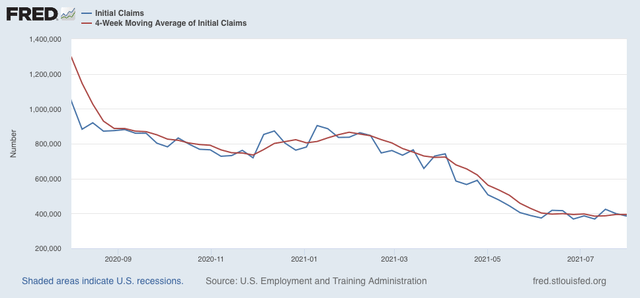
Initial jobless claims declined another 14,000 this week to 385,000, still 17,000 above their best pandemic levels of 368,000 set on June 26 and July 10. The 4 week average of claims declined by 250 to 394,000, also 9,500 above its pandemic low set on July 11:


Significant progress in the decline of initial claims remains stalled, as it has for the last 2 months.

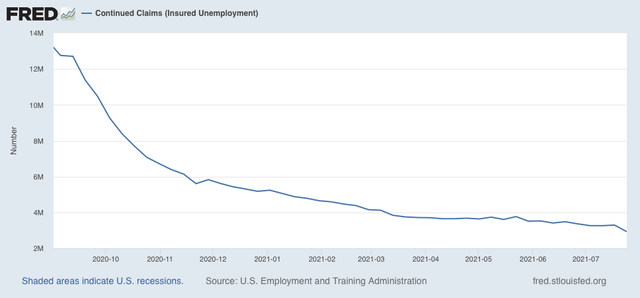
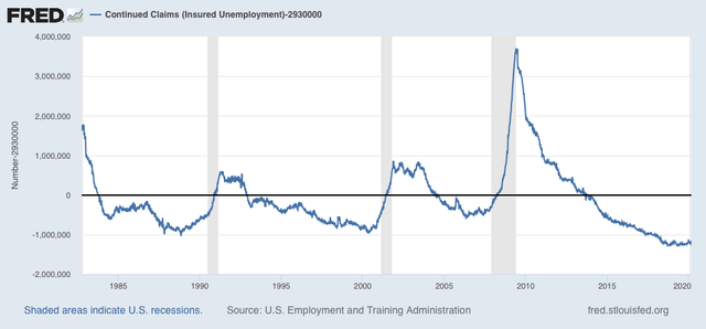
The story is quite different for continuing claims, which declined 366,000 to a new pandemic low of 2,930,000:


This series, which had also been near a stall, now looks to have begun a new slow declining trend on May 29, and to have accelerated this week. This may reflect the termination of special pandemic benefits in many States, the impact of $15 minimum wages and signing bonuses being offered, or other items.

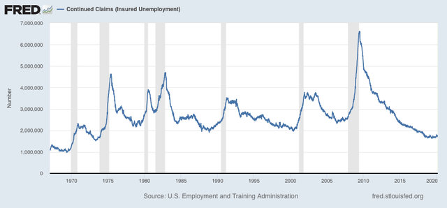
From the long term perspective, this level of continuing claims is consistent with early to mid-expansions over the past 40 years (graph subtracts -2,930,000 so that current level = 0):


The decline in continuing claims is good news, provided those whose claims have ended are able to start new jobs, and not just being arbitrarily tossed to the economic wolves.

My theme for the present remains that whether claims will continue to stall, reverse, or improve from here is under the control of the Delta variant, and whether new vaccinations continue to stall. My best guess is that August and September will not be good months, as Delta burns through the dry tinder.

Wednesday, August 4, 2021

Coronavirus dashboard for August 4: in which I see reason for optimism


 - by New Deal democrat

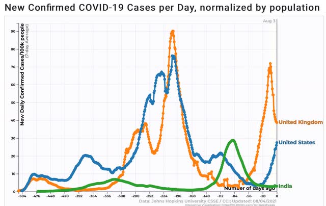
It seems pretty clear that Delta burns through the dry tinder very fast - on the order of 9 to 12 weeks from onset to peak, based on the experience of the UK and India, respectively. The US is 7 weeks past its trough in cases, so it is a fair hypothesis that the Delta wave will reach its peak at some point in the next 2 to 5 weeks - roughly at some point in the second half of August or early September. 

But what does that mean for the number of cases and deaths? And what exactly is the “dry tinder” for Delta?

Let’s start with a graph of the 1 week average in cases per capita for the US, UK, and India, all of which have seen Delta wave spikes:


As I indicated above, from prior trough to peak took 12 weeks in India, and 9 weeks in the UK. During that time, in India *confirmed* cases rose 35x. In the UK it was 25x. Seven weeks in, the US has seen an 8x rise in cases. If we use the UK and India as our range, when it comes the peak in the US will be about 280,000 to 400,000 cases/day!

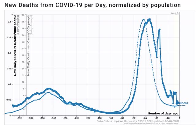
Now let’s turn to deaths.

In India, deaths peaked 3 weeks after the peak in cases, up 43x from their previous trough:


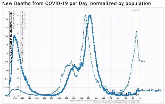
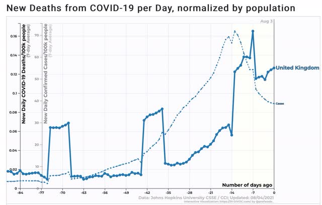
In the UK, many have taken heart from the fact that the rate of deaths is but a small percentage of previous peaks:


But deaths are presently at 12.6x their trough just before Delta, 2 weeks after the peak in cases. Another doubling to the same 25x multiple as the UK had in cases, before deaths peak in a week or two seems a reasonable estimate:


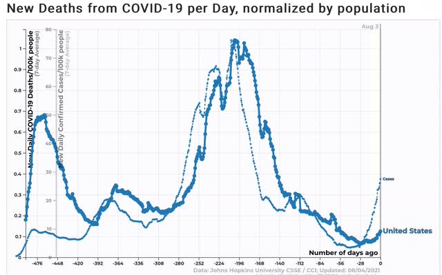
Similarly in the US, deaths are only about 1/8 of their worst levels in previous waves:


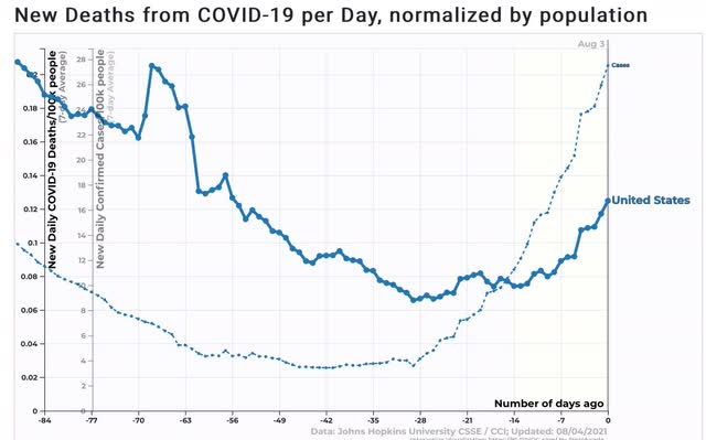
But deaths are 1.9x the level of their trough 4 weeks ago, and 1.7x from 2 weeks ago:


If these keep increasing at the same pace, that is a range of between 774 to 1720 deaths per day when the peak arrives.

Turning to the second issue, what exactly is the “dry tinder” for Delta? Is it the unvaccinated? Everybody? Or just those with a particular genetic or other predisposition? If it is one of the first two, then in a couple of months the US will have stumbled into herd immunity. If it is the latter, then the door is open for yet another variant to raise hell this winter.

In India, a study showed that seroprevalence increased by more than 50% of the entire sampled population post-Delta, rising from 14% to 78% of the population. If this is true, then it appears that an absolute majority of the unvaccinated population at least is likely to  become infected by Delta, whether or not the case is “confirmed.” In India, the “confirmed” cases only rose by 2% of the population! 

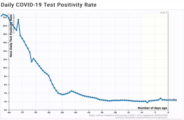
In India, the positivity rate for COVID testing peaked at about 22.5% 12 weeks ago (I have truncated the graph because of a glitch in the data from early 2020):


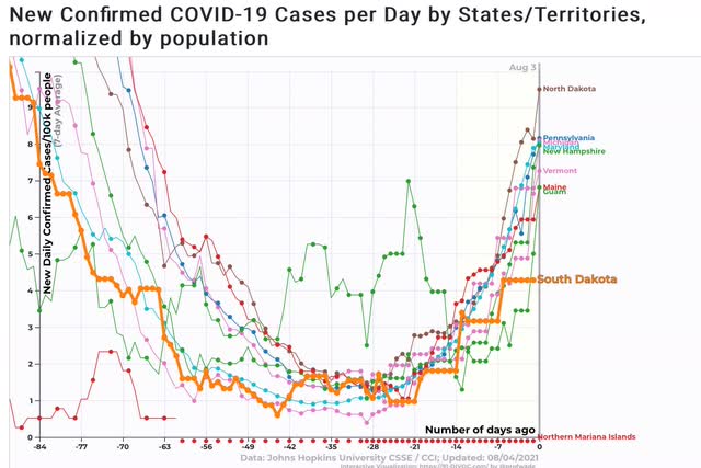
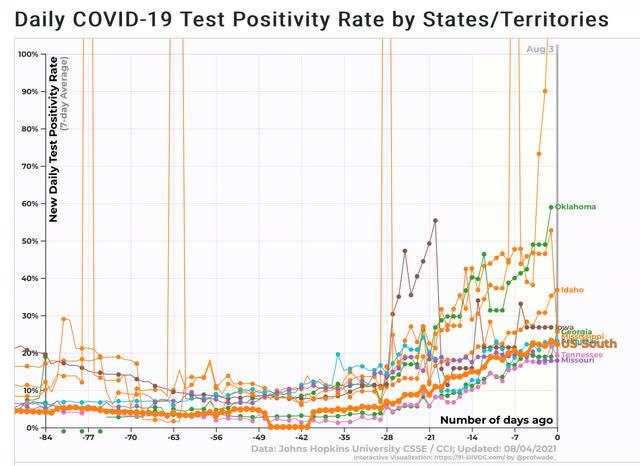
Now let’s consider the curious cases of South Dakota, which had a horrid outbreak last fall with over 60% positive test rates (similar to that of Oklahoma right now):


but which is among the States with the lowest per capita new infections now:


If over 50% of the population of India got infected with Delta and only showed a 22.5% positivity rate, what are we to make of the US, which as of a week ago had roughly a 12% positivity rate (the most recent data), but where many States are running higher (the top 10 are shown below, plus the regional South as a whole:


Testing is running at close to a 20% rate in the South.
 
To a virtual certainty there are simply multiples of actual cases that are going undiagosed.

If I am correct that Delta is going to infect at least 50% of the US’s unvaccinated population over about the next month, then the remainder of this month and September are going to be brutal. But if about 70% of US adults are fully vaccinated by then, and over half of the rest have antibodies due to recent Delta infection, then with over 85% of US adults immune either the easy or the hard way, by late this autumn there may an actual return to near-normal life.

Monday, August 2, 2021

Manufacturing sector continues to be on fire; but real construction spending plunges


 - by New Deal democrat

August data started out mixed. 


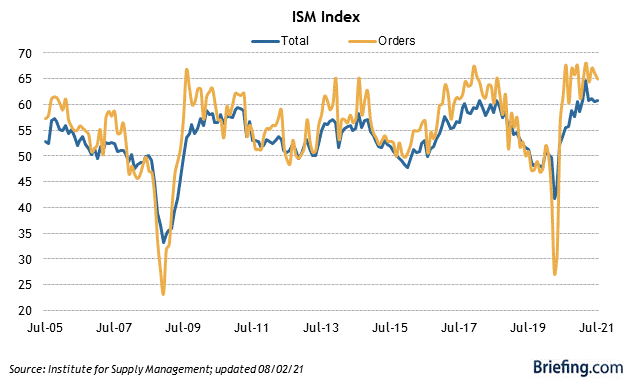
The ISM manufacturing index continued to show strong expansion. Both the overall and new orders components declined slightly m/m, but at 59.5 and 64.9 remained far about the breakeven point between expansion and contractions of 50.0:


The simplest way to read this is that the manufacturing sector remains on fire.

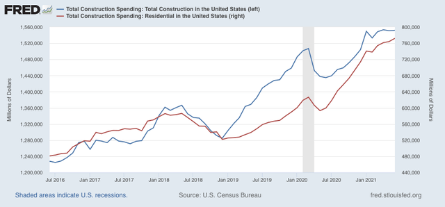
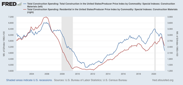
The story is different with this morning’s release of June construction spending. Total nominal spending increased 0.1%, and spending in the long leading residential construction sector increased 1.1%, the former less than 0.1% below its all time record from a few months ago, and the latter to the highest level ever:


But when we deflate by the cost of construction materials, that increase disappears, and in fact shows a plunge, down -3.6% and -2.7% monthly, respectively:


In other words, in real terms construction has been faltering badly. This is a substantial negative indicator for spending in the second half of 2022.

Saturday, July 31, 2021

Weekly Indicators for July 26 - 30 at Seeking Alpha


 - by New Deal democrat


My Weekly Indicators post is up at Seeking Alpha.


Ironically, as the bond market smells weakness ahead, driving long term rates down, it also sets up a rebound from that weakness further out. In the meantime, Q2 corporate profits are through the roof.

As usual, clicking over and reading should bring you up to the virtual moment, and bring me some change for a libation or two.

Friday, July 30, 2021

June personal income and spending show pandemic cushion approaching depletion


  - by New Deal democrat

How well personal income and spending held up throughout the pandemic is one of the best things about the government response.


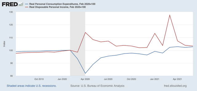
For June, nominal personal income increased 0.1%. After inflation, however, it decreased -0.4%. Nominal personal spending increased 1.0%. After inflation, it still increased 0.5%. Here are the real figures for both personal spending and disposable income:


Expenditures are up 2.7% since right before the pandemic, while income is up 3.3%.

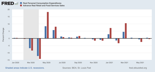
Here is how real personal spending compares with the other side of the coin, real retail sales:


Both of these have returned to basically normal levels m/m. While the stimulus has abated, spending hasn’t crashed. That’s a good thing.

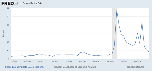
The cushion of the increased pandemic stimulus has also largely faded in the personal savings rate:


This tells us that within the next few months that cushion is probably going to be exhausted, and consumers are going to have to stand on their own.

Thursday, July 29, 2021

Q2 2021 GDP: goodbye recession, hasta la vista recovery, hello expansion


 - by New Deal democrat

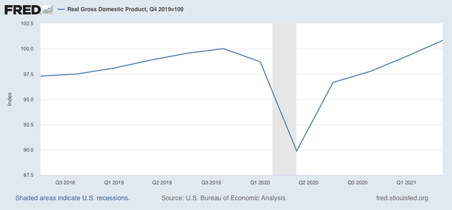
Nominal GDP before inflation increased 3.1%, while real GDP for the 2nd Quarter increased 1.6%. The real annual rate of growth was thus 6.5%. Real GDP is now 0.8% higher than its last quarter before the onset of the pandemic:


The recession is over, as was declared by the NBER last week. In fact, so is the recovery, if one measures by GDP, since once all of the decline during the recession is made up, that qualifies for calling it an expansion.

Real income and spending are also at higher levels than at any point before the recession, while industrial production and - especially - employment have continued to lag.

Initial claims continue two-month stall


 - by New Deal democrat

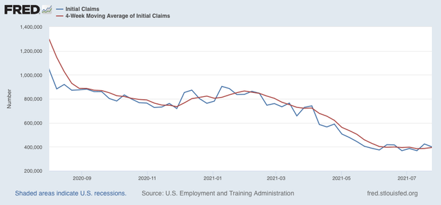
Initial jobless claims declined 24,000 this week, but at 400,000 this was the 2nd week in a row starting with a “4” handle. The 4 week average of claims also increased by 8,000 to 394,500:


Significant progress in the decline of initial claims has stopped for the last 2 months.

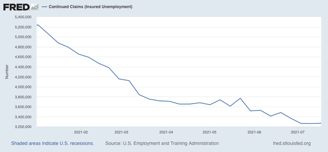
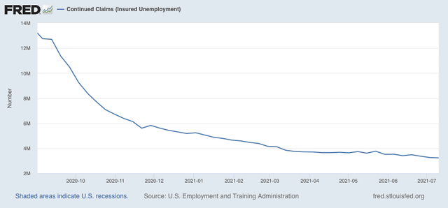
Continuing claims rose 7,000 to 3,269,000:


This is the third week within 10,000 for continued claims. This level was last seen at the end of 2012 during the last expansion.

Whether claims will continue to stall, reverse, or improve from here is under the control of the Delta variant, and whether new vaccinations continue to stall.

Wednesday, July 28, 2021

Coronavirus dashboard for July 28: you’re reading the right blog, ghoulish edition


 - by New Deal democrat

In writing about the economy, I make use of long and short leading indicators to forecast coincident indicators. In writing about COVID, the template isn’t much different: cases lead hospitalizations by about 2 weeks, which in turn lead deaths by about 2 weeks. Put another way, cases lead deaths by about 4 weeks.

Four weeks ago I wrote:


we have to start worrying about COVID again, because the delta variant has now taken hold in up to 8 States with rising new cases. All of those States have fewer vaccinations per capita than the national average, and most of them much below the average. By the end of July, I anticipate that it will be clear there is a new ‘wave’ of cases in the relatively unvaccinated States.”

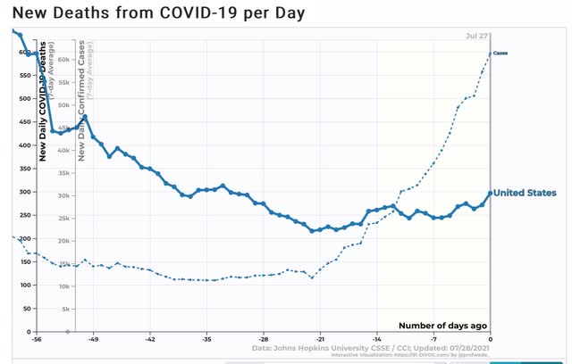
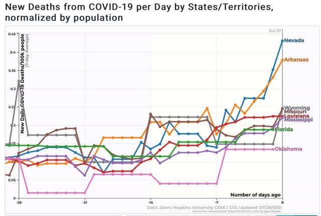
In the past 4 weeks, cases have nearly quintupled from about 11,300 to 55,000. Hospitalizations have risen about 2.5x. And here is what deaths nationwide look like, vs. cases:


Deaths have been trending slightly higher and just made a 1 month high.

And here are deaths in the bellwether States that were first hit with Delta, plus a few others:


Deaths in some of those States have started to go parabolic.

In the last 4 weeks, the US has gone from about 47% fully vaccinated to just under 50% fully vaccinated - i.e., not much of a change.

Here is what is going to happen in the next month. Deaths are going to follow cases. Cases have nearly quintupled. Deaths are going to nearly quintuple - I.e., to a level of about 1,000/day.

Tuesday, July 27, 2021

Housing sales decline, while price surges continue


 - by New Deal democrat

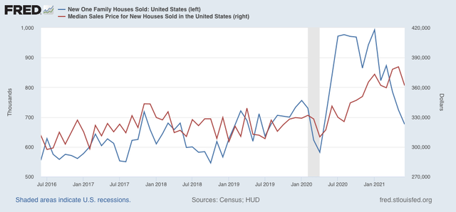
So I take a little one day road trip on my vacation, and come back to find much weeping and gnashing of teeth and generalized whining about a big decline in new home sales. Well, what exactly were they expecting?


The new home sales data is particularly volatile and heavily revised. So, in June, it was volatile, and May was revised substantially downward (blue in the graph below). Prices also declined, although they remain within the range of monthly noise (red):


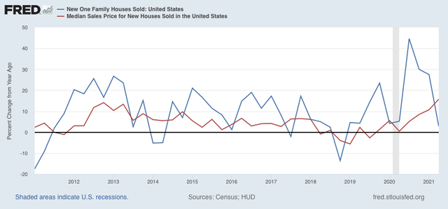
When we look at the YoY% change quarterly (to reduce noise), the prices follow sales continues to be in evidence:


In absolute terms, sales peaked at the turn of the year, while prices continue to rise faster than the pace of overall inflation.

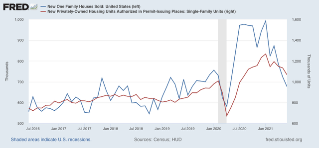
But of course, we really already knew this, because single family housing permits give us the same information, which much more signal and much less noise, with about a 1 month delay (red in the graph below):


Sales lead prices. Once sales decline enough, sellers will get the message about prices.

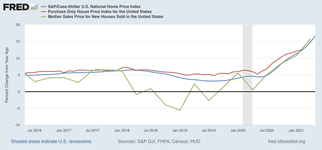
Meanwhile, this morning both the FHFA (red in the graph below) and Case Shiller (blue) house price indexes for existing homes were released, which I show YoY compared with median new house prices (green):


All three continue to show YoY acceleration in prices. As inventory of existing homes held back in 2020 continues to catch up, and supply chain disruptions dissipate, price increases will abate, and I further expect them to reverse.

Saturday, July 24, 2021

Weekly Indicators for July 19 - 23 at Seeking Alpha


 - by New Deal democrat

My Weekly Indicators post is up at Seeking Alpha.

No visible impact on the economy yet due to the Delta wave. In March 2020, the first indicator to tip over was restaurant reservations. I would expect that to be the first item to suffer now as well.

As usual, clicking over and reading will not only bring you up to the virtual moment, but bring me a penny or two for my efforts.

Friday, July 23, 2021

Comments on existing home sale prices


 - by New Deal democrat

Existing home sales were reported yesterday. Since, although they are about 90% of the market, they have much less effect on the economy than new home sales, I normally don’t pay that much attention.


But I did want to emerge from my vacation hideaway to make a few comments.

1. Inventory is up 11% YoY. Inventory follows prices, and as prices rise, more and more people decide now is a good time to sell their house (especially if they are downsizing). A huge number of people held off selling during the pandemic lockdowns last year in spring. Those houses are going to come back on the market, and I expect inventory to surge as the pandemic recedes.

2. Prices are up 23.4% YoY, almost as insane an increase as last month’s 23.6%.

3. Prices are even more extreme compared with income as they were at the height of the housing bubble. Using average hourly income, here’s how many hours a person would have to work to buy the median existing home for sale last month vs. the two peaks of the bubble, August 2006 and May 2007:

6/21: 14,147 hours
8/06: 12,889
5/07: 12,585

4. But when we look at monthly mortgage payments as a multiple of average hourly income, prices aren’t nearly as extreme as they were at the peak of the bubble, because mortgage rates in June averaged 2.98%, vs. 6.52% in August 2006 and 6.26% in May 2007:

6/21: 59.5 hours
8/06: 81.6 
5/07: 77.6

So, as insane as existing home prices appear now, they could still rise substantially higher. Nevertheless, as they continue to rise, I expect sales to continue to decline (unless mortgage rates come down significantly more).

Thursday, July 22, 2021

New jobless claims rise sharply; is the Delta wave beginning to take its economic toll?


 - by New Deal democrat

New jobless claims are the most important weekly economic datapoint with regard to the effects of vaccination progress. At this point, it is also a test of how much the “delta wave” of new cases is setting economic progress back. Three weeks I wrote that, because progress in vaccinations had largely stalled, “that implies at least a stall in the decline in new claims, and - I actually suspect - an increase, perhaps to about 450,000 per week or so.”

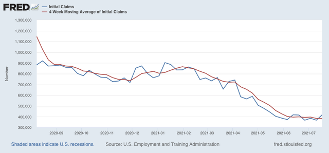
This week’s number may just be noise, or may be evidence such an increase. New jobless claims rose by 51,000 to 419,000, the highest number in 9 weeks. The 4 week average of claims also rose - slightly - by 750 to 385,2500. Here is the trend since last August:


After trending down by roughly 100,000 per month from late February into May, as vaccinations increased quickly, the rate slowed sharply ever since, to a decline of less than 20,000 in the past 6 weeks in the 4 week average.

On the other hand, continuing claims, which are reported with a one week lag, and lag the trend of initial claims typically by a few weeks to several months, have declined gradually about 15% from roughly 3,800,000 over the past 4 months, did set another new pandemic low today at 3,236,000:


Some of this decline *may* be due to many States’ termination of all extended jobless benefits due to the pandemic.

A long term perspective shows that this week’s level is similar to early during other recoveries from most previous recessions, versus at 2,000,000 or below later in strong expansions:


My ultimate target for economic success from vaccinations has been for claims to average 325,000 or below. But with the Delta variant surging, and new COVID cases rapidly increasing to near last summer’s highs, I suspect that both employers and potential customers will become more cautious again. I remain skeptical that there will be a full return to employment until the disease has run its course.


Wednesday, July 21, 2021

Coronavirus dashboard for July 21: brace yourself for the surge in deaths


 - by New Deal democrat

I have been warning since late June that the situation would likely look very different by the end of July. By 2 weeks ago, I wrote:

In the near future, there appears to be bad news and *relatively* “good” news for the US. The bad news is that the “delta wave” is spreading, and we should expect a real outbreak on the order of last summer’s by early August. The *relatively* “good” news is that the death rate is likely not to be nearly so bad, if the experience in the UK is any guide.”


Cases have nearly tripled in the US in the past 2 weeks:

Since deaths lag by about 28 days, we haven’t nearly begun to see the kind of increase that is already baked into the cake.

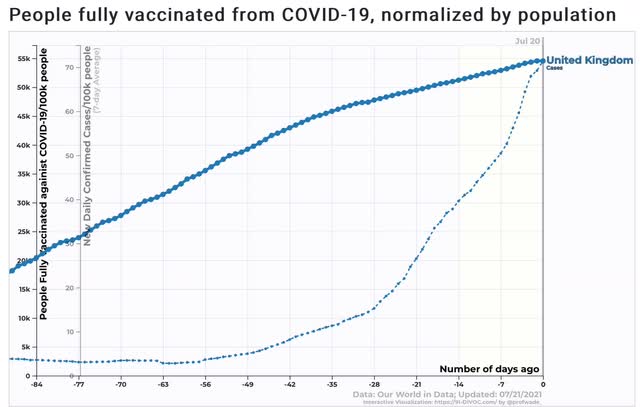
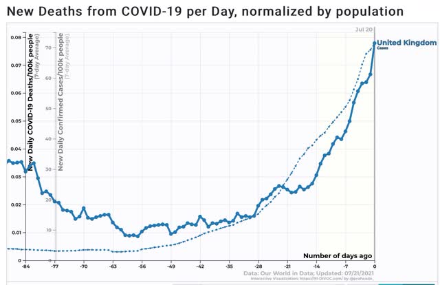
In the UK, the government has been congratulating itself over the low death rate. And in comparison with the number of deaths last winter, they are correct. To some extent, this is due to the fact that 15% more of the UK population has been vaccinated during the Delta wave there:


But over the last 2 weeks, the death rate in the UK has actually increased *faster* than the rate of new cases:


If we compare the increase in deaths in the UK over the past two weeks with the increase in cases 2 to 4 weeks before, it isn’t clear at all that the death rate there isn’t going to follow cases proportionately higher over the next month.

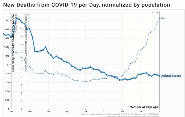
Turning to the US, deaths have only risen slightly so far, but again, since deaths follow cases by about 4 weeks, we are probably only 2 weeks away from a proportionate increase in cases. And in the US, there has been no comparable surge in vaccinations since the onset of the Delta wave. In fact, there has been a subsidence.

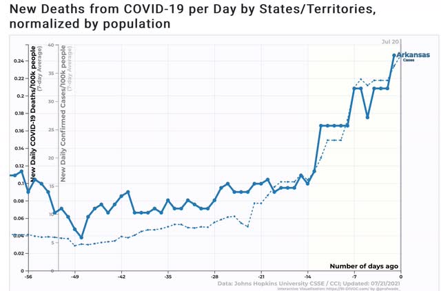
For a taste of what is in store, here are new cases and deaths in Arkansas, one of the States where the Delta wave increase started the earliest:


Deaths have risen just as fast as cases, and started to rise very quickly after cases did.

So, brace yourselves. Cases have nearly tripled in the US over the past 2 weeks. Deaths are likely to increase to nearly 1000/day over the next 2 to 4 weeks.

One more thing: as I wrote a few days ago, the virus is essentially a parasitic copy machine. Its adaptive mechanism is chance mutation. But the human *reaction* to the virus, and to knowledge about the trend in cases and deaths, is fiendishly difficult to model. For example, almost certainly after hearing from their lawyers, Fox News issued a spate of “get the vaccine!” messages from their hosts. Will that continue, or even intensify? Will Congressional GOPers and Red State governors change their tunes? As cases and even more importantly deaths go parabolic, panic is likely to set in. What will the unvaccinated do then? Impossible to know.

Tuesday, July 20, 2021

Housing permits continue decline in June; more challenging YoY comparisons ahead


 - by New Deal democrat

First, a brief comment about the NBER’s declaration yesterday that the COVID recession ended in April 2020. I am not surprised at all that they chose that date. It has been clear for a year that the trough in economic activity across the board was that month (which we’ll see below as to housing, for example).  Remember that a recovery starts when economic activity improves, even if that improvement is from totally awful to almost totally awful. The only thing that surprised me about the NBER announcement was that I expected them to wait for next week’s GDP report, which will probably show that Q2 set a new all time peak, surpassing Q1 2020 just before the pandemic.

Now, to housing ...

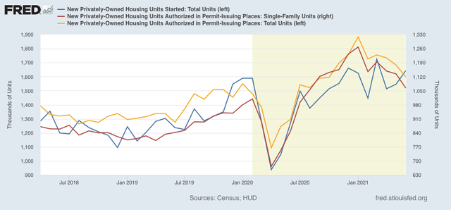
Housing permits, both in total (gold in the graph below) and the less volatile single family permits (red), both continued to decline in June, to the lowest level since last August. The more volatile and slightly lagging measure of housing starts (blue) increased, although they remained below their recent peak from this March and also last December:


Both as to permits and starts, the level of construction activity remains higher than its pre-pandemic peak. At the same time, the decline of slightly more than 15% in permits is consistent with a slowing down of economic growth next year.

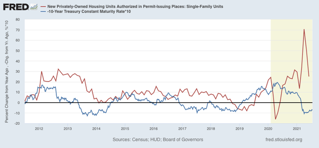
Finally, here is the YoY change in mortgage rates (red)(*10 for scale), inverted so that up = economic positive, and down = economic negative, compared with total permits (blue):


As I have said many times before, mortgage rates lead permits and starts. The big pandemic decline evaporated last July, so beginning next month, the YoY comparisons are going to be much more challenging. On the other hand, the renewed decline in mortgage rates in the past few weeks will at least temporarily put a floor under the decline in housing purchases.

Monday, July 19, 2021

Coronavirus dashboard for July 19: The UK as Delta wave trailblazer for the US


 - by New Deal democrat

An initial note: I am on vacation this week, so posting is likely to be sporadic. I’ll still hit the important data.


Now that the Delta wave is well and truly here in the US, let’s compare it with the UK experience, which has been about 7 weeks ahead, to get an idea where we are going.

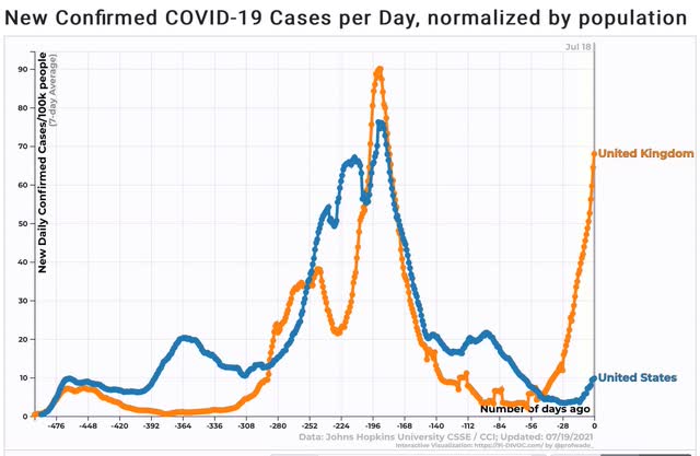
Here is the long term view: 


As I said, the UK resurgence due to Delta started about 7 weeks before that in the US.

So the experience in the UK is likely to give us a good idea where the US will be in about 7 weeks. 

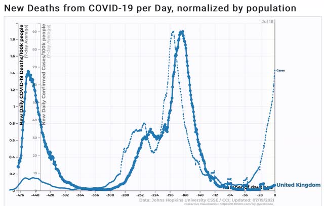
So here is a look at cases (narrow line) and deaths (wide line) in the UK:


In the autumn and winter wave last year, as well as the Delta wave this year, deaths followed cases with about a 4 week lag.

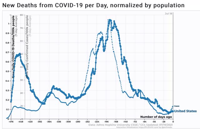
As similar 4 week lag between cases and deaths shows up in the long term view of the US data:


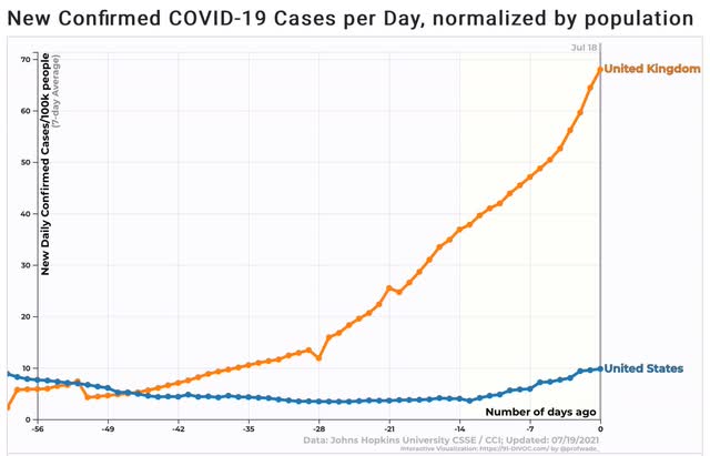
Now let’s take a close-up look at cases in the US (blue) and the UK (orange) over the last 8 weeks:


Cases in the UK have doubled roughly every 2 weeks, from a low of about 1900 to over 45,000 now. In other words, cases now are over 20 times higher than they were 8 weeks ago. Cases in the US bottomed about 3.5 weeks ago at 11,300, and have since risen to over 32,000, roughly a tripling during that time.

So if we project US cases to double every 2 weeks over the next 8 weeks, as they have in the UK, that puts us at 512,000 cases daily in the US by mid-September (more than double the US’s peak last winter).

Now let’s look at deaths:


In the UK, deaths bottomed at 8 per day about 6 weeks ago. As of now they have risen to an average of 42 daily, an increase of over 5x. In the last 2 weeks, they have more than doubled. In the US, deaths bottomed at about 215 per day less than 2 weeks ago, and have risen to about 270, a slow increase that is similar to that of the UK in the first several weeks after their bottom in deaths.

If the US follows the same course as the UK, 1 month from now the US will have about 1000 deaths per day. 

But remember, deaths follow cases with a 4 week lag. So if the US has 16x more cases in mid-September, then by mid-October there will be over 4000 deaths per day.

The question in the US is whether there will be government interventions at the State level to slow down the spread of these new cases, such as reinstating masking and distancing restrictions, and shutting down certain businesses. Unsurprisingly, that is unlikely to happen in the Red States. The other alternative is that individuals reinstate some precautions, such as masking indoors, that they may have recently abandoned. At some point I believe that *will* happen, even in the Red States (as it did last winter), but I do not know how severe conditions must be first.

What I can say is that, if cases and deaths double every 2 weeks, then in about 4 months the Delta variant will have ripped through virtually the entire unvaccinated US population, with deaths following suit about a month later.