Thursday, March 17, 2016

First autos wobbled, now it's housing

 - by New Deal democrat

The two most leading sectors of the consumer economy are houses and cars.  For the last three months, vehicle sales have backed off of last autumn's highs.

My take on yesterday's report on housing permits and starts is up at XE.com.

At best, we have hit a temporary plateau.

Bonddad Thursday Linkfest

At 3PM CST on Thursday, March 31, we’ll be reviewing the latest month of economic and market data in the US.  This is a free webinar that will last about 30 minutes.  You can sign up here.


Chart from the Fed 


5-year Chart of the Dollar


Wednesday, March 16, 2016

I am running out of positives


 - by New Deal democrat

Not everything is gloom and doom.  Let me get the positive out of the way first: manufacturing industrial production rose +0.2% in February.  There is no sign whatsoever that the severe downturn in commodity production and exports, which caused the overall industrial production number to decline -0.3%, has hit the large manufacturing sector.  I don't see a recession where both employment and manufacturing are growing:


Now the bad news.  Although the -0.2% decline in consumer prices in February means that real retail sales were flat, the big downward revision in January was in no way ameliorated:


Worse, real retail sales per capita have been basically flat for 8 months, with a peak in December:


(note that population data isn't available for February yet, so the graph ends with January.)  This is a long leading indicator.

Just as bad, housing, which is perhaps the best of all long leading indicators, has also turned flat to negative.  No graphs yet, but neither permits nor starts made a new high.

Since the middle of last year, because of the NYC distortions, I have been looking at single family permits, and also permits excluding the Northeast in order to compensate.  Neither one of these made a new high, either, and both look flat for at least the last 4 months.

With a very long lag, 4th Quarter corporate profits will finally be reported as part of next week's final revision to Q4 GDP.  Should these not make a new high, which seems most likely, that would leave real money supply and the yield curve as the only two long leading indicators still giving positive results.

I am running out of positives.  At the moment there is no engine for growth.  Unless there is a quick jump-start to production and profits from the abating of US$ strength, or consumers finally spend much more of their gas savings, this does not bode well for 2017, and possibly Q4 of this year. 

Bonddad Wednesday Linkfest


UK Unemployment rate:


Tuesday, March 15, 2016

The US$ has ceased being a drag on the economy


 - by New Deal democrat

The biggest drag on the US economy for over a year and a half has been the surging US$, which favored imports and hobbled exports, counteracting the benefit to consumers of lower gas prices.

As I have been documenting in the last several months, all of the trends from the 2015 economy are changing.  And the biggest, most important of those trends, the strength of the US$, has also changed.

Here is the YoY% change in the trade weighted US$,, both broad (blue) and against major currencies (red), as of the Fed's update yesterday:


Not only is the US$ now down YoY against major currencies, but it has also faded to being just 3% positive YoY on the broad scale.  This is a much more neutral reading, as shown in this longer term view:


Note in particular that the YoY% change in the US$ has fallen to about where it was exiting the last two recessions.

It will take a few months at least before this feeds through into imports and exports, as well as corporate profits.  But for now the US$ has ceased being a drag on the economy.

Retail sales: February OK, January revisions - OUCH!


 - by New Deal democrat

The slight negative report for February in retail sales is not concerning, or at least not until we find out what February inflation was in the CPI report tomorrow, especially since ex-gasoline they were up +0.2%.

But the big OUCH! was the revision in January from +0.4% to -0.2%.  Here's the dismal graph:


The big hit was in general merchandies.  In particular furniture sales, building materials, and sporting goods, and  were poor.  I don't have a good explanation, and I find this revision particularly bothersome since it contradicts the contemporaneous weekly reports.  Needless to say, any evidence that the consumer is rolling over is particularly unwelcome.

In any event, further consideration after tomorrow.

P.S.:  I see that Bill McBride is reporting a good YoY number.  He has been using the same metric for auto sales, which one a monthly basis have retreated from their late 2015 highs .  As I have repeatedly pointed out, where we have seasonal adjustments, looking at YoY numbers will miss turning points, sometimes badly.  This makes tomorrow's housing permit and starts numbers all the more important.

Monday, March 14, 2016

Jazz Shaw: Dear God But the Economic Stupid is Strong With This One

     Jazz Shaw is a blogger at Hot Air who has written several pieces on Seattle's minimum wage issue.  He argues that the hike -- which is just beginning to take effect -- has sent Seattle employment plummeting, thereby proving his point that the hike was ill-advised.  However, as I will point out, Mr. Shaw is not only ill-qualified to make such an argument, but that the data he is using to justify his conclusion is the wrong data.  This second point not only disproves his thesis, but also bolsters my contention that Mr. Shaw is simply unqualified to write about economics in general.

     Who is Jazz Shaw?  Oddly enough, for a man with an extensive online presence, we know remarkably little.  I received the following after typing "Jazz Shaw, Biography" into Google:

Jazz Shaw is a heretical, Northeastern former RINO and the weekend editor at HotAir.com He can be reached at jazzshaw@gmail.com. Or you can follow him on Twitter @JazzShaw

This tells us nothing about his qualifications to write about economics.  My suspicion is that he has no training in the field.  I will happily change that opinion should I see contradictory information. However, if he wanted to bolster his assertions, we'd probably see something definitive about his background.  In addition, his statement "Is economics really a science? I’ve long felt it should be taught alongside astrology or some related field," is not only wrong (there is a tremendous amount of data and analytical work in the field that is statistically and mathematically very sound) but is the kind of thing someone would say to imply they could offer an informed opinion without having the requisite pedigree to do so.

     Let's turn to his latest effort, which is titled, "Fight for 15 update: Seattle employment craters." The entire basis for this article is a report from AEI, which supposedly shows a large drop in Seatle employment numbers after the minimum wages increased.  Here's the problem:  The AEI study uses the wrong data to justify its argument.  From the LA Times:

Now, Perry is back, armed with what he says are Seattle-only statistics. "Seattle's 'radical experiment' might be a model for the rest of the nation not to follow," he wrote on Feb. 18. He cited figures from the Bureau of Labor Statistics showing that Seattle employment fell by more than 11,000 from April, the date of the first minimum wage hike, through December. He compared these numbers to the Seattle MSA, writing that "while jobs in the city of Seattle were tanking starting last April, employment in the suburbs surrounding Seattle was increasing steadily to a new record high in November."

Unfortunately, local economists say Perry is still using bad data. Although he attributes the city-only numbers to the Bureau of Labor Statistics, they're not reliable jobs numbers. Perry's source is the Local Area Unemployment Statistics file, or LAUS, which is based on a small sampling. It's aimed at counting the number of employed people living in the sample area (in this case, Seattle), not the number of jobs. The data are "prone to error," University of Washington economist Jacob Vigdor told me by email, and "basically worthless for any serious analysis." 

Indeed, Vigdor — who is overseeing the university's analysis of minimum-wage data — notes that the same statistics for Bellevue and Everett, Wash., showed exactly the same percentage decrease that Perry found in Seattle, even though they haven't increased their minimum wage. (See below.)

Cities that didn't institute a wage hike experienced the same drop. That indicates something else is the cause of the drop.  You can't argue an event only impacting one area is the primary cause for the drop in two adjoining areas experiencing a similar decline.  That's poor logic.

     Shaw's and Perry's reasoning run into two primary microeconomic problems.  Both assume labor demand is elastic (a term I doubt Mr. Shaw is familiar with) -- that a change in cost will have a disproportionate impact on demand.  However, this simply isn't true.  For example, let's assume that a restaurant owner currently has 10 employees when wages increase.  Let's assume he fires 4 people due to increase cost.  At some point, he'll cut off his economic nose to spite his face -- that is, he'll lower his payroll to such an extent that he'll hurt customer service, lowering overall revenue.  Given the profit maximizing principal underlying cost theory (again, I doubt Mr. Shaw is aware of this concept, either), the current level of 10 employees is probably already peak efficiency, which means he'll either, absorb the cost, cuts costs elsewhere, raise prices, or do some combination of all three.

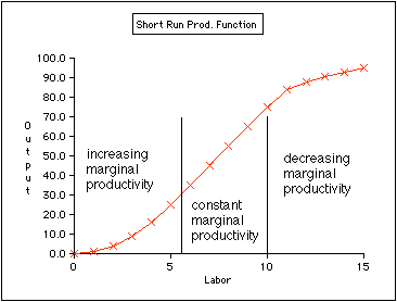
     And then there's the inherent problem of the production function graph:


As anyone who knows micro (which, it is painfully obvious Mr. Shaw doesn't) would note, when you lower your primary short-term variable cost (labor) you also lower your output.   Now, it's possible you might not do too much damage, depending on a number of different factors, but the bottom line is that you're moving in the wrong direction.

     So, Mr. Shaw, you have not won the argument, as you claim.  In fact, you've demonstrated that you really don't know anything about economics.  This of course, doesn't concern him.  He is a political blogger making political points.  Data is irrelevent.  However, it's also important that a record exists documenting his incompetence in this matter, if for no other reason, than to show him the large error(s) in his analysis.


Two encouraging signs from Transport


 - by New Deal democrat

Charles Dow's theory was that industrial production and the transportation of goods should move in tandem.

While we don't have any high frequency data with respect to manufacturing generally, last week I shared a graph showing that steel production appears to have bottomed, and indeed for the last two weeks the YoY change in steel has been positive.

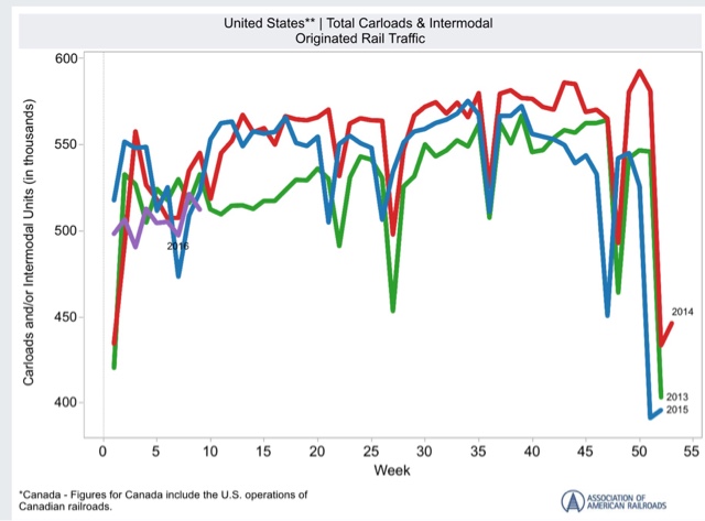
On the transport side, rail traffic is reported weekly, but truck traffic only monthly.  The AAR report of carloads ex-coal shipments has been particularly encouraging.  Here's a graph of the last 3 years:


What is particularly positive about rail carloads ex-coal is that in the last few weeks, they haven't just been outperforming 2015, but 2013 and 2014 as well. They've been outperforming 2015 since mid-January.  And this measure doesn't include intermodal traffic, which is heavy with imported goods.  In other words, transport of domestically manufactured goods by rail looks pretty encouraging.  In a couple of weeks, the comparisons will get more challenging.

One pretty good monthly measure of trucking, meanwhile, is the Cass Freight Index, which just came out for February.  Since trucks do not carry coal very much, the comparison with rail carloads ex coal is a good one:


This is still negative YoY, but note that it is much "less bad" than any comparison since September.  And sufficiently so that it suggests that if we could seasonally adjust, probably late last autumn was the bottom.  We'll have to wait a month and see if trucking follows rail into positive territory in March.

Saturday, March 12, 2016

Weekly Indicators for March 7 - 11 at XE.com


 - by New Deal democrat

My Weekly Indicator post is up at XE.com.

For the last month I have pointed out that the trends that were established in 2015 are all reversing.  That process continued this week, as one more turned positive, and one deteriorated closer to negative.

Friday, March 11, 2016

Potpurri for a light week of economic data

 - by New Deal democrat

Well, this has been just about the lightest week I can ever remember for economic news. Even the JOLTS report, which is usually issued the week after the jobs report, was put off until next week.

So here are a few things to hopefully interest you until something actually, you know, happens.

1.  Labor conditions were negative, but there's no cause for imminent concern.

The Labor Market Conditions Index does a good job forecasting the trajectory of the YoY% change in jobs.  Here's the long view:


Here is the last 5 years:


We're not any worse than we were in 2012, so there's no cause for panic.  On the other hand, the continuing weakness in the LMCI indicates that were are going to get progressively weaker jobs gains in the coming months.

2.  Wholesalers' inventory to sales ratio. OUCH!

No updated graph, because FRED waits for retail sales to update total sales and inventory data.

The high frequency weekly data has been pointing to a bottom in the shallow industrial recession.  That wholesalers' inventories grew as well as sales falling contradicts that narrative.  Bad news. Hopefully a one-month glitch?  I dunno.

3.  Can you really have a recession when nobody is getting laid off?

Jobless claims:


I mean, seriously, how could that be even possible!?!

4. Speaking of high frequency weekly data...

My rule of thumb for not-seasonally-adjusted data is that, when the series is less than half as good, or bad, as it was at its best/worst YoY, then it has probably made a bottom or top

Here's steel (through February):


and staffing:


and rail (this year is that purple squiggle on the left):


Steel does look like it has bottomed. Staffing not quite yet, although the YoY comparisons are clearly "less bad" than they were in the September through December frame. Rail is probably benefitting from less bad February weather this year - another two or three weeks of data will tell the tale.

Wednesday, March 9, 2016

Updating the mid-cycle indicators: part 2 of 2


 - by New Deal democrat

A majority of the 7 mid-cycle indicators should have turned south well before the beginning of a recession.  Since lots of commentators are talking about recession now, I've taken an updated look at these 7 indicators.

Part 2 of 2, with the conclusion, is up at XE.com.

Tuesday, March 8, 2016

Updating the Mid-cycle indicators: part 1 of 2


 - by New Deal democrat

If the mid-cycle indictors haven't turned, talk of an imminent recession is clearly premature.

So, have they?  I take a detailed look in two parts.  Part 1 is up at XE.com.

Monday, March 7, 2016

Four out of five leading jobs indicators show weakening


 - by New Deal democrat

Every month when I discuss the jobs report, I have a section devoted to those parts of the report which tell us where the overall numbers are likely to go in the future.

We may be at a turning point for those numbers, as 4 out of 5 either look like they are turning or have already turned.

First, here are temporary jobs:  


Note that these typically turn down about a year before the overall jobs numbers turn down.

Here is a close-up on the last year:


These look like they are making a peak now (or may have made a peak 2 months ago).

Next, here are the number of unemployed between 0 and 5 weeks.  This was identified by Dr. Geoffrey Moore, the founder of ECRI, and in his 1993 book he wrote that it was more accurate than initial jobless claims:


These are quite noisy.  But they have not made a new low in 5 months.

Third, here are jobs in manufacturing:


In  the post-World War 2 era, these sometimes but not always peaked significantly before the onset of a recession. Sometimes they went sideways for awhile before rolling over as well.  

Since 1990, they have undergone a secular decline.  But even then the first derivative (i.e., rate of decline) accelerated before the last 2 recessions (red, right scale):


Now here is a close-up on the last 5 years:


These have pretty clearly gone sideways in the last year, and the first derivative has declined.

Fourth, here is the manufacturing workweek:


This is one of the actual components of the LEI.  Note that these peaked almost two years ago, although they are improving off their recent bottom in late 2015, thus being consistent with an ebbing of the shallow industrial recession.

Finally, here are residential construction jobs, which also typically peak a year or more before jobs as a whole turn down:


These are still growing, as the housing sector is doing quite well.

The poor improvement in manufacturing jobs is a representation of the shallow industrial recession in the economy during the past year.  But the other three either  have not made new highs in months, or even going on two years, suggesting  that the overall labor market is decelerating. This is a caution flag for jobs possibly turning negative next year.

Saturday, March 5, 2016

Weekly Indicators for February 29 - March 4 at XE.com


 - by New Deal democrat

My Weekly Indicators post is up at XE.com.

This is one of those time when watching the high frequency data is so important, because the trends do appear to be changing.

Friday, March 4, 2016

February jobs report: solid headlines, decidedly mixed internals


- by New Deal democrat

HEADLINES:

  • +242,000 jobs added to the economy
  • U3 unemployment rate unchanged at 4.9%
With the expansion firmly established, the focus has shifted to wages and the chronic heightened unemployment.  Here's the headlines on those:

Wages and participation rates
  • Not in Labor Force, but Want a Job Now: down  -103,000 from 5.973 million to 5.870 million
  • Part time for economic reasons: unchanged at 5.988
  • Employment/population ratio ages 25-54: up +0.1% from 77.7% to 77.8% 
  • Average Weekly Earnings for Production and Nonsupervisory Personnel: unchanged at $21.32,  up +2.4%YoY. (Note: you may be reading different information about wages elsewhere. They are citing average wages for all private workers. I use wages for nonsupervisory personnel, to come closer to the situation for ordinary workers.)
December and January were revised upward by +9,000 and +22,000, for a net change of +31,000. 

The more leading numbers in the report tell us about where the economy is likely to be a few months from now. These were neutral to negative.

  • the average manufacturing workweek was unchanged at 41.8 hours (but last month was revised up +0.1.  This is one of the 10 components of the LEI, the net will be a posittive.
  •  
  • construction jobs increased.by +19,000.  YoY construction jobs are up +253,000.  
  •  
  • manufacturing jobs decreased by -16,000, and are up +25,000 YoY.
  • Professional and business employment (generally higher-paying jobs) increased by +23,000 and are up 604,000 YoY.

  • temporary jobs - a leading indicator for jobs overall decreased by -9,800.

  • the number of people unemployed for 5 weeks or less - a better leading indicator than initial jobless claims - increased by +48,000 from 2,249,000 to 2.297,000.  The post-recession low was set 6 months ago at 2,095,000.

Other important coincident indicators help us paint a more complete picture of the present:

  • Overtime was unchanged at 3.3 hours.

  • the index of aggregate hours worked in the economy fell by -0.4 from  105.3 to 104.9. 
  •  
  • The broad U-6 unemployment rate that includes discouraged workers declined from 9.9% to 9.7%.
  •  the index of aggregate payrolls fell by -0.7  from 127.8 to 127.1.
Other news included:      
  • the alternate jobs number contained in the more volatile household survey increased by +520,000 jobs. This represents an increase  of 2,843,000  jobs YoY vs. 2,673,000 in the establishment survey.  [Note: I updated this to correct an error, as I originally had +555,000 jobs for this]
  •  
  • Government jobs rose  by +12,000.  
  • the overall employment  to  population ratio for all a ges 16 and above -rose by 0.2  from  59.6   to 59.8  m/m and +0.5% YoY.  The  labor force participation rate rose 0.-1% from 62.7%  to  62.9%  and is now up +.0.1% YoY (remember, this incl udes droves of retiring Boomers).  
 SUMMARY:  

The headline numbers - strong job gains, and a decline in the broad U6 underemployment rate - are certainly welcome. 

Other significant positives included positive revisions to the last two months, an increase in both the employment to population ratio and labor force participation rate, and a decline in those out of the labor force who want a job now (but still about 1.4 million above its 1999 and 2007 lows).

But there were some significant and/or worrisome negatives as well.  Last month's big increases in wages and hours were partially reversed.  More worrisome was the establishment of a trend in declining temporary jobs (a leading indicator for overall employment), and negatives in two other leading sectors:  a rise in short term unemployment, and a loss of manufacturing jobs

In short, while the strong positives in coincident measures of employment are certainly welcome, the decline in some important leading indicators for employment raises a significant yellow flag.

Thursday, March 3, 2016

February ISM manufacturing suggests slowdown still has a ways to go


 - by New Deal democrat

I wrote a month ago that before either an inventory slowdown or a recession end, the new orders sub-index of the ISM Manufacturing Index turns up first.  The inventories component tends to trough at the end of a recession, or sometimes bounce along a bottom for a few months.

Last month I compared ISM new orders (red in the graph below) with real GDP.  A similar order occurs with Industrial production (blue):


It was encouraging one month ago that new orders were above 50 showing expansion.  

So what happened this month?  Once again new orders were positive (red in the graph below). Inventories, however, also ticked up slightly (blue):


Note, by the way, that both new orders and inventories are consistent with levels we saw during past non-recession inventory corrections, in 1996, 2002, and 2012.

For me to be confident that this slowdown was ending, I would want to see new orders spike to at least 54.  They didn't do that. That doesn't mean that I expect things to get worse.  In fact there are encouraging signs in things like steel production and rial shipments that we may have bottomed.  The failure of new orders to pick up means at least that we aren't out of the woods yet.

Wednesday, March 2, 2016

Houses and cars put up a yellow flag


 - by New Deal democrat

I have a new post about the two most leading sectors of the consumer economy - housing and cars - up at XE.com.